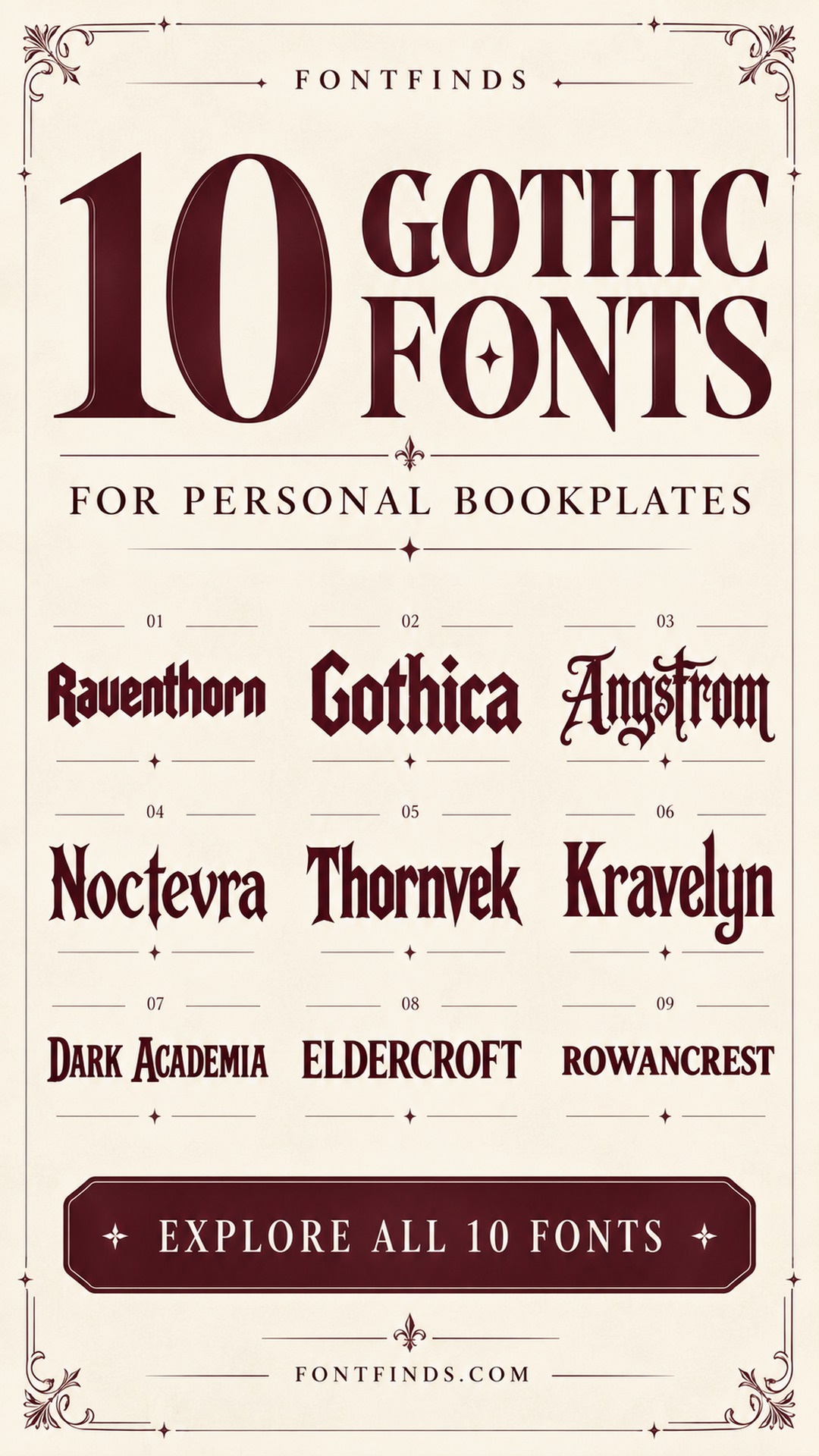
10 Gothic Bookplate Fonts for a Personal Home Library
This post contains affiliate links. If you buy through them, we may earn a commission at no extra cost to you.
An ex libris label is a small piece of design with a very personal job: saying this book belongs to you. Gothic bookplate fonts can turn that simple statement into something closer to a library seal. The challenge is keeping the owner’s name readable on a label that may be only a few inches wide.
This selection includes dramatic blackletter faces and quieter heritage alternatives. They are not all the same typographic category, and that is useful: you can choose between a dark fantasy mood, a traditional library look and a restrained academic label. Each image is a font product preview, followed by a suggested bookplate direction.
Using gothic bookplate fonts on a small label
Begin with the actual owner’s name. Ornate capitals can change the spacing dramatically, especially in a short centered line. Try the name in mixed case before committing to all capitals. Keep a plain line for an inscription, date or inventory number, and leave a generous blank margin around the lettering. A border should frame the name rather than touch its tallest strokes. Print a draft at final size: a font that looks impressive across a screen can become dense on a small sticker.
1. Tattoo Classic: An old-school ownership badge
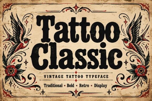
Tattoo Classic is a vintage tattoo-inspired alternative to the blackletter faces in this list. Its heavy rounded forms suggest a personal ownership badge with a slightly rebellious, old-school character.
Try a short surname above a plain Ex Libris line. I would avoid a large ornamental frame here, since the broad lettering already gives the small label plenty of weight.
View Font on Creative Fabrica →Preview • Download options • License details
2. Raventhorn: A medieval library seal
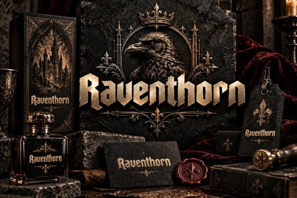
Raventhorn’s angular blackletter forms create an immediate medieval mood. It is a convincing starting point for a bookplate built around a surname, a simple crest shape and a short ownership line.
Keep the border fine and the lettering large. At small sizes, adding elaborate decoration around already dense letters can make the name harder to identify.
View Font on Creative Fabrica →Preview • Download options • License details
3. Gothica: A dark personal collection
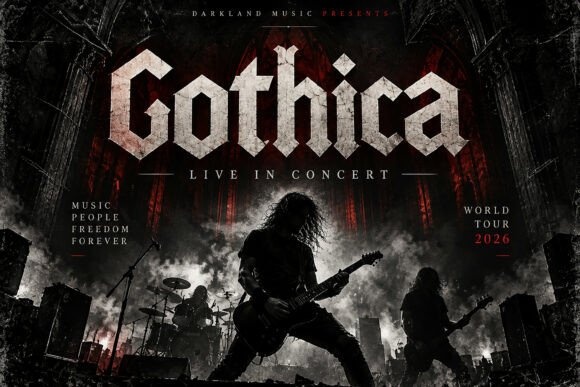
Gothica is a bold blackletter face with strong angular forms. I would try it on a plain cream label for a horror or fantasy shelf, using only the owner’s name as the decorative line.
A quiet date or inscription beneath it will be enough. The contrast between the dark title and the open paper helps the label feel deliberate rather than crowded.
View Font on Creative Fabrica →Preview • Download options • License details
4. Angstrom: A dramatic vertical nameplate
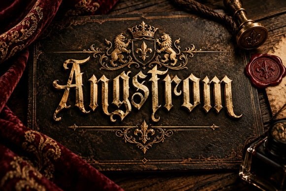
Angstrom’s strong vertical strokes and decorative blackletter structure suit a compact nameplate with an emphatic center. Test the surname on one line before adding any secondary wording.
If the name is long, make the label wider rather than compressing the font. Distorting the letterforms can undermine the proportions that give this style its character.
View Font on Creative Fabrica →Preview • Download options • License details
5. Noctevra: A dark-fantasy bookplate
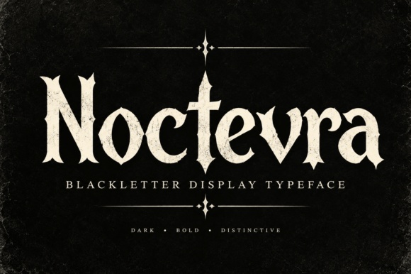
Noctevra adds sharp ornamental details to a gothic display structure. It offers a more atmospheric direction for a fantasy collection or a personal library mark with a slightly mysterious tone.
I would use a simple rectangular frame and a small plain ownership line. Keep the ornate letters away from the frame so their edges remain easy to distinguish.
View Font on Creative Fabrica →Preview • Download options • License details
6. Thornvek: A pointed heritage heading
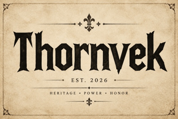
Thornvek’s pointed terminals and strong medieval forms work well as a short Ex Libris headline. Place the owner’s name underneath in a quieter style if it is too long for the main display line.
That reversed hierarchy can be useful on narrow labels. It preserves the gothic mood without forcing a complicated name into a dense decorative setting.
View Font on Creative Fabrica →Preview • Download options • License details
7. Kravelyn: A refined gothic monogram label
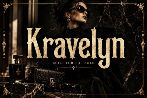
Kravelyn combines pointed blackletter details with more flowing curves. I would test it for a prominent initial or short family name above a simple ownership statement.
Use a single decorative focal point. A small bookplate does not need a large crest, a heavy border and an elaborate name all competing at once.
View Font on Creative Fabrica →Preview • Download options • License details
8. Dark Academia: An academic reading-journal label

Dark Academia shows decorative display lettering with a literary, atmospheric presentation. I would test the full owner’s name on a cream label before adding a small border or a date.
Keep the layout restrained: name, ownership line and one supporting detail. The result can serve both a bookplate and a matching reading-journal label without requiring an elaborate crest.
View Font on Creative Fabrica →Preview • Download options • License details
9. Eldercroft: A warmer heritage library mark
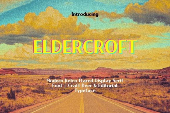
Eldercroft is a flared display serif, offering a warmer alternative to the sharper gothic choices. Its confident proportions would suit a family library label with a short name and a simple horizontal rule.
Try dark brown ink on cream paper. This direction can feel established and personal without relying on blackletter or a heavily medieval border.
View Font on Creative Fabrica →Preview • Download options • License details
10. Rowancrest: A Victorian-inspired book label
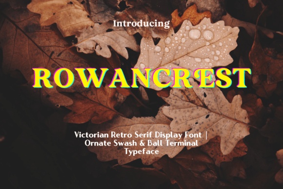
Rowancrest’s serif structure, ball terminals and swash flourishes suggest a decorative heritage label. I would use it for a centered family name with a generous margin and a narrow plain caption below.
Choose the simplest letterforms first. Add a flourish only where it improves the balance, rather than treating every available ornament as necessary.
View Font on Creative Fabrica →Preview • Download options • License details
Which style would I start with?
Raventhorn and Thornvek are strong starting points for a medieval mood. Eldercroft or Rowancrest offer a softer route if you want a library label without the intensity of blackletter. Keep the text brief, and let the paper and border do some of the atmospheric work.
Font previews are supplied product artwork. Layout suggestions are editorial ideas; fonts have not been installed or production-tested for this guide. Check the linked listing for the current files, supported characters and license.
More font ideas
Frequently asked questions
What words belong on a bookplate?
An owner’s name is enough. You can add Ex Libris, From the Library of, a date or a short dedication. Extra wording needs a quiet supporting font and enough space to remain readable.
Are all the fonts in this list blackletter?
No. The selection includes blackletter, gothic display and heritage alternatives so you can vary the strength of the mood. Choose the letterforms that suit your label rather than relying on a category name alone.
Should I use all capitals for the owner’s name?
Try both mixed case and capitals with the exact name. Ornate uppercase forms can become crowded; the best choice depends on the letters, the available width and the final printed size.