24 Fitness Challenge Poster Fonts for Bold Headlines
This post contains affiliate links. If you buy through them, we may earn a commission at no extra cost to you.
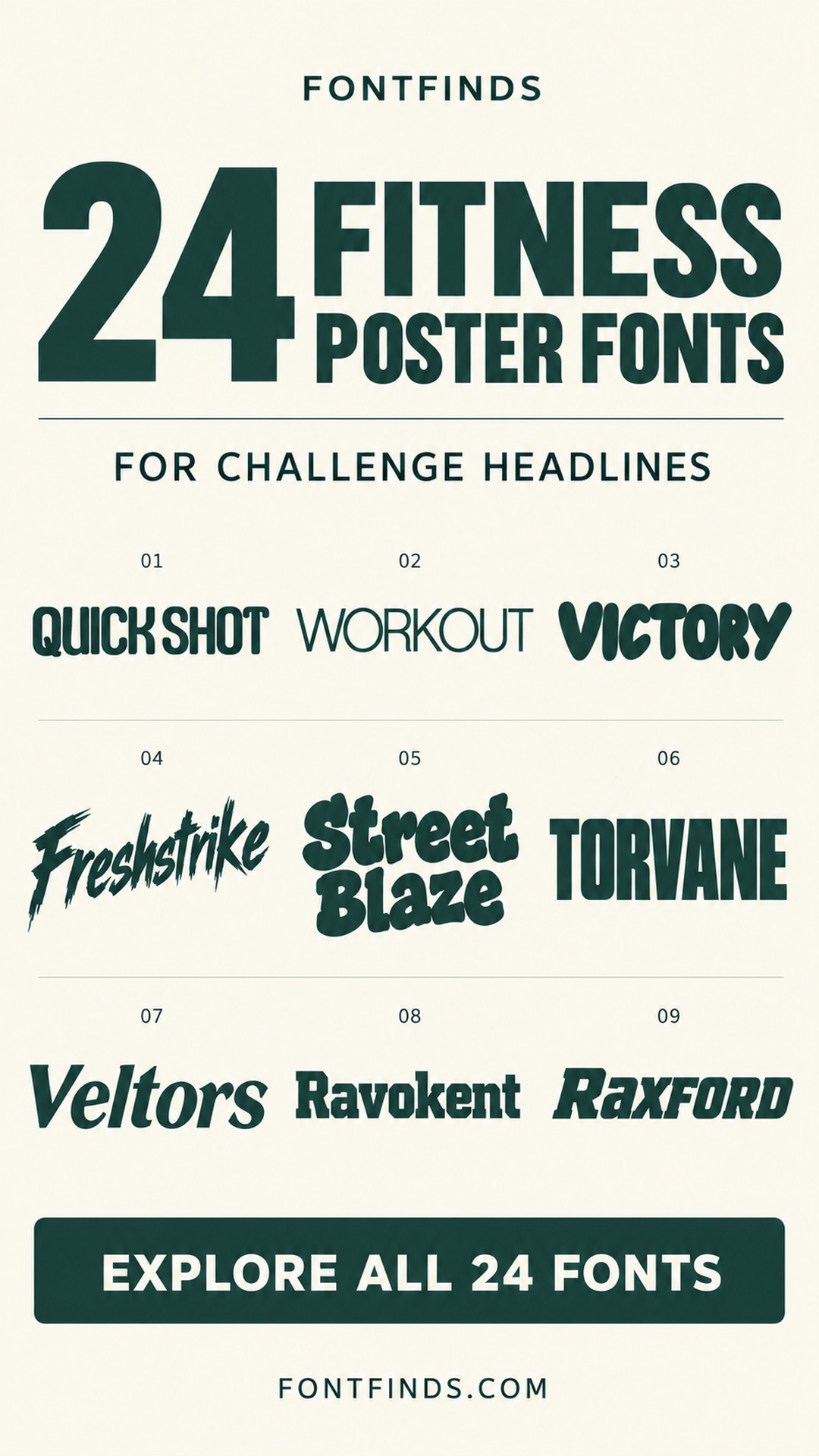
These fitness challenge poster fonts include athletic slabs, condensed capitals, energetic brush lettering and friendlier handwritten alternatives. They can help a campaign feel competitive, social, approachable or intense, depending on the event and its audience.
The font should support the invitation rather than obscure it. A poster needs to communicate what the challenge is, when it starts and how to join. Use the expressive options for the main headline, then make the practical information easy to scan.
Create a clear path from headline to action
Arrange the poster in three levels: challenge name, essential details and sign-up instruction. Make the title distinctive, but reserve enough space for the date, location and participation information. A plain companion font often provides the contrast needed beneath a heavy display headline.
Test both the large poster and a smaller social-media version. Check numerals, time information and any short URL at the size people will actually see. Avoid adding visual intensity through several competing textures, outlines and motion effects at once.
1. Quick Shot: Rounded technical lettering for timed challenges
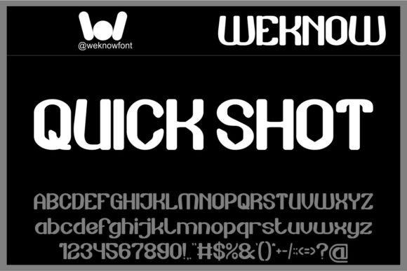
Quick Shot has compact, rounded forms with a technical rhythm. It could suit a short challenge title built around speed, intervals or a clearly measured goal.
Keep the duration and start date in a simple companion. Check the numerals separately before using them for the most important challenge information.
View Font on Creative Fabrica →Preview • Download options • License details
2. Workout: A restrained option for studio fitness
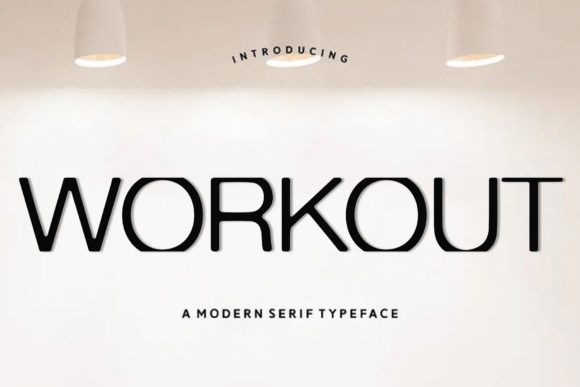
Workout has a clean, relatively light appearance compared with the heavier fonts here. It can support a studio challenge that needs a composed, contemporary tone.
Use generous spacing and a strong size contrast between the title and details. Avoid placing thin strokes over a busy exercise photograph.
View Font on Creative Fabrica →Preview • Download options • License details
3. Victory: Friendly lettering for an approachable challenge
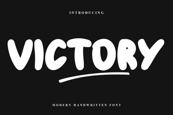
Victory uses rounded, substantial handwritten-looking forms. It can help a beginner-friendly challenge feel welcoming rather than intimidating.
Try a short positive headline and keep the practical information clearly aligned. The soft letters work best when the rest of the poster gives them enough space.
View Font on Creative Fabrica →Preview • Download options • License details
4. Freshstrike: Brush movement for an energetic launch
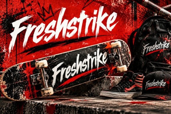
Freshstrike has sharp, slanted brush forms that suggest speed and effort. It could introduce a short training challenge or a high-energy event.
Use it for the headline only. Place dates, location and sign-up information in a calm companion font so the poster remains easy to act on.
View Font on Creative Fabrica →Preview • Download options • License details
5. Street Blaze: Rough boldness for an outdoor workout
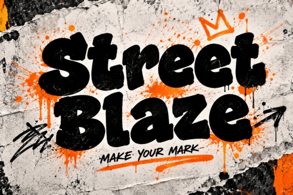
Street Blaze has thick, irregular lettering with a worn visual character. It can suit an outdoor group challenge or a street-inspired training campaign.
Keep additional textures restrained so they do not hide the letters. Use a clean information panel for practical details and registration instructions.
View Font on Creative Fabrica →Preview • Download options • License details
6. Torvane: Condensed impact for a short command
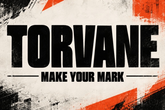
Torvane uses heavy, narrow capitals that can make a brief headline feel forceful. It is a useful option for a poster with limited horizontal space.
Stack the words deliberately and leave a clear gap before the details. Avoid stretching the letters wider just to fill the layout.
View Font on Creative Fabrica →Preview • Download options • License details
7. Veltors: Forward motion for a running challenge
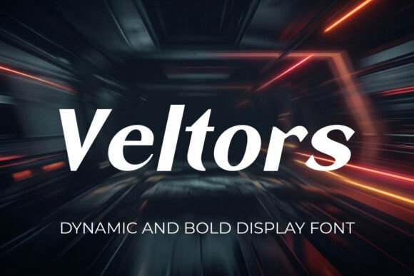
Veltors has a slanted, streamlined appearance that can suggest movement without extreme ornament. It could work for a running, cycling or interval-training headline.
Align it with a simple directional element. Keep the supporting text upright so the overall poster has a stable structure.
View Font on Creative Fabrica →Preview • Download options • License details
8. Ravokent: Solid slabs for a team-based event
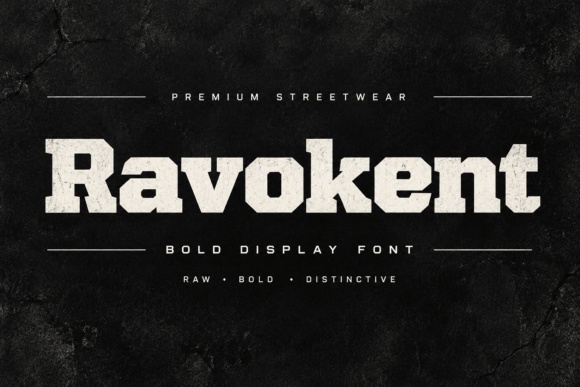
Ravokent has heavy slab-style forms with a strong, grounded silhouette. It can support a team challenge or a campaign that needs a substantial, collective feel.
Use a short title and a plain date line. Test any distressed details at the smallest promotional size before repeating the design across social posts.
View Font on Creative Fabrica →Preview • Download options • License details
9. Raxford: Athletic slant for a competitive headline
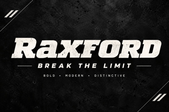
Raxford combines bold slab-like forms with a forward lean. It can give a challenge poster a familiar sports identity without requiring a complicated badge.
Keep the headline separate from sponsor marks or club logos. Use a simpler style for rules and sign-up information.
View Font on Creative Fabrica →Preview • Download options • License details
10. Shock Strike: Marker energy for a community challenge
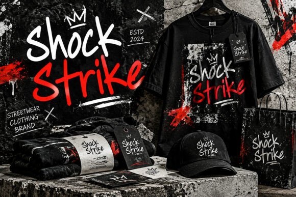
Shock Strike has loose, drawn lettering with an energetic rhythm. It could suit a casual club challenge or a campaign built around participation and enthusiasm.
Use a short headline and limit the number of tilted elements. A clean secondary font will help the dates and location remain immediately clear.
View Font on Creative Fabrica →Preview • Download options • License details
11. Boldriven: Block lettering for a strong event identity
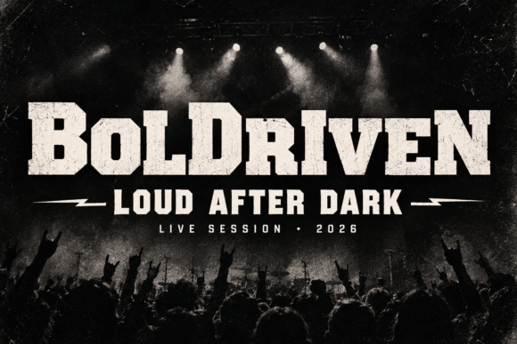
Boldriven has substantial, angular slab forms with a compact rhythm. It is a direction to explore for a team event or a challenge with a bold badge-like identity.
Keep the title large and the subtitle brief. Avoid packing every piece of information into the same heavy lettering.
View Font on Creative Fabrica →Preview • Download options • License details
12. Raw Street Vibe: Graffiti-inspired character for an urban campaign
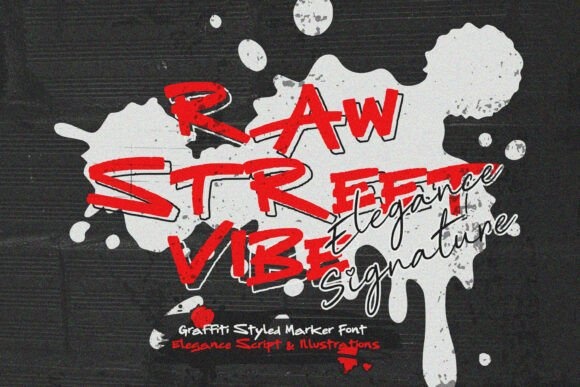
Raw Street Vibe offers loose marker-style forms with a deliberately expressive appearance. It can support an urban fitness campaign or a short motivational phrase.
Keep the practical details outside the expressive lettering area. Test the phrase with readers who have not seen the design before to catch ambiguous letters.
View Font on Creative Fabrica →Preview • Download options • License details
13. Truxo: Irregular weight for a lively headline
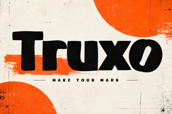
Truxo has thick, uneven display forms that feel energetic without a conventional sports-serif structure. It could make a short challenge title feel distinctive.
Use a clean background and a strong line break. Let the irregular shapes supply movement while the rest of the poster stays aligned.
View Font on Creative Fabrica →Preview • Download options • License details
14. Stadron: Tall weight for a compact challenge name
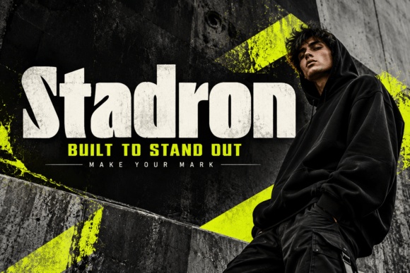
Stadron offers narrow, heavy display lettering with a forceful vertical presence. It can work when a longer title needs to occupy a defined block.
Check the smallest counters and leave sufficient line spacing. Keep essential details in a less condensed font for quick scanning.
View Font on Creative Fabrica →Preview • Download options • License details
15. Night Runner: Casual handwriting for a night-running group
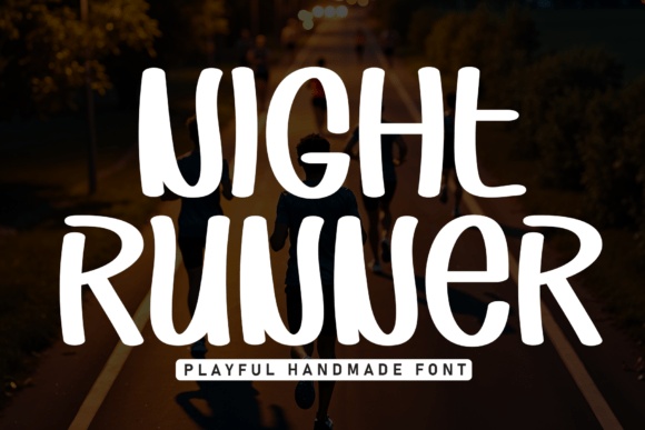
Night Runner has rounded, informal forms that can make a club event feel approachable. It suits a social running challenge more naturally than a severe competitive treatment.
Use a high-contrast background and a clear time line. The font name alone does not establish the theme, so make the event information explicit.
View Font on Creative Fabrica →Preview • Download options • License details
16. Rebel Legion: An intense display accent for a themed challenge
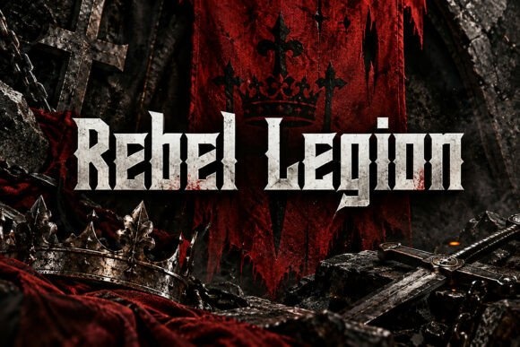
Rebel Legion has angular, dramatic forms with a fantasy-like character. It is a specialized option for a themed event or a challenge with a deliberately fierce identity.
Use it sparingly and keep the instructions plain. A powerful-looking title should not make the start date or participation details harder to find.
View Font on Creative Fabrica →Preview • Download options • License details
17. Raptor: Heavy angular forms for a forceful title
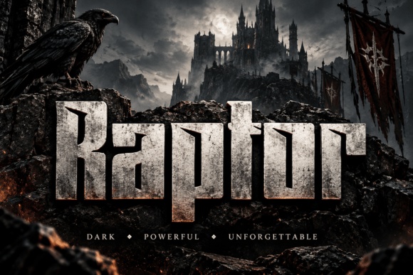
Raptor has broad, substantial letters with sharp details. It can give a short challenge name a strong presence on a poster with minimal imagery.
Leave generous margins and avoid extra metallic effects until the plain lettering works. Use a quieter companion for all supporting information.
View Font on Creative Fabrica →Preview • Download options • License details
18. Campus Boston: Collegiate lettering for a club challenge
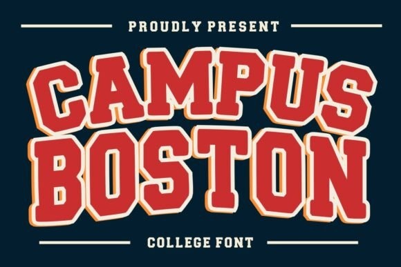
Campus Boston uses a familiar varsity-style structure. It could suit a school club, alumni event or community challenge that wants a team-oriented visual identity.
Keep outline treatments consistent and separate the date from the main badge. Confirm that the title remains clear in a single-color version.
View Font on Creative Fabrica →Preview • Download options • License details
19. Golden Athlete: Athletic slabs for a recognizable sports mood
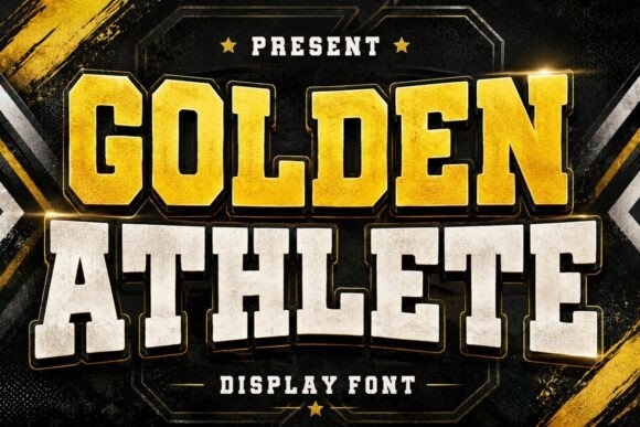
Golden Athlete brings substantial collegiate-style lettering to the collection. It is a useful direction for a challenge centered on team participation or personal achievement.
Use it for the event name and a simple sans serif for the schedule. Avoid making decorative outlines too thin for smaller promotional versions.
View Font on Creative Fabrica →Preview • Download options • License details
20. Glory Jersey: Worn varsity character for a team event
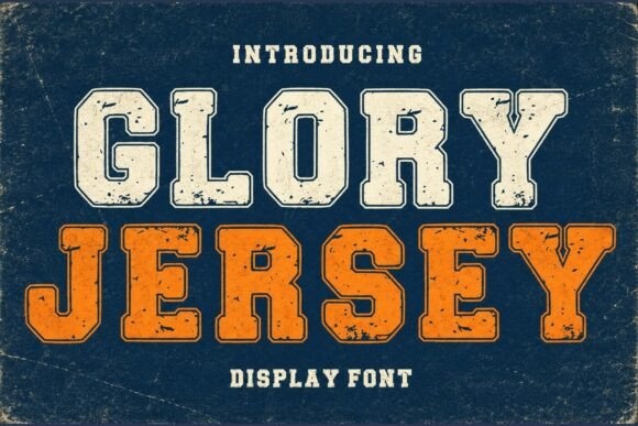
Glory Jersey has slab forms with visible distressed styling in its preview. It can lend a challenge poster a familiar, established team mood.
Keep the background relatively clean so the texture remains controlled. Check small text separately rather than using the distressed style for every detail.
View Font on Creative Fabrica →Preview • Download options • License details
21. Stryker: Sharp geometry for a dramatic headline
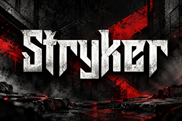
Stryker has angular, tightly constructed display forms. It could suit a short, forceful challenge name or a campaign with a more intense visual tone.
Use clear spacing around the title and a plain information block beneath it. Test recognition before adding shadows or textured backgrounds.
View Font on Creative Fabrica →Preview • Download options • License details
22. Asphalt Fury: Brush speed for an endurance theme
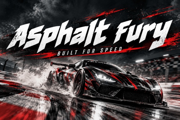
Asphalt Fury uses sharp, slanted forms with a strong sense of forward motion. It can support a running or cycling challenge that emphasizes pace and momentum.
Keep the title short and avoid crossing it with motion streaks. The date and registration details should remain upright and easy to read.
View Font on Creative Fabrica →Preview • Download options • License details
23. Super Football: Traditional sports weight for a team campaign
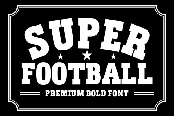
Super Football has bold slab-style forms that naturally suggest team sports. It can be adapted to a club challenge even when football is not the central activity.
Use a simple badge or stacked headline. Keep any supporting sport imagery relevant to the actual event rather than copying the preview's framing.
View Font on Creative Fabrica →Preview • Download options • License details
24. Athletic Union: A coordinated athletic direction
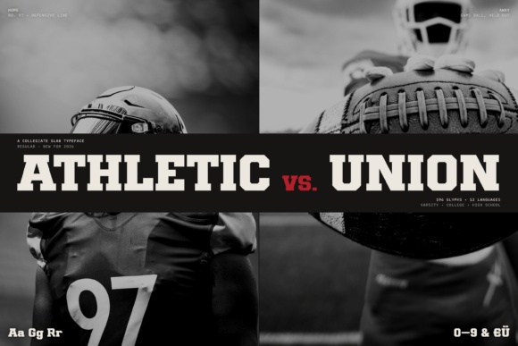
Athletic Union presents a substantial sports-style alphabet with supporting numeral examples. It could help create a consistent challenge identity across posters, score cards and social graphics.
Confirm the supplied styles and test the exact numbers you need. Keep the visual system simple enough to work in both large posters and small updates.
View Font on Creative Fabrica →Preview • Download options • License details
Which font would I try first?
For a team-oriented campaign, I would compare Campus Boston with Golden Athlete. Veltors offers a cleaner sense of motion for running or cycling, while Victory feels more welcoming for a social challenge. The final choice should match the event tone and keep the invitation immediately understandable.
Product images are supplied font previews. The cover is an illustrative lettering montage. Layout suggestions are editorial ideas; fonts have not been installed or production-tested for this guide. Check the linked listing for current files, supported characters and license details.
More font ideas
Frequently asked questions
Should every fitness poster use an aggressive font?
No. A social or beginner-friendly event may benefit from softer, more welcoming lettering. Match the tone to the audience and the actual activity.
How many display fonts should the poster use?
One main display font is usually sufficient. Use a simpler companion for dates, location, rules and sign-up information so the hierarchy stays clear.
What details should be checked at small size?
Inspect the event name, date, time and sign-up instruction in the smallest version you will publish. Decorative numerals and condensed text can become difficult to distinguish after reduction.