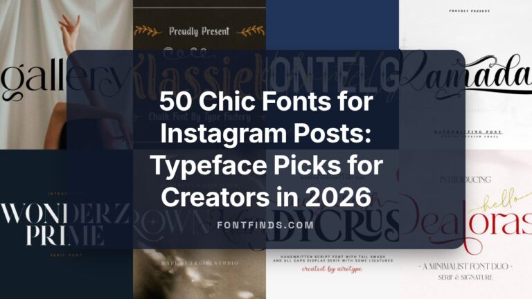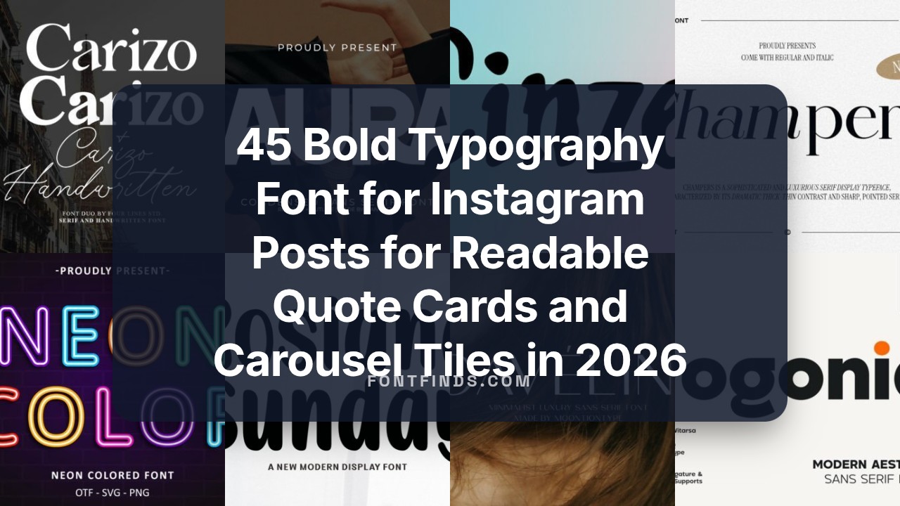
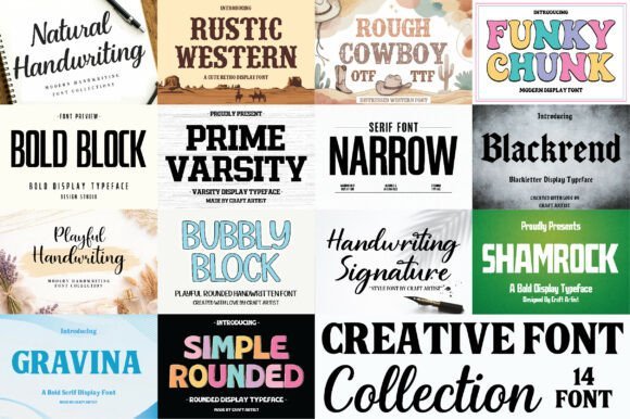
45 Bold Typography Font for Instagram Posts for Readable Quote Cards and Carousel Tiles in 2026
Typography font for Instagram posts can decide if a viewer stops to read or just keeps scrolling. Small tweaks to weight, spacing, and contrast change how legible a line feels on a phone screen.
Below I round up 45 fonts with clear use-case notes: which ones suit quote cards, buttons, product shots, and carousel micro-blogs. For each entry you’ll get size recommendations, pairing ideas, and quick polish tips so type matches your image and message.
1. Modern Aesthetic Font
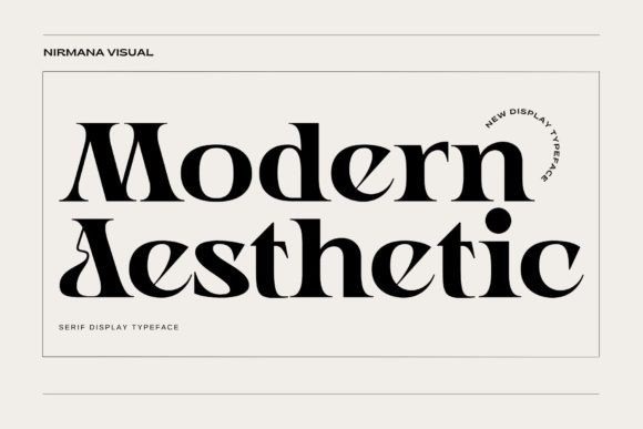
Modern Aesthetic channels Renaissance letter proportions into a display face that balances ornament with restraint. Fine stroke contrast and gently flared terminals give it a warm, vintage-tinged character that sits well in headlines and identity marks. Its measured shapes make it a reliable Typography font for Instagram posts where decorative details must remain legible on small mobile screens.
PUA-encoded alternates, swashes and discretionary ligatures are included so designers can add flourish without extra software steps. Thoughtful kerning and open counters mean it holds up on product labels, social adverts, and poster artwork. Pair it with a neutral sans or a light script to create layered typographic compositions that read clearly in feeds and printed collateral.
╰┈➤ Download Modern Aesthetic Font
My Recommendation: I reach for Modern Aesthetic when a project needs historic character without looking ornate; it brings a handcrafted sensibility while staying practical for production. The PUA glyph set saves time when assembling monograms or decorative headlines, especially for tight deadlines. Best suited for boutique brands, editorial-style Instagram grids, and product packaging where a subtle vintage mood helps tell the story.
2. Wedding Couple Monogram
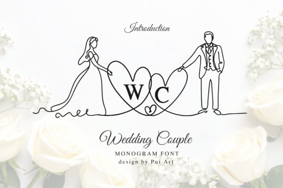
Wedding Couple Monogram is a one-line art alphabet that turns initials into a pictorial emblem-each letter integrates with a simplified bride-and-groom illustration. Instead of heavy ornament, the face uses continuous linework to create readable initials that double as an emblematic mark. That economy makes it scalable for tiny favors, stamps, and engraved tokens.
OpenType alternates let you swap which initial anchors the composition, while even stroke widths keep the motif crisp across print and vector applications. Use it as the primary logo on invitations or as a repeating motif on signage and packaging. Because it reads as both illustration and letterform, it adapts well to laser cutting, foil stamping, and web headers without extra tracing work.
╰┈➤ Download Wedding Couple Monogram
My Recommendation: I recommend Wedding Couple Monogram when a couple wants a distinctive emblem that feels bespoke but production-friendly. Its single-line construction reduces prep for engraving and vinyl-cut projects while still feeling intimate. Ideal for invitations, stationery suites, keepsakes, signage, and small wedding merchandise where a subtle, symbolic mark is the focal point.
3. Pogonia Font
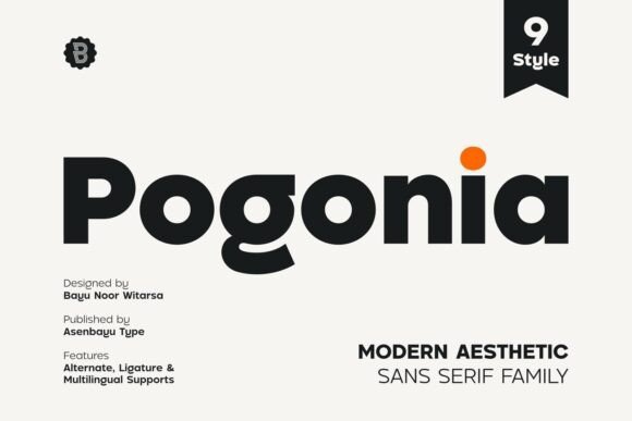
Pogonia Font blends geometric proportions with humanist warmth: clean strokes, open counters, and modest terminals ease reading across sizes. The design keeps letter rhythms steady, which helps maintain hierarchy in multi-weight systems and editorial layouts. It reads confidently on shop signage, posters, and social tiles without calling undue attention to itself.
Use bolder weights for logos and title blocks, with lighter cuts for longer captions and body text on screens. Careful hinting and spacing support crisp rendering on lower-resolution displays, a clear advantage for social media visuals and promotional banners. Combine it with a condensed display for contrast or a classic serif to add editorial polish to longer pieces.
My Recommendation: I turn to Pogonia when a project needs clean, modern clarity with a human touch-branding, editorial headers, and online shops benefit most. Its weight range lets me build hierarchy without introducing extra families, which speeds layout work. Great for fashion labels, startups, and campaigns that want neutral character with personality.
4. Helvetica
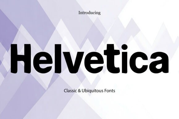
Helvetica remains a go-to when neutrality and high legibility are the priority; its even stroke widths and open counters make small captions and multi-slide carousels easy to read. Designers often pick it as a Typography font for Instagram posts because headlines register with authority while mid-weight text reads smoothly on phones, preserving brand clarity without ornament. The bold sample shown carries presence without fuss, so messages land plainly and reliably.
Under the hood, Helvetica’s moderate x-height and predictable spacing yield consistent kerning and tidy line breaks across weights, which helps maintain typographic hierarchy in layouts. Pair it with a warmer serif or a thin script for contrast, and favor high-contrast color combinations so thumbnails retain legibility. Use heavier weights for CTAs and logos, lighter ones for longer captions, and keep tracking subtle to preserve its classic voice.
My Recommendation: I turn to Helvetica when a project needs plain, proven legibility across print and pixel. For Instagram I value how it reads at small sizes and how it keeps a brand voice trustworthy without calling attention to itself. I typically pair it with one accent display face to add character while keeping feeds coherent.
5. Egiloy
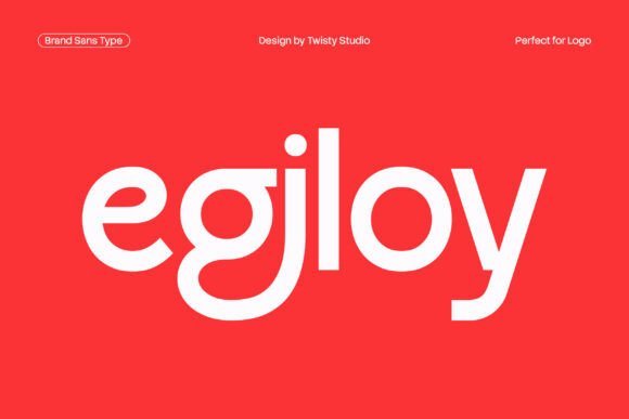
Egiloy is a minimalist brand sans that favors simple forms and measured proportions, so typography feels calm and precise instead of showy. Its restrained details make it a reliable choice when you need copy to sit comfortably over photography or texture in social layouts. The overall tone reads modern and composed, perfect for identity work, packaging, and editorial headers.
Metric-wise, Egiloy scales cleanly from tiny captions to broad banners because spacing remains consistent across weights, which reduces fiddly adjustments on mobile screens. Use it as the typographic backbone when imagery should dominate, and experiment with light tracking or subtle weight swaps to shape emphasis. It pairs well with condensed display faces or muted scripts when you want a spark of personality without overwhelming clarity.
My Recommendation: I use Egiloy for brands that want quiet confidence: it supports visuals instead of competing with them. It’s great for product pages, minimalist identities, and editorial grids where tidy, readable type matters. Small tracking tweaks help it breathe on compact mobile presentations.
6. Neon Colored
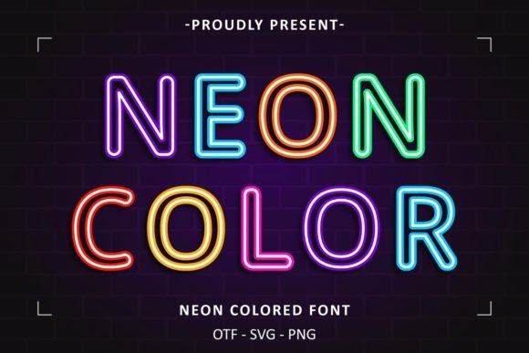
Neon Colored mimics glowing neon tubing with saturated fills and layered outlines, producing instant urban energy and retro-nightlife flair. Treat it as a display element-headline words, story covers, or stickers-since heavy color detail can degrade at small sizes or in thumbnails. Dark backgrounds and strong contrast help preserve the glow and keep the effect punchy across devices.
Technically it behaves like a color OpenType style, so check how your target app renders layered color fonts before committing. On social feeds, pair it with a neutral sans for body copy so readability and accessibility stay intact. Reduce saturation or thicken the outline when exporting to compressed images to ensure the neon ring survives platform compression and varying screen modes.
My Recommendation: I reach for Neon Colored for event promos, nightlife visuals, or any campaign that needs immediate visual pop. It signals playfulness and urban attitude, but I avoid it for long captions where clarity matters. Pair it with a simple sans to keep the overall layout readable while letting the neon headlines do the heavy lifting.
7. Chunky Plump
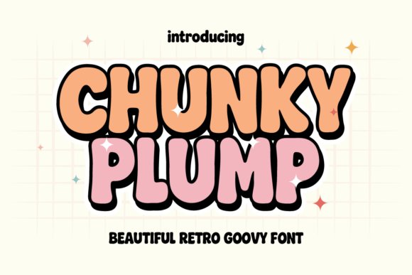
Chunky Plump is a bold, bubbly display with thick rounded shapes and soft playful curves that read like a retro groovy sticker. The heavy forms keep letter shapes legible even at small sizes, and the handmade irregularities give text a tactile, approachable voice. Use it for kids’ products, craft labels, poster headlines, or any design that benefits from a warm, cheeky character.
For social graphics this face holds up well against textured photos and busy backgrounds, so it makes strong headers and bright callouts; try pairing it with a neutral sans for body copy. I often use Chunky Plump as a Typography font for Instagram posts because its weight and rounded counters remain distinct in thumbnails and stories. Work with saturated hues or soft pastels to push either playful or nostalgic tones.
My Recommendation: I pick Chunky Plump when a project needs instant personality and bold, friendly lettering; it livens layouts without fuss. It’s perfect for children’s packaging, festival posters, and brands that want a handcrafted, retro vibe. On social media I rely on it for headers and stickers because it reads clearly and feels delightfully upbeat.
8. Laura Font
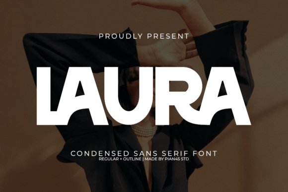
Laura Font is an ultra-condensed sans serif defined by tall, narrow proportions and refined terminals that read as fashion-forward yet composed. The family includes a solid style and an outline variant, which opens simple but effective typographic contrasts for mastheads and logo wordmarks. Delicate ligatures and a compact vertical rhythm give layouts a couture sensibility without heavy visual weight.
This typeface works where horizontal space is limited: bottle neck labels, stacked headlines, and slim editorial columns. Pair Laura with a warm serif or a soft script to temper its linearity, loosen tracking for long lines, and avoid busy backgrounds to preserve clarity. Metallic inks or monochrome palettes make the face feel elevated for premium packaging and identities.
My Recommendation: I choose Laura Font when a design needs chic compression and runway-ready proportions; it creates a polished, tall silhouette. It’s ideal for fashion editorials, upscale product labels, and identity systems that favor refined verticality. Use the outline sparingly for airy mastheads or delicate logo treatments.
9. Caveline Font
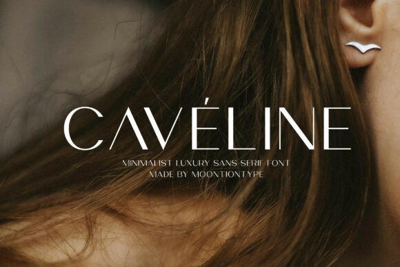
Caveline Font is a minimalist luxury sans with measured proportions and low-contrast strokes that deliver a quiet, refined presence. Its neutral terminals and considered spacing make it legible across sizes, so the same mark works on web, print, and social without fuss. The set includes uppercase, lowercase, figures, and punctuation for reliable typesetting across projects.
In practice Caveline suits brands that aim for understated premium expression-skincare labels, editorial spreads, and wedding invitations where restraint signals quality. Slight tracking increases open up headlines while retaining the typeface’s calm posture; combine it with muted palettes, subtle textures, or foil accents to suggest luxury. OTF and TTF files ensure smooth production across platforms and workflows.
My Recommendation: I recommend Caveline Font when a brief calls for elegant minimalism that doesn’t compete with product imagery or photography. It’s my go-to for beauty brands, refined editorial work, and packaging that needs clarity with class. Use it with plenty of white space and careful color choices to reinforce its understated character.
10. Andores Font
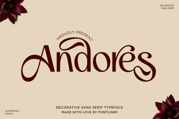
Andores is a decorative sans serif that balances delicate swashes with open, graceful letterforms to create a soft premium voice. Its flowing terminals and refined proportions read as romantic and modern at once, and the face ships with PUA-encoded alternates so designers can access flourishes without specialized tools; it works especially well as a Typography font for Instagram posts where small emotional cues matter. The ornate touches are measured rather than excessive, which lets the type feel deliberate across packaging, logos, and editorial headers.
In practice Andores performs as a headline hero: its mid weights give presence while light weights keep body copy airy at typical social sizes. Small tracking adjustments help the ornamentation breathe, and pairing it with a plain grotesque will protect legibility while letting the decorative features take the stage. Use it for boutique identity, wedding suites, skincare labels, and feed graphics when you want a gentle, high-end impression.
My Recommendation: I use Andores when a project needs femininity without becoming fussy. The alternates let me craft unique wordmarks quickly, and its soft curves read beautifully on mobile posts and packaging alike. It’s ideal for brands that want an intimate luxury look-weddings, beauty lines, and boutique labels all benefit from its personality.
11. Barium Font
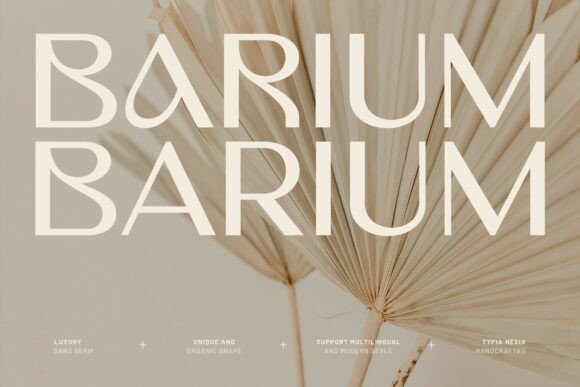
Barium presents a restrained luxury through precise strokes and even counters, giving headlines an editorial polish that feels both contemporary and refined. The shapes favor clarity, with gentle curvatures that suggest a feminine sensibility without ornamentation, so the type holds up across print and on-screen applications. Subtle letterform quirks add warmth, making it suitable for identity marks that must read premium yet readable.
Heavier weights become compact monogram tools while mid weights perform well on packaging where information and style must coexist. The set’s kerning and proportions reduce the need for manual tweaks when composing logos or invitations. For visual systems, Barium pairs neatly with a low-contrast serif or a minimalist geometric to build a calm, upscale presence.
My Recommendation: I pick Barium when a project requires quiet authority rather than flash. It gives labels and invitations a polished look and saves time thanks to clean spacing and predictable metrics. It’s a reliable choice for beauty brands, fashion projects, and any identity work that benefits from a poised, elegant sans serif.
12. Qorvyn Font
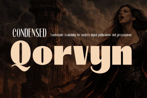
Qorvyn Condensed spans nine weights plus matching italics, offering a broad palette from very light copy to heavy display without losing a consistent voice. Its condensed proportions reduce horizontal footprint while open counters and disciplined spacing preserve legibility, which makes it useful for compact layouts and bold headlines alike. The italic styles introduce momentum, useful for emphasis and energetic editorial accents.
Because the family covers thin through black weights, it supports a unified typographic system where a single family can handle body text, captions, and show-stopping headers. The geometric-informed details create a crisp, professional texture that reads well on posters, interfaces, and sports apparel. If you need space-saving typesetting that still carries strong character and readable forms, Qorvyn is a solid workhorse.
My Recommendation: I turn to Qorvyn when space is tight but tonal range matters. Its condensed axis lets me fit more copy into narrow modules without crowding, and the weight range means I rarely need a second family. It’s especially handy for editorial layouts, UI headers, and athletic branding where clarity and impact must coexist.
13. Cormorant Garamond
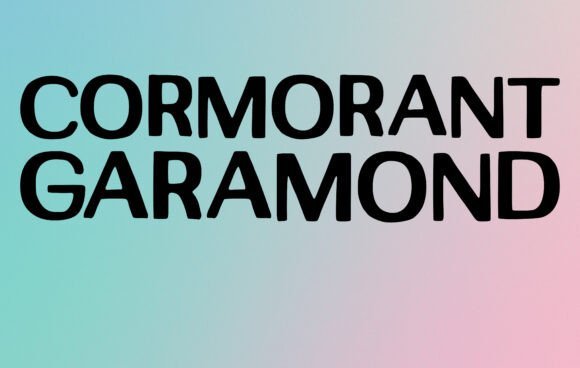
Cormorant Garamond wears high-contrast serifs with theatrical poise, which gives headings a crafted, editorial feel rather than a generic one. Its narrow counters and refined terminals make it striking at display sizes and surprisingly readable on small screens, so it works well as a Typography font for Instagram posts when you need character without sacrificing clarity. The italic styles offer expressive swashes for quotes and pull lines, and modest increases in tracking help it sit cleanly over images.
Kerning and built-in ligatures mean small spacing adjustments yield big improvements, so you can control rhythm without heavy manual tweaking. Pair it with a neutral geometric sans to avoid visual clutter and preserve hierarchy across multi-card carousels. It lends a refined voice to wedding suites, boutique branding, and magazine-style social content.
╰┈➤ Download Cormorant Garamond
My Recommendation: I pick Cormorant Garamond when a project needs a classical, editorial tone – think high-end invitations or curated Instagram grids. It gives headlines a sense of craft while remaining usable for short body text at larger sizes. I usually pair it with a simple sans to keep layouts modern and legible on phones.
14. Farmhouse Font
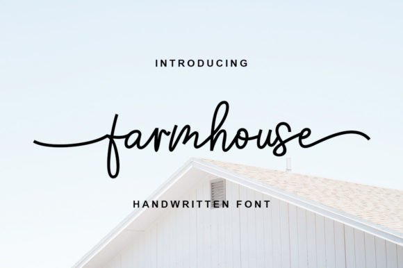
Farmhouse Font reads like a warm handwritten note: its uneven strokes and decorative swashes create a romantic, homespun personality that photographs well on textured backgrounds. The fact that it is PUA encoded means alternate glyphs and swashes are immediately accessible in most design apps, so you can swap endings and ligatures without complex OpenType workflows. At display sizes it feels lively and authentic, especially on labels and banners.
Because the forms retain legibility for short headlines, Farmhouse is ideal for product packaging, wedding stationery, and lifestyle social posts that need a human touch. Pair it with a restrained sans to maintain contrast and readability, or let it stand alone on wood-texture or kraft-paper layouts for a handcrafted look. Installation is straightforward and the family yields fast visual personality for small brands.
My Recommendation: I use Farmhouse when a brand wants warmth that reads as handmade – perfect for bakeries, florists, and artisanal goods. Its swashes let me shift tone from casual to elegant without heavy edits. For social graphics I combine it with a clean sans so captions remain clear on mobile.
15. Poppins Font
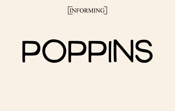
Poppins Font is a geometric sans with round, uniform letterforms that read crisply on screens and in print, making it a reliable choice for both UI and bold headlines. Its extensive weight range and large x-height keep small captions legible in thumbnails while allowing heavy styles to command attention in cover graphics. Multilingual support and careful hinting mean characters render consistently across devices.
The neutral, contemporary voice of Poppins suits tech brands, editorial projects, and Instagram content that favors clarity over ornament. Introduce a script or a warm serif for contrast to add personality without destroying hierarchy. Because it scales reliably across carousel images and profile banners, it makes iterative social campaigns easier to execute.
My Recommendation: Poppins is my go-to when a project requires clean, modern lettering that performs across devices. I rely on its heavier weights for headlines and lighter weights for navigation or small UI labels to keep a cohesive system. Its dependable rendering and broad character support make it practical for multi-platform campaigns.
16. Libre Baskerville
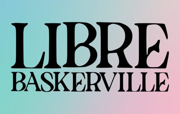
Libre Baskerville brings a refined transitional serif voice to modern feeds: tall x-height, open counters, and firm serifs that keep letters distinct at phone sizes. That clarity makes it an excellent Typography font for Instagram posts where quote cards, carousel essays, and long captions must remain readable within tight column widths. Its italic and bolder weights provide clear headline contrast against photography while regular weights hold up for paragraph text without crowding the layout.
Use it when you want an editorial or literary mood-bookstagram, boutique brands, or wedding announcements-without feeling overly formal. Pair Libre Baskerville with a neutral geometric sans for captions or a soft script for invitations; modest letter-spacing (tracking) and 1.2–1.4 line-height tend to work best on mobile. It also supports many languages and renders reliably across web and app environments, so text won’t break when posts are reshared.
╰┈➤ Download Libre Baskerville
My Recommendation: I reach for Libre Baskerville when I want a serif that reads beautifully on tiny screens but still carries an elegant, human tone. It’s perfect for accounts that publish longer captions, editorial carousels, or any feed that leans into storytelling. Use it on quote images, product announcements, and wedding or literary-themed posts where clarity and a classic feel matter.
17. Montserrat Alternates
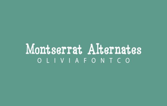
Montserrat Alternates takes the geometric slab idea and injects personality through alternate glyphs: unexpected terminals, slight swashes, and playful ligatures that catch the eye in a crowded feed. As a display face it offers punchy contrast for post thumbnails and headline overlays, making it a strong choice among Instagram typefaces and social media fonts for brands seeking character. The slab structure keeps letterforms stable at bold sizes while alternates introduce a handcrafted warmth.
Apply it to logo marks, carousel covers, or t-shirt mockups where typographic quirks matter more than rigid uniformity. Combine with a neutral sans for body copy or a delicate script for romantic projects; at very large sizes you may want to adjust kerning to balance the alternates. It’s especially effective for fashion and lifestyle accounts that need a distinctive headline voice without sacrificing legibility.
╰┈➤ Download Montserrat Alternates
My Recommendation: I use Montserrat Alternates when a headline must feel modern but personable-its alternates give each word a slight, memorable twist. It works brilliantly for fashion and wedding-themed posts, merchandise mockups, and bold social campaigns. When I want attention-grabbing headlines that still pair well with clean body copy, this is my go-to.
18. Gotham Rounded
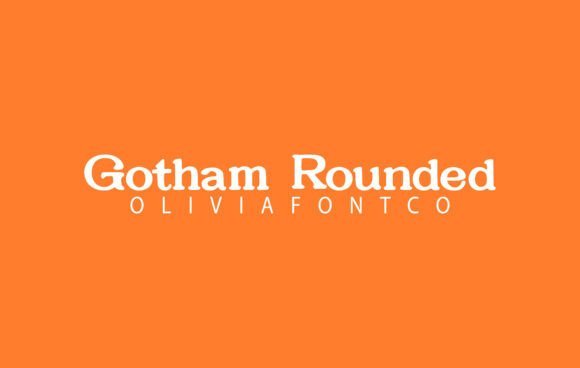
Gotham Rounded softens a geometric sans with rounded terminals and generous spacing, producing a friendly, approachable tone that reads well on mobile screens. Those softened endings reduce visual fatigue in dense feeds and carry a contemporary, human feel that suits UI overlays and short headlines. The even stroke contrast keeps shapes legible across Instagram story stickers, profile banners, and static posts.
Use heavier weights for strong overlays and lighter weights for supporting captions; the family’s multiple weights let you build clear hierarchy inside a single post. Pair Gotham Rounded with a condensed serif or a narrow display face for contrast, and increase tracking slightly for very small text to aid readability. Its friendliness makes it ideal for brands wanting a modern but warm identity.
My Recommendation: I reach for Gotham Rounded when I need a brand voice that’s modern and welcoming-perfect for family-focused products, children’s content, and approachable tech brands. The rounded terminals make it feel less formal without losing polish, so it’s great for onboarding screens, story templates, and product labels. It translates well from tiny UI elements to bold cover headlines.
19. Baloo Font
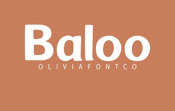
Baloo is a handwritten display with rounded strokes and a gentle slant that gives captions a warm, personable character ideal for headlines and short blocks of text. It reads well on small screens, making it a natural Typography font for Instagram posts that need a warm, handwritten tone. The open counters and moderate contrast help letters stay distinct across tight layouts and mobile thumbnails.
This voice suits wedding stationery, lifestyle brands, and shop headers where a human touch matters; pair Baloo with a neutral sans for longer copy. Kerning is forgiving, so stacking words or using tighter tracking for bold titles works without fuss. Small alternates and clean terminals keep the font simple to apply across both digital templates and printed pieces.
My Recommendation: I reach for Baloo when I want captions that sound handcrafted but remain legible on phones. It softens brand voice in lifestyle feeds and creates friendly headers for invites and product tags. Use it for Instagram story quotes, shop banners, and any project that benefits from a handwritten personality without losing clarity.
20. Children Sticker Font
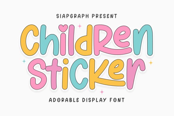
Children Sticker brings chunky, rounded letterforms that read clearly at small sizes while carrying a cheerful, kid-centric energy. Bold strokes and simplified counters make the glyphs friendly to vinyl cutting and digital die-cut workflows, so letters weed cleanly from sticker sheets. Consistent baselines and open apertures are practical for classroom labels, nursery signage, and party printables.
The caps snap into badge art, t-shirt designs, and party invites without complicated adjustments, and outlines or fills translate well when building layered sticker assets. It also makes social thumbnails and teacher gifts pop with minimal fuss. Designers using Cricut or Silhouette will appreciate the predictable shapes when preparing SVGs and print-ready PDFs.
╰┈➤ Download Children Sticker Font
My Recommendation: I pick Children Sticker whenever I design for kids, school events, or craft shop listings because it speeds production and cuts cleanly in vinyl. Its bold shapes read well on thumbnails and physical stickers alike. If you’re creating classroom decor, birthday graphics, or playful merchandise, this font reduces fuss and keeps files straightforward for cutting machines.
21. Cinzel Font
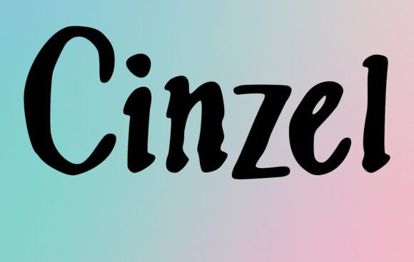
Cinzel references carved Roman letters with sharp serifs and measured proportions that lend headlines a sculpted, formal look. High stroke contrast and pronounced capitals reward large-scale use, making words feel anchored and intentional for posters, mastheads, and logos. A set of small caps and alternates provides subtle options for initials and refined wordmarks.
This typeface suits premium packaging, certificates, and cinematic posters that call for a classical tone without excessive ornament. Pairing Cinzel with a restrained sans for body copy balances display impact and readability, while modest tracking adjustments preserve clarity on narrow screens. For identity work, its crisp terminals and upright stance help craft memorable, authoritative marks.
My Recommendation: I choose Cinzel when a project needs classical presence-think premium labels, formal invites, and film posters. It gives headlines a dignified, crafted feel while remaining clean enough for modern layouts. When building a logo or masthead, Cinzel’s serifs and alternates help produce a refined, unmistakable headline voice.
22. Bebas Neue Font
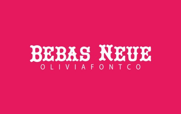
Bebas Neue arrives as a tall, condensed display with crisp, geometric letterforms and open counters that read cleanly on phones. As a Typography font for Instagram posts, its all-caps rhythm makes headlines, promo cards, and quote overlays register immediately without crowding the image. The neutral voice pairs well with soft scripts or a simple sans for supporting copy.
It sings at larger sizes: tighten tracking for single-line titles and increase spacing for longer lines to preserve legibility in story stickers and carousel covers. With a few weights and straightforward kerning, you can stack bold titles over photography while leaving room for logo marks and call-to-action buttons.
My Recommendation: I reach for Bebas Neue when a post needs immediate headline impact without fuss. Its condensed silhouette gives strong presence while freeing up composition space, so short phrases punch through images. I use it for sale banners, event promos, and minimalist brand posts where clarity on small screens matters.
23. Pacifico Font – Typography font for Instagram posts
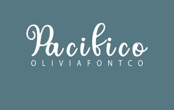
Pacifico is a bouncy brush script that channels 1950s surf signage with round terminals and playful baseline shifts, giving a friendly, handcrafted voice. It shines as a short headline or sticker on lifestyle feeds, pairing naturally with candid photography and colorful palettes. Be cautious at tiny sizes: the connected strokes lose detail if reduced too far.
Limit Pacifico to one or two words per image to avoid visual clutter, and pair it with a neutral sans for readable captions. Use contrast, subtle shadows, or an outline when placing it over textured backgrounds so the lively shapes remain distinct and legible.
╰┈➤ Download Pacifico Font – Typography font for Instagram posts
My Recommendation: I pick Pacifico when a brand brief calls for warmth and personality – think cafés, handmade goods, or playful product labels. It makes short headlines feel immediate and human, but I avoid it for dense copy. For stories and highlight covers it becomes a memorable signature when balanced with clean supporting type.
24. Avelira Font
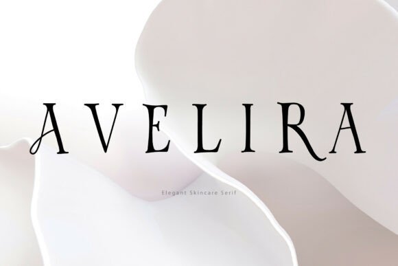
Avelira is a high-contrast serif built for luxury beauty and refined editorial work, with delicate hairlines and sculpted serifs that read as polished and deliberate. Its graceful proportions and selective ligatures create a sophisticated rhythm ideal for mastheads, perfume labels, and premium packaging. Small caps and alternate characters add personality while keeping the overall tone restrained.
On social feeds, Avelira works best as headline typography set against soft product photography or generous negative space so its thin strokes can breathe. Pair it with a neutral sans for body text, nudge tracking upward for light colorways, and use generous leading to protect the fine details against busy backgrounds.
My Recommendation: I choose Avelira for upscale campaigns where visual refinement is the goal – luxury beauty, boutique fashion, and high-end editorial spreads. It elevates logos, hero images, and packaging with a controlled, feminine presence. For Instagram I use it sparingly as headline type, always paired with a quiet sans to handle supporting copy and captions.
25. Rosiana Sunday
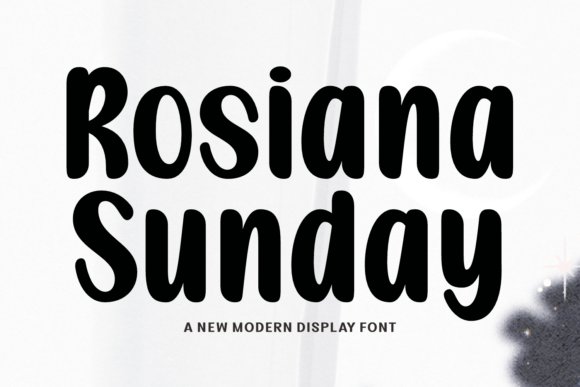
Rosiana Sunday arrives as a broad-minded script and handwritten font suite that moves from delicate calligraphy to chunky sporty scripts and a mischievous ghost display. The family includes cursive signatures with plentiful swashes, cheerful hand-lettered styles for seasonal cards, and a retro sweet set that reads warm and familiar on print or screen. Each style has its own rhythm, so you can mix a refined invitation header with a playful body font and keep a coherent visual voice.
Technical delivery covers OTF and web-ready formats with alternates, discretionary ligatures, and stylistic sets that speed up layout work in design apps. The designs are spaced and weighted to retain legibility at small sizes while still showing personality on banners and thumbnails, which makes the pack helpful when building Typography font for Instagram posts or other social visuals. Use the sports and signature cuts for merchandise and premium labels, and reach for the handwritten and cute faces when you want a more intimate, seasonal mood.
My Recommendation: I’d pick Rosiana Sunday when a single project needs many moods: romantic invites, holiday promos, and sporty merch can all come from the same family, which keeps branding consistent. The alternates and stylistic sets save time in layout because I can tweak letter forms without swapping typefaces. This set fits event planners, lifestyle shops, and social media managers who run theme-driven campaigns and want a ready-made palette of expressive type.
26. Hello September Duo
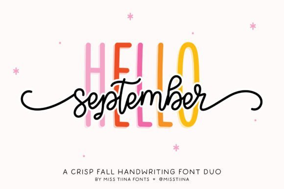
Hello September Duo pairs a tall, farmhouse-style sans with a playful script that is heavy on curls and swashes. The sans feels airy and upright, making it a great structure for headlines, while the script supplies organic movement and decorative ligatures for logos or accent lines. Together they create a friendly, handcrafted look that works well on tags, labels, and mood-driven graphics.
Both fonts come with multiple alternates and kerning tuned for tight set-ups, so simple headlines and layered photo overlays stay readable without fiddly adjustments. Use the sans for clean promo banners and the script for signature-style signatures or quotes; the pair tends to shine in lifestyle branding, craft packaging, and social artwork where warmth and a homespun aesthetic are the goal.
╰┈➤ Download Hello September Duo
My Recommendation: I’d use Hello September Duo when a project needs charm without looking fussy; its straight sans keeps layouts tidy while the script adds personality. It’s particularly handy for boutique packaging, blog headers, and Instagram story covers where a handmade feel sells. The built-in alternates and careful spacing mean fewer tweaks during production, which speeds up client rounds.
27. Creative Collection
The Creative Collection bundles Western, vintage, script, and serif styles into one library meant for broad brand applications. Each family offers distinctive letterforms-ornate western caps, weathered vintage marks, flowing scripts with multiple swashes, and reliable serifs for body copy-so you can build contrast between headline and text without hunting for matches. This breadth makes it easy to prototype logos, product labels, and editorial spreads while staying visually consistent.
Files ship in standard OTF/TTF formats with webfont options and simple licensing for commercial use, which speeds deployment across packaging and online shops. Designers who produce merchandise, signage, or retro-styled campaigns will appreciate how quickly the set covers different moods, from rugged display type to polished serif supporting text and scripted accents for flair.
╰┈➤ Download Creative Collection
My Recommendation: I recommend the Creative Collection when a client needs a go-to library to cover multiple visual directions without buying separate packs. It saves time assembling mood boards and mockups because you can pull Western, vintage, and script styles from the same source. Ideal for small brands, makers on Etsy, and packaging designers who juggle product lines with varied personalities.
28. Notebook Font
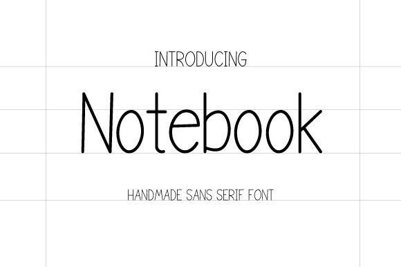
Notebook balances the warmth of hand lettering with the clarity of a sans serif: strokes feel slightly irregular without sacrificing on-screen legibility. It holds up well at caption size and in story overlays, which makes it a practical choice when selecting a Typography font for Instagram posts where mobile readability and personality both matter. The handmade character gives captions an approachable, authored voice rather than a cold mechanical feel.
Files include common desktop and app-ready formats, so you can install it on iPad apps like Procreate or drop it into Canva and Photoshop with minimal fuss. Try pairing Notebook with a condensed weight for headlines or a mono slab for contrast; it also suits school-themed promotions, product tags, and tidy branded documents that need a human touch.
My Recommendation: I reach for Notebook when a brand needs to feel human but still readable on small screens. Its handmade rhythm keeps captions from feeling generic, yet the sans serif base preserves clarity for fast glances. Use it for back-to-school promos, neat product labels, or any social feed that benefits from a tidy handwritten look.
29. Paper Rabbit Font
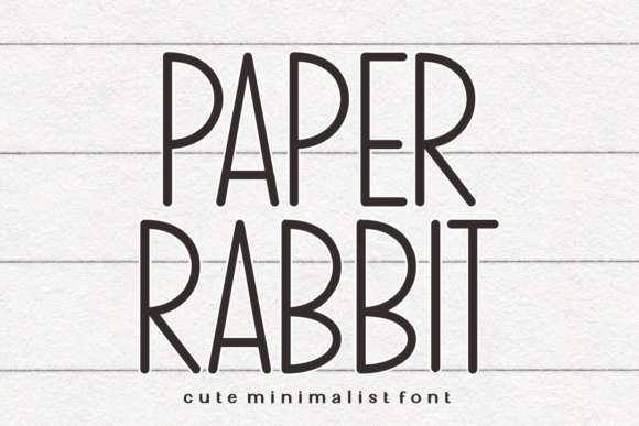
Paper Rabbit sits on the slender side of sans serif designs, offering a restrained, elegant voice that complements minimalist layouts and paper goods. Its narrow strokes and open counters make it ideal for planners, journal headers, and interiors where a light touch is needed; at larger sizes it reads like a refined signature, while keeping a clean rhythm across repeating lines. The type’s restraint lets imagery and decorative elements breathe.
Because the face is thin, consider using it for printed items like stickers, tote designs, or quote prints where size and contrast are controlled; for small-scale crafts such as tumblers or Cricut cuts, add an outline or pair with a heavier display face to ensure durability. It harmonizes with hand-drawn icons and muted palettes, making it a favorite for calm, craft-led projects.
╰┈➤ Download Paper Rabbit Font
My Recommendation: I use Paper Rabbit when I want a soft, modern look without visual fuss. Its slim profile makes layouts feel airy and curated, perfect for planners, handmade product labels, and interior-themed social tiles. Pair it with a bold companion for hierarchy, or let it stand alone on delicate prints.
30. San Diego Duo Font
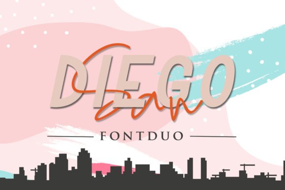
San Diego Duo combines a clean sans serif with a flowing signature script to give both structure and personality in the same family. Use the sans for clear headlines, subheads, or body snippets, and the script as a focal accent for logos, signatures, or promotional badges-the contrast reads as intentional and crafted rather than mismatched. Spacing between the two styles is handled so that they feel like relatives rather than separate type choices.
Its strengths show up in branding and social graphics where you want a professional base voice softened by a human mark: think boutique labels, event posters, and blog headers. Adjust tracking and weight to suit small-screen use, and pair with neutral palettes to let the script flourish without competing for attention.
╰┈➤ Download San Diego Duo Font
My Recommendation: I pick San Diego Duo when a project needs both authority and warmth-brand marks, influencer headers, and printed invitations all benefit from the pairing. The sans brings discipline; the script adds character, so the combination reads as handcrafted but still polished. It’s especially handy when you want a single family to handle multiple roles in a visual identity.
31. Animals Font
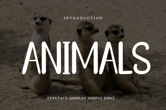
Animals Font blends soft, rounded terminals with a restrained geometric skeleton, producing an approachable sans-serif that still feels purposeful. Its high x-height and open counters boost legibility at small sizes, while alternate glyphs and subtle ligatures add visual character for short headlines and overlays. The bold styles maintain shape against textured photos and the kerning is unusually tight and consistent across punctuation.
On social feeds it behaves like a reliable workhorse: as a Typography font for Instagram posts it holds clarity over gradients and busy imagery, and pairs well with sticker-style graphics or thin scripts for contrast. Use lighter weights for captions and reserve bold for on-image calls to action; testing color contrast is straightforward because the forms remain readable at phone scale. The licensing covers small commercial runs, so it can serve a micro-brand from profile tile to highlight cover without surprises.
My Recommendation: I reach for Animals when a project needs a warm, modern sans that doesn’t look generic. Its open counters and steady weights make text legible on small screens, so I use it for social tiles, headlines, and brand captions. It pairs especially well with a hairline serif or a delicate script when I want visual contrast without clutter.
32. Caligraphy Font
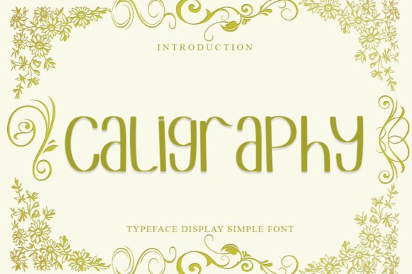
Caligraphy Font mixes calligraphic gestures with a sans-serif discipline, yielding letterforms that feel hand-crafted yet measured. Stroke variation is modest rather than extreme, so the slanted terminals suggest motion without disrupting blocky layouts, and the family includes swash alternates for decorative words. The italic has an expressive tilt that reads like a signature, while spacing remains predictable for multi-line headers.
This face excels as a display tool for lifestyle branding, event covers, and product labels where a handcrafted tone matters. On social graphics it performs best as a headline or focal word rather than dense body copy, since the ornamental swashes need breathing room to read. Pair it with a neutral geometric sans and ensure sufficient contrast so the thinner strokes don’t disappear over textured backgrounds.
My Recommendation: I use Caligraphy when I want a handcrafted aesthetic without sacrificing grid alignment. It’s perfect for invitations, boutique packaging, and editorial covers where expressive lettering can act as the focal point. Keep the type large and allow space around swashes for the best visual impact.
33. Fox Happy Duo Font
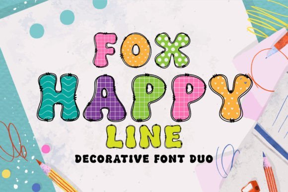
Fox Happy Duo Font ships as a matched pair: a filled decorative face and a congruent line version that layer neatly together. The solid style is bold and slightly condensed for punchy headlines, while the line counterpart keeps identical proportions so an overlay registers cleanly at display sizes. Both include playful alternates and ligatures that give logotypes and posters a handcrafted, friendly personality without extra vector work.
For social graphics the two styles are excellent for quick visual experiments-stack the filled and outline versions with an offset color or slight stroke to create depth that still scales for stories and feed tiles. Use the outline for lighter overlays and the filled face for badges or CTAs, but watch letterspacing at small sizes to preserve counters. This family speeds up work for children’s branding, party promotions, and any project that benefits from bold, cheerful display type.
╰┈➤ Download Fox Happy Duo Font
My Recommendation: I reach for Fox Happy Duo when a project calls for playful energy and instant character. The layered filled/line approach lets me create lively headlines without extra graphics work, which is handy for tight turnarounds. It’s especially useful for kids’ brands, event posters, and bold social tiles where readable display type matters most.
34. Ronalld Font
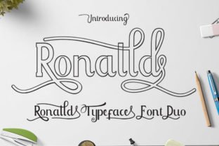
Ronalld Font pairs a handwritten script with a neat companion face to form a refined duo that balances flourish and clarity. The script’s swashes and alternate characters add personality for headlines and quote cards, while the companion type maintains legibility for captions and tags – ideal as a Typography font for Instagram posts and story covers. Use it where expressive lettering must sit next to readable body text.
Kerning arrives tuned for tight social layouts and the set includes discretionary ligatures, stylistic alternates, and multilingual support so lines stay tidy across languages. On-screen it sustains contrast at small sizes, and pairing suggestions favor muted backgrounds to let the script breathe without clutter. For brand work, swap the companion face for a neutral sans when you want a more minimal editorial look.
My Recommendation: I reach for Ronalld when a project needs handcrafted warmth combined with on-screen clarity. The script brings personality to headlines while the companion face keeps labels readable across feeds. It’s perfect for boutique shops, handmade product promos, and lifestyle pages that benefit from a slightly artisanal voice.
35. Carizo Font
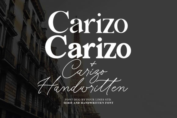
Carizo Font merges a measured serif with a flowing script to create contrast that reads well in square social tiles and printed invitations alike. The serif anchors logos and headlines while the script handles signatures and short pull-quotes with a human touch. With open counters and a generous x-height, Carizo stays legible in caption text and larger display settings.
Designers will value alternate stylistic sets and careful kerning that adapt to compact Instagram grid arrangements, enabling layered treatments-serif headlines overlain by cursive strokes-without losing clarity. Subtle texture and color choices accent the script curves while preserving the serif’s terminals, so the pairing fits both refined brand identities and relaxed lifestyle posts. The family ships in OTF/TTF formats for straightforward app installation.
My Recommendation: I would use Carizo when a project calls for a poised voice with a handcrafted accent. It suits wedding suites, boutique branding, and social campaigns where a signature flourish adds emotional weight. If you need a serif that can play well with handwriting accents across print and digital, Carizo is a solid pick.
36. Champers Font
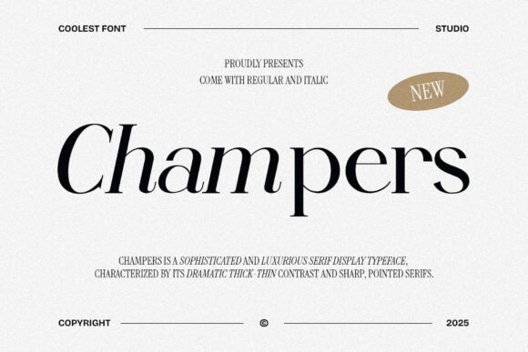
Champers Font brings a dressy serif palette with moderate contrast and clean terminals, aimed at premium identity work and editorial headlines. Its range of weights, italics, and condensed cuts lets you dial tone from formal to approachable while keeping letterforms distinct on mobile feeds and printed menus. The design balances ornamentation with solid readability so headings stand out without becoming decorative noise.
Technical touches include careful hinting for small-screen clarity, alternate glyphs for stylish initials, and extended Latin support for broader markets. Use Champers where typographic hierarchy matters: mastheads, restaurant menus, product labels and Instagram carousel covers all benefit from its composure. Pair it with a plain sans for captions to maintain legibility and avoid visual competition.
My Recommendation: I prefer Champers when a brief requires tasteful presence rather than loud display. It works exceptionally well for hospitality branding, fashion lookbooks, and editorial spreads because the condensed styles save space while italics add motion. Choose it when you want typography that reads confidently across print and social formats.
37. Lightning Script Font
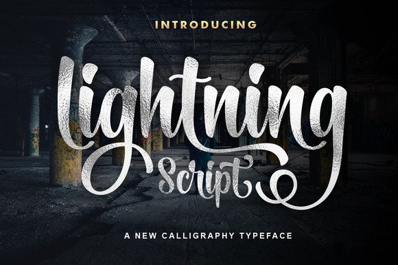
Lightning Script is a hand-drawn script with lively strokes and refined connections that read like a personal signature. Its open forms and tidy x-height keep curves readable on phone screens, making it a reliable choice when you need legible ornamentation for captions or story headers. It’s especially effective as a Typography font for Instagram posts where you want expressive lettering that still reads at small sizes.
Use it as a display headline, a handwritten logo mark, or for event invites; its thinner hairlines suit light backgrounds while bolder use calls for a subtle drop shadow to maintain contrast. Pay attention to letterspacing with long words and test alternates to avoid repeating shapes; the included swash set lets you vary endings and create natural flow. Works well paired with a neutral geometric sans for body copy and with simple color palettes to keep focus on the script.
╰┈➤ Download Lightning Script Font
My Recommendation: I reach for Lightning Script when I want a personable, handcrafted voice across social posts or boutique branding. The alternate characters let me avoid repetitive letterforms quickly, and its balance of flourish and readability means images and thumbnails keep the lettering intact. I’d use it for product launch cards, wedding stationery, and headline overlays on lifestyle photos.
38. I Love Glitter Font
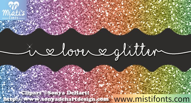
I Love Glitter is a playful hand-lettered font with lively loops and exaggerated terminals that mimic a glittered craft piece. Its irregular baseline and generous swashes give compositions an energetic, made-by-hand feel suited to party invites, scrapbook titles, and merchandise mockups. The font ships with alternate characters that help prevent repetitive letterforms and a mix of long and short strokes that read well at headline sizes.
Although the style reads as tactile, on-screen use benefits from bold color contrast or an added outline to suggest texture without extra files. For print or vinyl cutting, this font’s open counters avoid fill issues, but you should test scale before reducing to small sizes. Pair with a restrained sans for captions so the lettering keeps center stage.
╰┈➤ Download I Love Glitter Font
My Recommendation: I’d pick I Love Glitter for projects that need a hand-decorated energy-party signage, kids’ apparel, or greeting cards are ideal. The alternates keep repeated words from feeling mechanical, and it prints cleanly for DIY craft work. Use it sparingly as a headline to let its personality pop without overwhelming supporting copy.
39. Anastasia Font
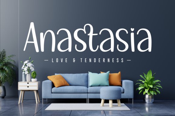
Anastasia is a soft handwritten script with gently rounded strokes and a modest slant that gives designs a romantic, approachable tone. It favors medium weights and airy counters, which makes it ideal for short headlines, branding badges, and product labels rather than dense paragraphs. The letterforms include subtle ligatures that soften repetitive joins, helping phrases feel crafted instead of typed.
Note that Anastasia is not compatible with Canva; install the OTF/TTF into desktop design apps to access alternates and typographic features. When paired with a narrow sans or a light serif it can lift an invitation suite or a boutique social post without competing for attention. Keep tracking tight on long words and reserve it for contexts where larger display sizes are available.
My Recommendation: I use Anastasia when I want an intimate, wedding-friendly aesthetic-its rounded terminals read warm and personal across invitations and labels. Since it isn’t Canva-ready, I treat it as a desktop tool in my Adobe workflow and export flattened art for web delivery. It performs best as a logo or short headline rather than body text.
40. Angista Script
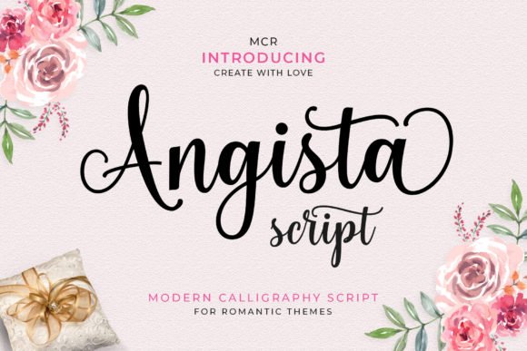
Angista Script is a delicate calligraphic script with flowing connections and letters that literally dance along the baseline, giving designs a refined, couture personality. The typeface is PUA encoded so every alternate, swash and stylistic set is available without extra utilities, making it straightforward to craft signature-looking headings and bespoke wordmarks. Fine hairlines balance fuller strokes to preserve readability on small screens while still feeling handcrafted.
For social graphics, Angista performs as a decorative display face for captions, story covers and branded tiles; Typography font for Instagram posts that want a luxe handwritten voice will find its swashes especially useful. Pair it with a neutral sans for body copy, raise tracking slightly, and favor high-contrast backgrounds so the thin terminals stay visible on phones.
My Recommendation: I reach for Angista Script when a project needs a refined handwritten signature-wedding invites, boutique branding, or premium social ads. The PUA glyphs let me compose custom ligatures and flourishes quickly, saving time on manual edits. Use it as an accent or headline rather than body text to keep mobile readability strong.
41. Elizabeth Font
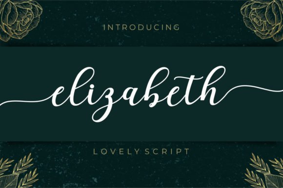
Elizabeth Font is an elegant script that blends high-contrast strokes with generous swashes, producing a look that feels both modern and slightly nostalgic. PUA encoding unlocks contextual alternates and decorative endings so you can shape unique headlines and logotypes without hunting for extra files. The letterforms maintain open counters, which helps when set over textured backgrounds or photographic overlays.
Apply Elizabeth to boutique logos, editorial drop caps, or wedding stationery where a measured personality is required; it sits best alongside a clean sans to avoid visual competition. Trim excessive swashes on long words and review at phone scale to ensure fine terminals remain clear, then reserve it for focal lines where its character can carry the message.
My Recommendation: I keep Elizabeth Font in my toolkit for assignments that need expressive handwriting without being fussy. Its PUA glyphs let me swap alternates on the fly, which is handy under tight deadlines. I typically use it for logos, social headers, or product labels where a decorative touch strengthens the brand voice.
42. Babydoll Font
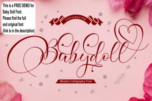
Babydoll Font reads like a warm, handwritten note: loopy ascenders, soft terminals and slight baseline shifts give short phrases a sincere, personable tone. Alternates and stylistic characters mimic natural pen lifts so headlines feel less engineered and more human, and the demo version is useful for testing kerning and pairings before buying the full family. The type’s charm comes from its irregularities rather than mechanical precision.
This face works well for greeting cards, boutique product labels, and Instagram highlight covers where a feminine, intimate voice is wanted; pair it with muted palettes and soft textures to keep the mood consistent. Avoid heavy shadows that obliterate delicate strokes, use generous line-height when stacking words, and upgrade to the full Baby Doll release when you need more alternates and weight options.
My Recommendation: I use Babydoll Font when projects call for a warm, handmade accent-the irregular baseline reads as sincere and crafted. The free demo lets me evaluate spacing and pairings on sample artwork, and I switch to the full release for extended usage or packaging. Treat it as an accent and balance it with a clean sans for supporting text.
43. Groovy Font
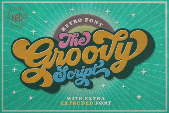
Groovy channels late 1960s–70s ad lettering with exuberant swashes and rounded counters; those thick-to-thin strokes inject retro personality without becoming cluttered. As a Typography font for Instagram posts, it performs strongly at cover sizes and quote cards while still holding up for story overlays, and its alternates and ligatures let you avoid repetitive word shapes across a feed.
The type behaves best when paired with a clean geometric sans to steady its flourish, and warm, saturated palettes-mustard, teal, cream-will emphasize the vintage feel. Pay attention to swash collisions on narrow mobile screens and nudge tracking when necessary; use Groovy for event promos, branded covers, and hero headlines that require an unmistakable vintage voice.
My Recommendation: I use Groovy when a post needs an immediate retro signature-music nights, artisan labels, or throwback-themed promos. Its alternate glyphs give headlines a handcrafted look without extra illustration work, and the bold shapes remain readable at typical Instagram export sizes. If you want nostalgia with practical legibility, Groovy is a fast, reliable pick.
44. Amazing Quirky Font
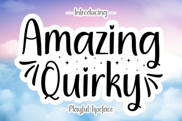
Amazing Quirky offers a nimble handwritten charm with an uneven baseline and soft terminals that feel personal and playful rather than polished. That lively irregularity suits stickers, highlight covers, and caption overlays where a very formal type would feel out of place; it keeps clarity at standard Instagram pixel dimensions while lending each phrase a friendly tone. Punctuation and small capitals match the same casual voice, keeping short blocks of text cohesive across posts.
For balance, pair this hand-drawn face with a neutral sans for body text or place it atop textured backgrounds to amplify the handcrafted look. Avoid setting long paragraphs in Amazing Quirky; it shines as an accent or headline that draws attention without demanding serious reading. Ideal applications include craft brands, family-focused content, and upbeat lifestyle promos where approachability is the goal.
╰┈➤ Download Amazing Quirky Font
My Recommendation: I turn to Amazing Quirky when a project needs warmth and personality-think DIY tutorials, café menus, or children’s product teasers. It reads like a real hand note, which helps social posts feel intimate and approachable. Use it as a headline or accent paired with a restrained companion face to keep compositions readable and lively.
45. Thunder Font
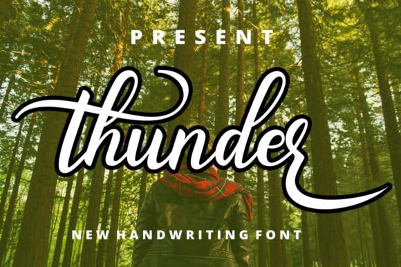
Thunder is a contemporary handwritten face with confident strokes and whimsical letterforms that bring energy without appearing chaotic. The font is PUA encoded, so swashes, alternates and stylistic sets are easy to access in most design tools; those extras let you compose distinctive titles, monograms, or single-line logos without custom lettering. Open counters and measured rhythm preserve legibility at display sizes while leaving room for expressive touches.
Because Thunder arrives with built-in ornamentation, I reserve full swashes for single-line headlines or animated story cards and trim flourishes in denser layouts to avoid overlap. It works well for boutique product promos, editorial thumbnails, and announcement posts that benefit from a handcrafted signature. Test it at native export sizes and adjust letter spacing where needed to keep characters from colliding on mobile screens.
My Recommendation: I pick Thunder for boutique launches and editorial-style posts when I want handcrafted personality without losing modern clarity. The PUA-encoded alternates speed up production and offer variety across a campaign, and the font holds up in motion graphics and static thumbnails alike. Use it for headlines, logos, and short promotional lines where character matters most.
Try three fonts from different mood groups across a week of posts to see which attracts saves and comments. Small shifts in size and letter spacing often have a bigger impact than swapping entire families.
Keep this list handy when planning campaigns or a seasonal refresh; consistent, readable typography helps you create scroll-stopping posts without extra effort.