50 Chic Fonts for Instagram Posts: Typeface Picks for Creators in 2026
Fonts for Instagram Posts shape first impressions on your grid – the right typeface steers the eye, sets tone, and improves readability for scrolling audiences.
Below are 50 thoughtfully chosen fonts spanning serif, sans, script and display styles, with pairing suggestions, caption tips, and notes on mobile legibility so you can match type to niche and mood.
1. Reconcile Font
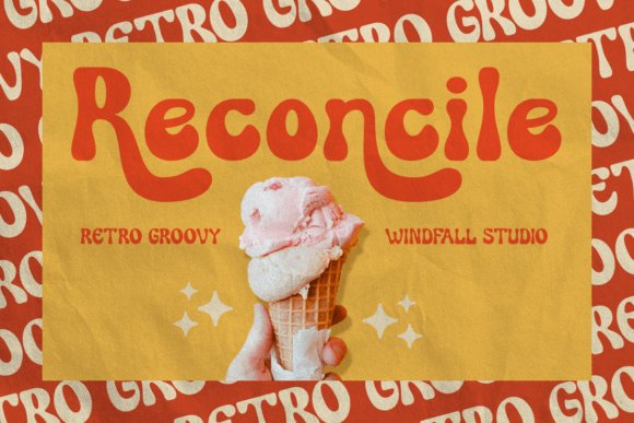
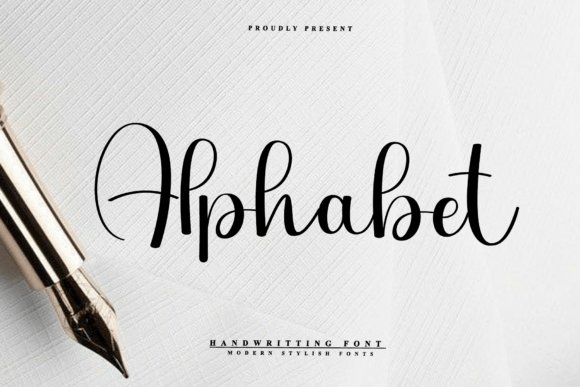
Reconcile is a retro groovy display that pairs thick, friendly strokes with playful terminals to create instant personality on-screen; its bold curves and generous counters make it particularly effective for attention-grabbing headlines and bright promotional graphics. Because it reads clearly on small and large formats alike, Reconcile is an excellent choice when selecting Fonts for Instagram Posts where a single word or short phrase must arrest the viewer and set a nostalgic tone.
The face includes alternate characters and quirky ligatures that let you vary letter shapes across posters, packaging, or social tiles without losing cohesion, and its handmade feel adds warmth without sacrificing polish. I found its kerning holds up when scaled for square feeds or printed event flyers, and it pairs well with a neutral sans for body copy or delicate scripts for accents.
My Recommendation: I reach for Reconcile when a project needs cheerful retro personality-think 70s-inspired product launches, playful event promos, or bold Instagram covers. Its strong presence works well for single-word headlines and packaging labels where character matters more than subtlety. Use it when you want type to feel handcrafted but still behave reliably in digital templates.
2. Gallery Font
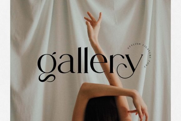
Gallery presents a refined display voice with graceful ligatures and finely tuned letterforms that read as both modern and sophisticated; its tall proportions and restrained stroke contrast suit luxe invitations, editorial mastheads, and boutique branding. The font’s refined shapes maintain clarity on high-resolution screens, giving headlines an editorial edge without appearing overly decorative.
For layouts, Gallery performs best when paired with a simple geometric sans to preserve hierarchy and space; slight tracking increases at small sizes prevent ligatures from feeling cramped. On social cards and portfolio thumbnails it lends a composed, premium atmosphere that complements monochrome or minimalist color schemes, while still holding up in more vivid palettes.
My Recommendation: I use Gallery when a project demands understated elegance-branding for artisan goods, wedding invites, or high-end lookbooks. Its ligatures add personality without drawing attention away from imagery, and it harmonizes well with clean sans-serif bodies. Choose Gallery when you want typography that reads cultivated and poised rather than loud.
3. Klassiek Font
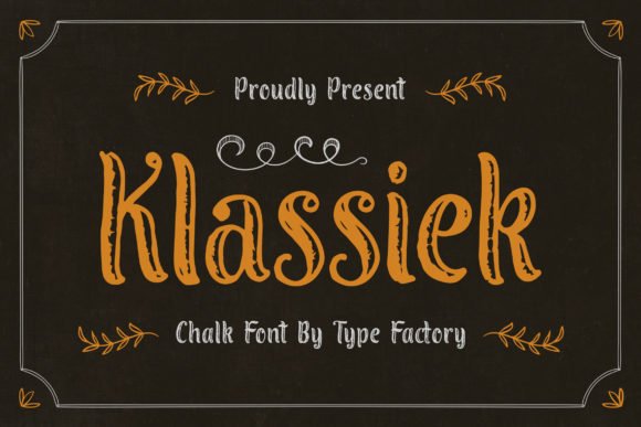
Klassiek is a stylish display type with an old-world charm softened by contemporary proportions, making it suitable for expressive titles and decorative headings. The letterforms carry confident curves and subtle flairs that communicate personality and clarity, which helps headlines stand apart on magazine covers, game menus, or whimsical packaging.
Because Klassiek balances ornament with legibility, it adapts to playful editorial treatments as easily as it does to dramatic poster work; alternates and weight choices let you dial up drama for a logo or pull back for a polished masthead. Try pairing it with simple sans blocks to let the display letters command attention while the supporting copy remains calm and readable.
My Recommendation: I pick Klassiek when a design needs character with readable structure-children’s titles, boutique editorial covers, or event posters benefit most. Its decorative touches bring warmth but won’t overwhelm supporting imagery, and the alternates give designers quick ways to customize wordmarks. Use it when you want typography that feels confident and a bit playful.
4. Enchanted Prismatic
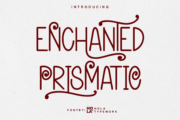
Enchanted Prismatic is a decorative display font that layers elegant, handcrafted strokes with whimsical swirl accents to create a fairytale-ready headline type. The smooth curves and playful flourishes give strong personality without feeling fussy, and the ornament details make it a go-to for eye-catching covers, invitations, or social tiles – I often use it when designing Fonts for Instagram Posts that need a magical, storybook vibe. Its swashes and spirals read best at larger sizes where the details breathe, so treat this as a headline or logo face rather than body text.
On a practical level the set includes multiple swash alternates and clear uppercase shapes, which simplifies pairing with a neutral sans for contrast; kerning is generous but still worth a quick tweak when you compose short captions or posters. Exports as OTF/TTF work reliably across desktop publishing and most social design apps, and the decorative bits layer well over textured backgrounds or subtle gradients without losing legibility. Use light tracking for single-line titles and slightly tighter spacing for stacked words to keep the ornament elements from colliding.
╰┈➤ Download Enchanted Prismatic
My Recommendation: I’d reach for Enchanted Prismatic when a project needs a distinctly whimsical identity – wedding invites, children’s book covers, or boutique branding flourish immediately come to mind. It brings handcrafted charm and ornamental detail that make a single headline feel bespoke, and pairing it with a clean sans keeps layouts readable. I avoid it for dense copy but love the way it lifts short quotes and profile banners.
5. Simple Elegant
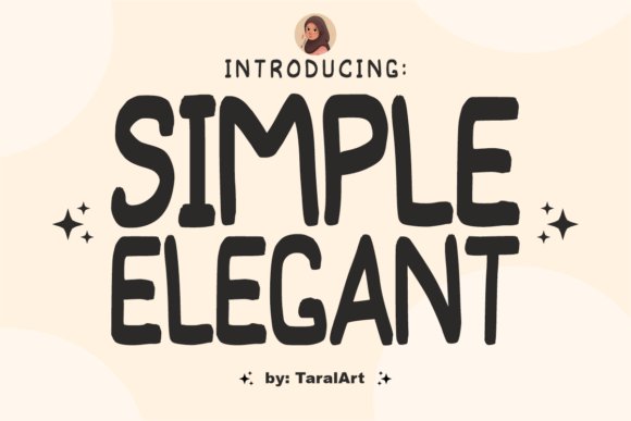
Simple Elegant presents as a hand-drawn display font with bold, slightly uneven letterforms and a relaxed brushed texture that reads both friendly and refined. It has a personal, handwritten sensibility that works well for lifestyle branding, boutique logos, and casual editorial headings where a human touch is desirable; the brush strokes retain character without becoming noisy. Letters maintain clear counters and predictable shapes, which helps when you scale the type for social graphics or print headers.
The font plays nicely with thin sans or minimalist serif choices to build contrast: use the handwritten glyphs for names and titles while reserving a neutral partner for secondary information. OpenType alternates add variety for repeated words in a layout, and the moderate x-height keeps readability solid in captions or café menus. For best results keep it as the focal display type and avoid forcing it into dense paragraphs where the organic rhythm will slow reading pace.
My Recommendation: I use Simple Elegant when a project needs warmth without becoming informal – think boutique signage, social quotes, or packaging for artisanal goods. It gives artwork a handcrafted edge while remaining legible and modern, and the alternates help avoid repetitive letterforms in longer headings. It’s my pick for brands that want personality without sacrificing clarity.
6. Funky Pickle
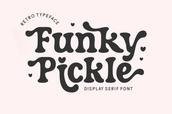
Funky Pickle channels retro charm with playful curves, alternate characters, and a hint of 70s boho energy that still feels fresh for contemporary designs. The serif-like hooks and soft terminals bring a quirky warmth that suits posters, t-shirt graphics, and mood-driven branding, while the alternates let you craft unique wordmarks and lively display lines. It reads as friendly and upbeat, making it ideal for seasonal or nostalgia-tinged campaigns that want personality at first glance.
Technically, the family includes stylistic sets and ligatures that make mixing caps and lowercase lively without clashing, and it behaves well in vector apps, Procreate canvases, and Cricut projects. Use bold sizes for headline treatments and play with layered color fills to emphasize its retro rhythm; tighter tracking can intensify its visual punch in short phrases. For merch and party invites it’s a strong choice when the brief calls for upbeat, retro-infused typography.
My Recommendation: I pick Funky Pickle for projects that need a cheerful retro voice – think birthday cards, summer event posters, and playful apparel designs. The alternate glyphs let me create distinct wordmarks while keeping production simple across print and digital tools. It’s a top option when I want type that feels lively and handcrafted without being overly decorative.
7. Soronok Font
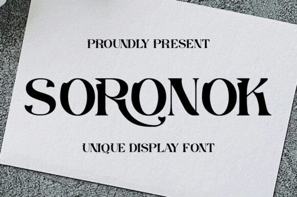
Soronok is a display face that pairs tall, narrow proportions with delicate flared terminals, producing headlines that feel both sharp and handcrafted. Its contrast and decorative stroke endings make letterforms read as visual ornaments, which draws attention on posters, labels, and editorial covers. The overall texture reads refined without becoming fussy, so words become design elements rather than just copy.
When used for social graphics, Soronok holds up as one of the better choices among Fonts for Instagram Posts that need a distinct, editorial voice. Apply it to single-line titles, event promos, or season announcements where character matters more than compactness. Pair with subtle backgrounds or monochrome photography to keep focus on the type itself.
My Recommendation: I reach for Soronok when a brief needs a decorative headline that still reads quickly. Its narrow forms help keep compositions compact, while the flared terminals give imagery an upscale, editorial feel. Use it on boutique launch cards, fashion promos, or any post where style must read at a glance.
8. Areus Font
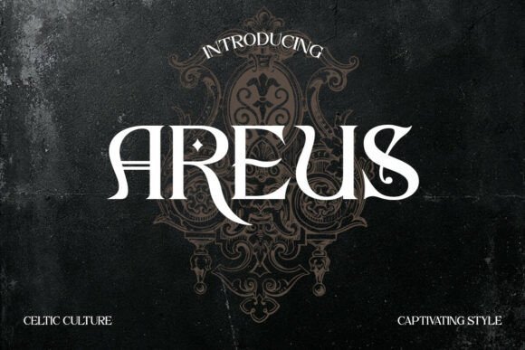
Areus channels Celtic-inspired serif details into a display type with pronounced shoulders and ornamental terminals that suggest historic lettering without literal knotwork. The family includes stylistic alternates and discretionary ligatures, letting designers shape words into bespoke marks rather than relying on default glyphs. Midweight stroke contrast keeps the ornaments legible at display sizes used in signage and packaging.
For identity work and social tiles, Areus gives brands a handcrafted, heritage-driven tone that stands out in a crowded feed. Use all-caps wordmarks or mix small caps with generous tracking to let the ligatures breathe. The font ships with PUA glyphs and broad language support, which simplifies packaging and regional collateral production.
My Recommendation: I pick Areus when a brand needs a sense of craft and history-think specialty foods, book covers, or gallery signage. The alternates let me tweak logotypes without redrawing letters, which speeds iterations. It pairs beautifully with textured papers, muted palettes, and simple ornaments for a coherent, artisanal look.
9. Valeris Font
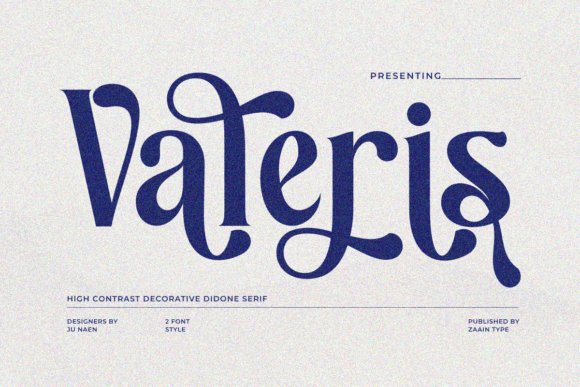
Valeris is a contemporary serif with gentle stroke contrast, open counters, and crisp wedge terminals that read as calm and assured at display sizes. The shapes favor clarity: broad counters and moderate spacing prevent crowding, so headlines remain airy even when set in longer lines. Its temperament leans toward editorial use, where refined letter rhythm supports legibility and style.
On social platforms, Valeris works well in fashion and beauty tiles that require a premium, understated voice without ornate embellishment. Use the italic for subtle hierarchy or to set apart product notes, then pair with a clean sans for body text. The face keeps feeds cohesive while allowing imagery and color to lead the visual story.
My Recommendation: I choose Valeris for projects that need quiet refinement-brand identities for fashion, beauty editorials, and upscale product mockups. It reads beautifully at large sizes and maintains a composed presence in caption art. Combining it with a geometric sans often yields a modern, balanced layout that feels intentionally curated.
10. Treifany Font
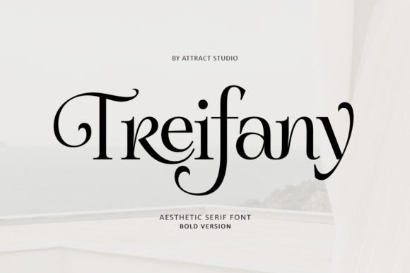
Treifany Font is an elegant serif family defined by ornate ligatures and a broad set of alternate glyphs that give headlines and logos a handcrafted character. With built-in multilingual support and carefully tapered serifs, it remains readable across scaled-down captions and larger editorial spreads, and it works particularly well as Fonts for Instagram Posts when you want a refined overlay that still reads on small screens.
The typeface rewards selective use of OpenType features so ligatures feel deliberate rather than decorative clutter; try reserved alternates for logotypes and fuller sets for magazine mastheads. Pair Treifany with a plain sans for body copy, adjust tracking for small sizes, and use heavier weights on packaging to anchor composition while lighter cuts perform nicely in captions.
My Recommendation: I would choose Treifany when crafting a premium editorial identity or artisanal product label because its alternates add distinctiveness without compromising legibility. The multilingual glyph set has saved me time on international projects, and the ligatures help me create bespoke wordmarks. Use it when you need elegance with technical polish.
11. Trace Adwany Font
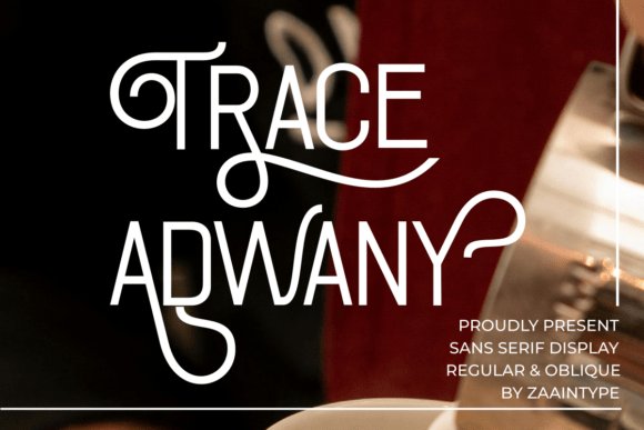
Trace Adwany Font is a sans-serif display with refined swashes and decorative curves that lend personality to otherwise minimal layouts. The design marries clean letterforms with flourish terminals and comes in regular and oblique styles, making it suitable for high-end logos, fashion editorials, and luxury packaging where a measured flourish communicates craft.
Best used at headline scale, Trace Adwany reads as a confident mark when given space; small sizes demand attentive kerning to keep forms distinct. Pair it with subdued body text to focus attention on the display face, and experiment with metallic finishes or embossing for print to amplify its upscale presence without adding extra typefaces.
╰┈➤ Download Trace Adwany Font
My Recommendation: I reach for Trace Adwany when a brand needs poised visual personality-perfume, boutique fashion, and premium labels are ideal scenarios. Its swashes add immediacy to headlines while the oblique offers a gentle sense of motion. Give it breathing room and precise spacing to let the decorative details sing.
12. Simple Minimalist Font
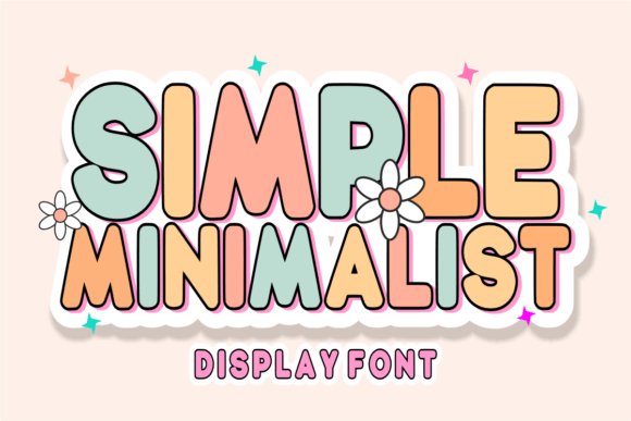
Simple Minimalist Font pairs rounded, monolinear letterforms with an outlined structure to produce a light, retro-tinged display face that feels modern and approachable. The smooth geometry and open counters suit lifestyle branding, wedding stationery, and blog headers, and the outlined versions layer cleanly over images without overpowering photography.
Its airy construction holds up well at social sizes and adapts easily across feed graphics and story covers; try stacking an outlined instance over a filled one for subtle depth. Increase letter-spacing for a breezy editorial headline or keep compact spacing for product labels-this face provides neat, friendly typography with a vintage wink.
╰┈➤ Download Simple Minimalist Font
My Recommendation: I use Simple Minimalist when a project needs a calm, curated headline-wedding invites, boutique shops, and lifestyle sites benefit most. The outline styles are perfect for image overlays and layered type treatments. Be sure to test contrast and spacing to maintain readability while keeping the design light.
13. Mistkin Font
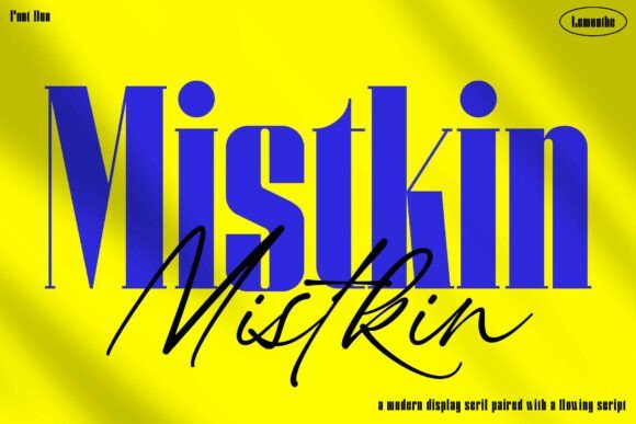
Mistkin pairs a weighty display serif with a flowing signature script, producing a contrast that reads both bold and refined. The serif provides strong letterforms with crisp terminals while the script introduces a natural, handwritten cadence through thoughtful ligatures and elegant swashes. That interplay gives designers control: the serif anchors compositionally, the script supplies expressive punctuation without overpowering the layout.
As a pairing it performs well across logos, editorial spreads, and premium packaging, and it also translates effectively to social graphics – notably among Fonts for Instagram Posts when you want a polished, boutique look. Used independently the styles can define tone quickly: the serif for assertive headlines, the script for accents and signoffs, and both maintain legibility on mobile displays. The overall mood suits luxury identities and lifestyle creatives who prefer polished contrast over ornamentation.
My Recommendation: I pick Mistkin when a project needs the confidence of a display serif with the warmth of a signature script. It’s ideal for boutique brands, magazine covers, and high-end product shots where distinct typographic contrast matters. The available ligatures and swashes let me craft unique wordmarks without adding extra typefaces.
14. Averys Font
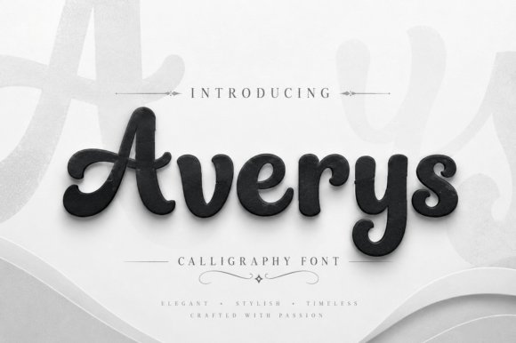
Averys is a calligraphic display script built around clean monoline strokes and generous, rounded terminals that give each character a tactile, inviting feel. Capitals carry expressive flourishes that remain controlled, while the lowercase maintains open counters for improved readability at display sizes. The design balances handcrafted rhythm with steady proportions, so swashes function as considered accents rather than distracting extras.
This script shines on wedding materials, beauty and fashion branding, premium packaging, and bold social headlines where a feminine, approachable voice is required. Pairing Averys with a neutral sans lets the script act as focal punctuation on logos and posters, and its alternates make it versatile for signature-style wordmarks. The overall effect is stylish and accessible, suited to projects that need charm without fuss.
My Recommendation: I gravitate toward Averys for invitations, boutique labels, and campaign headers where a refined, friendly script is called for. Its rounded shapes read beautifully in print and on-screen, and the alternates give extra flexibility for logos and packaging. Use it when you want elegance with a personable edge.
15. Nerva Archane Duo Font
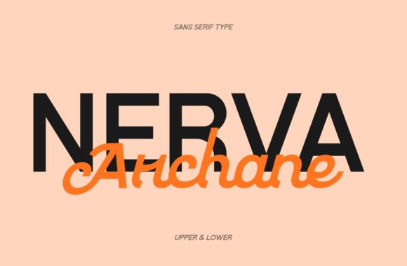
Nerva Archane Duo combines a geometric sans with a lyrical script to provide immediate typographic hierarchy in one package. The sans offers clear, open forms and steady spacing for headline clarity, while the Archane script contributes fluid strokes and decorative ligatures that bring warmth and motion. Both styles were created to complement each other so you can shift emphasis smoothly without testing separate families; the script is also PUA-encoded for easy access to alternates and swashes.
Use the sans for dominant headers and the script for subheads, taglines, or highlighted words across editorial layouts, boutique branding, and social templates. The contrast helps guide the eye and keeps copy legible on small screens while still feeling personal and crafted. This duo suits designers who want a unified voice across print materials and Instagram assets without juggling multiple typefaces.
╰┈➤ Download Nerva Archane Duo Font
My Recommendation: I recommend Nerva Archane Duo when a brief needs crisp typographic structure plus handcrafted personality-think hospitality branding, wellness editorials, and curated social feeds. The built-in pairing cuts setup time and ensures consistent visual voice. PUA-encoded alternates are handy for bespoke headlines and custom logotypes.
16. Wonderz Prime
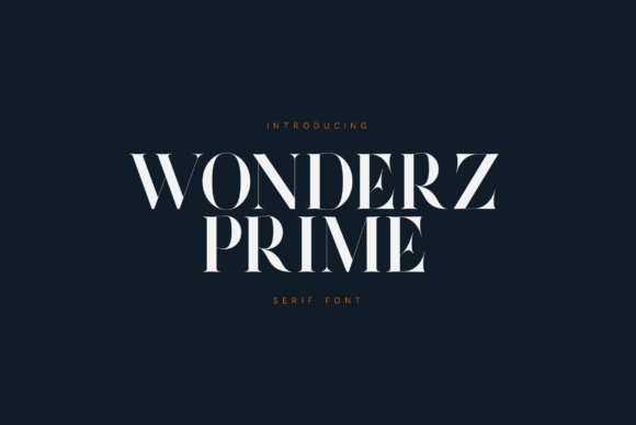
Wonderz Prime is a modern luxury serif with sharp contrast and sculpted curves that create a confident editorial voice. Its high-contrast strokes and open counters read impressively in large headlines and hold clarity on phone screens, making it well suited for Fonts for Instagram Posts and other social-first graphics. Use bold weights for mastheads and thinner cuts for subheads to keep hierarchy clear and striking.
The family ships with full Latin character sets, extended numerals, punctuation, and multilingual support so global campaigns stay consistent. Small typographic choices-tight tracking on display caps, generous leading for stacked titles, and subtle metallic or letterpress textures-accentuate its premium mood. Pair Wonderz Prime with a light script or a minimal grotesque to build elegant brand systems, packaging, and magazine covers.
My Recommendation: I reach for Wonderz Prime when a project needs a high-end editorial tone without feeling fussy. The contrast and sculpted serifs give headlines refined authority while the complete character set keeps production straightforward across print and social. It’s ideal for luxury skincare brands, travel editorials, and title work where a strong, readable display font matters.
17. Premium Look Duo Font Duo
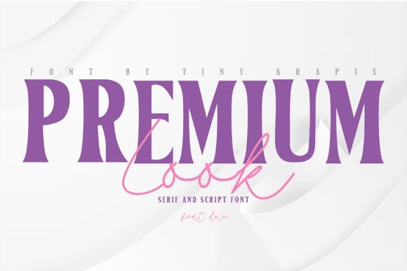
Premium Look Duo pairs a bold high-contrast serif with a flowing handwritten script so typography can feel serious and personable at the same time. The heavyweight serif anchors logos and headlines while the script adds warmth to invitations, quote cards, and product labels. OpenType alternates and ligatures in the script let you create authentic, calligraphic details without manual letter edits.
Apply the serif for brand names and the script for signatures or accent words to build a clear visual hierarchy across grids and print pieces. Shifting color, size, or texture-try foil on the serif with watercolor behind the script-stretches the duo’s handcrafted luxury from packaging into web and social banners. This combination works well when you want editorial polish paired with human warmth.
╰┈➤ Download Premium Look Duo Font Duo
My Recommendation: I pick Premium Look Duo when a brief calls for contrast between authority and personality, such as boutique branding or wedding suites. The serif gives structural clarity for logotypes while the script supplies the handcrafted flourish that reads personal and inviting. Use it for social media quote posts, labels, and stationery where a two-part typographic voice sells the concept.
18. Sweety Birthday Font
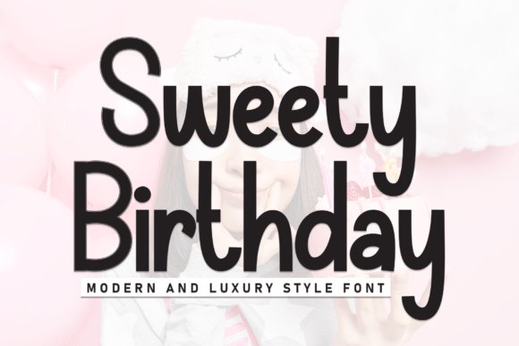
Sweety Birthday is a bold display font built from hand-drawn shapes that read like a confident marker stroke. Its thick, even strokes and rounded terminals create an approachable, celebratory tone perfect for banners, party invites, and headline graphics. Subtle irregularities keep the letters feeling handmade rather than mechanical, adding genuine character to each word.
Because it commands attention at large sizes, reserve Sweety Birthday for hero text, stickers, packaging labels, and story covers where impact matters most. Pair it with a restrained sans for supporting copy to preserve legibility and avoid visual clutter. Bright palettes and playful textures amplify its friendly personality for seasonal promos and boutique product launches.
╰┈➤ Download Sweety Birthday Font
My Recommendation: I’d choose Sweety Birthday for projects that need bold personality-party branding, children’s products, or celebratory marketing. Its hand-drawn heft reads cheerfully across social posts and printed labels, and it pairs cleanly with a simple sans for body copy. The font’s approachable energy makes it an instant attention-grabber that feels handcrafted and fun.
19. Maison Époque Duo
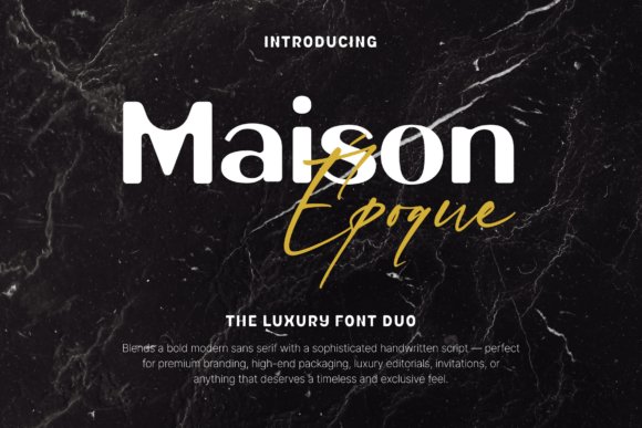
Maison Époque Duo pairs a crisp modern sans with a ribbon-like handwritten script to create a refined two-typeface system. The sans offers clean uppercase and lowercase forms with careful kerning and balanced spacing, while the script brings expressive swashes and alternates via PUA encoding; both ship in OTF, TTF and WOFF and include multilingual support. This is a pairing built for clarity at display sizes yet flexible enough to add personality to a headline or label.
On social feeds and polished print, the contrast between minimal sans blocks and decorative script details reads as intentional luxury – an asset when styling Fonts for Instagram Posts, hero banners, or boutique packaging. Use the sans for legible captions and the script for logotypes or event names; keep swashes limited to focal words and test letterspacing on mobile to preserve impact without clutter.
╰┈➤ Download Maison Époque Duo
My Recommendation: I reach for Maison Époque Duo when a project needs a quiet but unmistakable mark of luxury-wedding suites, perfume labels, and boutique identity work. The two styles let me build hierarchy quickly: straightforward sans for body text and the script for brand signatures. For social campaigns I like pairing the script sparingly on product close-ups while keeping UI copy in the sans so everything reads clean on phones.
20. Sample Alphabet Font
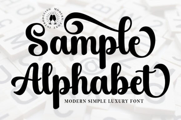
Sample Alphabet is a confident bold script that captures retro glamour through thick strokes, dramatic curves, and playful baseline shifts. It comes PUA-encoded so alternates and swashes are easy to access, and its strong forms perform best at large sizes where the vintage-inspired rhythm can breathe. The typeface excels as a headline voice rather than as long-form text due to its pronounced stroke contrast and ornamental terminals.
Use it for brand marks, apparel labels, and packaging seals where a single strong word needs to own attention; pair it with a neutral sans if you need secondary copy to stay unobtrusive. Pay attention to tracking and line breaks so the bouncy baseline doesn’t interrupt word shapes, and consider embossing or foil finishes to capitalize on its tactile, retro character.
╰┈➤ Download Sample Alphabet Font
My Recommendation: I recommend Sample Alphabet when you want a bold, memorable title that reads like a personality rather than plain text. Its retro flair makes it perfect for boutique apparel labels, limited-edition packaging, and short brand names. In practice I reserve it for focal statements and combine it with a quiet sans to preserve legibility for supporting copy.
21. Zamrani Font
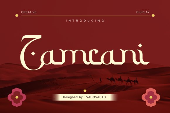
Zamrani channels a Kufic-inspired aesthetic with geometric rigor: sharp angles, strong verticals, and broad counters create a display face that feels architectural and commanding. Its visual heft translates well to premium food and beverage labels, cinematic title sequences, and travel branding that wants to communicate heritage and weight. The font’s angular rhythm gives designers a chance to craft bold typographic marks that read both historic and contemporary.
Because of its heavy forms and distinctive cuts, Zamrani performs best as a headline or logo rather than body text; pair it with a neutral humanist sans to soften layouts or with simple photographic backdrops for packaging. For print, test embossing and spot varnish to emphasize the geometry; for digital, preserve generous tracking to avoid crowded counters on small screens.
My Recommendation: I choose Zamrani when a project needs visual authority rooted in calligraphic tradition-think specialty date packaging, artisan coffee labels, and boutique hotel identity. Its strong shapes help craft memorable wordmarks that feel both classic and deliberate. When I use it, I balance the weight with ample negative space and a calm supporting type so the display face remains the focal point.
22. Lady Crush Font Duo
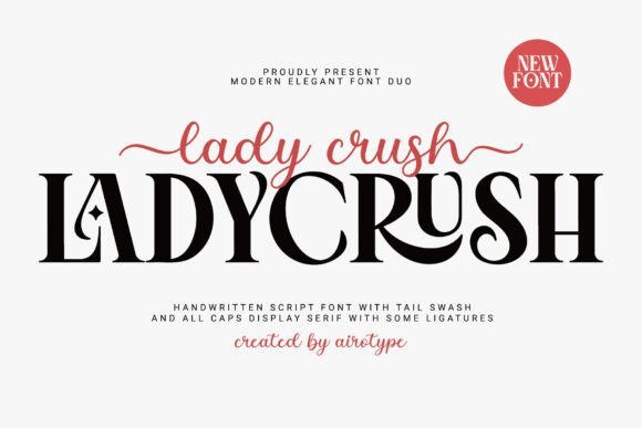
Lady Crush pairs a flowing handwritten script with a bold all-caps serif to create striking contrasts that read well in feed layouts and short captions. The long tail swashes and crisp serifs offer expressive headlines and tidy body anchors, which makes this duo particularly useful for Fonts for Instagram Posts where personality must meet legibility. Use the script for highlighted words and the serif to hold blocks of text so posts stay readable on small screens.
The family includes alternate swashes and useful ligatures so you can dial back ornamentation when space or contrast is tight; careful kerning keeps the two styles cohesive at mobile sizes. On printed invitations or packaging the serif maintains authority while the script supplies warmth, and mixing weights produces a refined editorial look without visual clutter.
╰┈➤ Download Lady Crush Font Duo
My Recommendation: I reach for Lady Crush when building feminine brand identities because the script supplies handcrafted charm and the serif keeps information readable. It shines on wedding stationery, boutique packaging, and Instagram grids that need a signature feel. I often use alternates to make headings feel bespoke while keeping captions clean.
23. Gayalie Swimwear Font Duo
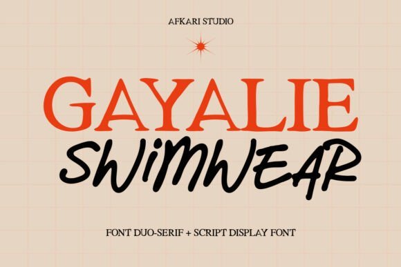
Gayalie Swimwear blends a clean, structured serif with a flowing handwritten script to echo resortwear and high-fashion visuals. The serif provides geometric stability for logos and headlines while the script introduces motion and softness ideal for lookbooks, product tags, and lifestyle overlays. Its refined terminals and measured contrast make it legible over textured photography and colorful backgrounds.
Compositionally, place the serif in strong uppercase for mastheads and reserve the script for accents, signatures, or pull-quotes to avoid visual competition. The family tolerates both looser letterspacing for captions and tighter tracking for labels, so it suits web banners, printed hangtags, and editorial spreads alike. Use warm palettes and film-grain textures to reinforce the sunny, coastal mood of the designs.
╰┈➤ Download Gayalie Swimwear Font Duo
My Recommendation: I use Gayalie Swimwear when designing seasonal collections because its fashion-forward serif keeps brand names clear while the script adds approachable femininity. It works especially well for boutique swim labels, resort identity systems, and editorial lookbooks. For ads I typically pair the serif with large imagery and the script as a handwritten accent to suggest luxury without heaviness.
24. Modern Valentine Font
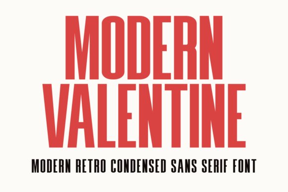
Modern Valentine channels mid-century advertising with a condensed silhouette and subtly irregular terminals that give copy lively character without overwhelming layouts. Its narrow proportions are ideal for tight headlines, price tags, or label work where space is limited, and the slightly sharp, hand-touched edges read energetic on both screens and print. Pair bold weights with soft backgrounds to preserve contrast and presence.
The typeface works well with delicate scripts for invitations or with neutral sans serifs for clean posters, and its condensed nature preserves typographic hierarchy across stacked lines. Pay close attention to tracking and optical kerning at display sizes-minor negative spacing can sharpen rhythm for headlines. Modern Valentine fits boutique packaging, retro-themed promotions, and carousel covers that need punch in compact dimensions.
╰┈➤ Download Modern Valentine Font
My Recommendation: I reach for Modern Valentine when a project needs vintage character but tight composition – it lets me fit bold statements into narrow spaces without losing personality. It’s great for labels, promotional headers, and retro-inspired campaigns. On social posts I pair it with muted textures and simple color blocks to let the type do the expressive work.
25. Cursive Holiday
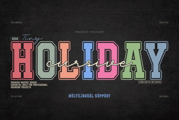
Cursive Holiday pairs a varsity-inspired college serif with a flowing cursive script to build a clear typographic hierarchy for editorial and brand projects. The serif brings bold, structured letterforms and crisp terminals while the script supplies fluid strokes and lively swashes that soften the composition. That contrast makes it a natural pick for impactful headlines, fashion concepts, vintage-magazine spreads, and for Fonts for Instagram Posts where bold shapes must read instantly in a crowded feed.
The sharp serifs balance with soft curves in logotypes, apparel graphics, and wedding stationery to produce a refined athletic character without feeling clichéd. OpenType alternates and tuned kerning let you adjust personality across sizes, and using the script sparingly as an accent keeps layouts legible and distinctive. Play with stacked lockups and reversed colorways to maintain presence across print and social formats.
My Recommendation: I reach for Cursive Holiday when a brand needs vintage athletic attitude but also a refined touch. The serif provides headline authority while the script adds human warmth, so it’s perfect for boutique apparel labels, wedding invites, or fashion editorials. On social feeds it cuts through scrolling because the contrast reads well even at small sizes.
26. Maffisoy Font – Fonts for Instagram Posts
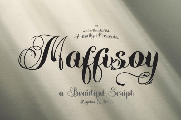
Maffisoy is a high-contrast display face that channels calligraphic traditions into bold, modern titling with thick strokes and razor-sharp terminals. Its letterforms carry theatrical presence, which makes it well suited to packaging, cinematic headers, and magazine covers where each glyph must perform. Use it where headlines are meant to be sculptural and instantly legible from a distance.
Because the type has strong personality, it functions best at large sizes with generous letterspacing and ample negative space so detailing isn’t lost. Pair it with a plain sans for captions or a restrained serif for secondary lines, and rely on alternate glyphs to keep headline set pieces expressive rather than mechanical. Reserve it for leading elements and minimal supporting copy to keep focus on form and rhythm.
╰┈➤ Download Maffisoy Font – Fonts for Instagram Posts
My Recommendation: I pick Maffisoy for projects that demand dramatic headline presence-think boutique product labels or editorial covers. Its heavy strokes and precise terminals give titles a crafted, memorable look. I always keep supporting text pared back so the type can breathe and maintain its visual punch.
27. Golden Bright Font
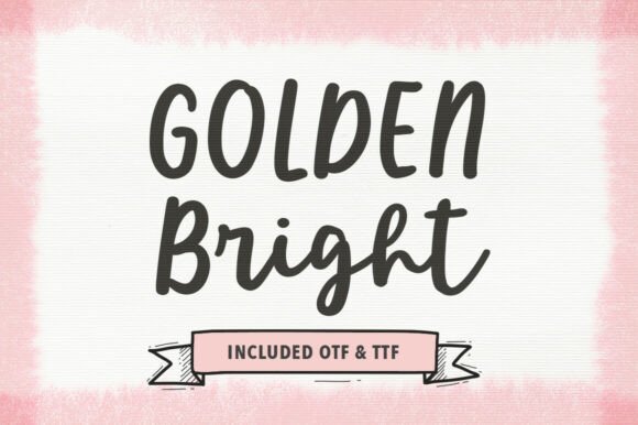
Golden Bright combines a solid display face with a flowing script to let designers build contrast-rich identities and layered headers. The display member offers presence and weight for mastheads, while the script introduces motion and handcrafted loops that read as signature marks. This pairing works well for wedding suites, lifestyle editorials, and premium business cards where both strength and refinement are required.
Try color blocking and overlay techniques to let the two styles interact without adding ornaments; a shadowed display with a script overlay creates depth cleanly. Adjust tracking on the display and enable contextual alternates on the script to preserve rhythm at different sizes, ensuring logos and social headers remain elegant across output. The result is a composed look that feels polished yet approachable.
╰┈➤ Download Golden Bright Font
My Recommendation: I use Golden Bright when a project needs both impact and a human touch, such as boutique branding or upscale invitations. The duo allows for a bold headline plus a warm signature without introducing extra typefaces. It’s especially effective for Instagram covers and editorial spreads where refined presence must still feel personal.
28. Relita Vintage
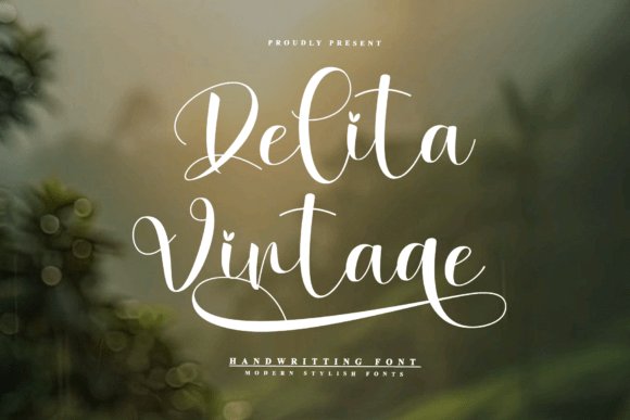
Relita Vintage is a graceful handwriting font defined by sweeping swashes and delicate heart-shaped flourishes that nod to classic penmanship while feeling current. Its flowing connections and careful stroke contrast suit luxury wedding suites, artisanal labels, and emotive social headers. When used among Fonts for Instagram Posts, its calligraphic shapes create romantic captions and layered quote graphics that read as handcrafted.
OpenType alternates and swash glyphs give designers fine control over rhythm and spacing, so you can soften joins or dial up drama depending on the layout. It performs best at display sizes where the thin hairlines remain visible; pair it with a neutral sans to keep long lines readable. Small accents like metallic textures or soft shadows amplify the luxe mood without cluttering the script.
My Recommendation: I choose Relita Vintage when a project needs an intimate, romantic voice-wedding collateral, boutique identity, or gift packaging. The alternates let me craft bespoke phrases that never feel repetitive, and the script holds up well as a headline across print and social. Use it sparingly as a focal display face and balance it with a clean companion type for body copy.
29. Simple Authentic
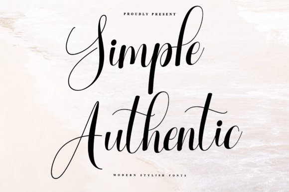
Simple Authentic offers an expressive script with bold downstrokes balanced by thin connectors, producing a lively handwritten rhythm that still reads clearly. Looping ascenders and a slightly bouncy baseline inject personality without becoming fussy, which makes it a strong pick for seasonal promotions, event invitations, and boutique beauty labels. At larger sizes it performs like a confident signature; reduce swash use for tighter layouts.
OpenType features-ligatures, stylistic sets and variable spacing-help you keep repeated posts feeling fresh across an Instagram feed and story sequences. For stable compositions, anchor the script with a geometric sans or a restrained serif so the two voices don’t compete. Avoid busy textured backgrounds where the finer connectors can lose definition at smaller scales.
My Recommendation: I use Simple Authentic when a brand needs warmth without losing structure, such as holiday campaigns or signature-style packaging. Its alternates let me create subtle variety across repeated templates and templates for social tiles. Keep it focused to headlines and short phrases so the characterful forms remain legible.
30. Ramadan
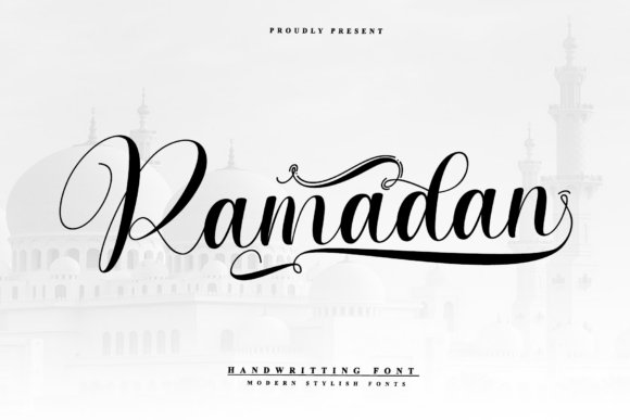
Ramadan is a flowing script that reads as both celebratory and approachable, ideal for holiday greetings, community event graphics, and seasonal fundraising visuals. The design’s lively ascenders and open counters give long phrases a rhythmic, inviting cadence that suits posters and greeting cards alike. Designers can choose more ornate terminals for print or pared-back forms for digital banners.
Multiple stylistic sets and contextual alternates let you tune letter joins and ornament strength quickly, which is helpful when adapting the type across feed tiles, story stickers, and printed flyers. Pair it with a calm sans to establish hierarchy and clear calls to action. At display sizes the heavier strokes anchor the composition while the lighter strokes deliver elegance.
My Recommendation: I pick Ramadan for projects that need a warm, human touch-community notices, festive greetings, or charity outreach materials. Its alternates make repeated use feel varied and personal, and the script holds strong on mobile screens when used as a display face. Reserve body copy for a simple sans or serif so the script’s personality can breathe.
31. Writing Font
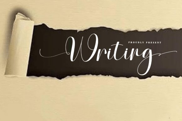
Writing is an elegant, rhythmic script that pairs thick, grounded downstrokes with feather-light connectors to produce a convincing hand-penned cadence. Looping ascenders and a springy baseline give words a lively, signature-style motion that reads personalized rather than manufactured. For social creators, when curating Fonts for Instagram Posts, Writing’s high-contrast shapes make quote cards, announcement tiles, and highlight covers feel bespoke while remaining legible at common display sizes.
Alternates and swash options provide subtle variety so repeated words won’t feel identical, and the typeface plays nicely with neutral backgrounds and textured papers. Keep tracking tight for headlines but loosen it a touch for multi-word lines to preserve the delicate links. Use a clean sans for supporting body copy so Writing can serve as the typographic focal point without overwhelming the layout.
My Recommendation: I reach for Writing when a project needs an upscale, handwritten voice – boutique invitations, seasonal promos, or signature watermarks are perfect fits. The alternates let me vary repeated letters without extra artwork, speeding up production. Pair it with restrained palettes and a simple sans to maintain clarity and emphasis.
32. Justime Winterlands Font
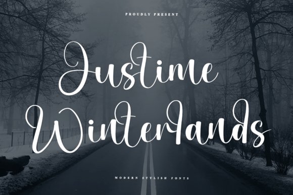
Justime Winterlands leans into ornamental calligraphy with frosted terminals and generous loops that evoke a wintry, handcrafted feeling. Decorative ligatures and roomy counters let short headlines and product names read like crafted ornamentation rather than plain text. The font thrives when shown large, so it’s ideal for seasonal packaging, event headers, and boutique labels that benefit from expressive letterforms.
Because of its flourish-heavy shapes, apply generous leading and restrained color contrasts to prevent visual clutter. Pair it with a neutral slab or geometric sans for small copy so the script can remain the visual anchor. Use OpenType alternates selectively to introduce variety and avoid repetitive patterns in repeated words.
╰┈➤ Download Justime Winterlands Font
My Recommendation: I use Justime Winterlands when a design needs character and a seasonal touch – holiday tags, festive menus, and boutique signage come to mind. Its ligatures and alternates allow quick customization without drawing on illustration. Keep surrounding elements minimal so the script can shine without competing details.
33. Hevin Font
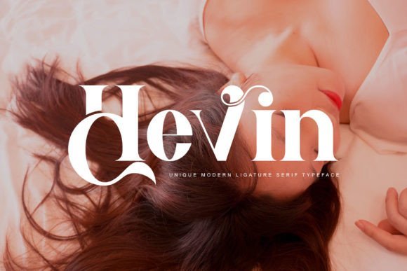
Hevin is a refined serif with geometric underpinnings: clean stems, subtly tapered serifs, and open counters that lend a poised, modern temperament to headlines. The typeface balances classical proportion with contemporary letterforms, giving identity work and editorial spreads a measured, professional voice. Its PUA encoding gives access to extra glyphs and swashes, allowing tasteful typographic flourishes without complex font workflows.
Hevin performs strongly across print and screen; its moderate contrast supports a clear hierarchy while keeping text readable at varying sizes. Pair it with a humanist sans for interfaces or reserve the swashes for logo work to introduce personality without sacrificing clarity. Careful kerning and modest tracking adjustments make Hevin look especially precise in premium packaging and long-form headers.
My Recommendation: I pick Hevin when a project needs a serif that feels polished yet contemporary – brands, magazines, and premium labels benefit most. The included glyphs let me add flourish without juggling multiple families. Thoughtful spacing and a clean sans partner keep its geometry from feeling stiff.
34. Angelyne Wedding
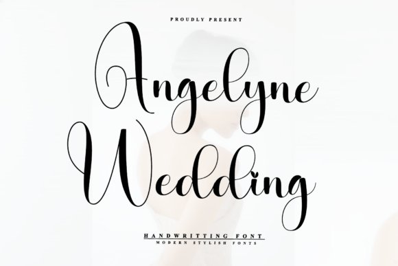
Angelyne Wedding is a rhythmic script with high-contrast strokes and expansive loops that read like a modern calligrapher’s hand. Its thick downstrokes and airy connectors create a visual rhythm that’s especially effective for short lines and display use, and it sits naturally among Fonts for Instagram Posts when you want romantic, handcrafted headlines. The bouncy baseline and long ascenders lend personality without feeling cluttered.
Technically, Angelyne provides careful kerning and multiple alternates to prevent repeated-pattern monotony and works best at headline sizes or for signature marks. For screen use, prioritize strong contrast and avoid long blocks of text; pair it with a restrained sans to stabilize compositions. Its flourish-driven voice matches wedding announcements, boutique packaging, and seasonal campaign headers.
My Recommendation: I reach for Angelyne Wedding when a piece needs a handcrafted, luxurious touch-wedding invites, bridal social posts, or boutique product tags. The alternates and ligatures keep repeated lines from feeling stale, and its energetic motion reads intimate on tight layouts. I usually pair it with a neutral sans to keep legibility high while preserving the script’s character.
35. Alphabet Font
Alphabet is a refined handwriting face that balances classic calligraphic structure with restrained flourishes, which helps it remain legible beyond short headlines. The hairline connectors and measured loops give text an artisan feeling without overwhelming a layout, making it useful for logos and editorial titling. OpenType features such as ligatures and stylistic sets allow designers to swap ornate forms for cleaner alternatives when rhythm matters.
Practical use favors quote cards, boutique branding, and signature marks where a human touch matters but clarity cannot be sacrificed. It pairs well with condensed serifs or minimal geometric sans choices, and minor spacing tweaks keep longer lines readable. Clean vector outlines and consistent stroke contrast ensure dependable rendering across print and screen projects.
My Recommendation: I choose Alphabet when I need handwriting that reads elegant rather than playful-perfect for labels, book titles, and brand headers. Its alternates reduce repetition in recurring social posts and make multi-post campaigns look handcrafted. I usually keep color palettes muted so the letterforms remain the visual focus.
36. Nicola Claire
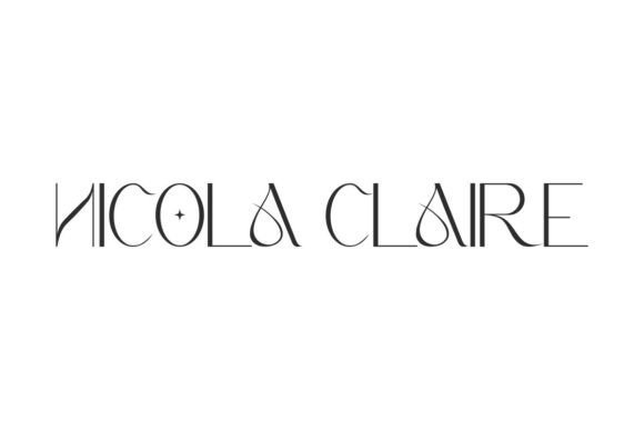
Nicola Claire is a light sans serif that pairs refined curves with disciplined structure to produce a quietly luxurious typographic voice. Proportions favor tall x-heights and open counters, giving it elegance at large sizes while retaining readability on screens. PUA encoding and broad language support make it practical for international branding applications.
The face performs strongly in identity systems for perfume, jewelry, and fashion, where minimal typography must communicate quality without ornament. On social graphics, modest tracking and monochrome palettes amplify its presence, while a soft script can provide an appealing counterpoint for editorial spreads. Predictable metrics and crisp outlines speed up layout iterations during production.
My Recommendation: I turn to Nicola Claire when a project demands understatement with presence-brand marks, hero web headlines, and boutique packaging benefit most. It reads premium without relying on heavy decoration, and the language support helps when scaling campaigns across markets. I typically increase tracking and give it ample white space to let the forms breathe.
37. Rages Font
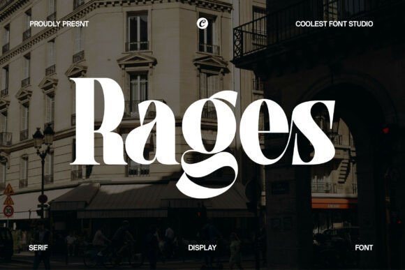
Rages is a modern serif with high-contrast strokes, graceful terminals, and decorative ligatures that give headlines a couture feel. Its stylistic alternates let you craft distinctive word shapes without extra effects, making it ideal for branding, editorial mastheads, and luxury packaging. The face adapts well to social imagery – including Fonts for Instagram Posts where profile grids and story covers demand a consistent, upscale voice. Use Rages for display sizes rather than dense body text to keep its details legible and impactful.
Spacing and kerning are thoughtfully drawn, though tight compositions often benefit from a touch of manual adjustment, especially when swapping ligatures. Pairing Rages with a neutral sans for body copy preserves readability while letting the serif carry personality across print and screen. The package includes OTF/TTF files and alternates that help create bespoke logotypes without custom lettering. For projects that need a high-fashion tone, Rages gives typography an immediate signature presence.
My Recommendation: I reach for Rages when a project needs a luxe yet contemporary voice; the ligatures and alternates deliver personality that feels bespoke. It’s perfect for magazine covers, boutique branding, and premium product labels where typography must stand out. Pair it with a clean geometric sans and reserve Rages for display use to keep the details crisp.
38. Sugo Gekai Font
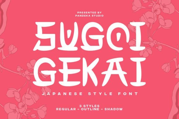
Sugo Gekai channels East Asian calligraphic forms into three distinct display styles – Regular, Shadow, and Outline – so designers can build layered headers without extra effects. The strokes carry a hand-brushed cadence that suits restaurant menus, festival posters, and themed packaging that benefit from cultural references. Each style reads clearly at poster and thumbnail sizes, making the family practical for merchandise, signage, and bold social headers. This typeface favours short bursts of text where character and atmosphere matter more than long paragraphs.
The Shadow and Outline variants are especially useful for creating perceived depth on flat backgrounds; stack them or combine Outline with fills for an ink-on-paper impression. Mind the letterspacing when using the Regular cut at smaller sizes, as the calligraphic terminals can crowd without added tracking. If you plan identity work, treat the glyph shapes as visual cues and test them against your color palette. Sugo Gekai performs best as a display voice that anchors visual themes rather than carrying dense content.
My Recommendation: I’d choose Sugo Gekai for restaurant identities, event posters, or packaging that nods to East Asian calligraphy without resorting to cliché ornament. The three styles let me build hierarchy and depth without extra production steps. It shines when you want bold, thematic headers that read instantly and feel handcrafted.
39. Silent Dream Font
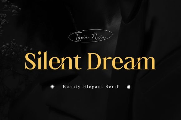
Silent Dream is a refined serif with soft terminals and a graceful rhythm that leans feminine and chic, suited for fashion, beauty, and boutique projects. Lighter weights feel airy in editorial pull-quotes and product labels, while the bolder cuts provide presence for logos and headlines. The overall impression is quiet refinement: it suggests careful craftsmanship without overt ornament. Use it where subtle personality is preferred over loud typographic gestures.
Kerning is tidy and the ascenders balance well against open counters, which helps readability in short blocks and social captions. For branding, pair Silent Dream with a minimalist sans or a restrained script to add contrast; for packaging, increase tracking to preserve clarity on textured substrates. It handles RGB and print reliably, but always test tiny point sizes before committing to body text. The family is compact but thoughtfully spaced for refined display work.
╰┈➤ Download Silent Dream Font
My Recommendation: I favor Silent Dream for wedding stationery, boutique branding, and beauty editorials because it reads delicate without feeling twee. It brings a calm, upscale tone to labels and headers. When I use it, I pay special attention to spacing and pairing to preserve its understated charm.
40. Clements Morgle Duo
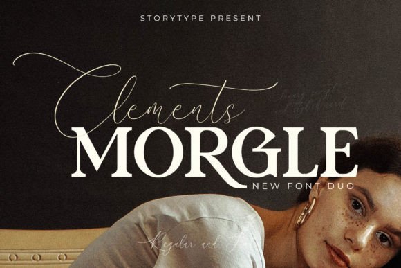
Clements Morgle Duo pairs a crisp serif with a flowing script that creates contrast and refinement ideal for visual storytelling. The serif brings vertical emphasis and sculpted terminals while the script provides airy swashes for signatures and overlays, and the family is PUA encoded so stylistic alternates and ligatures are accessible without extra tooling. Use this pairing for quote cards, product callouts, and editorial-style feed posts-it’s a strong candidate among Fonts for Instagram Posts when you want a refined, magazine-like aesthetic for captions and images.
Technically the two styles balance one another: reserve the serif for bold headlines and the script as a signature accent to avoid visual clutter, and expect forgiving kerning and line-height at display sizes. The script’s heavier strokes still read well on phones when used sparingly; try pairing with a neutral sans for body copy in carousels or placing the script over negative space for logos. The result reads upscale without fuss, making it useful for boutique branding, invitations, and polished product announcements.
╰┈➤ Download Clements Morgle Duo
My Recommendation: I reach for Clements Morgle Duo when a project needs a polished, editorial look-wedding brands and small-batch makers get the most mileage from this pairing. The PUA features speed up production in mobile editors, and the script gives an authentic handwritten counterpoint to the serif. I’d use it for hero images, announcement posts, and elegant quote cards where typography must feel curated.
41. Baleny Duo
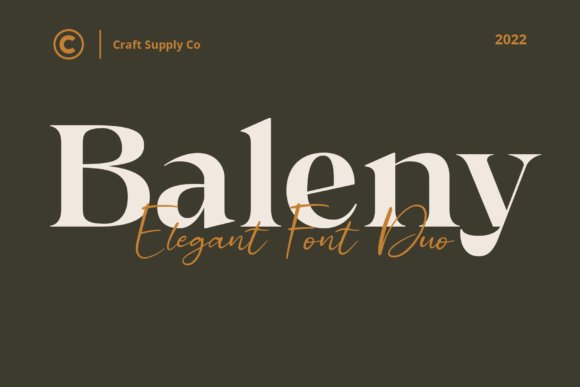
Baleny Duo combines a poised serif with a complementary script to produce rhythmic typography that reads intentionally crafted. The serif features graceful terminals and open counters that hold clarity at medium sizes while the script contributes motion with looping connections and contextual alternates. That measured interplay makes the duo a natural pick for stationery, brand marks, and social headers where a touch of refinement matters.
OpenType features like ligatures and stylistic sets expand creative options, from decorative lockups to toned-down captions. On social imagery, use the serif for stacked headlines and save the script for signatures or accents so small-screen legibility stays intact. Pair Baleny with a clean geometric sans for body text to maintain modern readability while keeping the overall tone refined and calm.
My Recommendation: I use Baleny Duo when a client wants quiet sophistication rather than loud ornamentation. Its measured rhythm makes invitations, boutique branding, and editorial cards feel deliberate and crafted. The accessible alternates let me produce distinctive lockups quickly, which is invaluable for tight deadlines.
42. Malibu Sunday
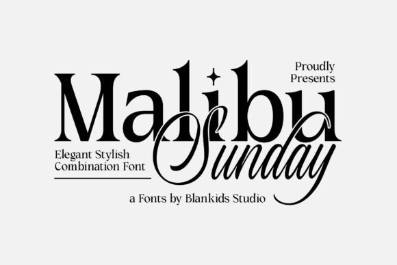
Malibu Sunday presents a refined duet of serif and script with a classical character suited for display use in logos, packaging, and posters. Uppercase and lowercase forms are drawn with balanced proportions so headlines feel formal yet approachable, and the script supplies graceful signatures and watermark possibilities for overlays. Designers will appreciate the consistency across weights and how the pairing reads reliably in print mockups and on-screen previews.
The family includes numerals, punctuation, and standard alternates that simplify layout tasks; the serif holds up at large sizes while the script works best as a subtle accent. For social visuals, slightly increase tracking on the serif in tight compositions and keep the script concise to avoid crowding. Malibu Sunday fits lifestyle labels and boutique product lines that want composed typography with character.
My Recommendation: I pick Malibu Sunday when a client asks for classic styling with a contemporary sensibility. The serif carries headlines without competing with imagery, and the script adds a personal touch for signatures and labels. It’s my go-to for packaging, poster series, and brand identities that need a composed, editorial tone.
43. Afregky Font

Afregky’s high-contrast serifs and elongated terminals give headlines a refined, romantic voice that stands out in image-based content. Its accentuated swashes work particularly well for lifestyle imagery and quote cards, key examples of Fonts for Instagram Posts where visual personality matters and mobile legibility is still required.
Turn on stylistic alternates and ligatures to craft handcrafted headlines, then pair Afregky with a plain geometric sans for body copy to preserve clarity. Pay attention to letterspacing on small crops and test it at social sizes; the font scales cleanly but benefits from modest tracking adjustments on tight compositions.
My Recommendation: I use Afregky for wedding announcements, boutique product features, and romantic quote graphics because it injects warmth without losing readability. The swashes give images an artisanal touch that reads well on phones. Pairing it with a neutral sans keeps layouts modern and ensures captions remain clear.
44. Glutern Font
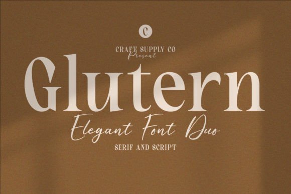
Glutern combines a restrained serif with an energetic script to create a polished contrast that feels editorial rather than fussy. The serif handles longer lines and microcopy with steady rhythm, while the script provides personality for names, highlights, or signature elements that demand attention.
Use the serif as the backbone for body text and reserve the script for accents-product labels, event promos, or social CTAs-so the hierarchy stays obvious in square feeds. Small tweaks to line-height and tracking will keep both styles readable on stories and post thumbnails without sacrificing the pairing’s stylish character.
My Recommendation: I recommend Glutern for boutique brands, cafés, and lifestyle profiles that want a refined presence with a playful signature. It’s great when you need dependable body text and a standout accent for logos or headlines. Mix weights thoughtfully to guide the viewer through each post.
45. Brown Marlyn Duo Font
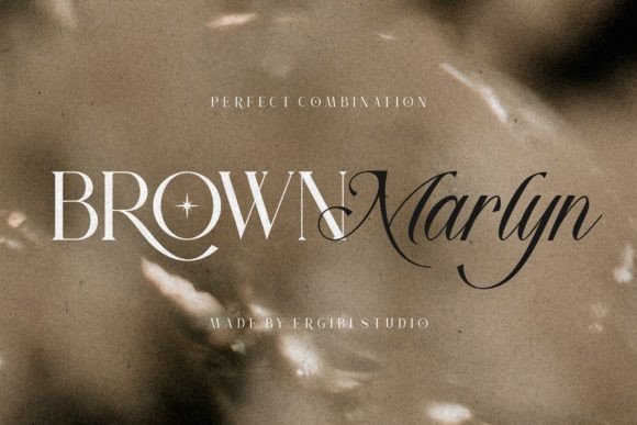
Brown Marlyn Duo pairs a confident serif with a flowing script designed for strong display use and decorative accents. The font set is PUA-encoded, so alternates and ligatures are readily available in most editors, which speeds up the creation of varied headlines and ornamented captions across multiple images.
This duo works well on attention-grabbing covers, packaging mockups, and seasonal promos where the script adds charm while the serif maintains structure. On Instagram, set the serif as the primary block text and layer the script sparingly over negative space to keep contrast high and readability intact.
╰┈➤ Download Brown Marlyn Duo Font
My Recommendation: I reach for Brown Marlyn Duo for product reveals and holiday grids because its script injects personality while the serif keeps compositions grounded. The accessible glyphs make it fast to produce multiple headline variations. It pairs beautifully with textured backgrounds and restrained color palettes.
46. Marney Holland
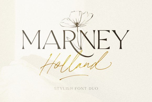
Marney Holland pairs a flowing signature script with a polished serif, built so the two styles read as one family. When choosing Fonts for Instagram Posts, this pair stands out: the script injects personality into captions and story stickers while the serif provides clear, compact headlines and credit lines. The package is PUA encoded, giving direct access to swashes, ligatures, and alternate glyphs that make micro-adjustments simple.
The script’s varied strokes and the serif’s restrained contrast make this duo especially useful when you need contrast without clutter; use the script for short, expressive overlays and the serif for slide copy or profile banners. Font metrics and spacing feel considered, so you can set tight compositions for mobile feeds without losing legibility or style.
My Recommendation: I reach for Marney Holland when I want a personal, editorial vibe on a small screen. The script adds signature flair for quotes and wedding posts, while the serif keeps carousel body text readable. Its PUA features save time when I need alternate swashes for a fresh look across multiple posts.
47. Dealoras Trio
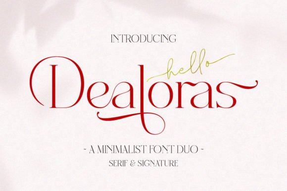
Dealoras Trio contains three complementary voices: a display face for attention-grabbing covers, a refined serif for longer blocks of text, and a script for ornament and emphasis. The trio is PUA encoded so alternate characters and decorative swashes are immediately available, which helps create distinctive headers, promotional tiles, and story highlights without hunting for extra assets. Each style shares proportions that keep layouts consistent across posts.
For feeds that rely on typographic hierarchy, this family gives clear roles-headline, body, accent-so you can design a multi-slide post with visual order. The display weight holds up on bold cover images, while the serif reads well in captions and in-app previews, and the script punctuates calls-to-action or logos with personality.
My Recommendation: I use Dealoras Trio when a single campaign needs a unified look across banners, captions, and short videos. The matched proportions mean I rarely wrestle with mismatched spacing, and the script adds just enough ornament to feel handcrafted. It’s a practical pick for branded promos, launch announcements, and editorial social posts.
48. Magnesian
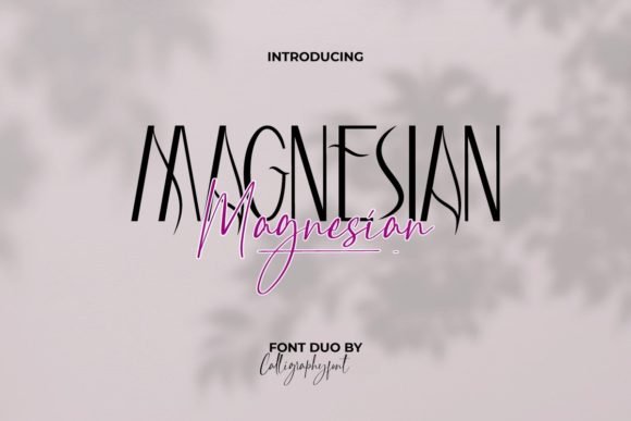
Magnesian pairs a clean sans serif with a handwritten script that were designed together so swapping one for the other never breaks the visual flow. That intentional match keeps an Instagram grid fresh: the sans can carry product captions and price tags while the script provides signature headlines and decorative flourishes. The typeface is PUA encoded, so alternate swashes and special characters are easy to use directly in design apps.
The contrast between the sans’s geometric economy and the script’s lively strokes creates a clear voice without feeling forced, which is especially useful for beauty, wedding, and boutique branding. Because spacing and x-heights are aligned, you can mix the two on the same card for layered layouts that remain readable at phone sizes.
My Recommendation: I pick Magnesian when projects need a refined yet approachable look that still feels human. The matched duo keeps my layouts coherent while giving me a quick way to inject warmth with the script. It’s ideal for product posts, pricing cards, and any feed that benefits from a clean-but-personal typographic tone.
49. Montelgo Duo
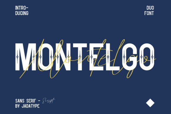
Montelgo Duo pairs a flowing script with a pared-back sans serif to create a refined contrast ideal for branding and editorial headers. The script shows long connecting strokes and smooth terminals that read well at display sizes, while the sans brings narrow proportions and generous counters for clean on-screen readability. As one of the Fonts for Instagram Posts I reach for when building a cohesive feed, it helps craft polished cover images, quote cards, and logo marks without feeling fussy.
In practical use, Montelgo gives warm character without sacrificing clarity: set the script for signatures and hero lines and reserve the sans for pricing, captions, and navigation. Alternate glyphs and careful kerning keep the script legible at tighter sizes, and the sans scales crisply across story stickers and thumbnails. The result is a fashion-forward voice that suits boutique identities, magazine layouts, and lifestyle product labels.
My Recommendation: I pick Montelgo Duo when a project needs a refined, approachable look: the script injects personality while the sans keeps content legible across mobile and desktop. Its alternates let me tune how playful or restrained the brand feels, and the pairing adapts well from logos to Instagram tiles. Use it for boutiques, editorial projects, and any feed that aims for a polished, contemporary presence.
50. Fox Nuvira & Fox Petalia
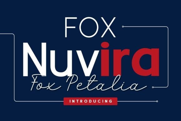
Fox Nuvira is a geometric sans family offered in Thin, Regular, and Bold weights, designed for tidy headlines, navigation, and magazine subheads. Fox Petalia answers with a handwritten script that has lively curves, irregular terminals, and a believable pen-driven rhythm ideal for invitations and product tags. Together they provide a clear structural base plus a handcrafted accent that reads as both professional and personal.
When you pair them, use Nuvira to establish hierarchy-menus, bylines, and body blocks-and let Petalia act as the focal flourish for names, quotes, or badges. Keep the script sized and weighted to preserve legibility against photos, and use Nuvira’s heavier styles for marks that must carry across tiny thumbnails. This combination works well for boutique e-commerce, editorial social posts, and wedding collateral where a clean baseline with a human touch matters.
╰┈➤ Download Fox Nuvira & Fox Petalia
My Recommendation: I turn to Fox Nuvira & Fox Petalia when a project needs structure with personality: Nuvira builds readable grids while Petalia adds warmth and charm. The clear weight range in Nuvira simplifies responsive layouts, and Petalia’s hand-drawn feel sells craft-focused products and intimate stationery. It’s a solid choice for brand systems, packaging, and social templates that want tidy order alongside handcrafted highlights.
Try a handful of these 50 fonts in your next batch of posts, test pairings, and check how each type reads at small sizes. Pay attention to contrast, line spacing, and whether a font supports the characters you need.
Use the list as a toolkit for better IG typography, balancing aesthetics with legibility so your captions and graphics communicate clearly to your audience.