32 Elegant Luxury Sans Serif Fonts for High-Fashion Editorials in 2026
Luxury Sans serif fonts offer a refined, minimalist voice that suits high-fashion editorials, boutique packaging, and upscale websites. These faces often balance open counters with subtle stroke contrast to convey restraint without ornament.
This article profiles 32 standout sans options across geometric, humanist, and neo-grotesque categories. You’ll find notes on mood, best-fit use cases, weight and width choices, and pairing tips so selecting the right face is quick and confident.
1. Pogonia Font
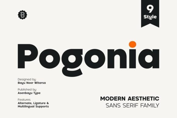
Pogonia is a modern aesthetic sans serif that balances geometric precision with a humanist warmth. Its restrained letterforms and open counters create a clean, airy presence suitable for logos, posters, social feeds and fashion websites. Among other options, it reads as one of the reliable Luxury Sans serif fonts
Proportions favor a mid-high x-height and crisp terminals, which improves legibility at display sizes while remaining usable for UI labels. Subtle stroke modulation and careful kerning reduce awkward collisions and make pairing with a serif straightforward. I find it particularly effective in identity systems and packaging where a refined, minimal voice is needed.
My Recommendation: I use Pogonia when a project calls for clear geometry with a touch of warmth-brand marks, boutique labels and editorial covers. The type’s spacing and weights make it easy to build consistent hierarchies without extra typefaces. It’s a safe pick for fashion-forward sites and printed hangtags where readability and restraint matter.
2. Choco Font
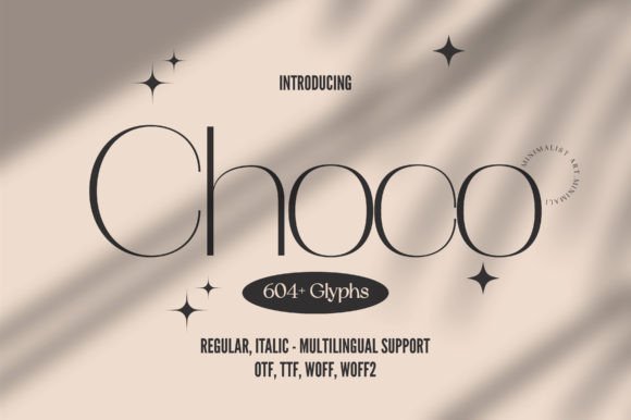
Choco is a minimalist sans serif defined by delicate thin strokes and an elegant silhouette that reads like contemporary stationery. With 604 glyphs across roman and italic styles, it supports extended languages and alternates useful for bespoke logotypes. That breadth makes Choco feel like a finished toolkit for refined identities and premium packaging.
Its hairline cuts favor display use and high-resolution layouts; small sizes can lose contrast, so use heavier weights or increased tracking for body text. The italic shapes carry a subtle calligraphic motion that works well in headlines and pull quotes. Pair Choco with a compact serif or a neutral geometric face to create typographic balance in multi-column spreads.
My Recommendation: I turn to Choco when a project needs an elegant, minimalist voice-magazine covers, boutique labels and premium web headings fit it well. The large glyph set gives flexibility for typographic detail without adding more fonts. Be mindful of the thinnest weights on low-DPI displays; they shine best at larger sizes.
3. Lignée Font
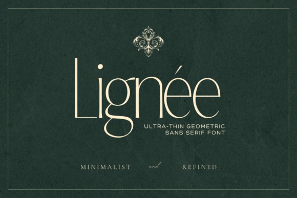
Lignée adopts an ultra-thin approach to sans-serif design, with proportions that nod to classic editorial types while keeping a hand-drawn openness. The lines are precise without feeling mechanical, which gives the face an architectural poise softened by subtle irregularities. It reads like a high-end option for boutique branding and luxury print pieces.
Optical spacing and tuned kerning make Lignée suitable for tight columns and invitation suites that need controlled letter spacing at large sizes. Because strokes run very fine, ink spread on uncoated stock or low-resolution screens can blunt details, so choose coated papers or sharp SVG rendering for best results. Use Lignée when you want headlines and logotypes to whisper rather than shout.
My Recommendation: I pick Lignée for upscale editorial work, invitations and luxury branding where delicate letterforms set a refined mood. It rewards careful production choices-good paper stock or crisp web rendering amplifies its strength. For projects seeking a quiet, premium presence, Lignée offers restraint and considered detail.
4. Mally Font
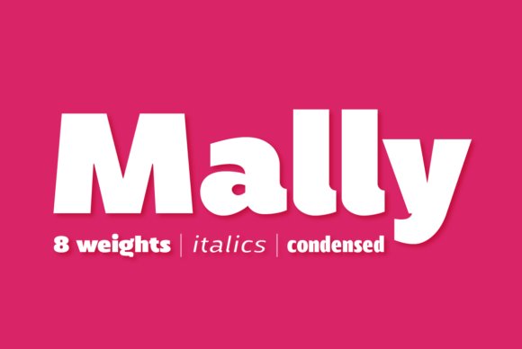
Mally is a humanist sans family built around clarity and nuance, offering 32 styles as a variable system that spans eight widths and their italics. Mally sits comfortably among Luxury Sans serif fonts with its refined proportions, 594 glyphs per font, and thoughtfully drawn alternates that make small-size text feel crisp and lively. The variable axes allow smooth weight and width transitions, letting designers tune presence without swapping files.
Readability is a clear priority: open counters, a balanced x-height and careful kerning keep lettershapes legible at micro sizes while still feeling contemporary in headlines. Extended Latin coverage and multiple alternates make it a practical choice for international brand work, UI typography, editorial columns and packaging where nuanced letterforms and flexible weights matter.
My Recommendation: I would reach for Mally when a project needs humanist warmth plus technical flexibility – its variable weights and widths let me fine-tune hierarchy without juggling multiple families. The generous glyph set and alternates make it ideal for brands that publish in several Latin languages or need elegant micro-typography. Use it for websites, magazines, and premium packaging where legibility and personality must coexist.
5. Condensed Collection – 10 Tall Set
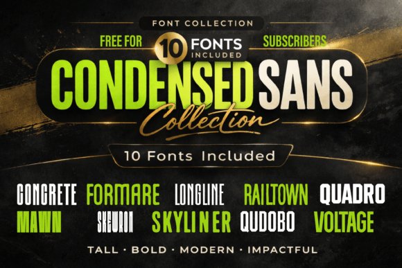
This condenses ten tall sans designs into one focused package, each face crafted for tight vertical rhythm and assertive display work. The set ships with Regular and Italic styles, full-case alphabets, numerals and essential punctuation, engineered for compact headlines and logo use where width is at a premium. Strong vertical stems and geometric construction create immediate presence without adding visual clutter.
These condensed faces perform best where impact and economy of space are required: posters, mastheads, product labels and modern retail signage benefit from their compressed forms. Pay attention to tracking and optical spacing when setting long runs; pairing a neutral text face with these tall caps maintains legibility while preserving the bold attitude of the headlines.
╰┈➤ Download Condensed Collection – 10 Tall Set
My Recommendation: I recommend this collection when you need bold, space-efficient typography that commands attention in tight layouts. Its tall proportions are excellent for urban posters, brand wordmarks and packaging lines where surface area is limited. Be ready to tweak spacing for dense copy, and pair with a softer body face to balance the overall composition.
6. Awesome Everyday Duo
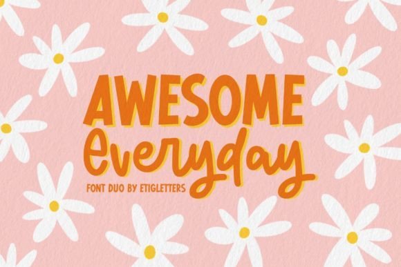
Awesome Everyday Duo combines a playful handwritten script with a clean sans companion to create a friendly, approachable typographic voice. The script offers lively strokes, alternate characters and contextual ligatures while the sans provides solid support for body text, headlines and badges-perfect for stickers, cards and cheerful product labels. The contrast between hand-drawn warmth and geometric restraint gives designs a handcrafted but professional feel.
Because the pairing is intentionally informal, it shines in packaging for small-batch goods, event collateral and social graphics that aim for personality over polish. Use the script for focal points and the sans for utilitarian copy; adjust weight and letterspacing to keep decorative letters legible at various sizes and on textured substrates.
╰┈➤ Download Awesome Everyday Duo
My Recommendation: I’d pick Awesome Everyday Duo for projects that need a happy, human touch-think boutique packaging, party invites, and playful brand identities. The script brings character while the sans keeps communication clear, making it easy to craft friendly hierarchies. It’s especially useful when you want handmade charm without sacrificing readability across formats.
7. Artezy
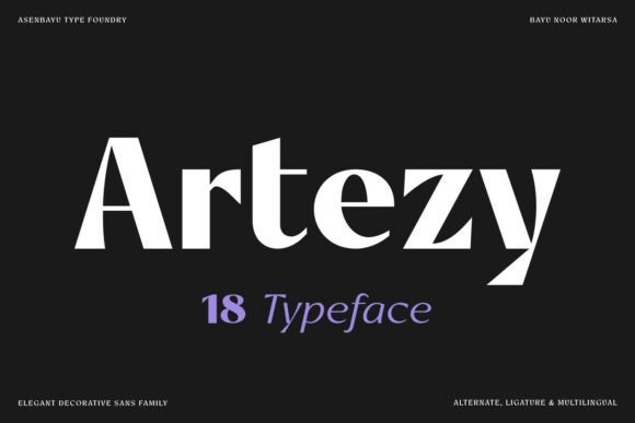
Artezy is an 18-font sans serif family that pairs delicate hairlines with strong stems to create a polished, high-contrast voice. As one of the Luxury Sans serif fonts , it balances tall ascenders and compact counters so headlines read with authority while staying legible at display sizes. The shapes feel deliberate rather than ornamental, which makes the family appropriate for logos, magazine mastheads, upscale packaging and premium web headers.
Weights range from whisper-thin to assertive black, and each style shows careful spacing and kerning that simplify type setting for identity work. Use the lighter cuts for elegant body text on luxury product pages and the heavier cuts for wordmarks and labels that must register from a distance. The overall character is refined and slightly dramatic without sacrificing clarity.
My Recommendation: I reach for Artezy when a project needs a restrained yet unmistakably premium tone. Its breadth of weights makes it easy to build cohesive identities that carry from print to digital. For high-fashion editorials, fragrance packaging and boutique branding, Artezy gives an upscale voice with reliable typographic control.
8. Melon Qatar
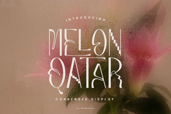
Melon Qatar is a tall, contemporary sans serif that stands out with elongated proportions and sleek terminals, giving words a statuesque, editorial feel. Alternate characters introduce subtle wave-like curves that add motion to headlines without undermining legibility, and the included ligatures smooth transitions for a cohesive display look. The face reads especially well on posters and large-format signage where its vertical emphasis becomes a focal point.
Spacing is generous enough for dramatic headline use yet tight when you need compact wordmarks, so Melon Qatar adapts to high-contrast layouts and minimalist compositions alike. Pair it with a neutral sans or a low-contrast serif to balance its height and to avoid visual fatigue in longer pieces. Designers will appreciate how the alternates and ligatures create tasteful flourishes in branding and advertising art.
My Recommendation: I would use Melon Qatar for fashion campaigns, hotel signage and poster series that require strong, elegant headlines. The alternates let you introduce personality without custom lettering, and the ligatures keep extended headlines feeling unified. It’s a solid choice when you want presence and refinement in display typography.
9. Ralokun
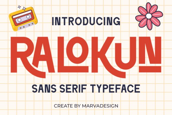
Ralokun is a retro-inspired sans serif that channels mid-century simplicity through clean strokes and minimal ornament. The letterforms feel familiar and friendly thanks to slightly rounded terminals and steady proportions, which preserves readability across print and screen. While it nods to vintage type, the overall execution is modern enough to avoid feeling dated.
This face works well for packaging, posters and editorial headings where a touch of nostalgia is desirable without sacrificing clarity. Use bold weights for signage and lighter cuts for subheads; combine with textured backgrounds or warm color palettes to enhance its old-school charm. Ralokun is a dependable display face for projects that want personality with legibility.
My Recommendation: I pick Ralokun when a project needs approachable vintage character-think craft labels, cafe menus and indie magazine layouts. Its clean execution keeps the retro mood readable and adaptable. For brand work that leans on warmth rather than ornament, Ralokun provides personality without fuss.
10. Shamper Font
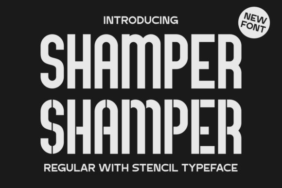
Shamper offers two tightly related voices: a clean, straight-lined sans and a cut-out stencil variant that keeps the same proportions while inserting intentional breaks in each glyph. The regular style reads well at small sizes and on screens, while the stencil option reads as a raw, industrial display – think signage, apparel labels, and gritty poster art – and when combined with metallic textures it sits comfortably among Luxury Sans serif fonts
The letterforms show controlled contrast and a practical x-height, which helps with predictable kerning and consistent color on the page. Use lighter weights for extended copy and reserve the stencil for headlines or branded marks where a constructed, mechanical feel is desired.
My Recommendation: I reach for Shamper when a project calls for a dependable sans with an attitude – classic legibility from the regular cuts and immediate presence from the stencil. Its pairing options let me create a refined package: body copy in the clean weights and bold display work with the stencil. Ideal for packaging, urban posters, or any identity that needs a hint of industrial grit without sacrificing clarity.
11. Cutta Font
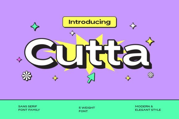
Cutta presents a wide spectrum of weights that let designers shape visual hierarchy without adding extra typefamilies, from near-hairline strokes to dense, headline-ready cuts. The forms favor straight terminals and modest geometric influences, so text maintains excellent clarity while heavier weights deliver strong presence for posters and brand logotypes.
Spacing is balanced to support both short display lines and longer copy blocks, making Cutta a good fit when you want a single sans family to handle packaging, web headings, and editorial captions. Pair it with a neutral serif or a condensed display face to build contrast while keeping a cohesive overall tone.
My Recommendation: I pick Cutta for projects that need a single reliable family across print and digital: it gives enough weight variety to set type systems without juggling multiple fonts. The crisp shapes read well at small sizes and stand out in large formats, so I use it for brand identities, posters, and interface headers. It’s especially helpful when timeline or budget restricts using many different typefaces.
12. Schedule Font
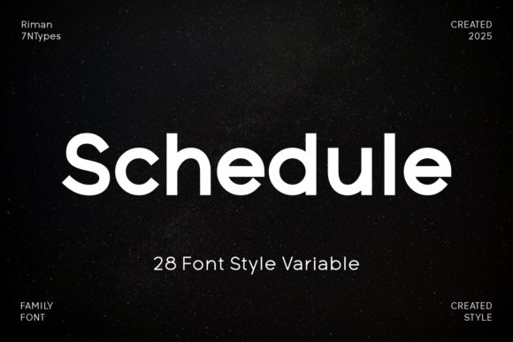
Schedule is a refined sans with calm proportions and open counters that make it comfortable in both display roles and tight settings like captions or UI labels. Its neutral rhythm and considered stroke endings yield an authoritative voice for logos, headlines, and subtitles while staying unobtrusive where clarity is the priority.
Small adjustments to weight and tracking let Schedule read warm or formal depending on context, which makes it a flexible choice for corporate identities and editorial layouts. Designed for crisp on-screen rendering, it pairs well with muted palettes and high-quality photography to convey a restrained, premium sensibility.
My Recommendation: I choose Schedule when a project needs quiet confidence: it’s clean enough for corporate branding yet subtle enough to support long-form layouts. Its even rhythm and readable shapes make building systems straightforward, so I rely on it for annual reports, professional services identities, and web interfaces. The result feels polished without calling attention to the type itself.
13. Ut Moringans
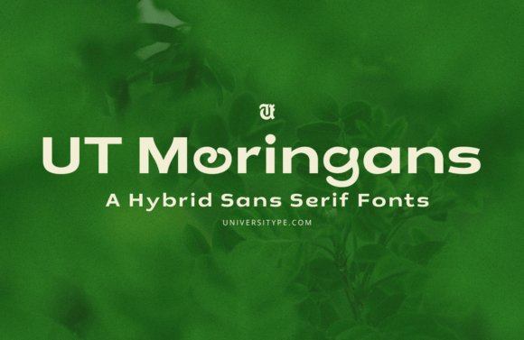
Ut Moringans translates the moringa leaf into letterforms: a geometric sans skeleton softened by subtle flares and rounded terminals that hint at veins and petiole curves. The result reads crisply at small sizes while carrying a warm, organic flavor for headlines and brand marks. Ut Moringans sits comfortably among Luxury Sans serif fonts and offers alternate hand-drawn characters and stylistic sets that introduce playful punctuation without sacrificing clarity.
This family works well for green-focused identities, wellness packaging and editorial spreads where a botanical touch is needed without cliché. OpenType features include contextual alternates, full kerning, currency glyphs and fractions, which keeps it useful for both display and extended copy. The range of weights supports bold hero type or restrained body text, and the organic accents pair nicely with textured paper or matte finishes.
My Recommendation: I reach for Ut Moringans when a brand must feel approachable and sustainably minded while remaining legible across print and web. The hand-drawn alternates let me add personality to labels or menus, yet the disciplined letterforms keep long copy readable. Ideal for boutique product lines, lifestyle magazines and environmental projects that want warmth without gimmickry.
14. Sunday Office
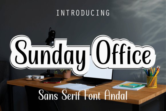
Sunday Office channels a relaxed, coffee-shop mood into a sans that feels upbeat without being whimsical. Slightly condensed proportions and rounded counters create a rhythmic texture that works beautifully on covers, posters and bold headers while remaining legible on screens. The family includes alternates that add springy terminals for display work and a solid weight range for typographic hierarchy.
Seasonal campaigns benefit from its cheerful voice: use heavier weights for energetic summer promos or softer styles for winter greeting cards. It also performs well in social graphics and merchandising where tone matters more than strict neutrality. Pair it with a modest serif for editorial balance or let it stand alone for refreshingly friendly packaging and identity systems.
My Recommendation: I recommend Sunday Office when a project needs warmth and personality, such as coffee brands, indie publications or retail campaigns. Its alternates are perfect for logotypes and hero headers, while the family’s spacing holds up across digital and print. Choose it when you want type that feels handcrafted but remains reliable.
15. Bland Beart
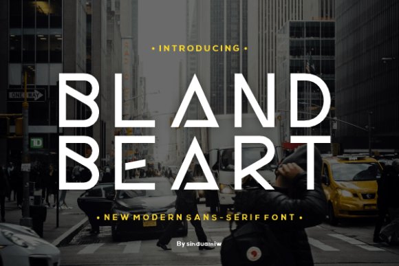
Bland Beart is a minimalist sans that emphasizes clarity and economy of form: open apertures, even stroke contrast and measured spacing make text feel neutral and highly readable at small sizes. Regular and bold weights are especially dependable for user interfaces, wayfinding and corporate documentation where distraction is unwelcome. It ships with a full glyph set and carefully tuned kerning for practical typography needs.
Rather than ornament, Bland Beart offers restraint that lets imagery and color take the lead in a layout. Its neutral voice suits startups, apps and technical reports where accessibility and quick comprehension are priorities. Combine it with an expressive display face if the brand needs character while keeping Bland Beart as the steady typographic backbone.
My Recommendation: I reach for Bland Beart when a project calls for function-first typography-dashboards, product UIs and investor decks are common fits. It keeps the interface unobtrusive while maintaining precise alignment and legibility across devices. Use this font when neutrality and readability should guide every layout decision.
16. Eutherlin Font
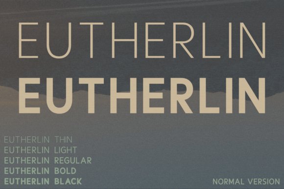
Eutherlin ranks among Luxury Sans serif fonts when projects require measured elegance; its five weights give designers a simple tonal palette from whisper-light captions to confident headlines. The letterforms are pared back and meticulously balanced, with slightly condensed proportions that perform well in tight editorial columns and on large-format posters.
Kerning and spacing favor consistent word color, so extended copy remains calm while display treatments feel poised and refined. With optical corrections applied to each glyph, Eutherlin reads as modern but quietly opulent across brand identities, magazines, and cinematic poster work.
My Recommendation: I reach for Eutherlin when a client asks for quiet luxury instead of an attention-seeking display face. Its weight range makes building clear typographic hierarchies straightforward, and the refined shapes remain legible across sizes. Use it for fashion editorials, premium packaging, and identity systems that need a polished, restrained voice.
17. Arpine Font – Luxury Sans serif fonts
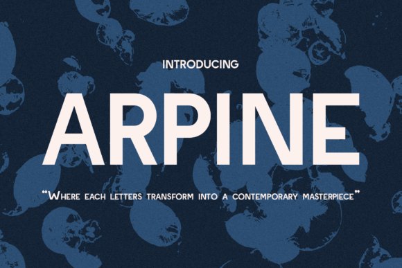
Arpine Font gives projects a contemporary, assertive personality through bold strokes and acute terminals that carve a distinctive silhouette. Unusual proportions and confident angles make it ideal for mastheads, posters, and labels that demand immediate recognition without resorting to ornament.
The heavier cuts deliver dramatic headlines while lighter weights preserve legibility in supporting elements; spacing has been tuned to keep multi-column layouts readable. For branding and packaging, Arpine thrives when paired with a neutral text face so its character can headline cleanly without competing with body copy.
╰┈➤ Download Arpine Font – Luxury Sans serif fonts
My Recommendation: I choose Arpine for work that needs clear typographic attitude – storefront signage, poster campaigns, or product labels that must stand out. Its bold letter shapes create memorable marks, especially at display sizes, and the lighter cuts let you build hierarchy. Pair it with a calm text face to retain readability while enjoying Arpine’s strong voice.
18. Evergrow Font
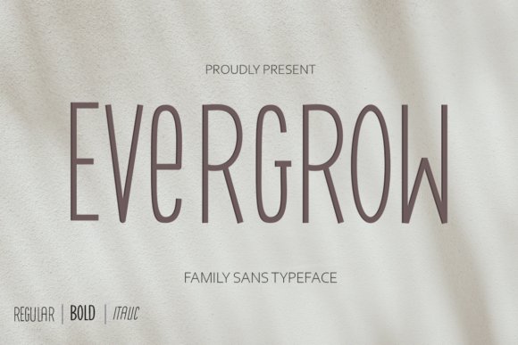
Evergrow Font family offers a soft, confident neutrality suited to invitations, business cards, and boutique branding; open counters and a moderate x-height give it warmth without excess flourish. The forms favor smooth joins and slightly rounded terminals, which aid legibility on both print stock and screens.
Because the family balances friendliness with restraint, it can carry both headline and supporting roles without visual friction. Pairing Evergrow with a restrained serif or a light grotesque creates a cohesive system for lifestyle brands, studio identities, and premium stationery.
My Recommendation: Evergrow is my go-to for projects that need understated elegance, such as wedding suites, boutique identities, and lifestyle product tags. It reads cleanly in small blocks of text while providing a gentle presence in headlines, so a single family can often cover most typographic needs. I typically combine it with a subtle serif or light grotesque to build a balanced, approachable system.
19. Sans Serif Bundle Collection
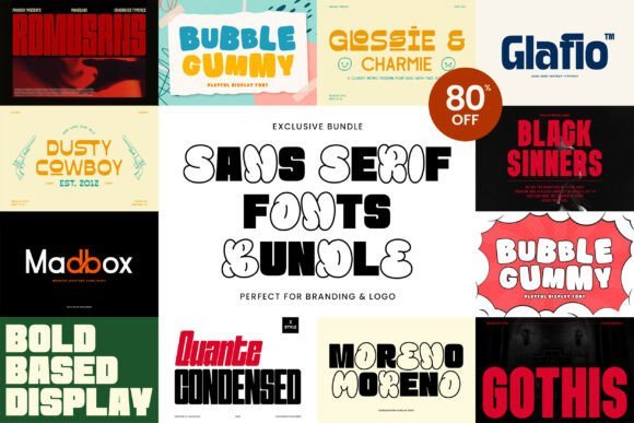
This Sans Serif Bundle Collection gathers a broad selection of modern and retro sans families, from assertive display faces to playful rounded options, giving designers a practical toolkit for branding, packaging, posters and social content. Included names like Moreno, Glossie & Charmie, Gothis and Bubble Gummy cover a wide tonal range so you can match type voice to product personality without juggling dozens of single-weight purchases.
For projects that demand Luxury Sans serif fonts , pairing Glossie & Charmie with Quante Condensed produces an elevated editorial look while Bubble Gummy and Madbox are perfect for lively merchandise and social art. The 80% savings makes it easy to test multiple directions quickly; just remember to check kerning and optical sizes on heavy display cuts so headlines read cleanly at every scale.
╰┈➤ Download Sans Serif Bundle Collection
My Recommendation: I keep this bundle ready for client work where budget and variety matter; it lets me audition very different type voices without extra licensing headaches. I would choose it for identity explorations, label work and campaign art because the mix covers polished and playful needs. When I need a quick switch from refined editorial to upbeat merchandise, this collection saves time and keeps the result cohesive.
20. Nova Grid Font
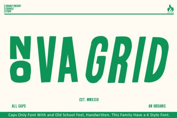
Nova Grid is an all-caps family that pairs bold proportions with handcrafted irregularities, producing headlines that feel energetic and authentic rather than mechanical. The slightly uneven strokes and open counters add character and texture, and the six available styles let you vary the intensity from raw and punchy to more muted caps without losing the face’s personality.
This face works best where display typography must read as human and lively: posters, apparel graphics, editorial covers and product labels. Use Nova Grid at large sizes or as short, emphatic lines of copy and pair it with a neutral geometric sans for body text; modest tracking and optical tweaks tidy the irregular shapes and improve legibility across sizes.
My Recommendation: I reach for Nova Grid when a brand needs headline energy with a handcrafted feel, especially for apparel, posters and artisanal product packaging. Its six styles let me fine-tune tone quickly, and pairing it with a plain geometric face keeps longer copy friendly to read. Small adjustments to tracking usually make all the difference with this one.
21. Mafia King Font
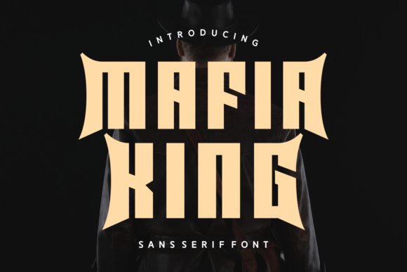
Mafia King is a bold sans collection with alternative cuts that nod to rounded spring forms and occasional slab-like details, resulting in a retro-meets-modern attitude ideal for expressive branding and covers. The family includes regular, italic and display options plus swash alternates and slab-adjacent companions, giving designers tools to craft logotypes and headlines with distinct personality.
Open counters and smooth terminals help quotes, magazine titles and apparel slogans register with confident presence, while the T-shirt-friendly glyphs and ornaments speed production for merch. Use swashes as accents rather than defaults and reserve the heaviest weights for marks and logos so the type maintains clarity across different applications.
My Recommendation: I pick Mafia King when a project needs bold personality without feeling gimmicky-think retro labels, editorial spreads and merch lines. The alternates and swashes are perfect for accents, and the core weights carry well in logotypes and packaging. I treat the decorative bits sparingly so the main wordmark stays strong and readable.
22. Naxia Font
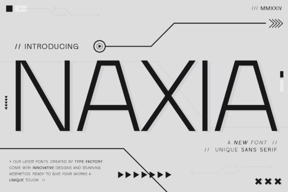
Naxia Font presents a contemporary sans serif voice with fluid, slightly condensed letterforms that balance clarity and quiet elegance. Naxia sits among Luxury Sans serif fonts , its smooth strokes and restrained terminals giving headlines an editorial poise while remaining calm in body copy. The shapes feel deliberate rather than ornamental, which helps content read confidently across screens and print.
Spacing and weight choices make Naxia perform well at small sizes yet deliver presence in display settings; its moderate contrast and tuned kerning prevent overcrowding in dense layouts. Pair a single bold weight with a neutral serif for layered systems, or let Naxia carry the whole palette for a consistent, refined brand tone. Use it when you want a premium look that reads clearly without flashy details.
My Recommendation: I would use Naxia for upscale brand identities, fashion editorials, or boutique product sites where clarity must feel considered and present. It gives logos and headlines memorable rhythm while staying perfectly readable in longform text. For projects that need a restrained, premium character without ornamental flourishes, Naxia is a practical, tasteful choice.
23. Naxotek Font
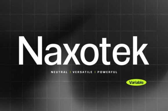
Naxotek Font is a precisely organized sans serif family built around consistent stroke weights and a deliberately large x-height to maximize legibility. The family includes multiple italics and a clear weight progression, allowing designers to create consistent hierarchies across editorial layouts and interfaces. Its low contrast and calm terminals keep the voice neutral yet confident, making it suitable for both long passages of text and striking headlines.
Because thicknesses match across styles, Naxotek simplifies typographic rhythm when switching between display and body usage, reducing the need for manual adjustments. The thin black option gives a refined display attitude while regular and medium weights carry bulk copy comfortably. Pick Naxotek when you want a no-frills, dependable type family that still offers expression through its italics and spacing choices.
My Recommendation: I tend to pick Naxotek for systems that require typographic consistency across touchpoints – corporate websites, printed catalogs, or packaging suites. Its matching thicknesses make hierarchy decisions straightforward, and the italics add tone without becoming decorative. If you need a restrained, reliable sans family that handles both UI and print, Naxotek earns a spot on the shortlist.
24. Unionruder Font
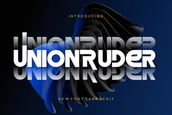
Unionruder Font is a clean, modern sans serif that focuses on open counters and efficient letterforms to enhance on-screen readability. The design favors neutral proportions and uncomplicated terminals, so text reads plainly and quickly – a benefit for interfaces and signage where comprehension is paramount. Tight but forgiving spacing helps preserve rhythm across varying sizes and media.
Its straightforward character set makes Unionruder a solid choice for corporate identities, wayfinding, and product interfaces that need a calm, readable voice. Combining it with a more expressive display face will create contrast while keeping overall readability intact. For projects prioritizing clarity over personality, Unionruder provides a steady, approachable foundation.
My Recommendation: I recommend Unionruder for projects where clarity is non-negotiable: enterprise UI, transit signage, or documentation sets. It pairs well with expressive display types when you want contrast without visual conflict. Test small sizes and line-height to ensure optimal legibility, and you’ll have a pragmatic, user-friendly type choice.
25. Avensa Font
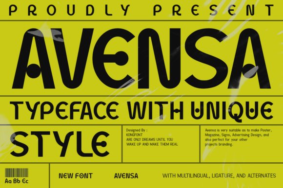
Avensa is a refined sans-serif with measured proportions and subtle terminals that give headlines a poised, high-fashion air. Avensa sits comfortably among Luxury Sans serif fonts , pairing narrow terminals with generous counters to balance presence and legibility on both print and screens. The family includes alternate glyphs and decorative swashes via PUA encoding, so designers can access stylistic sets without a separate tool.
Its neutral geometry lets it hold its own in brand systems, editorial spreads, and minimalist logo marks while still offering personality in display sizes. Try heavier weights for wordmarks and lighter cuts for captions; the kerning and hinting feel finished, which reduces micro-type adjustments. Avensa works well when you want typography that reads luxurious yet controlled.
My Recommendation: I reach for Avensa when a project needs a polished, high-end typographic voice without fuss. The PUA glyphs let me add subtle flourishes for headlines or logos without managing extra files. It’s a smart choice for fashion brands, boutique packaging, and editorial covers that demand restrained elegance.
26. Flowzic Font
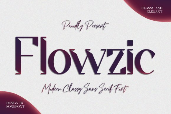
Flowzic blends a minimalist skeleton with flowing terminals, producing a contemporary typeface that softens harsher geometric sans styles. Rounded joins and open apertures create a warm reading texture while keeping the overall look modern and crisp. PUA-encoded alternates and swashes expand decorative options for headlines and logotypes without extra design steps.
Because of its humanist touch, Flowzic suits lifestyle brands, boutique packaging, and social graphics that need personality alongside clarity. Use lighter weights for longer text blocks and reserve bold cuts for hero banners or striking wordmarks. The result feels friendly and refined, with readable shapes across digital and print media.
My Recommendation: I pick Flowzic when I want approachable typography that still reads as premium. Its flowing terminals give logos and social content a handcrafted feel while remaining tidy in UI contexts. Ideal for boutique retailers, lifestyle websites, and packaging where warmth and modernity must coexist.
27. Erigo Font
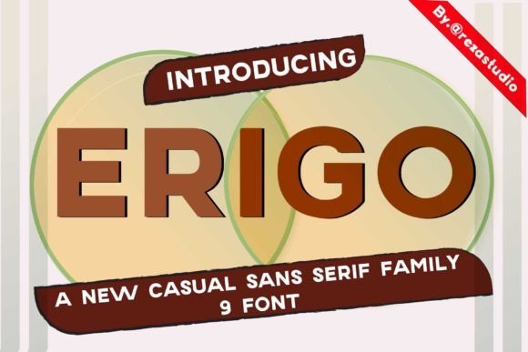
Erigo is a restrained sans-serif focused on clarity and economy of form, favoring straight stems and moderated curves for a steady rhythm. Open counters and consistent stroke contrast make it excellent for long labels, data tables, and body text that must remain legible at small sizes. Metrics are tuned to produce even color on the page, which benefits multi-column layouts and responsive interfaces.
Its neutral temperament works well for corporate identities, dashboards, and product literature where readability is the priority rather than ornament. The italic provides subtle emphasis without calling undue attention, keeping hierarchy clear and practical. Pair Erigo with a warm serif or a bold display face to introduce contrast when needed.
My Recommendation: I turn to Erigo when readability and consistency outweigh stylistic flourishes. It reduces the micro-adjustments designers often face with long documents or dense interfaces, and its steady rhythm makes typographic systems predictable. Use Erigo for corporate communications, SaaS dashboards, or any project that needs dependable, no-nonsense type.
28. Delphin Font
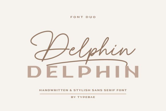
Delphin pairs a flowing handwritten script with a clean sans-serif to create contrast and balance. The script includes graceful swashes at the beginning and end of letters; type a1 for an initial swash and a2 for a terminal swash (the same applies to lowercase), and PUA encoding makes all glyphs and ligatures directly accessible. Delphin sits comfortably among Luxury Sans serif fonts , offering a refined voice that suits boutique branding and premium packaging.
The sans companion maintains moderate stroke contrast, open counters, and even spacing so it reads well from business cards to large-format posters. Use the script for signatures and headlines, the sans for captions and body copy, and tweak tracking when they appear together to preserve visual rhythm. Kerning pairs and stylistic alternates make it simple to craft unique wordmarks and lockups.
My Recommendation: I reach for Delphin when a design needs character without sacrificing clarity. The hand-script provides tasteful ornament while the sans keeps text legible, which makes it ideal for wedding stationery, boutique identity systems, and refined editorial spreads. Because the glyphs are PUA encoded, I can move quickly in Illustrator or InDesign without fiddling with feature panels.
29. Qomonna Font
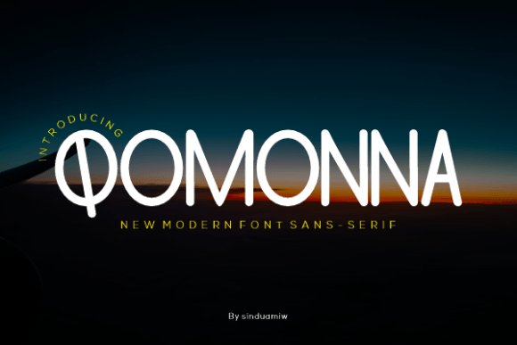
Qomonna is a straightforward sans with a high x-height, steady stroke width, and open counters that improve legibility on screens and in print. Its simple terminals and neutral proportions make it unobtrusive yet reliable for running copy, labels, and interface elements. The overall voice stays calm and utilitarian, which suits signage, digital products, and advertising where readability is the priority.
Spacing is tuned to avoid crowding at small sizes, and the family includes several weights to maintain hierarchy between headings and body text. Pair Qomonna with a textural serif or bold geometric artwork to add visual interest without sacrificing order. Its hinting and webfont behavior are predictable, so typography remains consistent across responsive breakpoints.
My Recommendation: I use Qomonna when clarity and neutrality are needed: dashboards, wayfinding, and corporate templates are all good fits. It holds up at small sizes and in condensed layouts, so type stays legible even in tight interfaces. For editorial projects, I prefer pairing it with a characterful serif to create readable contrast.
30. Equador Bolld Font
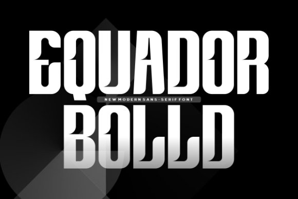
Equador Bolld is a heavy display sans built for headline impact: wide strokes, compact counters, and squared terminals give it a dense, assertive silhouette that reads from a distance. It functions like a vocal headline voice, grabbing attention on posters, retail signage, and packaging without ornamentation. Careful openings and spacing prevent the letters from filling in at coarser print resolutions, which keeps text legible in practical use.
For visual tension, pair Equador Bolld with a light sans or an elegant serif to create contrast and hierarchy. Small caps and tightened tracking intensify its compact, commanding presence, while slightly expanded spacing opens the texture for very large applications. Designers will appreciate its straightforward geometry when crafting bold logotypes and title treatments.
╰┈➤ Download Equador Bolld Font
My Recommendation: I pick Equador Bolld whenever a headline needs to dominate the page or storefront. It’s perfect for posters, product labels, and brand marks that must read instantly and with force. When using very large sizes I loosen letterspacing a touch to keep the forms readable and avoid visual crowding.
31. Phaquito Clask
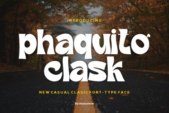
Phaquito Clask is a refined sans-serif that pairs a tall x-height with generous counters, yielding a formal but approachable voice for high-end typographic work. Its sculpted strokes and subtle terminal treatments give headlines a composed presence while remaining legible at small sizes, positioning it among Luxury Sans serif fonts suited to identity and packaging. The family ships with multiple weights, careful kerning, and optical spacing that preserve rhythm in both dense copy and bold display settings.
Alternates, small caps, and a handful of stylistic glyphs let designers fine-tune wordmarks without resorting to bespoke lettering, and the hinting keeps clarity on pixel-dense screens. Because the letterforms read with calm authority, Phaquito Clask works well for boutique magazines, luxury e-commerce, and high-end editorial projects where tidy proportions and subtle personality are required.
My Recommendation: I reach for Phaquito Clask when a brand needs a poised, luxury-oriented type voice without relying on ornament. Its weight range and alternates let me craft distinct logos and headlines quickly, while the spacing maintains legibility across responsive breakpoints. It’s a dependable choice for premium packaging, invitation suites, and refined web storefronts.
32. Somiery Primer
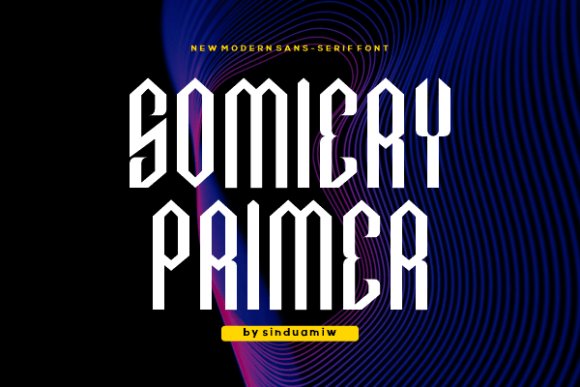
Somiery Primer is a warm, humanist-leaning grotesque that balances neutral geometry with soft, approachable letter shapes. Open apertures and steady stroke modulation make it easy to read at micro sizes, which is particularly valuable for interfaces and long-form digital copy. The face includes practical OpenType features-ligatures, tabular figures, and alternate numerals-that streamline editorial and UI workflows.
In larger settings its slightly condensed capitals deliver confident headlines without feeling aggressive, and the consistent rhythm of lowercase runs keeps column color even. Variable weight support allows subtle contrast adjustments for print or screen, making Somiery Primer a flexible system for corporate identity, apps, and publications that need personality without fuss.
My Recommendation: I recommend Somiery Primer when a project needs clarity and warmth together-think corporate sites, mobile apps, or member-facing dashboards. Its readable micro-sized forms and OpenType toolkit reduce the need for typographic compromises in UI. The variable axis is especially handy when matching tone across screen sizes and print collateral.
Focus on tone, legibility, and how each face performs at the sizes and weights you need. Try several weights in your real layouts, check letterspacing, and pair with a contrasting serif or neutral companion to create clear hierarchy.
With these 32 Luxury Sans serif fonts you get a broad palette of voices-from strict minimalism to softer, high-contrast options-ready for editorial, packaging, and identity work in 2026.