15 Handwritten Planner Cover Fonts for Personal Stationery
This post contains affiliate links. If you buy through them, we may earn a commission at no extra cost to you.
A planner cover should feel like something you want to pick up, not another form waiting to be filled in. Handwritten planner cover fonts can add that personal feeling before the first page. The best choice depends on whether your cover says one short word, a name or a longer intention for the year.
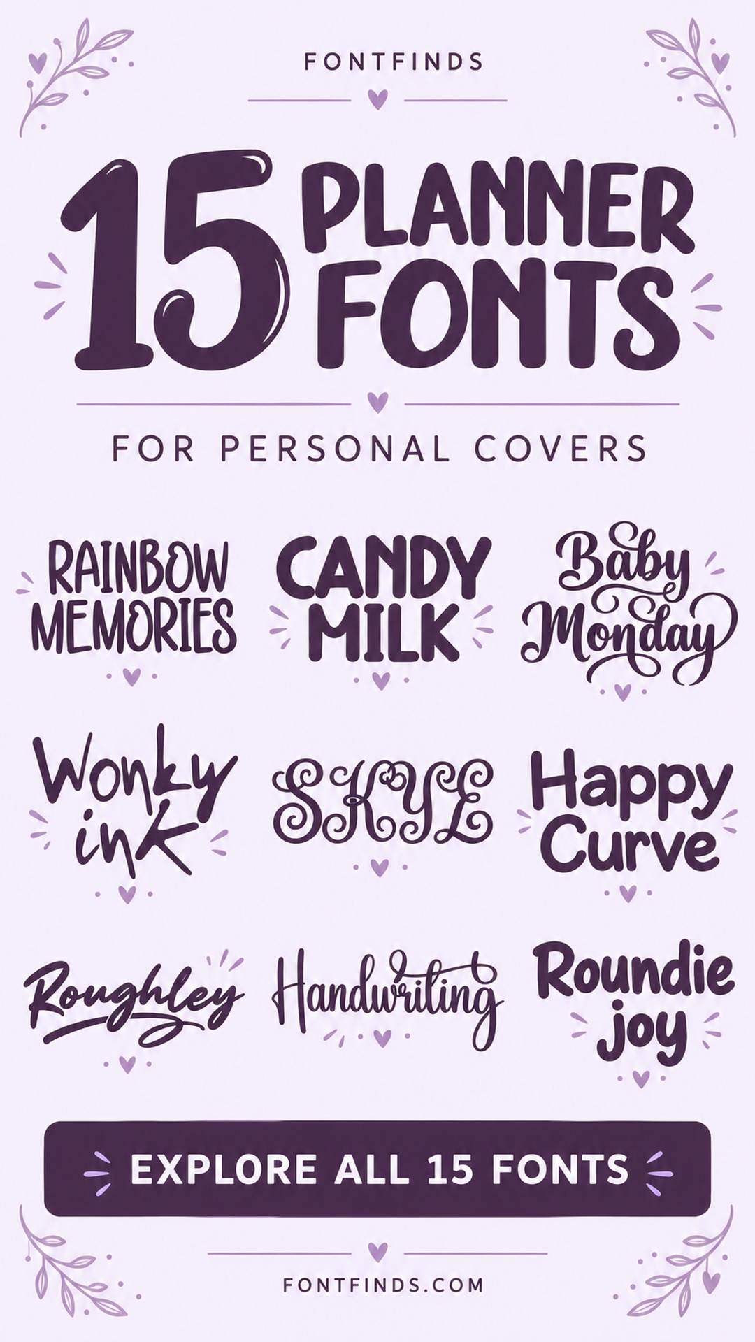
These 15 options cover relaxed pen lettering, romantic scripts, expressive brushwork and one ornate monogram direction. Keep the cover lettering separate from the functional typography inside. A flourish can be lovely on the front and frustrating across a month of tiny calendar labels.
How to use handwritten planner cover fonts
Write the final cover phrase before choosing a font. A name with long ascenders and descenders needs more vertical space than a short word like Notes. Leave a clear area for the year, and compare the cover at thumbnail size if it will appear in a shop listing. For print, keep the title comfortably away from the binding and trim. If you are creating an editable product, check both font licensing and how the chosen app handles uploaded fonts before promising buyers an editable type system.
1. Rainbow Memories: A colorful personal-year cover
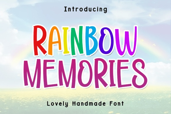
Rainbow Memories shows tall, playful hand-drawn capitals rather than a connected cursive script. I would use it for a short personal title in one or two colors, with the year kept small underneath.
Leave generous space between the title and the binding. The upright letterforms give the cover an informal energy without needing an elaborate border or a long decorative flourish.
View Font on Creative Fabrica →Preview • Download options • License details
2. Candy Milk: A cheerful gratitude journal
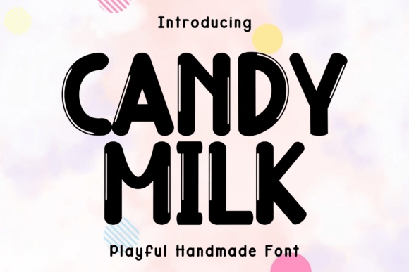
Candy Milk shows bold, rounded handmade letters that would give a gratitude journal a cheerful cover. Try a short title in one dark color on a pale background, with a small name line underneath.
The practical choice is the line length. A compact two-word title lets the soft forms stay generous, while a long sentence would take too much room from the rest of the cover.
View Font on Creative Fabrica →Preview • Download options • License details
3. Baby Monday: A weekly planner with a soft title
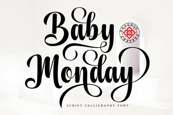
Baby Monday has a romantic script character that can soften a very structured planner. I would use it for the cover title and repeat it sparingly on the large monthly divider pages.
Keep the calendar numbers in a clearer companion. That contrast lets the cover feel personal without making the planner’s everyday information harder to scan.
View Font on Creative Fabrica →Preview • Download options • License details
4. Wonky Ink: An informal creative notebook
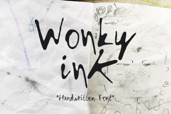
Wonky Ink’s irregular pen-like forms give a cover a casual, unfinished quality in a useful way. It would suit an ideas notebook where the title feels written rather than formally typeset.
Try an off-center title with a broad blank margin. A simple composition will let the wobble and ink-like character remain the focus instead of looking accidentally messy.
View Font on Creative Fabrica →Preview • Download options • License details
5. Skye: A personalized monogram cover
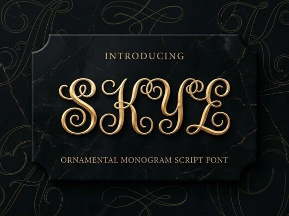
Skye is an ornate monogram script direction, making it better suited to a single prominent initial than a long planner title. I would center the initial and place the owner’s name in a quiet line below.
Do not assume the gold styling is built into the installed font. Start with plain outlines and choose any metallic finish separately.
View Font on Creative Fabrica →Preview • Download options • License details
6. Happy Curve: A friendly everyday planner
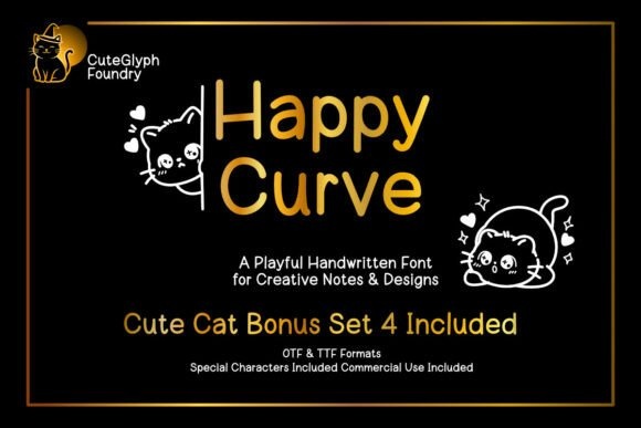
Happy Curve’s rounded handwritten strokes create an approachable cover for an everyday planner. A short title such as Little Plans can sit comfortably above a simple year or name line.
I would keep the cover graphics minimal. The cheerful rhythm already adds warmth, and a cleaner front will be easier to adapt to different names or dates.
View Font on Creative Fabrica →Preview • Download options • License details
7. Roughley: A bold goals journal
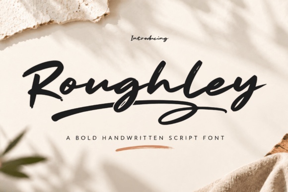
Roughley’s stronger brush strokes offer more energy than the lighter scripts. It would work as a large cover statement for a goals journal or a notebook intended for rough ideas and ambitious plans.
Use a short phrase and let it occupy a broad area. The texture and movement can lose their impact if the title is squeezed between several smaller captions.
View Font on Creative Fabrica →Preview • Download options • License details
8. Single Line: A neat hand-drawn cover
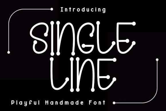
Single Line shows tall, thin handmade capitals with small dot-like details. I would test it for a short title on a quiet planner cover, giving the letters plenty of space against a plain background.
The product name is not a technical promise about pen plotting. If a writing-machine workflow matters, inspect the files and test them before building the design around that assumption.
View Font on Creative Fabrica →Preview • Download options • License details
9. Handwriting: A name-led personal notebook
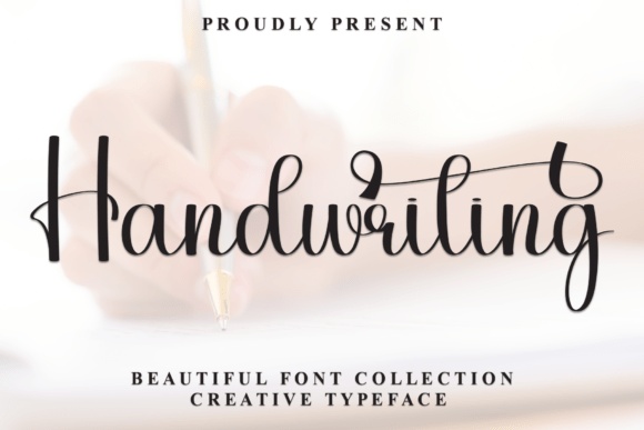
Handwriting uses fine monoline loops and slender forms for a personal signature-like direction. It can be effective when the owner’s name is the cover’s main visual element.
Set the year and notebook purpose separately in a small companion face. This keeps the handwritten name expressive while the rest of the cover remains organized.
View Font on Creative Fabrica →Preview • Download options • License details
10. Roughly Yours: A textured creative-project journal
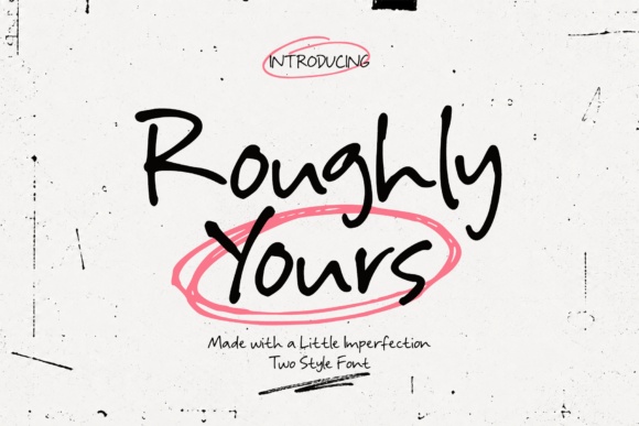
Roughly Yours includes regular and rough styles according to the supplied description. I would compare both on the same short title before deciding how much texture the cover actually needs.
A plain background makes that choice easier to see. Once the title is settled, repeat just one version on dividers so the notebook feels intentional rather than inconsistent.
View Font on Creative Fabrica →Preview • Download options • License details
11. Roundie Joy: A rounded, cheerful planner title
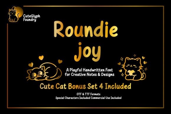
Roundie Joy has a softer handwritten rhythm that suits a relaxed planner or personal journal. I would use it with a generous title size and a simple arrangement of the name and year.
Keep the color palette small. The rounded forms already create a friendly mood, so the cover does not need a different color for every word.
View Font on Creative Fabrica →Preview • Download options • License details
12. Overthinking: A quiet reflection journal
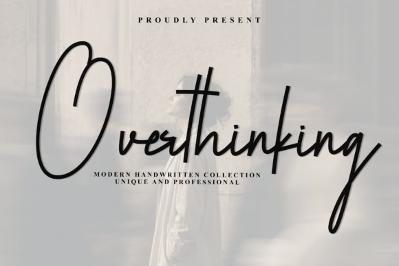
Overthinking’s tall, thin strokes and airy slant suggest a restrained reflection journal. Try a short title placed high on the cover with a wide area of open space below.
This is a good direction to test with a darker ink color. Very pale thin lettering may look attractive close up but become weak in a small shop thumbnail.
View Font on Creative Fabrica →Preview • Download options • License details
13. Looseend: A relaxed daily notebook
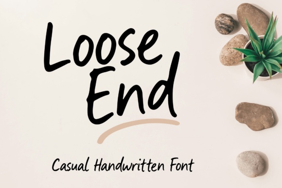
Looseend has flowing, casual strokes that suit a title meant to feel personal rather than formal. I would pair it with a small upright year and a simple flat-color cover.
Check the ends of the word carefully. A flowing terminal needs enough room near the edge, particularly if the notebook will be trimmed or bound close to the title.
View Font on Creative Fabrica →Preview • Download options • License details
14. Handies: A practical handwritten cover
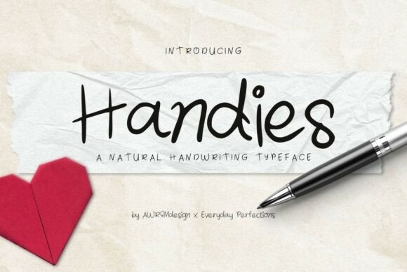
Handies offers a natural handwriting direction for a notebook that should feel easy to use. A centered title and a small name line can be enough to make a useful personalized cover.
I would avoid forcing a highly decorative border around it. Let the handwriting supply the human touch and use consistent alignment for everything else.
View Font on Creative Fabrica →Preview • Download options • License details
15. Thin Jejari: A neat hand-drawn title
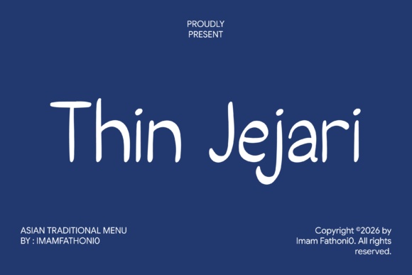
Thin Jejari sits between a formal heading and a playful note, making it useful to test for a cleaner journal cover. Try a short title with plenty of space around each line.
Keep the small supporting information simple. This direction works best when the hand-drawn character stays subtle, rather than being amplified by several other decorative fonts.
View Font on Creative Fabrica →Preview • Download options • License details
Which style would I start with?
For an informal everyday planner, start with Happy Curve or Handies. Roughley gives a goal journal more energy, while a single Skye initial can carry a dressier personal notebook. Keep the front expressive and let the inside pages prioritize writing space.
Font previews are supplied product artwork. Layout suggestions are editorial ideas; fonts have not been installed or production-tested for this guide. Check the linked listing for the current files, supported characters and license.
More font ideas
Frequently asked questions
Should I use the cover font on every planner page?
Usually a limited role works better. Repeat it on section openers or large headings, and use a clear companion for dates, instructions and small labels.
Can I sell an editable planner made with these fonts?
Verify the license for the exact font and the way the product will be distributed. Selling a flattened printable and supplying an editable file with font access are different workflows.
Is a font named Single Line automatically suitable for pen plotting?
No. The name alone does not establish how the file is constructed. Check whether the product is a genuine single-line writing font and test it in your cutting or plotting software.