
16 Best Gothic Letter Tattoo Font for Tattoo Design 2026
Choosing the right gothic letter tattoo font can make or break a lettering piece-names, dates and mottos need both personality and legibility. This guide shows 16 selected blackletter, Fraktur and modern gothic script options with quick notes on size, spacing and suitability for skin.
Each entry includes sample lettering, suggested placements and practical tips on stroke thickness and scale for clear healing. Use these examples to match tone-ornate blackletter for bold statements or simplified gothic script for smaller, fine-line work.
1. Rawuh Font
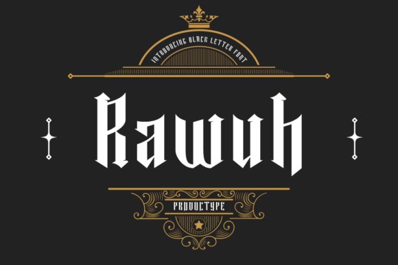
Rawuh Font is a modern take on black letter that preserves the heavy, angular silhouette while softening terminals to sit better on skin. High-contrast strokes, tight counters, and carefully tuned alternates give it an ornamental density that still functions as a readable gothic letter tattoo font at mid sizes. Hand-tuned ligatures and pointed spurs add character to names and short phrases without collapsing legibility.
Technically, the family ships with stylistic alternates, discretionary ligatures, and layered ornaments so you can dial the flourish level for branding or ink. Vector outlines export cleanly for stencil prep and the spacing holds up for embossing, labels, and packaging. I recommend testing tiny scales first; Rawuh’s presence is strongest on chest pieces, collar scripts, headers, and premium marks.
My Recommendation: I reach for Rawuh when a brief phrase needs the weight and history of black letter but still must read on sight. The alternates let me push ornamentation for band logos or pare it back for boutique packaging, and clean vectors make stencils straightforward. For name tattoos, shop signage, and upscale labels this font gives personality without sacrificing clarity.
2. Black Letter Font
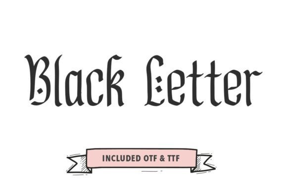
Black Letter Font channels vigorous brush-made strokes into a gothic skeleton, producing characters that feel artisanal rather than factory-precise. Narrow counters and a strong vertical rhythm anchor bold headlines while textured terminals introduce a tactile, inked quality. The designer eased heavy joins compared with traditional Old English, improving legibility without losing that historical edge.
This face performs well in identity work where a handcrafted attitude is desired: it pairs neatly with simple sans-serifs to establish a clear hierarchy and the moderate x-height prevents uppercase blocks from overwhelming layouts. Kerning across initials is thoughtfully balanced, and the light distressing survives small-format printing and embroidery. Use it for brewery packaging, tattoo studio logos, or streetwear headers that need heritage with presence.
╰┈➤ Download Black Letter Font
My Recommendation: I use Black Letter Font when a headline must read bold and authentic while still staying clear at a glance. Its textured strokes bring an aged, artisanal vibe that works well for band art and craft labels, and pairing it with a neutral sans creates strong contrast. For any identity that wants a handcrafted, vintage-forward voice, this typeface is a reliable choice.
3. Snakebite Font
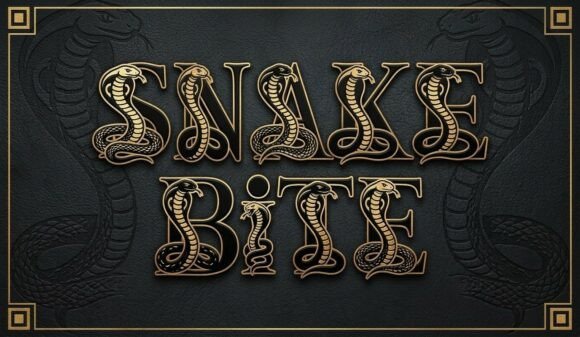
Snakebite Font converts each glyph into a miniature engraving, entwining cobra hoods and panther details around bold serif forms to create ornate initials. That illustrated approach makes it unsuitable for running text but ideal for posters, tattoo flash sheets, and limited-edition merch where letters double as artwork. The engraving-style shading and compact compositions read like vintage flash art rendered in type.
From a production standpoint the glyphs are single-color vector fills that adapt well to screen printing, embroidery, and vinyl cuts, while alternates offer simpler variants for cleaner wordmarks. Keep tracking generous-too-tight spacing makes the animal motifs collide-and reserve Snakebite for large display sizes so the details remain legible. It’s a strong pick when you need a headline that’s illustration-first and typography-second.
My Recommendation: I reach for Snakebite when I want typography that behaves like an illustration and saves time on custom artwork. It’s perfect for poster covers, band merch, and tattoo studio promos where each letter can be admired at scale. I avoid using it for body copy and reserve it strictly for headlines and display pieces so the motifs stay readable and impactful.
4. Anomale Font
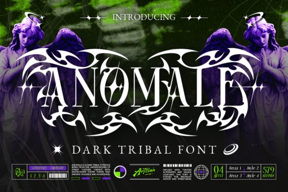
Anomale Font channels dark tribal energy through razor-edged curves and aggressive ornamentals that call to ancient symbols and underground rites. As a gothic letter tattoo font it balances heavy strokes with narrow counters and decorative terminals, so each glyph feels like a crafted sigil rather than a simple letterform. The set includes multiple stylistic alternates and ornamental ligatures that let you steer designs toward occult, tribal, or urban-metal directions without reworking the base shapes.
On skin and in print Anomale prefers medium-to-large scales where fine internal details remain visible; tiny sizes can lose the thin barbs and inner counters. Kerning is intentionally tight to create compact wordmarks, so plan spacing when pairing it with clean sans types or busy textures. Use bold fills, distressed overlays, or metallic treatments to keep the raw aesthetic vivid while preserving legibility for logos, album art, and tattoo lettering.
My Recommendation: I reach for Anomale when a project needs raw, ritualistic attitude-its alternates make it easy to craft a singular mark without manual redraws. It shines for band branding, album covers, streetwear patches, and large-format tattoo lettering where ornamentation can breathe. Be mindful of scale and line weight when applying it to skin so the finer spikes survive healing and wear.
5. Star Tattoo Font
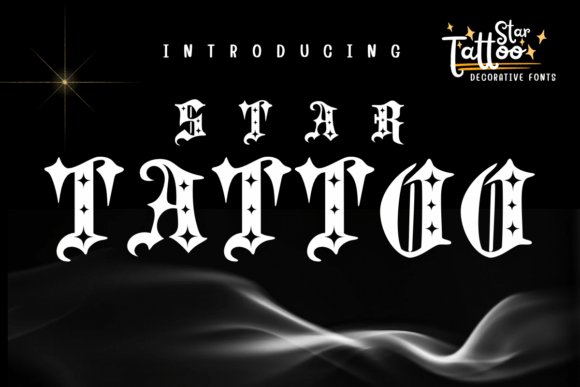
Star Tattoo Font melds blackletter structure with bold star-shaped terminals and playful decorative accents, giving Old English forms a fresh, emblematic spin. The star motifs are integrated into stroke endings and counters so the type keeps its gothic backbone while feeling distinctly emblematic-ideal when you want a letterform with personality. High contrast and compact proportions make the letters punchy at typical tattoo headline sizes without collapsing into illegibility.
This decorative typeface works well as a headline or insignia on apparel, posters, and band merch rather than as body copy. Swap in alternates to accentuate or simplify the stars depending on the mood, and pair with a neutral sans or a restrained script to keep the overall layout readable. For tattoos, confirm stencil size with the artist so the star details retain proportion and clarity over time.
My Recommendation: I’d pick Star Tattoo for projects that need a mascot-like mark or striking merch art-the star details give each letter instant recognition. It’s especially useful for badge-style logos, tattoo flash, and streetwear headlines where a bit of whimsy still reads bold. Scale planning is important: the star accent is brilliant at display sizes but needs simplification for small or fine-line work.
6. Ornate Victorian Blackletter Font
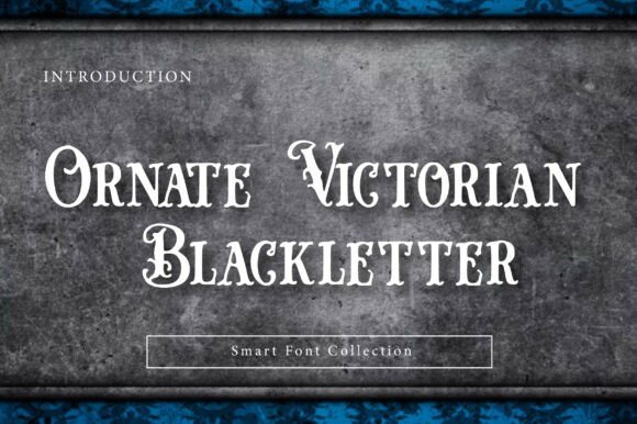
Ornate Victorian Blackletter Font recreates the engraved drama of 19th-century display types with sharp serifs, high-contrast strokes, and lavish curls that feel ceremonial and theatrical. Despite heavy ornamentation, letter construction remains disciplined so the type behaves as a headline rather than decorative clutter. The Smart Font features-contextual alternates, ligatures, and swash sets-allow careful modulation between historically faithful and more restrained modern looks.
This typeface excels on luxury packaging, boutique branding, and dramatic posters where a sense of heritage matters; it pairs exceptionally well with dark textures and metallic finishes. For tattoo-style lettering choose simplified alternates or trimmed swashes to preserve clarity on skin, and keep supporting copy in a plain sans to maintain hierarchy. Use sparingly as a display face to avoid overwhelming layouts that require readable long-form text.
╰┈➤ Download Ornate Victorian Blackletter Font
My Recommendation: I use Ornate Victorian Blackletter when a design needs aristocratic flair-its swashes and alternates give options for both ornate headlines and slightly tamed treatments. It’s perfect for premium labels, invitations with gothic charm, and theatrical posters where foiling or embossing adds payoff. Avoid heavy text blocks; instead let this font hold court as a focal headline paired with clean, understated copyfaces.
7. Demon Crown Font
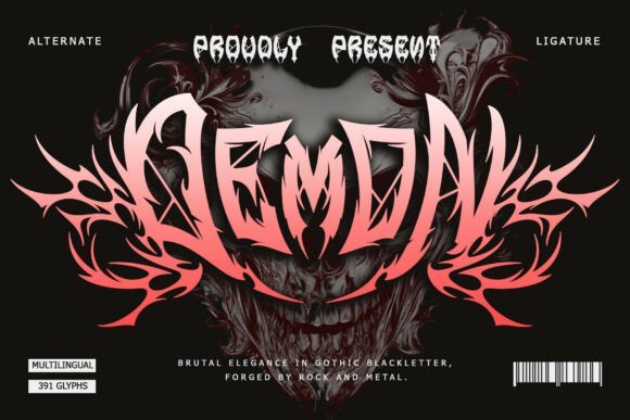
Demon Crown arrives as a fiercely detailed blackletter with razor-cut terminals and aggressive counterforms that carve a harsh silhouette on any surface. As a gothic letter tattoo font, its symmetrical weight and ritualistic flourishes feel at home in heavy-metal branding, dark fantasy titles, and bold body art where letters must project menace and presence.
The font ships with PUA-encoded alternates and decorative glyphs, making ornate ligatures and occult-inspired icons simple to access in design apps. For best results pair it with weathered textures, stark monochrome layouts, or high-contrast photographic backdrops to let the strokes speak without crowding the composition.
My Recommendation: I reach for Demon Crown when a project needs visceral attitude-album covers, band merch, or tattoos that read like insignia. Its PUA extras save time during layout and its heavy forms hold up at a distance, so it’s perfect for posters and sleeve pieces. I would avoid tiny text blocks; this is a display face meant to be shown large and unapologetic.
8. Crucifer Font
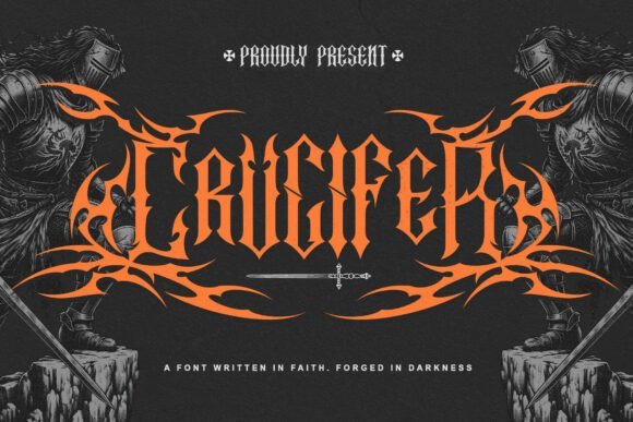
Crucifer channels archaic cathedral lettering with towering ascenders and a carved-metal feel that suggests ritual and gravitas. The type’s vertical emphasis and sharp bisected strokes create strong silhouettes that translate well to emblematic logos, hymn-like album headings, and statement tattoos that need to look carved rather than written.
Details such as tight counters and ornamental terminals reward careful kerning and generous spacing; minimal backgrounds help preserve legibility while maintaining the font’s austere character. Use it for cinematic title sequences or band identities where a weighty, solemn tone is required, and consider pairing with a clean sans for secondary copy to avoid visual competition.
My Recommendation: I pick Crucifer for projects that call for ritualistic seriousness-movie posters, gothic branding, or bold back-piece tattoos. Its stern letterforms read as insignia and carry a historic, manuscript-like temperament that suits solemn or theatrical work. When applied with ample breathing room and high contrast it becomes a powerful visual anchor.
9. Linden – gothic letter tattoo font
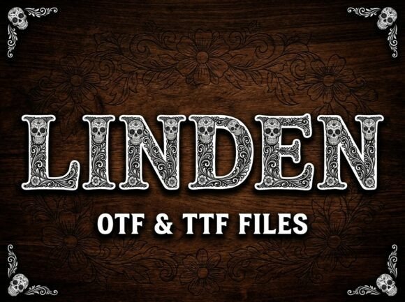
Linden mixes ornate serif anatomy with floral acanthus motifs and sugar-skull ornamentation, producing a decorative display that reads both vintage and folkloric. Each uppercase glyph is rich with engraved linework, creating a woodcut impression ideal for event posters, tattoo-style branding, and holiday-themed packaging where decorative storytelling matters.
Because of its intricate fills, Linden performs best at headline sizes or on vector art where the fine details remain crisp; consider simplified alternates for very small uses or embroidery. Pair it with a sparse layout or simple geometric shapes to let the ornamentation breathe and avoid overloading visual hierarchy.
╰┈➤ Download Linden – gothic letter tattoo font
My Recommendation: I use Linden when I want a headline that feels handcrafted and ceremonious-festival posters, boutique apparel, or tattoo flash art are perfect fits. Its decorative capitals bring personality and heritage, so it’s especially effective for projects that lean into folk imagery or seasonal themes. For practical use, I create alternate simplified cutlines for tiny applications to keep the detail readable.
10. Brocore Font
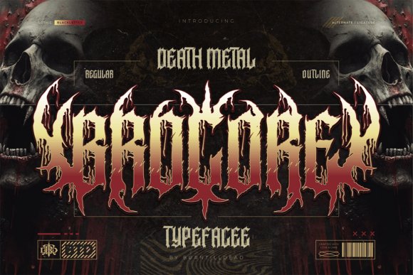
Brocore is a brutal death-metal blackletter typeface designed for visuals that need to hit hard. Its letterforms favor jagged spikes, dripping terminals and compact gothic structure, with Regular and Outline weights plus alternates and ligatures for custom logotypes; as a gothic letter tattoo font it mimics hand-inked abrasions while remaining modular enough for layout work. Use it large so the carved details and negative space resolve cleanly.
This face shines on album art, band logos, merch and horror posters where an aggressive aesthetic is the goal. Files ship as OTF/TTF with full A–Z, numerals, punctuation and multilingual support; careful tracking and selective ligature use will keep names legible without softening the attitude. Pair Brocore with a neutral sans for credits or small text to preserve hierarchy.
My Recommendation: I reach for Brocore when a project needs to feel feral and handcrafted-its spikes and drips work perfectly for extreme-music branding, tattoo-flash, and limited-run apparel. The alternates let me craft distinctive logotypes without redrawing glyphs, which speeds production. I rely on it for covers and merch that must read as uncompromising and visceral.
11. Knights Font
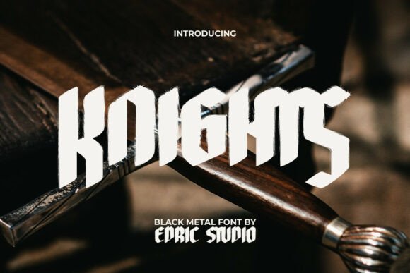
Knights channels medieval manuscripts and heraldic lettershapes into a heavy blackletter display that commands attention. The brush-stroke textures and splattered details give each glyph a weathered, tactile quality that reads as handcrafted when used at display sizes; smaller settings will lose the subtle distress. It favors headline use where strong personality is required.
Apply Knights to skate apparel, tattoo shop signage, dark festival posters and book covers that benefit from a raw, historic tone. For practical layouts, pair it with a light, open serif or a roomy sans for body text, and allow generous tracking so the ornate counters don’t feel crowded. The result is cinematic and rugged without being precious.
My Recommendation: I use Knights when a project needs medieval heft without pristine polish-great for posters, apparel branding and titles that must read from a distance. Its textured strokes add instant character on print and fabric, and it holds up well on large-scale web headers. I typically combine it with a simple support face to keep readability high.
12. Aghony Font
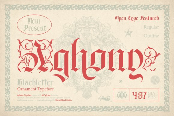
Aghony pairs classical blackletter proportions with ornamental terminals and subtle flourishes for a decorative gothic effect. Offered in Regular and Outline styles, it can provide dense, authoritative headlines or lighter, airy headings where ornamentation carries the tone without overwhelming composition. The outline variant is especially useful for layered color work or photo backgrounds.
Its alternates and embellished terminals make Aghony ideal for vintage branding, tattoo-inspired graphics and ornate album sleeves that need personality beyond flat type. Use it sparingly at display scale and increase letterspacing when combining with busy imagery to avoid visual clutter; the font rewards careful composition and considered contrast.
My Recommendation: I choose Aghony for projects that require elegant darkness-boutique tattoo studios, heritage product labels, and deluxe album covers benefit from its ornamentation. The two styles let me toggle between weighty presence and lighter treatments without swapping families. It’s a go-to when I want decorative lettering that still reads as purposeful typography.
13. Cathedrave Font
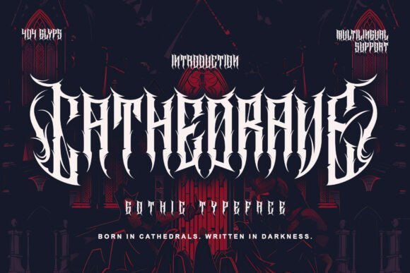
Cathedrave channels the geometry and weight of cathedral stone into letterforms defined by razor serifs, pronounced verticals, and deep interior counters. As a gothic letter tattoo font it pairs severe contrast with tight symmetry, so short words read like carved sigils while longer lines keep a measured rhythm. The strokes are deliberately angular and dense, using negative space to amplify depth and deliver a ritualistic, emblazoned character.
This face excels in dark fantasy covers, metal band identities, large-format posters, and bold tattoo pieces where silhouette matters more than delicate filigree. It holds up well at tattoo scale, though ornate terminals benefit from slight size increases or tightened kerning to avoid crowding. For print and motion work, vector output preserves its chiseled quality and crisp transitions between thick and thin strokes.
My Recommendation: I pick Cathedrave when I want typography that reads like a monument: it gives logos and tattoos a carved, authoritative punch. Its heavy shapes are perfect for album art, title sequences, and chest or back tattoos that need bold silhouettes. Keep backgrounds simple so the glyphs retain full impact and the stone-like texture remains legible.
14. Rusty Gore Font
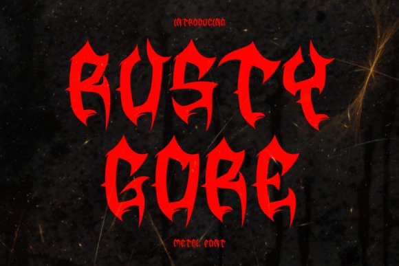
Rusty Gore Font presents jagged terminals, spiky counters, and a textured finish that suggests battle-worn metal more than classical calligraphy. The design favours aggressive silhouettes and distressed details, which make it ideal for extreme metal branding, horror posters, and gritty merchandise. Because the letterforms push legibility in service of attitude, they perform best as display pieces rather than body text.
Use Rusty Gore for band logos, festival posters, and large tattoos where the serrated edges can dominate a composition without losing presence. It responds well to high-contrast palettes and layered textures-distressed overlays accentuate its feral energy while vector outlines keep edges sharp for print. For projects requiring readable captions, pair it with a clean sans to maintain hierarchy.
My Recommendation: I choose Rusty Gore when a project needs raw, confrontational personality: it screams old-school metal and underground horror. Its weathered teeth and spikes work brilliantly on gig flyers, backpatches, and monstrous title art. Keep it large and isolated so the rough details can read clearly and hit hard.
15. Blegor Font
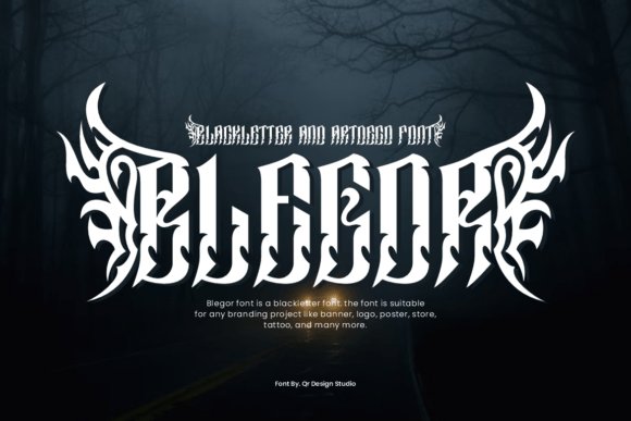
Blegor Font melds blackletter verticality with art-deco geometry to create letters that feel ornamental yet disciplined, like crafted sigils with a modern twist. Uppercase glyphs bristle with elongated terminals and tribal-inspired flourishes while the lowercase remains comparatively restrained, preserving rhythm across words. PUA-encoded alternates and punctuation make decorative choices accessible without extra tools.
Because Blegor leans toward baroque ornamentation, it shines in display roles-tattoo lettering, boutique fashion labels, and band logotypes where every character can be appreciated. The face rewards generous tracking and isolated use; metallic textures and layered backgrounds enhance its sculptural quality, but smaller sizes can obscure fine spikes. Pair it with a neutral type for supporting copy to avoid visual competition.
My Recommendation: I reach for Blegor when a design needs ornate personality without collapsing into chaos: it’s great for premium merch, statement tattoos, and decorative wordmarks. The PUA access speeds layout work when I layer alternates and glyphs. Give it space and a pared-back color scheme so the ornamentation reads crisply.
16. Ghazkar Font
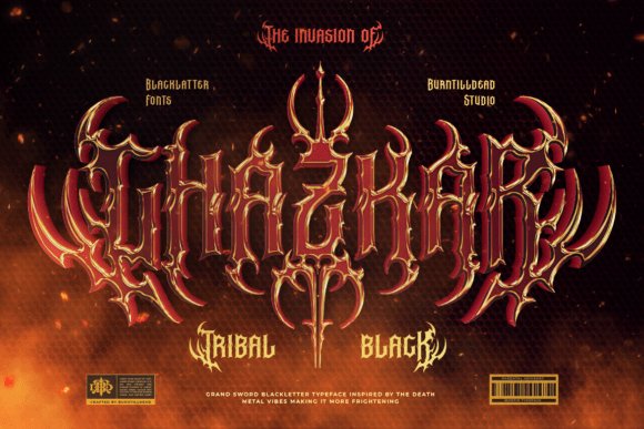
Ghazkar is a sharp, tribal blackletter face that combines aggressive spiked terminals with thorn and vine-like flourishes woven into each glyph. As a gothic letter tattoo font it ships in Regular and Outline styles and includes a wide selection of ligatures and alternates to craft custom letterforms. The Outline variant produces strong negative-space effects ideal for skin art, while the filled style reads heavy and authoritative for metal and dark-fantasy visuals.
At display sizes the jagged serifs and pronounced counters remain legible, though heavy ornamentation can overwhelm small blocks of text so pick alternates carefully. Ligatures let you create connected, handcrafted lettering and alternates provide subtle shifts from ornate to raw. Best uses include album covers, band logos, poster headlines and tattoo lettering where each character must carry attitude and presence.
My Recommendation: I reach for Ghazkar when I want a bold blackletter with a tribal edge-its spikes and vine motifs give designs a muscular, handcrafted feel. The Outline style is perfect for negative-space tattoos and layered print effects, while the filled version anchors posters and band marks with gravitas. I’d pick Ghazkar for heavy metal art, gothic branding, or any tattoo lettering that needs to read tough and bespoke.
Wrapping up, these 16 styles offer solid starting points whether you want traditional blackletter, Fraktur edges or a cleaner gothic script for delicate pieces. Test stencils at the intended size and talk through kerning and stroke weight with your tattooist before inking.
Keep this list handy when planning lettering tattoos and refer to the placement and sizing notes to get the best result with any gothic letter tattoo font you choose.
One Comment