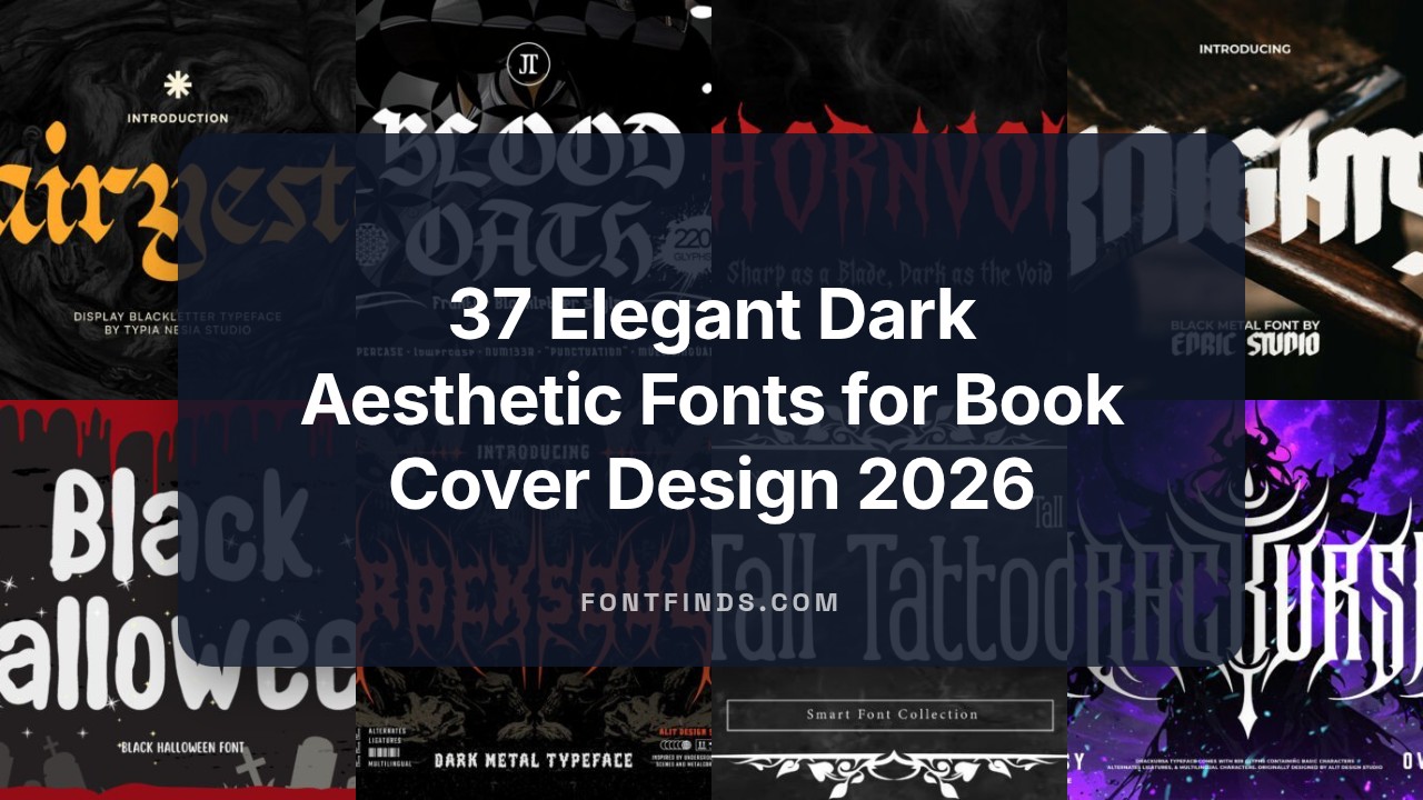
37 Elegant Dark Aesthetic Fonts for Book Cover Design 2026
If you need dark aesthetic fonts for Book Cover Design, this guide presents 37 moody, type-driven options from gothic serifs to grainy scripts. Each pick suits different tones-horror, noir, occult, and dark fantasy-so you can match type to story.
Entries list style, recommended pairings, file formats, and licensing basics. Use the samples and pairing tips to test how each face performs at headline sizes and on textured covers.
1. Thornvoid Font
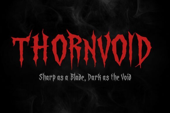
Thornvoid Font – Thornvoid is a modern gothic display face with razor-cut terminals and blade-like strokes that slice through space on the page. Its letterforms carry a raw, aggressive voice suited to horror branding, occult art and retro tattoo aesthetics, and it sits well among dark aesthetic fonts for designers chasing high-contrast mood. The heavy contrast and tight counters create a menacing rhythm that reads best as a headline or single-word logo.
Apply Thornvoid to movie posters, album covers, merch and tattoo-style marks where a sense of danger is required; it demands large sizes and bold treatments. Treat the type with wide tracking and textured overlays – grain, halftone or metallic ink enhance its gothic character. Avoid body copy: the ornate terminals can clog at small sizes, so reserve it for display use and bold typographic statements.
My Recommendation: I reach for Thornvoid when a project needs immediate menace and strong personality – horror posters, metal band logos and tattoo-inspired branding are ideal. I like pairing it with muted palettes and tactile textures to deepen its gothic feel. Use it as the focal point rather than a supporting text face so its sharp anatomy can do the work.
2. Dark Bloods Font
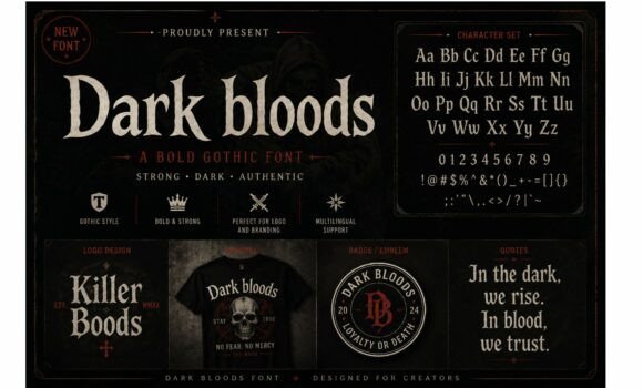
Dark Bloods Font – Dark Bloods channels medieval blackletter with thick verticals and dramatic swashes that recall vintage woodcuts and underground music merch. The character set feels handcrafted: heavy strokes, condensed proportions and serrated terminals that translate well to badges, patches and apparel. Its aesthetic leans into urban goth and metal culture, giving graphics a ritualized, old-world punch.
Place Dark Bloods on streetwear, album jackets, posters or logos where weight and attitude matter, and combine it with distressed printing or embroidered textures for authenticity. Fine-tune tracking and contrast to preserve legibility in compact layouts or curved badges. Pair with a plain sans for body copy to maintain readability while keeping the headline theatrically dark.
My Recommendation: I recommend Dark Bloods for projects requiring raw gothic energy with a vintage, hand-forged look – think band merch, capsule streetwear and premium apparel labels. It behaves beautifully with textured printing techniques like foil or puff ink and suits monochrome or high-contrast palettes. Use it as the hero element and balance it with clean, modern supporting type.
3. King’s Decree Font
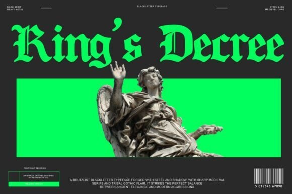
King’s Decree Font – King’s Decree revives Old English flare with modern spacing and refined stroke endings, balancing ornamental flourishes with legible forms. It evokes royal manuscripts and cathedral inscriptions through angular spurs, contrasted strokes and a range of stylistic alternates that enrich headings and monograms. The set includes upper- and lowercase glyphs, numerals and extended punctuation suitable for multilingual typesetting.
Deploy King’s Decree for logos, historical fiction covers, brewery labels and heritage-brand identity where ceremonial weight is desired, and use alternates sparingly to avoid clutter. Tighten kerning on ornate pairs and reserve elaborate caps for short words or initials instead of long lines of text. When paired with a neutral serif or geometric sans, the face provides a noble accent that grounds a composition in period character.
╰┈➤ Download King’s Decree Font
My Recommendation: I reach for King’s Decree when a design needs ceremonial weight or a historical accent-book covers, signage and identity projects benefit most. Its alternates and extended support make it flexible enough for complex layouts, but I recommend conservative use of decorative caps to preserve clarity. Pair it with restrained colors and tactile materials to reinforce the antique feel.
4. Malvoid Font
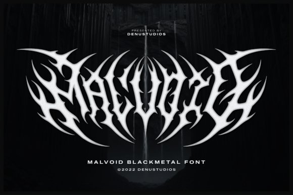
Malvoid Font channels black metal typography through jagged, root-like terminals that knot and bleed into adjacent letters, producing marks that feel ritualistic and raw. Letters are deliberately high-contrast and razor-edged, carved to read as emblematic sigils across posters and merch. As one of the more visceral dark aesthetic fonts, Malvoid favors stark white or blood-red on black, where its blade-like symmetry becomes both logo and ornament at once.
Use Malvoid for death metal band identities, occult zines, concert posters and vinyl sleeves where a single word must carry the entire mood. It scales well for large display use but will collapse into texture at small sizes, so give it room and generous tracking. Treat its organic overlaps as design material-distress, grain and metallic inks amplify the menacing character.
My Recommendation: I reach for Malvoid when a project demands uncompromising attitude: it converts text into a symbol that feels handcrafted and hostile in the best way. Its strength is visual identity-one word becomes a badge, perfect for album covers, merch, and poster art. I’d avoid using it for body copy; reserve Malvoid for headlines and logo marks where scale and texture can show off its aggressive details.
5. Soulcrave Font
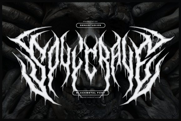
Soulcrave Font emphasizes skeletal geometry with thorn-like spikes and elongated terminals that drip into filigree ligatures, producing a living, tense silhouette on the page. The type has pronounced verticality and mirrored forms that create dense but readable clusters when set at display sizes. Intricate webbed connections between letters give it a woven, atmospheric quality suited to moody compositions.
It excels as a headline treatment for horror editorials, atmospheric game titles, and dark streetwear graphics where a decorative, aggressive voice is required. For best results pair Soulcrave with open negative space and high-contrast photography; tighten or loosen tracking to control the degree of visual clutter. Use sparingly so its ornamental complexity retains impact.
My Recommendation: I pick Soulcrave for projects that need ornate menace without sacrificing legibility at large sizes-magazine covers, game splash screens, and apparel hits are ideal. Its filigree ligatures give designs a handcrafted, almost architectural feel that photographs well on distressed fabrics. When using it, I keep layouts minimal so the type becomes the main spectacle rather than competing with other elements.
6. Fairyesta Font
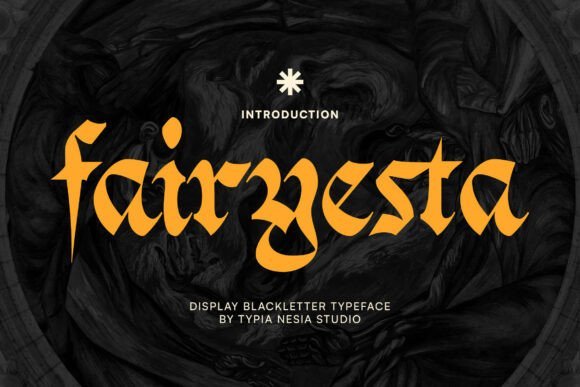
Fairyesta Font revives medieval blackletter with emphatic strokes, steep contrast and Old English character while retaining a bold display presence for modern design. The letterforms combine historical fidelity-pointed crossbars and angular serifs-with theatrical proportions that read as cinematic and archaic. That strong historical voice contributes a sense of gravitas ideal for fantasy and horror titles.
It suits logos, film titles, game branding and posters where an old-world seal is wanted; pair it with parchment textures, gold foils, or deep jewel tones to amplify its period feel. Watch spacing carefully-small sizes lose detail quickly-so reserve Fairyesta for headline use and decorative marks. Thoughtful ornamentation around headlines will let its medieval roots shine without overpowering compositions.
My Recommendation: I use Fairyesta when a design needs immediate historical weight-movie posters, epic game covers, and band branding benefit from its cinematic blackletter voice. It creates instant atmosphere and reads like a relic, which helps set tone before any imagery does. My workflow puts it in large display roles only, combined with textured layers and restrained color palettes to preserve its carved detail.
7. Knights Font
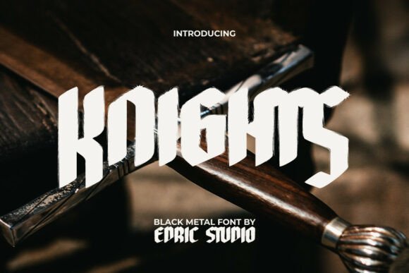
Knights Font throws a heavy, hand-forged blackletter silhouette that reads like weathered steel and ink. Letterforms carry textured brush-stroke edges and splatter details that register best at large point sizes, giving headlines a tactile, visceral weight. Among dark aesthetic fonts, it stakes out theatrical gravitas rather than subtlety, so each character feels like a piece of heraldry reworked with urban grit.
Use Knights where typography must dominate: posters, album covers, storefront logos, or limited-edition merchandise. It works well with generous negative space and a narrow, modern serif for any small blocks of copy to keep the display face dramatic yet readable. For a cinematic occult mood, set Knights over deep vignetted textures and high-contrast photography so the rough edges breathe and the splatter marks remain visible.
My Recommendation: I reach for Knights when a project needs weight and attitude – metal albums, tattoo shop identities, or event posters that must feel handcrafted. The distressed terminals give letters distinct personality, making logos feel bespoke instead of generic. Use it at large sizes, keep supporting copy minimal, and the type will carry the visual narrative for you.
8. Black Halloween Font
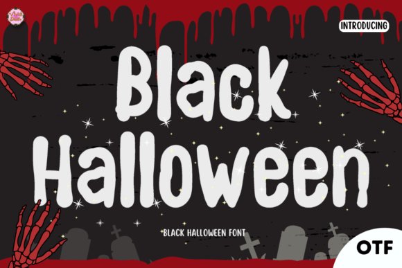
Black Halloween Font is a hand-lettered script built around jagged loops and an uneven baseline that reads spooky without becoming unreadable. Alternates and rough terminals offer quick options for dripping swashes and irregular end strokes, so titles look improvised rather than manufactured. Its rhythm favors short lines and headers, where the bouncing glyphs create a playful, eerie motion.
Apply this face to party invites, seasonal packaging, social banners, or any design that benefits from a lively macabre voice. Pair it with muted oranges, washed purples, and subtle grain overlays to avoid visual clutter; the font stands out against flat, high-contrast backgrounds. For print, tighten tracking slightly and limit decorative words per composition to preserve clarity.
╰┈➤ Download Black Halloween Font
My Recommendation: I choose Black Halloween when a headline needs spooky character without sacrificing legibility. The alternates let me tailor word endings quickly, speeding up layout iterations. It’s ideal for limited-edition labels, seasonal promos, and indie zines where handcrafted charm matters more than mechanical perfection.
9. Devil Comes Font
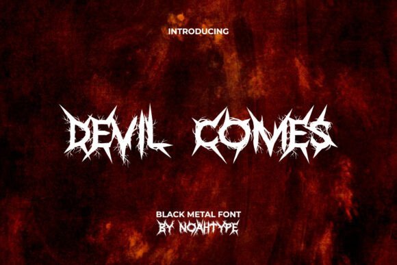
Devil Comes Font carves its identity from thorn-like serifs and sharply angled terminals that march in mirrored symmetry to create an immediate sense of menace. Dense ornamental strokes make it an assertive display face – readable as a logotype but unruly at small sizes – and it benefits from careful attention to spacing and background texture. The visual language reads as aggressive ornamentation rather than elegant calligraphy.
Best used on black or heavily textured canvases, Devil Comes amplifies raw, high-contrast art such as band tees, festival posters, and horror-themed game headers. Treat it as a motif: simplify surrounding elements, work in monochrome or duotone, and scale the type large so the thorned details remain intact. For micro-typography, pair it with a plain neutral face to preserve hierarchy and legibility.
My Recommendation: I reach for Devil Comes when I need violent, attention-grabbing lettering for merch or poster fronts. Its jagged geometry slices through busy art and pairs exceptionally well with grainy photography and harsh light. Use it for brands and projects that lean into rawness – extreme music, underground events, or gritty game identities.
10. Zoltrax Font
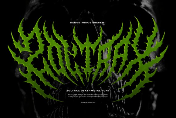
Zoltrax Font slashes through convention with exaggerated blackletter forms that look hewn from rusted steel. Its thorn-like terminals and spiky contours deliver an aggressive personality that reads like visual distortion; within conversations about dark aesthetic fonts it stakes out a place for extreme metal and horror identities. The face ships with 182 glyphs and five stylistic alternates, enabling dense ligatures and jagged wordmarks that feel handcrafted rather than templated.
Use Zoltrax predominantly at display sizes where its negative space can breathe-at smaller scales the fine spikes collapse into noise. For printed merch I suggest converting to outlines and testing halftones to preserve texture, while pairing with a neutral sans for informational text to avoid visual exhaustion. Its unapologetic brutality makes it a go-to when you need a type voice that refuses to blend in.
My Recommendation: I reach for Zoltrax when a project must communicate raw aggression-band logos, tour posters, or underground apparel labels. The large glyph set and alternates let me craft unique ligatures and chaotic wordmarks without rebuilding letters from scratch. I would avoid using it for body copy, but for bold headers and merch it gives instant character and edge.
11. Darkella Font
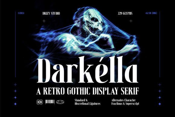
Darkella Font blends retro serif drama with gothic ornamentation to produce an elegant-yet-haunted display face. High-contrast strokes and decorative terminals create a theatrical headline voice that evokes Victorian posters without feeling pastiche. Swash capitals and alternate glyphs let you dial between refined formality and baroque flourish for seasonal event designs or boutique branding.
Because of its decorative complexity, Darkella performs best at generous sizes where serifs and swashes remain legible; avoid tight tracking or heavy texture overlays. Pair it with a spare geometric sans for body copy to keep layouts readable, and test ink coverage for screen-printed applications to preserve thin strokes. It’s especially suited to retro horror promotions, premium packaging, and identity work that leans into period charm with a shadowed edge.
My Recommendation: I choose Darkella when a project needs period personality-think event posters, Halloween campaigns, or luxury labels with a gothic bent. The ornamental alternates help craft dramatic mastheads without resorting to costume type. Use it large and pair it with a neutral text face for balance; the mood it creates is theatrical and memorable.
12. Bochil Anjelos Font
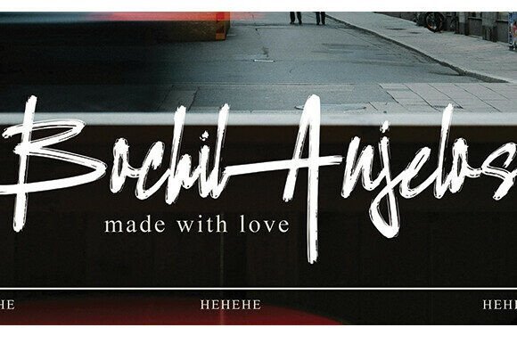
Bochil Anjelos Font is a high-velocity dry-brush script with bold, textured strokes that feel caught mid-swipe. Its dramatic rough edges and splatter marks lend immediate motion and handcrafted grit, making headlines and logotypes read like urgent signatures. This script works well where personality and raw energy matter-cinematic titles, aggressive sports branding, or fashion labels that trade polish for attitude.
Avoid long passages of text with Bochil Anjelos; it shines as a statement display element paired against clean, restrained supporting type. Convert to outlines for large-format printing to keep the dry-ink texture intact, and experiment with layered color or duotone overlays to emphasize stroke depth. I often use it to inject immediacy and tactile realism into visuals that need to feel made-by-hand rather than assembled.
╰┈➤ Download Bochil Anjelos Font
My Recommendation: I pick Bochil Anjelos when a design needs visceral motion and handcrafted personality-music covers, limited-run apparel, or bold poster headlines. Its texture reads as authenticity, which is perfect for brands that want a lived-in look. Keep it short, pair with a calm neutral face, and treat it as the visual focal point.
13. Moris Font
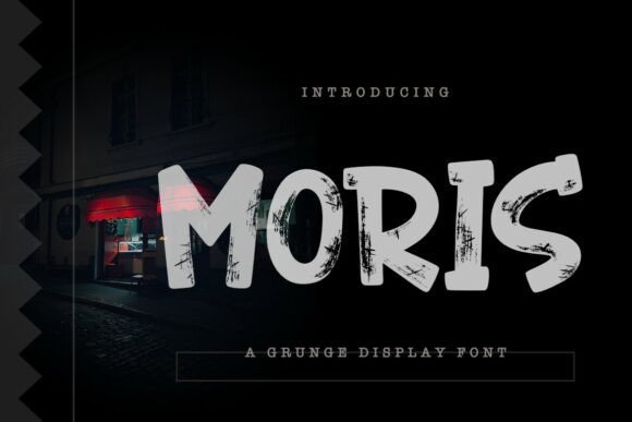
Moris Font wears its abrasion proudly: heavy, scraped strokes, ragged terminals and ink-fed irregularities give each glyph a handcrafted, vandalized attitude that reads loud at any size. This grunge display injects street-level texture into layouts, with deliberate abrasion and uneven fills that catch the eye and resist polite refinement. For projects calling for dark aesthetic fonts, Moris balances legibility with raw character so headlines, logos, and covers feel tactile and weathered rather than overproduced.
On posters and album art Moris thrives when set large, where distressed details resolve into readable shapes; at smaller scales the roughness creates a grainy atmosphere more than clear letterforms. Pair it with a neutral geometric sans or a thin script to temper aggression, or layer it over paper textures and halftone patterns for punk and horror moods. Supplied in OTF/TTF, the robust counters handle heavy treatment and texture masking without losing presence.
My Recommendation: I reach for Moris when a design needs instant, unpolished attitude-think underground shows, gritty album covers, and aggressive gaming thumbnails. Its scraped forms add personality that stock textures alone can’t replicate, and it holds up beautifully at poster scale. Use Moris when you want typography that reads as weathered and human rather than slick.
14. Cromons Font
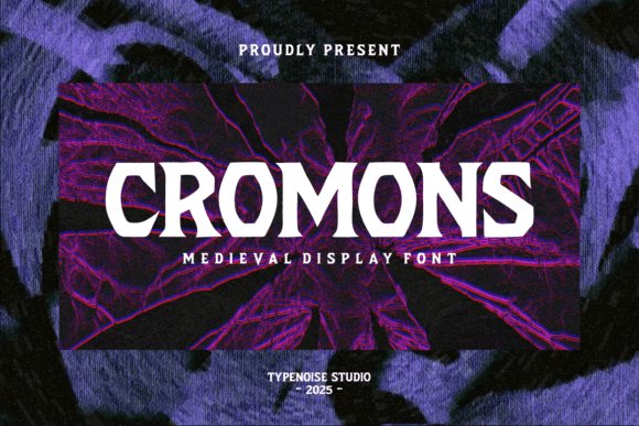
Cromons Font channels the feel of carved stone through sharply angled serifs and chiseled terminals that suggest historic weight without sacrificing modern readability. Strong vertical stress and pronounced flares give the letters a statuesque headline voice, ideal when you need a heroic or mysterious tone. The overall silhouette reads like medieval lettering refined for contemporary layouts, making it well suited to dramatic titles and emblematic wordmarks.
Used on band logos, book jackets, or fantasy game headers, Cromons performs best in display sizes where its carved details register clearly; small text flattens its personality. It pairs neatly with ornamental flourishes or textured backgrounds to push a baroque or heraldic look, or can run in stark monochrome for a bold, emblematic presence. Thoughtful kerning and robust capitals let it work in stacked marks and tight compositions without collapsing the original feel.
My Recommendation: I pick Cromons when a project needs historic authority-fantasy titles, metal band crests, or period-inspired branding benefit from its chiseled voice. It reads as handcrafted and monumental, so it pairs well with borders and aged textures. If you want medieval character without defaulting to blackletter, Cromons delivers that carved quality with usable modern spacing.
15. Ochlaz Font
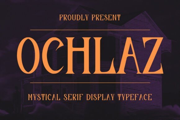
Ochlaz Font pairs high-contrast strokes with theatrical serifs to produce a refined yet unsettling headline presence that suits gothic and noir-inflected work. Long ascenders, curled terminals and purposeful alternates create a measured rhythm across display lines, while the ligatures allow subtle shifts between ornate and restrained moods. The full glyph set and multilingual coverage make Ochlaz practical for international campaigns and cinematic title treatments that demand personality with precision.
Because Ochlaz is optimized for display use, it shines on posters, luxury invites, and film titles where scale reveals sculpted details; smaller applications require generous tracking. Consider cream-on-black palettes or foil printing to emphasize its vintage elegance with a darker attitude, or pair it with minimal supporting text to keep focus on the headline. Included OTF/TTF files and alternates make typographic experiments straightforward without needing heavy graphic overlays.
My Recommendation: I choose Ochlaz when the brief asks for elegance with an edge-editorial spreads, boutique horror covers, or upscale event posters benefit from its dramatic serifs. Its alternates and ligatures give precise control over tone while preserving headline clarity. Use Ochlaz when you want polished serif styling that still carries a shadowy, theatrical personality.
16. Cremated Font
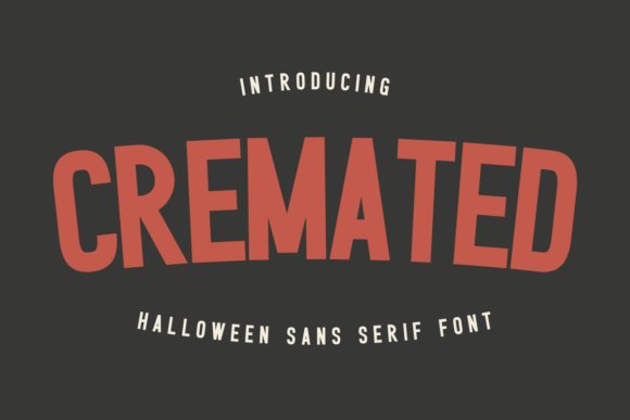
Cremated Font is a bold, angular sans-serif built for macabre branding and seasonal merch. Its razor-like terminals and condensed weight give headlines a rigid, menacing posture that reads cleanly on tees, posters, and mug prints. If you are assembling a set of dark aesthetic fonts for Halloween collections or horror titles, Cremated supplies a high-contrast personality designers rely on.
On the technical side it arrives PUA-encoded in OTF and TTF, so cutters and design apps pick up alternates without extra setup. Kerning trends tight, which favors large display sizes; pair it with a neutral geometric sans or a rough script to soften the bite. For film titling, print-on-demand products, or vinyl-cut signage that needs an aggressive silhouette, it holds up under practical production workflows.
My Recommendation: I reach for Cremated when a headline needs to feel like a warning-perfect for Halloween drops, horror zines, and merch. The PUA encoding saves time when prepping files for Cricut or Silhouette, and the sharp letterforms photograph well on textured surfaces. I usually pair it with muted colorways and grain overlays to emphasize its skeletal geometry.
17. Glien Swoler Font
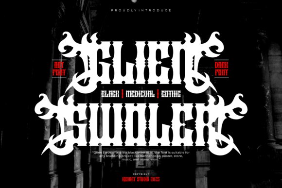
Glien Swoler Font channels old-world blackletter with ornamental strokes that feel handcrafted rather than merely decorative. Its heavy weight and elaborate swashes demand attention, making it ideal for metal band wordmarks, tattoo signage, and gothic poster headers. Because the glyphs are densely detailed, it performs best at large display sizes where the flourishes contribute to the composition.
Designers should let this typeface breathe-use it sparingly to avoid legibility loss and pair it with flat backgrounds or desaturated photos so the ornaments don’t compete. OpenType alternates offer decorative starting and terminal forms for tight lockups and expressive initials. For identities that need historical weight and dramatic character, Glien Swoler has a confident, inky voice.
╰┈➤ Download Glien Swoler Font
My Recommendation: I’d use Glien Swoler when a project requires authentic blackletter gravitas-think album covers, artisan labels, or boutique tattoo branding. It reads like a handcrafted mark and performs best when given room to shine. Keep other elements minimal so the complex letterforms become the focal point.
18. Rocksoul Font
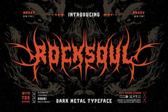
Rocksoul Font pushes blackletter into aggressive metal territory with thick stems crowned by thorn-like barbs. Symmetrical alternates for word beginnings, middles, and endings let you create mirrored logotypes and tight, mirror-like lockups that feel intentional and rehearsed. Despite its violent ornamentation, the letterforms remain sturdy enough for poster headlines and apparel printing.
The designer balanced chaotic detail with generous stem widths so the type survives screen printing and small-run merchandise without collapsing. It rewards manual spacing-the payoff is rhythmic, high-impact word shapes that read like a banner on a gig poster. Use the alternates to craft repeated motifs or ambigram-like treatments for band identities and zines.
My Recommendation: I pull Rocksoul when a project needs full-on attitude-underground shows, zines, and limited-run merch are perfect fits. It loves tight compositions and monochrome palettes, so I pair it with distressed textures to amplify its raw edge. Give it careful kerning and it becomes a strong visual signature.
19. Young Dark Font – dark aesthetic fonts
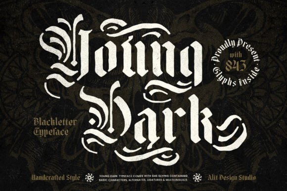
Young Dark Font – dark aesthetic fonts – Young Dark Font channels gothic calligraphy through a blackletter-stencil hybrid that pairs ornamental medieval strokes with intentional negative-space cuts. The letterforms present heavy contrasts and sharp terminals, producing a headline presence that reads like a reclaimed banner-bold, theatrical, and unapologetically dramatic within the world of dark aesthetic fonts. At large sizes the carved details remain readable while lending an artisanal, hand-inked feel.
Practical touches include optional ligatures and stencil gaps that let designers dial between raw aggression and clearer mark-making, plus tight kerning tuned for logotypes and badges. It responds well to textured treatments-distress brushes, metallic inks, and layered overlays all intensify its gothic personality without sacrificing structural clarity. Use it where typography must act as a visual proclamation rather than background filler.
╰┈➤ Download Young Dark Font – dark aesthetic fonts
My Recommendation: I reach for Young Dark when a project needs authentic blackletter attitude-album covers, boutique apparel runs, or fantasy book titles are perfect fits. The stencil breaks allow fast, layered treatments without extra art assets, and the ornate terminals give logos a historic weight. If you want typography that reads as a crafted emblem instead of simple text, this font delivers.
20. Mason Font
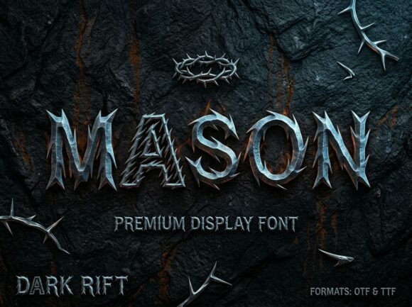
Mason Font simulates a weathered, three-dimensional metal inscription with carved edges and thorn-like terminals that create an almost sculptural silhouette. The design emphasizes surface texture-bronze-to-iron shading and subtle distressing-so titles read as though they’ve been forged rather than typed. That tactile depth makes it especially effective on dark photographic backdrops or matte-print posters where highlights and shadows matter.
This font performs best at display sizes: festival posters, book covers, and theatrical headers where the embossed look can dominate the composition. It pairs nicely with pared-back sans serifs for body text to avoid visual competition, and it translates well to print treatments like spot UV or foil to accentuate the metallic illusion. Avoid small-body use, where the detail becomes noise instead of character.
My Recommendation: I pick Mason when I want typography that feels cast from metal-its dimensional shading gives a sense of weight and craftsmanship. It’s ideal for metal or fantasy album art, cinematic posters, and premium streetwear labels that need a strong emblem. Keep it strictly for display work, and accent it with minimal supporting type to preserve legibility.
21. Drackursa Font
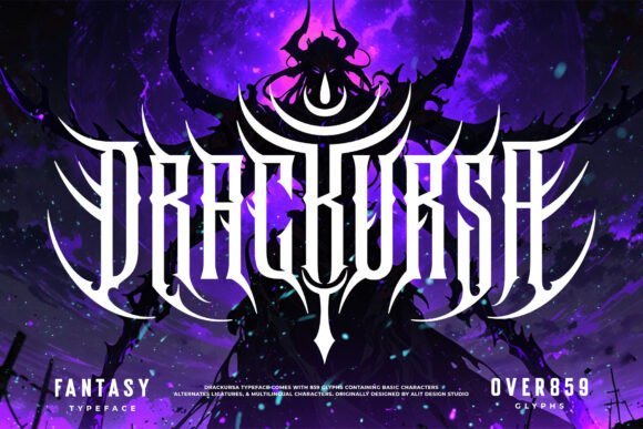
Drackursa Font is sculpted for raw impact: every glyph carries spikes, hooked terminals, and sinuous curves that recall demonic horns and talons, producing a rhythm of jagged silhouettes. The dense ornamentation creates an aggressive texture that reads best when given scale, so it excels as a headline or emblem rather than for continuous text. Its visual energy makes it a go-to for materials that demand hostility and intensity.
When applying Drackursa, allow generous letter spacing or simplified alternates to prevent the details from colliding; gritty overlays and halftones amplify the intended aesthetic without obscuring form. Exporting vector outlines preserves crispness for large-format printing and embroidered merch, while single-color variants help when reproduction needs to be cleaner. Use it where maximalist attitude is the brief-gig posters, merch, and horror zines all benefit from its confrontational stance.
My Recommendation: I use Drackursa when a design must feel confrontational and visceral-band logos, gig posters, and aggressive merch are its natural habitat. The thorned characters instantly signal a no-compromise attitude, and with careful spacing it reads powerfully even at a distance. Keep simplified alternatives handy for tighter layouts, but lean on it for projects that need to shock or provoke.
22. Kate Font
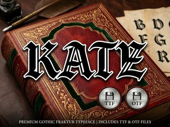
Kate Font – Kate is a premium Gothic Fraktur typeface that channels medieval calligraphy through sharply cut strokes and dramatic contrast. Its capitals and elaborated terminals carry a ritualistic, old-world weight that reads as regal and menacing at display sizes. If you’re curating dark aesthetic fonts for posters, covers, or editorial headers, Kate brings an unmistakable antique voice and theatrical presence.
Technically, Kate holds up in large-format reproduction thanks to crisp outlines, careful kerning, and a suite of contextual alternates and ligatures that maintain rhythm across words. It benefits from generous leading and restrained tracking when paired with a modern sans or simple serif to avoid visual overcrowding. Reserve it for title work, packaging, album art, and any application that needs a historically charged, dramatic headline treatment.
My Recommendation: I use Kate when a project calls for an authentic Gothic statement-book jackets, metal album covers, and cinematic headers are where it shines. Its detailed letterforms demand space and respect, so I keep it to short headlines rather than body text. Pairing it with a neutral sans balances the theatrical strokes and keeps layouts readable.
23. Rune Witch Font
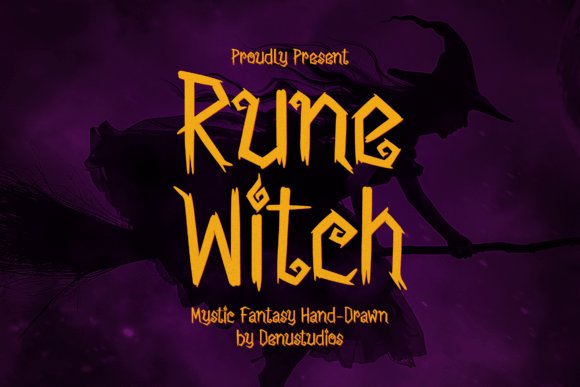
Rune Witch Font – Rune Witch is a hand-drawn display font defined by jagged terminals, irregular baselines, and inked strokes that read like markings from a weathered grimoire. Each character feels improvised, with uneven edges and expressive alternates that suggest spellwork or ritual graffiti rather than polished type. The effect is lively and unsettling, ideal for projects that need a handwritten, occult-inflected voice.
Because of its idiosyncratic shapes, Rune Witch performs best as a headline or logo; spacing adjustments and selective vector cleanup preserve legibility at smaller sizes. It responds well to layered textures, subtle glows, or emboss treatments to amplify its supernatural mood without overpowering composition. Use alternates sparingly to maintain readability while keeping the font’s raw, handcrafted charm intact.
My Recommendation: I reach for Rune Witch for Halloween posters, indie fantasy zines, and game titles when I want a raw, magical edge. It gives instant personality but benefits from careful spacing and texture to stay readable. For supporting copy I pair it with a clean sans to avoid competing letterforms and to let the display type take center stage.
24. Lycolips Font
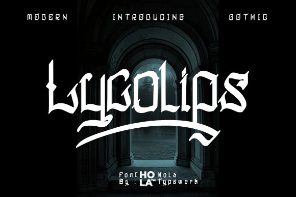
Lycolips Font – Lycolips updates traditional blackletter with cleaner terminals, tighter proportions, and a sharper silhouette that balances gothic heritage with modern clarity. It evokes carved stone and stained-glass verticality while trimming excess ornament so the forms remain bold and legible in logo contexts. The result is a dramatic yet disciplined face that works across print and screen without feeling fussy.
Lycolips ships PUA-encoded, offering swashes, alternates, and decorative capitals that speed up custom lettering and wordmark creation. Designers can mix default glyphs with stylistic sets and refined kerning to craft distinctive headers, tattoo layouts, or packaging labels. It holds up best at medium display sizes and responds well to subtle metallic or textured finishes for premium applications.
My Recommendation: I pick Lycolips when I need blackletter energy with modern readability-perfect for labels, tattoos, and boutique branding. The PUA extras let me add flair without juggling multiple tools, and the pared-back details mean the text stays clear on screens. I typically combine it with a restrained sans and use alternates selectively to keep compositions balanced.
25. Death Blode Font
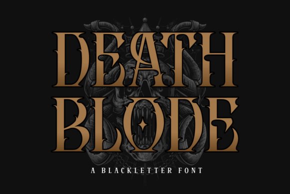
Death Blode Font – Death Blode is a showy blackletter display that leans into gothic mood with needle-like terminals and dense, inked counters. Its carved shapes and ornamental strokes echo medieval manuscripts and metal record sleeves, making it one of the stronger dark aesthetic fonts for projects that need theatrical, weighty lettering. The overall rhythm favors large sizes where the texture and dramatic forms can read clearly.
This face works best as a headline or logotype: the tight spacing and complex forms lose clarity at small sizes, but shine on posters, album covers, and branded merchandise. OpenType ligatures and alternate capitals give room for custom wordmarks, while pairing it with a neutral sans helps tame the visual intensity for layouts. If you use it, increase tracking slightly and test for web rendering to avoid loss of stroke detail.
My Recommendation: I reach for Death Blode when a design must feel ritualistic and hand-forged-metal bands, gothic events, or tattoo-inspired identities. It supplies instant character and historical weight that simple fonts can’t match. Use it at display scale and pair with clean, simple type to preserve readability while keeping the dramatic flair.
26. Dark Empire Font
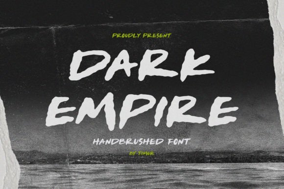
Dark Empire Font – Dark Empire is a hand-brushed script built from thick, textured strokes and lively terminals that read as deliberately rough rather than slick. The brush texture projects an urban, gritty energy that works well on posters and packaging where personality is required without sacrificing legibility. Its shapes lend themselves to motion-titles animate cleanly while retaining their handcrafted feel.
The family includes alternates and expressive swashes to vary wordforms and avoid repetition, and its raw edges reproduce nicely with distressed printing or screen-based grain effects. Pair it with a restrained grotesque for body copy, and watch collisions where brush tails meet. It fits apparel branding, music artwork, and bold editorial headlines that need a human edge.
My Recommendation: I use Dark Empire when a piece needs attitude and a human touch-streetwear labels, promo posters, or craft beverage packaging. The brush marks give headlines movement and a lived-in quality that vector scripts often lack. Work in generous sizes so the texture remains legible and true to the original brush strokes.
27. Gerka Font
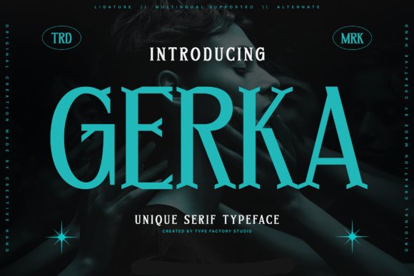
Gerka Font – Gerka is a high-contrast serif with sharply sculpted serifs and pointed terminals that flirt with ornamental aggression. Its architecture feels like a modern revival with aggressive bracketing and thorn-like details, producing a couture, cinematic tone that suits edited, upscale layouts. Vertical stress and narrow counters grant Gerka a statuesque posture ideal for commanding headlines.
Because of its strong personality, Gerka excels in mastheads, luxury packaging, and identity marks where a single display face must set the mood. Pair it with a neutral geometric sans for longer passages, and reserve the boldest styles for short phrases or logotypes to prevent visual fatigue. On screens, consider optical sizing or slightly increased tracking so the fine strokes remain crisp and legible.
My Recommendation: I pick Gerka when the brief asks for fashion-minded authority-lookbooks, boutique identities, or cinematic posters. It brings a sharp, editorial edge that reads refined and slightly severe, which is perfect for brands that want presence without ornament overload. Use it sparingly in headlines and balance it with simple supporting faces to let its character lead the design.
28. Tall Tattoo Font
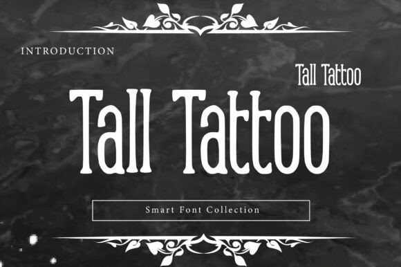
Tall Tattoo Font – Tall Tattoo is a bold, elongated serif that borrows the grit of inked lettering while leaning into high-fashion proportions. Its compressed verticals and knife-like serifs read like professional needlework, producing striking negative space and a sense of upward motion. As one of the more theatrical dark aesthetic fonts, it balances retro tattoo cues with polished display sensibilities.
Use it for boutique apparel labels, barber and biker branding, editorial mastheads, or posters where vertical drama matters. It rewards tight tracking, tall caps, and bold weights against textured backgrounds – think leather, washed denim, or distressed paper – and pairs well with a clean sans for contrast. The face performs best at large sizes where its decorative serifs and elongated counters can be appreciated.
My Recommendation: I reach for Tall Tattoo when a project needs vertical attitude rather than generic toughness. Its elongated serifs and compressed forms give logos and apparel labels a refined outlaw character that prints beautifully on fabric and leather. I’d use it for boutique tees, barbershop signage, and editorial covers where a bold, vintage-meets-fashion headline is required.
29. Outline Blackletter Font
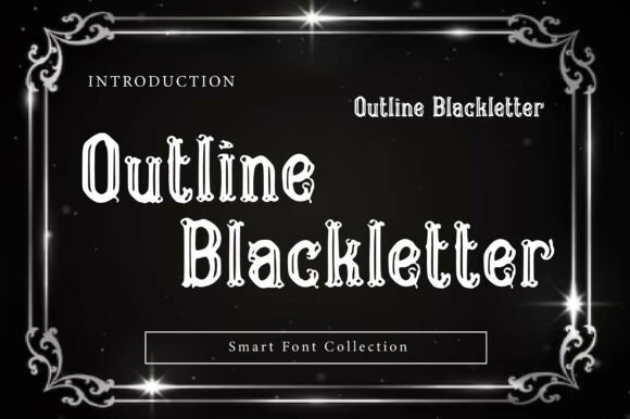
Outline Blackletter Font – Outline Blackletter strips Old English forms down to their contours, producing a hollow-letter effect that reads as both vintage and graphic. The open interiors let backgrounds show through, making it ideal for layered treatments with photos, gradients, or neon glows. Sharp terminals and ornamental strokes give headlines a medieval-meets-retro personality without tipping into heavy blockiness.
It thrives at large scales on posters, merch, and band logos where silhouette and contrast matter most. Try masking imagery through the letter hollows, or pair it with solid sans subheads to preserve readability; thinner outlines sing over flat colors while bolder weights hold up against textured scenes. Treat it as a headline tool rather than body copy for maximum impact.
╰┈➤ Download Outline Blackletter Font
My Recommendation: I choose Outline Blackletter when I want Gothic flair that interacts with the background-its hollow forms make composite art feel integrated rather than layered. It’s perfect for streetwear drops, festival posters, and band merch where the lettering should feel sculptural. Scale it up, experiment with glows or gradients in the hollows, and let the surrounding artwork tell half the story.
30. Tsagaru Font
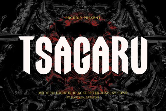
Tsagaru Font – Tsagaru refashions classic blackletter into a cinematic horror display with elongated shafts and blade-like serifs that bite the page. Its silhouettes recall cathedral tracery and ritual lettering, while refined stroke endings keep the look contemporary and purposeful. The overall tone is atmosphere-heavy, giving titles a sense of ceremony and looming tension.
Ideal for movie posters, metal album covers, and dark fiction titles, Tsagaru responds well to distressed overlays, selective ink traps, and dramatic lighting effects. Keep tracking tight and use large sizes for maximum presence, pairing it with muted palettes-deep crimsons, slate grays, and bone tones-to amplify contrast. When reserved for display use, it anchors a layout with unforgettable mood and character.
My Recommendation: Tsagaru is my go-to when a title needs to feel ominous but curated; it brings ritualistic weight without appearing antique. I use it on horror film posters, album art, and special-edition novels where atmosphere drives the reader’s first impression. Add subtle grime or ink splatter textures to deepen the mood while keeping the letterforms legible at display sizes.
31. Blood Oath Font
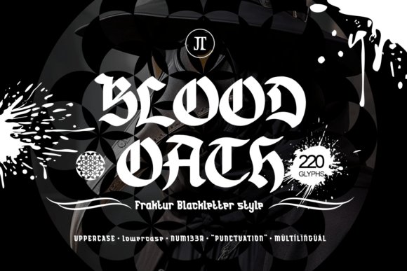
Blood Oath Font – Blood Oath throws a visceral, hand-inked punch: thick blackletter forms with ragged terminals and dripping stroke details that feel intentionally imperfect. The type behaves like a display asset rather than body text, with high contrast and textured fills that read best at large sizes and on poster layouts. It ships with full case sets, numerals, punctuation and multilingual glyphs, so you can compose headlines and extended wordmarks without hunting for substitutes.
Use the font when you want theatrical menace-movie posters, metal band logos, Halloween campaigns and gritty brand marks all gain theatrical personality from its raw, tactile strokes. Pair Blood Oath with a neutral, low-contrast sans for subheads so the ornamentation stays legible; for atmosphere, layer it over grainy blacks or muted crimson accents to join other dark aesthetic fonts in mood-driven work.
My Recommendation: I reach for Blood Oath when a project needs an immediate gothic statement that feels hand-rendered. Its textured edges give printed and screen pieces a tactile darkness that flat blackletters often lack. I’d use it for horror posters, vinyl covers or limited-edition merch where headline impact and personality matter most.
32. Cherysan Font
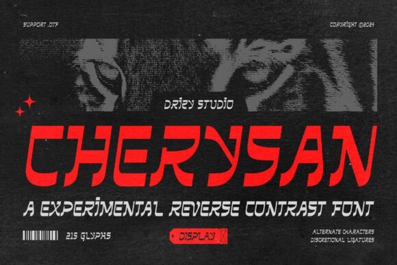
Cherysan Font – Cherysan flips slab expectations with reverse-contrast serifs that emphasize heavy horizontal strokes and comparatively lighter verticals, creating a slightly mechanical but stylishly off-kilter effect. Those unusual proportions generate a rhythmic cadence across words, making it an attention-grabbing choice for album art and poster headers where each letter carries visual weight. The slab roots keep it readable while the reversed stress injects an industrial, futuristic vibe without feeling cold or clinical.
This face works well with neon palettes, stark photography, or abstract geometric backgrounds for club flyers and electronic music branding. For tight layouts try slightly increased tracking and crisp negative space to prevent the strong horizontals from crowding; combining Cherysan with a minimalist grotesque for body copy keeps hierarchy clear and the headline dramatic.
My Recommendation: I’d pick Cherysan for techno and synthwave projects where typography needs to feel slightly mechanical yet expressive. It draws the eye in posters and album covers, and plays nicely with high-contrast color schemes. Use it when you want an edgy headline that reads like part of the visual identity rather than a neutral label.
33. Headbang Font
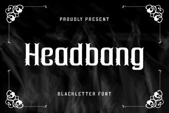
Headbang Font – Headbang channels classic blackletter energy with angular forms, sharp serifs and stiff verticals that emphasize force and attitude. The letterforms are condensed and aggressive, designed to scream from billboards and t-shirt chests alike, while still maintaining enough internal counters to remain recognizable in short headlines. Its aesthetic leans toward medieval and metal subcultures, making it instantly legible as a symbol of rebellious identity.
Best applied at bold display sizes, Headbang pairs well with distressed textures, scratched backdrops and monochrome palettes used in band merchandise and gig posters. Keep tracking relaxed for long words to avoid clashing serifs, and reserve it for titles, logos, or initials where the design needs uncompromising presence rather than subtlety.
My Recommendation: I rely on Headbang when designing for metal bands, skate apparel, or alternative event branding that demands attitude. The font reads like a shout-great for large-format posters and caps-on logos. Use it when you want typography to convey raw power and cultural edge rather than quiet refinement.
34. Echoes Font
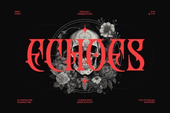
Echoes Font – Echoes is a blackletter display drawn with razor-pointed terminals and jagged barbs that read like extreme metal album typography. Its heavy, angular strokes produce an immediate, menacing silhouette ideal for stage posters and band logos, and it fits naturally among dark aesthetic fonts used in alternative music art. Designers will notice the font’s dramatic internal counters and compressed proportions, which create dense, tactile headlines.
At display sizes Echoes holds crisp detail and the uppercase and lowercase forms offer surprising versatility: swap in alternates to increase ornamentation or simplify for clearer branding. Tight tracking amplifies the texture while generous leading helps legibility in stacked headlines; outlines convert cleanly to vector work for merchandise and packaging. Use with a neutral geometric sans for body copy to balance its intensity.
My Recommendation: I reach for Echoes when I need a visceral, metal-ready voice-its pointed forms cut through imagery and read well on dark backgrounds. The alternates let me dial between ornate and pragmatic, so I’ve used it on gig posters, album sleeves, and enamel patches. If a project needs a typeface that reads as both threat and ceremony, Echoes supplies that personality without heavy tweaking.
35. Dark Brutal Font
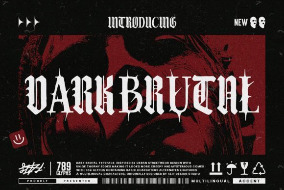
Dark Brutal Font – Dark Brutal channels medieval blackletter with rough, weathered strokes that look hand-chiseled rather than machine-forged. The textured edges and uneven stress read like worn metal signage, giving a gritty, confrontational voice to headlines and identity marks. Its letterforms are heavy but retain open counters, keeping words legible even as the type suggests age and abrasion.
This typeface thrives on high-contrast layouts: pair it with muted palettes, distressed photography, or stark monochrome to let the texture sing. It performs best at large sizes for posters, album art, or apparel, and small text will obscure its distressed detailing. Use selective caps and tracking to build hierarchy without overpowering the composition.
My Recommendation: I use Dark Brutal when a project needs a raw, lived-in character-its weathered finish reads as authenticity rather than simulation. It’s perfect for streetwear branding, punk or metal posters, and merch mockups where tactile, analog character helps sell the concept. The distressed forms often save time because they deliver an aged look without layering extra effects.
36. Banas Font
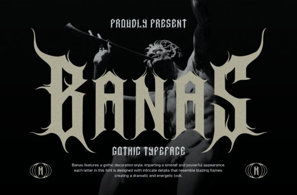
Banas Font – Banas pulls from Indonesian myth with letterforms that feel like embers-flaring terminals, curled strokes, and decorative flame-like serifs that give each glyph a ritualistic presence. Alternates for uppercase letters let you toggle between restrained Gothic and a more ornate, ceremonial script, so the type can either whisper menace or roar with ornament. The overall effect suits theatrical posters, metal logos, and designs that want a mythic, incendiary voice.
Despite its ornamentation, Banas remains production-friendly thanks to clean stroke construction and consistent baseline locking. Reserve it for titles, badges, and packaging where its decorative details can breathe; pair with a stripped-back sans or slab for supporting copy. For small-scale uses, convert glyphs to outlines to preserve the fine flame motifs in print and embroidery.
My Recommendation: I choose Banas when a concept benefits from folklore-infused drama-its flame motifs add narrative without extra imagery. It works especially well for band branding, festival posters, and collectible merch where symbolic lettering drives the mood. When I need a bold decorative voice that packs meaning into each letter, Banas is my go-to.
37. Hudson Font
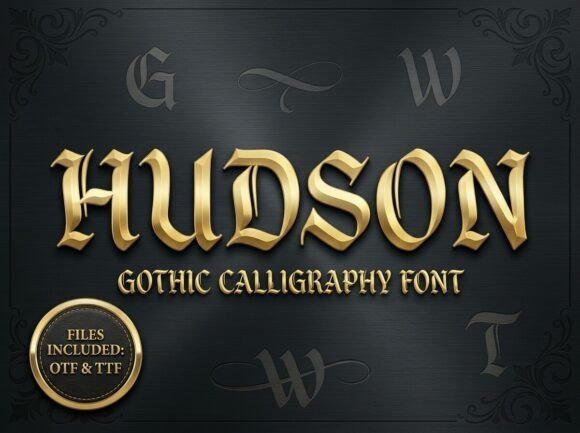
Hudson Font – Hudson channels old-world Blackletter into a bold, modern display: its gothic calligraphy roots are visible in angular, architectural strokes and a rigid vertical rhythm that reads like carved lettering. The chisel-tip contrast gives each glyph a sculpted feel, while alternate characters and ornamental ligatures let you dial between restrained and baroque moods. At headline scale the type becomes a visual anchor, ideal for labels and mastheads that need a commanding, historic voice.
Among dark aesthetic fonts, Hudson brings theatrical density without collapsing legibility thanks to deliberate counter shapes and thoughtful spacing, so it photographs well on packaging and album art. Stylistic sets and contextual alternates make it simple to craft distinctive wordmarks, and it pairs best with neutral sans-serifs or compact slab faces when you need an elegant but forceful contrast. Keep it for display use-posters, boutique spirit branding, tattoo studio identities, and cinematic editorial headers where drama matters.
My Recommendation: I pick Hudson when a project needs weighty, heritage-driven typography that reads as crafted rather than generic. Its alternates and ligatures give me flexibility to tune ornamentation without juggling multiple families, and the strong vertical rhythm makes logos and covers feel intentionally designed. Use it for premium liquor labels, metal or hip-hop album art, high-impact editorial headers, or any identity that benefits from a gothic, inked attitude.
These 37 dark aesthetic fonts offer a compact toolkit for Book Cover Design, whether you need brooding serifs or raw display scripts. Try a handful on mockups, check licenses, and refine spacing and kerning for the strongest impact.
Keep a shortlist of 3–5 favorites to speed approvals and maintain a consistent mood across editions. Thoughtful type choices will anchor your cover and draw readers in.