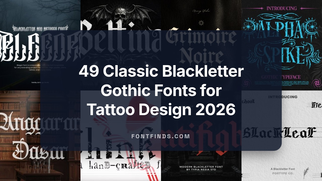
49 Classic Blackletter Gothic Fonts for Tattoo Design 2026
Blackletter gothic fonts have been a staple of historical typography and modern tattoo lettering; this list of 49 blackletter gothic fonts highlights options that work especially well for Tattoo Design. You’ll find Textura, Fraktur, and Old English variants alongside more calligraphic, swash-ready faces.
When choosing a blackletter for ink, check stroke contrast, ligatures, alternate characters, and how the forms hold up at small sizes. Many families offer stylistic alternates and vector outlines that make it easier to adapt lettering to body contours and stencil work.
1. Story Chef Font
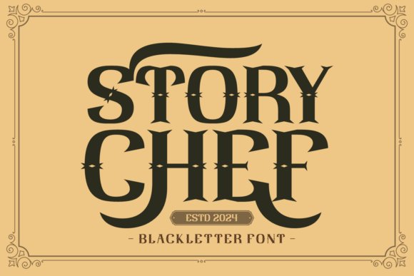
Story Chef sits firmly in the canon of blackletter gothic fonts, marrying dense verticals with broad, confident pen strokes for a commanding headline presence. Its letterforms nod to 19th‑century Fraktur but use tightened spacing and thicker counters that improve readability at display sizes. Decorative capitals include swashes and alternate terminals that let you build dramatic initials without extra illustration. The overall weight produces an immediate focal point on packaging, posters, and editorial mastheads.
Under the hood Story Chef includes discretionary ligatures, contextual alternates, and small caps to smooth word shapes across long titles. It pairs effectively with neutral sans faces when you need a modern contrast, or with textured backgrounds for a period look; webfont and desktop formats are bundled for quick deployment. Designers will appreciate the balance between ornamental detail and practical spacing for logos, book covers, and merchandise graphics.
My Recommendation: I use Story Chef when a headline must feel historical and authoritative without reading as decorative noise. The alternates make logo exploration fast, and the heavy color holds up on textured substrates like kraft or linen. It’s my go-to for editorial covers, craft-label work, and posters that need a strong period voice.
2. Praw Font
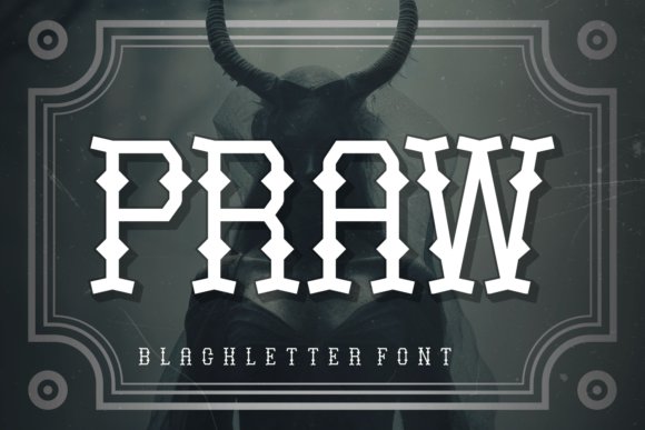
Praw reframes blackletter traditions into a cleaner, more geometric set of forms, softening some high‑contrast strokes for improved clarity in mid‑sized headlines. The design pares back ornate terminals in favor of squared curves and compact counters that hold up at smaller display sizes. OpenType ligatures remain available to inject character when needed, but the overall impression is restrained and contemporary. That restraint makes Praw a solid choice when Gothic flavor is desired without full historical flourish.
In practice Praw pairs well with neutral grotesques so the letter shapes can breathe, and its single weight covers most headline needs while offering stylistic alternates for bespoke logotypes. Kerning is pragmatic and predictable, which speeds layout work on apparel mockups and poster art. Use it for merchandise, modern editorial headlines, and identity work that benefits from vintage references but requires readable forms.
My Recommendation: I pick Praw when a design needs a subtle nod to Gothic lettering without the theatrical trappings. It gives projects personality without hogging the composition, and the alternates let you tweak wordmarks quickly. Ideal for clothing labels, posters, and packaging that want attitude with control.
3. Highway Dreams Font
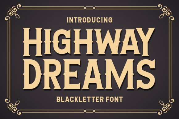
Highway Dreams stretches blackletter cues into a condensed, motion‑oriented display face that reads like retro road signage. Long vertical stems tilt with a slight forward bias and terminals flare with speed‑line motifs, creating a sense of movement while preserving a Gothic backbone. Its narrow proportions allow long headlines to sit in tight columns and marquee strips without losing punch. Decorative ligatures and drop‑cap alternates add flourish for posters and album covers.
Technically, Highway Dreams ships with multilingual support, PUA‑encoded stylistic sets, and responsive kerning tuned for compact headlines on digital banners. It performs best at larger sizes where the carved strokes reveal texture; at small sizes delicate details can fill in. Designers favor it for band logos, retro branding, and event posters where a road‑tested, Americana energy is needed and horizontal space is limited.
╰┈➤ Download Highway Dreams Font
My Recommendation: I reach for Highway Dreams when a piece needs speed and attitude in a tight layout: it reads like a neon boulevard sign but with Gothic structure. Its condensed profile saves space while keeping strong visual identity, and the alternates let you customize initials quickly. Perfect for music posters, lifestyle brands with a vintage tilt, and any application that needs bold display headlines in narrow columns.
4. Hained Font
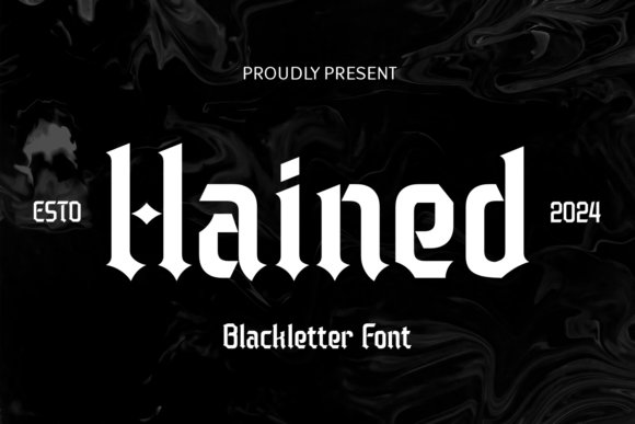
Among blackletter gothic fonts, Hained reads like a modern reinterpretation of medieval calligraphy: strong vertical stems, compact counters, and heavy terminal strokes give each word a forceful silhouette. Capitals carry restrained ornament while lowercase letters are built for clarity, so the face holds up in both printed posters and pixel displays. The overall temperament leans toward authoritative typography without becoming overly ornate, preserving legibility at display sizes.
Use Hained where a design needs historical weight but still must feel contemporary-think hardcover titles, boutique apparel labels, and event posters with a stern, formal mood. It responds well to high-contrast palettes and generous tracking when set in long headlines, and it benefits from subtle texture when screened for merchandise. For best results, pair it with a narrow sans for captions or small information blocks to keep the layout readable.
My Recommendation: I use Hained when I want a headline that carries heritage and punch without collapsing into excessive decoration. It gives book covers, premium product labels, and poster art a serious voice while remaining surprisingly adaptable for modern layouts. If you need a dominant display face that still behaves in tight compositions, Hained is a reliable choice.
5. Knights Font
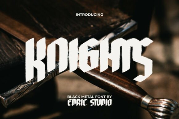
Knights is a display blackletter designed to feel handcrafted and weathered, with rough brush textures and splatter marks that read as intentional grit. Its forms are bold and angular, evoking manuscript inkwork and metal engravings; letters demand space and show best at large sizes where texture and stroke contrast remain visible. The font favors display use and carries a theatrical, nocturnal personality suited to darker themes.
Practical applications include posters, band identity, and event branding where an aggressive, vintage-heavy presence is wanted; it pairs well with open, minimalist serifs or monospaced blocks for credits and secondary text. For print and screen printing, convert the textured fills to vectors or apply a halftone for tactile depth; reduce kerning slightly for headline runs to keep the word shapes compact and impactful. Use sparingly in body text-its strength is headline authority, not long-form reading.
My Recommendation: I reach for Knights when a project needs raw character-album art, tattoo shop signage, or Halloween-themed campaigns are prime fits. The textured strokes give compositions a lived-in, analog feel that digital effects rarely match. If you want a typeface that reads like it was forged by hand and looks striking from a distance, Knights does that job well.
6. Blegor Font
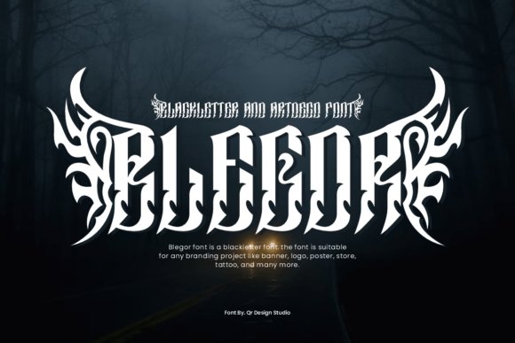
Blegor combines blackletter verticality with art-deco geometry and tribal embellishments to form letters that are almost emblematic rather than purely alphabetical. The uppercase glyphs carry elongated spikes and carved ornaments that create a motion-like silhouette, while the lowercase set simplifies the drama enough to maintain rhythm in short lines. Weight is heavy and uncompromising, so Blegor performs best in logo work, headings, and one- or two-word treatments where each character can function as a visual motif.
The typeface includes stylized numerals, punctuation, and PUA-encoded alternates, which makes complex lockups and decorative wordmarks straightforward to assemble. For application, think band insignia, couture labels, or poster art where baroque attitude is desirable; keep surrounding elements minimal and use solid color fields or subtle gradients to let the carved details breathe. When reproducing at large scale, convert to outlines and refine contrast to preserve delicate spikes during production.
My Recommendation: I pick Blegor when a project needs maximal personality-its hybrid gothic-art-deco DNA works beautifully for band logos, edgy fashion branding, and tattoo-inspired identity. The built-in alternates and heavy weight make it simple to create unique wordmarks without stacking extra ornament. For any brief that asks for theatrical, high-contrast lettering with a rebellious edge, Blegor is one of my first choices.
7. Anggaran Dasar Font
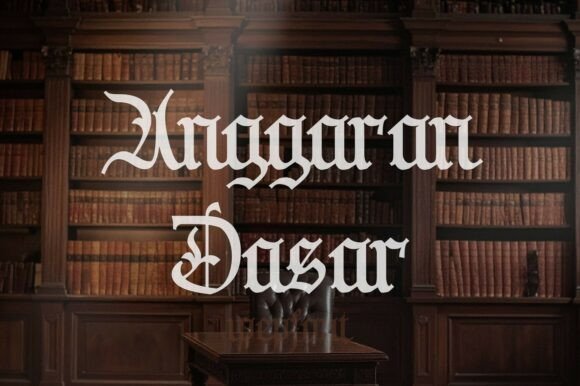
Anggaran Dasar channels medieval manuscript flair with dense, calligraphic strokes and ornate capitals. Its sharply cut serifs and tightly woven counters give a stately, ceremonial presence that sits squarely among blackletter gothic fonts used for heritage projects. The letterforms show careful attention to stroke contrast and terminal details, so initials feel like miniature engravings. Despite its heavy texture, letter spacing avoids clogging when used at headline sizes.
Use this face when a project needs formal weight – diplomas, seals, period book jackets, or event titles that require a solemn voice. The abundant ligatures and decorative alternates let designers craft initials and monograms without adding bespoke illustration. Treat it as a display face: pair with a neutral sans for body copy and reserve the ornate capitals for focal moments. Its vintage character reads as authenticity rather than pastiche when set with restrained color and layout choices.
╰┈➤ Download Anggaran Dasar Font
My Recommendation: I reach for Anggaran Dasar when I want an authoritative, historically grounded title face; its carved capitals and dense texture immediately set a formal tone. It excels on embossed stationery, certificates, or covers for historical fiction because it reads as handcrafted. Use it sparingly at large sizes and pair with a clean sans to keep layouts readable.
8. Bundles Blackletter Font Bundle
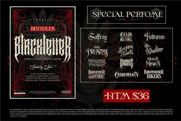
This twelve-font collection gathers heavy Victorian blackletter, metal-inspired faces, Old English revivals, and moodier gothic display types into a single kit. The range of weights and ornament sets gives you options for headline drama, decorative logos, and packaging that nod to 19th-century sign painting. Each font differs in contrast, x-height, and flourish density, so mixing a simpler banded blackletter with a more ornate companion creates visual hierarchy without redesigning letterforms. Licensing across the bundle often includes desktop and web formats, useful for cross-platform branding.
Designers will appreciate how the bundle covers both tight-textured textura styles and airier Victorian variants that perform better at medium sizes. Use the chunkier metal styles for posters and apparel, while the refined Old English cuts suit certificates or themed hospitality signage. Pay attention to kerning and manual ligatures when setting copy; these fonts sing at display sizes but can become dense in long lines. Consider pairing with slab or humanist sans families to ground the compositions.
╰┈➤ Download Bundles Blackletter Font Bundle
My Recommendation: I recommend this bundle when a project needs a broad toolkit of antique-inspired display faces – it saves time compared to sourcing individual licenses. Its variety lets you craft cohesive identity systems with period flavor across print and web. I keep bundles like this on hand for theater posters, craft brewer labels, and album art.
9. Dwaycome Font
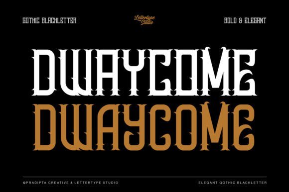
Dwaycome blends ornate blackletter gestures with simplified strokes that prioritize legibility, putting a contemporary spin on traditional gothic script. Alternates and restrained swashes present the visual drama of Fraktur and Old English while reducing visual clutter, so logos and titles retain impact at small display scales. The face includes refined kerning and discreet ligatures, which keeps word shapes readable without losing that carved-letter feel. Its modernized proportions make it a practical choice for identity work that wants a historic voice without sacrificing clarity.
Use Dwaycome for branding that needs personality-boutique labels, poster headlines, and editorial covers where a vintage tone must read across digital and print. It pairs well with pared-back sans-serifs for body text and gains presence with subtle textures or metallic inks. When working in motion or animation, the simpler terminals avoid distracting flicker at small sizes, so titles remain crisp. Consider the font’s alternate capitals for monograms or standout initials.
My Recommendation: I’d pick Dwaycome for client work where heritage aesthetics must coexist with modern usability; it gives character without compromising legibility. The alternate glyphs make it flexible for logos and merchandise. Apply it at headline sizes and balance it with neutral supporting type for clean results.
10. Wild Eagle Font
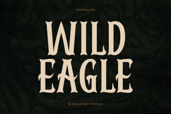
Wild Eagle reinterprets Old English letterforms with crisp modern lines and assertive contrast. As part of a curated set of blackletter gothic fonts, it blends the dense, interlocking shapes of Fraktur with trimmed terminals so headlines remain legible at display sizes. The design keeps dramatic silhouettes while removing excess ornament, making it suitable for contemporary branding, apparel badges, and product packaging.
Its OpenType toolkit includes discretionary ligatures, stylistic alternates and small caps, giving creative control over ornament without manual redraws. Tight kerning and strong vertical stems suit logotypes and label work, though long passages will feel heavy; pair Wild Eagle with a plain geometric sans for contrast or a muted serif when a vintage mood is wanted.
My Recommendation: I reach for Wild Eagle when a brand needs Gothic impact without period excess. The restrained swashes preserve readability on small labels while ligatures add personality for packaging and headlines. Use it for streetwear branding, boutique spirits, or editorial mastheads where historic presence must feel contemporary.
11. Anabella Font
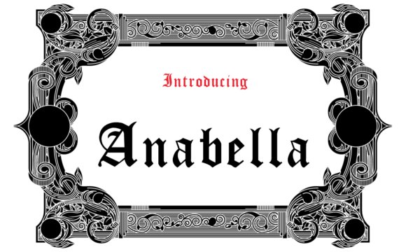
Anabella lives on the decorative side of blackletter-inspired type, favoring elongated ascenders and refined terminal strokes that read as deliberate calligraphy. It shines in display work: titles, logotypes and print covers where its fine contrasts and graceful swashes communicate a handcrafted aesthetic. Textured papers and premium packaging amplify its tactile qualities, making each letter feel sculpted rather than mass-produced.
The family offers several alternates and a robust set of ligatures so designers can vary word shapes without redrawing characters. At tighter sizes the ornamentation can clog, so reserve Anabella for headers, badges and invitations rather than body copy. For balance, pair it with a neutral grotesque or a calm serif and keep layouts minimal so the decoration remains the focal point.
My Recommendation: I’d choose Anabella for wedding stationery, boutique labels, and editorial mastheads that need ornament with clarity. Its decorative capitals make monograms and initials sing, but keep point sizes generous to show the delicate strokes. Pair it with clean supporting type to let its character take center stage.
12. Westend Ridge Font
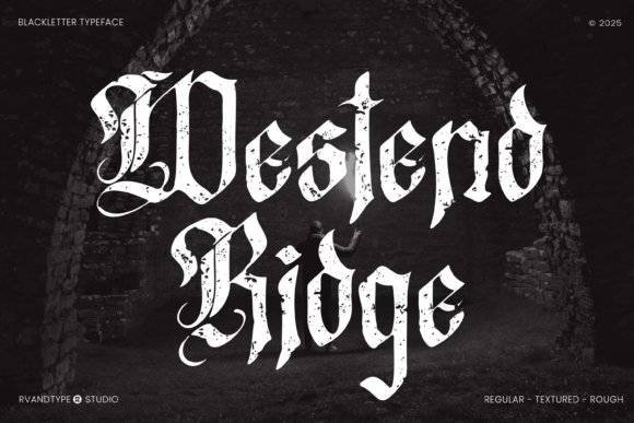
Westend Ridge channels mid-century sign painting through a blackletter-influenced voice, marrying Old English letterforms with retro proportions and slightly weathered contours. The result reads handcrafted and nostalgic, ideal for projects that benefit from an aged, artisanal presence rather than a strict historic replication. It’s particularly effective on brewery bottles, gig posters and lifestyle brands seeking an old-school edge.
The family includes roughened textures and heavier weights that translate well to distressed printing, embroidery and embroidered patches. Because of its ornamentation and dense forms, limit use to short phrases, logos or display headlines so the personality can breathe. Keep backgrounds muted and palettes restrained to let the type’s vintage character remain the focal point.
╰┈➤ Download Westend Ridge Font
My Recommendation: I reach for Westend Ridge when a brief calls for authentic vintage character-think craft beer labels, barbershop signage, or vinyl covers. Its aged shapes work beautifully over textures and photographs without feeling fussy. Use it sparingly as a display face so the nostalgic details can carry the design.
13. Alice Font
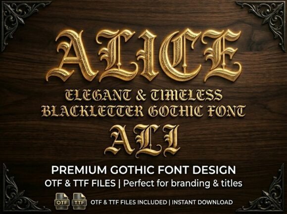
Alice channels the monumentality of medieval script while keeping letterforms readable for modern design. Its high-contrast strokes, sharply flared terminals, and finely worked ornamentation read like script from illuminated manuscripts, and the set includes contextual alternates and decorative ligatures that give text a handcrafted presence; this makes Alice a strong entry among blackletter gothic fonts for projects that need an aristocratic voice.
The typeface performs best at display sizes where its carved details can breathe, and kerning appears tuned for tight headlines and label work. OpenType features such as stylistic sets and discretionary ligatures let you tighten or loosen the flourish level, so you can use Alice on premium spirit bottles, cinematic title cards, and editorial headers without losing clarity.
My Recommendation: I would reach for Alice when a design must read expensive and archival: think boutique liquor labels, jewelry packaging, or a film title sequence that needs a regal mood. It adds historical weight without feeling fussy, and the alternates let you dial ornamentation up or down. Pair it with a clean sans for contrast and reserve it for headlines rather than body text.
14. Bladge Font
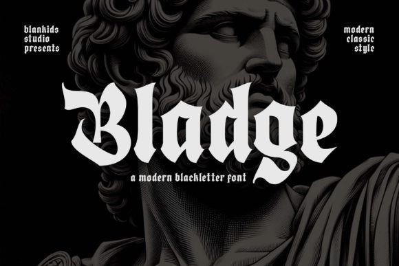
Bladge merges old-world blackletter structure with a raw, Western attitude, producing compact letterforms with bold verticals and sharp crossbars. The character set includes tattoo-friendly glyphs and exaggerated swashes that create strong, single-word logos and signage; its personality reads loud on apparel and storefront signage where presence matters more than subtlety.
Spacing and stroke weight favor display usage, so Bladge excels on crowns, caps, and stitched patches rather than long paragraphs. Designers will appreciate the headline impact and the way its weight holds up in low-resolution reproduction like embroidery, screen printing, and shopfront lettering.
My Recommendation: I use Bladge when a project needs a gritty, Western-goth edge-tattoo studio marks, barber shop badges, and streetwear labels are ideal. It cuts through textured backgrounds and prints well on fabric. For balance, set it against a lighter, neutral secondary face to keep compositions readable.
15. Think Font
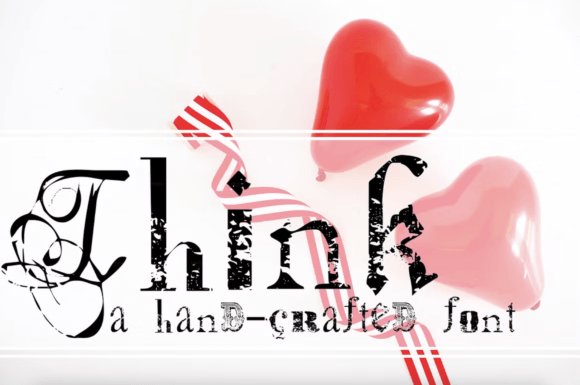
Think is a playful mashup that threads distressed blackletter with typewriter and rubber-stamp aesthetics, giving each glyph an off-kilter personality. Roughened edges, uneven ink distribution, and irregular baselines produce an analogue, DIY feel that works especially well for posters, album covers, and packaging that want to evoke vintage presswork without being historically precise.
The family includes alternates and textured fills so you can vary the degree of wear across headlines, and its compact proportions make it useful where space is tight. Use Think for short bursts of text and graphic elements where tactile, handcrafted texture is the main message rather than formal legibility.
My Recommendation: I pick Think for projects that need character over polish-indie record art, craft beer labels, and retro event posters come to mind. Its weathered look reads as authentic print distress and brings warmth to sterile layouts. Combine it with minimal layouts and solid colors to let the texture take center stage.
16. Gothic Font
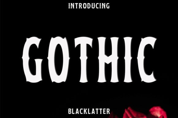
Gothic Font channels medieval script with bold, angular strokes and pronounced verticals that recall stone-cut lettering and illuminated manuscripts. The letterforms combine sharp serifs and ornamental terminals to produce a theatrical, somber voice that sits squarely among classic blackletter gothic fonts while remaining surprisingly adaptable for modern graphic contexts.
At display sizes the type delivers strong hierarchy for mastheads, packaging, certificates, and poster headlines; its decorative alternates and ligatures lend authentic Old English and Fraktur flavor without feeling canned. Pair it with a neutral sans for contrast, enable contextual alternates and discretionary ligatures in OpenType, and use generous tracking when typesetting multi-word lines for best clarity.
My Recommendation: I reach for this Gothic Font when a project needs immediate historical weight-book covers, brewery labels, and event posters all benefit from its ritualistic tone. It gives designs an authoritative, archival feel while still allowing for modern composition through OpenType alternates. For me, it’s the go-to when I want a piece to read like a relic rather than a trend.
17. Underaz Font
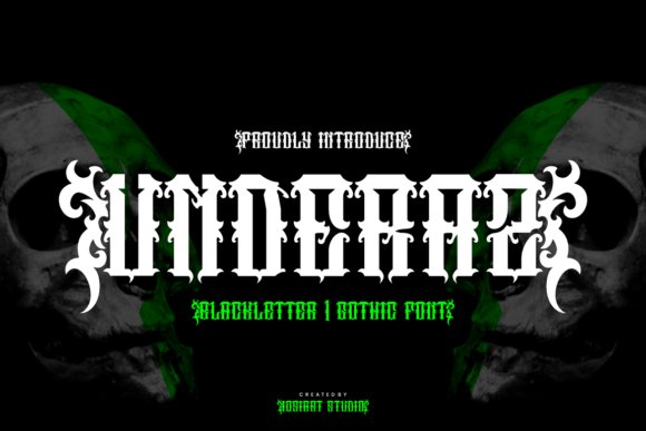
Underaz Font presents an aggressive, modern take on blackletter with jagged serifs and high-contrast strokes that demand attention. The contours are deliberately sharp and ornamental, giving each glyph a rugged personality that reads as rebellious and stylish at large sizes.
This family is PUA encoded so designers can access swashes, alternates, and decorative glyphs quickly, making single-word logos and poster headlines simple to craft. Use it for tattoo-shop signage, heavy music branding, or arresting promotional posters, but avoid small-body text where the fine details can clutter legibility.
My Recommendation: I use Underaz when a brand or band needs to project an edgy, uncompromising attitude-its razor-like serifs create instant character. The included alternates and swashes let me tailor letterforms for custom wordmarks without drawing on extra tools. It’s especially effective on merchandise and large-format art where the details can sing.
18. Getohc Font
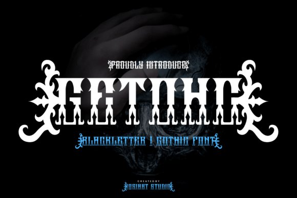
Getohc Font blends calligraphic blackletter roots with a contemporary, angular silhouette to produce a dramatic display face. Its heavy strokes and pointed terminals create a sense of motion and tension that works well for album covers, horror visuals, and bold editorial headers.
The set comes PUA encoded with numerous alternates and ligatures, enabling quick exploration of stylized wordmarks and poster copy. Strong kerning and considered weight distribution make Getohc reliable at large sizes, while its ornamentation supports distinct branding across signage, merch, and promotional art.
My Recommendation: I pick Getohc when a project needs theatrical intensity-its distinctive shapes cut through noisy layouts and photographs. The alternates let me craft unique logotypes without custom lettering, saving time while keeping results bespoke. It performs best at display scale, so I reserve it for covers, posters, and headline-driven identity systems.
19. Bemore Font
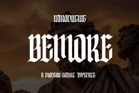
Bemore Font reinterprets old English letterforms with softer terminals and added breathing space, producing a display face that reads more cleanly than many ornamented cuts. As one of the more readable blackletter gothic fonts, Bemore preserves Fraktur-inspired diagonals and swashes while opening counters so logos, posters, and mastheads keep visual impact without collapsing into illegibility.
Under the hood it ships with OpenType ligatures, stylistic sets, and a couple of weights to help build typographic hierarchy and tidy kerning at large sizes. The alternates let you dial in vintage drama or calm the forms for contemporary branding; pair it with a neutral sans for body text so the letterforms remain the focal point.
My Recommendation: I reach for Bemore when I need gothic character without sacrificing clarity. Its ligatures and alternates let me craft distinctive wordmarks while the open counters keep headlines readable at a distance. Ideal for craft beer labels, fashion editorials, boutique signage, and any design that needs a historic voice with modern balance.
20. Blackleaf Font
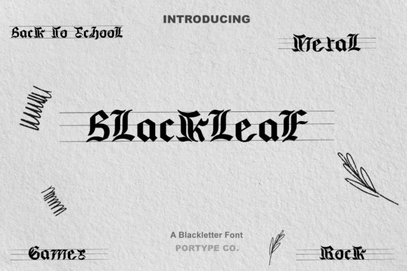
Blackleaf Font channels high-contrast Old English proportions, emphasizing sharp diagonals and ornamental terminals that feel hand-inked rather than machine-sculpted. Dense black fills and filigree-like serifs form a striking silhouette that works well for posters, album art, and theatrical graphics where gothic fonts and Fraktur echoes are desirable.
The face includes multiple stylistic alternates and contextual ligatures to help tame collisions in tightly set words, though its heavy colour makes it best suited to display use. Reserve it for headlines, packaging, or tattoo mockups where the letter detail can be appreciated rather than for small captions or long copy.
My Recommendation: I choose Blackleaf when a project calls for maximal drama and an antique, handcrafted voice. Its ornamentation reads like ink and flourish, which makes it perfect for band art, heritage branding, or stage posters. Avoid using it for body text; keep it as a headline or logo treatment so the detail can breathe.
21. Dark Widow Font
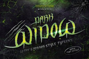
Dark Widow Font turns traditional blackletter into a distressed, horror-ready display face by adding scratchy terminals and broken serifs that mimic aged ink and rough engraving. Letterforms retain gothic proportions but are intentionally eroded and irregular, creating an aggressive, gritty personality that reads like a haunted or metal aesthetic.
It ships primarily as a heavy display cut with rough alternates and distressed capitals; kerning requires attention when set tightly, but at large sizes the texture becomes a powerful atmospheric tool. For print or high-resolution art, keep the size generous so the rough detail resolves instead of collapsing into noise at small scales.
My Recommendation: I use Dark Widow when I want a design to feel ominous and timeworn-its scratched edges and ink-speck textures deliver that instantly. Great for horror film posters, haunted-event flyers, metal band covers, and gritty packaging where mood matters more than body text utility. Treat it as an accent face and pair it with a bold, simple sans to let the distress read clearly.
22. Colide Font
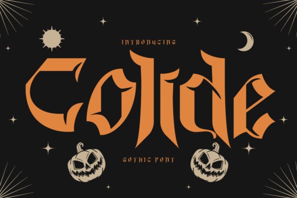
Colide reimagines medieval letterforms with aggressive pointed terminals and a razor-like cut running through each character, producing a fractured, cinematic attitude. As one of the more distinct blackletter gothic fonts, it reads like a hybrid between traditional textura and experimental display type, balancing ornamented strokes with stark negative space. The result is a typeface that signals tension and atmosphere while remaining readable for headlines and titles.
The family ships in two flavors: a crisp clean set for sharp mastheads and a rough textured variant that simulates ink bleed and surface wear for posters or album art. Use the clean cut for logos and packaging where clarity matters and opt for the textured style to add grit on horror posters, film titles, or band identities; careful tracking at display sizes keeps the fine cut line legible. Heavy verticals pair well with a neutral sans to prevent visual competition.
My Recommendation: I reach for Colide when a project needs a confrontational Gothic voice-metal band branding, horror film posters, or edgy editorial covers benefit from its pointed terminals and cut-stroke detail. The textured variant gives authentic distressed character for print runs, while the clean set holds up for logo and packaging work. Pairing it with a simple sans helps the display letters take center stage without clutter.
23. Gledius Font
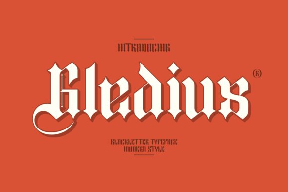
Gledius blends blackletter letterforms with contemporary proportions, softening traditional density through wider counters and pared-back swashes. Its uppercase set preserves dramatic strokes but introduces geometric terminals that improve readability at smaller display sizes, making it a strong option for modern branding and fashion labels. Refined ligatures and consistent stroke contrast give it a handcrafted feel without overwhelming layouts.
Spacing and baseline rhythm are handled with care, which simplifies kerning and headline composition across packaging and editorial spreads. Apply Gledius to boutique product identities, magazine headers, or lookbooks when you want historical reference without heavy ornamentation. Tight tracking and slightly increased leading push it toward expressive poster work while keeping letterforms distinct.
My Recommendation: I recommend Gledius when a design needs blackletter character with restrained decoration; it brings personality to labels and editorial headers while staying legible. Its built-in ligatures and measured metrics cut down on manual adjustments and make it a reliable display choice. I often pair it with minimalist photography and muted palettes so the type can do the talking.
24. Genius Player Font
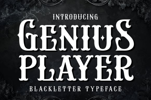
Genius Player presents a performance-ready blackletter expression with bold strokes and lively terminal flicks that suit concert posters and esports branding. The glyphs emphasize vertical rhythm while offering playful alternates and swash options to dial up showmanship for album art or marquee headlines. OpenType stylistic sets and discretionary ligatures enable layered, customized treatments without rebuilding letterforms by hand.
Despite its theatrical posture, the face retains strong readability at display sizes thanks to sturdy counters and controlled stroke widths, so it performs well on merchandise and social graphics. Pair it with condensed sans types for team logos or increase tracking for striking cover treatments; swapping alternates quickly yields unique logotypes. The font’s stage-ready personality helps designs feel immediate and assertive.
╰┈➤ Download Genius Player Font
My Recommendation: I choose Genius Player for projects that need swagger-band posters, streamer branding, or limited-run merch where attitude matters. Alternate characters let you craft distinctive wordmarks, and the robust core shapes keep the design legible across print and screens. Used large, it functions like a headline performer that anchors surrounding visuals.
25. Caber Font – blackletter gothic fonts
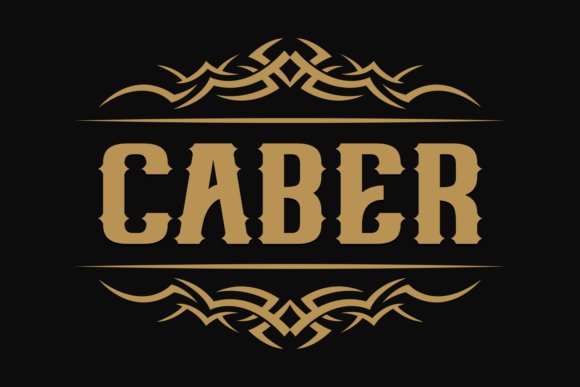
Caber Font is a reimagining of classic blackletter forms, and it sits squarely in the blackletter gothic fonts category by pairing carved, high-contrast strokes with simplified counters for improved legibility. The shapes preserve pointed bows and angular spires while trimming excessive ornamentation, so short headlines retain personality without collapsing into visual clutter. Subtle tapered terminals and slightly wider interiors help the letters read crisply on print labels and large-format posters.
Weight choices and alternate glyphs give designers control over tone-lean into heavier weights for a medieval, engraved feel or use lighter cuts for contemporary mastheads. Kerning and spacing are tuned for tight wordmarks, which makes the font reliable for logos, packaging, and bold editorial headers. When paired with a clean sans for body copy, Caber sustains a historic presence without overwhelming modern layouts.
╰┈➤ Download Caber Font – blackletter gothic fonts
My Recommendation: I reach for Caber when a project needs a historic voice that still behaves like modern typography. It’s excellent for brewery identities, editorial covers, and packaging where a strong headline must stand up to texture or finishing effects. Use its alternates sparingly to keep words legible while retaining that carved, Gothic charm.
26. Black Miles Font
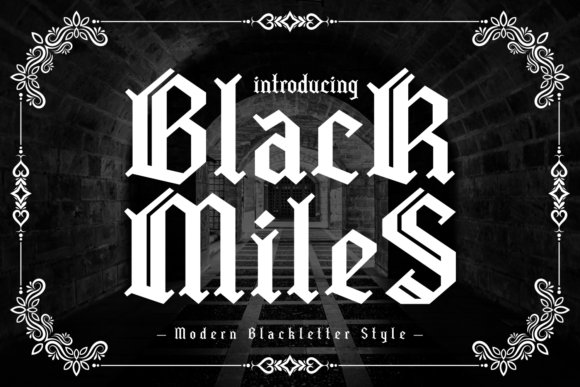
Black Miles softens the severity typical of traditional blackletter by introducing rounded terminals and smoother transitions between strokes, producing a friendlier Gothic aesthetic. Its letterforms keep enough of the old English silhouette to feel rooted in that tradition, yet the moderated contrast and open counters make it more forgiving at mid display sizes. The result is a font that reads well on apparel prints, band tees, and boutique labels where attitude must coexist with readability.
The face includes a useful set of ligatures and alternate capitals that let designers dial in ornament without resorting to heavy flourishes. Spacing is calibrated for stacked wordmarks, making it suitable for chest logos or vertical signage. Try pairing Black Miles with a condensed sans for modern posters or with textured backgrounds to amplify a handcrafted vibe.
My Recommendation: I’d choose Black Miles when a project wants a nod to Gothic heritage but needs softer, wearable letterforms. It works particularly well for merchandise, posters, and lifestyle brands that need attitude without sacrificing clarity. Swap in alternates for display use and keep supporting copy simple to let the type do the work.
27. Gothic Blackletter Font
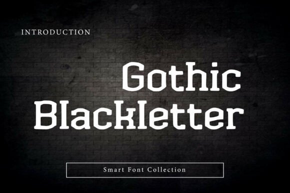
Gothic Blackletter embraces a faithful medieval character, marked by rigid vertical strokes, sharp serifs, and tightly angled bows that recall woodcut and letterpress origins. The high contrast between thick downstrokes and fine hairlines creates dramatic silhouettes that command attention in album art, tattoos, and book titles. Despite its historic weight, the design includes measured counters that preserve legibility at headline sizes.
Stylistic alternates and decorative swashes are available for display use, so designers can ornament initials or flourish wordmarks without custom lettering. It performs especially well when paired with textured paper, foil stamping, or embossed treatments that highlight its engraved quality. For contemporary layouts, balance Gothic Blackletter against minimal layouts to avoid visual competition and let the type set the tone.
╰┈➤ Download Gothic Blackletter Font
My Recommendation: I recommend Gothic Blackletter for projects that require an unmistakably historic or dramatic voice, such as metal album covers, vintage-inspired packaging, and editorial spreads with a dark mood. It’s ideal when you plan to use large headline sizes or special print finishes that emphasize strokes. Use it sparingly as a focal element and pair with restrained supporting type to maintain impact.
28. Stackwin Font
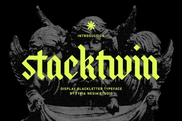
Stackwin is a display blackletter that balances old-world Fraktur cues with a loud, modern silhouette; its chunky stems and flaring terminals sculpt letters that read like carved insignia. Among blackletter gothic fonts, Stackwin leans into drama – ornate alternates, tight counter shapes, and high-contrast strokes give headlines and logos an authoritative, mysterious feel without collapsing into illegibility.
The face works well at large sizes for album covers, apparel, event posters, and packaging, while generous kerning and deliberate proportions keep it usable in digital banners as well as print. Built with attention to traditional calligraphic patterns and contemporary typecraft, Stackwin offers stylistic sets and swash options that let designers dial the level of ornamentation precisely.
My Recommendation: I reach for Stackwin when a project needs theatrical attitude and clear display presence – it reads like a mark rather than a body text face. Its ornamental alternates let me tailor the personality for streetwear, band art, or boutique product labels. Use it where headline impact and a touch of gothic drama are priorities; pair it with a restrained sans for supporting copy.
29. Antifight Font
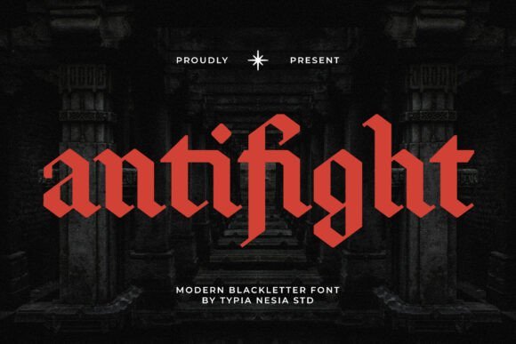
Antifight channels Old English weight with an aggressive contemporary cut: sharp terminals, rigid diagonals, and compact counters give the alphabet a confrontational posture suited to hard-hitting visuals. The letterforms feel engineered for identity work that needs a raw, underground attitude – sharp caps and tight joins create a strong silhouette in single-line marks and monogram-style logos.
Applications that benefit most include band merchandise, esports badges, and horror-themed posters where high-contrast display type dominates the layout. Its clear uppercase focus and bold stroke rhythm make it simple to layer with textures, embossing, or screen prints without losing readability at modest display sizes.
My Recommendation: I choose Antifight for projects that require a fearless, streetwise headline that won’t get lost among imagery. It shines on album sleeves, patches, and competitive gaming brands where toughness and clarity must coexist. Treat it as a primary display type and keep supporting text neutral to maintain balance.
30. Scarlet Crown Font
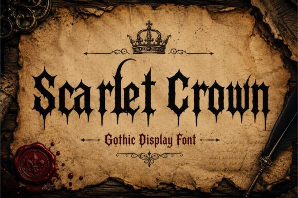
Scarlet Crown takes inspiration from medieval calligraphy and heavy metal lettering, producing a dense, ornamental blackletter that prioritizes presence and texture. Its sharp serifs, flourished terminals, and decorative ligatures create a tapestry of strokes that feel ritualistic and ceremonial, giving compositions a stately, somewhat ominous character.
Best suited for album art, gothic posters, and apparel where decorative display type is the focal point, Scarlet Crown performs at large scale and in single-word logotypes. Designers will appreciate the punctuation of alternate characters and titling caps that add variety while keeping the core alphabet tightly unified.
╰┈➤ Download Scarlet Crown Font
My Recommendation: I use Scarlet Crown when the brief demands a bold, ceremonial aesthetic with elaborate letter detail. It’s excellent for metal bands, premium street labels, and event posters that aim to project mythic or gothic identity. Pair it with minimal backgrounds and simple supporting typography so the ornate forms remain the visual anchor.
31. Beltina Font
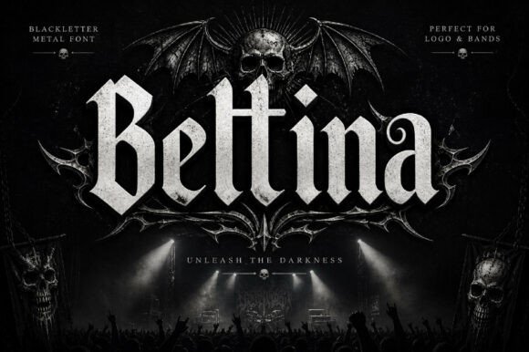
Beltina takes traditional blackletter skeletons and tightens them into a confident display face: firm verticals, sharp terminals, and narrow counters give text a measured, historic cadence. Among blackletter gothic fonts, Beltina marries classic Old English character with careful spacing so that its decorative serifs remain readable at headline sizes and on packaging alike.
The family includes upper- and lowercase forms, figures, and punctuation, letting designers set everything from festival posters to tattoo motifs without resorting to ornament-only treatments. Its bold personality reads especially well in high-contrast layouts and vintage-inspired branding where a commanding, period feel is needed without sacrificing clarity.
My Recommendation: I reach for Beltina when a project needs visible period character-think posters, labels, and album art that must read from a distance. It keeps the medieval aesthetic but doesn’t obscure words, which is rare in this genre. Use it when you want a historic tone that still performs cleanly in print and on-screen.
32. Black Raven Font
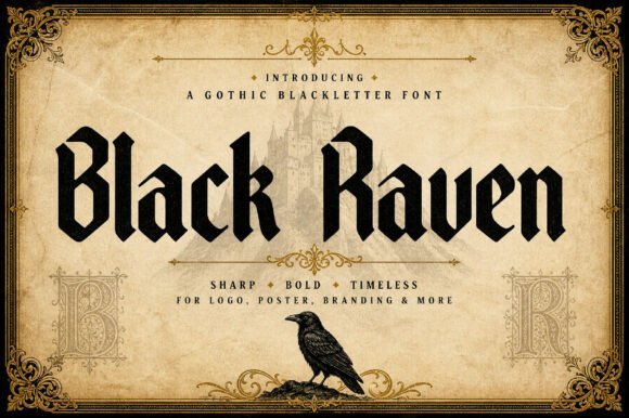
Black Raven projects a moody, theatrical voice through sharply angled strokes and pronounced verticals that suggest drama more than restraint. The letterforms favor showy capitals and embellished terminals, making this face a statement maker for short copy and identity marks rather than long bodies of text.
Because its details are bold and ornate, the font excels at album covers, editorial mastheads, apparel graphics, and any application that benefits from a darker, atmospheric aesthetic. Use it large and let the ink traps and spiky counters do the heavy lifting-tiny sizes will lose the carved-detail charm that gives this face its identity.
My Recommendation: I pick Black Raven when a design must carry a cinematic or gothic mood-music packaging, theatrical posters, and boutique apparel labels are perfect fits. It’s best applied where ornament and attitude can breathe, so I avoid cramped layouts. The result is always a striking, memorable headline treatment.
33. Arkhaven Font
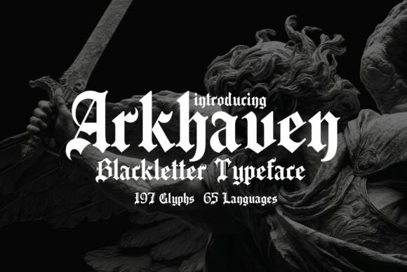
Arkhaven reads like a modern take on cathedral lettering: refined serifs, sweeping curves, and pronounced contrast give it a ceremonial air while remaining disciplined enough for composed typesetting. With 197 glyphs and support for 65 languages, the face is engineered to handle extended Latin sets and stylistic alternates for tighter typographic control.
Its ornamental features and careful stroke modulation suit book covers, formal invitations, and identity systems that need a historic or fantastical register without appearing gimmicky. OpenType ligatures and alternate capitals allow tasteful flourishes, and the design holds up across print and high-resolution digital art where detail is preserved.
My Recommendation: I use Arkhaven when a project calls for a regal, manuscript-inspired look-fantasy covers, wedding suites, or heritage branding are ideal. The wide glyph support makes it practical for multilingual work, and the alternates let me dial up ornament selectively. It’s my pick when elegance must read as intentional craftsmanship.
34. Thornt Font
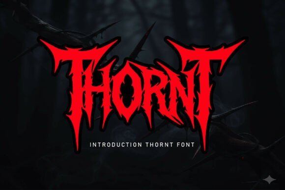
Thornt has a violent, thorn-laced personality that reads as raw display power; it ranks among the more aggressive blackletter gothic fonts available for bold branding. The uppercase-only set and numeric glyphs are cut with high-contrast strokes and razor terminals, so words land like logos rather than paragraphs. Use it for metal band art, horror headlines, or game titles where every letter must dominate the composition.
Though intensely ornamental, Thornt remains surprisingly precise-small counters and sharp junctions give it a crafted, architectural feel rather than chaotic scribble. A subtle red or metallic wash amplifies the menacing mood, while large-format treatments on textured paper, vinyl, or distressed backgrounds let the thorn shapes breathe and read clearly in display contexts.
My Recommendation: I would reach for Thornt when a project needs uncompromising attitude: album covers, festival posters, or tattoo-style logos where attack and legibility matter at large sizes. Its aggressive silhouettes cut through noisy layouts, and the built-in numerals make it easy to lock up dates or catalog numbers. Use it sparingly against calm, minimal elements so the font remains the focal point.
35. Alpha Spike Font
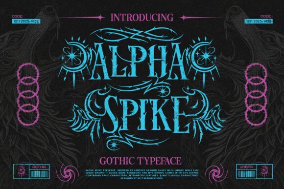
Alpha Spike reads like a Neo-Gothic experiment that marries mythic ornament with sharp, contemporary terminals; dragon-scale motifs and fang-like serifs give each glyph a predatory edge. The face is designed for display work that needs theatricality-logos, apparel labels, and RPG posters take to its flame-shaped strokes immediately. It sits well inside cyberpunk palettes or grunge textures, allowing a look that can feel antique or futurist depending on treatment.
Functionally it’s generous: 929 glyphs plus four stylistic sets for uppercase characters provide alternates and ligatures to create bespoke wordmarks without manual drawing. Swap SS01–SS04 to craft a hand-lettered rhythm, or pair the font with clean, modern sans serifs to keep readability while preserving attitude. Neon or parchment backgrounds both highlight different aspects of its form, making it adaptable across print and digital art.
My Recommendation: I’d pick Alpha Spike when I want a theatrical headline with plenty of character options and alternates-ideal for streetwear collections, band merchandise, or game title screens. The extensive glyph set means fewer workarounds for special characters and multilingual needs. I recommend pairing it with straightforward supporting typography so the ornate letterforms remain the visual star.
36. Demon Crown Font
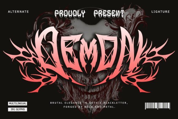
Demon Crown presents a darkly ceremonial take on blackletter: symmetrical letterforms, aggressive curves, and deliberate weight shifts create a sense of ritual authority across titles and logos. The strokes feel carved, echoing cathedral tracery and occult sigils rather than casual script, which gives headings a monumental, cinematic presence. It excels in album art, game branding, and tattoo concepts where a heavy, emblematic look is required.
Practical touches include PUA encoding for direct access to decorative glyphs and alternates, speeding up layout work without special tools. For best results use bold single-color fills or metallic textures and reserve long copy for simpler typefaces-the font’s power shows most clearly at display scales and in compact badges or crests.
My Recommendation: I use Demon Crown when a project needs ritual gravitas-movie posters, dark fantasy covers, and identity marks that must read like heraldry. The included PUA glyphs streamline stylistic choices, so creating ornate wordmarks is quicker. Keep it as the dominant visual element and support it with restrained layouts to avoid visual competition.
37. Crucifer Font
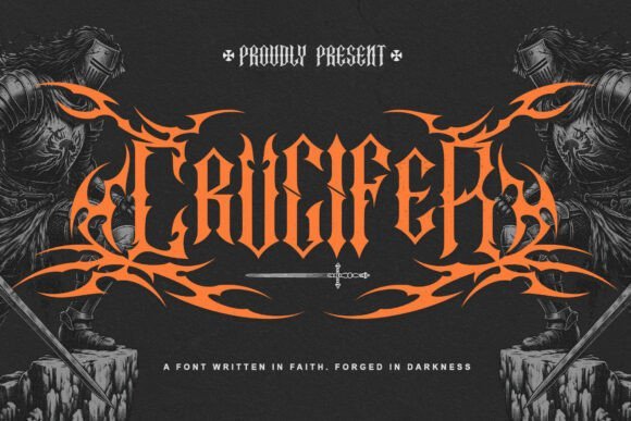
Crucifer stands out with razor-edged serifs and towering verticals, a typeface that sits squarely among blackletter gothic fonts and channels the carved lettering of medieval chapels. High-contrast strokes and tight counters create a dense, ritualistic texture that reads like ironwork more than ink on paper. Ornate capitals and restrained swashes add ceremonial weight while keeping a compact footprint for tight titles.
Its aggressive forms demand display use: album covers, band insignia, tattoo lettering, and cinematic title plates where a stern, archaic mood is required. OpenType alternates and discretionary ligatures provide stylistic choices, though careful kerning is essential to avoid visual crowding. Pair with a plain sans for contrast and reserve it for short headlines where clarity and impact are priorities.
My Recommendation: I pick Crucifer when a project needs uncompromising gravitas-metal artwork, dark fantasy posters, or a theatrical logo. Its carved, iron-like letterforms give designs an ancient, ritual edge while alternates let me tune the mood. Use it large and sparingly so each letter reads as a bold emblem rather than dense text.
38. Grimoire Noir Font
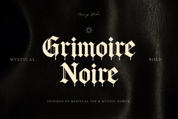
Grimoire Noir channels manuscript calligraphy into a restrained Gothic blackletter typeface, pairing delicate hairlines with steady vertical stems to suggest vellum pages and stone inscriptions. Characters show subtle irregularities that mimic inked strokes and aged presses, producing a warm historic texture without excess ornament. Its lowercase set is notably calm for the genre, making short passages and chapter headings easier to set.
It fits novel jackets, immersive game headers, and retro brand marks where period authenticity is wanted alongside modern proportions. Rich ligature support and alternate glyphs let designers craft signature wordmarks while stylistic sets allow dialing back flourish. Use it where you want medieval flavor but need dependable spacing and predictable stroke contrast on screen and in print.
╰┈➤ Download Grimoire Noir Font
My Recommendation: I recommend Grimoire Noir for projects that need a readable historic tone-book covers, tabletop game boxes, and nostalgic branding benefit most. The alternates help create distinctive titles while the tempered lowercase shapes keep short copy legible. It’s a dependable choice when you want old-world charm without sacrificing layout control.
39. Garcoff Font
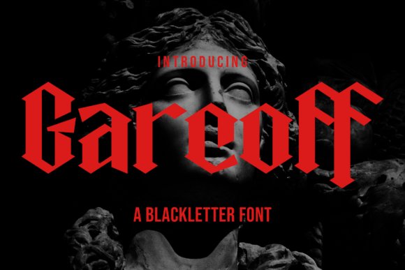
Garcoff emphasizes sharp angular strokes and elongated verticals that deliver a compact, attention-grabbing silhouette tailored for display typography. Strong contrast between thick stems and acute terminals gives it a hard-edged personality that performs well on posters and merchandise. Pointed details and narrow counters register particularly clearly at large sizes where form takes precedence over ornamentation.
Best used for headlines, band merchandise, signage, and editorial covers, Garcoff works when immediate visual drama is the goal rather than extended reading. OpenType features include stylistic alternates and multiletter ligatures; expect to tweak kerning and tracking when building logos to avoid crowding. Pair it with minimalist layouts so its geometric bite becomes the focal point of the composition.
My Recommendation: I reach for Garcoff when a design must hit hard in a single glance-gig posters, apparel drops, or striking magazine covers are ideal. Its angular forms carve a memorable silhouette that reproduces cleanly across print and fabric. Keep the setting large and give it breathing room so those sharp terminals retain their visual punch.
40. Steelbane Font
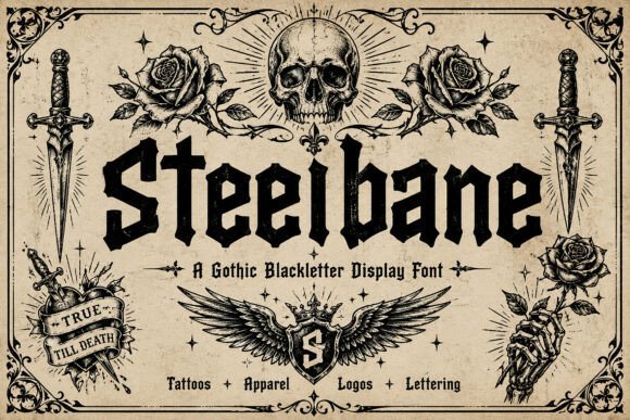
Steelbane is a purpose-built display face that emphasizes carved, angular terminals and heavy vertical stress; among blackletter gothic fonts it stands out for its razor-edged serifs and broad, punchy counters that maintain presence at poster scale. The letterforms read as hewn metal rather than soft script, with aggressive contrast and raw stroke endings that produce a ritualistic cadence across words. These design choices make it unmistakable in short wordmarks and headlines where atmosphere matters.
It works best at large sizes for band logos, game titles, album art and apparel where texture contributes to identity, and the full upper/lowercase set plus numbers and punctuation keep composition flexible. For layout, tighten tracking slightly for stacked words and avoid using it in body text; pair it with a plain sans for visual relief. OpenType alternates and contextual forms help prevent awkward joins, so long headlines can retain momentum without jarring connections.
My Recommendation: I reach for Steelbane when I want typography that reads like forged metal-bold, ritualistic and unmistakable. Its aggressive terminals cut through busy backgrounds, giving logos and album covers a weighty, medieval personality. Use it for hero headlines, merchandise, and title screens where a dramatic, historic voice is required.
41. Frostbane Font
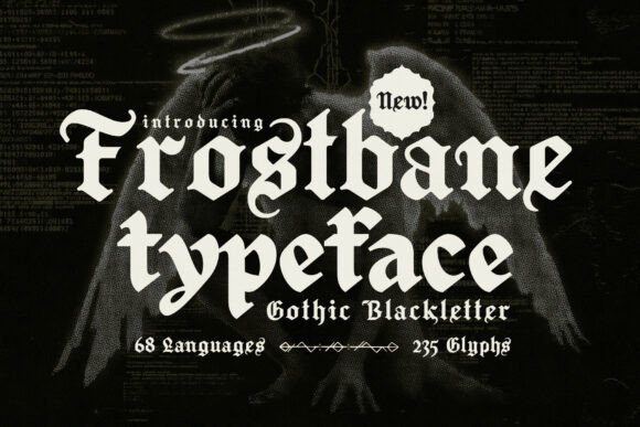
Frostbane channels the ornamental grammar of medieval script with dense, interlacing strokes and decorative terminal work that recalls illuminated headings. It ships with 235 glyphs and supports 68 languages, so accents and special characters are handled cleanly for international projects. The type offers alternate caps and swash forms that allow you to craft singular, manuscript-like openers for covers and posters.
As a display face it excels on fantasy book jackets, festival posters and evocative branding where history and ceremony are part of the message, but its detail makes it unsuitable for small captions. For balance, pair Frostbane with a restrained serif or a geometric sans to keep long copy readable and let the ornamentation breathe. It also responds well to textured print finishes, giving titles an aged, tactile presence without losing contrast.
My Recommendation: I select Frostbane when I need a true manuscript feel with broad language support; the glyph set removes guesswork for non-English headlines. It’s ideal for fantasy publishing, theatrical posters and identity work that calls for ceremonious lettering. Treat it as a headline voice and combine it with understated body type for clarity.
42. Yvonne Font
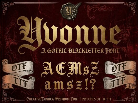
Yvonne refines traditional blackletter forms into a more restrained, high-contrast face that reads as aristocratic rather than wild. Its sharp, angular strokes and finely tuned terminals are designed to accept luxury treatments-foil, emboss and metallic inks-so the letters gain dimension under tactile processes. Thoughtful ligatures and alternate glyphs lend a bespoke, engraved quality useful for wordmarks and monograms.
Best applied sparingly as a logo or headline, Yvonne brings a polished historic presence to premium labels, boutique packaging and cinematic titles while resisting clutter when paired with minimal supporting type. Give it generous margins and pair it with a roomy humanist sans to preserve readability and let the ornate forms command attention. The result positions a product or brand toward craft and exclusivity without appearing overwrought.
My Recommendation: I keep Yvonne in rotation for premium packaging and identities that need a historic silhouette with refined finishes. It shines under foil stamping and embossing, and the alternates make crafting unique wordmarks straightforward. Use it for spirits, couture labels and title treatments that benefit from a polished, ceremonial tone.
43. Canderagle Font
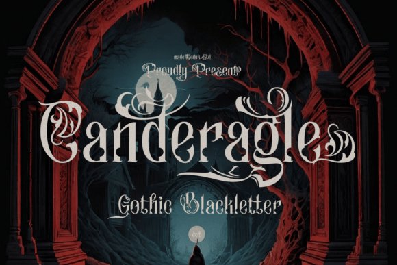
Canderagle channels aristocratic Gothic letterforms with dense vertical strokes and ornamental terminals, giving headlines a commanding, ceremonial presence. Its richly detailed capitals and sweeping swashes reference royal manuscripts and heraldic engraving, lending an antique authority to short headlines and insignia. Among blackletter gothic fonts, Canderagle stands out for high-contrast stroke modulation and considered spacing that preserve legibility at display sizes.
OpenType alternates, contextual ligatures, and stylistic sets let designers dial the ornamentation up or down without upsetting rhythm. Pair it with a restrained sans for body copy or set it against textured stock and metallic inks to emphasize its ceremonial mood. The face works particularly well on editorial mastheads, classic album jackets, boutique logos, and wedding stationery where dignity and theatrical presence matter.
My Recommendation: I reach for Canderagle when a project needs a noble, historic voice-its ornamented capitals and OpenType controls let me tune decorative density precisely. Use it for high-impact headlines: wedding invites, classical music covers, boutique branding, or film title cards where a regal character is the goal. Because of its heavy display nature, I avoid long text blocks and reserve it for focal moments.
44. Coldtwine Font
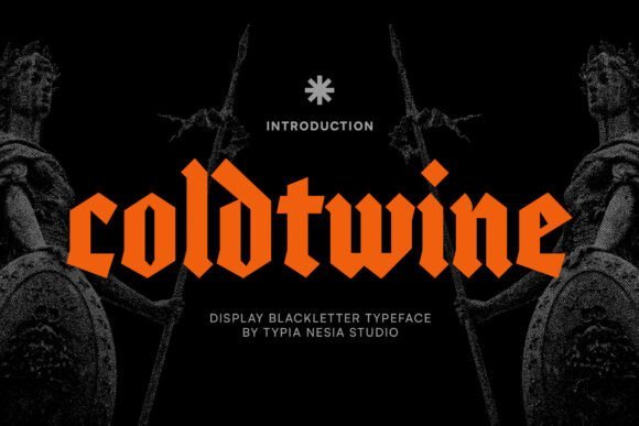
Coldtwine is a bold gothic blackletter typeface built around heavy strokes, sharp terminals, and compact counters that create a menacing, vintage attitude. Its forms borrow from medieval textura and old English traditions, producing a dark, cinematic voice that reads well on posters and album art. The font’s aggressive weight and pronounced contrast give short headlines an immediate, attention-grabbing presence.
OpenType features include alternate capitals and discretionary ligatures that help craft custom wordmarks without extra illustration work. Tight kerning and strong vertical rhythm make it suitable for logos, game titles, and horror or fantasy packaging where a brooding atmosphere is desired. Apply layered textures or metallic inks to amplify its aged, handcrafted feel for visual impact at large scales.
My Recommendation: I use Coldtwine when I want to convey intensity and grit-its weight and silhouette are perfect for metal band logos, horror posters, and fantasy game headers. The alternates let me create unique wordmarks fast, and the face holds up at big sizes where detail matters. For best results pair it with shadowing or distressed overlays to enhance its vintage, ominous character.
45. Cattedrale Font
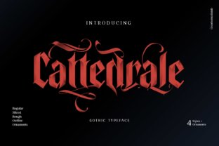
Cattedrale draws inspiration from Gothic cathedral signage, with tall ascenders, roomy bowls, and measured serifs that read clearly at display sizes. Its vertical emphasis and balanced counters give headlines a stately, architectural feel without collapsing into excessive ornament. The overall rhythm makes it surprisingly legible for a decorative blackletter, especially in short phrases and signage.
The glyph set focuses on practical display use: a modest selection of ligatures, a clear lowercase structure, and capitals that work as initials or drop caps. It pairs well with clean sans serifs for body copy and performs nicely on packaging, venue posters, and editorial headlines where a classic, handcrafted look is needed. Small adjustments to tracking tame its tall forms for tight layouts.
My Recommendation: I pick Cattedrale for projects that need Gothic character without unreadable complexity-its proportions are friendly to designers who want ornamentation that still behaves. Ideal uses include boutique packaging, church or venue signage, and editorial titles that reference historic architecture. It’s a dependable choice when you want heritage flavor while keeping typography practical.
46. Fairyesta Font
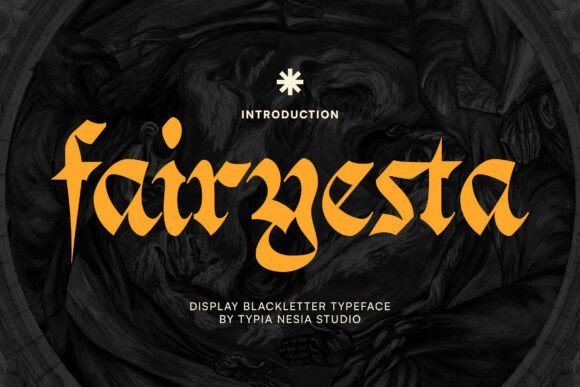
Fairyesta channels Old English calligraphy into a theatrical display face with sharply cut strokes and narrow terminals that read like engraved metal. Within the field of blackletter gothic fonts, it stands out for its cinematic silhouette – heavy capitals, pointed descenders, and high-contrast strokes that carry weight even at a glance.
Technically, Fairyesta offers a useful set of alternates and contextual ligatures so you can tune letter pairings for logos or title art, and the spacing favors large-format work such as posters, album covers, and game headers. Use subtle distressing or tight tracking sparingly to preserve legibility while keeping its medieval drama intact.
My Recommendation: I’d reach for Fairyesta when a project needs a powerful, period-driven personality: think metal album covers, fantasy film titles, or immersive game branding. Its alternates let me customize key words without redrawing each letter, and the face reads with theatrical presence at large sizes. If you want a font that immediately signals medieval intensity, this one delivers reliably.
47. Pelysska Font
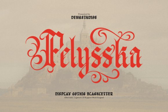
Pelysska reinterprets traditional calligraphic blackletter for contemporary display work, pairing razor-like serifs with long, decorative swashes that create dramatic horizontal movement. The design balances ornamented capitals with more restrained lowercase forms, making it effective for headline use where ligatures and alternates can become focal details.
On the technical side it ships with a broad OpenType feature set and multilingual support, so designers can deploy complex typographic treatments without sacrificing compatibility. It excels on book covers, premium beverage labels, and theatrical posters where a sense of crafted luxury is required, but keep body text clean and minimal to avoid visual competition.
My Recommendation: I’d use Pelysska when a project needs ornate elegance rather than pure aggression – for example, historical fiction covers or boutique spirit labels. Its swashes and alternates create bespoke wordmarks quickly, and the OpenType toolkit saves time when building stylistic sets. For best results, pair it with a simple serif or neutral sans for supporting copy.
48. Gothic Bamliero Font
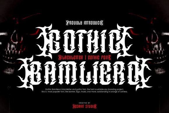
Gothic Bamliero fuses medieval blackletter traits with punk-era attitude, producing a display face that reads as both ornamental and confrontational. The letterforms favor heavy vertical strokes and pointed terminals, while decorative flairs and high contrast give logos, posters, and apparel an in-your-face personality.
Because of its pronounced contrast and compact counters, this font works strongest at headline sizes or on merchandise, where texture and background treatments can be used to enhance its rebellious tone. Pair it with bold photographic backdrops or gritty halftone effects to amplify the underground aesthetic without losing typographic clarity.
╰┈➤ Download Gothic Bamliero Font
My Recommendation: I’d pick Gothic Bamliero for streetwear branding, band posters, or any campaign aiming for gritty, counterculture flair. It has enough ornament to feel handcrafted but enough bite to read across prints and patches. Use it for bold, single-word treatments and reserve simple supporting text to keep the main mark legible and striking.
49. Dottore Vibulanus Font
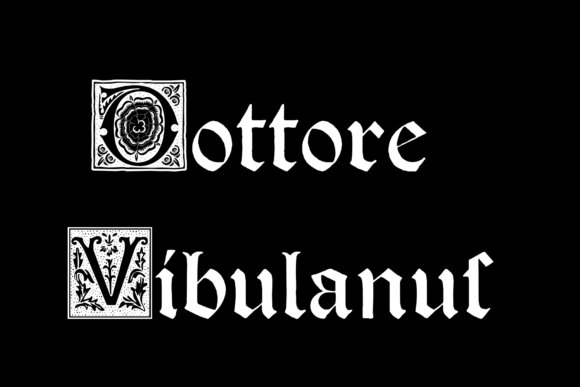
Dottore Vibulanus channels late-medieval manuscript lettering into an ornamental display face, loaded with filigreed capitals, flourished terminals and tight calligraphic contrast that reads like hand-inked script. The collection of discretionary ligatures, alternate swashes and long-s strokes gives headlines an antique gravitas without tipping into visual clutter, making it one of the more expressive blackletter gothic fonts for work that needs historical authority. Heavy verticals and delicate hairlines reproduce the cadence of gothic penwork while maintaining surprising clarity at large sizes.
Technically the family includes OpenType stylistic sets, contextual alternates and small caps, plus tuned kerning to avoid crowded counters in display use, though fine body text will lose the finest ornaments. Pair it with a plain humanist sans or a muted old-style serif to keep compositions readable and let the ornate letterforms dominate; great uses are book covers, certificates, boutique packaging and period film titles. For web use prefer WOFF2 and larger pixel sizes so the decorative strokes remain crisp on-screen.
╰┈➤ Download Dottore Vibulanus Font
My Recommendation: I’d choose Dottore Vibulanus when a project calls for ceremonious, historically informed lettering rather than subtlety. The alternate glyphs and ornate caps give titles a formal, handcrafted presence that works exceptionally well in print-first applications like invitations, heritage brands and editorial covers. For screens I’d use it sparingly at large display sizes and pair it with a simple supporting typeface to avoid visual overload.
This set of 49 blackletter gothic fonts covers a wide range of weights and moods suited to Tattoo Design, from dense, gothic Textura faces to cleaner Old English cuts. Test a few candidates with sample words, check licensing for body-art use, and refine spacing before finalizing a stencil.
Trying multiple styles and pairing them with simple layout mockups helps identify the best fit for placement and scale. That practical approach leads to stronger, more reliable lettering in the finished tattoo.