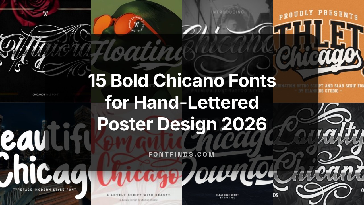
15 Bold Chicano Fonts for Hand-Lettered Poster Design 2026
Chicano fonts draw on Mexican-American lettering traditions like lowrider script, barrio block letters, and Old English influences. These chicano fonts work well when you need bold strokes, dramatic swashes, and strong display presence for posters.
Below you’ll find 15 typefaces-ranging from tight, condensed scripts to heavy decorative blackletter-that suit hand-lettered poster design in 2026. Each entry includes a quick style note, best uses, and pairing tips so you can test fonts in real layouts.
1. Chicago Font
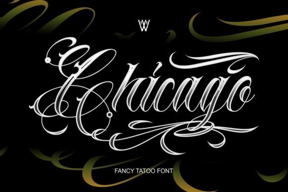
Chicago Font – Chicago is a compact collection that blends heavy blackletter with flowing script and hand-drawn Chicano calligraphy, aimed at designers who need bold display type with tactile charm. As one of the stronger chicano fonts offerings, it pairs dense, inked strokes with open, ribbon-like swashes and plenty of alternates so lettering reads like custom tattoo work rather than a generic typeface. The family includes contextual ligatures and decorative caps that help produce authentic-looking wordmarks and flash sheets without extra manual tweaking.
Technically the bundle behaves well: OpenType features handle stylistic sets, kerning is adjusted for tight headlines, and multilingual support covers most Western languages used in branding. Use it for streetwear logos, vintage posters, tattoo shop signage, and packaging where a handcrafted, inky presence is the goal-pair with a neutral sans for contrast or a distressed texture to push the retro vibe.
My Recommendation: I reach for Chicago when a project needs raw, tattoo-inspired personality without sacrificing readability. It gives lettering a handcrafted feel while offering enough alternates to avoid repetition across a full layout. Great for apparel branding, shop signage, and editorial spreads that want that inked, historic look.
2. Loyalty Chicano Font
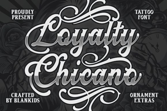
Loyalty Chicano Font – Loyalty Chicano leans into ornamental blackletter forms softened by playful curves and flourishes, creating a decorative voice that remains surprisingly readable at display sizes. The letterforms come with extra terminals, swashes, and stylistic alternates that let you tune how ornate a headline becomes, from restrained to lavish, without relying on multiple type families. These decorative options make it a strong pick for posters, comics, and packaging where character and personality matter more than strict neutrality.
On the workflow side, the font includes a robust set of ligatures and matching ornaments that slot easily into layout software, so building badges or logotypes is quick. It performs well on merchandise and print runs when used at headline scale; for longer body text or small captions, keep it strictly decorative to avoid eye strain.
╰┈➤ Download Loyalty Chicano Font
My Recommendation: I’d use Loyalty Chicano when a piece needs a spirited, ornamental headline that feels hand-crafted. Its flourishes inject personality into merchandise, poster art, and comic covers without demanding extensive manual letter-shaping. Favor it for display work where ornamentation is part of the message rather than background filler.
3. Chicano Font
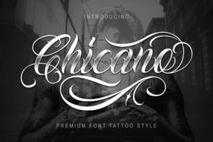
Chicano Font – Chicano is a bold handwritten font inspired by classic tattoo lettering and heavy-script signage, built to make single words read like statements. Strong contrast, confident terminals and sweeping connections give it an assertive rhythm that works well at larger sizes, while a small suite of alternates and ligatures keeps repeated words from feeling static. The overall tone is muscular but hand-rendered, which helps designs feel personal and direct rather than mass-produced.
Its tuning favors display contexts: kerning and spacing are set for even word color in headlines, and the character set covers common Latin languages with basic punctuation. Pair Chicano with a narrow sans for editorial layouts, use it on album art or posters for instant attitude, and avoid dense paragraph settings where its personality would overwhelm legibility.
My Recommendation: I pick Chicano when I want a script that reads loud and handcrafted without looking messy. It’s ideal for album covers, posters, and identity marks where a strong, inked voice helps sell the concept. Use it as a headline face paired with a restrained sans to keep compositions balanced.
4. Floating Script Font
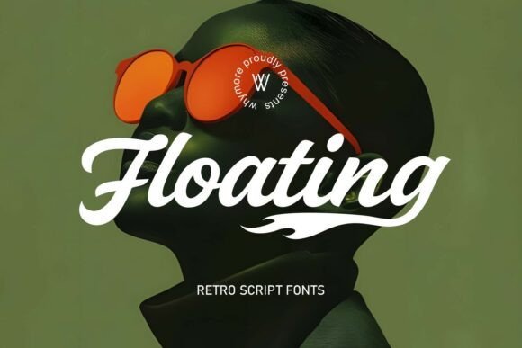
Floating Script Font – Floating Script channels mid-century sign painters and lowrider letterers into a display-ready script that carries immediate attitude. The letterforms boast broad, confident strokes and ornate terminals that make headlines, logos, and tattoo mockups read like hand-painted signage; this is one of the more expressive chicano fonts you can use when you need personality without losing legibility.
Technically it performs well as a display face: ample spacing, strong contrast, and a suite of alternates and swashes give designers quick options for emphasis and lockups. Pair it with a condensed sans or a slab for contrast, use its alternates sparingly to avoid clutter, and rely on raster-friendly rendering for textured print effects and enamel signage mockups.
╰┈➤ Download Floating Script Font
My Recommendation: I reach for Floating Script when a project calls for vintage street credibility-album covers, tattoo studio brands, or apparel drops that nod to old-school lowrider culture. Its swashes and alternates let me craft custom wordmarks without commissioning lettering, and the bold strokes hold up nicely on embroidered patches and screen prints. For pieces that want attitude and readable curves, this font delivers a quick, authentic shorthand.
5. Manciety Font
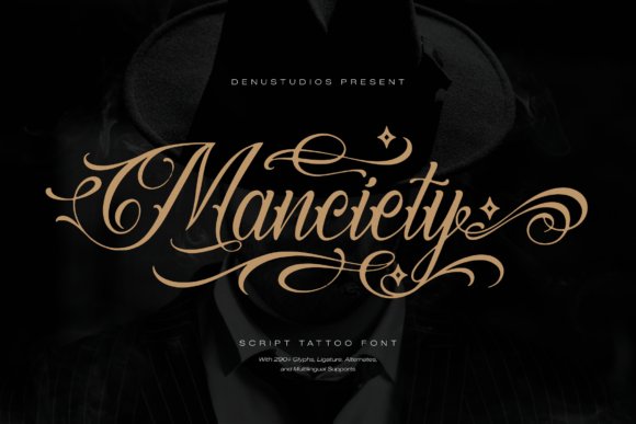
Manciety Font – Manciety reads like a refined tattoo master’s hand: high-contrast stems, dramatic flourishes, and a steady rhythm across caps and lowercase produce a dignified yet gritty voice. The composition favors display uses where detail matters-packaging headers, boutique grooming brands, and editorial titles benefit from its formal calligraphic roots meeting urban sensibility.
OpenType features include contextual alternates and long swashes that allow decorative ligatures without breaking flow, and its heavier strokes make it a strong choice for embossed materials and varnished packaging. Use it sparingly-reserve the most ornate forms for focal words and pair with a neutral sans to preserve hierarchy and legibility in long copy.
My Recommendation: I use Manciety when a brand needs a bold, artisanal signature that reads luxury with an edge-think high-end barbershop logos, selective streetwear labels, or feature headlines. Its flourishes give a handcrafted look without messy execution, and the weight range makes it suitable for print and large-format signage. If you want a commanding script that still feels refined, Manciety is a dependable pick.
6. Deudhora Font
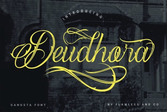
Deudhora Font – Deudhora is built for smooth connections and ornamental flair, offering flowing ligatures and a generous collection of swashes that create a natural, handwritten rhythm. The PUA encoding means every alternate, stylistic set, and flourish is easy to access in most design apps, making it straightforward to craft phrases that feel bespoke without manual drawing.
Because its strokes remain relatively narrow, Deudhora is especially useful for packaging labels, wedding stationery mockups, and boutique signage where an elegant script is required at moderate sizes. Pair it with a soft serif for editorial contrasts or keep it solo for signature-style marks; careful kerning and selective swash use will preserve clarity in dense layouts.
My Recommendation: I pick Deudhora when I want a graceful script that behaves predictably across apps thanks to PUA mapping-ideal for invitations, boutique branding, or refined merchandise. Its connected letterforms lend authenticity to handwritten concepts while the accessible glyph set speeds up production. For projects needing polished ornamentation without overwhelming the layout, Deudhora is a smart, practical choice.
7. Ulgiora Font
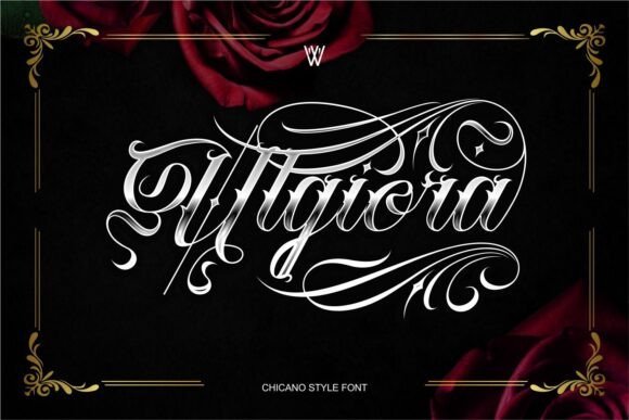
Ulgiora Font – Ulgiora Edgy Chicano Tattoo Font blends elegant Chicano script with bold blackletter shapes to create a look that feels both refined and rebellious. The design highlights ornate swashes, measured contrast, and compact letterforms that command attention in large logos and tattoo lettering. Among contemporary chicano fonts, Ulgiora stands apart for its decorative alternates and the way it preserves legibility while adding attitude.
OpenType alternates, contextual ligatures, and layered weights let designers control texture and density so typographic pressure points are easy to adjust. It pairs well with a neutral sans for modern branding or with distressed textures for vintage apparel and barbershop signage. I reach for it when a piece needs handcrafted drama without losing typographic polish.
My Recommendation: I use Ulgiora when a project calls for ornate lettering with real presence; it reads strongly on tattoo mockups, storefront signs, and premium streetwear labels. The alternates allow quick mood shifts from formal to gritty, and the blackletter influence gives marks memorable weight. Choose this font when you want script drama that holds up at mid to large sizes.
8. Amigos Font – chicano fonts
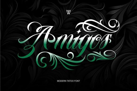
Amigos Font – chicano fonts – Amigos Font is a curated collection of tattoo-inspired blackletter calligraphy styles that prioritizes authentic, hand-lettered character. The family includes multiple weights and hand-drawn alternates that suit custom logos, lettering lockups, and signature-style wordmarks. Files are prepared for Procreate and Photoshop so you can drop type into artboards without reinventing the wheel.
Default spacing and kerning are thoughtful, while OpenType features invite playful swaps of swashes and ligatures to make each phrase feel bespoke. Stroke contrast remains moderate, helping the type hold up at smaller sizes for packaging or thumbnails while still reading as tattoo-rooted. Use Amigos when you want a confident, hand-rendered voice for editorial spreads, shop identities, or apparel badges.
╰┈➤ Download Amigos Font – chicano fonts
My Recommendation: I reach for Amigos when a brief needs authentic tattoo lettering quickly – the Procreate-ready files speed up concepting and client previews. The alternates make it simple to craft signatures and badges that read like custom handwork. It’s particularly strong for barbershop branding, band posters, and limited-run apparel where authenticity matters.
9. Chicago Downton Font
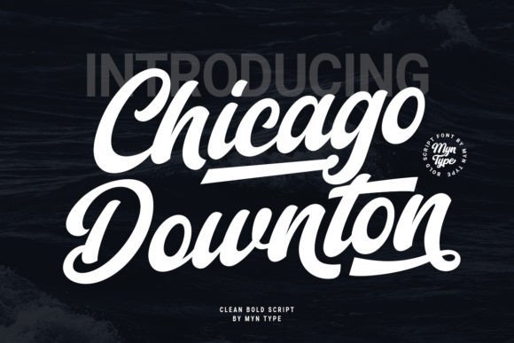
Chicago Downton Font channels vintage baseball script with an airy rhythm and friendly attitude that suits sports branding and retro posters. Rounded terminals, generous loops, and a subtle slant give it a lively headline presence that warms packaging and event signage. The face maintains character at large sizes and keeps clarity when paired with a solid sans for contrast.
Alternate swashes and contextual ligatures provide playful options for team names and merch while slightly condensed caps save horizontal space in tight layouts. The package includes clean vector outlines and web-ready formats, which simplifies handoff to production. I often pick this font when a project needs classic Americana energy without heavy ornamentation.
╰┈➤ Download Chicago Downton Font
My Recommendation: I use Chicago Downton when clients want nostalgic sports or retro retail vibes with modern usability. Its playful script works beautifully on posters, jerseys, and shop signage and scales well from print to web. Pair it with slab or sans companions for editorial layouts, or let it lead as a headline-first treatment.
10. Chicago Athlete Font
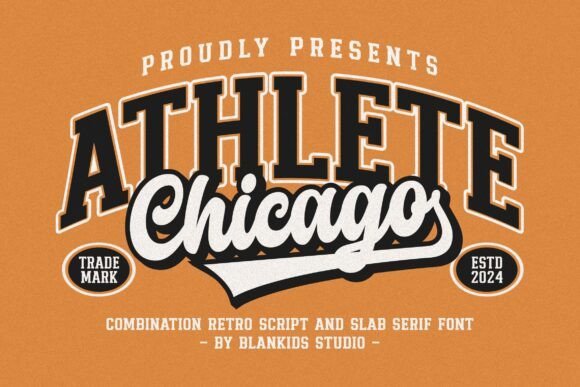
Chicago Athlete Font – Chicago Athlete blends varsity block lettering with inline and shadow variants to create a punchy retro sporty display that reads well at a distance. It sits comfortably among chicano fonts and lowrider sign lettering, offering four complementary combinations-solid, inline, outline and shadow-that make layered wordmarks and badges simple to compose. The family ships with uppercase and lowercase alternates, numerals and punctuation, so you can build locker-style logos, posters or product labels without hunting for extras.
The type’s broad strokes and carved cutouts yield strong silhouette and ornamentation, which is perfect for vehicle wraps, event posters and apparel branding. Pair it with a plain sans or a flowing script to control contrast and keep longer copy legible. Kerning is usable out of the box, though slight tracking adjustments help when fitting condensed lines or stacked text blocks.
╰┈➤ Download Chicago Athlete Font
My Recommendation: I’d grab Chicago Athlete when a project needs bold athletic energy with an authentic vintage vibe. The four style options let me layer fills and outlines quickly, cutting design time for badges and apparel. It’s particularly well suited to team branding, promotional posters, car-culture graphics and packaging that benefits from a varsity or lowrider attitude.
11. Chicago Font
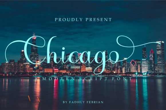
Chicago Font – Chicago is a flowing script that balances graceful strokes with a relaxed handwritten feel, keeping forms readable without feeling mechanical. The family is PUA encoded so stylistic alternates and swashes are easy to access for invitations, logos, greeting cards and thoughtful packaging. Letter spacing and moderate contrast help the face retain clarity at small display sizes while preserving a crafted appearance.
Use Chicago where you want a refined hand rather than an ornate calligraphic flourish; it plays nicely on wedding stationery, boutique branding and social formats. Pair with a neutral serif or geometric sans to create clear hierarchy, and limit line length to preserve the script’s rhythm. The file set works smoothly in common design tools, which speeds up typographic exploration and final tweaks.
My Recommendation: I turn to Chicago when a project needs approachable hand-lettering that still reads as composed and intentional. The PUA encoding removes friction when switching swashes, so iterations are fast. It’s ideal for invitations, small brand marks and any layout that benefits from handcrafted script without excessive ornament.
12. Beautiful Chicago Font
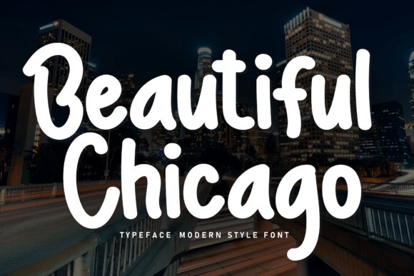
Beautiful Chicago Font – Beautiful Chicago reads as a cheerful hand with rounded terminals and slight baseline variation that suggests quick pen strokes on textured paper. Playful alternates and ligatures give headlines a friendly cadence, which makes the face a natural fit for cafe menus, kids’ packaging and lifestyle labels. The design maintains strong readability at display sizes while keeping an unmistakable handmade personality.
Because the bouncy baseline and lively terminals are central to its charm, this font functions best in short bursts rather than long paragraphs. Layer it on tactile backgrounds, reduce tracking for compact labels, or combine with a neutral sans to let the lettering sing. The set includes punctuation and numerals so it’s production-ready for packaging, signage and social posts.
╰┈➤ Download Beautiful Chicago Font
My Recommendation: I’d choose Beautiful Chicago when a design needs an upbeat, homespun look that feels immediate and inviting. Its alternates allow subtle tonal shifts without swapping typefaces, which is handy during fast proofing. Great for product packaging, children’s materials, cafe signage and playful editorial headers.
13. Chicago Font
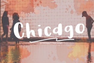
Chicago Font is a refined script that balances brisk, confident strokes with delicate hairlines. Each glyph feels hand-drawn, with a slight slant and generous loops that read clearly at display sizes. It brings personality without becoming ornate, making it suitable for invitations, boutique branding, and editorial accents.
The family includes careful kerning and straightforward OpenType alternates so you can build connected words and custom swashes. When paired with old-school display faces, chicano fonts and this Chicago create a layered street-style palette ideal for posters and packaging. I found it renders crisply in print and keeps its character at small sizes.
My Recommendation: I reach for this Chicago when a project needs a warm, human script that still behaves well in layouts. The alternates let me tweak word shapes quickly, and its legibility makes it dependable for both print and web. Great for wedding invites, boutique product labels, and lifestyle blog headers where a handwritten touch matters.
14. Chicago Font
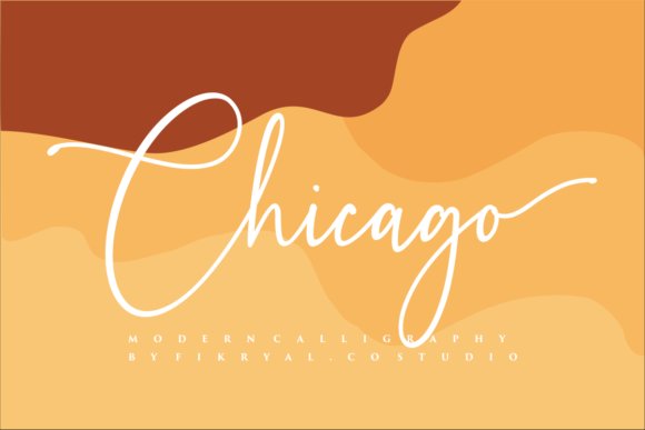
Chicago Font leans into a classic calligraphic rhythm where sturdy downstrokes meet airy upstrokes to create a welcoming, elegant voice. The lowercase forms are broad and open, which helps legibility in longer headings and pull quotes. It carries an old-world charm while remaining approachable, so it suits headlines that want character without excess flourish.
This release includes smooth ligatures and tasteful capitals that sit well on textured paper or clean digital layouts. The weight balance favors display use, and the swash alternates provide measured ornamentation for expressive wordmarks. Use it for logos, editorial headers, and specialty packaging where a handcrafted feel adds credibility.
My Recommendation: I pick this Chicago when I want traditional script warmth without overdoing the flourishes. It pairs nicely with a solid sans to anchor layouts, and the capitals make strong, usable logotypes. Ideal for magazine covers, product labels, and café signage that seek a classic handwritten personality.
15. Romantic Chicago Font
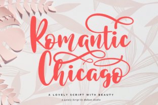
Romantic Chicago Font blends playful loops with refined terminals to produce a lively yet composed script that sings across greeting cards and boutique branding. PUA encoding gives access to a wide gallery of swashes, alternates, and ligatures so every headline can have bespoke motion. The rhythm reads as spirited while keeping readability at common display sizes.
Alternate glyphs allow varied word shapes and the ligatures smooth awkward joins for natural connectivity. On textured stocks and embroidered patches it preserves personality and reads clearly, a useful trait in heavily styled scripts. I find it especially suited to arts-and-crafts projects, wedding suites, and fashion labels craving expressive hand-lettering.
╰┈➤ Download Romantic Chicago Font
My Recommendation: I use Romantic Chicago when a brief needs lively calligraphy and ample swash options to craft unique titles. The PUA mapping makes alternates easy to access in many editors, and it translates beautifully from print to web banners. Best for boutique branding, event stationery, and packaging that benefits from playful, hand-drawn flair.
Try several entries at actual poster scale to judge legibility and mood; small tweaks to weight and spacing change the entire feel. Many of the Chicano fonts listed here pair effectively with simple block faces or condensed sans when you want contrast.
Use this selection as a starting point for hand-lettered poster design in 2026, swapping weights and scripts until the composition reads bold and authentic.