21 Premium Hand Drawn Summer Fonts for 2026 Beach-Ready Packaging
Hand drawn summer fonts bring a sun-soaked, handwritten look to projects that need a relaxed, playful feel. Use them for beach party invites, seasonal labels, and social tiles where warmth and personality matter.
This guide lists 21 handpicked styles, from doodle scripts and brush lettering to casual serif complements, with pairing suggestions and quick licensing notes to help you work faster in 2026.
1. Summer Doodle Font
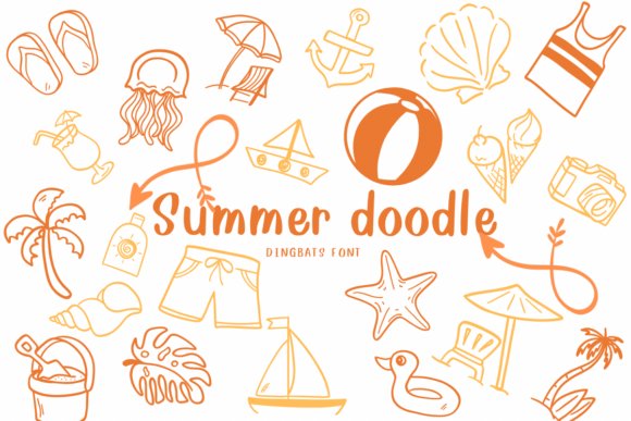
Summer Doodle packs a cheerful collection of hand-drawn beach icons – seashells, ice cream cones, palm trees, swimsuits and umbrellas – rendered as vector-style dingbats that stay crisp at any size. Hand drawn summer fonts are well represented here, with playful line weight and casual shapes that read clearly in print or on-screen. The artwork favors bold silhouettes over tiny detail, which makes the glyphs easy to layer into stickers, planner pages, and quick event graphics.
These doodles slot neatly into most design apps as simple ornaments, so you can drop them into invites, scrapbooks, party signage, and kids’ crafts without fuss. Because the icons are deliberately uncluttered they scale cleanly for vinyl cutting, small-format prints, and web thumbnails, and they pair naturally with rounded scripts or friendly sans faces. If you need bright, readable accents that feel hand-made, this dingbats set delivers that sunny mood.
╰┈➤ Download Summer Doodle Font
My Recommendation: I choose Summer Doodle when a brief, sunny accent is needed – it’s perfect for party invites, sticker sheets, and children’s projects because the shapes read well even tiny. The straightforward silhouettes make production easier for print and cut processes. Pair it with a soft script headline to keep the overall look warm and playful.
2. Doodle Holiday Summer Font
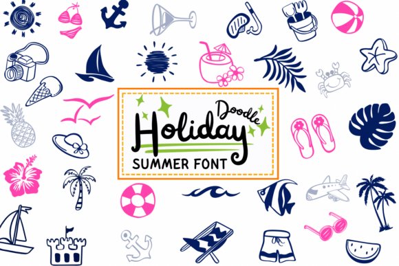
Doodle Holiday Summer assembles a lively set of summer-themed dingbats – beach balls, flip-flops, sailboats and tropical drinks – drawn with a slightly irregular stroke that feels spontaneous and joyful. The font leans toward small scenes and composite motifs, so you can combine glyphs to build charming vignettes for headers or social tiles. Its expressive, hand-sketched voice gives instant personality to seasonal work without crowding the layout.
Because the glyphs emphasize clear shapes rather than fine detail, they reproduce reliably on stickers, T-shirts and thumbnail images where clarity matters. Use these dingbats as accents around a strong headline or as repeating motifs across packaging and event collateral; the playful rhythm complements bold scripts and narrow sans serifs. The set works best when paired with bright color palettes and generous spacing to show off each icon.
╰┈➤ Download Doodle Holiday Summer Font
My Recommendation: I reach for Doodle Holiday Summer when a design needs upbeat, hand-sketched charm – it brightens social posts, event posters, and DIY stationery with minimal effort. The icons are especially handy for seasonal campaigns and party decor because they read well at small sizes. I like to combine them with bold color blocks to maximize impact.
3. Summer Font
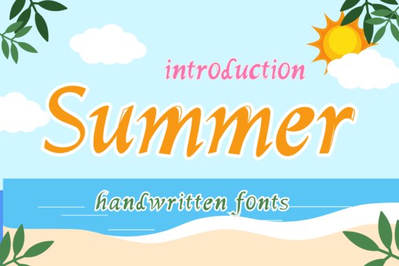
Summer Font is a sunny handwritten typeface with smooth, rounded letterforms and a relaxed rhythm that evokes warm afternoons and casual notes. Characters feature open counters and friendly terminals, which keeps short headlines and playful subheads legible while retaining a handmade feeling. The overall tone is approachable and buoyant, suited to designs that aim for sincerity over polish.
This script is well suited for children’s books, seasonal promotions, colorful invitations and social posts that want a human touch. Pair it with a clean geometric sans for balance, or overlay it on textured paper to enhance the hand-written aesthetic. When a project calls for typography that feels personal and upbeat, this font gives copy a sunny, conversational voice.
My Recommendation: I use Summer Font when a piece needs warmth and personality – think packaging for playful goods, kids’ party signage, or bright newsletter headers. The rounded strokes keep text friendly and readable at display sizes. Let it breathe with generous leading and pair with simple sans faces for a balanced layout.
4. Sunset Font
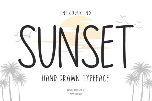
Sunset is a tidy, modern hand-drawn font that channels warm, late-afternoon colors into its letterforms. Its smooth, organic strokes read approachable on screen and print, giving layouts a relaxed, handcrafted character. As part of a small collection of Hand drawn summer fonts , it balances casual charm with surprisingly clean spacing.
Use it for tees, short headlines, quote graphics, or clean logo marks where legibility matters alongside personality. The regular weight holds up at medium sizes while subtle irregularities add authenticity without feeling messy. Pair it with a low-contrast sans for modern layouts or with textured backgrounds for a sun-faded look.
My Recommendation: I often pick Sunset when a project needs a friendly handwritten voice that remains tidy across sizes. Its calm curves read well on merchandise and social posts, and the spacing prevents cluttered headlines. Choose it when you want breezy personality without sacrificing clarity.
5. Summer Vintage Font
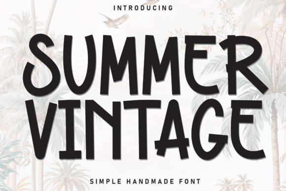
Summer Vintage hits hard with hand-painted brush strokes and a retro beach mood that reads like a weekend poster from another era. Tall, condensed letterforms and sharp angled cuts create a strong vertical rhythm and immediate poster presence. Textured edges and intentional ink breaks give artwork a worn, tactile feel rather than a machine-perfect finish.
The roughness helps the face sing on large formats while keeping the letters bold and readable. It’s ideal for surf shop signage, festival posters, and packaging that wants big, nostalgic character. Treat kerning carefully at tight sizes so the condensed letters retain clarity.
╰┈➤ Download Summer Vintage Font
My Recommendation: I turn to Summer Vintage when a design demands loud retro attitude, especially for posters and apparel. Its condensed build delivers impact without using a lot of space, and the brush texture brings handcrafted soul to printed pieces. Use it for headlines and logos that need fast recognition and seaside energy.
6. Sunset Signature Font
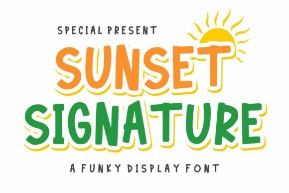
Sunset Signature is a lively display face built around playful, hand-carved shapes and smooth looping curves. Slight irregularities in stroke width give the letters a handcrafted cadence that reads as both friendly and confident. The layered style lets you stack fills, outlines, or shadows to produce instant dimensionality and visual fun.
This font excels for short phrases, badges, and stickers where decorative impact matters more than long-form reading. It pairs strongly with clean sans serifs and bright palettes, and solid fills preserve the integrity of the strokes in print. The result is a cheerful, approachable look that stands out in crowded feeds.
╰┈➤ Download Sunset Signature Font
My Recommendation: I use Sunset Signature when a project needs obvious playfulness-kids’ packaging, party invites, and event badges benefit most. The layered options speed up color tests while keeping typographic rhythm consistent. Reach for it when you want text that feels handcrafted and joyful at a glance.
7. Summer Flowers Font
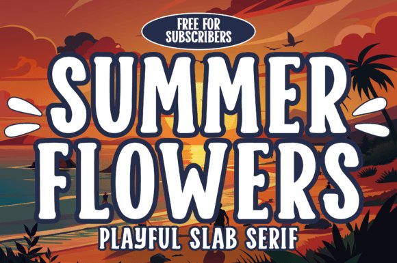
Summer Flowers is a hand-drawn slab serif built from chunky letterforms and soft, rounded terminals that read like a crate of sunlit postcards. Among Hand drawn summer fonts Summer Flowers stands out for headline work, holding up at poster scale while keeping a warm, handmade edge; its generous counters and slightly rough outlines give copy personality without sacrificing clarity. The bold weight is comfortable on-screen and in print, and the irregular stroke endings make each word feel handcrafted rather than mechanical.
The face pairs naturally with casual scripts and simple icon sets, and its broad shapes cut cleanly for heat-transfer vinyl and sublimation on Cricut or Silhouette workflows. Use it for beach party invites, tote bag slogans, retro travel posters, classroom headers, and punchy social thumbnails where a tactile slab is wanted. Free for Creative Fabrica subscribers, it behaves like a reliable display staple that invites color fills and textured overlays.
╰┈➤ Download Summer Flowers Font
My Recommendation: I reach for Summer Flowers when a headline needs to read friendly from across the room-its slab weight and hand-drawn quirks make merch and event materials feel handcrafted without extra artwork. It’s especially handy for crafters doing vinyl or sublimation projects because the shapes are forgiving in cutting workflows. Use it for seasonal sales, kids’ products, and any design that benefits from a bold, playful display face.
8. Beach Cocolate Font
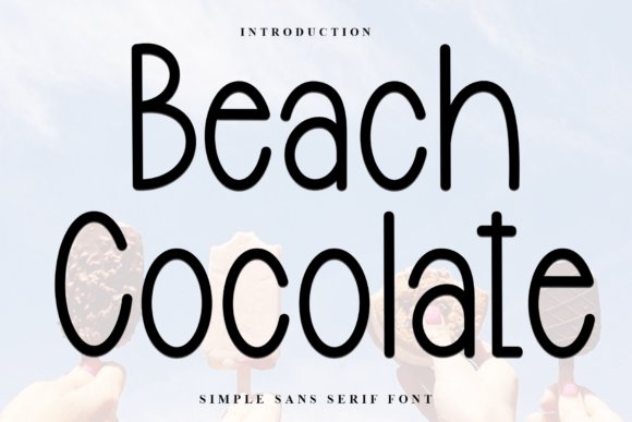
Beach Cocolate is a soft, rounded sans with a hand-drawn flavor that manages to feel both playful and tidy. Its even stroke width and open apertures keep legibility high across small labels and user interfaces, while a relaxed baseline rhythm gives reading a breezy cadence. The overall balance of warmth and restraint makes it suitable where friendliness can’t compromise readability.
This face slides neatly into logos, product tags, casual packaging, and children’s editorial layouts, pairing well with light scripts or simple pictograms. Spacing holds up at tight tracking and the forms reproduce cleanly in print and web contexts. For designers who want a modern but approachable voice, Beach Cocolate is a straightforward, low-fuss choice that avoids frills while keeping charm.
╰┈➤ Download Beach Cocolate Font
My Recommendation: I use Beach Cocolate when a brand needs to feel approachable without becoming childish-think café menus, snack packaging, or playful UI headers. Its clean curves make production predictable across materials and sizes, which saves time in mockups and approvals. It’s my go-to for projects that require a friendly tone with reliable legibility.
9. Summer Beach Font
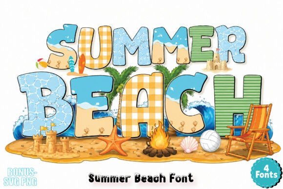
Summer Beach is a color font composed of hand-sketched doodles-waves, shells, fruits and surf motifs woven into each glyph so titles become small illustrations. The multi-layered, full-color glyphs render in Adobe apps, Figma and Canva, allowing you to place vibrant, ready-made artwork directly in headlines and badges. Keep in mind some systems show only a monochrome preview; the colored result appears correctly in supported software.
This pack excels for stickers, party invitations, seasonal labels and playful posters where the decorative bits around letters act as tiny scene-builders, reducing the need for extra art. If you must hand files off to cutters or printers that lack color font support, export flattened PNGs or vectorize glyphs to preserve the look. Summer Beach speeds up colorful mockups and social content with a collage-like, hand-crafted vibe.
╰┈➤ Download Summer Beach Font
My Recommendation: I pick Summer Beach when a project needs instant, full-color personality without building separate artwork-event invites and kids’ party graphics benefit most. It saves hours in mockups and social posts, but I always check client workflows first and prepare flattened exports for vendors that don’t support color fonts. Use it to punch up seasonal promos and playful product labels where bright illustration matters.
10. Summer Splashy Font
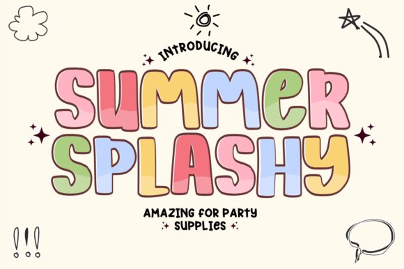
Summer Splashy is a hand-drawn, bubbly display font that channels boardwalk energy with thick rounded strokes and a retro 70s bounce. The heavy letterforms give short headlines and logos a loud, friendly presence while subtle irregularities preserve a handcrafted charm. Hand drawn summer fonts are popular for seasonal work, and Summer Splashy reads like sunshine in type.
On the production side it’s built to hold up: bold weight and wide counters mean reliable cuts for Cricut and Silhouette vinyl projects as well as crisp large-format prints. It shines on party invites, T-shirts, stickers and YouTube thumbnails where bold, readable display type needs to feel playful rather than mechanical.
╰┈➤ Download Summer Splashy Font
My Recommendation: I pick Summer Splashy when a design needs immediate, cheeky impact-posters, beach party invites, and kids’ apparel are perfect fits. Its stout strokes survive cutting and printing without fragile joins, which makes production simpler. The retro, joyful look also helps craft quick, memorable merch and social headers with minimal fuss.
11. Lobster Font – Hand drawn summer fonts
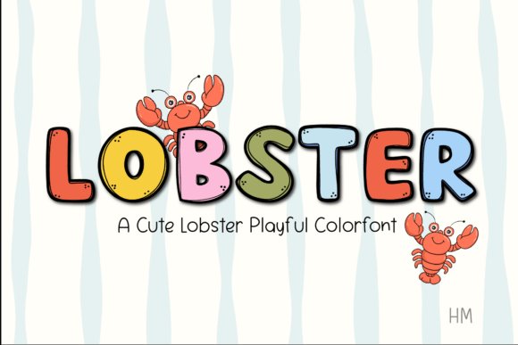
Lobster is an OpenType-SVG color font that stacks hand-drawn fills and textures into each glyph so text gains color and depth without extra layers. The alphabet balances a playful, rounded hand with predictable spacing, which keeps longer display lines readable while still feeling handmade. That ready-made colorability makes mockups and final art move faster when bright, kid-friendly visuals are the goal.
Because it’s delivered as a color-capable font, Lobster performs well for digital stickers, scrapbooking spreads, and classroom materials where separate artwork would otherwise slow the workflow. It also translates nicely to party graphics, cover headers, and sticker sheets-any application that benefits from lively, multicolor letterforms rendered straight from the font file.
╰┈➤ Download Lobster Font – Hand drawn summer fonts
My Recommendation: I use Lobster when a piece needs immediate color and cheerful personality without extra illustration work. For event invites, sticker packs, and playful web banners it speeds production and keeps visuals consistent. If your toolchain supports OpenType-SVG, Lobster is a fast route to colorful, handcrafted-looking text.
12. Sunny Beach Font
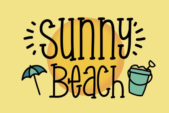
Sunny Beach is a whimsical handwritten script packed with beach-themed extras-palm trees, suns, and bouncy beach balls that act as ornaments and alternates. The letters have a casual, slightly uneven rhythm that reinforces a homemade aesthetic, great for playful branding and seasonal promotions. The decorative elements make it easy to build themed layouts without hunting for separate icons.
Technically the family provides stylistic sets and contextual alternates so headings can vary naturally instead of repeating identical shapes, and the open counters keep legibility acceptable at display sizes. Pair it with a neutral sans for body copy when you need contrast, or use it solo on packaging, posters, and event signage that benefits from a relaxed tropical mood.
My Recommendation: I reach for Sunny Beach when a project needs a relaxed, beachy voice and built-in ornaments to speed production. Its alternates and dingbats simplify small runs like tags, menus, and flyers, while the hand-drawn loops give logos instant personality. Use it for summer events, camp materials, or any project that calls for a breezy, cheerful look.
13. Lemon Dream Font
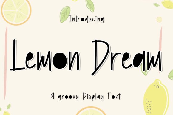
Lemon Dream is a playful display face with tall, slightly wobbly letters that read like quick marker sketches; the uneven stroke widths give it a sunny, retro-soul personality. The font sits comfortably among Hand drawn summer fonts and is a go-to for citrus labels, beverage branding, festival posters and thumb-stopping social posts. Its narrow vertical build keeps longer headlines readable while preserving a mischievous, handmade silhouette.
At print sizes the textured edges maintain character without looking messy, and the generous x-height helps keep small caps legible in stacked lockups. Pair Lemon Dream with a neutral sans for balance, add grain or halftone fills for vintage flavor, or use high-contrast palettes to make the groovy shapes pop. Ideal for short headlines, logo wordmarks, and cheerful product badges that need personality more than polish.
My Recommendation: I use Lemon Dream whenever a brief asks for hand-made energy rather than sleek perfection. Its tall letterforms suit vertical packaging and narrow labels, and the imperfect strokes add instant warmth. Great choice for summer drink branding, festival posters, and playful social templates.
14. Summer Flower Font
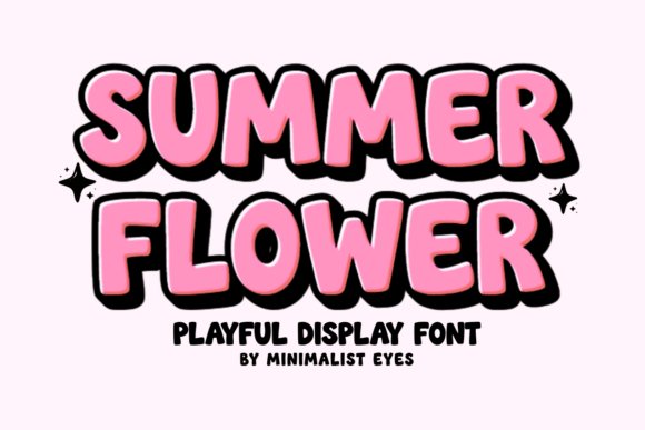
Summer Flower is a bold, rounded display font built for craft projects and playful branding; its thick strokes and soft counters read as friendly and tactile. The full PUA encoding exposes alternates, ligatures, and decorative forms without hunting through glyph panels, which is a real time-saver for makers. Because the outlines are intentionally simple, this face cuts and weeds cleanly on vinyl and HTV platforms.
Designers will appreciate that the heavy weight holds up at small sizes and resists breakage on low-res prints, while alternates let you mix organic shapes for layered compositions. Try it on personalized T-shirts, nursery prints, or party stationery where a chunky, hand-drawn voice is needed. It pairs nicely with thin scripts or subtle textures to create contrast and visual play.
╰┈➤ Download Summer Flower Font
My Recommendation: I reach for Summer Flower when working on Cricut-friendly apparel or bold vinyl labels because its shapes are forgiving and PUA makes special characters accessible. The font speeds up production and yields clean cuts, which matters for bulk crafting. Use it for party invites, kid-focused merchandise, and DIY product lines.
15. Sunkist Summer Font
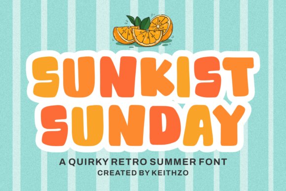
Sunkist Summer channels a 70s retro pop with chunky rounded letterforms that bounce with a sunny optimism; the hand-drawn quirks add warmth and a slightly imperfect charm. Its bold, wide proportions make this face ideal for posters, tote bags, and seasonal merchandise where a vintage mood is desired. Headline kerning is forgiving, so blocks of display type read clearly from a distance.
Try distressing edges, layering halftone fills, or applying duotone color blends to underline the nostalgic feel; the font works well with geometric retro patterns and simple iconography. It behaves predictably in both vector exports and raster artboards, and pairs cleanly with a condensed sans for subheads. Great for labels, summer campaigns, and packaging that benefits from a warm, approachable personality.
╰┈➤ Download Sunkist Summer Font
My Recommendation: I pick Sunkist Summer when a project needs nostalgic warmth that still stays bold and legible-posters and packaging get an immediate personality boost. Its weight translates well across screen and print, which makes it reliable for merch and campaigns. Pair it with sun-kissed palettes and textured overlays for best results.
16. Summer Chunky Font
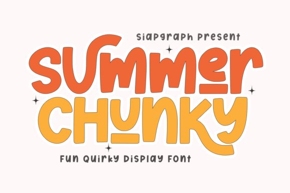
Summer Chunky Font throws a bright, retro punch with thick, rounded strokes and playful underlined accents that read like hand lettering on a vintage poster. It sits neatly among Hand drawn summer fonts thanks to its deliberately overscaled counters and generous spacing, which make glyphs easy to cut and weed on Cricut and Silhouette cutters while keeping high legibility at display sizes.
The contouring is purpose-built for makers: smooth outlines, predictable joins, and minimal interior detail so vinyl and paper cutting yields clean, repeatable results. Use it for bold T-shirt slogans, oversized event banners, sticker sheets, or any project where readable, joyful type needs to survive physical production and still feel handcrafted.
╰┈➤ Download Summer Chunky Font
My Recommendation: I reach for Summer Chunky when I need a headline that reads clearly from a distance and survives the realities of craft production. Its heavy strokes make it forgiving for SVG cut files and heat-transfer work, and the goofy underlines bring personality to kid-focused merch and party goods. If you want type that reads like a hand-cut sign but behaves reliably in production, this is a solid pick.
17. Summer Handwriting Font
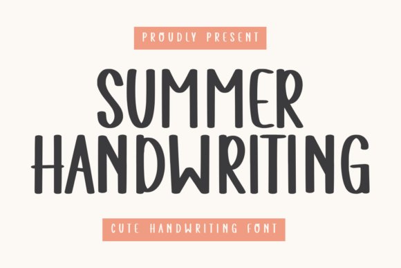
Summer Handwriting Font offers a restrained, personable script with smooth strokes and soft terminals that feel both intimate and casual. The letterforms maintain a light, airy rhythm that suits wedding stationery, romantic branding, or short social captions where warmth and readability matter more than ornament.
Its clean linework makes pairing easy: try it with a neutral sans for body text or a textured display for seasonal posters. The font keeps ligatures subtle and spacing steady, so it works well at smaller sizes without losing its handwritten charm or appearing cluttered on-screen.
╰┈➤ Download Summer Handwriting Font
My Recommendation: I pick Summer Handwriting for projects that need a human touch without theatrical flourishes-think invitations, boutique logos, and heartfelt social graphics. It reads well on both print and digital, so I feel confident using it for small-format packaging or elegant blog headings. For designs that require understated personality rather than bold statements, this font fits neatly.
18. MTF You Are My Summer Font
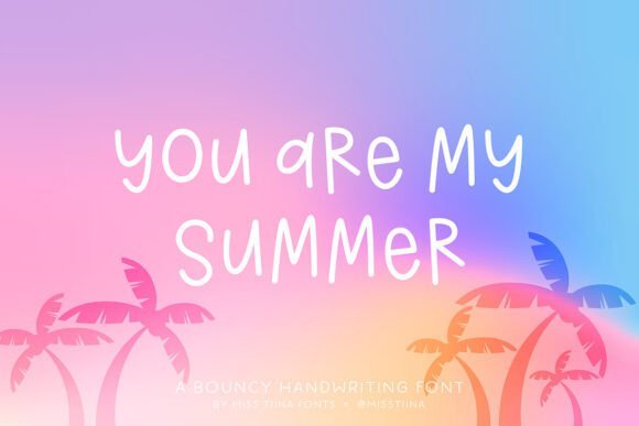
MTF You Are My Summer Font thrives on playful irregularity: alternating caps, uneven baselines, and slightly exaggerated terminals give the type a doodled, spontaneous feel that reads like a page from a cheerful sketchbook. Those quirks make it immediately charming for children’s books, ice-cream shop signage, or cheerful quote art where personality is the main objective.
Because the face favors distinct, bouncy shapes over tight metrics, it performs best in short lines and display headers rather than long paragraphs; pair it with a neutral serif or geometric sans to anchor layouts. Small kerning tweaks and selectively used alternates can push the font from cute to characterful without losing legibility.
╰┈➤ Download MTF You Are My Summer Font
My Recommendation: I use MTF You Are My Summer when a project needs a spontaneous, friendly tone-kids’ apparel, party invites, or confectionery labels are ideal matches. Its irregular rhythm injects personality quickly, so it’s great for short headlines and product names where mood matters more than formality. For best results, combine it with a calm companion type and keep copy lengths brief.
19. Summer Sport Font
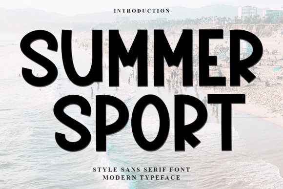
Summer Sport feels like a sunlit poster: round terminals, generous counters, and playful strokes that read as friendly at a glance. Hand drawn summer fonts are well represented here thanks to its informal rhythm and PUA-encoded glyphs that make alternates and special characters easy to access in Photoshop, Illustrator, Canva, and other layout apps.
The letterforms keep clarity at small sizes while still carrying personality for headlines and badges, and the slightly bouncy baseline gives designs a relaxed athletic vibe. I appreciate the way it pairs with clean sans-serifs for balance, and the built-in alternates mean quick, hand-lettered looks without manual tweaking.
╰┈➤ Download Summer Sport Font
My Recommendation: I reach for Summer Sport when a design needs to feel approachable and energetic without looking overworked. It shines on youth sports flyers, summer camp signage, casual apparel tags, and social posts that need a friendly face. The PUA glyphs save time when assembling hand-lettered compositions, making it a practical pick for quick-turn projects.
20. Summer Mood Font
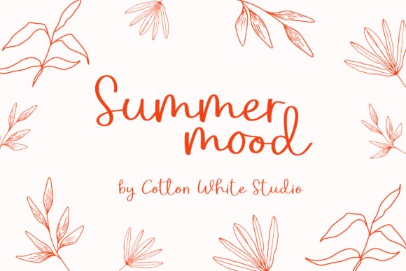
Summer Mood is an elegant handwritten script with deliberate strokes and a slightly imperfect finish that reads as handcrafted rather than mechanical. The flowing connections and occasional high-contrast swashes give it personality for logotypes and boutique packaging while keeping legibility in multi-word settings.
This design includes contextual alternates and ligatures to mimic natural pen movement, so headings look varied instead of repeating. Use it alongside muted textures, linen backgrounds, or minimalist layouts to let its calligraphic charm take center stage without competing with heavy ornamentation.
My Recommendation: I use Summer Mood when a project needs a refined, personal voice-think wedding suites, artisan food labels, and lifestyle blogs. Its scripted forms convey craft and warmth, and the alternates help avoid a canned appearance. For best results pair it with a restrained serif or clean geometric sans for contrast.
21. Summer Ocean Font
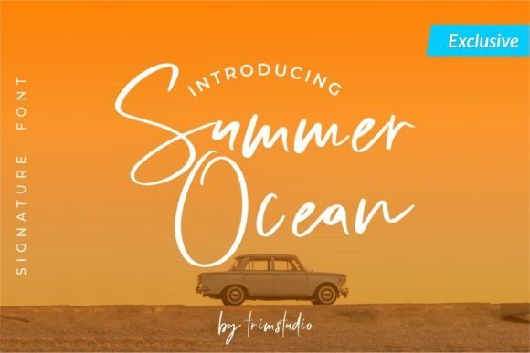
Summer Ocean flows like a coastal breeze: cursive connections, soft terminals, and a loose baseline create a relaxed, beachy rhythm that suits vacation-themed work. Hand-drawn touches and irregular strokes keep the script feeling organic, as if written quickly on a sun-warmed postcard.
The set includes swash options and contextual glyphs so you can create breezier display headlines or softer subheads without manual editing. It pairs nicely with textured paper backgrounds, tropical photography, or minimalist layouts that need a hint of seaside personality.
╰┈➤ Download Summer Ocean Font
My Recommendation: I pick Summer Ocean for projects that should feel effortless and sun-soaked, such as travel promos, destination wedding invites, and resort branding. The swashes and alternates let me craft flowing headlines without heavy hand-lettering work. It works best when combined with airy layouts and natural photo treatments to reinforce the coastal mood.
These 21 selections cover a wide range of summer moods: breezy scripts, chunky brush faces, and casual handwritten sets that read well at display sizes. Try swapping weight, adding a hand-drawn underline, or pairing with a clean geometric sans for contrast.
Pick a few favorites, test them in mockups, and keep licensing details handy before publishing. Small typographic choices give seasonal work an approachable, sunlit voice that resonates on social and on-product alike.