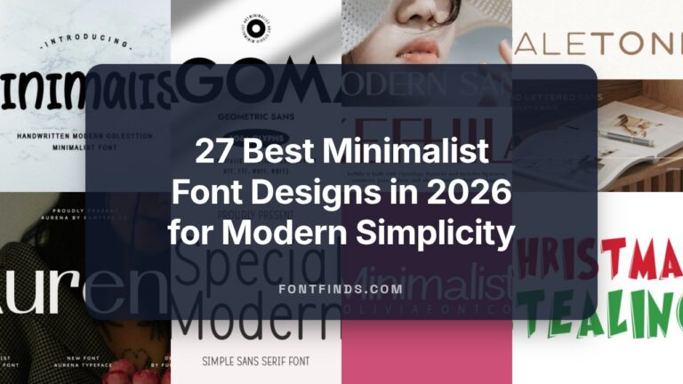
43 Stunning Quote Fonts to Add Poetic Authority in 2026
Quote fonts are the unsung typographic heroes that can make a short line linger in a reader’s mind. In this guide, we present 43 handpicked options spanning serif warmth, script flourish, and modern sans restraint to fit social posts, editorial spreads, and book epigraphs.
Alongside each recommendation you’ll find pairing tips, contrast strategies, and accessibility notes so your quotation typography, citation typefaces, and quote mark styling work across screens and print. Read on to match mood to message and elevate your quoted lines with confidence.
1. Vintage Magazine Font
Vintage Magazine is a handcrafted display face that captures the tactile thrill of ransom-letter collages while remaining surprisingly refined; its uneven baselines, mixed weights and paper-cut counters create an immediacy that commands attention in short bursts. Because each letter reads like a found object, it excels at emphatic headlines, poster pull-quotes and packaging badges where a retro, rebellious voice is needed and where traditional serif or sans treatments would feel polite.
Use it when you want quotation typography to feel like a physical discovery-it pairs beautifully with textured backgrounds and minimal body text to avoid visual clutter, and as an expressive option among Quote fonts it gives quotations a scrapbooked, human touch that’s hard to replicate digitally. Designers will appreciate how the font’s irregular rhythm adds motion to layouts, turning ordinary captions and social tiles into conversation starters.
╰┈➤ Download Vintage Magazine Font
My Recommendation: I’d reach for Vintage Magazine when a project needs personality over polish-its ransom-cut charm injects warmth and handmade authenticity into album covers, indie zines, retro packaging and Instagram quote tiles. It’s especially useful when you want text to read like a found artifact rather than a corporate message. Use sparingly at large sizes for maximum impact and pair with cleaner secondary type to keep readability high.
2. Romeo Chunky Font
Romeo Chunky is a bold, rounded display type with generous counters and a friendly, contemporary silhouette that reads clearly at both large and medium sizes; its sturdy forms make it ideal for headlines, signage and apparel branding that require instant legibility. The face’s approachable geometry gives logos and magazine covers a confident, warm tone while its weight range supports layered treatments like shadowing and embossing without losing clarity.
Designed with versatility in mind, this type shines in craft packaging, promotional posters and web hero panels where tactile presence matters; its simple shapes work well for sublimation printing and merchandise, and the built-in multilingual characters broaden its applicability. If you need a headline voice that balances playfulness and authority, Romeo Chunky offers a reliable, modern option that scales across print and digital channels.
╰┈➤ Download Romeo Chunky Font
My Recommendation: I use Romeo Chunky when a project needs an upbeat, no-nonsense headline that remains readable on everything from t-shirts to transit ads. Its friendly heft and clean curves make brand lockups and greeting-card covers pop, while also surviving heavy production finishes. For any application that benefits from bold clarity and an amiable personality-think packaging, posters and social banners-this is a go-to choice.
3. Cupid Crazy Font
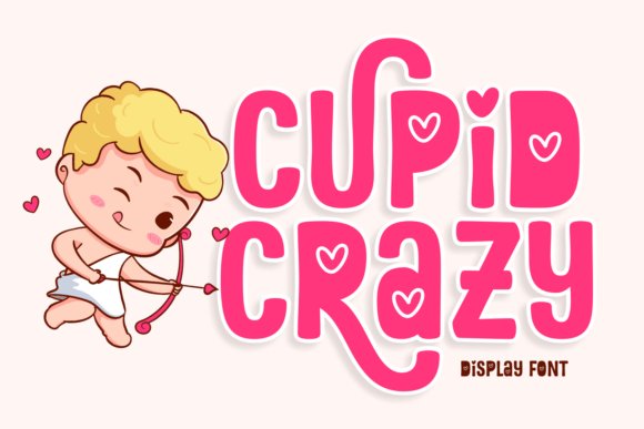
Cupid Crazy blends playful swashes and rounded terminals into a display face that radiates warmth and whimsy, ideal for romantic branding, seasonal campaigns and playful editorial work. Its loops and heart-tipped strokes create a lively rhythm that enhances short lines of type-perfect for greeting-card headlines, love-themed posters and magazine callouts that need emotional specificity.
The font’s light-hearted forms pair well with soft color palettes and illustrative artwork, lending charm to apparel prints, social graphics and book covers aimed at younger or design-forward audiences. When you want quotation lettering to feel affectionate rather than formal, Cupid Crazy delivers a flirtatious, expressive option that brightens layouts without overpowering supporting text.
My Recommendation: I’d reach for Cupid Crazy on any brief that calls for character and warmth-Valentine’s Day campaigns, children’s books, boutique packaging and playful logos are natural fits. Its decorative swashes add personality without sacrificing readability in short lines, so it’s great for headlines and merchandise prints. Pair it with a neutral sans for body copy to keep designs balanced and readable.
4. Smart Memory Font
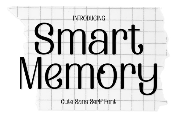
Smart Memory is a refined humanist sans that blends crisp geometry with gentle, feminine curves to create an approachable yet elegant texture on the page. Its open counters and moderate contrast deliver crisp headlines and sustained readability for body use alike, and it pairs especially well with Quote fonts and ornamental punctuation to lift pull-quotes and social media captions.
Designed with a variety of weights and subtle italic forms, Smart Memory supports smooth brand systems-from magazine mastheads to apparel tags-without losing warmth at small sizes. The font’s considered spacing and tidy terminals make it a reliable choice for logos, book covers, and greeting-card prints where polished simplicity matters.
╰┈➤ Download Smart Memory Font
My Recommendation: I reach for Smart Memory when a project needs sophistication without pretension: beauty editorials, boutique branding, and social graphics all benefit from its clean yet personable voice. Its multiple weights and clear legibility make it easy to implement across print and digital collateral. Use it when you want a neutral base that still feels stylish and human.
5. Rattesh Font
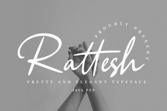
Rattesh is a flowing script with generous ligatures and alternate characters that recreate the fluidity of a skilled hand, giving each word an effortless, bespoke appearance. Its flourishes and varied stroke widths make headlines and wordmarks sing, especially in packaging and advertising where personality matters more than rigid formality.
Technically robust, Rattesh leverages OpenType features to swap in contextual alternates and decorative caps, so designers can craft unique logotypes or expressive titles without manual tweaks. It excels for boutique brands, invitations, and bold editorial uses where a handcrafted, signature look will boost memorability.
My Recommendation: I use Rattesh when a project calls for personality and a human touch-think artisan packaging, boutique logos, and luxury stationery. The extensive alternates mean you can produce distinct lockups without heavy custom lettering. It’s my go-to when I want typography that feels intimate and custom-made.
6. Happy Dreams Font
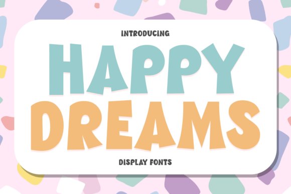
Happy Dreams brings a retro, groovy spirit to contemporary design with playful letterforms that channel 60s and 70s sensibilities while staying fresh for today’s displays. Bold curves and lively terminals give this display family strong poster presence, perfect for album art, event posters, and nostalgic branding that needs an upbeat, recognizable voice.
The family’s varied styles allow creative layering and color experimentation-ideal for holiday promotions, birthday cards, and eye-catching packaging-while multilingual support keeps it practical for global use. Pair Happy Dreams with a neutral sans for balance or use it alone as a dominant headline font when you want joyful, expressive typography to drive the visual identity.
╰┈➤ Download Happy Dreams Font
My Recommendation: Happy Dreams is my pick for projects that want to evoke nostalgia with a playful twist: festival posters, retro apparel, and cheerful packaging shine with this font. Its versatility across sizes and styles makes it easy to experiment with color and texture. Use it when you need an optimistic, unmistakable headline voice that feels both vintage and current.
7. Stacked Magazines Font
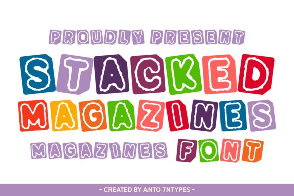
Stacked Magazines is a riotous collage-style display font that channels vintage ransom-note charm through bold cut-and-paste letterforms and handmade textures. Its layered glyphs and uneven baselines give headlines a lively, tactile energy that snaps attention on posters, T-shirts, and playful packaging. The design balances nostalgic grit with contemporary punch, making it feel both handcrafted and refreshingly modern.
Because of its cutout aesthetic, Stacked Magazines excels for attention-grabbing social posts and editorial pull-quotes where personality matters; it pairs especially well with neutral sans-serifs to control its exuberance. It also handles short, emphatic lines with flair, so use it for brand badges, zine mastheads, and Quote fonts for social captions, magazine callouts, and bold merchandising statements.
╰┈➤ Download Stacked Magazines Font
My Recommendation: I’d reach for Stacked Magazines when I need loud, collage-like energy that turns ordinary headlines into visual artifacts-perfect for indie brands, zines, and merch. Its handcrafted feel is ideal for projects that benefit from nostalgic personality and a DIY aesthetic. Use it as a display voice rather than body copy and let it lead covers, posters, and social cards to grab attention quickly.
8. Maybe Next Time Font
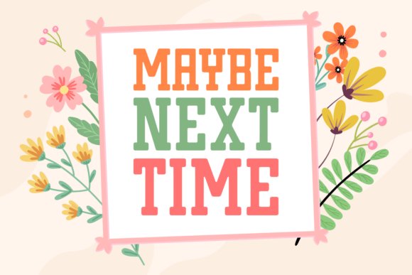
Maybe Next Time delivers a sturdy slab-serif presence softened by a slight grunge texture, marrying mid-century charm with contemporary utility. The robust serifs provide authority for logos and headlines while the subtle distressing lends a human, tactile quality that reads well on labels and apparel. Thoughtful proportions and solid x-heights maintain legibility even at large display sizes.
Its versatility shines across packaging, editorial spreads, and identity systems where you want vintage warmth without feeling old-fashioned; the face adapts to both minimalist and rustic contexts. Multilingual support and careful spacing make it reliable for global projects, and it pairs nicely with clean sans or delicate scripts to create balanced, characterful layouts.
╰┈➤ Download Maybe Next Time Font
My Recommendation: I recommend Maybe Next Time when a project needs dependable vintage weight with a touch of personality-perfect for packaging, editorial work, and branded apparel. The textured finish gives designs authenticity without overwhelming the message, and its robust forms scale well from print to web. It’s a go-to choice when you want warmth and presence without sacrificing clarity.
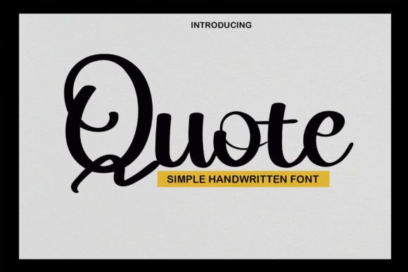
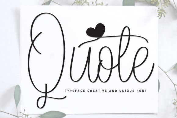
9. Quote Font
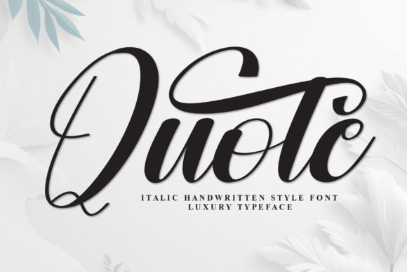
Quote Font is a breezy handwritten script that reads like a friendly note: playful, intimate, and immediately approachable. Rounded strokes and lively terminals create an inviting rhythm that suits wedding invites, greeting cards, and boutique brand identities where a human voice is key. Despite its whimsy, consistent spacing and moderate contrast keep lines clean and comfortably readable.
Beyond stationery, this script is excellent for product labels, blog headers, and social imagery that needs a personal touch; alternates and subtle ligatures prevent repetition and add visual variety. Pair it with a restrained sans for modern contrast or layer it over textured imagery for a cozy, handcrafted aesthetic that feels both polished and warm.
My Recommendation: I’d choose Quote Font when a design needs warmth and personality-its handwritten charm personalizes invites, hero banners, and product notes effortlessly. The script remains legible at typical invitation sizes and its alternates keep repeated text feeling fresh. It’s ideal for small brands, lifestyle blogs, and anyone seeking a friendly, handcrafted look.
10. Quote Baby Font
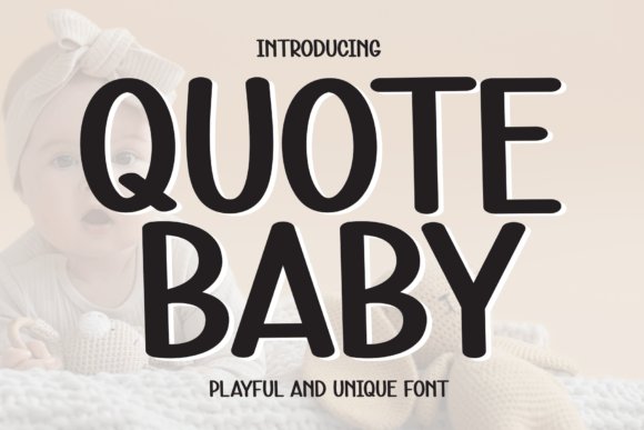
Quote Baby is a neat, casual sans-serif with warm undertones that soften its geometric skeleton; clean strokes and carefully balanced proportions make it instantly readable while feeling personable. Among Quote fonts it stands out for generous counters and subtly rounded terminals that reduce visual tension, giving headlines and UI labels a friendly, contemporary voice.
Its neutral rhythm and precise spacing make it versatile across digital interfaces, social graphics, and editorial pull-quotes where clarity matters but personality is welcome. Designers will appreciate how the type’s open shapes scale crisply at small sizes and retain charm in large display settings, making it a reliable workhorse for branding and content systems.
My Recommendation: I’d reach for Quote Baby when a project needs approachability without losing professionalism-think startup sites, product listings, or kid-friendly packaging. Its balance of warmth and clarity helps maintain legibility across screens while adding a human touch that photographs and strong visuals often need. It’s especially useful when you want friendly headline text that pairs well with a neutral body font.
11. Quote Display Font
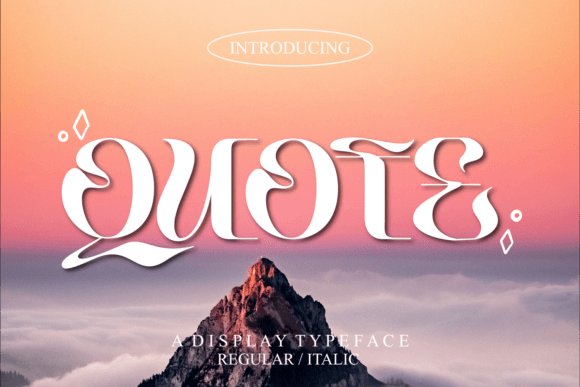
Quote Display Font is a bold, expressive typeface defined by wavy, sculpted letterforms that inject movement into any composition; its playful curves make words feel kinetic and modern. The family’s distinctive alternates, ligatures, and decorative glyphs-PUA encoded for easy access-allow creative layering and bespoke typographic moments without fiddly workarounds.
Use it to create arresting posters, bold magazine covers, or product packaging that needs an energetic voice and memorable silhouette. Because it reads best at larger sizes, pair it with restrained supporting text and exploit its unique rhythms for headlines, logo marks, and social art that must pause a viewer scrolling quickly.
╰┈➤ Download Quote Display Font
My Recommendation: I’d choose this Quote Display Font for projects that need visual drama and personality-album art, event posters, or eye-catching social campaigns are perfect fits. The built-in alternates and PUA glyphs speed up creative exploration, letting you craft bespoke letter combinations without extra tools. Use it sparingly as a focal display element so its quirks remain delightful rather than overwhelming.
12. Quote Script Font
Quote Script Font channels contemporary hand-lettering with refined calligraphic roots, offering flowing connections and elegant stroke contrast that evoke crafted signatures. Its consistent slant and carefully shaped terminals deliver a sophisticated rhythm, making the face ideal for tasteful accents rather than dense blocks of copy.
This script shines on wedding stationery, premium branding, and editorial pull-quotes where a touch of refinement is required; its ligatures and contextual alternates create natural joins that read as authentic handwriting. Pair it with a clean sans for contrast, and reserve its ornamental forms for focal phrases, monograms, or invites where legibility and style must coexist.
╰┈➤ Download Quote Script Font
My Recommendation: I’d use Quote Script Font when a design demands handwritten elegance-luxury brand identity, invitation suites, or boutique packaging are ideal use-cases. Its polished strokes give projects a bespoke, human quality while remaining legible in display sizes. It’s perfect for adding a signature flair that elevates a layout without overpowering supporting typography.
13. Happy Quote Font
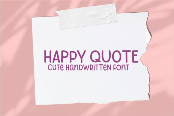
Happy Quote is a small-batch, hand-lettered script that reads like a friendly note on a chalkboard. Its slightly irregular baseline, open counters, and tapered strokes reproduce the tactile wobble of marker and chalk while remaining legible at display sizes, and the included alternates add natural variation for authentic lettering.
When curating Quote fonts for classroom posters or social captions, Happy Quote supplies a warm, human voice that feels crafted rather than manufactured. It pairs beautifully with a neutral sans for body copy, tolerates high-contrast backgrounds, and responds well to light tracking and subtle shear for poster layouts.
My Recommendation: I’d reach for Happy Quote when I want design that feels handcrafted – classroom art, menu chalkboards, or heartfelt social pull-quotes. Its organic irregularities give each line personality while alternates prevent repetition. Use it with simple sans-serif bodies and muted textures to emphasize the homemade look without losing readability.
14. Sports People Font
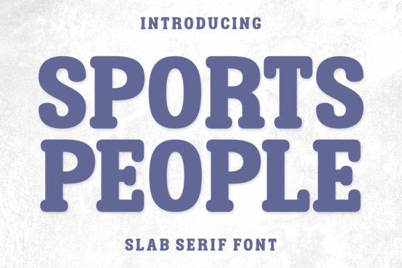
Sports People is a chunky, slab-serif display face with a mischievous cartoon energy: thick stems, rounded slabs, and playful counters deliver instant character. The exaggerated proportions and compact letterforms create strong presence on stickers, posters, and kids’ packaging, where boldness and amused expression matter more than subtlety.
This font shines in large-format settings like event banners, children’s book covers, and toy labels because its heavy weight reads clearly from a distance and cuts well for vinyl or die-cut stickers. Pair it with simple geometric shapes and bright palettes to amplify its comedic vibe, and avoid overusing small body text where details could clog up.
╰┈➤ Download Sports People Font
My Recommendation: I’d use Sports People for any project that needs to make people smile – playground signage, birthday invites, or playful product branding. Its bulk gives immediate legibility and a sticker-friendly silhouette that reproduces cleanly at scale. Keep it up front as a headline face and balance it with minimal supporting type so the humor stays focused.
15. Stylish Ballpoint Font
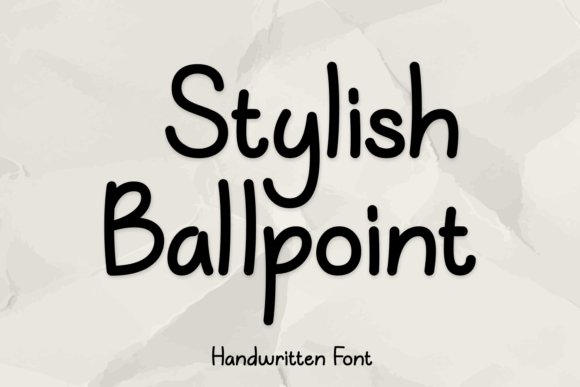
Stylish Ballpoint captures the steady, clean line of a well-inked pen: measured strokes, subtle modulation, and open apertures give the face an approachable clarity that still feels personal. The letterforms are balanced for medium- to large-size headlines, offering an approachable tone that avoids being overly casual or too formal.
It’s an excellent choice for brand identities and social graphics where warmth and readability must coexist; use it for product names, subheads, and pull-quotes to impart a human touch without sacrificing structure. Pair with a restrained sans for body text, and take advantage of tight kerning and optical sizing at display levels for crisp digital and print output.
╰┈➤ Download Stylish Ballpoint Font
My Recommendation: I’d pick Stylish Ballpoint for brands that want to feel personable but polished – boutique labels, lifestyle blogs, and editorial headings are perfect fits. The pen-inspired strokes communicate warmth and reliability while staying clean at headline sizes. Use it alongside a neutral sans to ground layouts and let the ballpoint character do the conversational work.
16. Wind Down Font
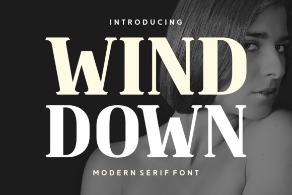
Wind Down is a serif display with graceful, tapered serifs and a calm, contemporary voice that bridges elegant and modern typographic tastes. Its refined stroke contrast and gentle terminals make headlines and photo overlays feel composed without stiffness, while its alternate italics and smooth curves give it a bespoke character. It also excels as one of the most readable Quote fonts for pull-quotes and epigraphs, lending warmth to book interiors and greeting cards.
On the technical side Wind Down provides extensive OpenType features-small caps, discretionary ligatures, and tabular figures-that reinforce a crafted editorial look, and its wider tracking options help when setting dramatic display lines. Multilingual support and a broad weight range make it reliable for packaging, mastheads and logotypes, and thoughtful kerning keeps it legible at both point sizes and poster scale. Pair it with a neutral sans for modern branding or a condensed serif for high-impact covers.
My Recommendation: I reach for Wind Down when a project needs a serif that feels handcrafted but impeccably composed; its alternates add personality without theatrics. It’s especially strong for book covers, boutique packaging and editorial mastheads where a warm, readable display face is essential. The rich OpenType set and language support save time on production and keep layouts consistent across print and web.
17. Title Love Font
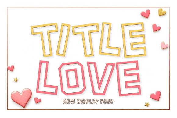
Title Love is a display family built around swooping curves and crisp terminals that merge contemporary polish with classic proportions, ideal for bold headlines and apparel graphics. Its spectrum-from delicate thin styles to chunky weights and bouncy playful cuts-lets you dial tone from elegant to exuberant without swapping type families. Outline and boxed treatments add decorative options for posters, packaging and promotional pieces while maintaining typographic hierarchy.
Sporty and campus-inspired variants inject youthful vigor for merchandise and team branding, whereas the thinner and outline faces suit boutique identities and editorial mastheads. OpenType alternates and stylistic sets unlock charming ligatures and alternate terminals that lift logotypes and headline treatments. I often pair Title Love with a geometric sans or a compact slab to stabilize its expressive shapes across layouts.
My Recommendation: I’d use Title Love for projects demanding personality-apparel branding, magazine covers and social campaigns-because it balances flair with legibility. The variety of weights and decorative styles means you can build a cohesive visual system from headlines to merchandise. Its alternates make crafting distinctive wordmarks fast and satisfyingly flexible.
18. Minimal Moment Font
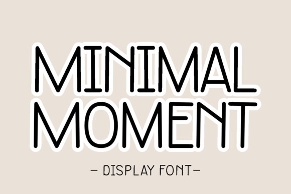
Minimal Moment is a restrained display collection that emphasizes clean forms and subtle charm, ranging from neat handwritten cuts to pared-back sans styles to suit diverse editorial moods. Its soft rounded strokes and measured proportions add a gentle warmth for greeting cards, logotypes and labels, while compact weights perform well on tighter layouts such as captions and interface elements. Small ornaments, discreet ligatures and drop-cap options give designers modest flair without overpowering content.
Built for cross-platform consistency, this family reads clearly on screens and print alike and supports multilingual typesetting with stable metrics. For pull-quotes and blockquote treatments I prefer its neutral weights with slightly increased tracking to create calm emphasis that complements longer text. Pair Minimal Moment with a neutral grotesque for sustained readability while keeping headers characterful yet unobtrusive.
╰┈➤ Download Minimal Moment Font
My Recommendation: I pick Minimal Moment when a project needs understated, reliable typography-editorial layouts, product labels and UI headers benefit most from its calm personality. Its restrained alternates and consistent spacing streamline typesetting and reduce fiddly manual tweaks. Use it whenever you want clarity and a human touch without visual fuss.
19. Hugs My Angel Font
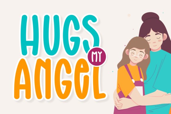
Hugs My Angel is a charming display family that mixes delicate scripts, soft display cuts, and hand-drawn alternates to evoke warmth and personality. Its airy cursive, playful ligatures, and rounded display weights are perfect for romantic branding, social visuals, and sentimental layouts-designers crafting sentimental Quote fonts are especially well served by its gentle strokes and ornamented glyphs. The collection reads as both fashionable and approachable, making headlines and subheads sing without losing readability.
The toolkit includes clean card and cover styles, cartoonish alternates for seasonal merchandise, and magazine-ready weights for packaging and apparel mockups. With broad multilingual coverage, tidy outlines, and pairing-friendly contrasts, the family scales nicely from tiny product tags to large posters. Reach for it when you need a tender, handcrafted voice across greeting cards, book covers, logos, and heartfelt social posts.
╰┈➤ Download Hugs My Angel Font
My Recommendation: I use Hugs My Angel when a project needs sincere warmth-wedding invites, boutique branding, and sentimental social campaigns are ideal. Its mix of cursive alternates and display weights lets me craft elegant headlines that still feel personal. It’s my go-to when I want typography that communicates affection without feeling fussy.
20. Barbie Hugs Font
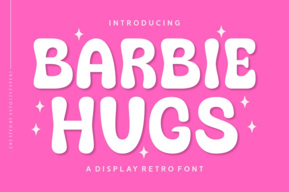
Barbie Hugs offers a bubbly, rounded display voice that immediately brightens playful layouts with retro-pop charm. Its smooth terminals and compact proportions translate beautifully onto children’s books, youthful packaging, and fashion labels that want an upbeat, friendly presence. The balance between personality and legibility makes it work well in both small and medium settings.
Backed by multilingual glyphs and crisp outlines, this family adapts cleanly to glossy magazine headers, greeting cards, and cheerful product tags. It thrives at medium sizes-ideal for T-shirt graphics, social thumbnails, and boutique branding where an approachable aesthetic matters. Pair it with a neutral sans for contrast or a soft script to amplify its whimsical energy.
My Recommendation: I recommend Barbie Hugs for projects aiming to feel fun, youthful, and unmistakably friendly-think children’s packaging, summer campaign tees, and playful editorial spots. Its rounded shapes hold up well in print and on-screen, making it versatile across formats. I reach for it when I want type that’s cute without being cutesy.
21. Tall Boy Ink Font
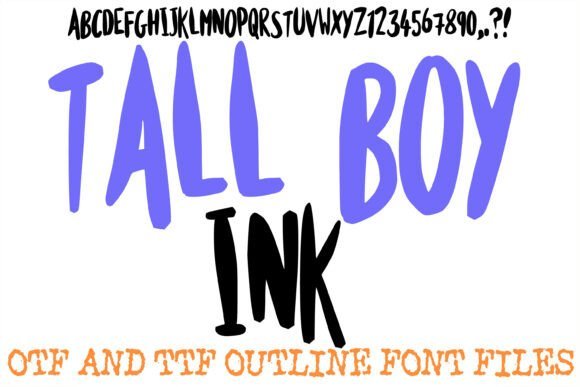
Tall Boy Ink is a high-energy, condensed display with exaggerated vertical proportions and a hand-inked texture that reads like marker lettering. The roughened strokes and pronounced height inject a streetwise, organic rhythm into posters, band artwork, and urban editorial headlines. Its dramatic presence is eye-catching but crafted to preserve clarity in short bursts of copy.
Structurally, this typeface holds up well at large sizes and in layered treatments-making it ideal for logos, hero banners, and gritty lifestyle overlays. Designers can rely on its compressed footprint to save horizontal space while delivering bold impact on apparel and event posters. It’s especially useful when you need typography that feels immediate, kinetic, and authentic.
╰┈➤ Download Tall Boy Ink Font
My Recommendation: I choose Tall Boy Ink for projects that demand attitude-music promos, streetwear branding, and bold event posters benefit from its raw, hand-inked personality. Its condensed form packs visual punch without sacrificing legibility. Use it when you want type that feels spontaneous and full of motion.
22. Advice Quote – Quote fonts
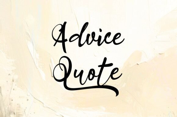
Advice Quote marries elegant calligraphic strokes with contemporary legibility to produce a handwritten voice that feels intimate yet refined. Its flowing connections and thoughtful contrast create a warm, artisanal presence that reads beautifully at display sizes and on social graphics. Because of its expressive rhythm and clear forms, Advice Quote is one of the most compelling Quote fonts for wedding suites, motivational wall art, and boutique branding projects.
Open counters and a generous x‑height boost readability, while optional swashes and ligatures let you tune the mood from subtle to decorative. It integrates seamlessly across print and digital workflows and pairs especially well with clean sans serifs for contrast. I recommend using it as a focal headline or signature element rather than for extended text to preserve its handcrafted charm.
╰┈➤ Download Advice Quote – Quote fonts
My Recommendation: I use Advice Quote when a project needs sincere, handcrafted personality-wedding invitations, inspirational posters, and artisanal logos are ideal. The decorative alternates let you customize every piece without sacrificing clarity, and it photographs and prints reliably. For maximum impact, pair it with minimalist layouts so the script can breathe.
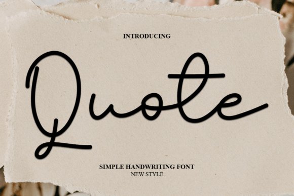
23. Quote Font
Quote is a sweet, approachable script with rounded terminals and a gentle slant that immediately reads as friendly and personal. Its compact letterforms make it well suited for short headlines, cards, and social posts where a casual, handcrafted tone is desired. Stroke contrast is intentionally low, which preserves consistency across both printed invitations and on‑screen graphics.
Stylistically, this variant thrives with soft color palettes and textured stock to amplify its warm character. Pair it with a geometric sans for contemporary stationery or with a classic serif for a more traditional look. A modest set of alternates gives designers variety without complicating simple layouts.
My Recommendation: I reach for this Quote Font when I want a gentle handwritten accent-perfect for wedding stationery, baby announcements, and boutique shop signage. It’s simple to set and adapts well to small scales like tags and Instagram captions. Treat it as a display element rather than body copy to keep compositions readable and charming.
24. Quote Font
This delicate rendition emphasizes thin, airy strokes and narrow proportions to create a refined, contemporary script ideal for upscale packaging and editorial captions. Subtle swashes and precise terminals lend a quiet elegance without distracting from surrounding design elements. Its restrained weight makes it particularly effective in headlines where sophistication is preferred over flamboyance.
Designers will find it especially useful on food labels, boutique product tags, menus, and title treatments that require space-conscious typography. It pairs beautifully with textured papers and monochrome palettes to signal craftsmanship and premium quality. For small or busy applications, slightly increasing tracking and contrast helps maintain clarity.
My Recommendation: I choose this Quote Font when projects call for understated refinement-artisan food packaging, minimal branding, and refined editorial headers benefit most. Its delicate forms communicate premium quality and handcrafted detail. For digital use, consider a slightly heavier weight or added contrast so fine strokes remain visible on screens.
25. Quote Notes Font
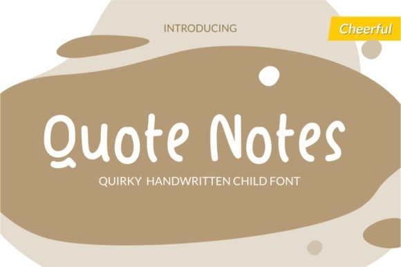
Quote Notes is a cute, whimsical handwritten script that brings a craft-room charm to small-format design. Its bouncy strokes, ribbony terminals, and playful ligatures make it one of the most charming Quote fonts for handmade invites, baby-shower tags, seasonal labels, and any project that benefits from an intimate, hand-rendered voice.
Alternates for double letters and capital styles keep repeated words feeling fresh, while the irregular baseline and generous ascenders create a sense of motion and personality. The face scales cleanly from greeting-card sizes to poster headlines, and the package usually includes OTF/TTF files plus webfont support for easy production.
My Recommendation: I reach for Quote Notes when I want instant handcrafted warmth – it makes invitations and product tags feel personal and joyful. The alternate characters prevent monotony in repeated words, and its lively rhythm reads well in both print and digital. Use it for holiday crafts, baby events, and boutique packaging where a playful, human touch matters.
26. Christmas Quote Font
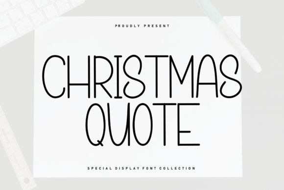
Christmas Quote is a sweet handwritten sans-serif that dances along the baseline with a cozy, homemade energy. Rounded terminals and a slightly modest x-height create friendly letterforms that feel approachable on cards, labels, and seasonal social art without sacrificing readability.
This display face works best as a headline paired with a clean sans or a condensed companion to maintain hierarchy; modest stroke contrast keeps legibility high at medium and large sizes. Apply subtle textures or kraft backgrounds to amplify its seasonal personality for packaging, banners, and holiday promotions.
╰┈➤ Download Christmas Quote Font
My Recommendation: I use Christmas Quote when I want a festive yet understated look that reads clearly across print and screens. It adds handcrafted character without competing with imagery, making it ideal for greeting cards, gift tags, and cozy brand activations. Pair it with simple shapes or metallic accents for an elevated holiday feel.
27. Goodbye Valentine Font
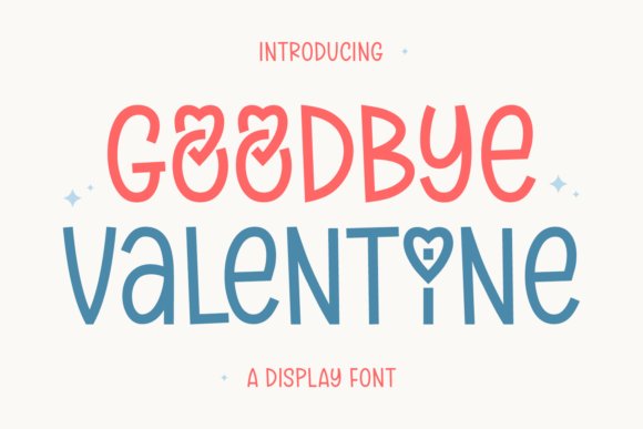
Goodbye Valentine is a friendly display font that brings pen-driven warmth to bold titles and romantic campaigns. Its generous counters and playful terminals strike a balance between expressive personality and clear readability, which makes it effective for posters, covers, and lifestyle branding that needs a touch of sentiment without being saccharine.
The family often includes stylistic sets and swash options, allowing designers to dial the tone from coy to elegant without changing typefaces. Strong heavier weights deliver headline presence while lighter cuts let you layer textures or overlays; it pairs especially well with classic serifs for editorial looks or fine scripts for layered compositions.
╰┈➤ Download Goodbye Valentine Font
My Recommendation: I choose Goodbye Valentine when a project calls for warmth plus boldness-think romantic product launches, posters, or gift-line packaging. The stylistic alternates give me tonal flexibility, so I can go playful or refined with minimal fuss. It’s particularly useful for campaigns that need a distinct, emotional voice while staying versatile across formats.
28. Sadistic Soldier Font
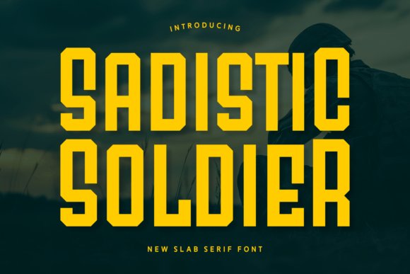
Sadistic Soldier is a heavy slab-serif display with thick, squared terminals and compact counters that deliver instant visual authority. Its condensed proportions and pronounced serifs create a bold headline voice that reads clearly on book covers, posters and logo marks while maintaining an industrial, vintage temperament. The typeface’s rhythm and weight distribution give designers a solid anchor for layered compositions and dramatic typographic locks.
Technically robust, the family tolerates heavy textures, embossing and inverse colorways without losing character, and its expanded glyph set supports multilingual layouts for global campaigns. Pair it with a neutral sans for body copy or a delicate script for contrast; use it where a commanding tone is required for slogans, merchandise and impactful Quote fonts on printed and digital displays.
╰┈➤ Download Sadistic Soldier Font
My Recommendation: I reach for Sadistic Soldier when I need typography that asserts dominance-its weight and slab geometry cut through busy visuals and make headlines unforgettable. It’s ideal for branding, editorial covers, and event posters that demand a strong, recognisable voice. Use it when you want to convey strength, heritage or a rugged, high-impact attitude.
29. Walking Slowly Font
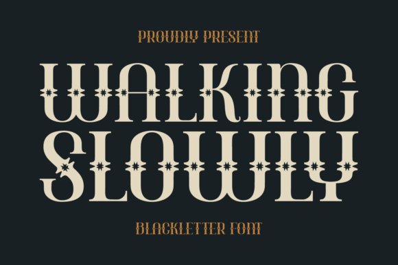
Walking Slowly reimagines blackletter with softened terminals and subtle grunge distress to create a vintage-but-approachable display face. The design preserves ornamental strokes and textured counters while improving overall legibility, giving it a handcrafted feel suited to barbershop signage, craft packaging and retro apparel. At display sizes the letterforms form striking silhouettes that read as artisanal and moody rather than ornate or inaccessible.
Practically, the family works best in headlines, badges and logo treatments; avoid using it for body text where fine details can clog. Pair Walking Slowly with clean sans serifs, high-contrast backgrounds or muted palettes to emphasize its retro personality, and take advantage of its multilingual support when you need heritage styling across markets. It thrives on posters, T‑shirts and labels that seek a nostalgic, textured identity.
╰┈➤ Download Walking Slowly Font
My Recommendation: I use Walking Slowly when a project needs handcrafted character-think indie brands, specialty packaging and vintage-inspired apparel. It gives logos and headlines a storied, tactile quality that feels authentic. I’d avoid long passages, but for badges, posters and merchandise it’s a flavorful, reliable choice.
30. Looks Unique Font
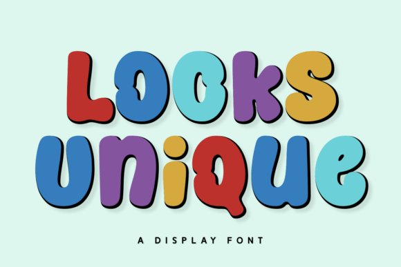
Looks Unique pairs retro sensibilities with modern smoothness to form a playful, friendly display family. Rounded terminals, open counters and modest contrast make the face inviting for children’s products, greeting cards and casual apparel while preserving strong legibility for headlines and shorter copy. Its balanced shapes translate well across screen, print and stitched applications, giving it broad utility for seasonal and lifestyle work.
The typeface excels in social banners, product packaging and embroidery where personality matters more than strict formality; use soft shadows or pastel palettes to amplify its warm tone. Looks Unique pairs naturally with minimalist sans-serifs or thin serifs to create contrast without overpowering the message, and it adapts gracefully to vector-based production for merchandise and craft projects.
╰┈➤ Download Looks Unique Font
My Recommendation: I pick Looks Unique when a design needs to feel approachable and upbeat-its rounded forms are ideal for kids’ brands, Valentine’s cards and casual apparel. It reads crisply on both screens and stitched goods, making it versatile for merchandise and packaging. Pair it with clean type for balance and let its personality drive the visual identity.
31. Loves Girls Font
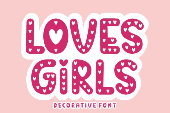
Loves Girls is a charming decorative family built around delicate swashes, alternate hearts and playful terminals that immediately read as feminine and affectionate – Quote fonts are baked into the set with specially crafted quotation marks and ornate ligatures that make sentiments sing on wedding invites, Valentine’s stationery and romantic branding. The palette of weights and a generous set of stylistic alternates let you dial the mood from sweet and subtle to bold and dramatic without losing legibility at display sizes.
Technically considerate, the collection ships in OpenType/OTF and TTF with tidy kerning pairs, multilingual glyphs and cut-friendly outlines for Cricut and vinyl projects, so what you design in print translates cleanly to crafts and apparel. Pair it with a neutral sans for body copy or a thin serif for elegant editorial spreads; the fonts excel on greeting cards, boutique logos and any project that needs an intimate, handcrafted voice.
My Recommendation: I’d reach for Loves Girls when designing anything that needs warmth and personality – wedding suites, boutique packaging or hand-cut vinyl decals. Its alternates and quotation glyphs make quoted passages feel intentional and decorative. Use it where sentiment and a handmade look are the headline, then balance with a simple sans for support.
32. Peace Road Font
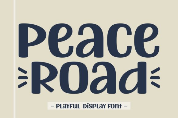
Peace Road is a hand-drawn display collection with a clean, cursive sensibility that reads modern yet approachable, great for fashion brands, photography overlays and stylish social media assets. The family’s rounded terminals, subtle irregularities and thoughtful stroke contrasts give headlines a human touch, while seasonal and cartoonish alternates add playful variety for festive packaging or children’s editorial work.
The pack includes multilingual support, useful OpenType features like contextual alternates and ligatures, and crisp outlines that scale well across wallpapers and sublimation prints; designers will appreciate the careful kerning for headline use. For best results pair it with restrained geometric sans or a light serif in body copy; avoid using it for long-form text, but exploit its personality for logos, covers and premium product labels.
My Recommendation: I recommend Peace Road for projects that need an authentic, handcrafted headline – think boutique lookbooks, social campaigns and apparel tags. Its hand-drawn warmth gives personality without looking sloppy, and the multilingual set makes it practical for international branding. Use the alternates to create unique logotypes or seasonal promotions.
33. Mafia King Font
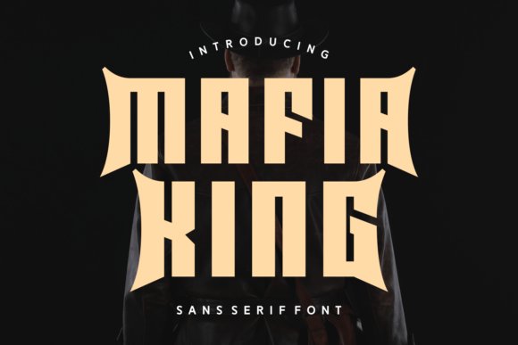
Mafia King is a robust sans family that leans into boldness and attitude: clean geometric forms, pronounced x-height and optional swash or slab accents make it ideal for impactful headlines, posters and apparel graphics. The collection offers regular, italic and display flavors so you can toggle between restrained brand voice and loud, retro-inspired statements suitable for packaging and editorial covers.
Designed for strong logotypes and headline typography, Mafia King includes well-tuned kerning, multiple weights and OpenType features for stylistic alternates and numeral options, delivering versatility across print and screen. It’s less suited for long passages, but pairs beautifully with light humanist serifs or narrow condensed faces when you need contrast and a polished, modern feel on merchandise, signage or magazine spreads.
My Recommendation: I’d use Mafia King when the project demands authority and attitude – brand marks, T‑shirt art or bold editorial spreads work especially well. Its variety of weights and alternates make custom logotypes achievable without heavy manipulation. For balanced layouts, combine it with a slim serif or neutral sans to avoid overwhelming the page.
34. Kitchen Quote Font
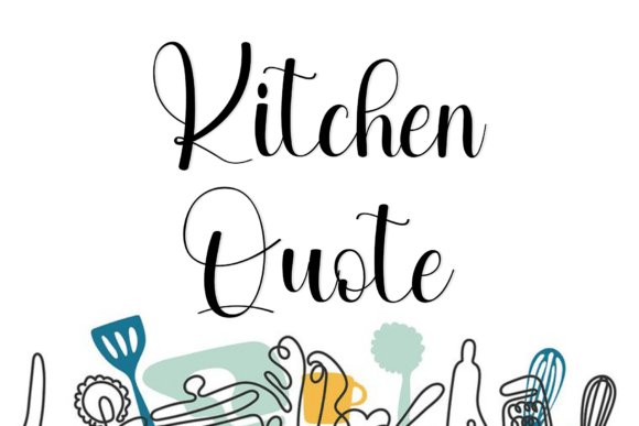
Kitchen Quote is a sophisticated, rhythmic script that balances commanding high-contrast strokes with delicate hairline connectors; its vertically elongated characters and looping ascenders mimic premium inkwork to produce an elegant, editorial cadence. Among contemporary Quote fonts , the design reads artisanal yet disciplined, delivering a refined handwritten voice that suits premium packaging and seasonal headlines.
The typeface’s grounded downstrokes and generous x-height give stability in display sizes, while stylistic alternates and swash options let you tailor ornamentation for invitations or subdued branding. Pair it with a neutral serif or a clean sans to preserve legibility while emphasizing its ink-like motion for boutique food labels, wedding suites, and magazine mastheads.
╰┈➤ Download Kitchen Quote Font
My Recommendation: I’d reach for Kitchen Quote when I need a refined handwritten voice with seasonal warmth and editorial polish. Its alternates and swashes let me craft expressive headlines without sacrificing readability. Use it for upscale food branding, boutique event stationery, or magazine covers where artisanal sophistication is essential.
35. Lovelly Quote Font
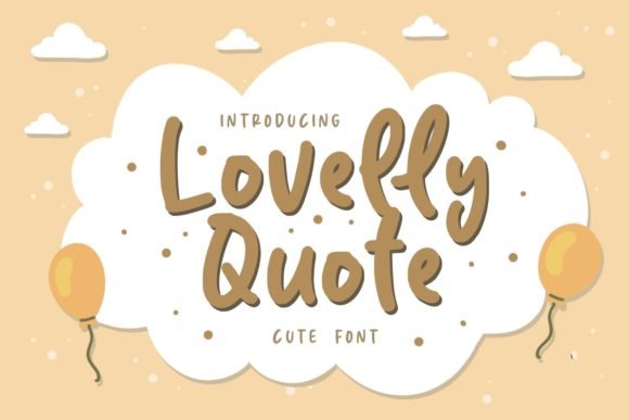
Lovelly Quote radiates a carefree, hand-drawn charm with soft curves and a playful bounce that feels instantly approachable. Its uneven baseline and loopy terminals create an infectious rhythm, giving short messages and captions a warm, conversational tone.
The glyph shapes are compact enough for logos yet expressive enough for bold social posts, greeting cards, and casual apparel. Try layering it over textured backgrounds or pairing it with a geometric sans to keep layouts fresh while preserving a delightfully human personality.
╰┈➤ Download Lovelly Quote Font
My Recommendation: I’d use Lovelly Quote for projects that need immediate warmth and friendliness, like greeting cards, kids’ products, or casual brand identities. It adds personality without feeling gimmicky and scales well for social media overlays and merchandise. This font makes brands feel accessible and joyful.
36. Notes Quote Font
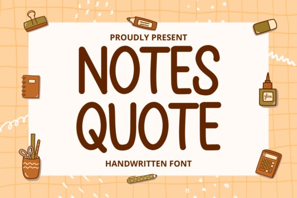
Notes Quote is a friendly display face with hand-sketched energy-rounded terminals and slight irregularities give it an unmistakable human touch that reads as both playful and intentional. It’s crafted for attention-grabbing use: headlines, posters, album covers, and packaging that demand a memorable, approachable voice.
Open counters and robust forms ensure clarity at scale, while quirky letter shapes inject personality into even short phrases. Pair it with a restrained serif for editorial work or place it on flat color blocks for contemporary branding; it also reproduces cleanly for stickers and merchandise where charm matters.
My Recommendation: I’d pick Notes Quote when I want big personality in headlines or packaging-something that stops the scroll and feels handcrafted. Its bold, legible forms translate well to print, vinyl, and merch, making it a reliable choice for posters, album art, and playful brand identities. Use it when you need warmth and instant recognition.
37. Quote Font
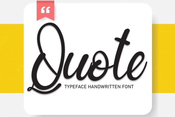
Quote is a sweet, smooth handwritten display that balances delicate loops with controlled rhythm, giving designs a personal yet refined voice. Designers seeking gentle calligraphic charm will find Quote fonts to be an excellent choice for romantic branding, elegant invitations, and intimate editorial pull-quotes because its strokes remain readable without losing personality.
The face comes with thoughtful spacing and a set of ligatures and alternates that let you vary word endings and swashes for bespoke compositions; it performs beautifully at display sizes and on printed goods. In practice, I pair it with a neutral sans for body copy and use subtle tracking adjustments to keep long lines airy and legible.
My Recommendation: I use this font when I want a handwritten touch that still behaves like a professional typeface-perfect for wedding invites, boutique packaging, and signature-style logos. Its alternates let me create unique wordmarks quickly, while the overall softness suits feminine or artisanal brands. If you need warmth without sacrificing clarity, Quote is a dependable go-to.
38. Black Quote Font
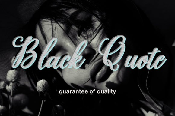
Black Quote is a bold script with strong, confident strokes designed to command attention on packaging and event posters. Its heavy weight and dramatic contrast make it ideal for headlines, product labels, and greeting cards where the type must read clearly from a distance while still feeling handcrafted.
Beyond its visual punch, the font includes decorative swashes and alternate caps that let you create ornate compositions without layering extra graphics. For best results, reserve this design for short phrases or logos, pair it with a clean geometric sans for balance, and keep tight kerning to preserve its assertive rhythm.
My Recommendation: I reach for Black Quote when a project needs bold personality-think artisanal food labels, seasonal packaging, or event posters that must stand out on crowded displays. Its heavy strokes read well at large sizes and the alternates let me tailor headlines with flourish. Use it sparingly for impact; it shines as the visual focal point.
39. Newyear Quote Font
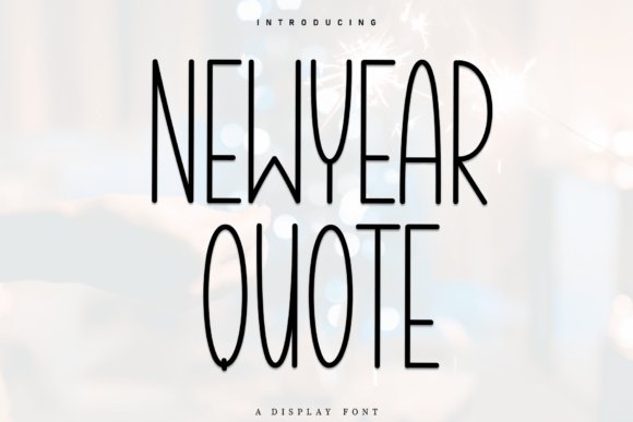
Newyear Quote blends the warmth of handwriting with the clarity of a humanist sans, producing an approachable, relaxed look that suits greeting cards and social graphics. Its smooth mono-weight strokes and open counters create a calm, airy texture that works across branding, invitations, and digital posts where a friendly, handcrafted aesthetic is desired.
The typeface’s rhythmic baseline and subtle irregularities give layouts a human touch without sacrificing legibility at smaller sizes, and it pairs well with a restrained serif for editorial contrast. Technically, it’s web-ready and adapts cleanly to responsive layouts, making it a practical choice for both print and online campaigns.
╰┈➤ Download Newyear Quote Font
My Recommendation: I recommend Newyear Quote when you want the impression of hand-lettering but need the consistency of a geometric face-excellent for lifestyle brands, seasonal promos, and influencer graphics. It reads well on screens and prints alike and creates approachable identities with minimal fuss. Use it to add warmth to modern layouts without losing professionalism.
40. Journey Slovanika Font
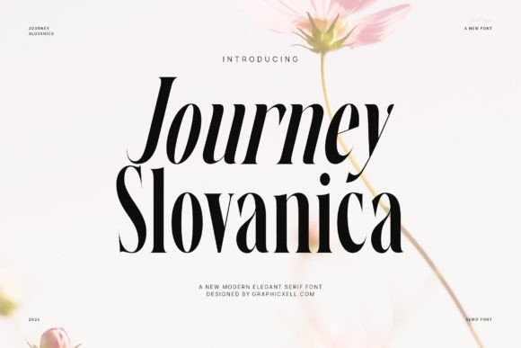
Journey Slovanika is a contemporary serif with a refined contrast between hairline strokes and bold terminals, giving every character a poised, fashion-forward silhouette. Delicate flared serifs and open counters balance ornament with readability, so it holds up as both a headline display and a comfortable body face at modest sizes.
The font’s graceful modulation and subtle flourishes make it a natural for feminine identity work, wedding collateral, editorial mastheads and boutique packaging; it also shines when you want short lines to resonate on social media – it is especially compelling for Instagram Quote fonts for shareable, styled captions and branded quote cards. Pair it with a neutral sans for contrast or a light script for romantic accents.
╰┈➤ Download Journey Slovanika Font
My Recommendation: I’d reach for Journey Slovanika when a project needs refined elegance without feeling old-fashioned – think premium wedding suites, luxe product labels, or fashion editorials. Its contrasty strokes give headlines a couture look while remaining readable in longer blocks. Use it to lift a brand into a sophisticated, feminine space where every letter feels intentional.
41. Dream Days Font
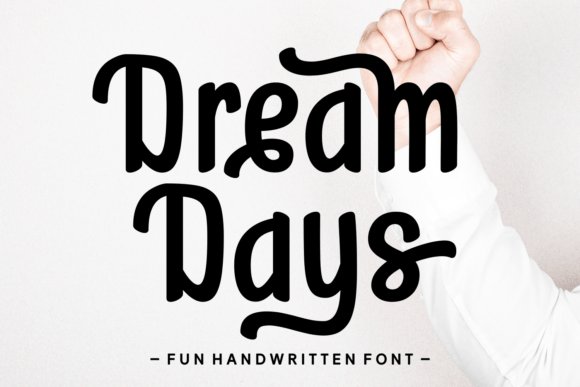
Dream Days is a diverse script collection that spans playful hand-drawn alphabets to polished calligraphic styles, offering alternates, ligatures and stylistic sets that let you tune the mood from cute and chubby to sleek and refined. The set includes rounded, striped and textured accents plus multilingual support, which makes it practical for global campaigns as well as boutique designs.
Because of its breadth, Dream Days adapts easily for apparel prints, book covers, packaging, seasonal greeting cards and lively social content; designers can mix the chunkier, informal cuts with elegant scripts to create eye-catching logotypes and headlines. Technical features like OpenType swashes and contextual alternates make it simple to craft unique lockups and hand-lettered effects without manual editing.
My Recommendation: I recommend Dream Days for projects that need personality and flexibility-small brands, lifestyle blogs, and seasonal product lines benefit from its range. The built-in alternates and ligatures let you achieve bespoke wordmarks quickly, and the playful styles are particularly effective for kid-friendly or casual apparel. Use it when you want type that feels handcrafted but remains production-ready.
42. First Moment Font
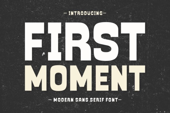
First Moment blends a clean sans skeleton with a vintage-inspired flourish, producing an approachable display face that reads modern yet nostalgic; sweeping swashes and gentle curves recall traditional handlettering without sacrificing the clarity of contemporary typography. Its proportions are generous, with open apertures that keep letterforms legible across posters, covers, and branding marks.
This family’s expressive alternates and swash characters make it an excellent headline choice for magazine covers, posters, boutique packaging and greeting cards where personality matters, while its restrained regular styles perform well in logotypes and identity systems. Use it to inject warmth into minimalist layouts or pair it with a neutral serif for editorial projects that need a handcrafted touch with consistent readability.
╰┈➤ Download First Moment Font
My Recommendation: I’d pick First Moment when a project needs charm and clarity together-think boutique brand identities, editorial covers, and lifestyle packaging. The swashes let you add decorative flair without custom lettering, and the core sans styles hold up across sizes. It’s my go-to when I want a handcrafted vibe that still behaves like a dependable display type.
43. Super Rays Display Font
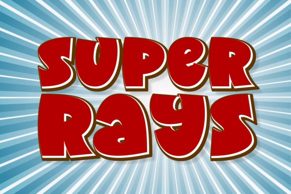
Super Rays Display Font is a playful yet refined font collection that balances cartoonish charm with professional polish, offering multiple weights, fun alternates, and Cricut-ready outlines for crafts and merchandise. The family includes decorative swashes, silhouette shapes, and condensed headline cuts that shine on posters, T‑shirts, and logos without losing legibility. It even contains tailored styles ideal for Quote fonts , with ornamented quotation marks and careful kerning that make pulled quotes and caption art feel intentional. Designers will appreciate its mix of craft-friendly cutting fonts and sophisticated display cuts that suit both children’s projects and editorial headers.
Under the hood Super Rays provides full OpenType features, reliable multilingual support, and well-tuned spacing so large display text reads cleanly across digital and print. Pair bolder weights with light scripts or slab serifs to create contrast in quote typography and social graphics; the varied moods in the set make typographic quotes and quote design flexible and expressive. Its file formats and crisp outlines are ideal for vinyl, heat-transfer, and high-resolution posters, while alternate glyphs let you craft unique logos or charming greeting card lines. Expect consistent stroke widths and readable counters that maintain character at any scale for confident display use.
╰┈➤ Download Super Rays Display Font
My Recommendation: I’d reach for Super Rays when I need one toolkit that handles playful branding and bold editorial headlines. Its craft-ready cuts are perfect for Cricut projects, kids’ apparel, and greeting cards, while the refined display faces make strong poster and magazine type. Use it when you want a versatile family that speeds up pairing and injects instant personality into both commercial and handmade work.
These 43 selections give you a broad palette of styles to match any emotional tone or design need – from intimate handwritten scripts to strong, authoritative serifs. Use the pairing and contrast tips to ensure your quotes read clearly and convey the intended feeling.
Keep this roundup handy as a reference when styling pull-quotes, captions, or epigraphs; the right quotation typeface can turn a sentence into a memorable moment. Test a few options on real content and refine size, weight, and spacing for the best results.