23 Unique Summer Party Fonts for Tropical Event Flyers 2026
Organizing a seasonal get-together starts with visuals that capture the heat and excitement of the sun. Choosing the best summer party fonts makes a huge impact on how your invitations and social media posts attract attention. This collection highlights the most vibrant styles available in 2026 to help your designs stand out.
Breezy lettering sets a fun tone before the event even begins. You need typefaces that handle bright color palettes and high-contrast backgrounds without losing their punch. These options offer the right mix of readability and character for any warm-weather celebration.
1. Summer Party Font
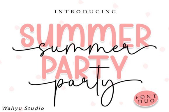
Summer Party Font – This pairing brings together two distinct styles that sync up for a cohesive look. Designers often struggle to find matching sets, but this duo removes the guesswork for pool bash invites or seasonal branding. Accessing the extra swashes is simple thanks to the PUA encoding, allowing for customized flourishes on every letter.
These summer party fonts work best when you want a relaxed, hand-drawn aesthetic that feels approachable. The clean lines ensure readability even on textured paper or digital screens. Whether you are crafting vinyl decals or digital headers, the balanced weight of each character provides a polished finish for your warm-weather projects.
2. Party Summer Script Font
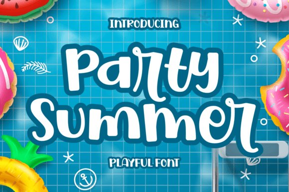
Party Summer Script Font – This script option captures a carefree spirit through its bouncing baselines and rounded curves. It mimics natural handwriting with a level of polish that suits both high-end stationery and casual event fliers. The letterforms flow into one another, creating a rhythmic visual pace that keeps the viewer engaged without feeling cluttered.
Using this typeface helps projects stand out by injecting a sense of spontaneity and movement. It performs well in logo design where a personal touch is needed to build brand trust. Because the characters are clearly defined, the font remains legible at smaller sizes, making it a reliable choice for social media captions and print materials.
3. Always Chunky Display Font
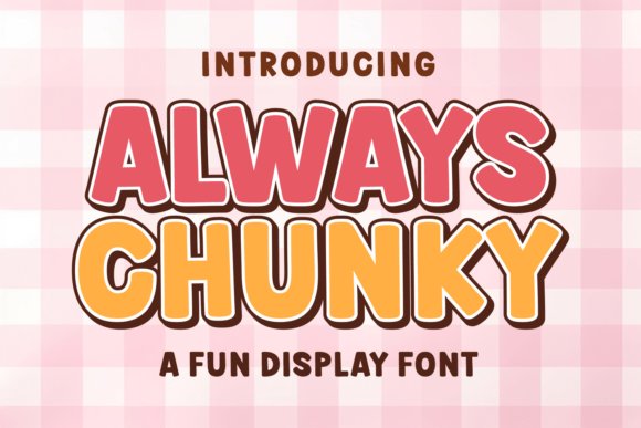
Always Chunky Display Font – Throwing back to the vibrant aesthetic of the seventies, this display typeface features heavy, rounded forms that demand attention. Its bubble-style lettering fits right in with the current trend of maximalist design, where more is definitely more. The thick strokes provide a solid foundation for bright colors or funky patterns, making it a favorite for T-shirt graphics and sticker sets.
Beyond its nostalgic appeal, the typeface maintains a modern edge that works for digital planners and YouTube art. It bridges the gap between retro kitsch and contemporary fun, providing a wide range of creative possibilities. The inherent boldness ensures that any message pops against busy backgrounds, which is a massive win for outdoor event posters or merchandise.
4. Real Super Font
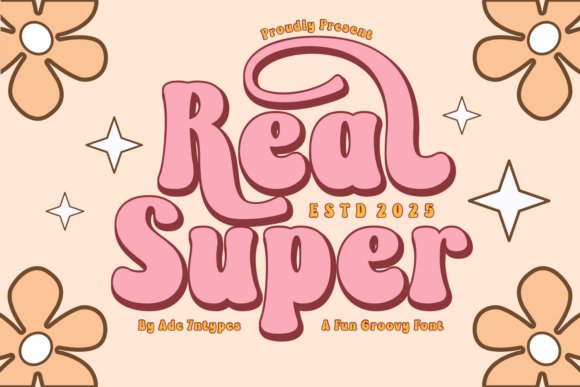
Real Super Font – This 70s-inspired collection brings a heavy dose of nostalgia to any creative layout. The thick, groovy curves work well for physical crafts like sublimation or Cricut projects where bold outlines matter. Using these summer party fonts helps capture that retro poolside aesthetic without feeling dated or stale.
Beyond simple display use, the variety here ranges from playful sans-serifs to artistic dingbats for social media. Each letterform carries a hand-drawn quality that feels authentic and high-end. It provides a reliable foundation for t-shirt printing or seasonal banners that need a distinct, groovy personality.
5. Summer Party Font
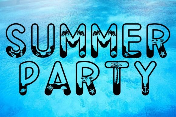
Summer Party Font – This bright display typeface captures the heat of a July afternoon through its bold and energetic letterforms. It works particularly well for magazine covers or product packaging that needs to stand out on a crowded shelf. The thick strokes ensure readability even when placed over busy, colorful photographic backgrounds.
Designers looking for a cheerful vibe will appreciate how easily these characters translate across digital platforms. From wedding invitations to casual social media graphics, the font maintains a lighthearted spirit. Its clean edges and consistent weight make it a practical choice for large-scale branding projects that require a punchy look.
6. Summer Party Script Font
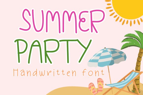
Summer Party Script Font – This handwritten script offers a personal touch that mimics actual penmanship for a relaxed, casual feel. It is an excellent fit for digital journaling, diary entries, or custom greeting cards where a machine-perfect look would feel too cold. The flowing ligatures provide a rhythmic quality that keeps the text engaging and readable.
For small business owners, this style adds a friendly face to stationery, mugs, and promotional shirts. It balances professional clarity with an approachable, DIY charm that connects well with customers. The slight irregularities in the line work give it a human warmth often missing from more rigid, standard typefaces.
7. Summer Party Display Font
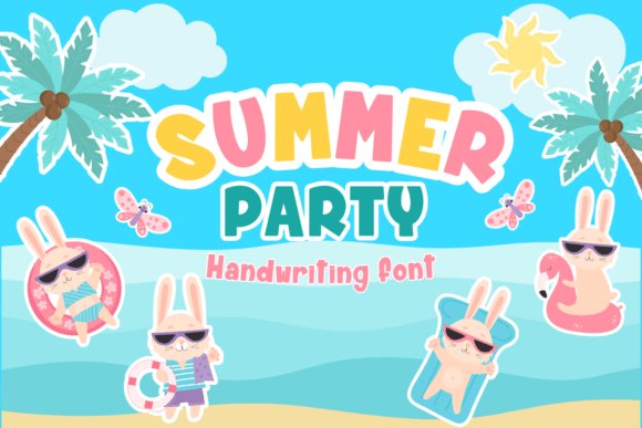
Summer Party Display Font – This casual display face captures a laid-back vibe, perfect for any seasonal gathering or backyard bash. Its handwritten strokes give off a relaxed energy that works well on printed invitations and digital event flyers. Adding these summer party fonts to your design kit helps maintain a friendly and approachable feel for casual get-togethers.
Use this typeface for personal projects like gift tags, custom apparel, or even simple digital scrapbooks. The letterforms are easy to read and carry a cheerful weight that pairs nicely with bright colors and tropical imagery. It fills the space on a poster without feeling overly formal or stiff.
8. Summer Party Script Font
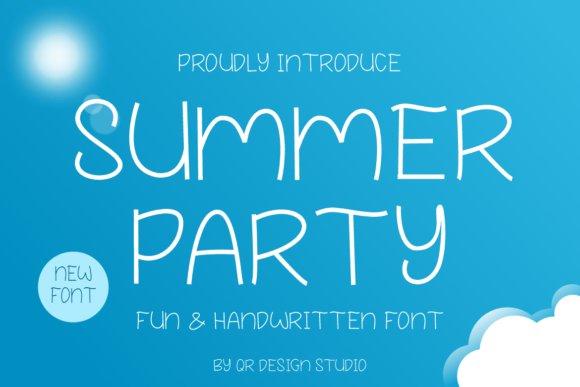
Summer Party Script Font – This script variation offers a softer touch with its flowing characters and organic appearance. It feels like a quick note written with a felt-tip pen, making it a great choice for social media graphics or branded merchandise. The letters connect with a sense of rhythm that mimics natural penmanship.
Designers will appreciate how this typeface brings a personal touch to small business branding or handmade card projects. Its lighthearted curves keep the mood light and inviting. Match it with clean sans-serifs to create a balanced look that stands out on packaging or website banners.
9. Summer Party Handwritten Font
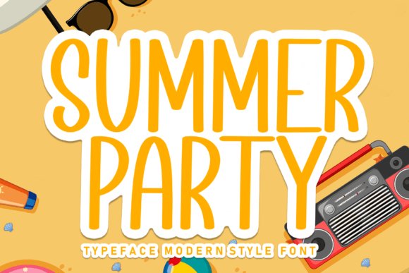
Summer Party Handwritten Font – This delicate handwritten style leans into a more romantic and dainty aesthetic than its counterparts. The fine lines and airy spacing make it an excellent pick for elegant wedding stationery or refined garden event materials. It provides a polished yet intimate feel that suggests careful attention to detail.
Its thin weight ensures that your text doesn’t overwhelm the visual layout, allowing floral borders or photography to shine. This font excels in settings where a subtle, human element is needed to convey warmth. It remains legible even at smaller sizes, making it practical for RSVP cards or detailed menus.
10. Summer Party Display Font
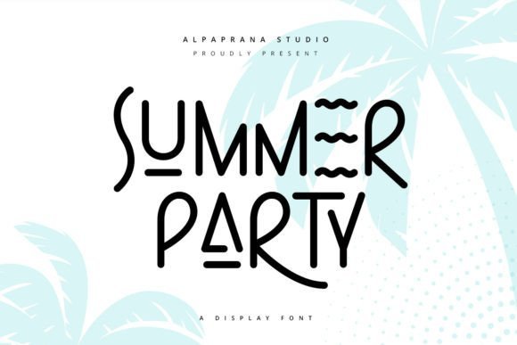
Summer Party Display Font – This typeface brings a relaxed, hand-drawn energy to any graphic project. Its irregular shapes and bouncy baseline capture the spirit of an outdoor barbecue or a beach gathering. When searching for summer party fonts, you want something that feels approachable and lighthearted rather than rigid.
Designers can use these letterforms for event flyers, merchandise, or social media graphics that need a dash of personality. The playful nature of the strokes makes it a great choice for titles that should stand out without feeling overly formal. It pairs well with bright colors and sunny imagery to create a cohesive seasonal look.
11. Summer Party Creative Display Font
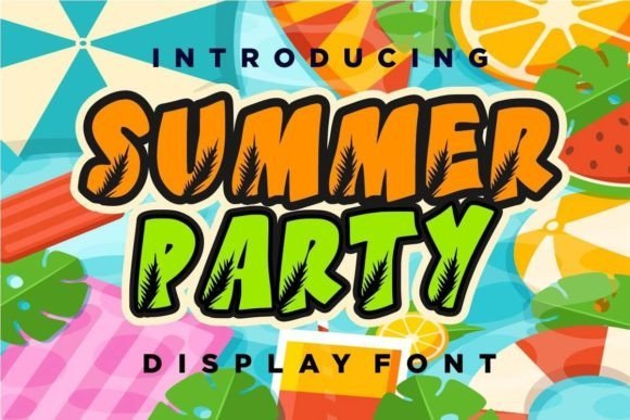
Summer Party Creative Display Font – This specific display option emphasizes bold, thick lines that remain legible even from a distance. It works remarkably well for headers on large-scale prints like banners or signage for pool events. The characters have a slight bounce that mimics the movement of waves or wind, adding visual interest to static layouts.
Integrating this typeface into digital designs allows for a cheerful aesthetic that instantly signals enjoyment. It works effectively for branding projects where a company wants to appear friendly and youth-oriented. Since the letters are thick, they can hold complex patterns or gradients without losing their distinct shape.
12. Summer Party Fonts: Summer Party Handwritten Script
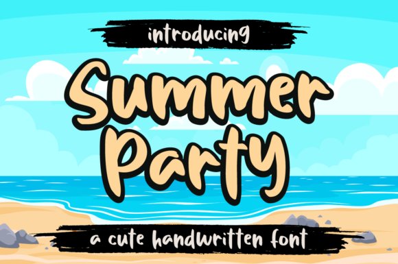
Summer Party Fonts: Summer Party Handwritten Script – This handwritten style offers a breezy, thin-line aesthetic that feels personal and warm. The rounded edges and fluid connections between letters suggest a casual note written on a vacation postcard. It provides a soft contrast to more industrial typefaces, making it ideal for invitations or intimate social gatherings.
The legibility of this script remains high despite its organic, flowing structure. You might find it useful for product packaging or logo marks that aim for a handmade, artisan look. It conveys a sense of ease that matches the slow pace of a hot afternoon spent outdoors.
╰┈➤ Download Summer Party Fonts: Summer Party Handwritten Script
13. Summer Party Font
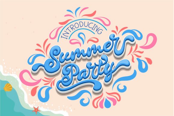
Summer Party Font – This script captures the relaxed vibe of a beachside gathering with its fluid, handwritten strokes. It brings a chic and feminine aesthetic to personal projects, making it a top pick among summer party fonts for those who value elegance. Each letter flows naturally, mimicking authentic penmanship to give your work an approachable, handmade feel.
Accessing the various ligatures and special characters is straightforward thanks to its PUA encoding. This allows for customized flourishes that add character to wedding invitations or high-end event branding. The balance between legibility and artistic flair ensures your message remains clear while looking sophisticated.
14. Summer Party Display Font
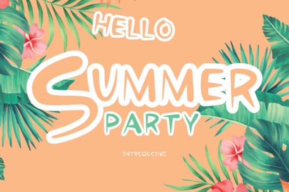
Summer Party Display Font – This bubbly display typeface radiates energy and youthful excitement through its rounded, thick letterforms. Its playful appearance works perfectly for children’s birthday cards or casual backyard barbecue signage. The bold weight ensures high visibility, grabbing attention immediately without feeling overly formal.
Each character feels bouncy and lighthearted, injecting a sense of fun into digital graphics or physical merchandise. It pairs well with bright color palettes and tropical illustrations to create a cohesive festive theme. Use this when you want text to pop with a friendly spirit.
15. Poster Hand Brush Font
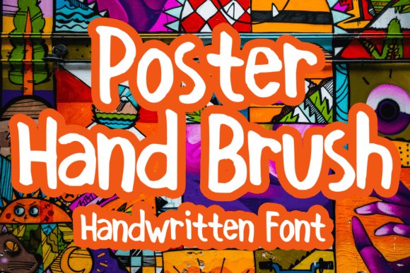
Poster Hand Brush Font – This marker-style typeface offers a raw, textured look that mimics actual ink on paper. Its heavy strokes and jagged edges provide a gritty yet cheerful personality for streetwear labels or festival posters. The organic imperfections contribute to an authentic aesthetic that many digital-first designs often lack.
Beyond clothing, this brush font excels in social media headers and bold advertising banners. It conveys a sense of urgency and confidence, making it ideal for announcements that need to stand out. The layout remains balanced despite the heavy weight, keeping your typography sharp and impactful.
16. Aloha Font
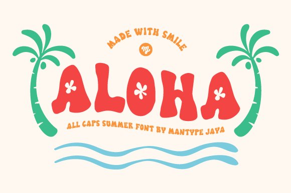
Aloha Font – Aloha brings an immediate smile to any creative project with its heavy weight and quirky letterforms. These thick characters look excellent on physical merchandise like tote bags or beach towels. It works well when you need a casual, sunny aesthetic that feels approachable rather than formal.
Designers often choose this specific style for summer party fonts because it stays readable even with its unconventional shapes. The bouncy baseline adds a sense of movement perfect for pool bash invites or seasonal social media posts. You can rely on its bold presence to grab attention without feeling overly aggressive.
17. Summer Vibes Font

Summer Vibes Font – This handwritten paint font carries a textured look that suggests manual brush strokes and artistic flair. Its heavy ink-like appearance makes it a strong candidate for apparel branding or custom stickers. The irregular edges provide a DIY feel that resonates with artisan markets and casual events.
You will find that this typeface pairs exceptionally well with bright, saturated color palettes. It handles short headlines and greeting cards effectively by providing a personal touch that clean sans-serifs lack. Using this on posters ensures a hand-crafted vibe that feels authentic and high-energy.
18. Summer Splashy Font
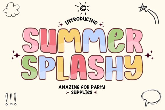
Summer Splashy Font – Summer Splashy offers a nostalgic trip back to the groovy aesthetics of the 1970s with its rounded, bulb-like letters. The thick curves are specifically optimized for crafters using vinyl cutting machines, ensuring clean lines and easy weeding. It provides a cheerful backdrop for beach-themed logos and youthful branding efforts.
The bubbly nature of the characters creates a sense of joy and lightheartedness in every word. It stands out on video thumbnails and classroom decorations where clarity and personality are equally vital. Its retro charm fits perfectly with current design trends that favor soft edges and bold, friendly typography.
19. Thick Magic Font
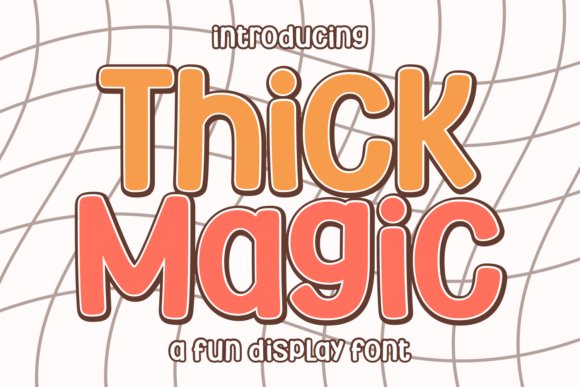
Thick Magic Font – This typeface brings a heavy-duty, playful weight to any canvas. Its sticker-style appearance, complete with white offsets and rounded corners, works well for children’s branding or casual mobile games. The bold, bubbly letters maintain high readability while leaning into a maximalist aesthetic that catches the eye immediately.
When picking summer party fonts, you want something that feels energetic and lighthearted. These bouncy characters shine on festive flyers and seasonal T-shirt designs. Whether building out a candy shop logo or organizing a youth camp event, the sparkling geometric details provide a distinct visual personality that stands out from standard sans-serifs.
20. Summer Season Font
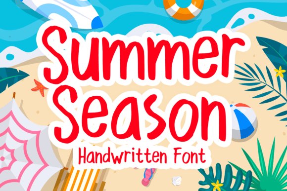
Summer Season Font – This handwritten script captures a relaxed, casual vibe that feels personal and unforced. The loose strokes mimic natural penmanship, making it a great fit for social media graphics and greeting cards. It moves away from rigid structures to provide a sense of movement and warmth for any printed material or digital banner.
Applying this style to merchandise like apparel or stickers gives your products a friendly, approachable look. It excels in layouts where a human touch is needed to soften the design. By using this typeface, you create an inviting atmosphere for invitations or book covers without looking overly formal or stiff.
21. Authentic Comic Font
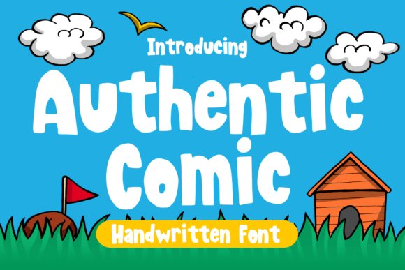
Authentic Comic Font – This display option leans into the nostalgic world of classic cartoons with thick outlines and animated proportions. The chunky letterforms are ideal for headlines that need to pop against busy backgrounds. It avoids the thin, fragile lines of modern minimalism in favor of a sturdy, punchy presence that demands attention on posters.
Designers looking for a cheerful, high-impact choice will appreciate how this set handles short titles and merch slogans. Its blocky nature ensures that every word remains clear from a distance. Integrating this into your next creative project brings a sense of joy and retro flair that appeals to both kids and adults alike.
22. Summer Camp Font
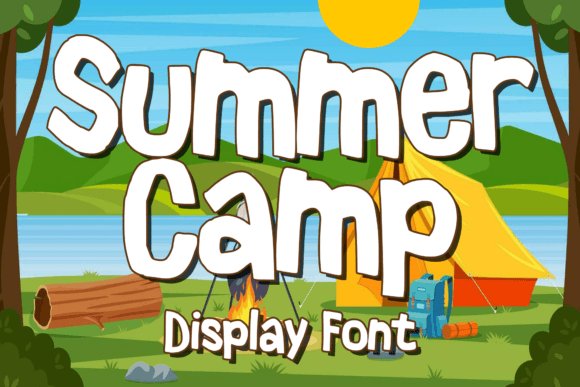
Summer Camp Font captures the nostalgic spirit of outdoor adventures and childhood retreats. Its chunky, slightly irregular letterforms bring a sense of handmade warmth to every project, making it a top choice for t-shirt graphics or youth club branding. This typeface works remarkably well when you want to evoke a feeling of retro joy without looking outdated.
This typeface stands out among other summer party fonts because of its clean legibility even at large sizes. Designers often pair it with bright, sunny color palettes to create high-impact posters or invitation headers that grab attention immediately. It simplifies the process of creating cheerful assets for seasonal festivals and backyard gatherings alike.
23. Summer Wood Font
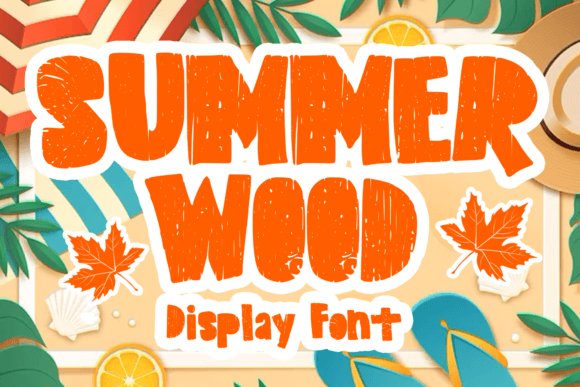
Summer Wood Font introduces a rustic, textured aesthetic that feels deeply connected to the natural world. Each character features subtle grain details that mimic the appearance of carved timber, giving your titles an organic, tactile quality. It is particularly effective for outdoor signage or environmental campaigns where a raw, earthy look is preferred over polished clean lines.
The heavy weight of these letters ensures they remain prominent against busy photographic backgrounds or complex patterns. Use this typeface for barbecue invitations or lodge-themed branding to establish an immediate sense of rugged comfort. It offers a distinct personality that bridges the gap between playful seasonal art and professional graphic design.
Picking the right lettering ensures your seasonal projects look professional and feel inviting. These 2026 selections give you the tools to create memorable visuals for any warm-weather occasion. Your choice of typeface determines the overall vibe of the announcement.
From local pool parties to large outdoor festivals, these styles provide the clarity and energy required for success. Using high-quality typography helps your event announcements stay fresh and engaging during the hottest months of the year.