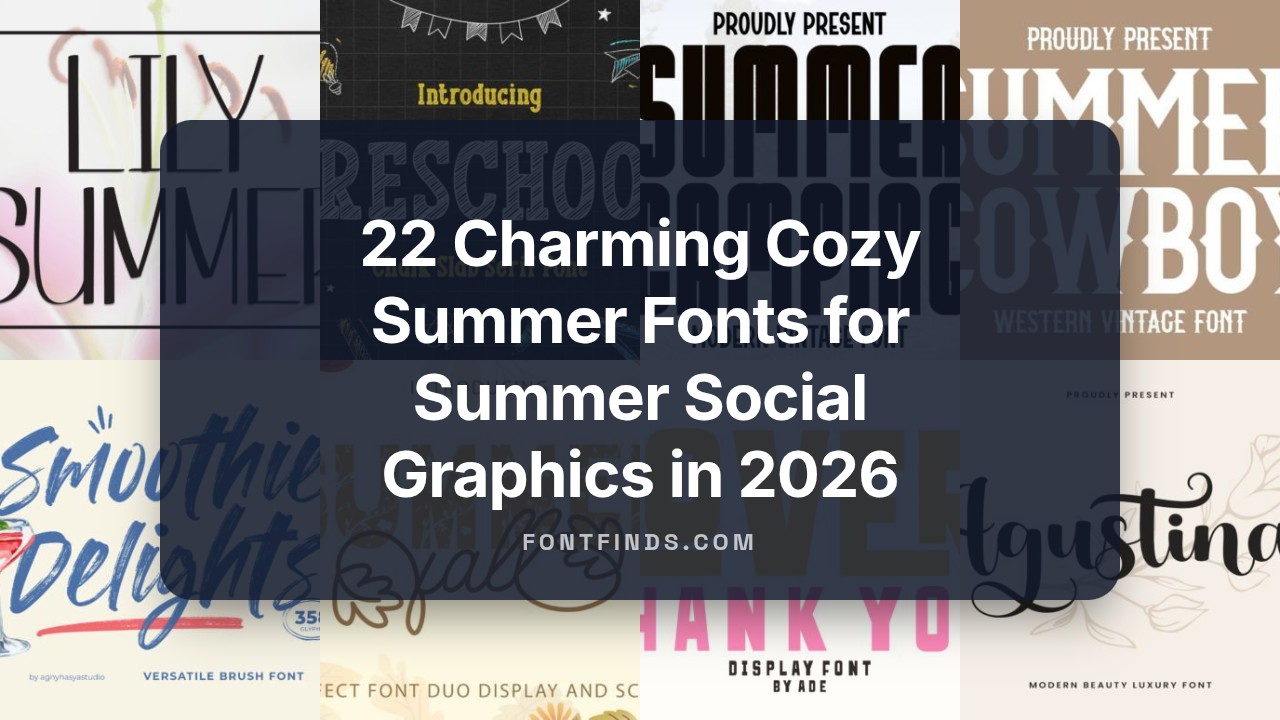
22 Charming Cozy Summer Fonts for Summer Social Graphics in 2026
Cozy summer fonts are ideal when you want typography that reads warm, casual, and gently sun-kissed. These styles work well for picnic flyers, seaside shop banners, and friendly blog headings, ranging from loose hand-lettered scripts to soft geometric sans-serifs.
Below you’ll find 22 curated picks with quick notes on mood, best pairings, and suggested uses so you can match each face to postcards, social banners, or seasonal product labels. Expect examples of script plus rounded sans, light serif with playful display, and textured brushfaces for a tactile, laid-back look.
1. Real Super Font
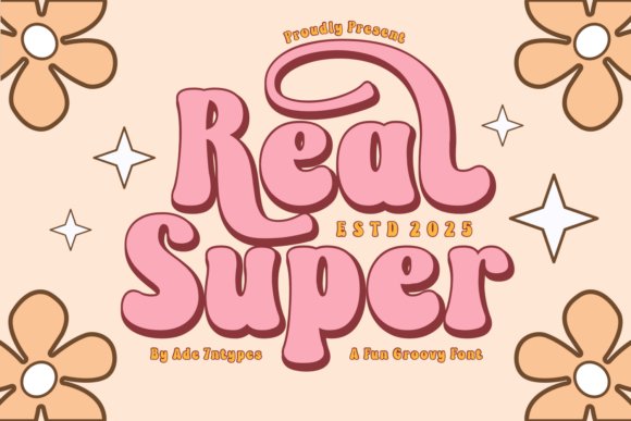
Real Super Retro Fonts channels 70s flair into a modern display collection, where groovy letterforms sit alongside cleaner, more restrained cuts. The pack contains elegant serifs, playful sans options, dingbats and season-themed styles geared toward sublimation, SVG/Cricut crafting, and bold signage work. Alternates and weight contrasts let you craft logos, posters, and apparel that feel deliberately designed rather than generic.
What stands out is the attention to spacing and the way decorative glyphs behave in vector cutting and heat-transfer workflows; the shapes keep integrity even when scaled or layered. Use chunky headline cuts for T-shirt prints and lighter serif companions for labels to get readable contrast. For anyone after an obvious retro nod without sacrificing practical spacing and file-friendly shapes, this collection is a strong pick.
My Recommendation: I reach for Real Super when a project needs authentic retro character that survives production constraints like vinyl cutting and sublimation. The variety of display styles and dingbats speeds up mockups for events, merch, and seasonal campaigns. It’s especially useful for boutique brands, party collateral, and vintage-inspired packaging where personality matters but legibility can’t be compromised.
2. Lover Thank You Font
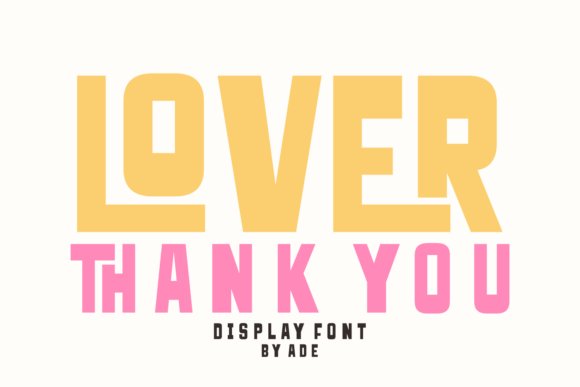
Lover Thank You pairs a bold, blocky display with loose, handwritten flourishes to create a lively, attention-grabbing voice. Built-in ligatures and swash alternates let headlines feel custom without manual redraws, while the monoline strokes give the script portions a clean, modern counterpoint. This contrast makes it ideal for posters, greetings, and product labels that need to catch the eye from a distance.
Workflows benefit from the font’s heavy stems-vinyl cutting and screen print hold up well-and the open counters in the script ensure small-format readability. Treat the block form as anchor copy and use the script to add emotional accents or dates; shifting tracking for overlap often yields playful compositions. If you want a typeface that makes headlines sing and keeps production straightforward, this family fits that brief neatly.
╰┈➤ Download Lover Thank You Font
My Recommendation: I use Lover Thank You when I want bold, friendly headlines that still feel handcrafted-party invites, market banners, and cheerful product labels are perfect fits. The swashes and alternates save time when creating multiple variations, and the sturdy weights print cleanly on apparel and stickers. Pair it with a minimal body face to keep longer copy legible while the display elements carry the personality.
3. Smoothie Delights Font
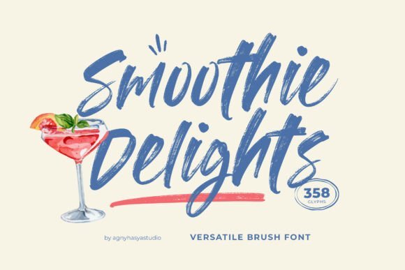
Smoothie Delights is a brush-style script that leaves visible strokes and ink edges, giving type a warm, handcrafted presence suited to food and lifestyle projects. Its organic rhythm and texture make headlines feel appetizing and approachable, while extended glyph coverage keeps multilingual work consistent. The brush roughness reads well on packaging, posters, and café menus where a handmade look matters more than mechanical precision.
OpenType alternates reduce repetition in repeated words and the weight variation survives typical print and web reproduction without becoming muddy. For balanced layouts, pair the brush with a neutral slab or geometric sans to ground copy, or apply light grain overlays for tactile mockups. File formats include OTF, TTF and web-friendly builds so it slots directly into print and online workflows.
╰┈➤ Download Smoothie Delights Font
My Recommendation: I pick Smoothie Delights for branding that needs to feel human and edible-coffee shops, packaged snacks, and seasonal menus benefit from its brush textures. The alternates keep repeated text lively, and the font holds up at headline sizes while remaining legible on labels. It’s my go-to when I want a handcrafted aesthetic that integrates smoothly into web and print assets.
4. Alphabet Charming Font
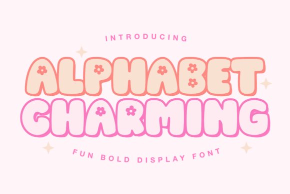
Alphabet Charming Font bursts with playful letterforms and uneven strokes that feel handcrafted rather than mass-produced. The display faces lean into seasonal moods-cheerful loops for Valentine themes, leaf-like terminals for autumn, and bouncy caps for summer craft fairs. It carries an expressive personality that grabs attention without sacrificing legibility, making it suited to display uses where tone matters.
Apply it to wall art, printed collateral, apparel and small goods where character is the priority: tees, tote bags, keychains and greeting cards all benefit from its lively voice. Alternates and decorative symbols are included for vinyl cutting, laser engraving and sublimation workflows, and it pairs well with a simple sans or narrow serif to keep compositions balanced. Makers using Cricut or Silhouette will find its shapes predictable for stickers, SVGs and laser-ready artwork.
╰┈➤ Download Alphabet Charming Font
My Recommendation: I reach for Alphabet Charming when a brief calls for a joyful, handcrafted look that still reads clearly at a glance. Its alternates and symbol set cut down on extra embellishment work when I produce seasonal home decor or small-batch apparel, and it performs reliably for cut files and sublimation. Use it for boutique branding, craft-market products and festive stationery where personality sells.
5. Preschool Font
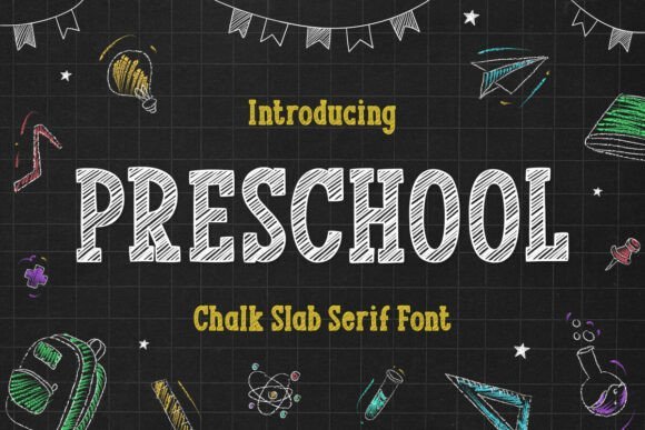
Preschool Font recreates a familiar chalkboard stroke with buoyant letter shapes and uneven edges that read as friendly and informal. Thick stems and open counters keep the type readable from across a room, which is perfect for bulletin boards, classroom signage and kids’ activity pages. A slight roughness in the glyphs gives printed work a tactile, handmade feel even on glossy stock.
It excels in kid-focused projects-activity books, party invites and classroom displays-and adapts easily to seasonal decorations like birthday banners or holiday crafts. The font’s solid contrast makes it suitable for heat-transfer vinyl and embroidery, and its roughened outlines translate cleanly into SVGs for cutting machines. Pair it with geometric icons or a restrained sans to preserve clarity in busier layouts.
My Recommendation: I choose Preschool when a design needs warmth and immediate recognition, especially for school events, children’s products and party collateral. Its legibility at a distance and texture-friendly strokes make it ideal for vinyl cutting, embroidery and print. If you want a handcrafted chalkboard vibe without sacrificing usability, this font does the job simply and effectively.
6. Summer Farmhouse Font
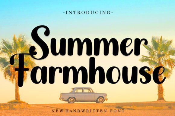
Summer Farmhouse Font offers relaxed, handwritten strokes with a slightly weathered texture that evokes kitchens, markets and slow summer afternoons. The varied baseline and organic terminals create a personal, inviting tone suitable for wedding invites, food labels and lifestyle branding. Despite its casual character, the glyphs maintain clarity so copy remains readable across sizes.
Use it for labels, logos for small food brands, market signage and lifestyle goods where an authentic, homespun voice helps sell the product. Alternate ligatures and swashes give headlines a handcrafted flourish without overpowering supporting text, and the face holds up well in print, web and stitched applications. Designers will appreciate how quickly it establishes a warm, approachable identity for artisanal projects.
╰┈➤ Download Summer Farmhouse Font
My Recommendation: I pick Summer Farmhouse when a project needs an intimate, handmade sensibility-think cafe menus, product labels and rustic wedding stationery. Its subtle imperfections add character while keeping layouts professional, which is great for small brands that trade on authenticity. For any design that should feel personal rather than corporate, this font is an easy, trustworthy choice.
7. Summer Cowboy Font
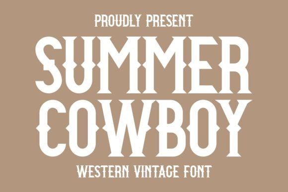
Summer Cowboy Font is an assertive slab serif that channels classic Western poster lettering with bold weight and square serifs. Thick stems and condensed counters give headlines a strong presence, while optional roughened alternates add an authentic, weathered texture without losing legibility. The overall silhouette reads reliably at a distance, which makes it a natural choice for signage and loud display work.
Apply it to festival posters, beer labels, apparel graphics, or packaging when you need a nostalgic punch; its personality is instantly recognizable and photographs well on distressed or sun-faded backgrounds. Pair it with a neutral sans for body text or a thin script for ornament; tightening letterspacing sharpens the attitude, while looser tracking softens the look. Colorways of deep rust, mustard and cocoa emphasize the Western vibe and make the type sing.
╰┈➤ Download Summer Cowboy Font
My Recommendation: I use Summer Cowboy when a headline must read like vintage signage-big, confident and slightly weathered. Its alternates let me dial between polished and rustic outcomes, so the same family can suit boutique packaging or festival posters. It’s ideal for apparel prints, bar and brewery branding, and any project that benefits from a bold, nostalgic voice.
8. Lily Summer Font
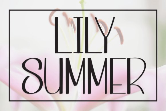
Lily Summer Font is a handwritten display face built from soft loops and friendly terminals that feel intimate without becoming cutesy. The letters sit on a relaxed baseline and offer airy spacing, which gives short lines-invitation copy, captions, headers-a genuine, human cadence. Subtle ink-like textures and contextual alternates keep repeated words from feeling mechanical.
Use it on wedding stationery, greeting cards, boutique packaging and warm brand identities that want a personal touch; it shines where tone matters more than formality. Balance its expressiveness with a restrained serif or a light geometric sans to avoid visual clutter, and try pastel palettes or kraft paper to emphasize its cozy character. Reserve it for display use rather than long paragraphs to preserve its readable charm.
My Recommendation: I choose Lily Summer when I want typography to read like a handwritten note-soft, personal and inviting. Its ligatures and alternates make small projects feel bespoke, which is perfect for invites and small-batch product labels. I avoid it for dense copy but love it for signatures, titles and any piece that needs warmth and personality.
9. Summer Camping Font
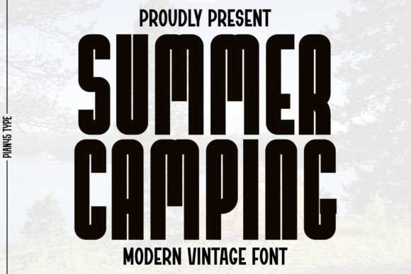
Summer Camping Font is a sans serif with vintage leanings: generous x-height, slightly squared terminals and clean stroke contrast that reference mid-century signage. The result is crisp and legible at display sizes, yet carries enough character to stand on its own in logos and merch. Rounded corners soften the geometry so the type feels friendly rather than stark.
It performs well on posters, quote graphics, t-shirts and product tags where a tidy retro vibe is required; using multiple weights creates clear hierarchy without extra ornament. Pair it with light scripts for a handcrafted accent or with condensed displays for layered headlines, and favor earthy palettes like olive, cream and tobacco to highlight its nostalgic mood. The font holds up on printed goods and textured backgrounds alike.
╰┈➤ Download Summer Camping Font
My Recommendation: I reach for Summer Camping when a design needs a clean, vintage-inflected headline that won’t compete with photography. Its clarity makes it dependable on small merch like mugs and tote bags, while the subtle character plays nicely on labels and posters. It suits lifestyle and outdoor brands that want a modern look with a hint of retro warmth.
10. Summer Vibes Font
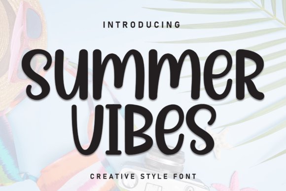
Summer Vibes Font has a hand-drawn rhythm that sits between casual script and careful calligraphy, giving designs a sincere, handwritten tone. Letter connections flow with soft terminals and modest contrast, so words feel warm without losing clarity when scaled down for tags or web banners. Its alternate characters and restrained ligatures make it easy to fine-tune word shapes while keeping a natural, unscripted look.
On textured stock or muted digital backgrounds the strokes read as intimate and approachable, and on brighter surfaces the letters gain lively personality. Pair it with a clean sans for body copy or place it over a watercolor wash to emphasize its handmade charm. The default tight kerning benefits from a touch of tracking when you want more breathing room between words.
╰┈➤ Download Summer Vibes Font
My Recommendation: I reach for Summer Vibes when I want type that feels like a warm handwritten note-wedding invites, boutique labels, and cozy product tags. Its controlled alternates let me tweak lines quickly without fighting the letterforms. Use this font when the goal is authenticity and a personal, tactile feeling rather than slick perfection.
11. Summer Font
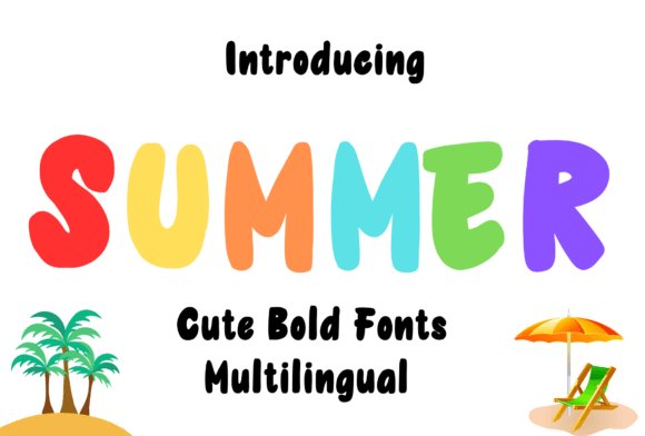
Summer Font throws a bold, playful weight into headlines with irregular terminals and energetic loops that read as confidently hand drawn. The letterforms have enough bulk to survive fabric printing while keeping quirks that make each word feel individual. Multiple stylistic sets provide options for tighter or more open forms so you can adapt the voice to different layouts and sizes.
This typeface performs well on merchandise from mugs to tees; on small items choose heavier glyphs or simplified alternates to avoid ink spread. Pair it with a neutral geometric sans to keep compositions tidy, or isolate it on a solid field when you want maximum impact. The font reads friendly and assertive, a strong choice for products that need personality.
My Recommendation: I use Summer Font for seasonal merchandise and bold greeting designs because it stands out in retail mockups and social posts. It prints reliably on cotton and ceramic, and the handwritten feel adds a human touch that flat sans options lack. Reserve it for logos, labels, and single-line headlines where character can take center stage.
12. Summer Good Font
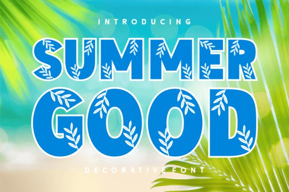
Summer Good Font integrates decorative leaf motifs into several letterforms, turning short headlines into graphic statements without extra artwork. The base letters keep a rounded, readable shape so the botanical details enhance rather than obscure words at display sizes. Stylistic alternates let you swap ornamented characters for plain ones if you want a subtler look, giving the set useful flexibility for themed work.
Because the leafy elements are part of the glyph outlines, this font shines on packaging, seasonal posters, and apparel tags where scale is generous. Choose palettes that echo warm, earthy tones to let the motifs feel cohesive with your design. For production printing, convert text to outlines to preserve the delicate ornament paths and avoid surprises at the printer.
My Recommendation: I pick Summer Good Font for fall collections and limited-edition labels because the type itself carries the seasonal detail, saving time on extra graphics. It gives products immediate character and feels handcrafted without extra compositing. Use it for headlines, badges, and small runs where the decorative letters can be seen and appreciated.
13. Summer Camp Font
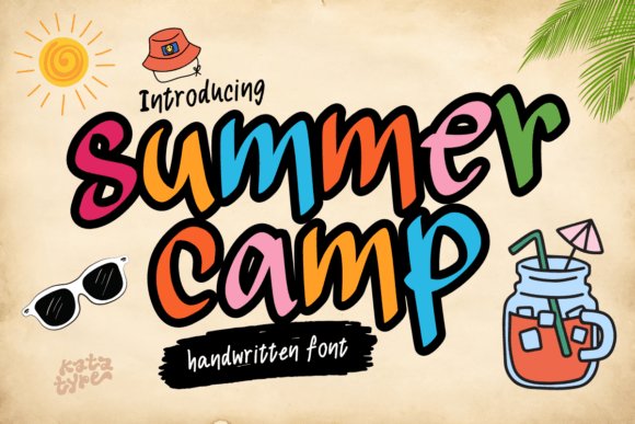
Summer Camp Font is a pen-style brush script that wears its hand-drawn strokes proudly: brisk hairlines, juicy downstrokes and subtle texture where the brush ribbon kissed the paper. The irregular baseline and open counters make phrases feel casual yet readable, so headlines sing while keeping clarity at poster scale. Built-in alternates and contextual ligatures supply enough variety to prevent repetition when names or repeated words recur.
It feels tailor-made for invitations, event signage and playful identity work where a warm, nostalgic voice beats a sterile geometric face. Try tighter tracking for logotypes and looser spacing for stacked headlines, and pair it with a neutral sans for body copy so the script can hold center stage. Files commonly include OTF features and web-ready formats, and a light ink texture or watercolor wash amplifies the handmade character.
My Recommendation: I reach for Summer Camp Font when I want designs that recall sticky-sweet summer afternoons without feeling twee. Its brushy rhythm is perfect for camp shirts, kids’ party invites and festival posters where personality matters. The set of alternates means I can give repeat names or phrases fresh appearances across collateral.
14. Summer Handmade Font
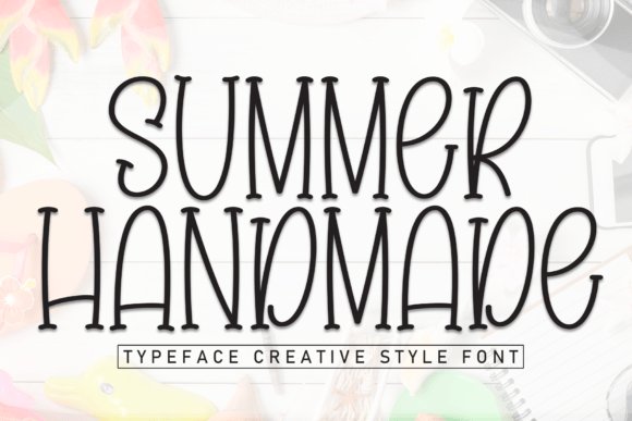
Summer Handmade Font is a serif with a handcrafted soul: modest serifs, slightly uneven stroke widths and tiny irregularities at terminals that suggest a human tool rather than a machine. That subtle roughness keeps short headlines and labels warm without compromising legibility, and open counters help it perform well in small-scale print. The overall voice leans toward intimate and crafted rather than formal or mechanical.
It pairs especially well with a clean geometric sans when you need readable supporting text, or with tactile paper textures for packaging and stationery. Alternates such as roughened edges and small caps allow you to dial the handcrafted feel up or down while maintaining hierarchy. Use it for boutique menus, artisanal product labels, book covers and any application that benefits from a made-by-hand presence.
╰┈➤ Download Summer Handmade Font
My Recommendation: I choose this font for projects that need a human, artisanal presence-think small-batch preserves, craft stores, or indie booklets. The restrained serif keeps things legible while adding character to titles and labels. It prints beautifully on textured stocks and holds up in tight label layouts.
15. Summer Fall Duo Font Duo
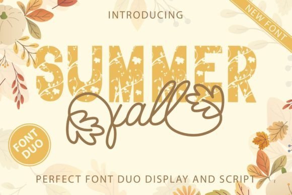
Summer Fall Duo Font Duo pairs a flowing script with a companion display face crafted to complement one another: the script supplies sweeping swashes and leaf-like terminals, while the display brings rounded, friendly capitals that ground headlines. That contrast-motion from the script against the display’s stability-creates clear typographic hierarchy without visual tension. Both styles include alternates and swash sets so you can swap playful tails for reduced forms depending on tone.
Drawn with autumnal warmth in mind, the faces share proportions and stroke quirks that keep them cohesive across badges, tags and seasonal packaging. Use the script for focal names and the display for subheads or product labels, mixing weights and alternates within a single layout for lively, unified branding. Consider minor kerning tweaks and the included OTF features for smooth web and print output.
╰┈➤ Download Summer Fall Duo Font Duo
My Recommendation: I rely on duos like this when a project needs a coordinated headline voice plus a companion face that won’t compete. It’s ideal for fall collections, children’s apparel tags and seasonal menus where a single visual language must travel across labels, web banners and printed cards. The swashes and alternates give creative options while keeping asset management simple.
16. Summer October Font
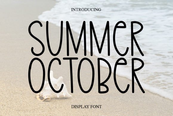
Summer October Font feels like a handwritten note left on a café table: airy, slightly slanted letterforms with lively terminals that bob along the baseline. The playful irregularities give each word a homespun personality while keeping shapes clear enough for display work. Occasional swashes and alternate characters let you dial up the flourish when a design calls for a more handcrafted touch.
The face reads strongly at larger sizes, making it ideal for posters, packaging, and signage where character matters. It includes standard numerals, punctuation and stylistic alternates so you can control how casual or refined the result appears. Pair it with a minimal sans to preserve hierarchy and prevent visual clutter.
╰┈➤ Download Summer October Font
My Recommendation: I reach for Summer October when a project needs an inviting, human presence without feeling sloppy. Its baseline motion and alternate glyphs add warmth to wedding invites, artisan food labels, and small-batch branding. I usually pair it with a clean sans to maintain readability and let the script do the personality work.
17. Summer Sunday Font
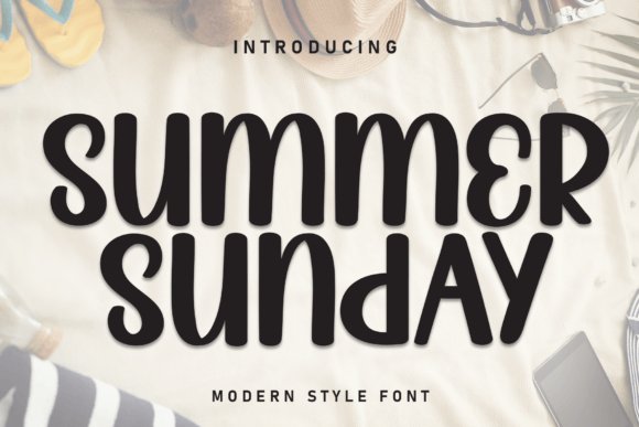
Summer Sunday Font mimics quick pen strokes with smooth joins and rounded terminals, producing an approachable, friendly handwriting. Unlike looser scripts, it keeps a steady baseline and tighter spacing, which helps longer lines feel cohesive and legible. Gentle contrast in the strokes adds life without making the letters jittery.
This design works well for social graphics, invitations, and lifestyle packaging where warmth must meet function. The set ships with alternates that create natural connections between letters, so phrases read like real handwriting. Use it as a headline or a short display line paired with a soft serif to maintain visual balance.
╰┈➤ Download Summer Sunday Font
My Recommendation: I choose Summer Sunday when I want an intimate, readable script for screen and print; it’s forgiving across sizes. It’s great for event stationery, social-media quotes, and family-oriented product labels where a friendly tone helps. For clarity I reserve long passages for a neutral body face and use this font for headings and accents.
18. Bonfires & Beaches Font Duo
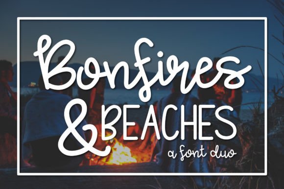
Bonfires & Beaches Font Duo brings together a rugged brush script and a tidy, playful sans to create a spirited contrast. The script member shows rough ink edges and sweeping strokes that suggest an evening by the shore, while the sans anchors compositions with compact, geometric forms. That tension between freehand warmth and structural clarity gives designs a sunny, handcrafted voice without losing order.
Both fonts include alternates and matching punctuation so you can shift tone quickly – favor the brush for emotive headlines and the sans for navigation or body copy. This pairing suits travel-oriented promos, summer event posters, and artisanal brands seeking an upbeat identity. Try mixing weights and spacing to build depth while keeping hierarchy obvious.
╰┈➤ Download Bonfires & Beaches Font Duo
My Recommendation: I use Bonfires & Beaches when a project needs seaside energy coupled with readable structure; the script injects personality and the sans keeps things navigable. It’s perfect for seasonal campaigns, surf-shop branding, and festival posters where contrast drives interest. My go-to approach: emphasize the script for focal lines and use the sans for menus, captions, and wayfinding.
19. Honey Picky Font
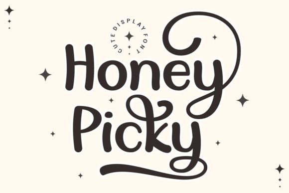
Honey Picky Font pairs chunky display letterforms with softer script companions to produce a mix of retro glamour and modern polish. The heavy weights have wide strokes and open counters that read clearly from a distance, while the lighter handwritten styles provide contrast for subheads and labels. OpenType features include alternate caps, ligatures, and stylistic sets so you can tweak endings and spacing to achieve a handcrafted finish.
In application the family feels at home on packaging, fashion identity, banners, and seasonal promos: drop the slab variant into a logo for presence, or use the script cuts for product tags and social headers. Bright palettes, layered textures, and shadow treatments make the display weights feel tactile for sublimation and print, and supplied OTF/TTF/WOFF files plus multilingual support simplify production across media.
My Recommendation: I reach for Honey Picky Font when a project needs a bold headline that still carries personality; its chunky display styles read well on posters while the script alternates let me soften the same wordmark for smaller touchpoints. For boutique labels, seasonal campaigns, or event signage it saves time because you can shift tone without swapping type families. The abundance of alternates and ligatures makes final word shapes feel custom with minimal fuss.
20. Autumn Harvest Font
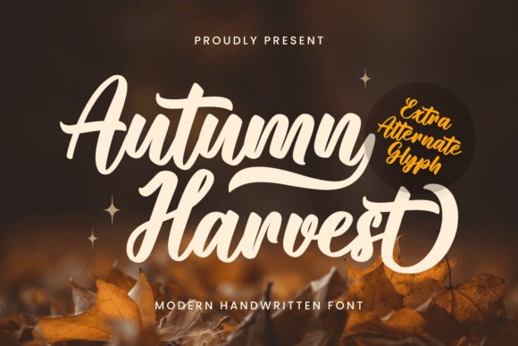
Autumn Harvest Font is built around warm, looping strokes and a handmade rhythm that reads like a note from a craft table. Soft terminals and modest contrast keep the letters legible for invitations, gift tags, and packaging while preserving an artisanal personality. Included swashes, contextual alternates, and careful kerning ensure headlines look deliberately imperfect rather than awkward.
Because its forms cut cleanly at medium sizes this face is ideal for Cricut files, embroidery, and laser-cut signage where simplified joins matter. The OTF/TTF/WOFF set covers web and print, and earth-toned palettes or hand-drawn ornaments amplify its seasonal charm. Use the bolder strokes for signage and the lighter swashy cuts for accents that need a homespun touch.
╰┈➤ Download Autumn Harvest Font
My Recommendation: I use Autumn Harvest when I want typography that feels handcrafted-perfect for holiday cards, farmer’s market tags, and rustic wedding invites. It behaves predictably in cutting and stitching workflows thanks to simplified joins and bold outlines. The built-in swashes speed up composition, so I spend less time creating custom lettering and more time on layout and color.
21. Roamilla Font
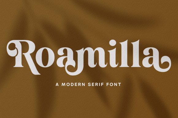
Roamilla Font marries a sturdy serif voice with playful curvature to create a type that feels both celebratory and composed. High-contrast strokes and slightly flared terminals give headlines a vintage magazine presence, while generous counters keep words readable across web banners and printed posters. The family ships with alternates and ligatures designed to add character to logotypes without relying on decorative overlays.
Applied to event stationery or seasonal packaging, Roamilla grounds layouts that mix textured paper and muted palettes, and its heavier cuts work well on labels and point-of-sale materials. For editorial use it pairs cleanly with a neutral grotesque for body copy, allowing the serif to act as a display anchor. OTF/TTF/WOFF files and stylistic alternates make creating unique headlines straightforward.
My Recommendation: I choose Roamilla when a project needs a serif that reads as handcrafted yet professional-excellent for boutique product labels, wedding suites, and seasonal promotions. Its alternates allow quick wordmark customization without hand-lettering. Because it balances warmth with structure, I often use fewer type pairings and still achieve a polished, distinct look.
22. Agustina Font
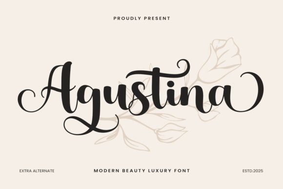
Agustina Font is a handcrafted script that pairs flowing, brushlike strokes with refined letter shapes to create a warm, personable voice. Each character has delicate beginning and ending swash tails, so connected words feel deliberate rather than mechanical-an asset for wedding suites, holiday cards, and celebratory packaging. The package includes alternate glyphs and swash sets via OpenType features, giving designers quick ways to vary repeated letters and preserve a handcrafted look.
Place Agustina at display sizes so its curves read clearly; keep ornate swashes to headings or focal words to maintain legibility in longer lines. It partners well with a clean sans for contrast or a light serif for a nostalgic mood, and it adapts smoothly to print, Cricut cut files, and embroidery mockups. The natural joins and contextual alternates help you shape distinctive wordforms without reworking vector paths.
My Recommendation: I reach for Agustina when a project needs a handmade, celebratory tone-wedding invitations, seasonal product labels, boutique packaging, and Cricut crafts are ideal uses. The built-in swashes and alternates speed up the layout process and prevent repetitive letterforms, which is a real time-saver. For small brands or event pieces that benefit from a human touch, Agustina gives charm without extra illustration work.
Use any of these 22 fonts to give summer designs a cozy, sunlit personality without heavy ornamentation. Try pairing a handwritten script with a soft sans or choose a retro display for nostalgic postcards; each entry includes pairing ideas and mood cues to help you decide.
Create a few mockups or a small mood board to see how type reads at different sizes, then apply the best match to headers, tags, or hero images. These selections make it easier to pick warm, breezy type that fits seasonal projects and small business collaterals.