24 Dessert Food Truck Fonts for Menus and Branding
This post contains affiliate links. If you buy through them, we may earn a commission at no extra cost to you.
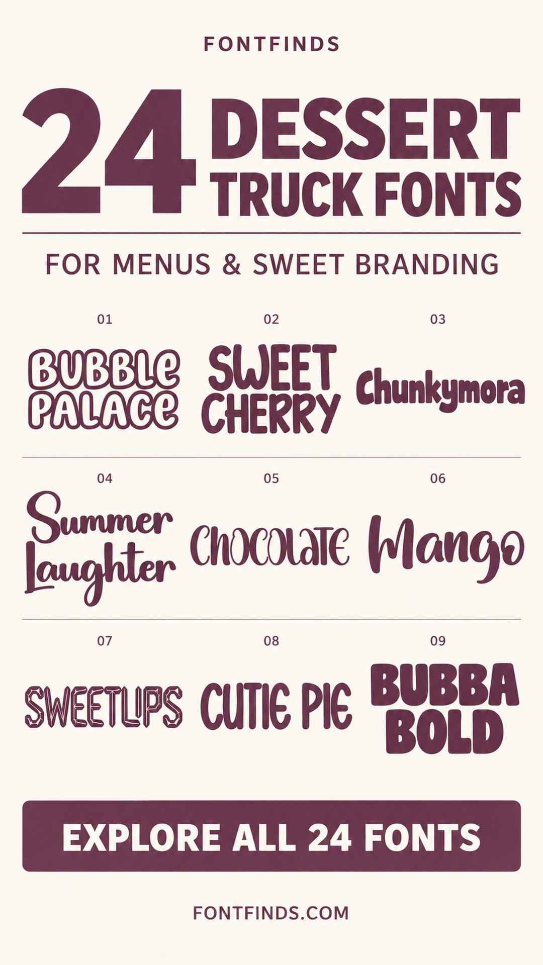
These dessert food truck fonts include bold bubbles, casual handwriting, bakery scripts and a few refined serif alternatives. The aim is to help you compare different brand voices for a truck name, a flavor board or a short promotional message.
The main logo and the ordering menu do different jobs. A decorative wordmark can attract attention, while prices, sizes and ingredients need a clearer structure. The collection therefore includes options for both expressive branding and calmer category headings.
Give each part of the menu a job
Start with the truck name, then organize menu categories, product names and prices beneath it. Use size, spacing and alignment to distinguish those levels before introducing additional fonts. Keep practical information easy to locate from the place where customers will stand.
Test the design on the actual vehicle color and in the intended menu format. Fine outlines or delicate scripts may need more contrast than they appear to require on a screen. Use an accurate printed proof for small details and a distance test for the main heading.
1. Bubble Palace: Bubble letters for a cheerful truck name
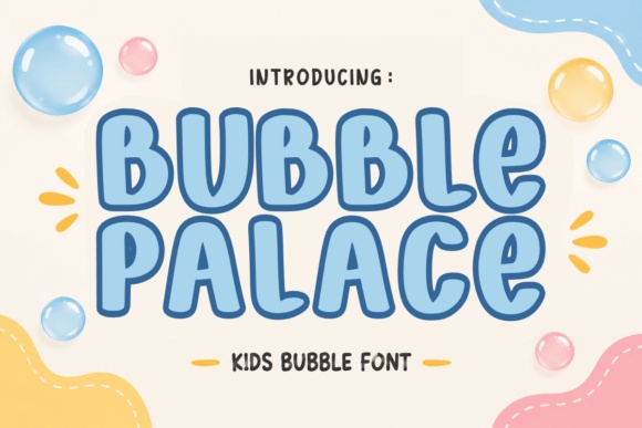
Bubble Palace uses rounded, outlined forms with a friendly, almost toy-like character. It can suit an ice-cream truck or a dessert brand aimed at families.
Keep the vehicle name large and reserve the detailed menu for a simpler font. Test the outline against the actual truck color before planning a full wrap.
View Font on Creative Fabrica →Preview • Download options • License details
2. Sweet Cherry: A playful headline for cherry specials
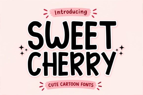
Sweet Cherry has tall, soft-edged lettering with a lively rhythm. It could introduce a seasonal sundae, fruit topping or signature dessert without making the menu feel formal.
Use it for short category headings rather than every description. Leave enough space between lines so the irregular forms do not create a crowded menu panel.
View Font on Creative Fabrica →Preview • Download options • License details
3. Chunkymora: A bold name that can lead the menu
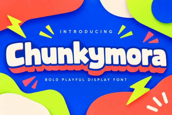
Chunkymora has thick, rounded forms with a broad, confident silhouette. It is worth trying for the truck name or the largest heading on a compact service-window menu.
Use a plain companion for ingredients and prices. A single solid color will help you judge the letter shapes before adding shadows or other decorative treatments.
View Font on Creative Fabrica →Preview • Download options • License details
4. Summer Laughter: A handwritten note for summer flavors
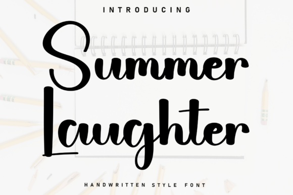
Summer Laughter mixes flowing handwritten movement with prominent capitals. It could give a seasonal special a more personal, small-batch feeling.
Keep the phrase short, such as a flavor name or weekend special. Avoid using the same script for ingredient details that customers need to read quickly while ordering.
View Font on Creative Fabrica →Preview • Download options • License details
5. Chocolate: A polished direction for chocolate desserts
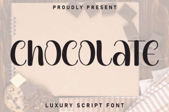
Chocolate presents curved, high-contrast display lettering with an elegant rhythm. It suits a more refined dessert concept, such as truffles, chocolate-dipped fruit or a premium pastry menu.
Let the type sit in a quiet area with good contrast. Use a separate practical font for prices so the decorative headline does not carry every job.
View Font on Creative Fabrica →Preview • Download options • License details
6. Mango: Loose handwriting for a fruit-led menu
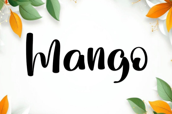
Mango uses broad handwritten strokes and a casual rhythm. It can support a fresh, sunny identity for smoothies, fruit bowls or frozen desserts.
Try one flavor name in large lettering above a simple product illustration. Keep portion sizes and add-on information aligned in a calmer typeface beneath it.
View Font on Creative Fabrica →Preview • Download options • License details
7. Sweetlips: Striped detail for a novelty special
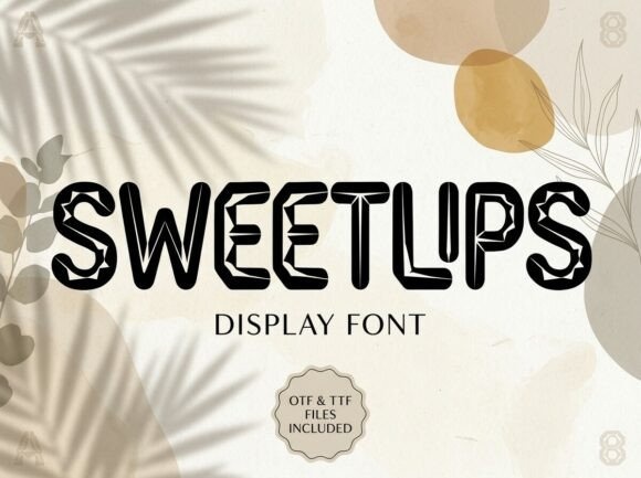
Sweetlips has decorative interior linework in its preview. That makes it a candidate for a large promotional heading where the unusual treatment can be seen clearly.
Keep it away from small price text. Print a test at the intended size, since internal details can merge or become distracting when viewed from farther away.
View Font on Creative Fabrica →Preview • Download options • License details
8. Cutie Pie: Tall lettering for a pie menu
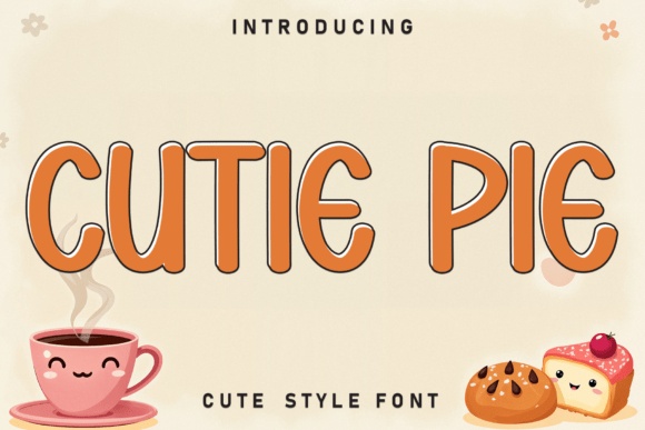
Cutie Pie brings tall, rounded capitals with a lighthearted outline treatment. It could work for a pie flavor board or a compact dessert category label.
Use a flat background and a limited palette. Make sure the outline remains visible beside product photography and does not become the only source of contrast.
View Font on Creative Fabrica →Preview • Download options • License details
9. Bubba Bold: A substantial headline for indulgent treats
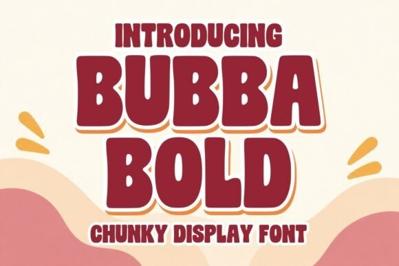
Bubba Bold has thick, compact display forms with a strong silhouette. It is a useful direction for loaded waffles, large sundaes or a dessert concept built around generous portions.
Try two short stacked words and leave a clear gap before the menu list. Resist squeezing the supporting copy into the same heavy style.
View Font on Creative Fabrica →Preview • Download options • License details
10. Ohgumi: A handwritten family of visual directions
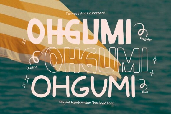
Ohgumi's preview shows several related lettering treatments, including outlined and lighter-looking examples. It offers inspiration for a menu system that needs both a prominent heading and a gentler accent.
Check exactly which files are supplied before planning the system. Choose one main treatment for the truck name so the branding remains consistent.
View Font on Creative Fabrica →Preview • Download options • License details
11. Candy Rounded: Rounded energy for candy specials
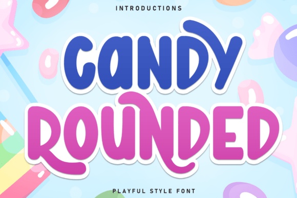
Candy Rounded has soft, substantial forms and a playful silhouette. It could anchor a sweets menu, candy-topped shake promotion or colorful dessert brand.
Use a single-color version first to assess readability. The colorful product presentation is styling inspiration, and the letterforms should still work without its gradients or background decorations.
View Font on Creative Fabrica →Preview • Download options • License details
12. Velvet Honey: An editorial serif for a refined dessert brand
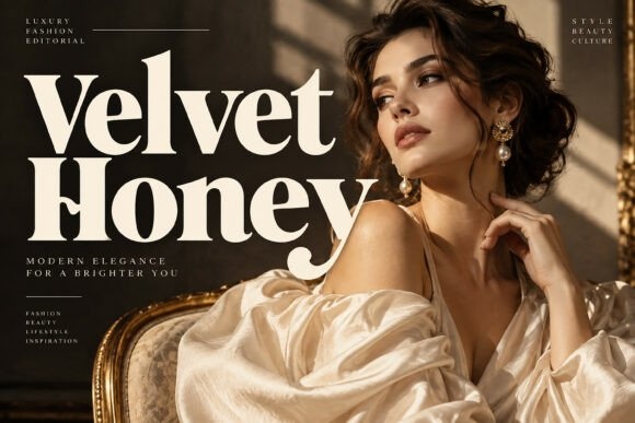
Velvet Honey offers a contrasting, high-fashion serif direction. It can suit a dessert truck selling carefully presented pastries or a menu with a more restrained visual identity.
Use it for the brand name or a short category heading. Protect the thinner strokes with a quiet background and clear supporting typography.
View Font on Creative Fabrica →Preview • Download options • License details
13. Spicy Bite: A bubbly wordmark for a busy service window
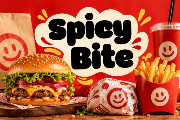
Spicy Bite has soft, inflated-looking forms that make a compact, friendly block. Despite the savory product mockup, the lettering could also suit cookies, donuts or a playful dessert truck.
Evaluate your own brand name in the font. Keep the surrounding badge simple so the rounded letters remain the recognizable element.
View Font on Creative Fabrica →Preview • Download options • License details
14. Queenie Sugar: Groovy curves for nostalgic sweets
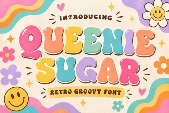
Queenie Sugar brings rounded retro lettering with an upbeat personality. It could support a nostalgic milkshake stand or a truck selling familiar childhood treats.
Limit the menu to one or two accent colors and give the headline room. Repeating every decorative color from the preview would make a practical menu harder to organize.
View Font on Creative Fabrica →Preview • Download options • License details
15. Cookie: Narrow handwriting for cookie flavors
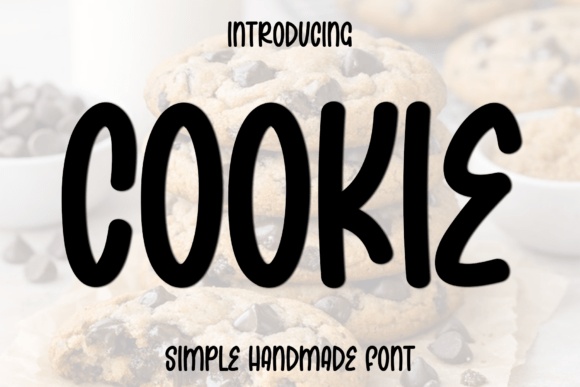
Cookie has tall, relatively narrow handwritten forms. It offers an informal option for flavor names where the menu has limited horizontal space.
Keep descriptions in a conventional companion font. Check repeated narrow letters in longer flavor names, especially when the menu is viewed from the queue.
View Font on Creative Fabrica →Preview • Download options • License details
16. Hamburger: Simple rounded capitals for menu categories
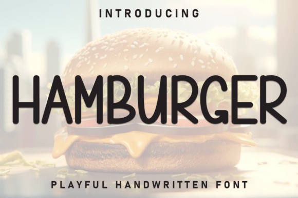
Hamburger uses clean, rounded handwritten-looking capitals. It is a less decorative option for headings such as waffles, shakes or toppings, regardless of the savory name.
Try it alongside a more expressive logo font. The contrast can give the menu personality while maintaining a consistent, easy-to-follow set of categories.
View Font on Creative Fabrica →Preview • Download options • License details
17. Biscuit: Swashes for a biscuit brand signature
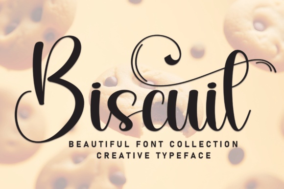
Biscuit presents a flowing script with large loops and flourishes. It can give a short brand name a handcrafted, celebratory feel.
Use the most restrained version that still communicates the name clearly. Leave generous clear space around loops, and keep contact details or ordering instructions in a simpler style.
View Font on Creative Fabrica →Preview • Download options • License details
18. Zippy Mango: Block lettering for a high-contrast special
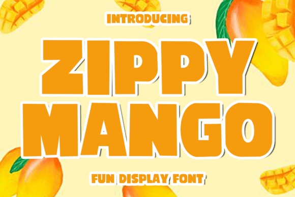
Zippy Mango has bold, squared display forms that can make a short promotion feel immediate. It is a promising direction for a limited-time flavor board.
Use a short phrase and a clear price block beneath it. The large letters should draw attention, while the supporting typography helps customers understand the offer.
View Font on Creative Fabrica →Preview • Download options • License details
19. Mister Bread: A bakery script with confident strokes
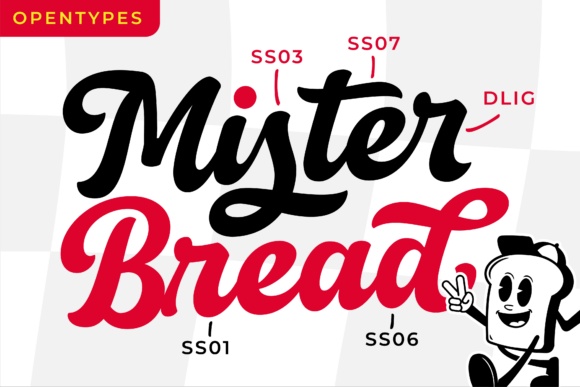
Mister Bread has connected, substantial script lettering with a classic bakery feel. It could support a dessert truck built around baked goods or a warm, nostalgic brand identity.
Preview the exact brand name and any alternates before choosing the final wordmark. Keep swashes clear of the service-window border and menu headings.
View Font on Creative Fabrica →Preview • Download options • License details
20. Soft Corn: Soft handmade letters for a relaxed menu
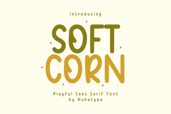
Soft Corn offers gently irregular, rounded lettering with a friendly tone. It can work for flavor headings or a small handwritten-style message on the truck.
Pair it with a plain price column. Aligning numbers consistently will help the menu remain usable even when the headings have an intentionally informal rhythm.
View Font on Creative Fabrica →Preview • Download options • License details
21. Sweet Candy: A gentle rounded style for sweet categories
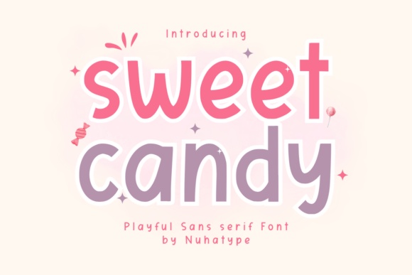
Sweet Candy has a light, playful character with rounded forms. It is an option for a softer brand voice, particularly for small dessert names or category labels.
Keep the headline color dark enough against a pale background. Do not rely on pastel color alone to distinguish important ordering information.
View Font on Creative Fabrica →Preview • Download options • License details
22. Toasty Morning: Warm retro shapes for breakfast desserts
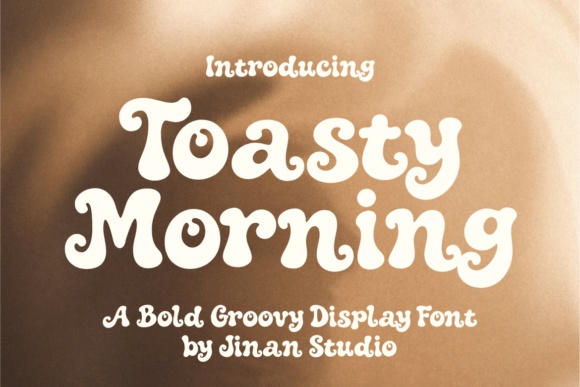
Toasty Morning has thick, curling display forms with a cozy, nostalgic mood. It could suit waffles, sweet toast or a breakfast-focused dessert truck.
Try a short two-line brand treatment and a simple steam or sun motif. Let the typography provide most of the ornament rather than adding several competing illustrations.
View Font on Creative Fabrica →Preview • Download options • License details
23. Oatmilk Cappuccino: Tall handwriting for a cafe-style truck
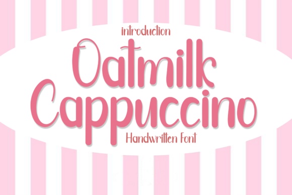
Oatmilk Cappuccino presents tall, rounded handwriting that can fit a gentle coffee-and-dessert identity. Its narrow proportions may be useful for longer category names.
Use generous line spacing on a menu board. Keep prices and practical labels in a sturdier companion if the display will be viewed from a distance.
View Font on Creative Fabrica →Preview • Download options • License details
24. Smiley Bread: Friendly lettering for a bakery counter
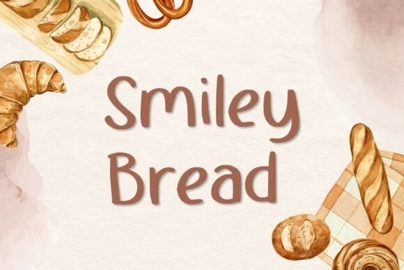
Smiley Bread has rounded handwritten forms and a relaxed rhythm. It is a useful option for small-batch pastries, bakery specials or a welcoming message beside the service window.
Try it on a short phrase rather than a dense menu paragraph. A tidy secondary font can preserve clarity for ingredients and serving information.
View Font on Creative Fabrica →Preview • Download options • License details
Which font would I try first?
Chunkymora and Bubba Bold are useful starting points for a substantial truck name. Mister Bread offers a bakery-style script, while Velvet Honey suggests a more refined dessert identity. I would pair the chosen brand voice with simpler category labels rather than using one decorative font for the entire menu.
Product images are supplied font previews. The cover is an illustrative lettering montage. Layout suggestions are editorial ideas; fonts have not been installed or production-tested for this guide. Check the linked listing for current files, supported characters and license details.
More font ideas
Frequently asked questions
Can the logo font also be the menu font?
It can be used for short headings, but detailed menu information often benefits from a simpler companion. Test prices, ingredient notes and longer product names separately.
Should I choose a font based on its food-related name?
No. Look at the actual letterforms and test your own brand name. A savory product name may still have shapes that work for a dessert concept, and the reverse is also true.
What is the most useful menu readability test?
View a realistic menu proof from the expected ordering distance. Check that customers can quickly identify categories, product names and prices without relying on decorative effects.