21 Charming Farmhouse Sign Fonts for Welcoming Spaces
This article contains affiliate links. If you buy through them, I may earn a commission at no extra cost to you.
Farmhouse sign fonts can make a phrase feel welcoming, but they can also turn a room into a wall of competing slogans. I prefer to start with one short line and let the lettering do the work. A warm script, a narrow handwritten face or a grounded serif can each tell a different story without needing extra flourishes.
For this collection, I am thinking about kitchen signs, family-name boards and small entryway pieces. I would choose the wording before the font, then consider the board’s shape and how far away people will stand. These are visual candidates for a sign design; cutting and painting suitability still needs to be checked with your own materials.
Choosing farmhouse sign fonts for the board you actually have
A narrow board rewards a different letter shape from a square plaque. Before browsing, I would draw the usable area and reserve a margin all the way around it. Type the full phrase inside that area. A font that only fits after extreme stretching has already lost its natural proportions; changing the line break is usually the better move.
I like a script for the emotional word and a quieter face for the practical information. On a family sign, that might mean an expressive surname with a simple established date. On a kitchen sign, the main word can stand alone. The more expressive the letterforms, the less surrounding decoration they tend to need.
Material matters. Fine loops that look graceful in a digital preview may become fragile in vinyl, difficult to paint cleanly or muddy against a strongly patterned wooden surface. I would start with a one-color print at the intended scale and identify the smallest enclosed spaces. If those spaces are already hard to see, simplify before moving to production.
To keep the result from feeling generic, change the composition rather than piling on more fonts. Try a lower placement, an off-center accent word or a slightly wider margin. Keep the main reading order obvious. The best sign is the one that belongs in the room, not the one that manages to display the most decorative options.
A welcome sign should work from the doorway
For a narrow entryway sign, I would begin with one welcoming word and a modest second line. The script can carry the friendly tone, while a plain companion gives a family name or location a stable base. Before adding a wreath, check the outside shape of the lettering. A long initial flourish might already supply the visual balance the left side needs.
Then step back from the full-size paper layout. If the message only reads when you stand directly in front of it, simplify the wording or increase the separation between lines. A painted design and a cut stencil also need different preparation: enclosed shapes and thin connections can become practical obstacles. I would ask the maker which details need adjustment before choosing the final face.
21 farmhouse sign fonts to compare
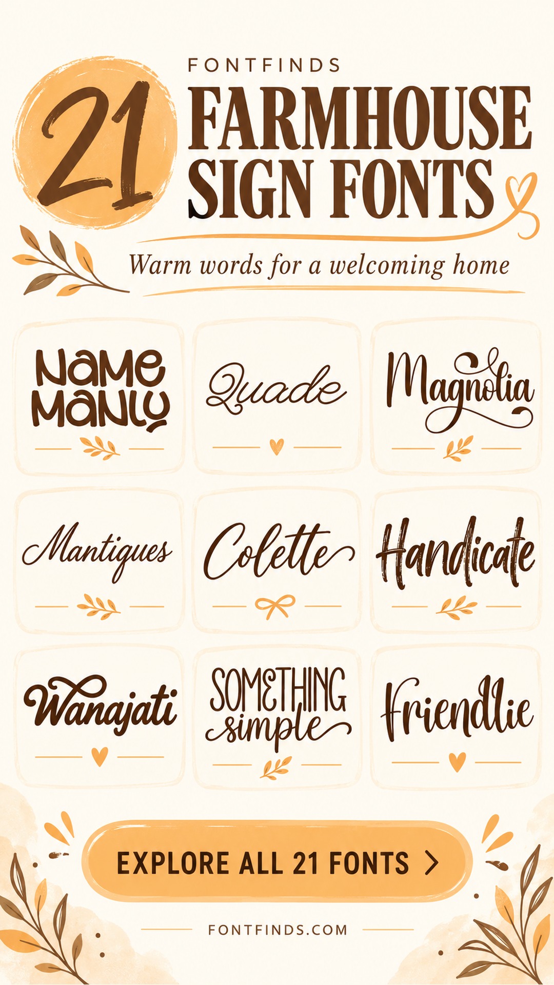
1. Name Manly: A casual welcome with open shapes
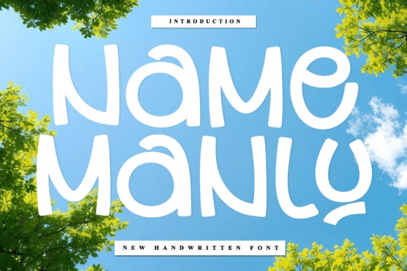
Name Manly’s rounded, informal letters feel approachable rather than ceremonial. I would try it for a kitchen or family-room phrase that should sound relaxed. Keep the wording short and let the uneven rhythm show; a rigid border or a highly formal companion would pull the design in a different direction.
Preview This Font →Preview & download options
2. Wk Quade: A gentle monoline script
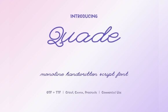
Wk Quade has a looping, even-stroke character that could soften a simple wooden sign. I would compare it for a short welcome or a family name, with practical details in plain capitals. Check the small loops at the intended production size before choosing it for a cut or painted design.
Preview This Font →Preview & download options
3. Magnolia: A generous flourish for a surname
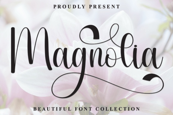
Magnolia’s large loops make the capital feel like part of the composition. I would give it a wide board and plenty of empty space rather than try to fit it inside a tight decorative frame. Set the actual surname first, because the balance will change with the starting letter.
Preview This Font →Preview & download options
4. Mantiques: A relaxed handwritten line
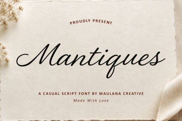
Mantiques has a smooth, slanted rhythm that feels personal without becoming overly ornate. I would use it for a short quote on a plain sign, especially when the room already contains texture and pattern. A quiet supporting line can establish the date or location without competing with the script.
Preview This Font →Preview & download options
5. Colette: A flowing signature-style accent
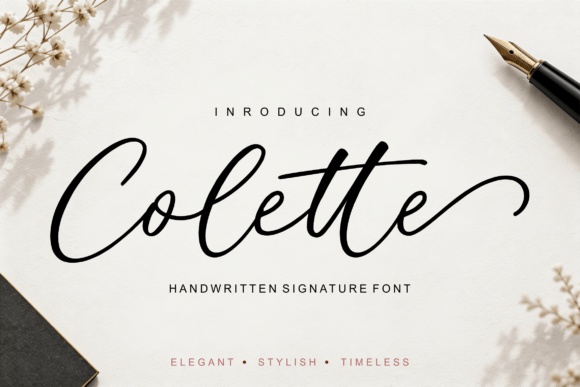
Colette’s long entry and exit strokes give a short word a graceful horizontal shape. I would compare it for a name board or a simple welcome sign with generous margins. Avoid placing a small word directly in the path of a flourish; the empty space is part of the lettering’s appeal.
Preview This Font →Preview & download options
6. Handicate: Texture that suits a rustic mood
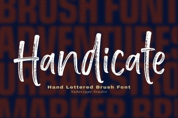
Handicate’s brush texture brings a less polished, more handmade feeling. I would try it for a kitchen phrase or a casual entryway sign in one dark color. Inspect the texture before production: tiny distressed marks may look attractive in print but require simplification for some cutting or painting methods.
Preview This Font →Preview & download options
7. Wanajati: A confident hand-lettered focal word
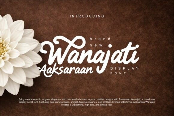
Wanajati has a substantial script shape and an emphatic underline in the preview. I would let it carry one main word, then place a restrained line below. It could suit a welcoming family space, provided the flourish has enough room and does not collide with the edges of the board.
Preview This Font →Preview & download options
8. Something Simple: A friendly mix of tall and flowing forms
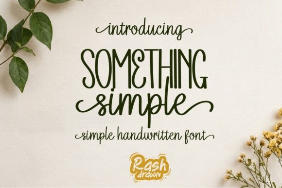
Something Simple offers a warm handwritten mood with a clear contrast between its sample lines. I would compare it for a compact kitchen sign where one word leads and another supports. Keep the surrounding illustration minimal so the change in letter rhythm remains easy to appreciate.
Preview This Font →Preview & download options
9. Friendlie: A softer name-board direction
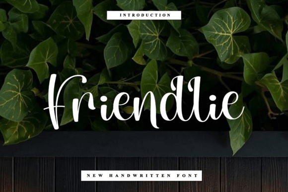
Friendlie’s flowing shapes give a phrase an intimate, welcoming tone. I would try it on a light board with dark lettering and a small secondary line. Watch the spacing around tall letters and descenders; a narrow frame can make an otherwise graceful word feel squeezed.
Preview This Font →Preview & download options
10. Roline Mono: A cheerful retro script
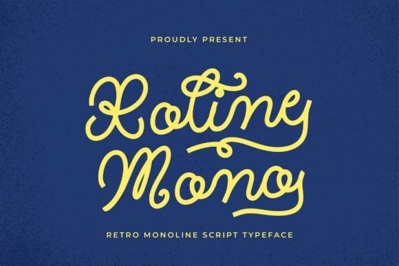
Roline Mono’s looping rhythm feels more nostalgic than formal. I would use it for a short pantry or kitchen phrase with a plain companion underneath. Its even-looking strokes create a lively line, but I would still inspect the smallest loops before using it in a cut-letter project.
Preview This Font →Preview & download options
11. The Chalks: A straightforward handwritten option
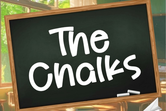
The Chalks has a casual, open appearance that could suit a small kitchen or family message board. I would compare it when readability matters more than elaborate decoration. Let the wording sit comfortably in the center, and use the board’s texture rather than another ornate typeface to add character.
Preview This Font →Preview & download options
12. Sometimes: A large initial as the main gesture
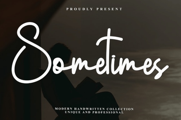
Sometimes starts with an expressive capital and continues in a softer handwritten rhythm. I would try it for a short family phrase on a wide sign. The initial needs breathing room, so I would reduce surrounding ornament and check that the smaller letters do not become secondary to an oversized flourish.
Preview This Font →Preview & download options
13. Lady Jane: A playful note for a family space
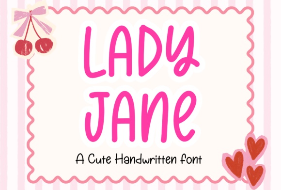
Lady Jane’s upright, rounded handwriting feels light and informal. I would compare it for a cheerful kitchen phrase or a child-friendly corner rather than a solemn family crest. Use a restrained palette and enough line spacing so the playful character remains easy to read from across the room.
Preview This Font →Preview & download options
14. Adelaide Home: A warmer brush-script statement
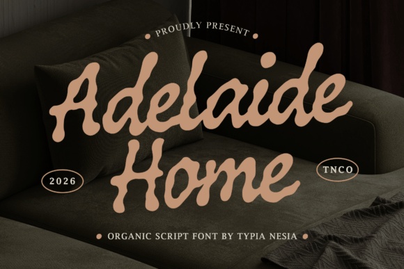
Adelaide Home has a substantial, slightly irregular brush rhythm. I would shortlist it for a short welcome or a surname on a larger board. Its weight gives the phrase presence, while a simple small-capital line can provide a quieter counterpoint underneath without making the whole sign feel formal.
Preview This Font →Preview & download options
15. Mellow Moment: A narrow, friendly handwritten line
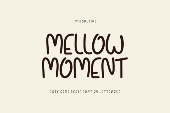
Mellow Moment’s tall, rounded letters can help a longer phrase feel light on a compact sign. I would try it with a generous outer margin and very little extra illustration. Compare the spacing between repeated narrow letters so the line stays readable rather than becoming a sequence of similar strokes.
Preview This Font →Preview & download options
16. Coaster: A decorative script for one main word
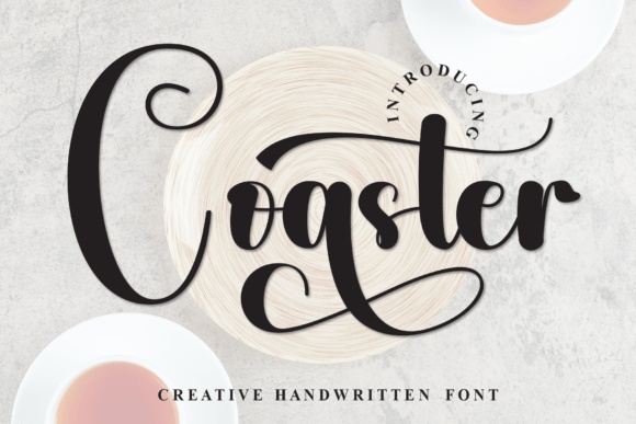
Coaster’s sweeping forms can turn a single word into the center of a sign. I would give it a simple rectangular space and avoid pairing it with another script. A practical date or short subtitle should sit well away from the large flourishes, in a much quieter typeface.
Preview This Font →Preview & download options
17. Folke: A restrained, graceful signature
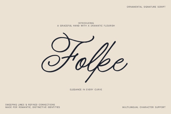
Folke has a fine, flowing line that could work for a personal name or a delicate entryway accent. I would reserve it for a sufficiently large design on a calm surface. It is less suited to a busy wood grain or a tiny phrase where the light strokes would struggle to remain visible.
Preview This Font →Preview & download options
18. Mustache: Tall lettering for a narrow board
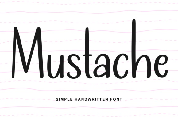
Mustache’s slim, upright shapes feel simple and handmade. I would compare it for a longer kitchen phrase that needs to fit naturally without stretching. Keep the line spacing generous and test the word from a realistic viewing distance; narrow letters can lose separation when placed too tightly together.
Preview This Font →Preview & download options
19. Grandpa: An easygoing family-room voice
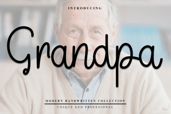
Grandpa’s rounded handwriting has a relaxed, conversational feel. I would try it for a short family saying with a straightforward layout and no ornate frame. A darker ink on a light board would let the warm letter shapes do the work without needing a second decorative feature.
Preview This Font →Preview & download options
20. Natural: A flowing word with more weight
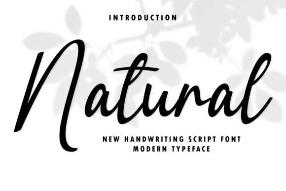
Natural has a confident handwritten rhythm and a noticeable slant. I would compare it for a welcoming focal word above a small plain subtitle. Give the longer strokes enough space, and test the actual phrase so its movement feels balanced rather than pulling the whole design toward one side.
Preview This Font →Preview & download options
21. Grandma: A gentle handwritten finish
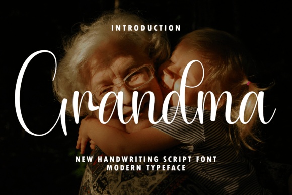
Grandma’s thin, generous curves create a softer personal mood. I would use it for a large name or a short phrase on a quiet background. Its delicacy is the attraction, so I would check a full-size production sample rather than assume the same effect will survive on a rough surface.
Preview This Font →Preview & download options
Make the phrase belong in the room
My first choice would be the font whose rhythm suits the exact phrase. Open the strongest two previews, compare the capitals and check how repeated letters look together. A simple board and a well-chosen word can be enough.
My recommendations are based on a visual review of the supplied product previews, not installation or production tests. The cover is an illustrative lettering montage. Open the linked listing to check the full character set, supplied files and current license before downloading.
More font ideas
Frequently asked questions
What is the best font for a farmhouse sign?
For a short, substantial word, I would compare a sturdy serif with a warm handwritten face. For a longer phrase on a narrow board, a more condensed style may fit naturally. The best choice depends on the wording, viewing distance and production method.
Why do some characters look different from the rest of the font?
A missing character can make the software substitute another font. Check the full character set for punctuation, accented letters and symbols before finalizing the sign. Use another companion deliberately rather than accepting an accidental fallback.
Can I cut these fonts in vinyl?
The previews do not establish cutting performance. Check the supplied files and your software, then test the smallest letters and tightest counters. Simplify fragile details and confirm the result with your cutter and material.
For another perspective on the design principles behind this selection, see published wood-sign typography questions.