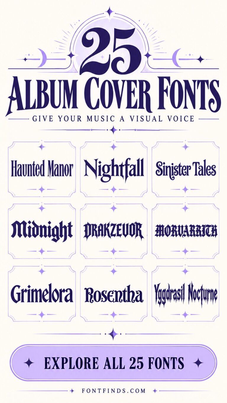
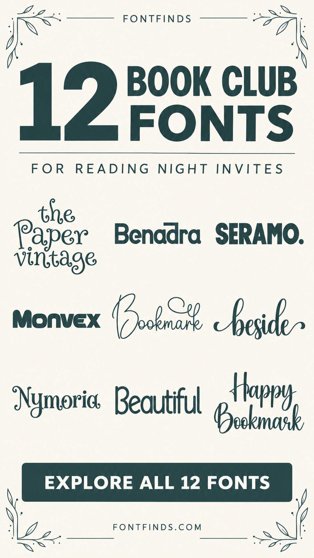
12 Book Club Invitation Fonts for a Welcoming Reading Night
This post contains affiliate links. If you buy through them, we may earn a commission at no extra cost to you.
A book-club invitation should make the next meeting feel worth opening a new chapter for. These book club invitation fonts range from whimsical storybook lettering to clean modern headings and elegant serifs for a more formal reading evening.
Choose the style around the group and the selected book. The invitation can suggest a mood without imitating a publisher's cover, and the book title, author and meeting details should remain easy to find.
Build the invitation around the book and the meeting
Decide whether the club name or the selected book should lead. If the group already has a familiar identity, keep that element consistent and let the featured title change. A decorative face can work for one short line, while a simple companion handles the author, date, location and any preparation note.
Test the longest book title before fixing the layout. Do not squeeze a long title into the same width as a short placeholder. Allow a second line, reduce decoration or change the hierarchy. For invitations shared in a group chat, view the final image at a small size and check that the meeting information survives the reduction.
1. The Paper Vintage: A whimsical literary invitation
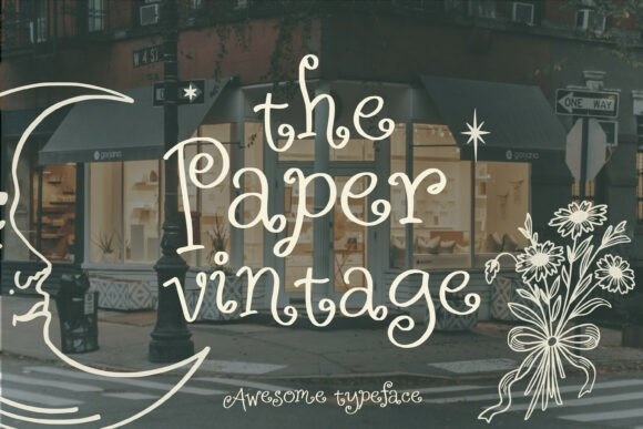
The Paper Vintage has curling, delicate letterforms that feel like an illustrated storybook heading. It could suit a book-club invitation for a cozy reading night or a discussion of whimsical fiction.
Keep the main phrase short and let the title occupy a generous area. A plain text block below can hold the book title, meeting time and location without competing with the ornamental letters.
View Font on Creative Fabrica →Preview • Download options • License details
2. Benadra: A modern discussion-night heading
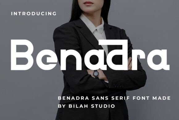
Benadra has clean, rounded geometric forms with an understated contemporary character. It could work for a book-club invitation that feels more like a modern event notice than a decorative literary poster.
Use a clear hierarchy between the club name and the selected book. A simple layout with one accent color can give the invitation personality without needing a large illustration.
View Font on Creative Fabrica →Preview • Download options • License details
3. Seramo: A clear recurring club identity
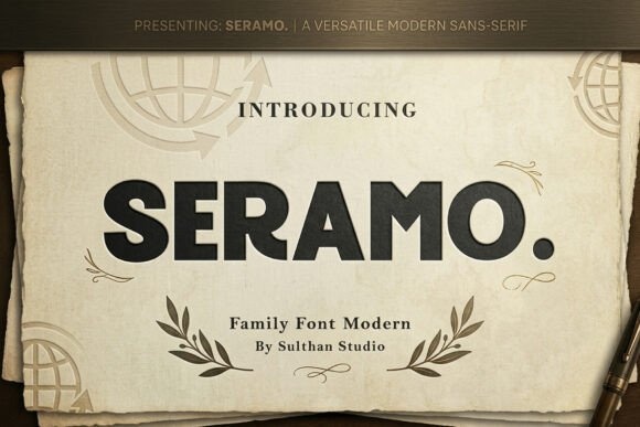
Seramo has a substantial, orderly sans-serif appearance in the preview. It could serve as a consistent heading style across a recurring book-club series, while the featured book and discussion theme change each month.
Keep the basic grid stable and vary a small accent rather than redesigning every invitation. This helps regular readers recognize the event quickly when it appears in a message thread.
View Font on Creative Fabrica →Preview • Download options • License details
4. Monvex: A bold speculative-fiction night
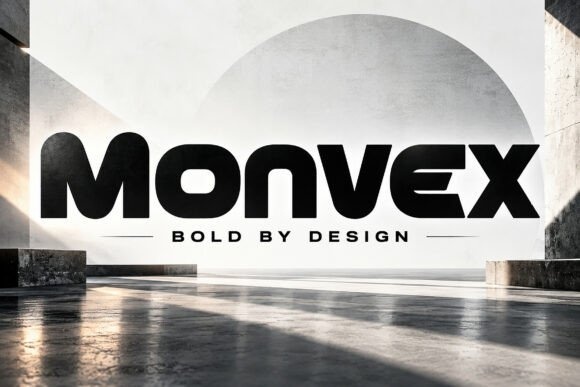
Monvex has heavy, rounded geometric forms with a modern display character. It could suit a book-club invitation for science fiction, experimental fiction or a discussion night with a deliberately contemporary identity.
Use the font for the event heading rather than a long book title. A lighter supporting face will keep the invitation from becoming a dense block of equally heavy text.
View Font on Creative Fabrica →Preview • Download options • License details
5. Bookmark: A personal handwritten invitation
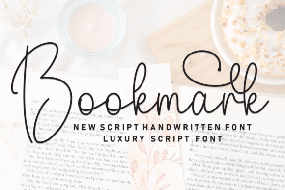
Bookmark has thin, flowing strokes and a large looping capital. It could make an invitation feel like a personal note, especially for a small reading group meeting at home.
Use it for a brief opening line and leave the book title in a clear upright companion. The invitation should still be easy to read when shared as a small image on a phone.
View Font on Creative Fabrica →Preview • Download options • License details
6. Beside: A gentle reading-night welcome
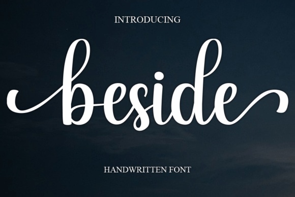
Beside has a soft connected-script appearance with long entry and exit strokes. It could suit a relaxed book-club invitation where a short phrase creates a welcoming tone above the practical details.
Leave room at both ends of the line. Swashes can look cramped against a border, and a decorative word should not run into the date or location underneath it.
View Font on Creative Fabrica →Preview • Download options • License details
7. Nymoria: A romantic literary mood
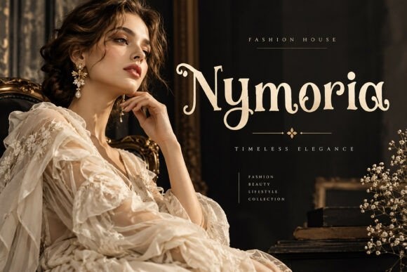
Nymoria combines decorative serif forms with unusual curves and flourishes. It could work for a book-club invitation focused on romance, historical fiction or a reading evening with a more dressed-up atmosphere.
Keep the title short enough to show the distinctive shapes. A restrained background and simple body text will help the invitation feel elegant rather than overloaded with literary ornament.
View Font on Creative Fabrica →Preview • Download options • License details
8. Beautiful: A light contemporary invitation
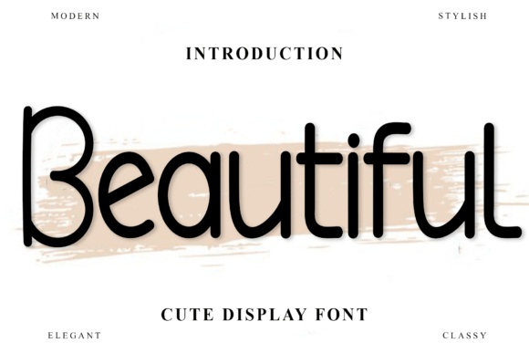
Beautiful shows slim, rounded, playful lettering in its preview. It offers a casual direction for a book-club invitation that should feel friendly and accessible without the formality of a traditional serif.
Try it above a neatly aligned information block. The lighter heading can work especially well when the book title below has a little more weight and becomes the second point of attention.
View Font on Creative Fabrica →Preview • Download options • License details
9. Happy Bookmark: A lively reading-group heading
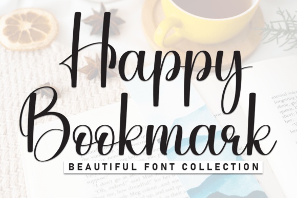
Happy Bookmark has tall handwritten forms with a strong, expressive capital. It could make a short book-club greeting feel warm and informal, particularly for a neighborhood or friendship-based reading group.
Avoid layering the script over a book-cover image. Giving the lettering its own clean space will make the invitation easier to read and keep the featured book visually distinct.
View Font on Creative Fabrica →Preview • Download options • License details
10. Manis: A refined literary salon
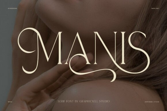
Manis uses fine high-contrast strokes and conspicuous swashes. It could suit a book-club invitation for a formal reading evening, a literary salon or a small gathering with a deliberately elegant presentation.
Choose a short heading and check its delicate lines at the final size. The meeting details should use a simpler face, especially if the invitation will be read primarily on a phone.
View Font on Creative Fabrica →Preview • Download options • License details
11. Gingga: An elegant fiction discussion
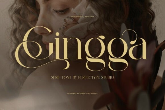
Gingga has graceful high-contrast serif forms and generous curves. It could create a polished heading for a book-club invitation where the selected novel is the focal point and the surrounding design stays restrained.
A single large book title may be more effective than several decorative lines. Keep the author, date and location in an orderly block so the invitation has a clear reading sequence.
View Font on Creative Fabrica →Preview • Download options • License details
12. Quiet: A cozy classic-book evening
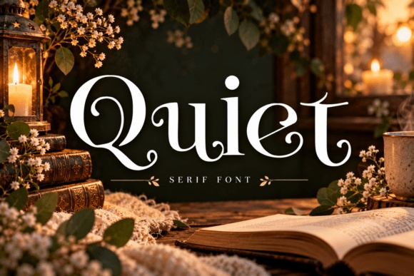
Quiet has a serif structure with soft curves and a prominent decorative capital in the preview. It could suit an invitation to discuss a classic novel or to host a calm, intimate reading night.
Use warm paper tones and a small amount of illustration if desired. The lettering can establish the mood without a photographic background that might interfere with the event information.
View Font on Creative Fabrica →Preview • Download options • License details
Which font would I try first?
The Paper Vintage would be my starting point for a whimsical reading night, Benadra or Seramo for a recurring modern club, and Quiet for a cozy classic-book discussion. Manis and Gingga offer more formal options when a short heading can have plenty of space.
Product images are supplied font previews. The cover is an illustrative lettering montage. Layout suggestions are editorial ideas; fonts have not been installed or production-tested for this guide. Check the linked listing for current files, supported characters and license details.
More font ideas
Frequently asked questions
Should the invitation match the book cover?
It can echo the mood, but it does not need to copy the cover design. A consistent club identity with clear information often works better across a changing reading list.
What if the book title is very long?
Give it a flexible text area and allow a deliberate line break. Test the actual title early, before choosing a decorative border or a fixed-size heading box.
Can I reuse the same layout each month?
Yes. Keep the club name, meeting details and basic hierarchy consistent, then change the book title and a small visual accent. This helps regular members recognize the invitation quickly.