22 Fantasy Chapter Heading Fonts for Book Interiors
This post contains affiliate links. If you buy through them, we may earn a commission at no extra cost to you.
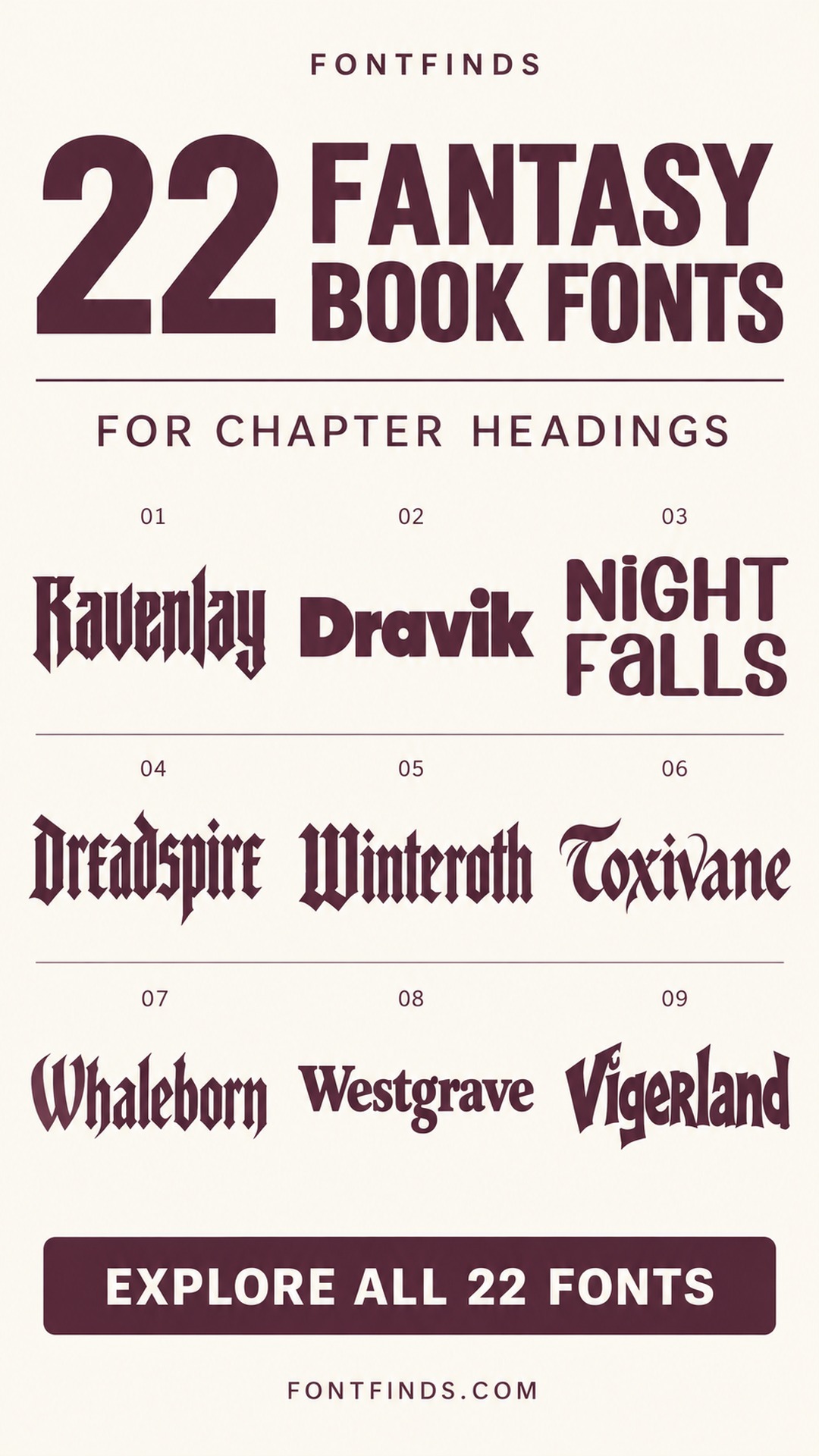
These fantasy chapter heading fonts range from literary serifs to pointed gothic forms and deliberately extreme decorative accents. They offer different levels of atmosphere, from a quiet storybook mood to a dark, ceremonial opening.
Not every expressive font is suitable for repeated chapter titles. Some options below are better treated as occasional section marks or inspiration for a themed heading. The goal is to compare mood and readability before choosing a consistent system for the whole book.
Balance atmosphere with navigation
Test the shortest and longest chapter names together, including any unfamiliar place names. Keep the chapter number easy to locate and leave enough space before the narrative begins. A decorative heading can establish the world, while a conventional text face supports sustained reading.
Use the same spacing and hierarchy across the manuscript. If an extreme font makes titles difficult to recognize, reserve it for a small emblem or an occasional part divider. Print a representative opening at the intended page size and confirm the licensing requirements for your publishing format.
1. Ravenlay: Angular gothic forms for dark chapter openings
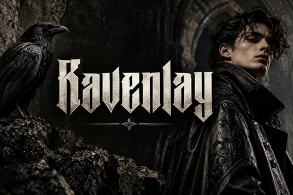
Ravenlay has narrow, pointed blackletter-style forms that suggest an old and formidable world. It could suit chapter titles in a dark fantasy or a story centered on an ancient order.
Use it only for short headings. Keep the narrative text in a comfortable reading face and check every chapter name for clear letter recognition.
View Font on Creative Fabrica →Preview • Download options • License details
2. Dravik: A modern contrast for an unconventional fantasy

Dravik offers bold geometric lettering rather than a traditional medieval mood. It can be useful for urban fantasy or a book whose chapter headings should feel direct and contemporary.
Try it with a small ornamental divider to connect it to the story world. Avoid forcing a historical tone onto letterforms that work better as a modern contrast.
View Font on Creative Fabrica →Preview • Download options • License details
3. Night Falls: Soft geometry for a gentler atmosphere
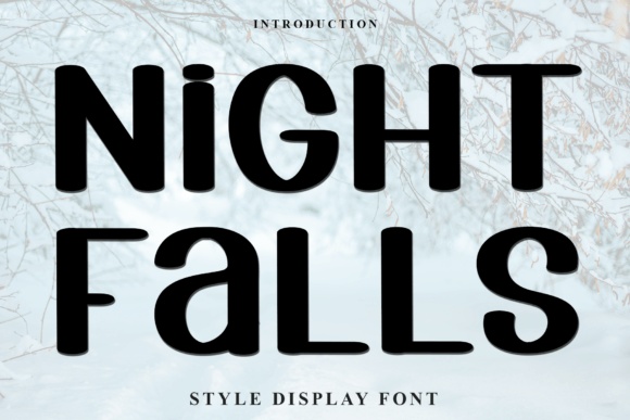
Night Falls has rounded, contrasting display shapes with a relatively friendly appearance. It could suit a lighter fantasy or chapter openings that need personality without severe gothic ornament.
Keep the heading short and use generous space above the first paragraph. Test capitalization choices, since the mixed shapes are part of the font's visual character.
View Font on Creative Fabrica →Preview • Download options • License details
4. Dreadspire: A formal gothic heading for an ancient order
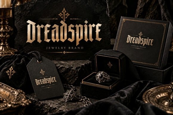
Dreadspire uses tall, pointed forms with a strong blackletter rhythm. It is a direction to explore for chapters named after castles, houses or secret societies.
Keep decorative borders restrained. The lettering already supplies substantial detail, and the chapter heading should remain easy to identify on a quiet reading page.
View Font on Creative Fabrica →Preview • Download options • License details
5. Winteroth: Narrow gothic lettering for winter kingdoms
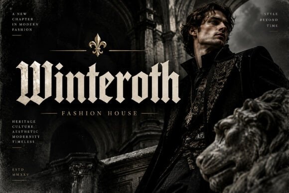
Winteroth has angular, upright forms that can suggest a stern historical atmosphere. It could suit a fantasy setting built around royal houses, old fortresses or a cold northern landscape.
Pair it with a simple chapter number. Check long names carefully rather than reducing them until the internal spaces become cramped.
View Font on Creative Fabrica →Preview • Download options • License details
6. Toxivane: Sweeping forms for magical chapter titles
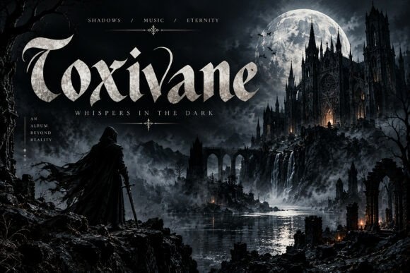
Toxivane combines gothic character with more flowing curves. It can give chapter openings a sense of ceremony or mystery without relying on a large illustrated frame.
Leave space around the prominent capitals and terminals. Keep the body text well below the heading so the decorative strokes do not intrude on the reading area.
View Font on Creative Fabrica →Preview • Download options • License details
7. Whaleborn: A dramatic heading for mythic adventures
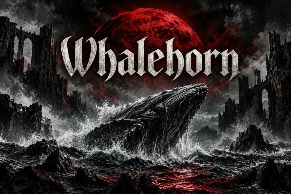
Whaleborn has sharp, flowing display forms with a strong fantasy presence. It could suit chapters about journeys, sea legends or encounters with powerful creatures.
Try it for short evocative titles rather than descriptive sentences. Use a plain chapter number to establish an immediate reading order.
View Font on Creative Fabrica →Preview • Download options • License details
8. Westgrave: A calmer serif for readable fantasy pages
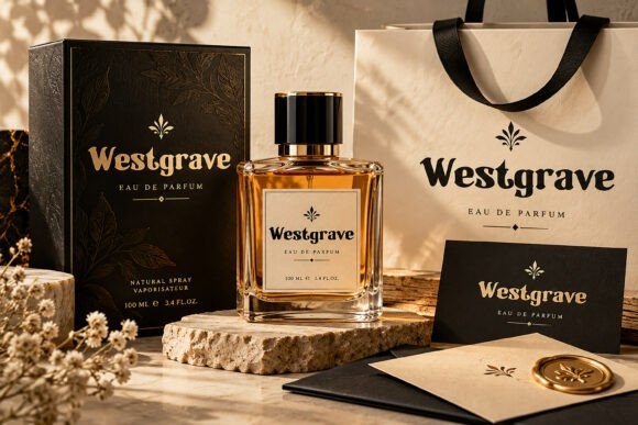
Westgrave has a more restrained serif appearance than the darkest options here. It is worth considering when chapter headings should feel established and literary without becoming highly ornamental.
Use consistent spacing and a small divider. The quieter lettering can leave room for a map symbol or chapter illustration if the book design includes one.
View Font on Creative Fabrica →Preview • Download options • License details
9. Vigerland: Rough display forms for turbulent scenes
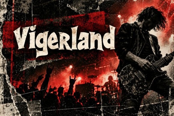
Vigerland has irregular, heavy letters with a rough visual energy. It can support a fantasy with a more rebellious or chaotic atmosphere, especially for short section headings.
Avoid using it for long chapter subtitles. A clean text face beneath the heading will provide a necessary change of pace for extended reading.
View Font on Creative Fabrica →Preview • Download options • License details
10. Reapergod: An extreme accent for a very dark world
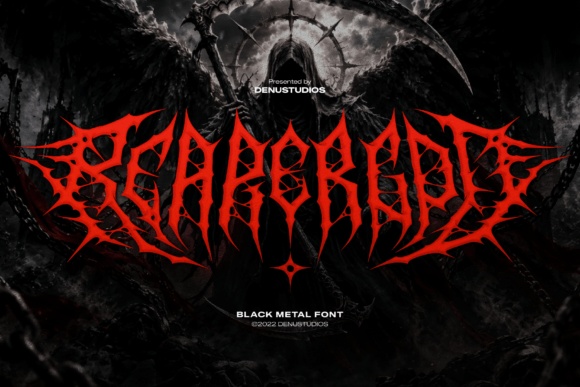
Reapergod uses highly intricate, spiky black-metal lettering. It is the most specialized direction in this collection and should be treated as an ornamental accent before a practical heading font.
Test the exact word with unfamiliar readers. For most chapter openings, a simpler title paired with a small decorative mark will be easier to navigate.
View Font on Creative Fabrica →Preview • Download options • License details
11. Moskavic: Geometric outlines for science fantasy
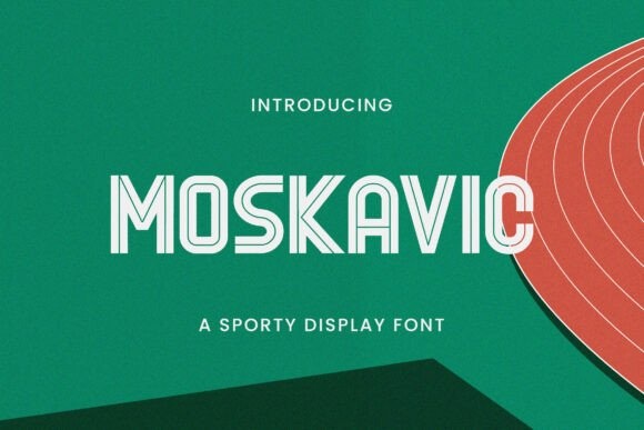
Moskavic has a clean, outlined geometric character rather than a medieval one. It could suit science fantasy, a game-like world or chapters associated with an engineered civilization.
Keep the outline large enough to print clearly. Use solid text for the chapter number and narrative so the page has a stable reading structure.
View Font on Creative Fabrica →Preview • Download options • License details
12. Witchora: Sharp lettering for an occult atmosphere
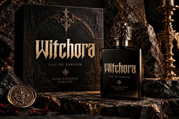
Witchora has tall, pointed forms that can give a chapter title a dark ceremonial character. It is a candidate for stories about hidden traditions or mysterious institutions.
Use a short title and a restrained divider. Check ambiguous letters at the intended page size before repeating the treatment throughout a full manuscript.
View Font on Creative Fabrica →Preview • Download options • License details
13. Thorn Warth: Jagged energy for a chaotic setting
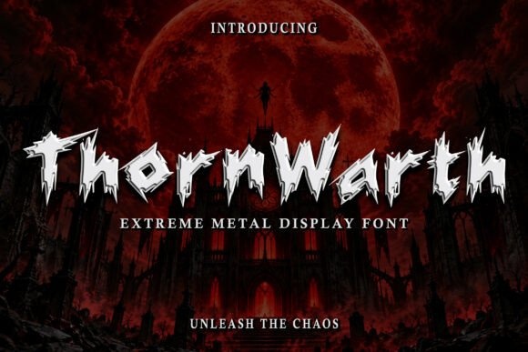
Thorn Warth has rough, spiked forms with an aggressive display character. It can provide an occasional accent for a dangerous faction or a particularly dramatic section.
Use it sparingly and avoid dense surrounding ornament. A full set of chapter headings in such an intense style may need more restraint than a single promotional title.
View Font on Creative Fabrica →Preview • Download options • License details
14. Draxovent: A strong gothic rhythm for chapter labels

Draxovent combines tall, angular forms with a forceful display presence. It could suit a dark adventure where headings need to feel bold and structured.
Keep the chapter number in a plain companion. Test the longest title first so the chosen size works consistently across the book.
View Font on Creative Fabrica →Preview • Download options • License details
15. Ancient Curse: Hand-drawn marks for an ancient inscription
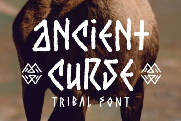
Ancient Curse has angular, drawn-looking forms that suggest an inscription rather than polished typography. It could work for a short chapter title associated with a relic or forgotten language.
Keep the actual words recognizable and avoid mixing too many decorative symbols into them. The narrative text should return immediately to a conventional reading style.
View Font on Creative Fabrica →Preview • Download options • License details
16. Death: A bold modern alternative
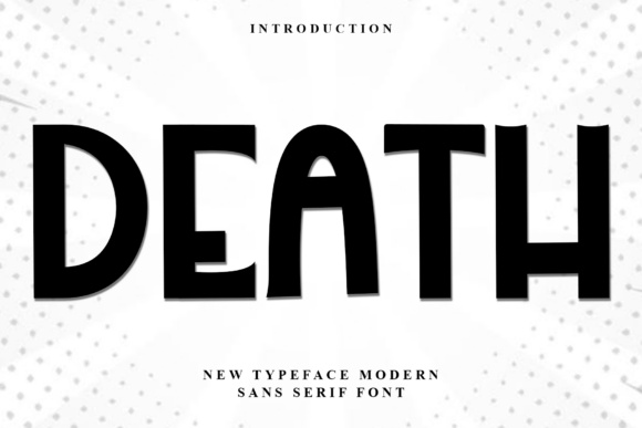
Death has broad, geometric display forms despite its ominous name. It is a useful reminder to choose by the actual letters, not the product title alone.
Try it for contemporary fantasy or a clean section divider. Use a darker illustration or ornament to establish atmosphere while the lettering maintains clarity.
View Font on Creative Fabrica →Preview • Download options • License details
17. Blood Moon: Playful horror for lighter fantasy
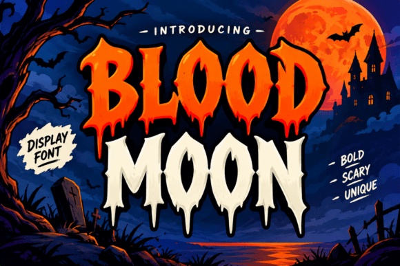
Blood Moon uses pointed, irregular display lettering with a theatrical quality. It can suit a lighter spooky adventure or a fantasy with a deliberately exaggerated tone.
Use it for short headings and keep the page layout calm. The expressive shapes can become tiring if repeated in subtitles, running heads and body text as well.
View Font on Creative Fabrica →Preview • Download options • License details
18. Shadow Curse: Rounded irregularity for approachable fantasy
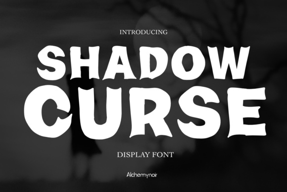
Shadow Curse has thick, uneven forms that feel more playful than traditional blackletter. It could suit a younger-facing adventure or a fantasy with a humorous voice.
Pair it with a simple chapter number and ample white space. Avoid adding extra distortion; the original letter rhythm already supplies character.
View Font on Creative Fabrica →Preview • Download options • License details
19. Bolleck Gothic: Decorative gothic detail for ceremonial titles
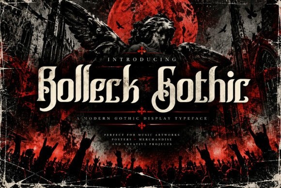
Bolleck Gothic has elaborate serif-like curves and a strong gothic influence. It can give chapter openings a formal, old-world character when the titles remain brief.
Check the complete heading at final size. Let a plain reading face handle subtitles or epigraphs so the decorative lettering has one clear role.
View Font on Creative Fabrica →Preview • Download options • License details
20. Drakvel: Tall serifs for a restrained dark mood
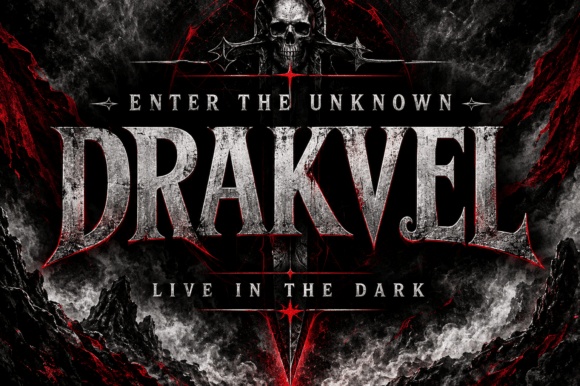
Drakvel uses tall, pointed serif forms with a strong vertical emphasis. It can create a dark atmosphere while remaining less intricate than extreme metal lettering.
Use a centered heading with generous space around it. Test long chapter names without compressing the letters horizontally.
View Font on Creative Fabrica →Preview • Download options • License details
21. Darkfang: A heavy fantasy mark for dramatic openings
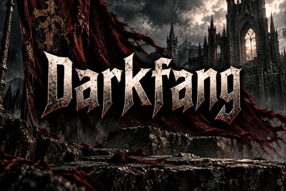
Darkfang has substantial, angular display forms that can suggest strength and danger. It is a candidate for a book with short, forceful chapter names.
Keep the surrounding frame simple and avoid stacking several decorative lines. A small plain chapter number can provide a clear entry point before the title.
View Font on Creative Fabrica →Preview • Download options • License details
22. Fanthorne: A literary serif for sustained consistency
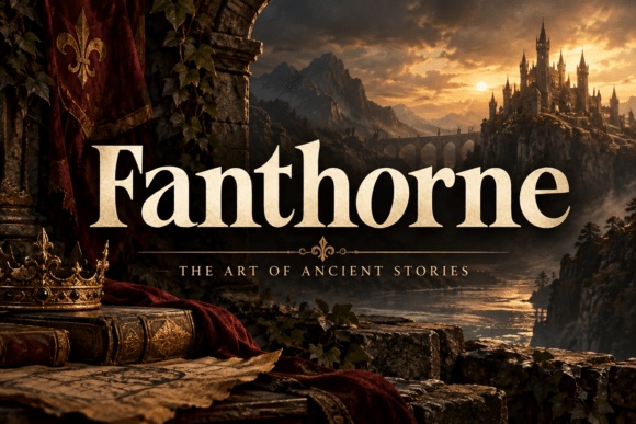
Fanthorne offers a comparatively readable serif direction with a classic fantasy mood. It is a useful starting point when the same heading treatment must work across many chapters.
Try the shortest and longest titles together before finalizing the size. Consistent spacing and a modest divider may be all the ornament the page needs.
View Font on Creative Fabrica →Preview • Download options • License details
Which font would I try first?
Fanthorne is a useful first comparison for a readable literary direction, while Ravenlay and Winteroth offer a stronger gothic mood. I would treat Reapergod as an ornamental accent rather than the default for every chapter. The best choice is the one that remains clear through the entire list of titles.
Product images are supplied font previews. The cover is an illustrative lettering montage. Layout suggestions are editorial ideas; fonts have not been installed or production-tested for this guide. Check the linked listing for current files, supported characters and license details.
More font ideas
Frequently asked questions
Can a decorative heading font also be used for body text?
Usually it is better to use a conventional reading face for the narrative. Decorative lettering can establish atmosphere in a short heading without carrying pages of continuous text.
How do I keep chapter openings consistent?
Test the longest title first, then establish a repeatable size, alignment and spacing system. Use a clear chapter number and avoid changing the layout for every title unless there is a deliberate structural reason.
Are extreme gothic fonts suitable for every fantasy book?
No. Highly intricate styles can be difficult to recognize and may not match the story tone. Use them selectively, and compare them with simpler serif or gothic alternatives.