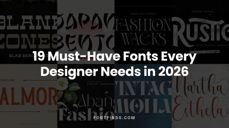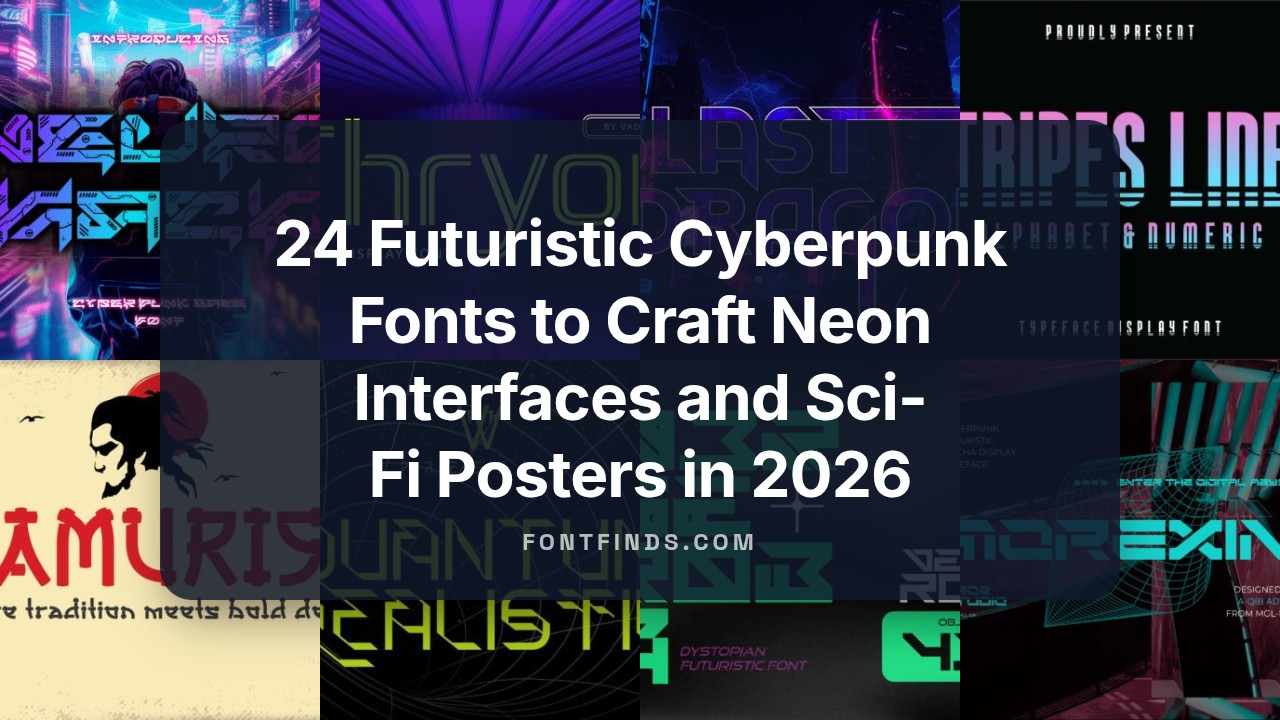
24 Futuristic Cyberpunk Fonts to Craft Neon Interfaces and Sci-Fi Posters in 2026
Looking for cyberpunk fonts that cut through visual noise? This collection of 24 typefaces focuses on neon-infused, high-contrast designs ideal for futuristic interfaces and gritty sci-fi art.
From modular techno sans to glitchy display faces, you’ll find fonts suited to game HUDs, album covers, motion graphics, and immersive UI concepts. I also cover pairing strategies, file-format recommendations, and quick licensing checks so you can deploy assets without delay.
Whether you’re building a cyber-noir website, a synthwave poster, or an in-game HUD, these selections and actionable tips will help you match mood to type and speed up production in 2026.
1. Quantum Cyberpunk Font
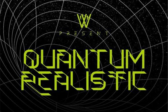
Quantum Cyberpunk merges space-age motifs with ornamental Blackletter callbacks to create a display face that feels both archaic and futuristic at once. Sharp terminals, high-contrast strokes and unexpected ligatures give the type a decorative flourish while a disciplined skeleton keeps it readable as a headline or logo, making it ideal where drama and elegance must coexist.
This family leans into the larger-than-life world of sci‑fi branding, galaxy-themed posters and neon-lit identity systems, complete with alternates that echo abstract quantum forms. As designers chasing authentic cyberpunk aesthetics will appreciate, Quantum Cyberpunk balances ornamental flair with modern utility, and supports bold typographic hierarchies in experiential projects using cyberpunk fonts and futuristic sans pairings.
╰┈➤ Download Quantum Cyberpunk Font
My Recommendation: I’d reach for Quantum Cyberpunk when a project needs theatrical presence-think film posters, album covers, or a boutique tech brand that wants to feel both historic and hi‑tech. Its ornamental Blackletter references stand out at large sizes, and the alternate characters let you customize wordmarks without custom lettering. Pair it with a clean geometric sans for body copy to keep layouts balanced and legible.
2. Cyberpunk Font
Cyberpunk is a bold decorative display face built for impact, with chunky shapes, angular cuts and lively rhythm that read instantly on posters and event banners. The aggressive letterforms and stylized terminals give a gritty, urban energy that suits street art, concert branding and high-contrast editorial spreads.
Despite its maximal personality, this font stays straightforward to use – strong kerning, clear uppercase silhouettes and a robust weight make it a go-to for headline work and merchandise. Use it where you need loud, immediate communication: gig flyers, social headers and apparel graphics that benefit from a raw, neon-and-concrete vibe.
My Recommendation: I recommend this Cyberpunk Font when you want an attention-grabbing headline that feels alive and tactile, especially for music, nightlife or street-culture projects. It reads well from a distance and prints cleanly on apparel, so it’s perfect for posters and tees. For balance, pair it with a neutral sans or condensed body text to avoid visual clutter.
3. Cyber Circuit Outline Font
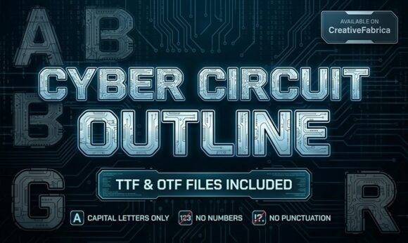
Cyber Circuit Outline is a technical display face whose open-outline construction mimics circuit traces and robotic schematics for a precise, mechanical look. Thin, parallel strokes and repeating geometry create an engineered rhythm that reads as modern tech signage and works beautifully layered over textures or colored glows.
This font excels in gaming IDs, e-sports badges and STEM-themed materials where a high-tech, schematic aesthetic is desired; it also adapts nicely to motion and VFX since the outlines animate cleanly. For best results use it large or combine the outline with a solid companion face to add weight and maintain legibility across media.
╰┈➤ Download Cyber Circuit Outline Font
My Recommendation: I’d use Cyber Circuit Outline for projects that need a literal tech signal-think hardware product launches, robotics club identities, and futuristic game logos. Its detailed linework looks great when paired with neon glows or metallic gradients, and animates well for title sequences. Combine it with a dense solid display to anchor copy in layouts where readability is essential.
4. Blast Dragon Font
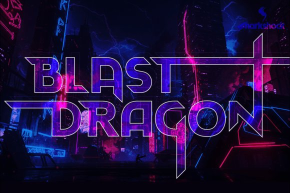
Blast Dragon is an all-caps display font built around condensed geometry and razor-sharp terminals; its 45-degree cuts and outward-reaching ascenders give each glyph a kinetic, blade-like silhouette that reads as speed and aggression. Among cyberpunk fonts, Blast Dragon stands out for balancing compact impact with legible form – the slanted terminals and extended strokes create a consistent visual rhythm that drives the eye across headlines and logotypes.
The family ships with three stylistic versions, full Basic and Extended Latin support, punctuation, kerning, alternates, and stylistic sets, making it production-ready for international projects. Use it where motion and attitude matter most: esports badges, action game titles, synthwave album art, anime posters, or hero web graphics that demand a forward-charging, high-tech voice.
╰┈➤ Download Blast Dragon Font
My Recommendation: I’d reach for Blast Dragon when I need a headline that screams velocity and attitude – it’s perfect for aggressive branding and entertainment graphics. The sharp terminals create instant character while the alternates let you fine-tune logos and titles. For any project aiming for a neon-drenched, high-energy aesthetic, this typeface delivers impact with practical language support.
5. Brogame Font
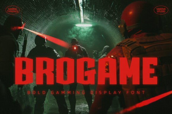
Brogame is a bold, modern display face designed specifically for gaming and high-contrast digital layouts; its crisp strokes and pointed counters give it an assertive, mechanical personality without sacrificing legibility. The design feels engineered for screens – letterforms retain clarity at large sizes and the tight, purposeful spacing keeps headlines compact and punchy for overlays and title cards.
It works exceptionally well with neon gradients, HUD-style UIs, and stream graphics, where you need a type that reads quickly under motion and visual noise. Use Brogame for eSports branding, launcher screens, tournament posters, and any interface where a futuristic, competitive tone must be unmistakable yet readable.
My Recommendation: I recommend Brogame when clarity under pressure is non-negotiable – it’s engineered to perform in motion graphics and UI contexts. Its geometric bite pairs well with glowing color schemes and animated treatments. For tournaments, stream packages, or game title screens, Brogame gives authority without compromising on screen-readability.
6. Lust Font
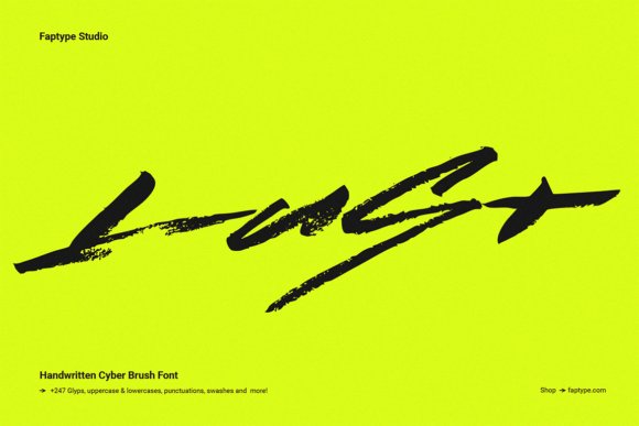
Lust is an expressive brush-blackletter hybrid that reads like a hurried manifesto scrawled in neon-lit alleyways; heavy bristles and intentional distortion give the letters an urgent, human cadence that resists digital perfection. The rough texture and jagged edges inject raw emotion into headlines, letting each glyph carry a sense of rebellion and tactile imperfection.
Technically, Lust is PUA-encoded with a rich set of swashes, alternates, and stylistic forms so you can easily craft chaotic yet controlled compositions. It’s ideal for streetwear labels, vaporwave posters, gritty album covers, and interfaces that need a handcrafted, underground voice paired with a cleaner sans for balance.
My Recommendation: I’d use Lust when a project needs to feel hand-made and defiant – it brings palpable energy and personality to posters and apparel. The PUA access to swashes makes it fast to experiment with expressive combinations. Pair it with minimal, geometric elements to let its roughness become the focal point without overwhelming the design.
7. Exon Font
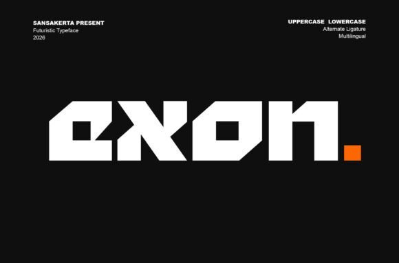
Exon is a precision-driven display face that fuses crisp geometric forms with digitally sharpened terminals, yielding a look that reads like a hardware blueprint for the future. Its tight construction and bold weight make it an immediate choice for projects that need a high-tech personality; Exon sits naturally among cyberpunk fonts while retaining enough clarity for brand marks and cinematic titling.
Beyond aesthetics, Exon is engineered for practical multi-platform use: generous spacing for legibility at large sizes, an extensive symbol set, and files in TTF, OTF, and WOFF for web and app deployment. Use it for esports logotypes, UI hero headers, movie captions, or tech identity systems where a confident, modern display face must convey authority without sacrificing refinement.
My Recommendation: I reach for Exon when a project needs a bold, futuristic identity that still reads cleanly across devices. Its geometric rigor makes logos and headlines feel engineered and contemporary, and the available formats simplify deployment for web and motion work. If you want a commanding display face for tech brands, game titles, or sci‑fi visuals, Exon delivers both style and utility.
8. Thryon Font
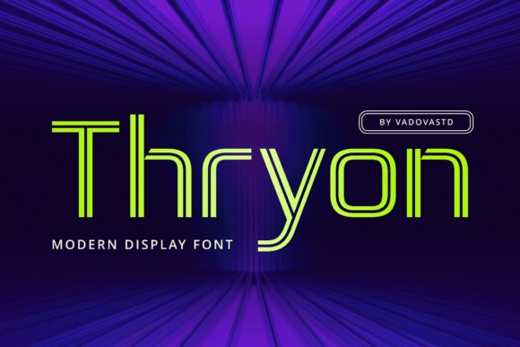
Thryon is a heavy, sans display that channels neon-lit alleyways and circuit-board geometry into a compact, punchy set of letterforms. Sharp angles and contrast cuts give each glyph an industrial, robotic cadence, while subtle rounded joins keep the rhythm readable on posters and large-format art.
Designed for high-energy environments, Thryon excels in headline work, game title cards, and tech-forward branding where visual intensity is the goal. Pair it with minimalist body types or monospaced UI copy to balance its aggressive attitude, and exploit neon or gradient fills for maximum retro-futuristic impact.
My Recommendation: I recommend Thryon when you need to inject a design with high-voltage attitude-think arcade posters, trailer titles, or edgy tech product launches. Its strong personality cuts through busy compositions and scales well for print and screen. Use it sparingly as a display voice and pair it with neutral supports to keep layouts legible and dynamic.
9. Voxel Font
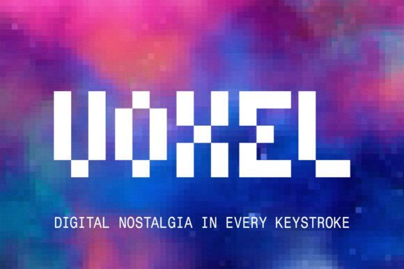
Voxel is an 8-bit pixel display that recreates the low-resolution charm of arcade cabinets with modern attention to glyph completeness and spacing. Blocky squares and rigid counters produce unmistakable retro fidelity, making Voxel ideal for interfaces and graphics that want an authentic pixel-era texture without sacrificing punctuation or multilingual support.
The font performs particularly well at small sizes and in on-screen overlays where crispness matters; it also adapts to merchandise and apparel that nod toward gaming nostalgia or cyberpunk-inspired streetwear. Voxel’s full character set and solid hinting ensure consistent rendering across streams, indie games, and poster art that lean into vintage digital aesthetics.
My Recommendation: I use Voxel for projects that benefit from an unmistakable retro mood-indie game UIs, stream overlays, and merch designs that celebrate 8-bit heritage. Its clarity at small sizes and complete glyph set make it practical as well as stylish. If you want authentic arcade vibes or pixelated branding with modern reliability, Voxel is a go-to choice.
10. Glowtone Font
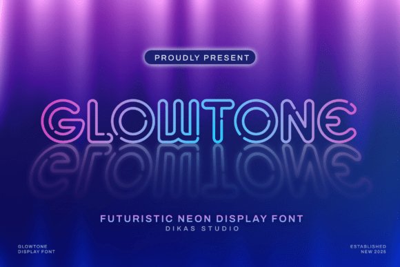
Glowtone is a neon-sign inspired sans-serif display face that convincingly mimics the bending and luminosity of real neon tubing, giving headlines an instant electric personality. Its smooth, rounded terminals and purposeful gaps recreate that glowing edge glow and sit naturally among cyberpunk fonts and synthwave aesthetics, making it an instant pick for retro-futuristic posters and nightlife branding.
The typeface’s clean skeleton and open counters make it highly legible even when layered with bloom and blur effects, while consistent stroke widths allow designers to stack colored glows or animated light overlays without losing form. Use Glowtone for club flyers, cinematic titles, game overlays, and any design that needs a vivid, illuminated focal point with crisp display clarity.
My Recommendation: I’d reach for Glowtone when a project needs immediate neon energy – it reads well at a distance and glows cleanly under layered effects. Its design balances ornament and legibility, so it works on signage and motion graphics alike. For synthwave posters, nightlife promos, or game HUDs that demand a luminous headline, Glowtone is one of my top go-to choices.
11. Samurise Font
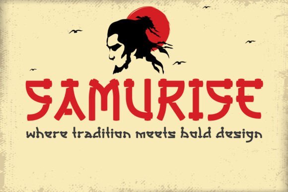
Samurise translates the disciplined strokes of samurai calligraphy into a bold stencil display that feels both traditional and modern. Sharp notches and angular terminals give each glyph a blade-like precision, while the stencil breaks lend an industrial, utilitarian edge that reads strong across packaging, posters, and identity work.
Because of its structured cuts, Samurise thrives in tactile and gritty treatments – think printed rubber ink, distressed textures, or layered halftone screens – and pairs exceptionally well with Asian-inspired layouts, martial-arts branding, anime titles, and streetwear labels seeking an assertive signature. It’s a compelling choice when you want cultural flavor without losing graphic clarity.
My Recommendation: I’d use Samurise for projects that need a bold, cultural attitude with a modern stencil twist – it’s great for restaurant signage, apparel branding, and game covers. The font’s carved-in look gives designs a handcrafted toughness while remaining highly legible. If you want an identity that feels rooted in East-Asian calligraphic tradition but engineered for contemporary graphics, Samurise fits perfectly.
12. Decagon Type Font
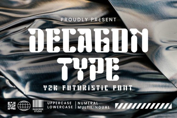
Decagon Type is a Y2K-inspired futuristic display font that fuses geometric clarity with sci-fi ornamentation, drawing visual cues from mecha engineering and hyperbeast culture. Its modular forms and faceted angles reference decagonal geometry, producing a technical, slightly mechanical voice ideal for retro-tech and modern-future treatments.
The type works especially well when treated with chrome gradients, subtle bevels, or glitch overlays, making it a natural fit for game HUDs, electronic music art, and tech-forward identities. Use Decagon Type for headline-driven layouts where a rigid, engineered aesthetic strengthens brand or editorial narratives without sacrificing dramatic presence.
╰┈➤ Download Decagon Type Font
My Recommendation: I’d pick Decagon Type when I want a bold, futuristic attitude that nods to early-2000s tech culture – perfect for game titles, electronic music covers, and product mockups. Its geometric construction is great for creating logomarks or custom letterforms. If your project needs a strong, engineered headline that reads as both nostalgic and forward-looking, this font is an excellent match.
13. Brayqose Expanded Font – cyberpunk fonts
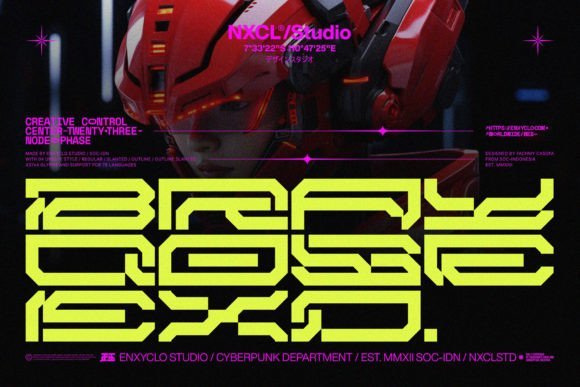
Brayqose Expanded is an assertive display face that stretches each character into a mech-like silhouette, blending angular terminals and wide counters for maximum visual impact. Brayqose Expanded sits confidently among cyberpunk fonts with its stretched proportions, industrial joints, and futuristic stencil cues that evoke signage on neon-drenched cityscapes. The design balances ornamented details with big, readable shapes so it reads as a headline whether printed large on posters or composited into motion graphics.
Practically, the type shines in large-format uses: title cards, arcade-style logos, event posters, and UI headers where presence matters more than fine text rhythm. It handles heavy color treatments and layered effects (neon glows, scanlines, chrome gradients) without losing its personality, and pairs well with condensed sans-serif bodies to keep layouts legible. If you need a type that signals high-tech menace and urban grit at a glance, Brayqose Expanded delivers that theatrical, futuristic stamp.
╰┈➤ Download Brayqose Expanded Font – cyberpunk fonts
My Recommendation: I’d reach for Brayqose Expanded when I need a headline that dominates a poster, game UI, or cinematic title sequence; its expanded forms give instant authority and visual drama. It’s ideal when you plan to layer neon glows, motion blur, or metallic textures because the wide counters preserve clarity under heavy effects. Use it for sci‑fi branding, festival posters, or any project demanding an aggressive, tech-forward voice.
14. Neuro Hack Font
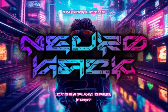
Neuro Hack is a purpose-built gaming display face that fuses sharp, circuit-like strokes with decorative breaks and notch details to read as both digital and aggressive. The letterforms feel engineered for on-screen application, where pixel-perfect kerning and bold silhouettes let complex neon or glow effects pop without muddiness. Its detailing-sliced terminals, inset bars, and angular junctions-creates a tactile, high-tech texture ideal for sci‑fi posters and game covers.
In practice, Neuro Hack excels in motion titles, level headings, and packaging where layered effects (inner glows, scanlines, animated glitches) amplify its mechanical aesthetic. Designers will appreciate how it acts as a focal point when paired with neutral geometric sans faces for body copy, maintaining hierarchy in busy compositions. Use it to suggest circuitry, hacking scenes, or a futuristic competitive edge where attitude and readability must coexist.
My Recommendation: I use Neuro Hack when a project needs a distinctly digital, adrenaline-charged tone-think esports banners, game splash screens, and retro-futuristic posters. The font’s built-in ornamentation reduces the need for extra graphic treatments while still supporting dramatic effects. It’s a top pick when you want a readable headline that already looks ‘designed’ without extra customization.
15. Inoe Font
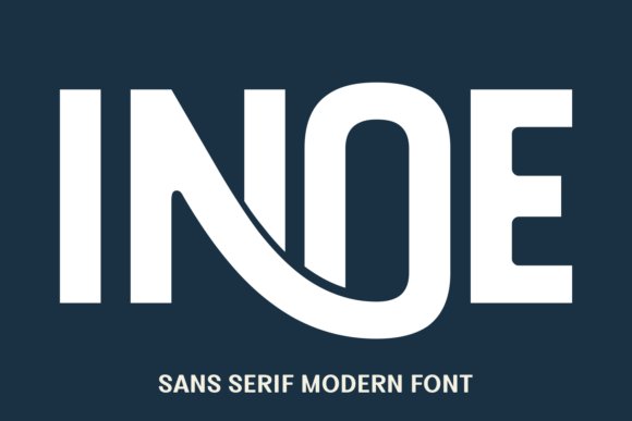
Inoe is a tall, narrow sans-serif that makes statements through confident verticality and pared-down geometry, giving headlines a sleek, modern silhouette. Its condensed proportions and firm stroke contrast deliver athletic energy and cinematic presence, with clean terminals that translate well across print and digital displays. The face’s simplicity hides a thoughtful balance between robustness and elegance, making it versatile for editorial layouts and bold branding.
Functionally, Inoe performs where space is tight but impact is required-magazine covers, poster mastheads, album artwork, and sports identity systems all benefit from its compressed strength. The font harmonizes with minimalist aesthetics and works effectively with oversized tracking or tight leading for dramatic typographic compositions. If you need a no-nonsense headline type that conveys power and modernity, Inoe is a dependable choice.
My Recommendation: I choose Inoe for projects that demand a lean, assertive headline-sports branding, film posters, and magazine spreads where vertical rhythm matters. Its condensed shape lets you fit big messaging into constrained layouts while retaining a clean, contemporary look. Use it when you want typography to feel purposeful and streamlined without extra ornamentation.
16. Verse Robo Font
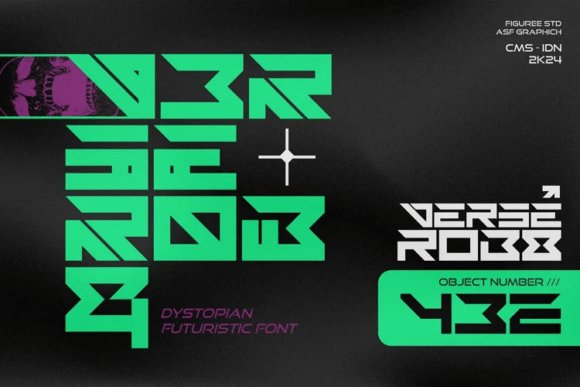
Verse Robo channels a neon-soaked future where industrial grit meets polished circuitry, giving headlines a tense, cinematic presence. As one of the stronger cyberpunk fonts in mood and construction, it balances raw, fractured shapes with engineered consistency to evoke a dense, machine-run metropolis. Its character set favors modular strokes and abrupt terminals that feel both hand-scored and precision-milled, creating a dramatic silhouette at display sizes. Deploy it when you want typography to read like urban infrastructure: loud, kinetic, and slightly dangerous.
On a technical level Verse Robo performs well in high-contrast treatments and layered effects-think holographic glows, scanlines, and chrome sheens-without losing legibility. The family’s spacing and weight choices make it suitable for posters, game UI headers, and sci-fi covers where boldness matters more than long reads. Pair it with simple geometric sans-serifs or condensed monospaces to preserve hierarchy and avoid visual clutter. Its personality is unmistakable, so use it as a commanding headline voice rather than a subtle supporting face.
My Recommendation: I’d reach for Verse Robo when building game HUDs, dystopian posters, or synthwave branding because its mechanical rhythm instantly reads as urban-tech. It tolerates heavy styling-glows, metallic textures, and layered treatments-while remaining legible at display sizes. Use it when you need a strong, cinematic typographic statement that anchors a futuristic visual identity.
17. Morexin Font
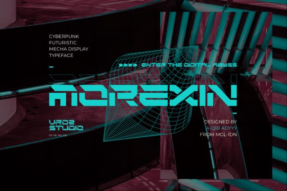
Morexin Font announces itself with compact, futuristic letterforms that demand attention in large formats and on tight thumbnails. Its streamlined strokes and condensed proportions create a steady, propulsive rhythm across words, making it ideal for posters, apparel, and bold social graphics. The typeface favors directness over ornament, so it reads quickly and retains impact even when scaled down for thumbnails or merch tags.
Technically practical, Morexin supports heavy display usage while keeping clear counters and stable spacing, which helps when applying gradients, halftones, or distressed textures. It pairs naturally with neutral sans-serifs for body text or with textured backdrops for a streetwear edge. If your goal is a modern, fashion-minded aesthetic that’s simple to style and deploy, Morexin delivers punch without fuss.
My Recommendation: I recommend Morexin when you need a headline face that registers instantly-perfect for thumbnails, streetwear labels, and poster campaigns. Its compact profile gives logos and titles an energetic stance while staying legible in tight layouts. Use it when you want a contemporary display font that feels bold and wearable without overcomplication.
18. Fyntra Font
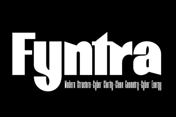
Fyntra Font emphasizes vertical momentum and a chiseled silhouette, producing headers and marks that feel engineered for speed and competition. Its high-contrast geometry slices space with acute angles and tight counters, delivering a taut, technical voice suited to esports identities and hardware packaging. The typeface’s rhythm and narrow proportions make it particularly effective in stacked logotypes and animated title sequences where every glyph contributes to motion.
Beyond aesthetics, Fyntra holds up well under motion blur and small-scale icons thanks to deliberate terminal treatments and a sturdy x-height. Alternate glyphs and stylistic sets offer customization for monograms and badge work, while pairing with rounded humanist faces can introduce softness when needed. Choose Fyntra for projects that require aggressive clarity and a contemporary, mechanical character rather than decorative retro sci‑fi flourishes.
My Recommendation: Use Fyntra for competitive branding, esports banners, and tech product launches where vertical presence and crisp geometry matter. I often pick it for animated logos and title cards because its forms adapt cleanly to motion and tight crops. It’s ideal when you want a modern display face that reads fast and asserts a professional, high-energy identity.
19. Chromo Robo Font
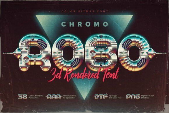
Chromo Robo is a showpiece color bitmap OpenType‑SVG display that recreates glossy, retro‑chrome robot aesthetics with convincing 3D depth and metallic sheen. The design channels arcade cabinets and synthwave signage, making it an immediate focal point for posters, title cards, and packaging that aim for a nostalgic yet futuristic mood; it plays especially well alongside other cyberpunk fonts and neon palettes thanks to its reflective highlights and saturated color layers.
Technically, the family ships as a functioning font plus high‑res PNGs (roughly 10MP) and exposes three per‑letter antenna variants accessible through the Glyphs panel, which lets you subtly vary word‑level rhythm. Bear in mind the current limits of color font support – Photoshop, Illustrator, InDesign, Procreate and Affinity work well, but some apps still render SVG layers differently – so I recommend testing assets and using the supplied PNGs where exact pixel fidelity matters.
My Recommendation: I’d reach for Chromo Robo when a project needs an immediate retro‑future personality: think arcade posters, synthwave album covers, or a sci‑fi game splash screen. Its built‑in color layers save time versus manually compositing chrome effects, and the antenna alternates let you customize word shapes without editing outlines. For crisp, high‑impact headers or limited‑use branding (where the color font will display reliably), this one gives instant character and nostalgia.
20. Mega Binory Font
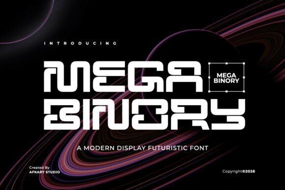
Mega Binory presents a razor‑edged, geometric sci‑fi aesthetic that reads as both minimal and muscular – ideal for conveying a forward‑leaning technological identity. Its disciplined proportions and acute terminals create strong letter‑shapes that remain legible at large sizes, making it a natural choice for headlines, cinematic titles, and competitive gaming branding where a high‑tech attitude is essential.
The family includes full upper and lowercase alphabets, numerals and punctuation, plus multilingual support and broad platform compatibility for straightforward integration into design workflows. Use Mega Binory as the headline voice in UI mockups, esports logos, or poster art and pair it with softer rounded sanses or condensed monospace to balance its angular geometry while preserving a cutting‑edge look.
My Recommendation: I recommend Mega Binory when you need a confident, futuristic display that reads clearly across screens and print – great for startup identities, trailer posters, and esports logos. Its clean forms scale well for thumbnails and large signage alike, and it pairs nicely with gradients or glassy UI elements to emphasize a techy vibe. For projects demanding clarity plus drama, this font delivers both precision and presence.
21. Stripes Lines Font
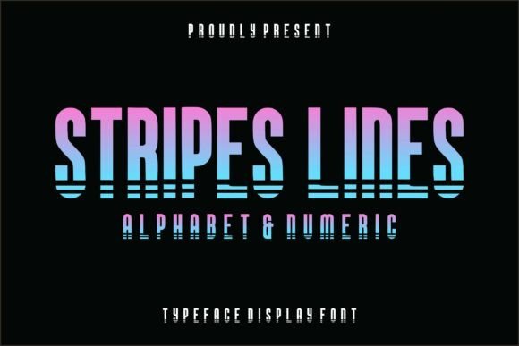
Stripes Lines uses horizontal cut‑outs to turn ordinary letterforms into a kinetic, techno‑styled display that suggests motion and circuitry without sacrificing readability. The striped treatment creates eye‑catching negative‑space patterns that look fantastic with neon gradients, glowing strokes, or layered glitch textures, making it a go‑to for posters, cover art, and any layout that needs a bold, modern accent.
Designed mainly for headline use, the set covers uppercase characters and numerals with careful spacing so the stripe motif survives at typical display sizes; it’s especially effective when paired with solid blocks of color or subtle grain backgrounds to amplify contrast. Try animating the stripes or masking bright gradients through the cut lines for dynamic social assets and motion graphics that demand an industrial, synth‑era edge.
╰┈➤ Download Stripes Lines Font
My Recommendation: I’d pick Stripes Lines for projects that need a striking headline with built‑in texture – album art, event posters, and eye‑catchy social banners are ideal. The cut‑out motif creates instant visual interest and adapts well to animated reveals or neon treatments. Use it when you want a single‑type solution that reads boldly at a glance while offering flexible styling opportunities.
22. Groptika Font
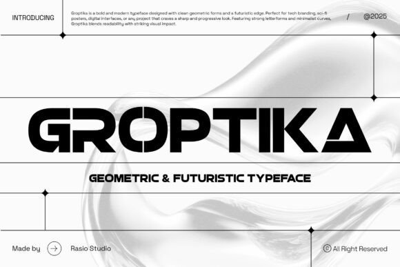
Groptika is a razor‑edged geometric sans with stencil-like interruptions that read like engineered typography; its angular terminals and broad counters create a forward-leaning personality that sits squarely among the best cyberpunk fonts for neon-lit identities. The design balances heavy strokes with precise negative space so the face retains legibility at large display sizes while projecting speed, aerospace tech, and a cinematic sci‑fi mystery.
Treat Groptika as a headline-only instrument: it excels on posters, team logos, and product hero art where every letter can act as a graphic element. Pair it with a neutral humanist or neo-grotesk for long copy, tighten kerning for compact badges, and exploit the gaps for animated reveals or printed die-cuts to maximize its dramatic, tech-forward presence.
My Recommendation: I would pick Groptika when a project needs an unapologetically modern, engineered headline that reads as part-icon, part-logo. Its stencil breaks give great scope for motion and merchandise treatments while its geometry keeps things readable at scale. Use it for esports, futuristic branding, or launch campaigns where boldness and technical attitude are the priority.
23. Zyper Font
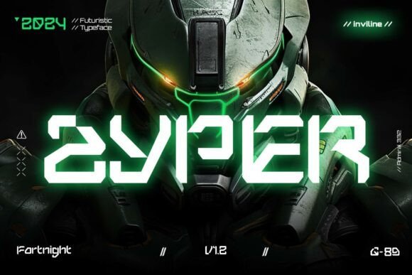
Zyper is a combat‑ready display face inspired by robotics, HUD overlays, and tactical hardware; acute angles and tight counters deliver an uncompromising, compact silhouette that feels like a visual instrument rather than a conventional type. Alternate glyphs and numeric treatments echo instrumentation readouts, giving designers modular pieces to craft lockups and on-screen status displays with military precision.
Because of its dense, engineered shapes Zyper behaves best at headline sizes and in short bursts of text-think game titles, packaging, or UI badges-where its assertive personality can dominate without sacrificing clarity. For balance, pair it with open, humanist body fonts and use letterspacing to avoid crowding when applied to condensed layouts or layered neon graphics typical of a gritty, retro-future aesthetic.
My Recommendation: I reach for Zyper when a design needs a no-nonsense, tactical edge-its HUD-inspired details make it perfect for posters, game branding, and tech product boxes. The alternates and numerals let you craft system-like layouts quickly, and its compact nature works well on gear labels and UI headers. Choose Zyper when you want typography that feels engineered, rugged, and instrumented.
24. Magister Font
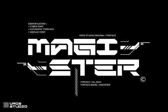
Magister is a streamlined display typeface built from simplified, futuristic shapes that prioritize clarity and modernism over ornamentation; its restrained curves and consistent stroke modulation create a clean, versatile voice for titles and logos. The overall cadence feels contemporary without being aggressive, making it a great choice when you want a sci‑fi vibe that leans polished rather than theatrical.
Use Magister for editorial headlines, apparel graphics, and web hero banners where subtlety is preferred over visual shock: it holds up well across thumbnails and billboards alike. Combine it with textured backgrounds or neon accents for a modern neo‑noir look, and exploit its open counters for tight uppercase lockups and minimalist logotypes aimed at tech lifestyle brands and streetwear collections.
My Recommendation: I would use Magister when a project needs a sleek, futuristic tone without shouting – it’s ideal for editorial covers, fashion labels, and clean tech branding. Its even rhythm makes it easy to pair with expressive imagery or neon accents while remaining legible in small and large formats. Choose Magister for work that demands modernity with composure and wide stylistic flexibility.
These 24 cyberpunk fonts provide a practical starting point for projects that need neon, tech, or dystopian energy. Apply the pairing suggestions and licensing notes to choose a face that reinforces your concept and supports your delivery channels.
Test several options in mockups, keep web-safe fallbacks ready, and bookmark favorites for future projects. Revisit this roundup whenever you need bold, future-forward typography and rapid implementation in 2026.