27 Top comic sans serif fonts for Friendly, Readable Design
Typography sets the tone — sometimes you need a friendly, informal look that still reads well. In this guide to comic sans serif fonts I present 27 well-crafted options, from cartoonish, hand-drawn sans to clean, modern playful sans styles, with pairing tips, ideal use cases, and licensing notes to help you choose the right face in 2026.
1. Yummy Cheese Font
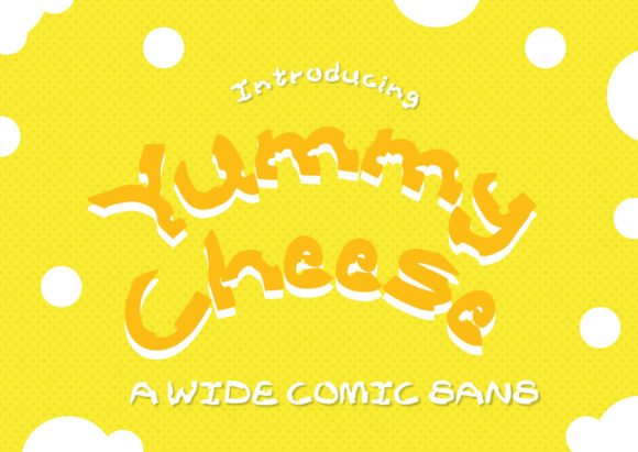
Yummy Cheese is a bold, wide display font that leans hard into a playful, hand-crafted aesthetic. Thick, uneven brush strokes give each glyph a chunky personality, while the deliberate indents and holes cut into characters make the letterforms literally resemble bits of Swiss cheese. The result is a comical, tactile look that reads as both friendly and whimsically imperfect — perfect when you want typography to feel approachable rather than polished. Unlike neat geometric sans options, Yummy Cheese celebrates irregular counters, lively baseline shifts, and an exaggerated x-height that keeps it readable at poster sizes while preserving its hand-drawn charm.
Technically, this font behaves like a specialty display face: it shines in headlines, packaging, and identity work where a cheeky, illustrative tone is required. Kerning is tuned for big, attention-grabbing settings, and the heavy strokes make it resilient in print and on-screen advertising; however, it’s not meant for body copy. Pair Yummy Cheese with a restrained neutral sans or a clean slab to balance the exuberance — let the type do the talking while the supporting type holds the line. Use cases that benefit the most include children’s menu design, snack packaging (especially dairy or cheese-themed products), playful posters, and comic cover art where a tactile, cartoonish voice is desired.
My Recommendation: I’d reach for Yummy Cheese when a project needs to smile out loud — think kids’ packaging, food festival posters, or quirky brand badges. Its distinctive ‘cheesy’ holes and hefty strokes give logos and headlines instant character, and it pairs well with minimalist body text so the overall layout doesn’t feel chaotic. If you want your design to feel hand-made, fun, and highly memorable, this is a worthy choice.
2. Doujinshi Sans – Regular Font
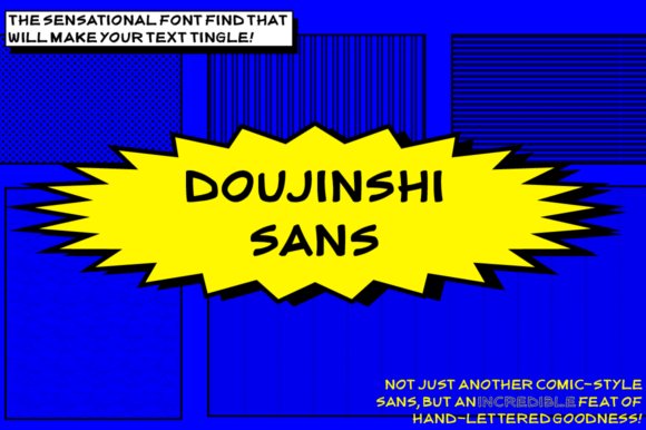
Doujinshi Sans Regular was crafted specifically for comic-style projects that require authentic, handwritten lettering for speech balloons and narrative panels. The designers built this face from the ground up to capture the casual, human rhythm of hand-drawn manga and indie comics, with open counters, rounded terminals, and slight irregularities that mimic a pen on paper. If you’re exploring comic sans serif fonts for sequential art or webcomics, Doujinshi Sans stands out because it balances readability in small sizes with the expressive quirks that give dialogue its personality — you get clarity without the robotic uniformity of a generic system font.
Beyond its use in speech and thought bubbles, this Regular cut is an excellent default for captions, credits, and UI elements tied to comic content. It includes character shapes optimized for fast-paced reading, deliberate stroke contrast to maintain legibility at low resolutions, and a neutral baseline that cooperates with balloon shapes and panel gutters. For creators working on manga translations, indie zines, or digital comic apps, Doujinshi Sans offers a neutral but warm voice that preserves the tone of hand-lettering while simplifying typesetting and localization workflows.
Download Doujinshi Sans – Regular Font
My Recommendation: I recommend Doujinshi Sans Regular when you want your comic pages or webcomics to feel handmade without sacrificing efficiency. Its balanced proportions and native comic sensibility make lettering faster and more consistent than drawing every word by hand. Use it for speech bubbles, caption boxes, and any project that benefits from a friendly, handwritten tone while keeping tight control over readability and layout.
3. Doujinshi Sans – Bold Italic Font

Doujinshi Sans Bold Italic transforms the understated charm of the Regular cut into an energetic, emphatic voice suited for action lines, sound effects, and punchy titles. The bold weight amplifies stroke thickness for dramatic impact, while the italic slant introduces motion and urgency — ideal for SFX lettering and emphatic dialogue. This variant preserves the hand-drawn humanism of the family but shifts emphasis: letters grow denser, counters tighten, and the slanted axis gives words a forward thrust that reads as excitement on the page.
Practically, Bold Italic works best at display sizes where its personality can breathe: panel headers, book covers, promotional banners, and dynamic in-panel effects where you need words to act like part of the illustration. It pairs well with the Regular cut for body speech or narration, creating a clear hierarchy between ordinary dialogue and shouted or action-oriented copy. From a production perspective, the Bold Italic is robust in print and digital exports, holding up in strong contrast situations and maintaining legibility even when layered over artwork or textured backgrounds.
Download Doujinshi Sans – Bold Italic Font
My Recommendation: I use Doujinshi Sans Bold Italic when I need typography to carry emotion — for onomatopoeia, emphatic captions, and energetic callouts. Its bold slant reads as movement, giving scenes a cinematic punch that flat upright text can’t match. If you’re designing comic covers, promotional art, or any layout where words must feel like part of the action, this style is a fantastic tool in your toolkit.
4. Standing Font
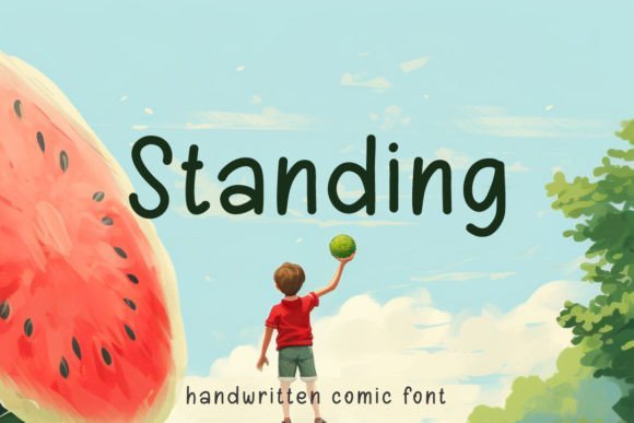
Standing is a compact, cheerful handwritten sans-serif that balances informality with strong legibility. Its rounded terminals and generous x-height give the face a friendly, approachable character while preserving clarity at small sizes — a rare combination in hand-drawn type. The letterforms are slightly irregular in baseline and stroke width, which reads as authentic handwriting rather than a mechanical script; this makes Standing feel at-home in comic panels, school worksheets, playful packaging, and social media headers. Technically, the font offers a full basic Latin set, numerals, punctuation, and a handful of alternates that soften repeated letterforms, reducing the monotony often associated with casual display faces.
From a design standpoint, Standing sits comfortably among comic sans serif fonts — its low contrast strokes and open counters are built for quick reading and high reproduction fidelity. Use it for speech bubbles, event posters, children’s book titles, and merchandising where warmth and friendliness are the goal. It pairs especially well with a clean geometric sans for body copy or a restrained slab for emphasis; the contrast helps the handwriting voice pop without overwhelming a page. For print and textile applications, Standing renders consistently when printed on textured surfaces or embroidered at medium sizes, and its robust shapes keep legibility under varying production conditions.
My Recommendation: I would reach for Standing when I need a genuinely handwritten vibe that still reads easily across media. It’s particularly useful for educational materials, kid-focused branding, and casual editorial headlines because it delivers personality without sacrificing readability. Use it when you want approachable, humanized typography that still performs in print and digital projects.
5. Rasha Font
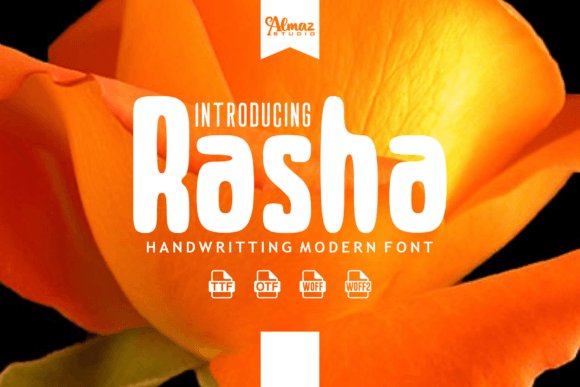
Rasha is a soft, hand-brushed sans serif with a playful weight and lively brush texture that reads as both handmade and contemporary. The strokes show subtle brush pressure dynamics—thicker downstrokes and lighter upstrokes—giving the letterforms a tactile, crafted feel that looks terrific on merchandise such as mugs, T-shirts, and tote bags. Because Rasha includes both uppercase and lowercase characters plus multilingual support, it adapts well to international packaging and greeting-card design. The glyph set also contains decorative alternates and ligatures that help you avoid visual repetition when a word appears multiple times on a layout.
Unlike uniform geometric sanses, Rasha brings a friendly irregularity that makes it ideal for playful branding, children’s product labels, and handmade craft projects. Its bold personality holds up in display sizes for logos and headers, while still looking convincing when scaled down for captions on stationery or social posts. In practical use, the font pairs beautifully with restrained serif or minimalist sans companions to create a balanced composition: let Rasha carry the emotional tone while a neutral type provides structure. It also performs well in print processes—screen printing and direct-to-garment reproduce the brush texture with flattering results.
My Recommendation: I’d choose Rasha when I want a bold, handcrafted statement that feels warm and energetic—perfect for boutique brands, gift products, or any design that needs a personal touch. Its brush details add authentic texture to merchandise and packaging, while the multilingual support keeps it useful for broader audiences. Use Rasha to inject friendly personality into logos, posters, or social campaigns that aim to feel artisanal rather than mass-produced.
6. Hello Graduation Font
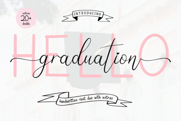
Hello Graduation blends a celebratory handwriting script with a companion sans style to offer a versatile toolkit for festive and youthful designs. The script side is fluid and expressive, full of swashes and ligatures that shine in display uses like headlines, invitations, and diploma-themed artwork. The sans companion provides a cleaner, more restrained counterpoint that works great for subheads and body copy, allowing designers to mix expressive flair with practical readability. Because the family is PUA encoded, accessing special glyphs and alternate forms is straightforward—great for designers who want to craft unique wordmarks or playful comic lettering without complicated software workarounds.
For projects that want to evoke the energy of comic books and playful branding, Hello Graduation comfortably sits in the conversation around comic sans serif fonts while offering far more nuance and decorative potential. It’s well-suited for posters, YouTube thumbnails, social media banners, and children’s book covers where a joyful tone and typographic personality are paramount. The typeface handles color backgrounds, textured paper, and printed collateral consistently, and its built-in alternates let you avoid repetitive letterforms in long headings or celebratory badges. When paired thoughtfully—script for display, sans for support—it produces lively layouts that still read clearly at a distance or on small screens.
Download Hello Graduation Font
My Recommendation: I’d use Hello Graduation for any project that needs to feel upbeat and approachable—graduation invitations and event posters are obvious fits, but it’s equally strong for animated social posts and youth-focused branding. The PUA encoding and alternate glyphs make it a designer-friendly choice when you want custom-looking typography without extra fuss. If you need festive, readable type that can switch between headline excitement and supporting clarity, this family delivers.
7. Gidzilla and Nightcrawler Duo Font
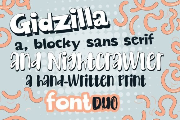
Gidzilla & Nightcrawler is a deliberately theatrical font duo that thrives on contrast. Gidzilla itself is a chunky, comic-inspired sans with heavy strokes and squared terminals that read with immediate authority at display sizes; it wants to be shouted from posters, banners, and playful packaging. Nightcrawler answers with an irregular hand-drawn print that feels like a loose marker sketch—its uneven stroke widths, slightly tilted characters, and irregular baseline introduce personality and an offbeat tension when paired next to the loud sans. Together the pair creates a layered visual hierarchy: Gidzilla anchors headlines with boldness while Nightcrawler supplies texture and human warmth for subheads, captions, or callouts.
From a practical perspective the duo performs best when used as a display combination rather than for dense body copy; the blocky Gidzilla loses nuance at micro sizes while Nightcrawler’s sketchy details can become noisy if overused. Experiment with heavy tracking on Gidzilla to emphasize its graphic shapes, and tighter kerning on Nightcrawler to preserve its scribbled rhythm. The set works especially well for children’s events, indie comics, Halloween promotions, and any brand that wants to pair cartoon energy with a homemade feel. If you need a type pairing that communicates both boldness and a handcrafted edge—without leaning on generic script fonts—this duo delivers clear utility and a lot of character.
Download Gidzilla and Nightcrawler Duo Font
My Recommendation: I’d reach for Gidzilla & Nightcrawler when I want loud, energetic messaging that still feels hand-made. Use Gidzilla for attention-grabbing headlines and Nightcrawler for playful annotations, RSVP cards, or comic-style speech bubbles. It’s particularly strong for kid-focused branding, party invites, and seasonal posters where contrast and personality matter more than rigid formality.
8. Nice Broy Font
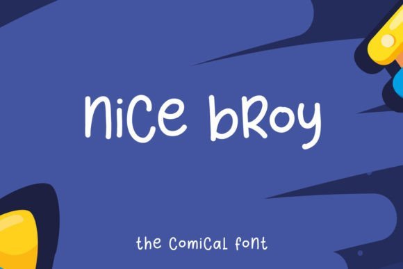
Nice Broy is a bubbly, friendly sans with a distinctly comic sensibility, built around wide counters and rounded terminals that make each glyph feel approachable and warm. The designer has prioritized an elevated x-height and open apertures, which improves legibility for short headlines, stickers, and on-screen captions while retaining a cute, hand-crafted demeanor. It pairs the visual shorthand of cartoon lettering—thick strokes, soft curves, and slightly irregular joins—with enough geometric stability to remain versatile across print and digital platforms.
In the landscape of casual typefaces, Nice Broy sits comfortably alongside comic and children’s display families and even earns a spot among more formal playful options because of its consistent spacing and stable metrics. If you search for comic sans serif fonts , Nice Broy is a modern take: it offers better proportions and crisper rendering than legacy comic faces, while keeping that cheerful vibe designers reach for in posters, school materials, and social posts. It’s an excellent pick for logo marks that need to feel friendly, editorial headers aimed at a young audience, or packaging that benefits from an inviting voice rather than a slick corporate tone.
My Recommendation: I recommend Nice Broy when your project needs to read as warm, informal, and energetic without descending into cliché. It’s especially handy for children’s books, classroom materials, playful branding, and any design that benefits from readable, smile-inducing typography. Pair it with a neutral slab or a simple script for accents to maintain readability while enhancing personality.
9. Bunny Font
Bunny is a lightweight display face that leans into soft curves and a bouncy rhythm to create an instantly adorable temperament. Its rounded terminals and slightly inflated letterforms give it the visual softness associated with mascots, nursery products, and lighthearted packaging—everything from lunchbox labels to splash screens for children’s apps. The font’s baseline bounce and occasional quirky terminals make it feel hand-assembled, which helps convey approachability and whimsy without relying on decorative swashes or heavy ornamentation.
Technically, Bunny performs best at headline and logo sizes where its character shapes can be appreciated; it isn’t intended for long paragraphs but excels in short bursts of copy, UI buttons, badges, and merchandise printing. Designers can exploit its playful proportions by pairing Bunny with a neutral sans for supporting text or a restrained serif for a nostalgic contrast. Colorful backgrounds, simple outlines, and soft drop shadows amplify its friendly tone and make it pop on social graphics, toy packaging, and kid-focused marketing collateral.
My Recommendation: I’d pick Bunny for projects that demand charm and immediate likeability—think toy branding, party invites, or cheerful app interfaces. Its rounded forms make it highly effective for logos and headlines aimed at families and children, and it pairs nicely with clean sans faces for body copy. Use bright palettes and generous tracking to let its personality breathe and maintain legibility at smaller sizes.
10. Busyman Font
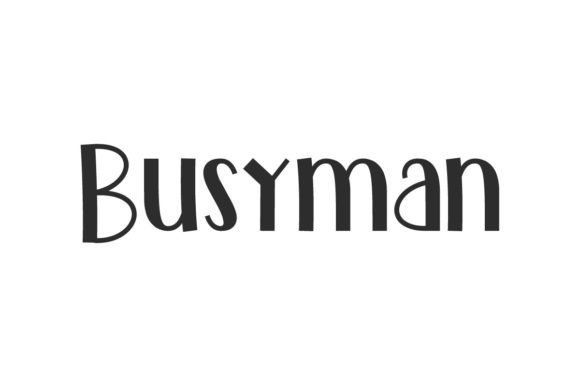
Busyman Font is a retro-contemporary display face that wears its playful heritage on its sleeve while remaining surprisingly modern. Its most distinctive visual trick is the asymmetric stroke treatment — one side of many letterforms reads bolder while the opposite side thins out — creating a tactile, slightly hand-made rhythm across words. That uneven stroke contrast gives Busyman an energetic personality: it reads as friendly and approachable rather than purely decorative. The letterforms feature a generous x‑height and open counters, which help keep the type readable at headline sizes even when the quirky stroke modulation is at its most pronounced.
Technically, Busyman behaves like a display family built for identity work: tight but considerate kerning, clear numerals, and punctuation that match the overall voice rather than fighting it. Because of its retro-but-clean proportions it pairs particularly well with neutral geometric sans fonts or a restrained slab serif when you want to balance whimsy with structure. Use it for logos, packaging labels, posters, stickers, and hero website headings where a nostalgic yet contemporary vibe is desirable. Designers will appreciate how Busyman can read both youthful and classic, making it a solid choice for boutique brands, food packaging, or any project that benefits from a warm, hand-tuned presence. And for teams assembling a type palette, Busyman serves as a strong display anchor that invites creative color and texture treatments without losing legibility.
My Recommendation: I recommend Busyman when you need a display face that feels both retro and fresh — it’s especially good for brand marks, product packaging, and posters that call for personality without sacrificing readability. Its asymmetric stroke treatment gives you built-in character, reducing the need for heavy illustration or extra ornamentation. Use it as a headline or logo font paired with a neutral body text face to keep layouts balanced.
11. Comic Font
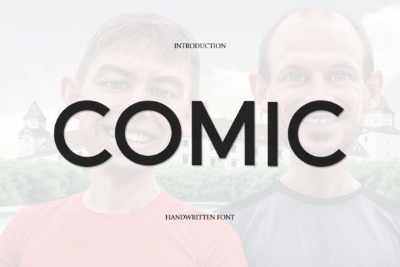
Comic Font is a clean, straightforward sans-serif designed around clarity and visual calm. It favors even stroke widths and balanced counters, making it a dependable choice for extended display use as well as longer reading contexts when space allows. The type’s measured proportions and moderate x-height yield excellent on-screen legibility; characters stay distinct at small sizes and remain unflustered in dense layouts. Unlike more expressive comic-style faces, this version leans into restraint: terminals are neat, spacing is rational, and overall temperament is unobtrusive, which is why it works so well across user interfaces, editorial subheads, and educational materials.
From a practical standpoint, Comic Font functions like a versatile system font for designers who prioritize neutrality with a hint of friendliness. It excels at interface labels, infographics, and signage where clean letter shapes avoid distraction while still feeling approachable. You can pair it with a warm serif for a humanist editorial system or with condensed display faces when you need headline impact without visual clutter. For teams building accessible digital experiences, Comic’s predictable kerning and careful hinting help maintain consistency across browsers and devices, making it a pragmatic choice for projects that demand reliability above flash.
My Recommendation: I’d reach for Comic Font when a project calls for clarity and warmth without stylistic baggage — think corporate learning platforms, apps, and informational collateral. It’s a workhorse: unobtrusive enough for long reading and tidy enough for UI labels. Pair it with a personality-rich accent face only where you want to introduce contrast.
12. Font for Fighting
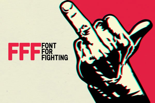
Font for Fighting is an intentionally provocative display type conceived as a visual megaphone: bold, direct, and slightly confrontational. Andrea Gaspari’s tongue-in-cheek framing of the face gives it a performative edge that reads like a shouted headline — letters are energetically weighted, with pronounced terminals and emphatic proportions that make short messages land with theatrical clarity. Where many comic-inspired faces aim for charm, this one tilts toward urgency; it’s built to support slogans, calls-to-action, protest posters, and any design that needs to look forceful while still readable. The glyph shapes favor impact over subtlety, offering solid presence at a glance.
If you’re surveying comic sans serif fonts as a group, Font for Fighting occupies the spot for rhetorical punch rather than casual friendly banter. Its robust letterforms ensure visibility across prints, posters, and social graphics, and the typographic voice works well in satirical, editorial, or activist contexts where the text itself is part of the message. For designers, the important technical wins are consistent stroke contrast and confident spacing that avoid muddiness when headlines are set at large sizes. Use the type sparingly as an attention-grabber — its theatricality makes it perfect for short, emphatic lines rather than long blocks of copy.
My Recommendation: I’d use Font for Fighting when a piece needs to read loud and unmistakable — political posters, campaign headers, or satirical headers are perfect fits. It’s uniquely effective for designs where the typography must carry emotional weight and urgency. Pair it with pared-back layouts and muted palettes so the type can do the heavy lifting without competing visual noise.
13. Bubble Lemon Font
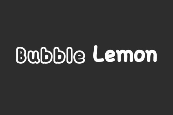
Bubble Lemon is a rounded, effervescent sans serif that leans hard into friendly geometry and generous counters. The letterforms are deliberately plump with soft terminals and slightly exaggerated bowls, which gives text an informal, approachable feeling without sacrificing legibility. Where many display sans faces push for modular strictness, Bubble Lemon keeps a hand-drawn warmth—perfect for birthday invitations, kid-focused packaging, or branding that needs to feel human and a touch nostalgic. The character set balances playful quirks (like a looping lowercase ‘g’ and wide-open ‘e’) with practical spacing, making it easy to set both short headlines and compact lines of body copy.
On the production side, Bubble Lemon behaves nicely in both print and screen contexts: hinting is optimized so strokes remain even at small sizes, and the generous x-height improves readability across UI elements and labels. Pairing-wise, it sings next to restrained serif faces or thin geometric sans fonts—use Bubble Lemon for display headlines and a neutral sans for supporting text to keep contrast. Designers will appreciate the flexible weight range and thoughtful kerning pairs, which let this font shift from playful poster art to modern toy branding without losing personality. If you need a fresh, upbeat display sans that avoids feeling gimmicky, Bubble Lemon delivers a lively, professional edge.
My Recommendation: I’d reach for Bubble Lemon when a project needs instant friendliness—children’s products, party collateral, or casual brand identities where warmth and clarity matter. Its rounded shapes make it feel modern and approachable, while the robust spacing keeps designs readable across sizes. Use it for headlines or logotypes paired with a subtle neutral text face to preserve hierarchy and keep things playful yet polished.
14. New Mode Comic Sans Font
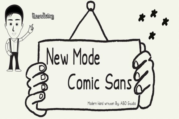
New Mode Comic Sans is a contemporary handwritten script that was engineered to be versatile across printed and digital touchpoints. It blends the looser, conversational rhythm of hand lettering with the structural consistency you expect from a modern typeface—so letters feel spontaneous without becoming unruly. If you’re evaluating casual display options, particularly when comparing comic and handwritten styles, and searching the landscape of comic sans serif fonts , New Mode stands out for its balanced stroke contrast and thoughtfully shaped terminals, which prevent the awkward, flattened look that plagues lesser casual scripts. The result reads as friendly and human, yet refined enough for packaging, social posts, greetings, and identity work.
Technically, New Mode offers a broad glyph inventory and helpful OpenType features—ligatures, contextual alternates, and multiple numeral styles—so it adapts to different layout needs from short headlines to product copy. On-screen rendering is smooth thanks to careful hinting, and the spacing has been tuned to avoid collisions in tight compositions like business cards or sticker art. For designers who want a lively handwritten voice without sacrificing typographic control, New Mode Comic Sans provides a reliable, characterful option that scales across formats while preserving its approachable charm.
Download New Mode Comic Sans Font
My Recommendation: I’d use New Mode Comic Sans when a project needs approachable, hand-crafted warmth but also precise typographic behavior—think boutique packaging, playful corporate collateral, or influencer social content. It’s especially handy for designers who want the casual look of hand lettering with the technical benefits of OpenType features. The font’s balance between spontaneity and structure makes it a go-to whenever you want friendly tone without compromising legibility or polish.
15. Doujinshi Sans – Bold Font

Doujinshi Sans – Bold was conceived specifically for comics and manga-inspired projects, where the weight and rhythm of letterforms must carry dialogue, sound effects, and narrative emphasis. The bold weight emphasizes clear on-paper contrast and reproduces crisply in black-and-white print, which is vital for traditional comic production and doujinshi self-publishing. Its strokes mimic hand-lettered brush and marker marks while retaining consistent counter shapes so word balloons and tight panel layouts remain legible even at small sizes. The face has a slightly condensed profile that helps save horizontal space without feeling cramped, a real advantage when typesetting columned text or multi-panel pages.
From a workflow perspective, Doujinshi Sans offers carefully tuned kerning and a compact glyph set tuned for English and commonly used special characters in fan comics, making it straightforward to drop into dialogue-heavy pages. The bold weight also doubles as a strong choice for expressive sound effects and chapter titles—its personality reads energetic and immediate, supporting the emotional tone of action or comedic beats. If you’re producing independent comics, translated manga, or editorial strips that need authentic, readable lettering with a distinctly handmade vibe, this font is engineered for that niche and performs confidently across both print runs and digital exports.
Download Doujinshi Sans – Bold Font
My Recommendation: I recommend Doujinshi Sans – Bold for creators working on comics, zines, or any sequential art where quick readability and expressive impact are essential. It’s built to stand up in tight panels and to handle both dialogue and loud sound effects gracefully. Use it when you want typesetting that feels handcrafted but still benefits from professional kerning and consistency—especially useful for indie manga-style projects and fan publications.
16. Doujinshi Sans – Hollow Italic Font

Doujinshi Sans – Hollow Italic reads like the kind of lettering that grew out of late-night fan comics and independent manga circles. The hollow italic treatment gives the strokes an airy, outlined feel that’s perfect for speech balloons, sound effects, and stylized captions where you want personality without overpowering artwork. This variant keeps a handwritten, slightly irregular rhythm across letters so that dialogue looks organic on the page, while the hollow counters maintain contrast against busy panel art. At display sizes the outline adds a tactile, hand-inked quality; at smaller sizes it still preserves readability because the letterforms are generously spaced and avoid overly thin strokes that could fill in when printed.
From a technical perspective, Doujinshi Sans strikes a practical balance between artistic flourish and typographic discipline. Kerning pairs are thoughtfully tuned for typical comic letter combinations, and the italic slant feels deliberate rather than mechanical — it leans into motion, which helps convey tone and energy in captions and exclamations. If you’ve ever wanted an alternative to common comic lettering that nods to Japanese doujinshi aesthetics yet feels at home in Western speech bubbles, this font sits squarely in that niche. As part of the broader family of comic sans serif fonts , Doujinshi Sans stands out for its outline styling and its emphasis on maintaining legibility in multi-panel layouts.
Download Doujinshi Sans – Hollow Italic Font
My Recommendation: I would reach for Doujinshi Sans – Hollow Italic when producing indie comics, zines, or any project where speech balloons and onomatopoeia need a hand-lettered look without sacrificing readability. Its hollow treatment makes sound effects and emphasis pop, and the slightly uneven strokes give dialogue a human touch that digital lettering often lacks. Use it for manga-inspired comics, playful posters, and print projects that must evoke fan-made energy while staying professional.
17. Roastery Font
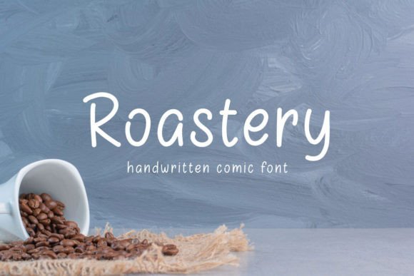
Roastery is a charming handwritten sans serif that balances cute, rounded letterforms with practical legibility. The overall construction favors a tall x-height and soft terminals, which means it reads comfortably on-screen and in print; whether used in narrative balloons, social media headers, or product packaging, Roastery conveys warmth without becoming cloying. Designers will appreciate how its gentle irregularities—slightly varying stroke widths and subtle baseline shifts—lend a human voice to text blocks, making it ideal for greeting cards, children’s projects, and informal logos that need approachable typography.
Beyond aesthetics, Roastery is versatile: it works as both a display face for titles and as a friendly body text at moderate sizes. The open counters and generous letter spacing keep text airy and prevent crowding when paired with photographic backgrounds or busy illustrations. For creative teams, Roastery pairs well with condensed sans-serifs or light modern serifs to create contrast in editorial layouts, posters, and merchandise. It’s an excellent choice for brands and creators who want a handwritten look that feels contemporary and polished rather than rough or overly decorative.
My Recommendation: I’d use Roastery on projects that demand a personable, modern handwritten voice—think café menus, event flyers, and comic captions for lighthearted material. Its accessible shapes make it a go-to for kids’ products and social posts where readability is essential. Pair it with a clean sans for body copy or with a subtle script for invitations to get the most out of its friendly character.
18. Sonata Font
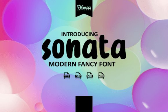
Sonata delivers a sweet, soft brush aesthetic but reads like a confident sans that’s been given a human touch. The brush-inspired terminals and rounded bowls create a playful aura that works especially well for merchandise, children’s book covers, and punchy headline work. Stroke contrast is restrained so that the font maintains clarity in comic panels and printed goods, and its lightly textured edges simulate natural brush pressure without becoming rough. This makes Sonata particularly effective for onomatopoeic effects, thumb-stopping social posts, and hand-lettered style titles where you want charm paired with professional legibility.
Technically, Sonata behaves like a robust display family: it’s bold enough to hold its own in apparel prints and mug decorations, yet nuanced enough to give stationery and interior prints an artisanal feel. The letter spacing leans open, which helps captions breathe inside speech bubbles and prevents ink-trapping on tighter print runs. In the landscape of comic sans serif fonts , Sonata stands out for its blend of brush warmth and sans clarity—bridging the gap between expressive, hand-drawn lettering and the structure designers rely on for consistent layouts. If you need a font that conveys friendliness while staying versatile across digital and physical media, Sonata fits that brief neatly.
My Recommendation: I’d choose Sonata for projects that require a handcrafted look but can’t sacrifice consistency—like T-shirt slogans, children’s covers, or boutique product branding. Its brushy charm adds character to headlines and sound effects while remaining stable for print reproduction. For best results, pair Sonata with a simple geometric sans for body text to preserve contrast and focus.
19. North Glamour Font
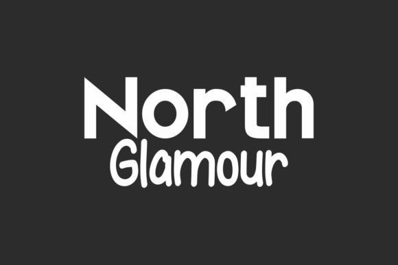
North Glamour Font arrives as a carefully balanced two-part system: a modern sans display and an informal comic handwriting script. The sans component reads clean and contemporary with a tall x‑height and modest stroke contrast that lends itself well to bold headlines, signage, and elegantly minimal packaging. Paired against it, the script brings an easy-going, human touch — loose terminals, slightly irregular joins, and playful letterforms that mimic quick pen strokes without sacrificing legibility. Together they create a sophisticated-versus-casual dialogue that feels curated rather than accidental, which is why this duo shines in lifestyle branding where personality matters as much as clarity.
On a technical level, the pairing performs across sizes: the display sans maintains crisp counters at large scales while the script scales down surprisingly well thanks to considerate overshoots and open counters. Designers will appreciate small extras like alternate characters, swash options for the script, and tightened kerning pairs that keep logotypes tidy. For applications from fashion lookbooks and florist hangtags to skincare labels and travel brochures, North Glamour offers a palette of moods — authoritative when you use the sans alone, intimate and handcrafted when the script leads, and lively when they mingle. If you need a type system that makes editorial spreads feel boutique or marketing collateral feel personable, this duo is a very practical and attractive option.
My Recommendation: I recommend North Glamour when you want high-impact branding that still feels approachable. Use the sans for structure and the script for accents — it instantly humanizes product names, callouts, and social media graphics. It’s especially useful for boutique retailers, indie publishers, and lifestyle services where a curated, handcrafted aesthetic supports the product story.
20. Weekend Cloud Font
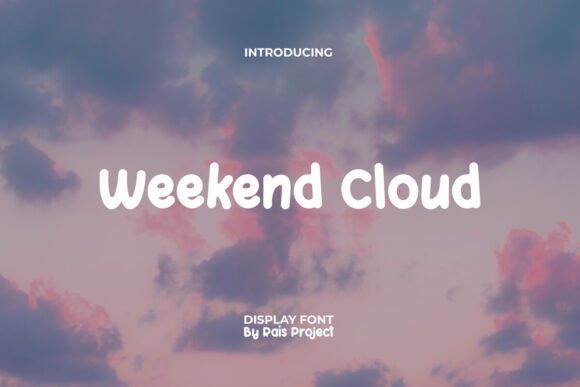
Weekend Cloud Font is a rounded, bubbly display face that channels an upbeat, cartoonish energy without feeling amateurish. The letterforms are short and cushiony with softened terminals and generous counters that create an irresistible hug of whitespace — perfect for headlines, children’s packaging, and cheerful brand identities. If you have been comparing warm, friendly typefaces, Weekend Cloud sits comfortably between naive hand lettering and polished display work; it keeps the spontaneity of comic lettering while offering balanced spacing and predictable metrics for layout work. Designers who want to inject optimism into flyers, stickers, or website hero sections will find its shapes evoke nostalgia and approachability in equal measure.
For anyone surveying comic sans serif fonts as part of a mood-board, this font is a more intentional alternative: it borrows the playful spirit often associated with comic lettering but adds consistent stroke weight and careful kerning that make it production-ready. The typeface includes full caps, numerals, punctuation, and basic diacritics, so it adapts well to short headlines and product tags. Because of its rounded geometry and short proportions, Weekend Cloud reads best in display sizes — think labels, signage, invitations, and social graphics rather than long paragraphs. Pair it with a neutral geometric sans or a subtle textured background to let the forms sing without competing visual noise.
My Recommendation: I’d pick Weekend Cloud when a project calls for joy and approachability — it’s my go-to for kid-focused products, playful restaurant menus, and event invitations that need a lighthearted tone. Use it for short bursts of copy where its rounded personality can do the talking. It’s particularly effective on packaging and social posts where a friendly face helps a brand stand out in a crowded feed.
21. Doodletoon Font
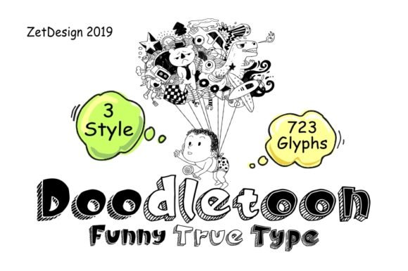
Doodletoon is a comic-style sans serif that leans into hand-drawn quirks while preserving the cleanliness of a modern sans. The letterforms show slight irregularities — off-kilter baselines, whimsical terminals, and variable stroke endings — all of which give text a crafted, illustrated feel without devolving into chaos. That balance makes Doodletoon especially useful for projects that need a playful voice but still require reliable legibility: think children’s activity books, comic strips, educational apps, informal branding, and quirky editorial headlines. Its personality reads as warm and imaginative rather than sloppy, which is a rare sweet spot for hand-influenced display faces.
From a technical viewpoint, Doodletoon includes a robust set of glyphs, punctuation, and several alternates for characters that benefit from variation (like a, g, and y), enabling designers to create slightly different looks across headings while maintaining a coherent identity. Kerning and hinting have been tuned for screen and print, so it remains friendly at web sizes and lively in print runs. When pairing, the typeface shines against a restrained serif or a geometric grotesque to give projects an energetic header without sacrificing a professional underpinning. If you need a type that communicates mischief and approachability but still respects layout rules, Doodletoon is a great creative tool to have in your kit.
My Recommendation: I’d reach for Doodletoon when a design needs a hand-illustrated charm that still behaves like a proper font — for example, children’s book covers, classroom posters, or quirky newsletter headers. It’s excellent for adding character to short headlines and product names without compromising on spacing or legibility. Use it as a headline accent paired with a neutral body face to keep projects playful yet readable.
22. Comic Font
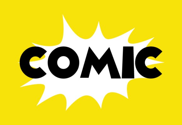
Comic Font walks a careful line between neat utility and playful informality. Its letterforms are built with soft terminals, open counters and modest stroke contrast, which makes reading at small sizes surprisingly comfortable while still carrying that casual, hand-lettered energy designers reach for when they want friendly personality. As one of the accessible comic sans serif fonts , Comic avoids aggressive quirks in favor of measured spacing and predictable shapes, so it reads well on screen, in print, and in application UI where approachability matters.
Beyond legibility, Comic is versatile: it performs as a headline voice for children’s books and educational materials, yet it also adapts to event flyers, social media graphics and packaging that benefit from a less formal tone. The font’s consistent x-height and moderate kerning reduce the fiddly adjustments often required with novelty typefaces, making it quicker to work into layouts. Pair it with a neutral geometric sans for body text or a light script for accent lines to create lively—but balanced—compositions. Licensing tends to be straightforward and its readability across resolutions makes it a solid pick when you want a cheerful sans without sacrificing clarity.
My Recommendation: I reach for Comic Font when a project needs to feel open, friendly, and instantly relatable without becoming gimmicky. Its clean construction speeds up layout work and reduces the need for micro-kerning, which is great for tight deadlines. Use it on children’s worksheets, playful branding, or social posts where warmth and readability must coexist.
23. Birthday Comic Font
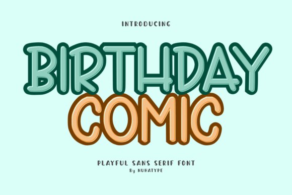
Birthday Comic is a warm, handmade-style sans serif that channels handwritten notes and scrapbooking stickers with charming, rounded strokes. Each glyph feels deliberately casual—slightly irregular terminals and subtly varied stroke widths give the font a crafted, human touch that reads as both familiar and approachable. This softness makes it especially well suited for print projects aimed at families and educators, such as worksheets, classroom signage, party invitations and personalized planner pages where friendliness and legibility go hand in hand.
Aside from its aesthetic, the font is designed with practical use in mind: its simple, unembellished forms cut cleanly on Cricut and Silhouette machines, and the clear spacing prevents small interiors from closing up during vinyl or cardstock cuts. It also scales predictably across sizes, so you can trust it for everything from tiny labels to bold poster headers. Pair Birthday Comic with a delicate script for celebratory headlines or a thin geometric sans to keep a modern balance—either way, the handcrafted character makes any DIY or craft-forward project feel instantly more personal.
My Recommendation: I recommend Birthday Comic for hands-on projects where a human touch matters—think stickers, party invites, planners and teaching resources. Its cut-friendly shapes save time for crafters and its friendly tone keeps materials approachable for kids and parents alike. If you want a type that feels homemade without sacrificing clean reproduction, this font is an excellent choice.
24. Honolulu Font
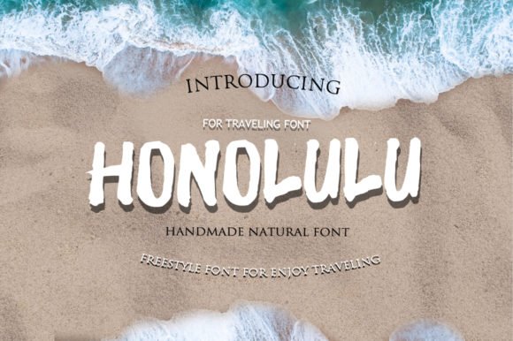
Honolulu Font brings a light, breezy disposition to the sans category while retaining a distinct comic-inspired warmth. The characters are airy, with generous counters and softly rounded corners that communicate playfulness without tipping into cartoonish territory. Thanks to its gentle strokes and high x-height, Honolulu works exceptionally well in short bursts—think captions, callouts, and speech bubbles—where a casual voice lifts the tone of designs without overwhelming other elements.
Technically, Honolulu is optimized for clarity across digital and print contexts: hinting and spacing ensure crisp rendering on low-resolution displays, and its restrained personality makes it easy to pair with more structured typefaces when a design requires hierarchy. Use it for children’s app interfaces, lifestyle branding with a relaxed identity, or editorial sidebars that benefit from an informal accent. Its lightweight charm keeps designs feeling modern and friendly while still remaining functional and readable at a variety of sizes.
My Recommendation: I use Honolulu Font when I want typography that feels sunny and informal but still polished enough for professional layouts. It’s especially effective for kid-focused interfaces, relaxed lifestyle brands, and any project that needs a gentle, comic-leaning voice. Choose Honolulu when you want to add warmth and openness without compromising on legibility or cross-medium performance.
25. Daily Bold Font
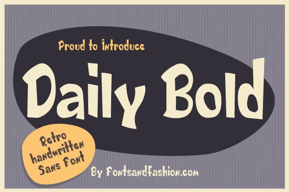
Daily Bold is a confident display type that channels the optimism of 1950s–60s advertising without resorting to kitsch. The letterforms are broad and muscular, with a high x-height and tight counters that give headlines a compact, attention-grabbing silhouette. Subtle rounded terminals and slightly flared strokes nod to vintage comic lettering and sign-painting traditions, yet the overall construction feels modern and disciplined rather than merely retro novelty. Because of its heavy footprint and clean shapes, Daily Bold performs exceptionally well at large sizes where texture and absence of fine detail are advantages — think posters, storefront signage, and package fronts.
Under the hood, Daily Bold balances personality and utility: its consistent stroke weight keeps legibility intact across bold color fields, and its generous spacing prevents letters from collapsing when used in all-caps logos. Designers will appreciate how the type’s mid-century character pairs beautifully with delicate scripts or thin geometric sans-serifs for supporting copy, and how it accepts texture well — try layered halftones or subtle grain for authentic period feel. While it’s not intended for long paragraphs, Daily Bold is a versatile tool for branding, apparel graphics, beverage labels, and any project that benefits from a nostalgic yet assertive display voice.
My Recommendation: I reach for Daily Bold when a project needs the warmth of mid-century design combined with modern clarity. Its retro-inspired forms give brand marks and packaging an immediate personality while staying legible at large scales. Use it when you want a headline that feels familiar and trustworthy but still contemporary — perfect for boutique products, posters, and retro-themed campaigns.
26. Volcazo Font
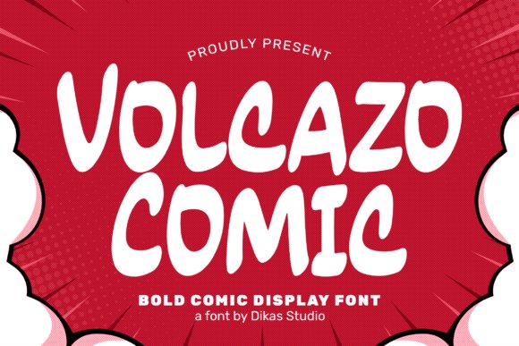
If you’re hunting for alternatives to comic sans serif fonts that still carry a playful, handcrafted spirit, Volcazo is a strong contender. The font radiates cheerful energy through rounded terminals, slightly irregular stroke endings, and compact proportions that read as both informal and purposeful. Its lively shapes make it easy to quickly convey lightheartedness without sacrificing clarity; reading at a glance remains simple because the characters maintain clear, distinct counters and well-calibrated spacing. Volcazo’s design feels hand-drawn rather than mechanically rounded, which gives it the human touch many brands seek when they want to feel approachable.
Volcazo works especially well in environments that require bold expression: comic strips, children’s product packaging, playful signage, and social graphics where personality must be immediate. It pairs nicely with neutral body fonts when you need a fun headline that doesn’t overwhelm the rest of the layout. Technically, Volcazo’s bold weight and generous letterforms make it ideal for large-format prints and animated titles in motion graphics, while its friendly tone also adapts well to stickers, badges, and on-screen UI when used sparingly for emphasis.
My Recommendation: I’d pick Volcazo when a project needs to convey friendliness and energy without feeling amateurish. It’s my go-to for children’s brands, casual social campaigns, or any creative piece that benefits from a lively, hand-lettered aesthetic. Use Volcazo for headlines, logos, and short bursts of copy where personality matters most.
27. Spagbowl Font Family
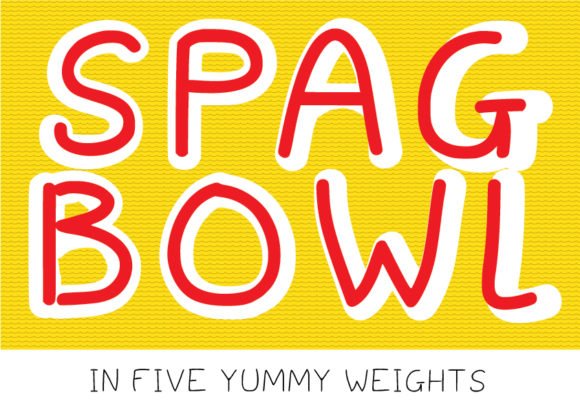
Spagbowl is a two-part display family that combines a chunky hand-lettered regular with a matching outline companion to create playful, food-themed typographic treatments. The base weight leans toward a slightly wobbly, hand-sketched aesthetic, with bulbous terminals and a buoyant rhythm across the glyph set that evokes casual handwriting and cartoon lettering. Because the family includes an outlined partner built to the same metrics, designers can layer the fills and outlines for instant depth and charm — an especially effective trick for menu headers, product labels, and food packaging where tactile and appetizing typography can influence purchase decisions.
Beyond its immediate culinary character, Spagbowl’s warmth makes it useful in any project that benefits from a whimsical, approachable voice: children’s menus, pop-up cafe signage, playful apparel, and event posters. The outlined variant lends itself to multi-color printing techniques and spot varnish treatments, while the solid weight holds up on small merch like stickers and buttons. Although reminiscent of casual comic lettering, Spagbowl is a deliberately crafted replacement for crude off-the-shelf options, offering tighter spacing, consistent stroke control, and a considered set of alternate glyphs to keep layouts feeling hand-made but professionally resolved.
My Recommendation: I use Spagbowl when I want typography to feel homemade and fun, but still polished enough for retail or printed collateral. The paired outline and solid fonts make it simple to create layered, colorful type treatments without wrestling with mismatched metrics. It’s ideal for cafés, food trucks, children’s packaging, and any project where a friendly, tactile headline will sell the experience as much as the product.
Whether you’re designing a kids’ book, a comic strip, or an approachable brand identity, this list gives practical, vetted choices and pairing advice so you can select a comic-style sans that fits your project and audience.