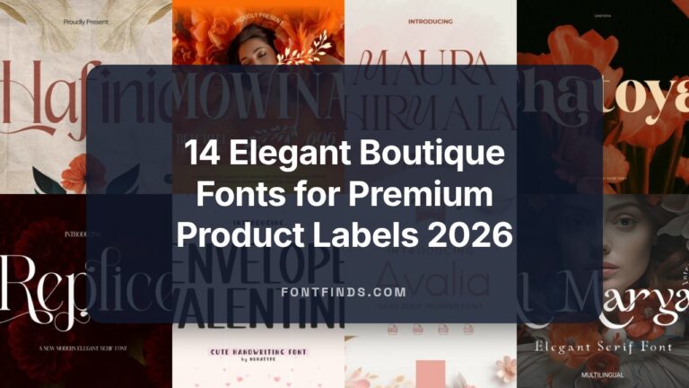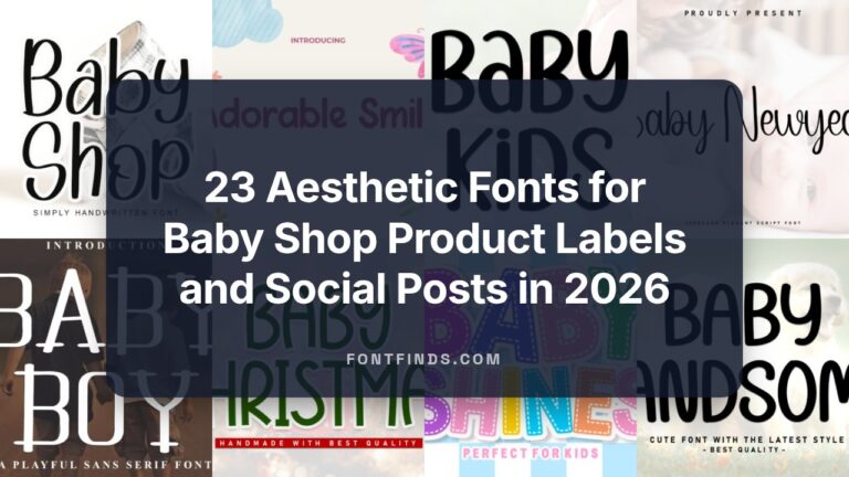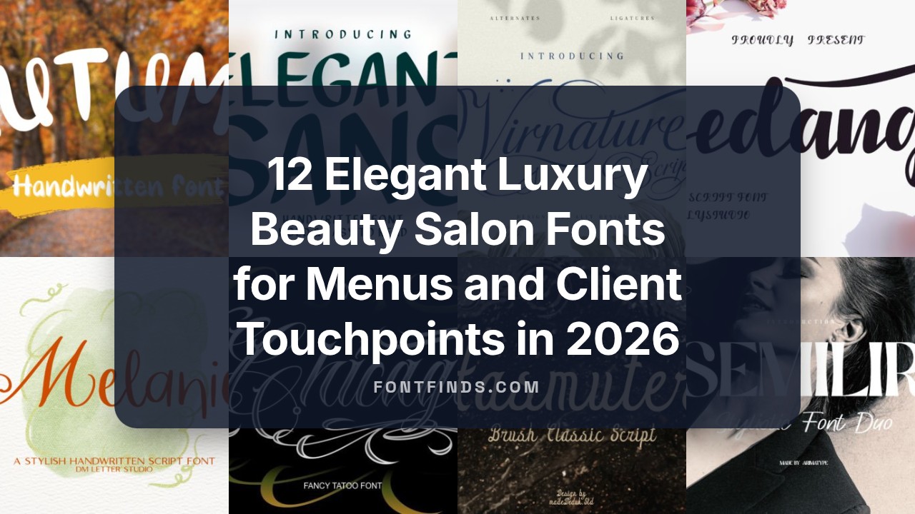
12 Elegant Luxury Beauty Salon Fonts for Menus and Client Touchpoints in 2026
If you’re updating branding or physical materials, luxury beauty salon fonts give an immediate sense of care and style to clients. The right typeface sets tone across menus, signage, social posts and booking interfaces without extra words.
Below you’ll find 12 options spanning elegant scripts, modern serifs and clean sans faces-each noted for legibility at different sizes and paired uses. I point out weight choices, spacing tips and mood fits so you can match type to your salon’s atmosphere and clientele.
1. Mollani Font
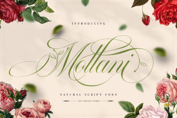
Mollani marries flowing calligraphy with delicate botanical motifs, most notably leaf ornaments that thread through capitals and swashes to create a refined, organic voice. PUA encoding gives designers immediate access to alternates, ligatures and swash sets without extra tools, which speeds layout for branding aimed at upscale spas and salons. The overall attitude reads polished and natural, positioning it well among luxury beauty salon fonts for logos, packaging and storefront signage.
OpenType features include discretionary ligatures, contextual alternates and stylistic sets so you can tune ornamentation to scale and medium. Kerning and moderate stroke contrast preserve legibility on embossed stationery and shopfront lettering, while the botanical details add visual interest without dominating copy. Pair Mollani with a restrained sans for body text or a thin modern serif in editorial spreads to keep the script from competing with surrounding elements.
My Recommendation: I reach for Mollani when a brief calls for upscale organic character-the leaf swashes feel deliberate, not gimmicky. The PUA setup saves time during production, especially on packaging or menu layouts. It’s a strong fit for high-end salons, boutique spas, wedding suites and any brand that wants a botanical, refined signature.
2. Virnature Font
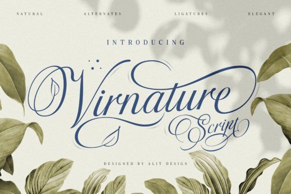
Virnature reinterprets elegant script traditions with a quieter botanical sensibility, integrating small leaf accents into lowercase joins rather than relying on dramatic capitals. Every swash and alternate is PUA encoded, allowing quick access to curated ornamentation without hunting OpenType panels. The tone sits between craft and polish, making it suitable for product labels, boutique branding and salon collateral that prefer understatement over flourish.
Stroke modulation leans toward a soft brush texture that keeps headlines readable on screens and print while preserving a handmade quality. For layout work, pair Virnature with neutral sans serifs or light condensed faces to maintain airiness; in print, subtle foil or spot gloss highlights will pick out the tiny leaf details. The font performs best where clarity matters but a handcrafted hint is desired.
My Recommendation: I choose Virnature when a project needs gentle botanical cues rather than overt ornamentation; it’s ideal for organic skincare lines, boutique hair studios and eco-minded salon menus. The PUA glyphs speed up compositing and the softer strokes translate well at small to medium sizes. Use it when you want warmth without excessive decoration.
3. Someday Font
Someday presents a lively, hand-drawn script with a relaxed baseline and visible stroke irregularities that read as human rather than mechanical. Its personality ranges from playful to intimate, which makes it versatile for seasonal campaigns, kid-focused merchandise and casual stationery projects without feeling forced. The family includes alternate characters so you can mute the quirks for longer text or crank them up for display pieces.
Thanks to its informal rhythm and slightly rough edges, Someday excels on textured materials like kraft tags, embroidered patches and ceramic mugs where totally clean scripts can feel sterile. Combine it with a clean geometric sans for modern contrast in social graphics, or keep palettes muted so the hand-lettered charm takes center stage. For quick, warm branding and lifestyle creatives, Someday brings a handcrafted attitude that reads approachable across print and digital media.
My Recommendation: I use Someday when a brief calls for personality and approachability-its irregular strokes make designs feel hand-crafted and sincere. Alternates let me dial the level of playfulness, and the font holds up across stickers, invites, apparel tags and social posts. Choose Someday for friendly, casual brands or seasonal promotions that benefit from an informal, human touch.
4. Gedang Font
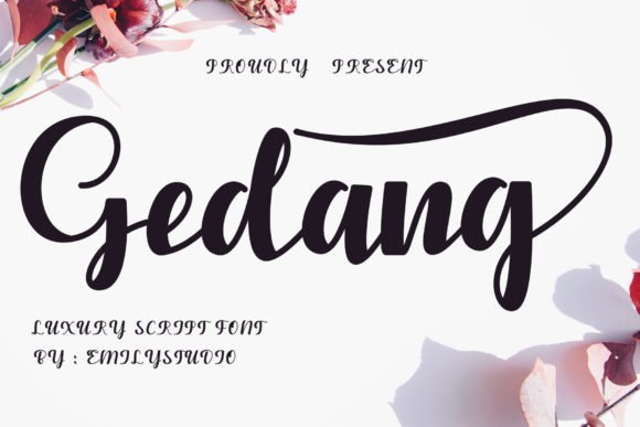
Gedang is a bold, elegant handwritten script with confident strokes and sweeping swashes engineered for high-impact display work. It arrives PUA‑encoded so every alternate glyph, ligature and decorative swash is immediately accessible inside apps that support private use characters. If you’re designing for high‑end spas or boutique brands, Gedang slots naturally into collections of luxury beauty salon fonts used on packaging, ads and storefront lettering.
Use Gedang at large sizes for hero headlines, product names and window vinyl where its contrast reads as polished hand‑lettering. Pair it with a pared‑back geometric sans to preserve legibility, add metallic foiling or emboss for tactile premium finishes, and give extra tracking for airy logotypes; the swashes work beautifully for monograms and signature marks.
My Recommendation: I pick Gedang when a brand needs confident, handcrafted character without losing polish. The PUA glyph set saves time and encourages creative wordmarks and labels that feel bespoke. It suits boutique salons, premium product packaging and campaigns that want expressive, handmade lettering with a luxury finish.
5. Melanique Font
Melanique is a soft, flowing script that recreates refined handwriting with gentle connectors and graceful terminals. Its rhythmic strokes are ideal for romantic layouts-wedding suites, boutique signage and beauty product labels-where typography should feel personal yet composed. The letterforms balance delicate hairlines with sturdier joins, producing a signature-style appearance that reads especially well in short names and callouts.
Installation is straightforward across Canva, Photoshop and Illustrator, and the font’s ligatures and alternates can act as a handcrafted logo without heavy embellishment. For best results use Melanique for names or standout quotes, add subtle letter‑spacing for an airy feel, and keep backgrounds uncluttered so the script’s flow stays legible and elegant.
My Recommendation: I reach for Melanique when a project needs a feminine, intimate voice that retains professional polish. It speeds layouts because the font itself creates mood, so you spend less time layering effects. Perfect for wedding stationery, beauty boutiques and soft‑luxury product labels where a handwritten signature matters.
6. Gift Font
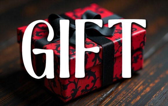
Gift is a bold, hand-drawn serif that communicates celebration through slightly irregular serifs and lively stroke contrast. It performs strongly on posters and packaging, giving seasonal campaigns and birthday announcements a warm, handcrafted tone. Set against textured paper or saturated color blocks the letters gain personality and immediate presence.
Treat Gift as a display headline and pair it with a neutral sans for supporting copy to preserve readability. It harmonizes nicely with flowing scripts or ribbon illustrations, making it a go-to for gift tags, festive stationery and promotional headers where friendly, readable type is needed.
My Recommendation: I use Gift when a design needs upbeat personality without sacrificing clarity. It’s especially useful for holiday or promotional work where warmth and legibility matter most. Pairing it with a delicate script or simple icons gives greeting cards, gift tags and salon promos a charming, handcrafted finish.
7. Hasmuter Font – luxury beauty salon fonts
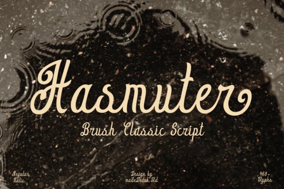
Hasmuter channels a 1970s brush-script character with deliberate, looping strokes and slightly roughened terminals that read as warm vintage glam; this personality makes it a natural pick among luxury beauty salon fonts for logos, salon signage, and product labels. The letterforms balance flourish and control, offering optional swashes and contextual alternates that let you dial in either a playful headline or a more composed logotype.
Use Hasmuter large for marquee headlines and packaging, then pair it with a spare sans for secondary copy to avoid visual clutter. Its hand-brushed texture performs especially well on textured cardstock, embossed foil, and social banners where tactile presence matters.
╰┈➤ Download Hasmuter Font – luxury beauty salon fonts
My Recommendation: I reach for Hasmuter when a brand needs nostalgic charisma without feeling informal. Its brushy motion gives beauty identities a human touch, while the alternate swashes allow polished treatments for premium labels. I’d use it for salon marques, boutique product lines, and event invitations where character and legibility must coexist.
8. Semilir Font
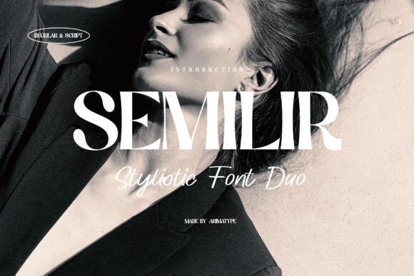
Semilir combines a sturdy geometric serif with an affectionate script to create a two-part typographic voice that feels simultaneously structured and intimate. The serif anchors headlines and blocks of text with measured proportions, while the script overlay provides signature-like moments through ligatures and stylistic alternates suited to beauty branding and boutique packaging.
Pair the serif base for menus, price lists, and body copy, and deploy the script for names, monograms, or accent lines to produce contrast without discord. The family’s OpenType features let you swap letter endings and flourishes for custom wordmarks and charming product labels.
My Recommendation: I’d choose Semilir when a project needs both dependability and personality in one package. It’s excellent for wedding stationery, boutique beauty labels, and cafés that want a handcrafted yet readable look. Mixing its serif and script always yields cohesive, memorable branding treatments.
9. Classy Bundle Vol. I Font Bundle
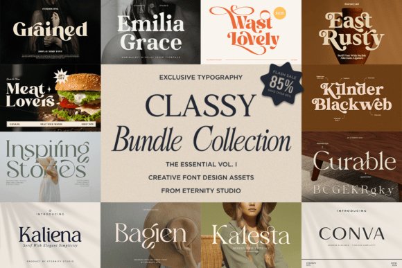
Classy Bundle Vol. I gathers retro display faces with refined serif and script companions to give a range of tonal options from nostalgic to polished. The collection includes display weights with distinctive characterful shapes plus more restrained serifs and flowing scripts that work together to create layered, editorial-style layouts.
Designers will find it useful for logos, packaging, posters, and social formats where a consistent voice across headlines, subheads, and signature marks is needed. Mix a bold retro display for attention, a serif for supporting text, and a script for decorative accents to craft cohesive brand systems quickly.
╰┈➤ Download Classy Bundle Vol. I Font Bundle
My Recommendation: I recommend this bundle when you need a compact toolkit that covers multiple brand moods without buying separate families. It’s especially handy for projects that call for retro personality alongside refined typography, such as boutique labels, editorial spreads, and lifestyle packaging. The variety lets you build consistent identities across print and digital touchpoints.
10. Elegant Sans
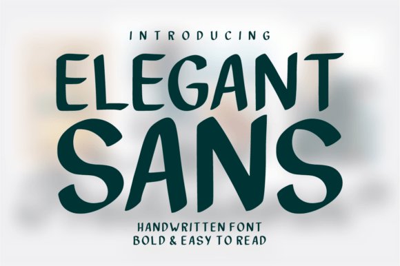
Elegant Sans is a modern handwritten sans that balances clean geometry with warm inked strokes. Its medium-to-heavy stems and open counters deliver strong legibility across print and screen, while subtle terminals preserve a handcrafted feel. Elegant Sans sits naturally among luxury beauty salon fonts, where restrained curves and confident letterforms read particularly well at headline and signage sizes.
The family includes short swashes and alternate glyphs that add personality without breaking alignment, making it suited to logos, packaging, and polished social headers. Kerning and spacing are tuned to perform on labels and banners as well as on tight mobile layouts. Use it when you want a personal signature that still behaves like professional typography.
My Recommendation: I reach for Elegant Sans when a project needs warmth without losing clarity. Its handwriting hints soften clean layouts, which makes it ideal for salon menus, Instagram headers, and product tags. For boutique identities that require readable display type with a handcrafted edge, this font saves time and looks deliberate.
11. Chicago Font
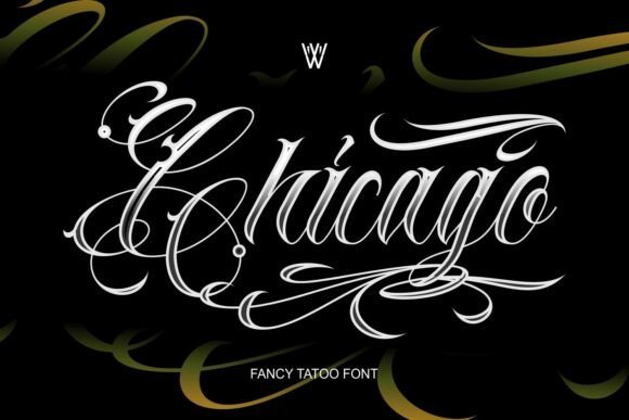
Chicago Font bundles bold blackletter, sweeping script, and Chicano calligraphy styles into one collection built for dramatic display work. The blackletter cuts are dense and ornamental, while the script choices supply flowing swashes and contextual alternates to craft custom lettering. Each style includes layered shapes and stylistic sets that let designers build unique marks for tattoos, apparel, and posters.
This collection thrives at large sizes – editorial covers, album art, and mascots where character matters – but demands careful spacing when used smaller. Pairing these pieces with a neutral sans helps them read as intentional rather than overpowering. Tattoo artists and streetwear labels will value the expressive forms for logo work and flash sheets alike.
My Recommendation: I keep Chicago Font handy for projects that need bold personality and historic flavor, especially streetwear and custom tattoo lettering. The bundle offers immediate options for logotypes or emblem work, and the calligraphic styles are great for hand-rendered badges. It’s best for designers who enjoy fine-tuning letterforms to match an attitude.
12. Allyssum North
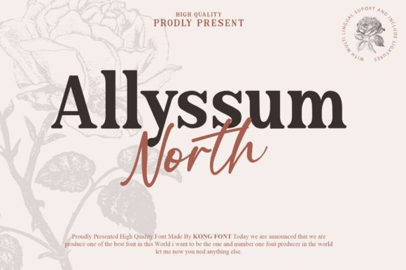
Allyssum North pairs a refined serif with a flowing modern script to form a cohesive type duo suited to sophisticated print and digital identities. The serif anchors hierarchy with steady rhythm and readable proportions, while the script supplies lively connections and decorative swashes for focal phrases. Both faces ship with OpenType features so you can access ligatures, alternates, and small caps for polished layouts.
Because the script is PUA-encoded, designers can access its glyphs without extra font utilities, which speeds production of wedding suites, boutique stationery, and editorial covers. The contrast between the structured serif and the expressive script creates immediate personality without taxing legibility. It’s a practical option when you want classical polish balanced with handcrafted detail.
My Recommendation: I choose Allyssum North when a brand needs both authority and a personal touch, such as boutique identities, invitations, and premium labels. The serif organizes content while the script provides signature moments, so hierarchy comes together quickly. The accessible glyph set makes it straightforward to craft ornate headers and delicate accents.
Choosing the right luxury beauty salon fonts brings cohesion between online booking, printed menus and in-salon signage. Prioritize clarity for pricing and service descriptions, then layer in a characterful headline face for personality.
Use these selections as a practical starting point: test font pairings at actual sizes, check contrast against your palette, and refine tracking and line-height until text reads smoothly across touchpoints.