12 Bold Modern Logo Font to Build Recognition in 2026
Modern logo font choice sets the tone for every mark, from app icons to bottle labels. Contemporary typefaces – from crisp geometric sans to soft rounded logotypes – affect readability at small sizes and the emotional tone a brand sends.
This article presents 12 curated typefaces with clear notes on weight, spacing, and pairing so you can test options fast. Expect specific tips for condensed marks, display wordmarks, and neutral brand faces you can trial on real mockups.
1. Grebavi | Modern Logo Typeface
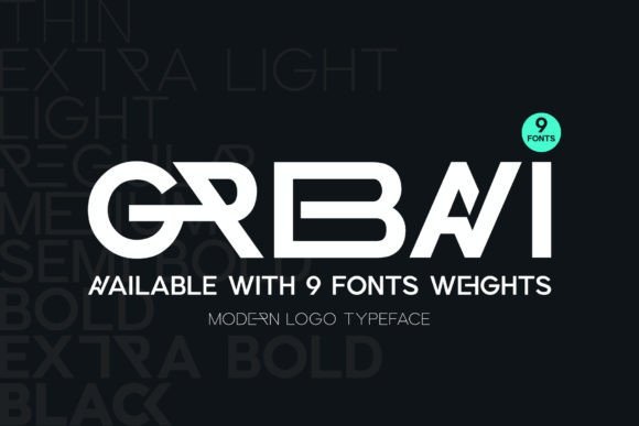
Grebavi is a well-balanced sans serif with a minimalist, iconic voice crafted for clear brand marks. As a Modern logo font it emphasizes open counters, a generous x-height and a useful ligature set that lets you create variations in seconds by swapping alternates. The letterforms feel deliberate and measured, with tight kerning and predictable metrics that suit compact logotypes and monogram work.
Reach for it when you need legible wordmarks across print, web and labels – from packaging to social headers. The alternate glyphs and ligatures speed up mockups and reduce manual edits, while the neutral tone pairs cleanly with bold imagery or muted color systems. Its geometry also performs well at small sizes, which helps maintain consistency across brand touchpoints.
╰┈➤ Download Grebavi | Modern Logo Typeface
My Recommendation: I use Grebavi when a client wants a minimalist identity that reads clearly at any scale. The ligature options let me produce distinctive logo variations fast, which shortens feedback loops. It’s ideal for startups, product labels and editorial brands that need a modern, no-frills wordmark.
2. Silkydusk Font
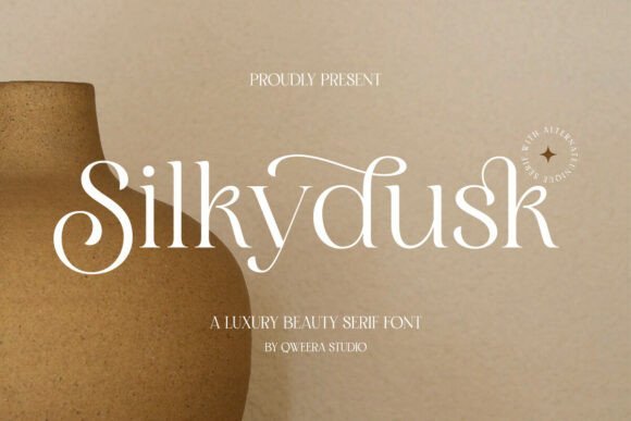
Silkydusk Font is a luxury-minded serif built for refined logo work and editorial headlines. Smooth curves, graceful alternates and delicate ligatures give it a poised, upscale presence suited to fashion labels, invitations and premium packaging. The family ships in OTF, TTF and WOFF formats and includes multilingual glyphs so it works for international identities.
Moderate stroke contrast keeps headlines readable without appearing heavy, while alternate characters let you add subtle personality to monograms or submarks. Pair it with a neutral sans for long-form copy to maintain hierarchy and let the serif carry the visual tone. Kerning is even and predictable, so spacing tweaks are minimal.
My Recommendation: I recommend Silkydusk when a project needs an elegant, editorial face that reads like a boutique label. The alternates make it easy to craft unique logotypes without hand-drawing every curve. Best for luxury boutiques, wedding suites and magazine mastheads where refined detail matters.
3. Bimolla Font
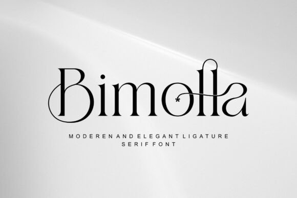
Bimolla Font presents a restrained serif voice that balances classic letterforms with subtly modern terminals. Generous counters and measured serifs lend a quiet elegance suited to wedding stationery, premium packaging and boutique branding. Alternates and ligatures give designers the tools to build initials and stamps that feel hand-crafted rather than mechanical.
The family performs well at large display sizes for signage and at small sizes for labels thanks to open apertures and careful hinting. It handles diacritics and non-Latin glyphs cleanly, which is useful for global projects, and the weights stack nicely for logos with stacked words or sublines. The rhythm favors modest letterspacing to keep block settings composed and readable.
My Recommendation: I pick Bimolla when a brief calls for a timeless, approachable identity with character in the details. Its alternates are perfect for monograms and seals that need to look bespoke. Great for premium product lines, boutique hospitality and printed invitations where craft and legibility are priorities.
4. Lamora Font
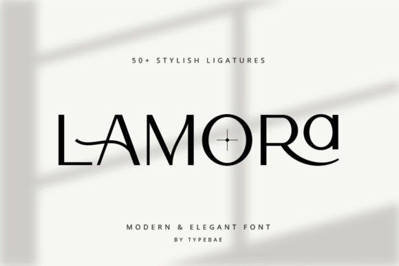
Lamora is a sensibly refined Modern logo font that pairs subtle contrast with crisp terminals to produce a high-end logotype feel. The letterforms sit slightly condensed, offering a confident silhouette while preserving legibility at small sizes. OpenType alternates and neat ligatures let you shape a bespoke mark quickly without heavy ornamentation.
Thoughtful kerning and spacing make Lamora read cleanly on labels, business cards, and web headers, while its balanced proportions handle both single-letter monograms and stacked wordmarks. The package includes stylistic sets, currency, and punctuation glyphs to cover most branding needs, so you can achieve a polished, premium look without custom drawing.
My Recommendation: I’d reach for Lamora when a project calls for understated prestige and a memorable logotype. Its alternates and ligatures save time when shaping initials or wordmarks, and it retains clarity across print and digital media. I’ve used similar faces for fragrance, boutique hotel, and artisan packaging briefs where refined restraint matters.
5. Elmorin Font
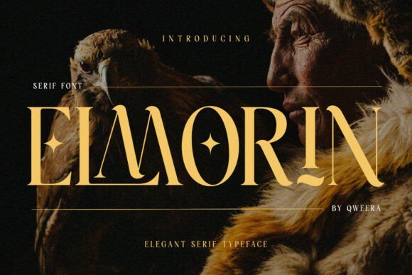
Elmorin Font channels classical serif proportions into a typeface that reads like modern editorial with a whisper of antiquity. High contrast between stems and hairlines gives headline treatments dramatic presence, while softened terminals help longer text remain comfortable to read. The overall voice leans literary and considered, ideal for projects that require storytelling through typography.
Elmorin ships with alternates, swash options, and PUA-encoded glyphs for quick access to ornaments and ligatures, speeding layout work on printed and digital pieces. It performs well on covers, labels, and formal invitations where a historic cast is required without feeling dated. Use it when a brand or publication needs a poised, characterful serif to carry tone and authority.
My Recommendation: I like Elmorin for editorial and heritage-brand projects because it offers both character and readable structure. The swashes and PUA glyphs make it easy to add personality without extra design lifts. I would pick it for museum programs, fashion lookbooks, and upscale packaging where typography must speak with history and clarity.
6. Bigoba Font
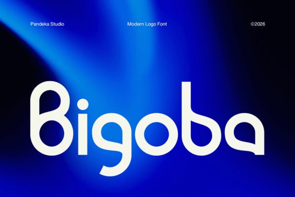
Bigoba Font is built on geometric shapes and fluid curves to create a forward-looking display face suited to bold logo work. Wide counters and rounded terminals lend a friendly but technical tone, helping marks feel distinct and contemporary at headline scale. Its identifiable terminals often become the recognisable element of a logomark when used large.
The design favors a single confident weight and generous x-height, so it reads crisply in UI headers, product labels, and splash screens. Tight kerning pairs and a stable baseline make layout decisions straightforward, and the face pairs well with neutral sans bodies for extended text. Reach for it when you need a clean, tech-leaning identity that’s simple to apply across media.
My Recommendation: I’d choose Bigoba for startups and tech products that want a clean, modern persona without being cold. Its geometric forms create memorable marks and scale smoothly from icons to posters. In practice I use it for app headers, packaging, and any project that benefits from a sharp, minimal display type.
7. Modern Royale Font – Modern logo font
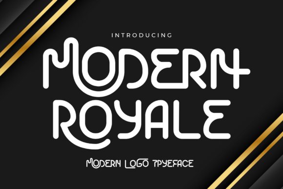
Modern Royale balances playful curves with restrained geometry, giving wordmarks a friendly yet refined voice. The letterforms show open counters and subtle flares that read as handcrafted without losing clarity; as a Modern logo font it holds up at tiny sizes and commands attention on signs and social headers. The overall rhythm is roomy enough to breathe but compact enough to feel intentional.
Alternates and tightened kerning make compact monograms simple to assemble, while rounded terminals soften bold headlines for approachable branding. Use a neutral geometric companion for body text to keep communications legible and focused. The family’s single-weight approach keeps toolkit decisions minimal while offering a distinctive signature for boutique labels, editorial covers, and product badges.
╰┈➤ Download Modern Royale Font – Modern logo font
My Recommendation: I reach for Modern Royale when a brand needs a warm, human touch without appearing casual; it brings personality to logos while remaining disciplined. Its alternate characters let me craft small, memorable wordmarks quickly. Best for lifestyle labels, indie boutiques, cafés, and editorial brands that want approachability with a neat, professional finish.
8. Meptora Font
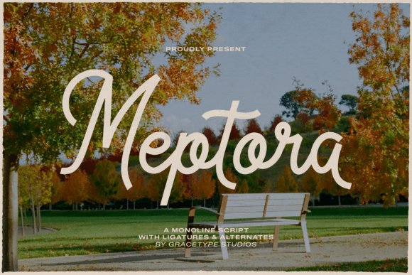
Meptora is a monoline script that channels practiced handwriting with calm, consistent strokes that retain excellent legibility. Generous ligatures and alternate glyphs create natural connections so extended words feel fluid rather than repetitive, making the face ideal for packaging headlines and social-art quotes. The tall x-height and gentle slant keep loops readable on screens and print alike.
Spacing and kerning behave predictably, which makes Meptora comfortable to use across multiple layout sizes without frantic tweaking. It’s a great choice where handcrafted personality is wanted but custom lettering isn’t feasible. Pair it with a plain sans for body copy so the script can act as a warm accent across menus, product tags, and invitation suites.
My Recommendation: I use Meptora when a project needs a handcrafted look that still scales cleanly-menus, artisan labels, and boutique event invites benefit from its charm. The ligatures let me shape small typographic gestures that read like bespoke lettering. Combine it with restrained sans faces to preserve readability while enjoying the script’s friendly character.
9. Mordash Font
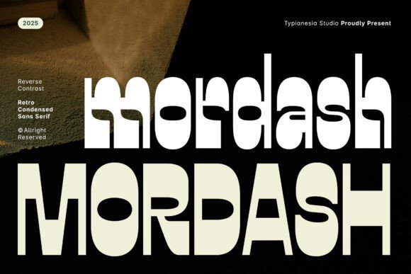
Mordash brings a bold, retro energy through tall, condensed letterforms and a reverse-contrast skeleton that flips expected stroke behavior. Rounded terminals introduce a softer edge, so the type reads loud without feeling harsh, perfect for posters and storefront lettering that need to land from a distance. The condensed widths let you gain headline presence in tight horizontal spaces.
This display face performs well in hospitality and lifestyle branding where a strong throwback signal is part of the identity. It pairs effectively with thin geometric sans or light serif accents to create contrast across collateral. Use it on merchandise, event posters, and coffee packaging to give a nostalgic but decisive voice to your mark.
My Recommendation: I pick Mordash when a project calls for immediate visual impact with retro personality-its condensed, reverse-contrast shapes are built to dominate headlines. The design is especially useful on limited real estate like can labels, signage, and stickers where presence matters. Ideal for cafés, venues, and seasonal campaigns that want a confident, vintage-leaning tone.
10. Germany Duo
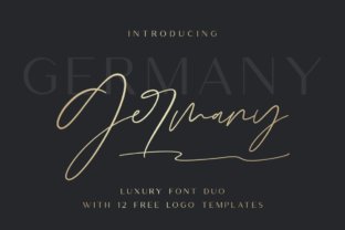
Germany Duo pairs a clean, free-flowing script with a high-contrast sans and a delicate monoline companion, giving designers a rich set of contrasts and moods. The package includes an uppercase-only sans, a ligatures variant, and monoline cuts that work together to create tight wordmarks and expressive logotypes. As a Modern logo font option, the duo balances ornament and restraint so brand marks read well at small sizes and hold personality at large scales.
Included are twelve editable logo templates that demonstrate smart pairings and provide quick starting points for brand identity, wedding stationery, social posts, and product labels. The kerning and alternate glyphs simplify creation of custom swashes and ligatures without manual tinkering. For projects that need a luxe yet readable presence, Germany Duo supplies both flair and control.
My Recommendation: I reach for Germany Duo when a project needs an expressive signature without sacrificing legibility. The combination of script and structured sans offers flexible hierarchy: use the script for the primary mark and the sans for secondary wordmarks. The editable templates speed up concepting, making it ideal for fashion, hospitality, events, and boutique product lines.
11. Ragyola Font
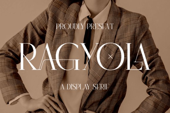
Ragyola is a serif with a poised silhouette that blends classical proportions and contemporary contrast, well suited to headline and title work. Letterforms show subtle bracketed serifs and refined terminals that convey authority and style across covers, posters, and brand marks. Its weight distribution and sculpted counters make it an appealing choice for elegant logos, book titles, and fashion identity systems.
Because Ragyola excels at display sizes, tight tracking and careful kerning will preserve its sculpted shapes; pair it with a neutral sans for extended reading. OpenType features such as small caps and alternate numerals (when present) broaden its use in editorial and packaging contexts. It fits labels, magazine mastheads, and boutique identities that want a classic voice with a current edge.
My Recommendation: I would choose Ragyola when a project needs a serif that reads like heritage but stays modern. Its proportions bring cinematic presence to headlines without feeling ornate. This typeface is a smart pick for luxury goods, editorial titles, and brands seeking a refined, readable headline treatment.
12. Gares Font
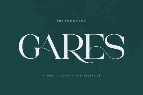
Gares is a bold serif that combines assertive stroke weights with refined terminals, producing a confident display face for logos and packaging. Built-in ligatures and carefully sculpted joins add personality while keeping letterforms legible at larger sizes. The overall effect reads as contemporary refinement-strong in presence but measured in detail.
Use Gares where brand identities must command attention, such as shopfronts, product labels, and fashion editorials; its geometric undertones pair cleanly with minimalist layouts. Optical spacing works well for headline work and can be tightened for compact wordmarks, so test a few tracking settings for crisp lockups. Pair the heaviest weights with a lighter sans companion to preserve hierarchy across collateral.
My Recommendation: I rely on Gares when a project calls for a serif with clear personality and dependable legibility. It performs well on packaging and title work where the type must carry the brand voice. For labels, editorial spreads, and bold identity systems, Gares offers character without compromising structural clarity.
Picking the right Modern logo font reduces guesswork and keeps marks legible across touchpoints. The short notes and examples here are meant to be a practical shortlist you can apply directly to mockups and prototypes.
Run side-by-side trials with a neutral sans, a condensed display, and a softer humanist face to see which fits your product’s character. A brief comparison will point you to the strongest option for your needs.