27 Clean Minimalist Monospace Fonts for Code Editors and UI Mockups in 2026
The list below highlights minimalist monospace fonts built for clear, compact layouts and forgiving letterforms. These monospaced choices are ideal for terminals, code editors, labels, and microcopy where alignment and rhythm matter.
Each entry includes a quick note on weight options, license status, and pairing ideas so you can judge fit fast. Expect a mix of open-source and commercial faces with an emphasis on clean metrics, consistent glyph shapes, and punctuation clarity.
1. Mono Vensca Space
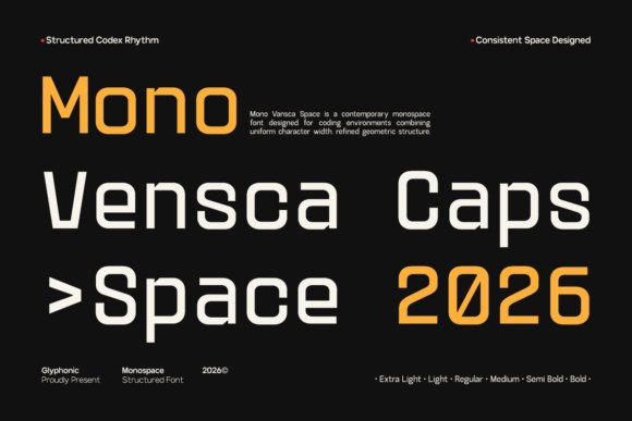
Mono Vensca Space pairs measured geometry with subtle terminal cuts to produce a clinical, readable monospace that feels contemporary rather than decorative. Its disciplined metrics and equal character widths make it a natural choice among minimalist monospace fonts for code editors, terminal themes, and compact UI components. The type’s steady rhythm reduces eye fatigue during long reading sessions and preserves alignment in dense tables.
The family offers open counters and clear punctuation so symbols and accented glyphs remain distinct when scanning logs or technical manuals. Fine-tuned hinting and uniform stroke widths help it render crisply at small sizes on high-density screens. I also appreciate how it balances density and whitespace, giving dense data visualizations a calm, ordered appearance.
╰┈➤ Download Mono Vensca Space
My Recommendation: I reach for Mono Vensca Space when a project needs modern fixed-width clarity that reads comfortably at tiny sizes. It performs especially well in command-line tools, dashboard tables, and code screenshots because alignment stays predictable and readable. Use it when you want a futuristic yet pragmatic monospace that keeps content highly legible.
2. Column Font
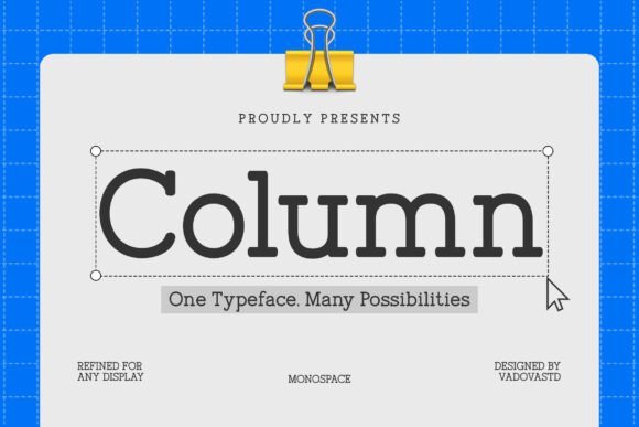
Column Font brings serif detailing to a fixed-width format, giving monospace a more editorial voice while keeping programmatic alignment intact. The design uses moderate contrast and broad apertures so punctuation, numerals, and diacritics remain legible across scripts. Its structured forms and generous x-height make columns of text both readable and visually distinct in print or on screen.
Because each glyph occupies the same horizontal space, Column Font lets code blocks read like typographic components within reports and brand materials without feeling misplaced. Serif terminals introduce a warm, professional character that pairs well with classical display faces and neutral UI sans. I often find it useful for academic papers, white papers, or any publication that combines narrative text with aligned technical samples.
My Recommendation: I choose Column Font when a project needs technical precision with a formal, editorial tone. It tames long blocks of aligned text while adding a refined texture that suits documentation and branded collateral. Ideal for white papers, developer guides, and identities that want a composed, typographic personality.
3. Monoglyphic Font
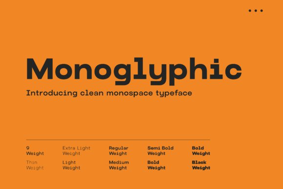
Monoglyphic is built around absolute clarity: high x-height, open apertures, and strict spacing make each glyph immediately recognizable. The design differentiates zeros from Os and keeps punctuation clean, which speeds up reading of code, hashes, and serials. Neutral stroke contrast means the type stays visually quiet and reliable across contexts.
It holds up well in terminals, web editors, and UI mockups, scaling consistently across pixel densities and sizes. Monoglyphic suits technical interfaces, data dashboards, and pixel-art inspired layouts where fixed-width rhythm is central to the look. Practical touches like tabular numerals and considered spacing make long sessions of code reading less taxing.
My Recommendation: I use Monoglyphic when legibility under constraint is the top priority; it excels in terminal themes, code samples, and dense dashboards. Its neutral voice keeps attention on content rather than decoration, which is perfect for documentation and developer tools. Pick it when you need a dependable, unassuming fixed-width face that performs across screens.
4. Heaven Mono
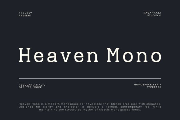
Heaven Mono is a monospace serif that balances technical precision with a refined, readable voice. Its steady proportions, crisp terminals, and restrained serifs set a calm rhythm across code blocks and editorial text, placing it among minimalist monospace fonts while keeping a distinct humanist touch. Subtle stroke contrast and open counters preserve clarity at small sizes and give headlines a composed, sophisticated tone.
Practically, its consistent metrics make columnar layouts and UI mockups simple to manage, and the italic and alternate sets introduce personality without breaking grid logic. The face reads reliably in documentation, IDE themes, and brand materials where a bit of warmth is wanted alongside strict alignment. It pairs especially well with neutral grotesques for labels and with heavier display faces for logotypes.
My Recommendation: I reach for Heaven Mono when a project needs technical clarity with a soft editorial character-think developer docs, product interfaces, or tech magazines. Its serif details provide voice for headings while the monospaced rhythm keeps code samples tidy. For brand work that wants precision without austerity, this font is a strong choice.
5. Tanaka Font
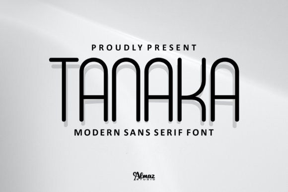
Tanaka is a condensed, monospaced sans that makes efficient use of horizontal space while projecting bold graphic personality. Narrow letterforms and tight tracking allow for dense headlines and compact labels without losing impact, and distinctive terminals give it a memorable silhouette at display sizes. The design is geared toward short-form text-posters, badges, and logos-where each character must do visual work.
Because it lives in a tight width, careful attention to hinting and spacing is important at small sizes, so test it at the final output dimensions. Uppercase sets and stylistic alternates make Tanaka especially useful for short wordmarks, game overlays, and merch. Pair it with a more open body face to maintain reading comfort in longer passages.
My Recommendation: I’d pick Tanaka when space is precious but the typography needs to be assertive-poster headlines, product labels, or compact UI elements. Its condensed stance gives instant graphic presence while conserving layout real estate. Use it alongside a roomy text face so long reads remain comfortable.
6. Brixela Font
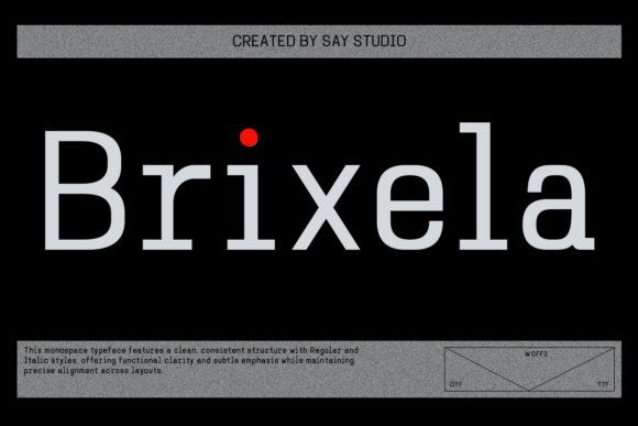
Brixela leans on geometric construction and uniform glyph widths to deliver a clean, technical look suited to modern interfaces. Monoline strokes and precise terminals create an orderly texture that reads well in dashboards, code samples, and data-heavy layouts where alignment matters. The family’s regular and italic styles preserve structural clarity while allowing modest emphasis without upsetting rhythm.
It excels with numerical tables and tabular figures, and its neutral proportions make responsive grids simpler to manage across screens. Designers will value consistent metrics that reduce guesswork when aligning components and creating motion sequences. The type feels composed in motion graphics and visualizations where steady rhythm is visible frame to frame.
My Recommendation: I reach for Brixela for admin panels, analytics dashboards, and product interfaces where precise alignment and numeric clarity are priorities. Its predictable metrics make responsive layout work more reliable, and the tabular figures are especially handy for finance or reporting screens. For a softer finish, combine it with a warmer humanist face for body copy.
7. Brutalist Bold
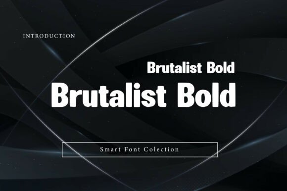
Brutalist Bold lands with architectural force: wide, blocky forms and blunt terminals give headlines an unmissable silhouette while keeping letter shapes legible at a distance. The low contrast and engineered counters favor posters, mastheads, and interface hero sections where clarity under scale is non-negotiable. Its industrial attitude reads modern without relying on decorative flourishes, making it a strong choice when you need text that behaves like built structure.
Paired with minimalist monospace fonts, Brutalist Bold creates a disciplined two-tier system where the headline provides mass and the monospace supplies measured detail-ideal for tech identities and editorial grids. Pay attention to tight tracking at display sizes and consider slightly looser kerning for body-size applications to avoid visual crowding. Use the heaviest weights for wayfinding and signage, midweights for website banners, and reserve thin accents for contrast where legibility permits.
My Recommendation: I reach for Brutalist Bold when a project needs unmistakable presence-product launches, event posters, or bold brand headers. It holds up at large sizes and pairs well with restrained type for supporting text, giving designs a clean but muscular hierarchy. If you want typography that reads as structural and modern, this font delivers consistently across print and screen.
8. Arsenov Font
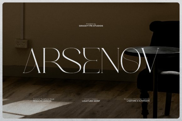
Arsenov trades neutral restraint for personality: wide proportions and crafted ligatures give the typeface a bespoke, hand-lettered veneer while remaining firmly rooted in serif traditions. Sharp terminals and rounded bowls sit in deliberate tension, producing letterforms that feel archival yet forward-looking; the unexpected joins in its ligatures create focal points that carry emotion across a headline. The result is a serif that works as a statement piece rather than a background performer.
Use Arsenov in settings where the typography must convey narrative-editorial spreads, posters, or cinematic title sequences-because its distinctive details reward close reading and large-format use. It pairs neatly with monospaced faces or clean sans-serifs when you want contrast between expressive display and neutral support. For branding, pick a single weight for logotypes and let the ligatures do the expressive work rather than overloading with multiple styles.
My Recommendation: I’d choose Arsenov for projects that need character and a hint of theatricality-art exhibitions, magazine covers, or premium labels. Its ligatures and wide stance help create memorable headlines without additional ornament. Work the font into a restrained palette and let its letter shapes define the tone.
9. Monoskrn Font
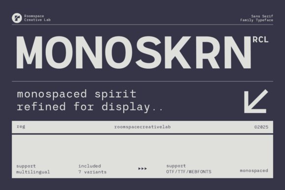
Monoskrn channels a coder’s precision with a softer, more readable edge: it mirrors monospaced rhythm but relaxes proportions for improved legibility in UI and long-form text. The consistent x-height and engineered spacing give interfaces a steady visual cadence, while the clean terminals and subtle humanist touches prevent the mechanical coldness of true fixed-width faces. It’s a practical pick when you want the technical aesthetic without compromising reading speed.
The family ships in OTF, TTF and webfont formats and offers multiple weights that adapt to dashboards, packaging, and editorial uses, so you can keep a coherent system from small labels to large headings. Because it reads more naturally than strict monospace, Monoskrn suits apps, developer tools, and tech brands that need clarity across responsive breakpoints. Pair it with a neutral sans for copy or a display serif for contrast when you want hierarchy without clutter.
My Recommendation: I use Monoskrn when a project needs that coding vibe but must remain user-friendly-product UIs, documentation, and dashboard designs are perfect fits. Its balanced spacing keeps interfaces calm while preserving a crafted, architectural feel. For brand systems that want technical credibility without the sterility of fixed-width type, Monoskrn is my go-to.
10. Beluga Mono
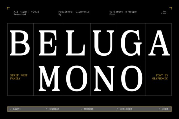
Beluga Mono pairs the steady rhythm of a fixed-width grid with refined serif terminals, positioning it firmly among minimalist monospace fonts that balance mechanical order and typographic warmth. Its modest stroke contrast and open counters keep characters legible at small sizes, while the serif details provide a quiet voice in headlines and captions. The even spacing enforces tidy alignment for tables and code blocks without making text feel cramped or overly mechanical.
Designed to perform on both screen and paper, Beluga Mono handles running copy, labels, and tight UI elements with consistent rhythm and clear punctuation. Distinct terminals reduce glyph ambiguity in dense numerical layouts, making it practical for editorial work, technical documentation, and premium brand systems. Pair it with a neutral sans for modern contrast or let the serifs lead in luxe identities and structured interfaces.
My Recommendation: I reach for Beluga Mono when a project needs mechanical precision softened by character. Its serif quirks make code blocks and tables feel more hospitable, and the fixed-width grid keeps alignment predictable. Use it for magazines, high-end tech identities, dashboards, or anywhere exact columns and a refined tone must coexist.
11. Byte Square
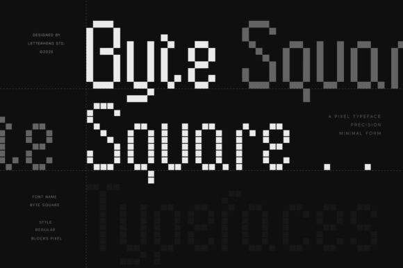
Byte Square distills pixel logic into a monospaced display where every glyph sits on a strict block grid, recalling early 8-bit fonts without feeling fussy. The uniform square strokes and consistent rhythm make it legible at low resolutions and visually striking at large sizes. PUA-encoded alternates and blocky stylistic sets give designers playful options for logos, in-game HUDs, and retro UI components.
This display font thrives in gaming art, event posters, and merch that lean into digital nostalgia while keeping a clean, minimal aesthetic. Its rigid construction eliminates awkward kerning choices, which simplifies layout decisions for pixel-style menus and large-format signage. Use bold tracking and pared-back color palettes to amplify the blocky character without cluttering compositions.
My Recommendation: I use Byte Square when a project asks for authentic pixel-driven character; it reads clearly at small sizes and makes a bold statement at headline scale. It’s ideal for indie game branding, retro-tech posters, and interfaces that nod to classic consoles. The PUA glyphs let me experiment fast with alternates and decorative shapes.
12. Monoscope Font
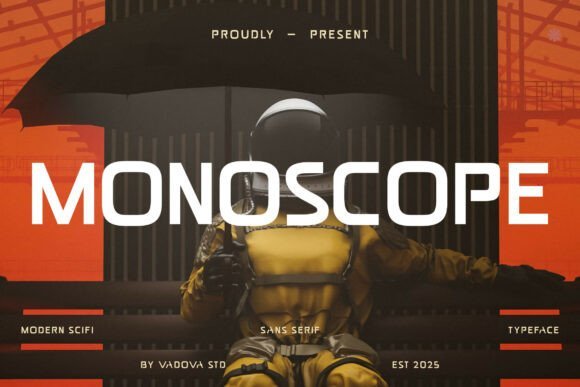
Monoscope Font is an all-caps sans serif built with geometric precision and sharp angles that give headlines a tech-forward attitude. Its strict monospace spacing and uniform proportions create a mechanical cadence that suits coding-themed visuals and sci-fi identities. Condensed letterforms deliver dense, impactful lines while maintaining clear letter recognition across display sizes.
Best applied to short headlines, product headers, and interface labels, Monoscope reads like engineered lettering made for emphasis rather than long copy. It pairs effectively with softer humanist faces or rounded iconography to offset its angularity and prevent visual fatigue. The result is a bold, direct voice that cuts through busy layouts and strengthens brand presence.
My Recommendation: I pick Monoscope Font when I want typography that feels engineered and unmistakable-perfect for event posters, navigation headers, and futuristic branding. Its all-caps stance and rigid spacing give immediate impact, so I limit use to short phrases or titles. Combine it with warmer supporting faces to keep compositions balanced.
13. Creak Font
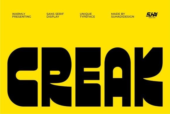
Creak Font strikes like a sculpted headline: ultra-thick, geometric forms scored with sharp cutouts that give each character a physical weight. The heavy strokes and bold counters create a visual anchor for posters, logos, and editorial headers, and when you need clean contrast, pair Creak with minimalist monospace fonts to balance the chunky headline against precise fixed-width text.
At display sizes the carved terminals become a signature detail, but the density of the letters calls for increased tracking in tight settings to preserve counter shapes. It performs best on flat backgrounds or high-contrast photographic layouts and reads as architectural-very suited to branding that wants presence without ornament.
My Recommendation: I reach for Creak when a project needs a headline that reads like an object-album covers, gallery posters, and bold brand marks are where it shines. Its heavy forms grab attention fast, so I limit use to short copy or logotypes rather than paragraphs. Pairing it with narrow, fixed-width text keeps the composition balanced and gives designs an industrial, modern edge.
14. Bold Ultra – minimalist monospace fonts
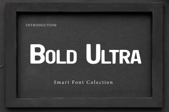
Bold Ultra channels the punch of 19th-century wood type with oversized serifs and a heavy presence designed for distance legibility. The slab-inspired geometry is softened by contemporary terminals, which keeps the face forceful without feeling dated. It suits cinematic titling, event posters, and signage where each word must register instantly.
The dense strokes read plainly at scale but benefit from extra tracking in compact layouts to avoid crowding; a neutral sans works well for supporting body copy while a thin monospaced face adds a technical counterpoint. Use Bold Ultra for short headlines and display settings where authority and readability from afar are the primary goals.
╰┈➤ Download Bold Ultra – minimalist monospace fonts
My Recommendation: I use Bold Ultra when a title needs weight and historical character-storefront banners, magazine covers, and film posters are ideal. It gives layouts a tactile heft that anchors composition, yet I avoid it for continuous text. For designs demanding visual authority at a glance, this face is a reliable choice.
15. Quadric Font
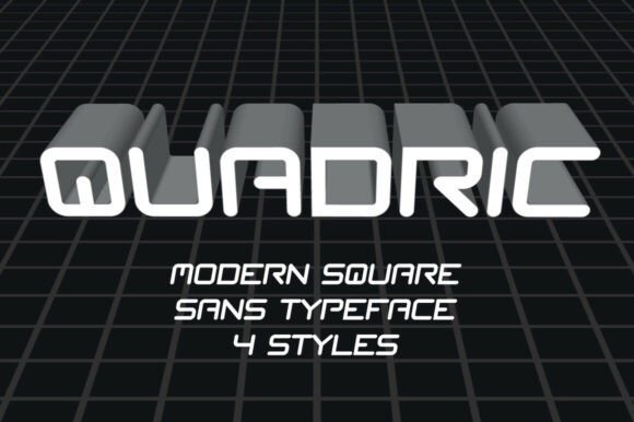
Quadric Font leans into near-square letterforms with softened corners, offering the steady rhythm of monospaced types while keeping room for expressive layout play. Its compact counters and uniform stroke widths create a calm mechanical order that reads crisply in UI headers, sci-fi posters, and gaming interfaces. The design feels modern without becoming gimmicky, which makes it flexible across contexts.
Because the shapes are space-efficient, Quadric tightens vertical metrics and helps preserve grid harmony in dense layouts or tables. It scales cleanly from small captions to bold display lines, and the predictable terminals simplify kerning across numerals and code-like strings. For projects needing a restrained technical voice, Quadric supplies a dependable backbone.
My Recommendation: I pick Quadric for interfaces and product screens where clarity and economy of space matter-dashboards, HUDs, and tech-forward branding benefit most. Its disciplined geometry keeps dense information legible and tidy, so I often use it in combination with a humanist sans for warmth. Quadric works equally well for short UI labels and striking hero text, making it a practical go-to.
16. Inkognito Font
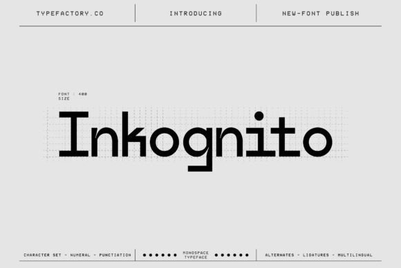
Inkognito balances fixed-width discipline with a crisp, technology-leaning silhouette. As one of the minimalist monospace fonts, it pairs evenly spaced glyphs with subtle terminals and open counters that keep long strings legible in code editors and compact UI panels. The unified letterforms reduce visual clutter, making this face suitable for technical branding, interface labels, and editorial columns where alignment and readability matter.
On screen its hinting preserves crispness at small sizes while larger display settings reveal the typeface’s precise geometry and angled joins. Numerals and punctuation are drawn for instant recognition, which helps when scanning logs, tables, or specification sheets. Use it when functional accuracy must meet a refined, modern aesthetic across print and digital outputs.
My Recommendation: I reach for Inkognito when I need a neutral, tech-forward monospaced face that keeps dense information readable. Its consistent widths make layout behavior predictable across interfaces and documents. Ideal for code editors, dashboards, hardware product pages, and technical publications where clarity is the priority.
17. Elrosa Font
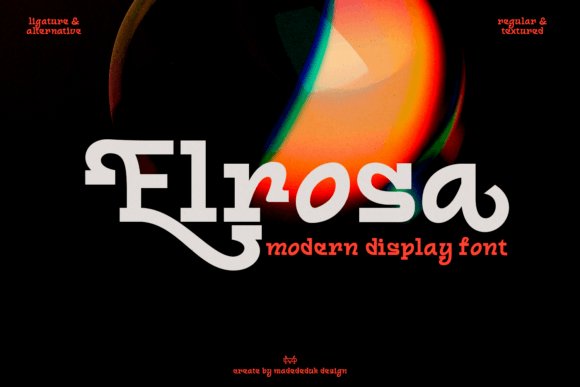
Elrosa channels industrial display roots into a monospaced-inspired display that reads loud and clean at large sizes. Tall proportions and open apertures create a strong vertical cadence, so headlines and numeric sequences feel assertive without appearing bulky. Its mechanical forms suit posters, signage, and packaging where a structured, utilitarian voice is desirable.
With compact widths and intentionally tight tracking it conserves space in dense grids while retaining presence on wide layouts. Designers often pair it with softer text faces to offset its machine-like clarity, or let Elrosa carry an identity solo for maximum impact. Try it for product labels, banners, and interfaces that call for a technical display character.
My Recommendation: I use Elrosa when a project needs industrial attitude at display scale. It’s great for posters, wayfinding, and packaging where condensed spacing and strong letter shapes deliver visual punch. Pairing it with a neutral text face keeps everything readable while preserving Elrosa’s distinctive mechanical tone.
18. Monoforge Font
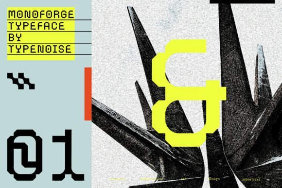
Monoforge translates brutalist architecture and industrial design into a serifed monospaced typeface with measured, geometric forms. Squared terminals and steady stroke widths give each character a built, engineered feel while the fixed-spacing enforces visual order across columns and tables. It reads with force in headlines and editorial settings where a constructed, utilitarian personality is wanted.
Because every glyph occupies identical width, Monoforge makes grid-based layouts and data-heavy pages feel deliberately arranged. The family is delivered in OTF and TTF formats and performs especially well at larger sizes where serifs reveal sculptural detail. Use it for identities, posters, and technical editorials that benefit from a durable, industrial presence.
My Recommendation: I recommend Monoforge when you need a serif that carries architectural strength and exact spacing. It’s perfect for headlines, posters, and technical publications that want a manufactured, purposeful voice. The OTF/TTF files simplify deployment across print and digital projects.
19. Monospace Tech Block
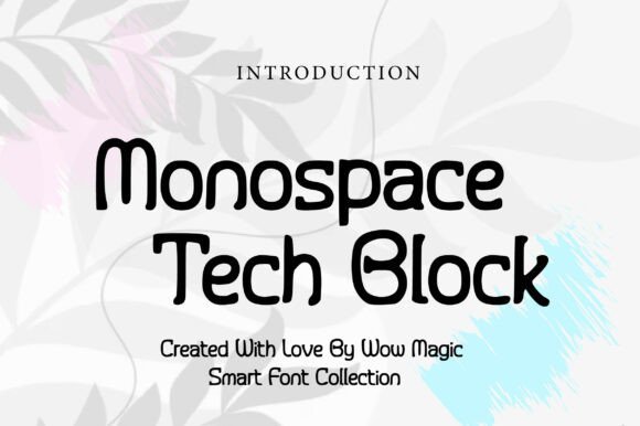
Monospace Tech Block pairs block-style letterforms with rigid spacing to create a mechanical, high-contrast display that reads clearly at large sizes. Its heavy strokes and squared terminals suit interfaces, game titles, and tech packaging, giving text a manufactured, industrial personality. Among minimalist monospace fonts it stands out for readable glyph shapes that hold up in splash screens and posters.
The face keeps uniform monospace metrics so columns and code samples align without fuss, and the open counters preserve legibility at medium sizes. Pair it with a narrow sans or a thin geometric face to soften contrast, or set it against bright neon tones for a retro-future feel. Reserve it for headlines, labels, and UI elements where a machine-like presence is wanted rather than long-form copy.
╰┈➤ Download Monospace Tech Block
My Recommendation: I reach for Monospace Tech Block when I want typography that reads like hardware: compact, blocky, and unmistakably engineered. It makes short headlines and code mockups feel concrete, and its strict metrics keep tables and terminal screens tidy. Use it on packaging, game titles, or any interface where a technical, bold attitude is the aim.
20. Borgen Monospace
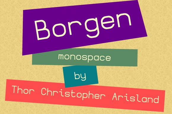
Borgen Monospace is a geometric monospace with restrained shapes and even rhythm, designed to feel neutral and highly legible at small sizes. The uniform character widths and tidy terminals make tracking columns and code blocks predictable, which is useful in IDE screenshots, terminal themes, and data tables. Its tone is quiet and efficient, so it doesn’t compete with surrounding design elements.
Construction favors simple bowls and straight strokes that reduce visual noise on low-resolution displays and print. A modest x-height and open apertures keep letters distinct, while subtle corners give a touch of personality without calling attention. Use Borgen for technical documentation, spreadsheet exports, or interface labels where clarity is the top priority.
My Recommendation: I use Borgen Monospace when clarity must come first and the type should slip into the background. It performs well in documentation, console themes, and tight UI labels because each glyph stays distinct at small sizes. Pair it with a neutral sans for body areas or a light display face for headers to maintain a calm, ordered look.
21. Bova Monospace
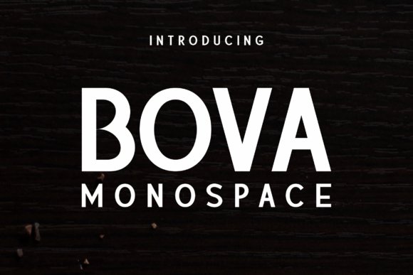
Bova Monospace blends refined stroke modulation with the discipline of fixed-width spacing, producing a monospace that reads like a display face. The contrast between open counters and crisp terminals creates a refined tension that performs on posters, magazine spreads, and book covers. It moves beyond utilitarian code fonts and gives typographic hierarchy a more editorial voice.
Multiple weights and small stylistic alternates expand its use for expressive headlines and striking chapter starts, while its monospaced rhythm keeps tabular material tidy when needed. Pair Bova with serifs for print editions or with a low-contrast sans for modern layouts; avoid using it for lengthy body copy where the display character would tire the eye. Choose it when a project needs monospace order but with personality and formality.
My Recommendation: I pick Bova Monospace when a publication or poster needs structure without feeling mechanical. Its refined proportions add drama to headings while still handling monospaced tables or captions cleanly. It’s ideal for editorial work, title sequences, and any design that requires a disciplined yet expressive monospace voice.
22. Bittypix Monospace
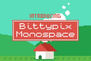
Bittypix Monospace is an 8-pixel grid face from Chequered Ink that reads like a compact bitmap sculpture: solid square blocks and consistent spacing give it a crisp, mechanical rhythm. Among minimalist monospace fonts, Bittypix balances extreme small-size legibility with unmistakable low-res character, so it feels both purposeful and playful. Its personality makes it a natural fit for pixel art, terminal-style headers, and UI elements that need a retro edge.
The design is engineered for raster clarity, with pixel-aligned strokes and tight hinting so glyphs remain distinct at tiny sizes. The set covers basic Latin, numerals and punctuation, positioning it as a display tool rather than a text workhorse. Use it for badges, HUDs, 8-bit branding and any compact layout where blocky geometry matters more than long-form reading.
╰┈➤ Download Bittypix Monospace
My Recommendation: I reach for Bittypix when I want authentic 8-bit flavor without sacrificing readability. It brings instant character to retro games, micro-UIs, and mock terminal screens. For tight labels and tiny on-screen elements, its clear pixel grid keeps things legible and visually coherent.
23. Monospace Font
Monospace Font is a plain sans serif with disciplined proportions and neutral terminals, designed to read steadily across screens and print. Characters share a consistent width so columns and code samples align predictably, while subtle stroke endings keep the face from feeling mechanical. Its restrained shapes allow imagery and interface elements to take center stage without visual conflict.
The family offers a small range of weights and straightforward punctuation, making it easy to deploy as a system or UI staple. It pairs well with expressive display faces when contrast is needed, or serves solo for documentation and technical content that demands clarity. For designers seeking a quiet, workmanlike monospace, this one performs reliably at various sizes.
My Recommendation: I use Monospace Font for documentation, developer tools, and interface text where neutrality matters. It holds up at small sizes and keeps tables and code neat, which reduces visual friction. When a project needs a dependable monospace that won’t distract, this is my go-to choice.
24. Sumyar Monospace
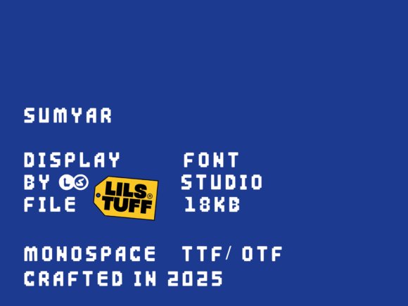
Sumyar Monospace is a bold, pixel-flavored display face that treats each glyph like a compact poster: thick strokes, squared terminals and tight spacing deliver a dense visual punch. It borrows arcade and LED motifs while retaining monospaced regularity, so strings align cleanly and create strong title blocks. Scaled up, the letters function as graphic elements as much as readable shapes, giving headlines real stage presence.
The character set emphasizes strong verticals and blocky counters, which makes lowercase texture feel intentionally heavy – excellent for headlines, badges and game UI but ill-suited to long passages. Number forms and stylized punctuation reinforce the retro-digital attitude and help the face read consistently in dense compositions. Pair it with softer text faces when you want contrast and avoid visual monotony.
My Recommendation: I pick Sumyar Monospace for projects that need bold, nostalgic attitude: poster art, arcade-style branding, and game interfaces. It grabs attention in headlines and functionally aligns text for a technical aesthetic. For paragraph copy I swap to a lighter face, but for display uses it delivers immediate personality.
25. Nk57 Monospace
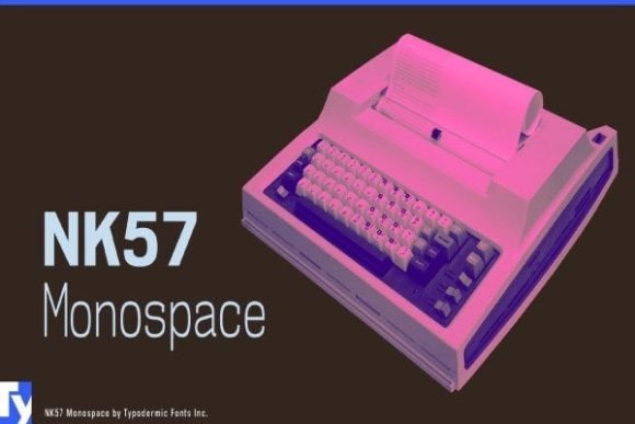
NK57 Monospace is a sixty-style programmer typeface built for high-resolution screens rather than the low-res pixel grids common in older code fonts. It delivers crisp counters and restrained stroke contrast so long code listings remain readable on Retina displays; the family ships with extended Latin, Greek and Cyrillic sets plus less common math glyphs such as the diameter symbol. As part of minimalist monospace fonts, NK57 prioritizes predictable metrics and clean punctuation shapes that speed visual parsing in editors and terminals.
Glyphs sit on a rigid baseline with uniform widths, which makes diff views, tables and aligned text trivial to scan at a glance. Punctuation and bracket forms are tuned for quick recognition, and the inclusion of stylistic alternates keeps the voice pragmatic without ornament. Typodermic’s approach favors pixel-accurate rendering and typographic clarity for technical documentation, code screenshots and interface mockups.
My Recommendation: I reach for NK57 when clarity on high-density displays matters and I need wide language support. Its math symbols and consistent metrics make lining up code blocks and tables effortless. Use it for coding environments, technical documentation, and UI screenshots where crisp rendering on Retina-class screens is important.
26. Joystix Monospace
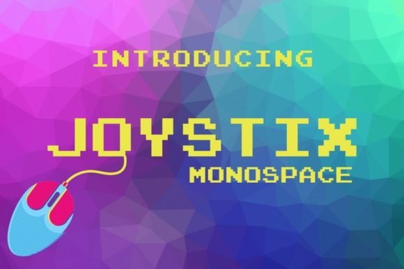
Joystix Monospace channels classic arcade hardware into a decorative, pixel-style monospaced font that reads like an authentic game cabinet display. Blocky letterforms and squared counters create a tight rhythm at small sizes, preserving legibility in low-resolution contexts while projecting a playful retro attitude. The set covers uppercase, numerals and core punctuation, making it useful for scoreboards, labels and stylized headings.
Because every glyph shares identical width, layouts that rely on perfect alignment-such as in-game HUDs, badges and pixel art captions-require no extra kerning. Its highly stylized shapes limit use in long text but give instant character to posters, packaging and UI elements that need a nostalgic video-game look. Pair it with plain backgrounds and restrained color palettes to keep the display readable and focused.
╰┈➤ Download Joystix Monospace
My Recommendation: I use Joystix when a project calls for unmistakable arcade personality-its pixel-perfect monospace look sells nostalgia instantly. It’s ideal for game jams, retro posters and playful UI mockups where atmosphere outweighs typographic subtlety. Keep it for display sizes and pair with minimal backgrounds so the letterforms hold visual priority.
27. Basic Inktrap Font
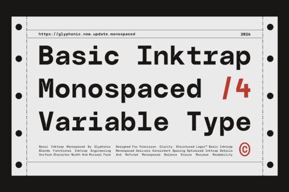
Basic Inktrap Font applies engineered inktrap cuts to a monospaced skeleton, giving the face a measured, technical clarity that reads well across sizes. The notched stroke joins control apparent weight at small sizes and help maintain sharp counters, which benefits code snippets, tabular data and captioned interface components. Geometric proportions and steady rhythm establish a calm typographic cadence that suits technical and editorial contexts.
With uniform widths and carefully tuned metrics, grid-based layouts fall into alignment with minimal manual tweaking, speeding up composition work across modules and columns. The design leans toward functional utility rather than flourish, so it performs strongly in dashboards, terminals and brands that require a restrained, engineered voice. Heavier weights provide emphasis while retaining alignment integrity across complex layouts.
╰┈➤ Download Basic Inktrap Font
My Recommendation: I recommend Basic Inktrap when projects need exacting spacing and a composed, engineered look. It reduces alignment chores in interface design and keeps documentation readable across sizes. Use it for product dashboards, developer tools and editorial systems that value discipline and mechanical clarity.
To sum up, these 27 selections offer restrained, readable monospaced options for code, UI, and editorial work. Try a few in your editor to see how each handles numbers, punctuation, and spacing.
Small differences in glyph width and dot placement affect legibility more than you might expect, so test in real text blocks before committing. If you want pairing notes or platform-specific testing tips, mention your setup and I can offer targeted guidance.