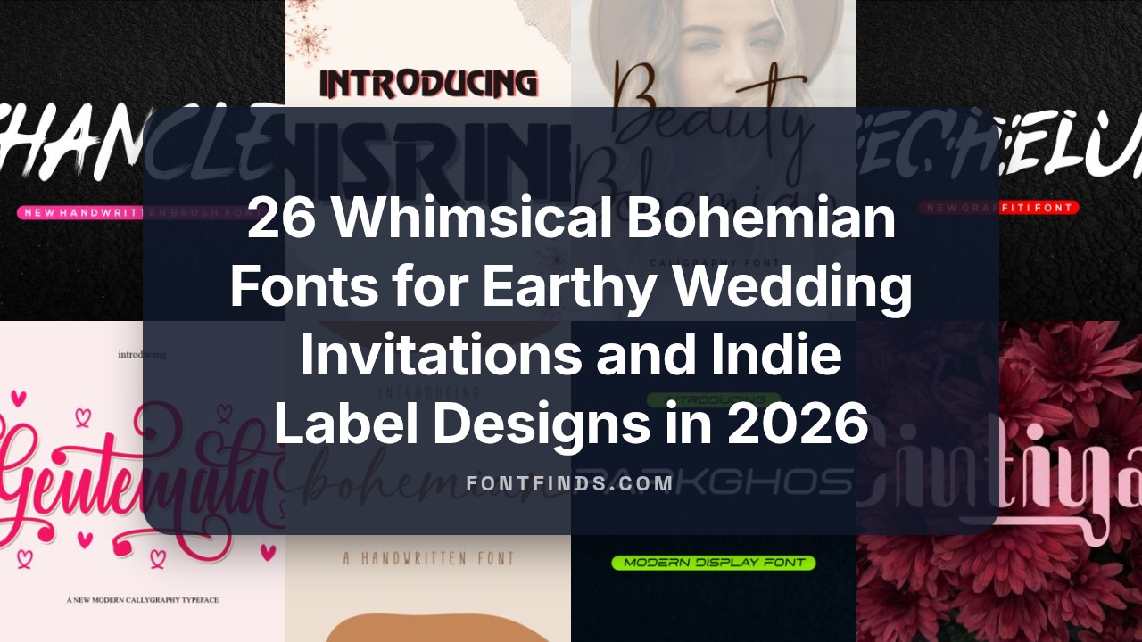
26 Whimsical Bohemian Fonts for Earthy Wedding Invitations and Indie Label Designs in 2026
bohemian fonts bring a relaxed, handcrafted vibe to projects that need warmth and personality. From hand-lettered scripts to worn serifs and decorative glyphs, these typefaces work well on wedding stationery, indie labels, and mood-driven social posts.
This post lists 26 distinct options arranged by style and mood, with quick pairing suggestions, color and texture ideas, and notes on practical legibility so you can match type to project intent.
1. Bohemian Dreams Font
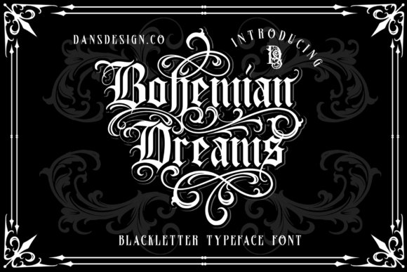
Bohemian Dreams arrives as a bold blackletter display with high-contrast strokes, dense counters, and generous swashes that read like hand-inked signage. The PUA-encoded OpenType file exposes alternate capitals, extended swashes and decorative ligatures directly from your font palette, so you can craft posters, labels, and mastheads with old-world flair without hunting for special panels or plugins.
Among bohemian fonts, this design stands out for a sculpted, calligraphic temperament that balances ornament with legibility at display sizes. It pairs well with a restrained sans for editorial work or sits alone on product packaging to give branding a heritage, artisanal voice that feels deliberately made rather than mass-produced.
╰┈➤ Download Bohemian Dreams Font
My Recommendation: I keep Bohemian Dreams in my toolkit for projects that need a historical, handcrafted attitude-brewery labels, boutique packaging, and event posters all benefit. The PUA swashes are a time-saver during layout, and the heavy weight commands attention on a shelf or poster. Use it when you want a strong, vintage-blackletter personality without sacrificing clarity.
2. Bohemian Typewriter Font
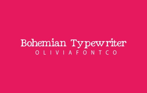
Bohemian Typewriter blends a typewriter-like serif skeleton with subtle hand-lettered irregularities, producing a warm, slightly nostalgic texture that reads well in headlines and short passages. The letterforms show gentle ink-bleed effects and thoughtful spacing so that magazine headlines, social posts, and web headers maintain a human touch without feeling sloppy. It’s legible across sizes and keeps body lines tidy when set at comfortable leading.
On invitations and lifestyle branding it brings an intimate, romantic character that looks like a personal note rather than a mechanical type slug. Pair it with a clean geometric sans or use on textured papers and linen backgrounds to amplify its handwritten charm for weddings, editorials, and boutique identity work.
╰┈➤ Download Bohemian Typewriter Font
My Recommendation: I reach for Bohemian Typewriter when a design needs personality but also readability-wedding suites, lifestyle blogs, and soft-brand identities are perfect fits. The subtle distressing gives compositions warmth without losing polish, and it photographs beautifully on printed materials. If you want a serif that reads like a letter from a friend, this is a reliable choice.
3. Tiny Bohemian Font
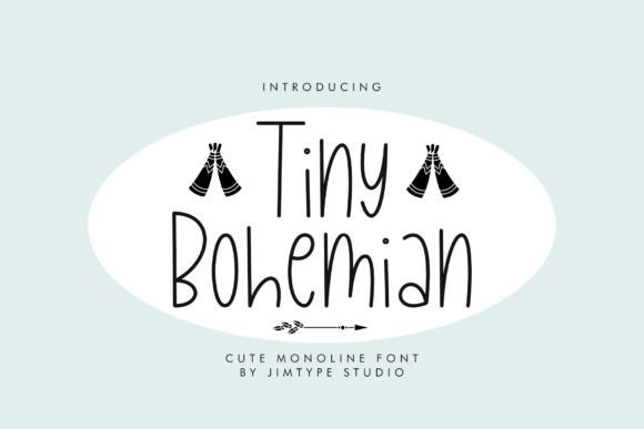
Tiny Bohemian is a playful handwritten script with a lively bounce and rounded terminals that read as friendly rather than sugary. It includes alternate characters and modest ligatures to keep repeated words from feeling monotonous, which is ideal for logos, product tags, and craft files intended for Cricut and vinyl cutting. The consistent stroke width helps the type maintain personality even at small sizes.
Because strokes are fairly uniform and clean, the face cuts well in paper and vinyl and holds up online for blog headers and social graphics. Use it alone for charming labels and stickers, or pair it with a neutral serif to give product packaging and kids’ goods an immediate handcrafted signature.
╰┈➤ Download Tiny Bohemian Font
My Recommendation: I use Tiny Bohemian for playful brand marks, children’s packaging, and any craft-focused piece where charm matters. The alternates prevent repetitive chains of the same shapes, and it trims neatly on cutting machines. It’s my go-to when projects need a hand-lettered feel that stays readable and cute at small scales.
4. Vintage Bohemian Font
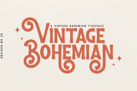
Vintage Bohemian is a display typeface that blends bold charm with a light, handmade feel. Its irregular strokes and playful counters give headlines a cheerful personality while remaining legible at large sizes. Collectors of bohemian fonts will appreciate the hand-drawn ornaments, alternate glyphs, and textured caps that read like vintage signage.
The family includes uppercase, lowercase, numerals, punctuation, a selection of stylistic alternates and ligatures, with kerning tuned for expressive headings. OpenType options let you swap in swash capitals without manual adjustments, and the lighter stroke weight pairs well with textured papers or grain overlays. Use it with a restrained sans or thin serif to keep layouts readable while letting the type carry character on posters, labels, and boutique signage.
╰┈➤ Download Vintage Bohemian Font
My Recommendation: I reach for Vintage Bohemian when a project needs a playful, authentic headline that still feels intentional. The alternates let me tweak letterforms quickly to suit brand personality, and the type prints beautifully on recycled or textured stock. It’s ideal for indie retail, festival posters, and packaging where a handcrafted, nostalgic vibe matters.
5. Bohemian Style Font
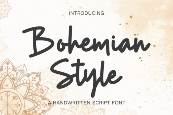
Bohemian Style is a graceful script defined by smooth, measured curves and a steady rhythm that reads as hand-lettered but controlled. Long ascenders, soft terminals, and thoughtful spacing create a refined voice suited to fashion branding and editorial mastheads. Contextual alternates and ligatures help the wordforms flow without awkward joins, keeping longer headings readable.
OpenType swashes provide decorative entrances and exits for logos and pull quotes, while the midweight strokes retain clarity on labels and web headers. Pair it with a minimalist sans or a modern serif to avoid visual clutter and let the script act as the focal point. It performs well across print and digital work, especially with muted palettes and tactile backgrounds.
╰┈➤ Download Bohemian Style Font
My Recommendation: I keep Bohemian Style on hand for boutique identities and magazine covers that need an elegant human touch. Its smooth joins make setting long names less fiddly, and swash alternates create distinctive wordmarks without custom lettering. Perfect for upscale branding, editorial headings, and luxe product labels.
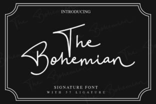
6. The Bohemian Duo Font
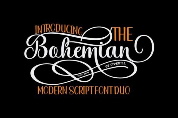
The Bohemian Duo pairs a modern script with a companion display face to give designers a ready-made contrast of flourish and structure. The script’s irregular baseline and feminine charm come with plentiful alternates, while the companion supplies steady caps and numerals that anchor layouts. You get initial and terminal letters, ligatures, full multilingual support, and a collection that reads both romantic and practical across formats.
PUA-encoding makes glyph access straightforward in most apps, so swashes and alternates are easy to apply without complex workflows. Use the script for names and headlines and the companion face for dates, addresses, or body snippets to maintain hierarchy. The combination works beautifully over watercolor textures, foil stamping, or embossed papers for wedding suites, greeting cards, and boutique packaging.
╰┈➤ Download The Bohemian Duo Font
My Recommendation: I choose The Bohemian Duo when a job needs both flourish and legibility, such as wedding suites or boutique labels. Having both a flowing script and a grounded partner speeds layout work and keeps the aesthetic cohesive. The PUA-encoded alternates are a real time-saver for polished mockups and final art.
7. Bohemian Fashion
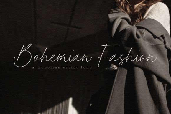
Bohemian Fashion is a hand-lettered script that pairs lively stroke contrast with decorative swashes and ink textures, giving words a warm, handmade personality. The letterforms include alternate characters and contextual ligatures that make headings, product labels and wedding stationery feel unusually organic; it slots naturally into current bohemian fonts trends for lifestyle brands and editorial covers. The font balances flourish with legibility, so it performs well on social graphics and magazine mastheads where expressive lettering is needed without sacrificing readability. Its playful loops and varied terminals help create distinct logotypes when used at display sizes.
Package contents typically feature OTF and TTF files with basic multilingual support and PUA-encoded alternates, so designers can access extras through a glyph panel or stylistic sets. On textured papers or photographic backdrops the generous x-height and open counters preserve clarity while the swashes create motion across layouts. For pairings, a clean sans or a low-contrast serif lets the script take center stage while maintaining hierarchy in complex compositions. Use lighter tracking for long lines to retain an airy, handcrafted rhythm.
My Recommendation: I reach for Bohemian Fashion when I want packaging or a wedding suite to read as lovingly made rather than manufactured. The alternates and swashes give me quick visual variety, and the ink-like textures print beautifully on recycled stocks and kraft. It’s a go-to for boutique labels, artisan food brands, and lifestyle projects that need a personable, stylish script.
8. The Bohemian
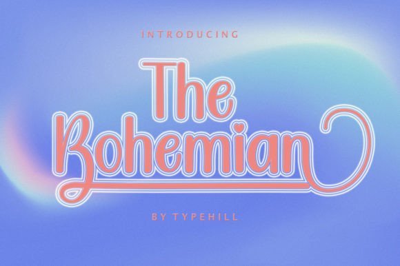
The Bohemian is a graceful calligraphic script with narrow, elegant strokes and subtle flourishes that mimic real brushwork. It excels on intimate stationery-wedding invitations, thank-you cards and greeting cards-because the shapes carry a hand-written intimacy while staying crisp in print. The font keeps delicate detail at high resolutions, and its alternates can simulate the slight variations you expect from ink on paper, preventing repetition in repeated words. It’s best used at display sizes where the slender terminals and tiny textures can be appreciated.
Pair The Bohemian with soft watercolor washes or light paper grain to amplify its painterly character; the open counters let background color show without losing shape. Kerning for standard pairs is thoughtfully set, though optical tweaks improve compact wordmarks and tight layouts. It pairs cleanly with a restrained serif for editorial spreads or with a geometric sans when a modern contrast is needed, helping invitations or small-run prints feel thoughtfully composed. Give it generous leading so the flourishes don’t crowd adjacent lines.
My Recommendation: I choose The Bohemian for projects that require a refined handwritten touch, especially wedding suites and boutique stationery lines. Its slender strokes retain sophistication even at small display sizes, and it layers beautifully over watercolor or textured photography. For designers creating greeting cards or premium event collateral, it offers the right balance of elegance and readability.
9. Bohemian Font
Bohemian Font delivers a classic handwritten tone with measured proportions and steady calligraphic rhythm, making it useful for both modern and vintage-inspired identities. It offers access to an extended glyph set-swashes, alternate capitals and decorative ligatures-that designers can pull into layouts without complex OpenType workflows. The neutral baseline and mid-range x-height mean the type holds up in logos, social headlines and quote graphics while keeping a human touch. Subtle contrast between thick and thin strokes makes it feel crafted rather than mechanical.
Because letter spacing and form are intentionally restrained, Bohemian works particularly well when repeatability matters: logotypes, embossed stationery and multi-piece branding systems reproduce consistently across media. The PUA encoding simplifies grabbing stylistic alternates from a character map, speeding iteration when composing swash-heavy wordmarks. It pairs especially well with condensed sans faces or a humanist serif to ground long copy, and it tolerates letterpress or foil stamping without losing its textured appearance. This font is suited to designers who want handcrafted expression with production-friendly behavior.
My Recommendation: I often select Bohemian Font for brand work that must look handcrafted yet remain consistent across printed and digital assets. The ready-to-use alternates accelerate logo exploration, and the restrained proportions make it reliable for embossing or small-scale printing. It’s ideal for identity systems, editorial pull-quotes, and boutique packaging where control and character are both required.
10. Bohemian Collection
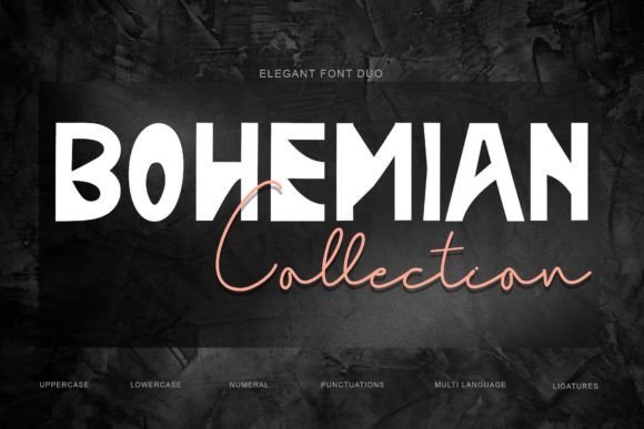
Bohemian Collection packages two complementary faces into a single duo that balances casual script with a more structured companion, giving designers a ready-made pairing for headline and subhead work. Both fonts include uppercase, lowercase, numerals, punctuation, multilingual glyphs and a healthy set of ligatures, which helps when crafting logotypes or textured display lines and places this release squarely among popular bohemian fonts used for handmade branding looks.
The duo works well for banners, business identities, stickers and wedding stationery where alternates and contextual forms add organic motion without losing legibility at larger sizes. Try the script for focal wording and the companion for taglines, then layer with paper textures or subtle emboss effects to enhance that artisanal feel.
╰┈➤ Download Bohemian Collection
My Recommendation: I reach for this duo when a project needs a relaxed, handcrafted voice paired with practical type options. The alternates and multilingual coverage cut layout time and prevent frantic back-and-forth with type treatments. Use it for boutique brands, invitation suites, packaging and any design that benefits from a warm, handwritten aesthetic.
11. Beauty Bohemian
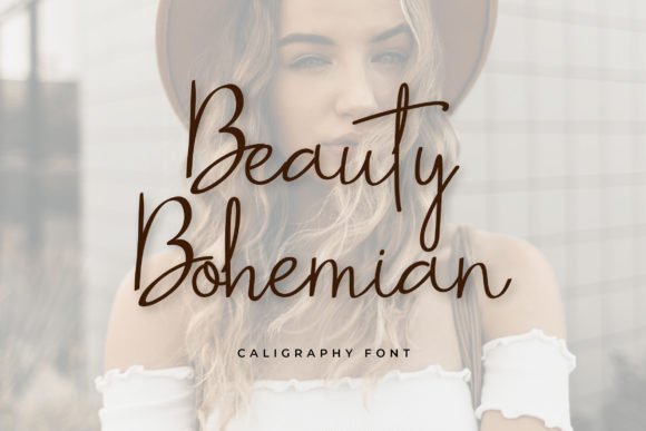
Beauty Bohemian presents a soft, cursive handwriting with airy loops and gentle terminals that read as romantic without appearing overwrought. The stroke rhythm and tidy baseline make it surprisingly legible for a swashy script, and available stylistic caps and optional swashes expand headline possibilities while keeping short text blocks clear.
This face is particularly effective on wedding invites, beauty labels, and social media graphics where an inviting, affectionate tone is wanted. Pair it with a plain serif for editorial contrast or let it run alone as a logo wordmark; give extended lines a light kerning pass to maintain smooth flow.
My Recommendation: I use Beauty Bohemian when a brief needs to feel warm and personal-think bridal collateral or boutique product packaging. The decorative caps create instant focal points, while restrained contrast keeps short body text readable. It’s a strong choice for romantic branding, editorial pull-quotes, and charming social headers.
12. Bohemian Font
Bohemian Font is a restrained handwritten script that leans toward refined simplicity rather than ornament, producing a signature-like mark that reads cleanly over photos and textures. Low-contrast strokes and modest flourishes keep the letters readable at display sizes, making this a solid option for business cards, quotations, and album covers where clarity matters.
Because it holds up across imagery and print mockups, the face pairs well with a sturdy sans for corporate pieces or with a condensed serif for a retro editorial twist. Small tracking tweaks help when setting long lines, and using it sparingly as an accent ensures it adds personality without overwhelming layouts.
My Recommendation: I choose this font when a project calls for understated, personal lettering that won’t fight with photographs. It’s ideal for creatives-photographers, musicians, independent brands-looking for a signature touch on cards, covers, and web headers. Use it as an accent to bring warmth and approachability to otherwise minimal designs.
13. Vonque Font
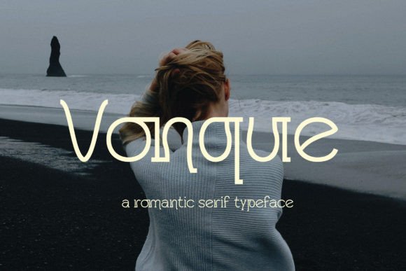
Vonque is a romantic serif built from long, graceful strokes and soft terminals that feel intimate without sacrificing clarity. Its high-contrast hairlines and subtle swashes create an elegant rhythm across headlines and short passages, while thoughtful kerning and refined ligatures keep letter pairs looking intentional and polished.
This face is especially good for stationery, editorial pull-quotes, and boutique branding where a warm, classical voice is wanted; it pairs well with hand-drawn scripts or minimalist sans choices and works beautifully alongside bohemian fonts for relaxed wedding suites and artisanal packaging. Small capitals and alternate characters give designers the tools to craft varied typographic choreography without adding extra type families.
My Recommendation: I reach for Vonque when a project needs romance and restraint at once – think wedding invites, perfume labels, or feature headlines. Its alternates and ligatures let me introduce subtle personality without sacrificing readability. Use it paired with a simple sans or a playful script to balance formality with charm.
14. Nisrine Font – bohemian fonts
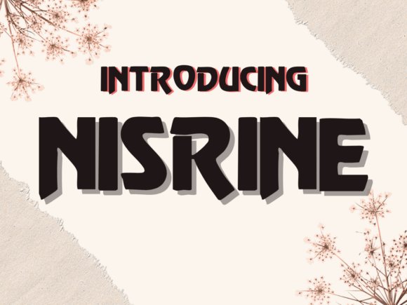
Nisrine is a lively script and handwritten hybrid that was drawn to stand out with energetic strokes and irregular terminals that feel hand-rendered rather than mechanically produced. The letterforms maintain a friendly rhythm that works well at display sizes, and a generous set of alternates helps avoid repetitive patterns in longer strings of text.
It makes greeting cards, classroom materials, and travel-themed posters sing thanks to its personality and legibility; the font also adapts well to digital note apps and slide decks where a human touch matters. Contextual alternates and open counters keep it readable on light backgrounds, while heavier weights hold their shape on product labels and playful headlines.
╰┈➤ Download Nisrine Font – bohemian fonts
My Recommendation: I use Nisrine when a design needs character and a handmade feel – it’s perfect for cards, teacher resources, and travel or lifestyle branding. The alternates stop repetition and make layouts feel bespoke. For busy compositions I pick a restrained sans to sit alongside Nisrine so the script remains the focal point.
15. Khanclep Font
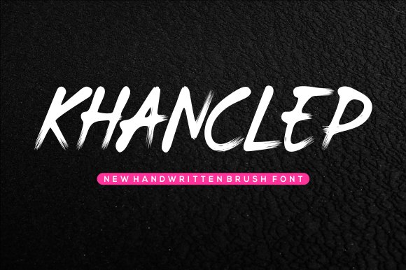
Khanclep is a cheerful handwritten typeface with rounded strokes and a slightly uneven baseline that lends instant friendliness to any composition. Its compact letterforms and open counters make it legible in playful contexts, while quirky terminals and varied stroke endings give each line a casual, human cadence.
Use Khanclep for children’s games, informal packaging, web comic headers, or whimsical signage where an approachable tone matters more than strict formality. The font scales well for headlines and short blocks of text, and it pairs attractively with hand-painted textures or bright color palettes to emphasize its warmth.
My Recommendation: I choose Khanclep when a project benefits from upbeat, approachable lettering – think kid-focused products, comics, or casual event posters. Its irregularities feel handcrafted and keep layouts feeling friendly. Pair it with bold colors or textured backgrounds to amplify its playful character.
16. Kechelup Font
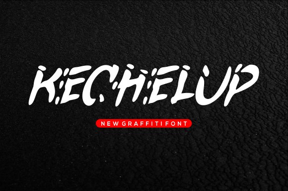
Kechelup is a playful handwritten font with irregular stroke endings and a bouncy baseline that reads like a quick sketch. Its rounded terminals and relaxed spacing give it a sunlit, boho cottage character; among bohemian fonts, Kechelup stands out for its sunny, carefree letter shapes that suit children’s illustrations and cartoon work. The glyphs stay highly legible at display sizes while still feeling hand-drawn rather than mechanically produced.
Apply it to logos, stickers, posters, and playful headers where personality matters more than strict formality. It pairs cleanly with a neutral sans or a condensed slab to provide contrast, and alternates or ligatures (when available) keep repeated words from looking monotonous. The simple strokes also make it forgiving for vinyl cutting and small-format printing.
My Recommendation: I reach for Kechelup when a project needs a warm, mischievous voice that reads handmade. Its lively rhythm gives product labels and children’s book covers an approachable character without sacrificing readability. Use it for preschool branding, party invites, or any design that benefits from relaxed, bohemian-inspired handwriting.
17. Jendela Font
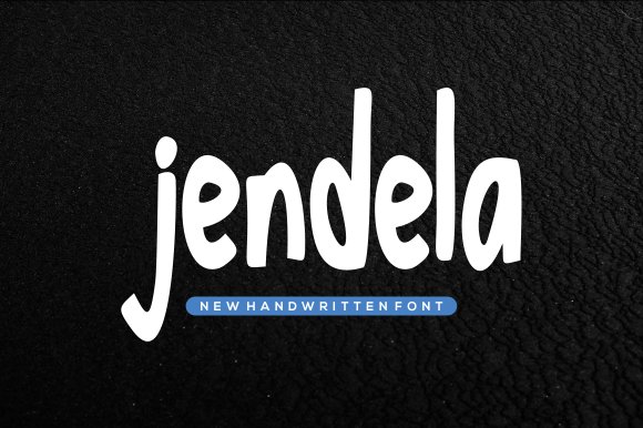
Jendela Font offers a lighthearted, casual handwritten look with airy strokes and playful downstrokes that imitate quick pen movement. Rounded terminals and mild contrast keep the face friendly and approachable, which makes it fit well on storybook headings and kid-centric packaging. Open letter spacing allows short phrases to breathe on posters and labels without feeling cramped.
It performs well for greeting cards, comic-style art, and packaging where a human touch helps sell the mood. Pair Jendela with a clean sans for body text or layer it over a subtle texture to enhance the handmade feel; the result reads handcrafted without appearing messy. The design also adapts nicely to both print and screen layouts and cuts cleanly for craft machines.
My Recommendation: I pick Jendela when the brief calls for upbeat, approachable typography that feels handcrafted. The clear letterforms speed layout work and reduce fuss when preparing files for cutting machines. It’s a reliable choice for kid brands, playful identities, and small-batch packaging where friendliness matters most.
18. Welcome Farmhouse
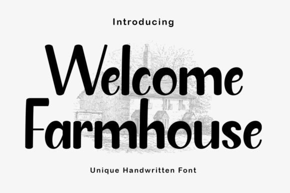
Welcome Farmhouse is a soft, feminine handwritten font crafted with smooth, flowing connections that flatter wedding and lifestyle projects. The joined strokes are intentionally forgiving, which reduces awkward breaks when used with Cricut or Silhouette and makes vinyl or heat-transfer production simpler. The overall voice reads cozy and rustic, ideal for labels, signage, and invitation headers that aim for a homey aesthetic.
Because the letter joins are prominent, the face works best at medium display sizes and in short lines where ligatures can breathe naturally. Combine it with kraft textures, linen backgrounds, or a restrained vintage serif to amplify the farmhouse feel without overdecorating. When preparing cut paths, slightly tighten spacing to avoid loops separating during production.
╰┈➤ Download Welcome Farmhouse
My Recommendation: I recommend Welcome Farmhouse when I want a tender, domestic look for bridal stationery, boutique product labels, or kitchen goods. Its smooth joins save time on machine cutting and make hand-finishing more forgiving. Use it for small-batch craft lines, wedding suites, and lifestyle branding that needs a warm, handmade sensibility.
19. Bunny Font
Bunny Font bubbles with round terminals, soft strokes and a hand-forged warmth that reads playful without tipping into cloying. Its lowercase characters have generous counters and subtle irregularities that give headlines a friendly cadence, and it fits neatly among bohemian fonts when you want a relaxed, artisanal mood. Large display sizes reveal charming ligatures and alternate glyphs while tight tracking keeps short phrases compact and legible. Warm pastel palettes and paper textures complement its approachable charm for stickers, party invites and product labels.
The package includes basic Latin, numerals, punctuation and a handful of stylistic alternates that add personality without fuss. Kerning is sensible for short headlines, though I recommend small manual tweaks on extended lines to maintain rhythm. Pair Bunny with a neutral sans for body copy or a light script for invitations; it also responds well to embroidered and print applications. Its predictability across print and screens makes it a reliable pick for playful branding.
My Recommendation: I pick Bunny when a project needs an immediate, friendly voice-kids’ party invites, preschool signage, or toy packaging are perfect fits. The shapes feel handcrafted but stay legible at different sizes, which speeds up layout decisions. Use it when you want warmth and charm without sacrificing clarity.
20. Transformer Font
Transformer Font channels classic comic-book energy with chunky letterforms, exaggerated caps and a snappy rhythm that grabs attention. The glyphs favor bold outlines and slight offsets to suggest motion, so titles pop on thumbnails, posters and social headers without heavy effects. Its generous counters and simplified curves preserve clarity even at smaller display sizes. Applying halftone textures, colored blocks or soft drop shadows intensifies its playful, hand-inked feel.
The family ships as a single weight with alternate cap sets that let you inject variety while keeping identity consistent. For longer copy, balance it with a neutral humanist sans to avoid visual fatigue; for merchandise, simple screen-print treatments keep the silhouette crisp. It layers predictably in both vector and raster workflows, which helps when preparing mockups for print or apparel. Review the license for extended merchandise use before large production runs.
My Recommendation: I use Transformer when a headline must be bold and friendly-comic covers, kids’ event posters, or energetic YouTube thumbnails are where it shines. It delivers character right out of the box, reducing the need for heavy styling, which speeds up approvals. Great for T-shirts, stickers and any application that benefits from loud, readable lettering.
21. Cintiya Font
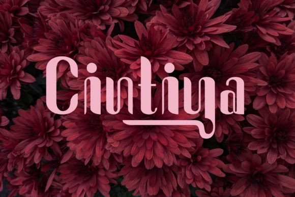
Cintiya Font offers a confident profile with narrow proportions, tall x-height and artful terminals that read modern with a retro hint. Its tight spacing and slightly condensed caps give posters and album covers a compact punch, making it ideal for merchandise, stickers and bold editorial headlines. Stylistic alternates let you toggle between quirky endings and cleaner forms to match tone. On textured stock or distressed overlays the letterforms gain tactile character that pairs well with analog photography.
Because Cintiya is optimized for display, small typographic adjustments matter: increase tracking for long headlines and allow generous leading. Pair it with a soft script or a clean geometric sans to create hierarchy without visual conflict. It converts well for embroidery mockups and vector prints, which makes it useful for apparel brands and limited-run packaging. Consider metallic inks or color blocking to emphasize its sculpted shapes.
My Recommendation: I choose Cintiya when a design needs a bold, slightly vintage personality-band posters, tote bags and boutique labels are prime candidates. Its sculpted letters hold up in print and vector work, so production tests tend to run smoother. Use alternates sparingly to maintain consistency while letting key words pop.
22. Clean Modern Font
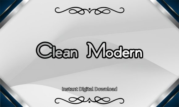
Clean Modern Font is a minimalist sans serif built for crisp branding and logotypes; its geometric shapes and tall x-height prioritize legibility in both print and screen contexts. The download includes TTF and OTF files with a commercial license, and the face holds weight without relying on decoration, making it ideal for storefronts, packaging, and contemporary stationery. Its clear counters and controlled terminals keep headlines authoritative without feeling heavy.
Technically, kerning and consistent stroke widths make grid-based layouts and CSS typography straightforward, so you can set tight mockups or broad signage with confidence. For added personality, pair the neutral base with hand-drawn accents or bohemian fonts as a contrasting companion to soften the tone while preserving readability. I often place it as the structural anchor in identity systems, letting a decorative partner supply the human touch.
╰┈➤ Download Clean Modern Font
My Recommendation: I reach for Clean Modern Font when a brand needs clarity and credibility without fuss. Its disciplined letterforms speed up layout decisions and perform reliably on labels, websites, and signage. Use it as a primary display face and balance it with an expressive companion when you want authority that still feels approachable.
23. Jellybean Font
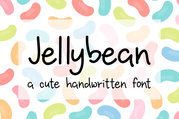
Jellybean Font is a bold handwritten face with rounded terminals and confident strokes that give headlines instant character and presence. Its nostalgic energy reads like retro brush lettering, making it a strong choice for logos, posters, and product packaging that demand personality. The design keeps letterforms readable even with its lively movement, which helps maintain clarity across sizes.
Spacing and contrast are tuned so headline lockups remain stable across digital and print outputs, and available alternates give options for custom wordmarks without heavy tweaking. Pair Jellybean with a clean sans for body copy to preserve legibility while letting the headline carry the brand voice, or use textured backgrounds to amplify its throwback charm.
My Recommendation: I use Jellybean when a project calls for bold, characterful lettering-think boutique drink labels, café signage, or retro apparel branding. Its strong presence simplifies logo creation because the type itself provides attitude. Choose it when you want warmth and nostalgia front-and-center without sacrificing readability.
24. Geutemala Font
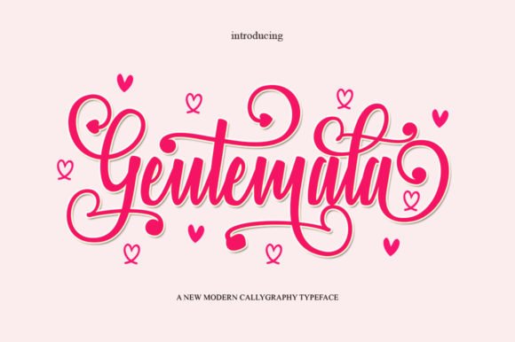
Geutemala Font is a flowing, delicate script that reads as elegant and handcrafted, with well-balanced joins and graceful terminals that suit refined layouts. The face includes PUA-encoded alternates and ligatures, so decorative swashes and stylistic sets are easy to access and insert into compositions. Its proportions make it work well for invitations, editorial accents, and boutique identity work where a handwritten touch matters.
When setting longer lines, modest tracking and careful baseline adjustments preserve rhythm and prevent crowding, keeping the script readable and natural. Combine Geutemala with a simple serif or neutral sans to ground layouts and let the script function like an ornamental signature, giving pages a sense of craft without overwhelming other elements.
My Recommendation: I reach for Geutemala for wedding suites, beauty branding, and premium packaging that benefit from a refined hand. The PUA glyphs let me compose expressive phrases without hunting through menus, speeding up production. Use it when you want an intimate, artisanal feel that still behaves predictably across print and web.
25. Mentions Font
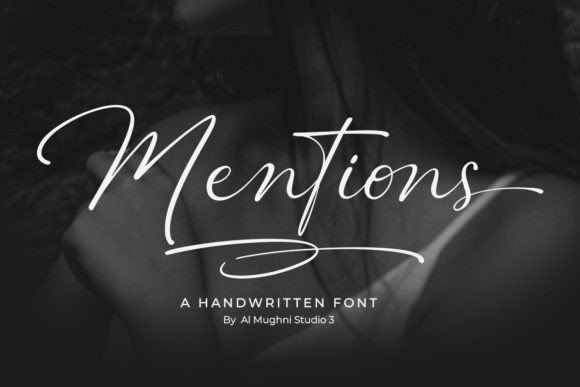
Mentions is a flowing handwritten script that pairs airy loops with refined strokes, producing a personal, slightly nostalgic voice. It sits nicely among bohemian fonts thanks to its loose baseline, varied stroke width, and artisanal ligatures that mimic a hand-held pen. The rhythm between ascenders and swashes gives headings and short lines a relaxed, boutique feel.
OpenType alternates and contextual forms are plentiful, so you can shape letter combinations to avoid repetition and keep compositions lively. Kerning is well-tuned for display use, and the font holds up in invites, labels, and brand marks where warmth and personality matter. Pair it with a simple geometric sans when you need contrast, or layer it over textured paper for editorial spreads.
My Recommendation: I reach for Mentions when I want text that reads like a crafted note rather than a manufactured script. Its alternates make it straightforward to avoid visual repetition across multiple lines, which is a big plus for wedding stationery and boutique identities. Use it for logotypes, packaging, or social headers when you want an approachable, artisanal aesthetic.
26. Sparkghose Font
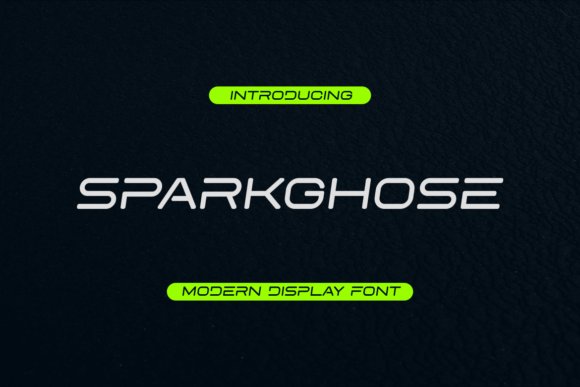
Sparkghose is a display font with a playful edge, mixing geometric stems with whimsical terminals that catch the eye. Its character set includes eccentric ligatures and quirky alternates that reward experimentation at headline sizes. Because of its strong personality the type performs best when given room to breathe on posters, album art, or product labels.
Weight contrast and generous counters keep it legible even when stylized, while layered color fills or subtle shadows amplify its theatrical side. The family ships with ornament glyphs and stylistic sets to break up repetition, and webfont formats help maintain consistent rendering across screens. Pair Sparkghose with a muted slab or a minimalist sans to give its flourishes center stage.
My Recommendation: I pick Sparkghose for projects that need bold, characterful headlines-think indie gig posters, craft beverage labels, or limited-edition packaging. Its alternates let me compose display text that feels bespoke without sacrificing clarity. Keep it out of long paragraphs and use it where every letter can be appreciated as part of the design.
Try a shortlist of three to five families from the 26 entries and test them in real layouts; contrast, spacing, and scale will determine whether a font reads rustic, romantic, or modern. Small treatments like ink textures, paper choice, or subtle distressing can shift the entire feel.
Keep licensing details handy for commercial use and save favorites into a reusable collection to speed future work. With the right pairings and a few tweaks, these bohemian fonts can help you craft designs that feel personal and authentic.