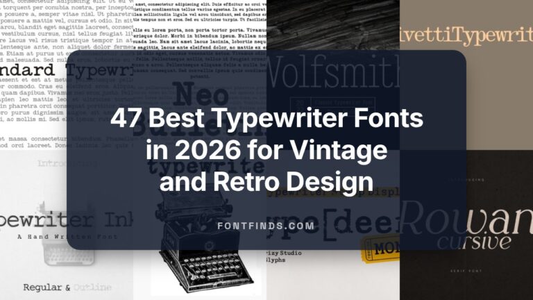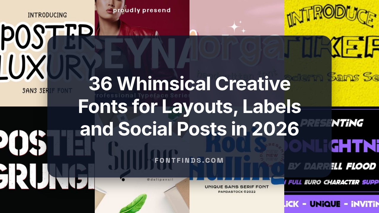
36 Whimsical Creative Fonts for Layouts, Labels and Social Posts in 2026
Creative Fonts can give a design personality without adding extra artwork. I selected 36 typefaces that span hand-lettered scripts, bold display faces, and refined serifs, each matched to a specific vibe or use case.
This post organizes samples into categories like handwritten, geometric sans, decorative display, and classic text faces. You’ll also find pairing ideas, licensing pointers, and brief tips for using each typeface on web and print projects.
1. Seyna Font
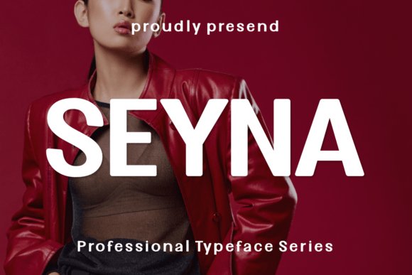
Seyna Font presents a bold blend of gothic angles and contemporary clarity, its medium weight built from strong vertical strokes and slightly condensed proportions that make headlines read like statements. The letterforms balance sharp terminals with generous curves so the face reads assertive yet refined at large sizes. On posters and identity marks it grants instant presence, while its carved shapes reproduce cleanly on merchandise, print, and screen.
For practical use, pair Seyna with a plain humanist sans for body copy to avoid typographic competition and tighten tracking for acronyms or short names to preserve impact. Reserve it for short, high-visibility lines where the form can breathe and consider metallic or tactile print finishes to accentuate its gothic notes without losing legibility. It also adapts well to condensed logo work and tattoo-inspired lettering where a confident outline is desirable.
My Recommendation: I choose Seyna when I need typography that reads as a bold signature rather than background text. Its gothic-inflected shapes give posters, fashion lookbooks, and brand marks a dramatic edge while remaining surprisingly legible. Use it for film posters, event headers, and identities that need to feel deliberate and memorable.
2. Kod S Hulling Font
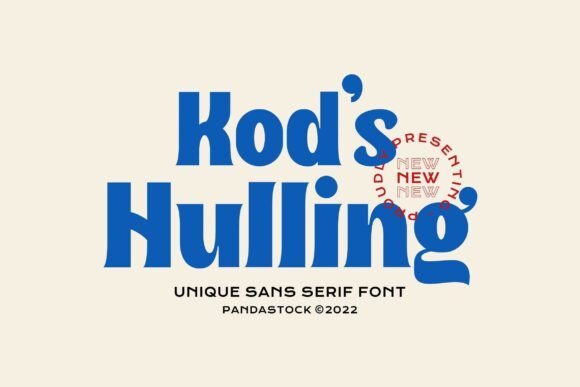
Kod S Hulling Font channels 1970s poster typography with chunky, rounded strokes and playful terminals that reference psychedelia without becoming fussy. The set of alternates and swashes (PUA-encoded) lets designers quickly switch moods, turning ordinary words into charismatic logos or badge-style headlines. Its dense weight and cheeky counters are built for short bursts of copy where personality must read at a glance.
Treat Kod S Hulling like a display toy: keep body text neutral and reserve this face for hero moments, labels, and short slogans that need warmth. Warm color palettes, sunburst gradients, or textured paper will boost its retro charm; avoid heavy distortion that flattens the crafted curves. It’s a strong pick for cafés, indie record sleeves, packaging, and social ads that aim to stop scrolling with friendly swagger.
╰┈➤ Download Kod S Hulling Font
My Recommendation: I reach for Kod S Hulling when a project wants nostalgic character with a playful attitude. Its swashes make simple marks feel handcrafted, perfect for food packaging, event posters, and social graphics. I usually pair it with a clean geometric sans to keep longer copy readable while the display type takes center stage.
3. Blood Font
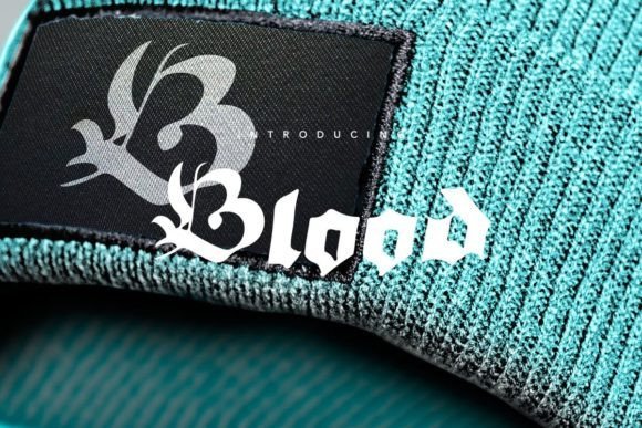
Blood Font reinterprets blackletter forms with restraint, offering high-contrast strokes and sculpted serifs that read dramatically at display sizes while avoiding excessive ornament. The overall effect is historic and deliberate: it works as an arresting headline face or compact logotype without becoming illegible. Because its contours are pronounced, printed and embossed finishes emphasize the carved quality of each letter.
Use Blood only for short phrases and marks to preserve clarity, and give it ample negative space so the angular counters can breathe. Pairing it with a neutral sans for body copy calms its intensity and improves readability, while single-color printing, foil, or letterpress will heighten its tactile presence. It fits craft beverage labels, band art, and fashion brands that reference tradition with contemporary restraint.
My Recommendation: I pick Blood when a design needs heritage and a strong visual signature without ornamental excess. It gives labels, posters, and apparel tags a sense of weight that reads well in tactile print or on merchandise. For brands in music, brewing, or heritage-driven fashion, it communicates character quickly and clearly.
4. Syukur Font
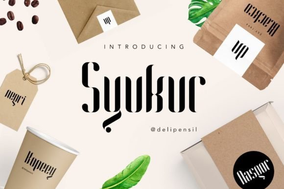
Syukur is a serif with a quietly charming personality: its modest bracketed serifs and gently tapered strokes give text a handcrafted warmth without losing clarity. Open counters and soft terminals make letters feel approachable on food labels and boutique packaging, while the slightly condensed proportions let you stack words in logos and posters without crowding the layout.
The font handles small sizes surprisingly well thanks to careful x-height and spacing, and it includes alternate glyphs that add subtle flair for headline work or monogramming. For apparel tags or editorial headings, Syukur brings a friendly but polished voice that reads as crafted rather than generic.
My Recommendation: I reach for Syukur when a brand needs to feel both handmade and legible-think artisan food, small-batch apparel, and warm identity marks. Its serif details give designs a sense of heritage while the clear counters keep things readable on small labels. For projects that want charm without ornamentation, Syukur is an easy, characterful choice.
5. Marni Font
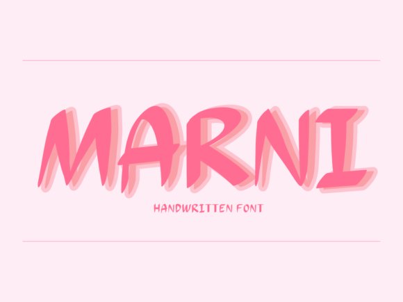
Marni reads like a personal note: relaxed, handwritten strokes with gentle irregularities that lend warmth to headlines and product badges. The letterforms keep a tidy rhythm so the casual look never becomes sloppy; it feels particularly well suited to greeting cards, café menus, and playful packaging where a human touch matters.
Use Marni large to let its personality sing, or pair it with a low-key geometric sans for body copy to avoid visual competition. Its informal tone works well on social graphics and boutique labels that need friendly, approachable typography rather than stiff formality.
My Recommendation: I use Marni when a design needs a friendly, handwritten voice-children’s brands, artisanal stationery, and boutique cafés are perfect fits. It injects personality without sacrificing readability, especially in short headlines and logos. Pairing it with a neutral sans keeps the overall look balanced and modern.
6. Gateso Font
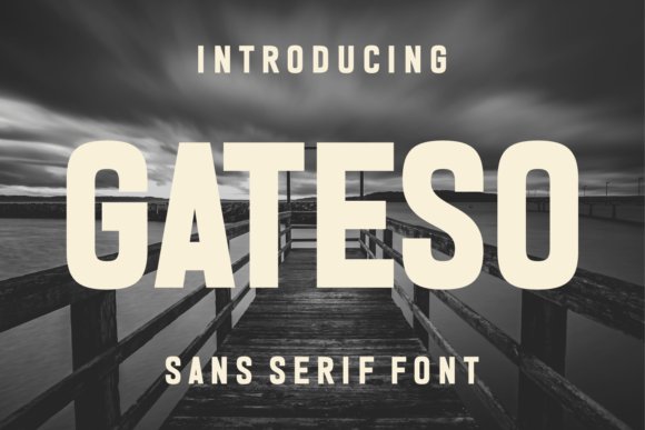
Gateso is an expanded sans with a clear nod to vintage poster lettering: broad, confident counters and pronounced horizontal stress give headlines a striking, fashion-forward attitude. The expanded width creates room for bold compositions, making it ideal for editorial mastheads, runway lookbooks, and packaging that must read from a distance with instant impact.
The italic companion sharpens the character into something sleek and couture, perfect for brand marks and high-end tags where a dash of glamour is needed. When used in large sizes with restrained color palettes, Gateso asserts presence; pair it with a narrow text face to keep long passages readable while maintaining the display’s drama.
My Recommendation: I pick Gateso for projects that demand visual authority-fashion branding, posters, and premium packaging benefit most from its wide, confident letterforms. The italic provides an elegant counterpoint that works well for accents and wordmarks. If you want a typeface that reads as contemporary yet carries a vintage poster spirit, Gateso delivers with personality and scale.
7. Mirox Font
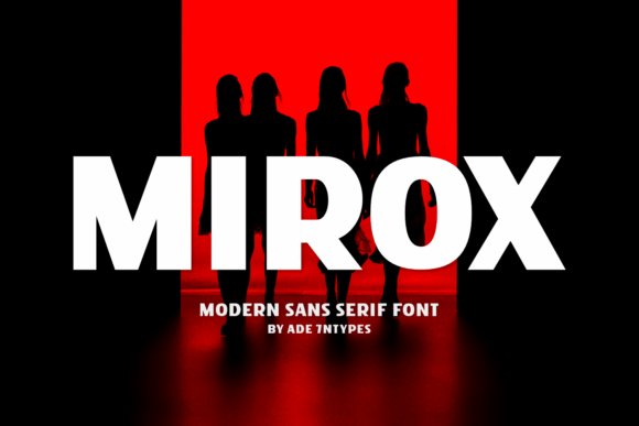
Mirox Font is a heavy display sans serif that hammers out a strong visual signature with chunky, geometric letterforms and softened terminals. Its all-caps emphasis and thick strokes read boldly from a distance while the rounded corners temper the weight, producing an urban-meets-retro energy that catches the eye without feeling fussy. Those broad counters and compact proportions make it feel purposeful rather than ornamental.
Apply Mirox to logos, posters, and packaging when you need typography that asserts itself loud and clear; it performs well on social banners and large-format prints. Pay attention to letterspacing to avoid visual crowding, and pair Mirox with a slender text face to create balance in longer layouts. The font simplifies hierarchy, allowing headlines to carry the tone so imagery and copy can stay restrained.
My Recommendation: I reach for Mirox when a project needs an unmistakable headline voice-streetwear labels, poster art, and product packaging all benefit from its presence. Its weight cuts through noisy feeds and its retro hints lend personality without gimmickry. For quick branding systems where you want one face to do most of the talking, Mirox is a reliable pick.
8. Melgis Font
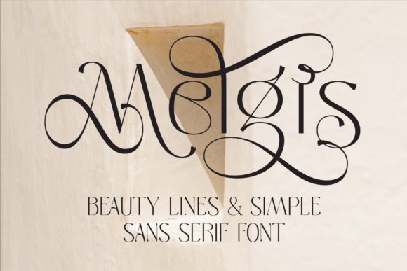
Melgis Font blends graceful curves with simple sans-serif structure to produce a refined, feminine voice that still reads clearly at display sizes. Swash alternates and gently tapered strokes add a sense of handwritten motion, while the base letterforms remain restrained so the type doesn’t overpower imagery. The overall effect is elegant and breathable rather than overly decorative.
Use Melgis for beauty identity work, editorial mastheads, and delicate packaging where a soft, stylish tone is desired. Reserve the swash glyphs for logos and large headlines and stick to plain variants for supporting copy to keep legibility intact. I recommend pairing it with a neutral grotesque or a narrow serif to give the ornate details room to breathe.
My Recommendation: I pick Melgis for projects that need graceful typography without excessive flourish, such as cosmetics branding, wedding stationery, and boutique editorials. The swash options let me craft expressive logotypes, yet the core letters stay readable in small sizes. It’s my go-to when the brief calls for subtle femininity and tasteful ornament.
9. Blade Rush Font
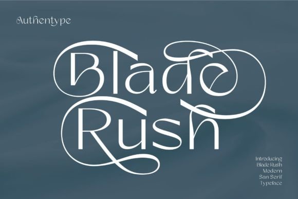
Blade Rush Font is a clean sans serif with a full complement of upper and lowercase letters, numerals, punctuation, and purposeful ligatures that tidy common letter pairs. The letterforms favor consistent stroke widths and a neutral posture, producing steady rhythm across both headlines and longer text. Because the shapes are unobtrusive, the face supports content without competing for attention.
Thanks to its wide glyph coverage, Blade Rush suits editorial pages, user interfaces, and multilingual packaging where dependable typography matters. Tight tracking sharpens headlines while looser spacing opens up posters; the ligatures give subtle polish in display settings. Pair it with a warmer display or a light script when you need an accent that doesn’t overwhelm the base type.
My Recommendation: I use Blade Rush when a project demands clear, everyday typography with solid language support-magazines, apps, and product copy all work well. The ligatures add small, professional flourishes and the neutral forms sit quietly alongside imagery. If you want a no-nonsense sans that adapts across formats, Blade Rush is a practical choice.
10. Moonlightning Font
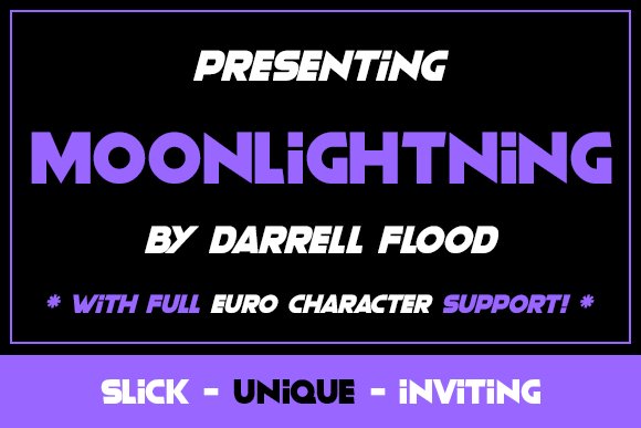
Moonlightning is a bold sans-serif with a slick profile and sharp terminals that hold up at distance. Its heavy weights feature compressed counters and a high x-height, giving headlines a compact presence without feeling claustrophobic. The letterforms blend geometric curves with subtly tapered strokes, adding a sense of motion to solid blocks of type.
This face is ideal for posters, billboards, and packaging where a single word must dominate; it cuts through busy imagery while remaining legible. Pair Moonlightning with a neutral serif or a soft humanist for supporting text to create contrast, and try tight tracking on short words to increase visual impact. It performs reliably in both print and large-screen digital work.
╰┈➤ Download Moonlightning Font
My Recommendation: I reach for Moonlightning when I need a headline that grabs attention without ornament. Its compressed bolds are perfect for poster campaigns, event signage, and product labels where space is limited but presence is essential. For best results I use it at larger sizes and balance it with a calmer body face.
11. Golden Grandma Font
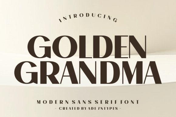
Golden Grandma channels Art Deco by way of tall, elongated letterforms and decorative terminals that evoke 1920s poster lettering. High-contrast strokes and ornamental alternates give you the ability to craft period-accurate headlines without relying on clichés. The design reads like refined vintage signage-elegant with a hint of theatricality-suited to editorial mastheads, boutique identity work, and premium packaging.
Use the display weights at larger sizes so the fine details remain visible; thin strokes are best avoided in small text. Combine it with textured papers, metallic foils, or deep color palettes to amplify that era-specific sheen. Stylistic sets and ligatures allow you to tune the personality from subtle glamour to pronounced retro flair.
╰┈➤ Download Golden Grandma Font
My Recommendation: I choose Golden Grandma for projects that need nostalgic glamour-artisan packaging, cocktail menus, and boutique brand marks benefit especially well. The alternates let me shift the mood from restrained to showy without switching families, which keeps identities cohesive. I avoid using it for long passages and keep it as a headline or logo treatment.
12. Kariwa Font
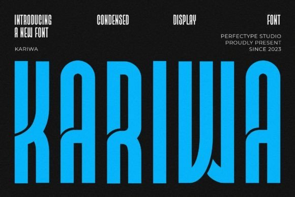
Kariwa is a streamlined sans-serif with monoline strokes and gently rounded terminals that feel modern yet approachable. Generous spacing keeps small UI labels readable while the balanced proportions lend a subtle futuristic temperament without gimmickry. Its clean apertures and consistent curves make it a strong choice for tech websites, signage, and editorial work that prizes clarity.
The family offers weights that establish clear hierarchies-light for captions, medium for body UI, and bold for emphasis-while preserving rhythm across sizes. Kariwa pairs well with geometric display faces or a soft serif when contrast is needed, and its hinting-friendly shapes render reliably on a wide range of screens. I also appreciate how it supports extended language sets without losing character.
My Recommendation: I often use Kariwa on product pages and mobile interfaces because its open forms improve legibility at small sizes. The neutral, modern voice complements photography and saturated color schemes, giving layouts a polished, professional look. It’s particularly useful when usability and a contemporary aesthetic must coexist.
13. Ectone Font
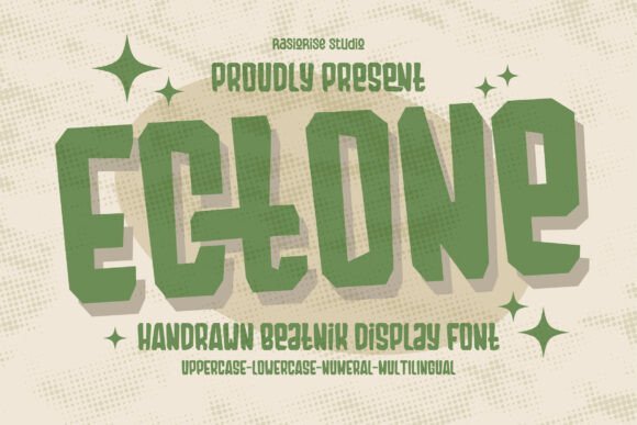
Ectone channels a raw, counter-cultural look rooted in ’60s–’80s Beatnik and surf-poster lettering. Its irregular terminals, slightly off-kilter letter widths and hand-drawn textures give headlines and badges an immediately aged, analogue character without reading as contrived. The result is a display face that feels like a found object from an underground print shop.
Use Ectone for posters, record covers, apparel graphics and retro packaging where personality matters more than strict uniformity. It pairs well with tight, neutral sans faces when you want the type to act like a visual accent rather than the whole story, and it tolerates heavy distressing and layered color work.
My Recommendation: I reach for Ectone when a project needs weathered personality-think surf brands, band posters, or hip coffee roasters. It gives text a lived-in, handcrafted tone that photography or bold shapes can play off. If you want an immediate vintage vibe without fussy ornamentation, this font makes that simple and satisfying.
14. Avila Font
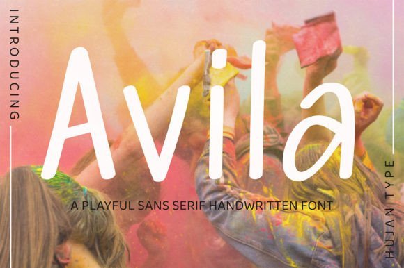
Avila reads like a handwritten sans that keeps legibility front and center; strokes are human and casual but the overall rhythm remains steady. Its slightly irregular baseline and soft terminals create warmth, so text feels personal without looking sloppy, which makes it suitable for small runs of copy on labels and social tiles. The face balances spontaneity and control in a way that photographs and product mockups welcome.
Because Avila holds up at modest sizes, it works nicely for packaging, invitations and subtle watermarks where you want a handcrafted touch without sacrificing clarity. Try pairing it with a narrow geometric sans for contrast, or use it alone across hero images to add an approachable, hand-marked voice.
My Recommendation: I use Avila when I want a human touch that still reads cleanly across screens and print. It’s perfect for boutique labels, social posts, and stationery where personality should complement imagery rather than compete. This font is my go-to when projects need warmth and legibility in equal measure.
15. Shawkind Font
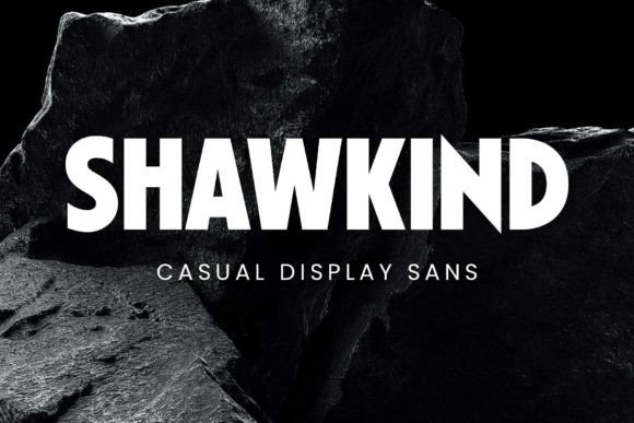
Shawkind is a loud, confident all-caps sans designed with poster-making in mind: bold counters, crisp curves and pointed terminals combine to create a commanding headline voice. The design’s geometry leans modern while details nod to classic advertising type, giving headlines a poised but assertive stance. Included alternates and punctuation let you tweak rhythm and emphasis without breaking the face’s overall discipline.
It excels on movie posters, storefront signage and brand identities that need presence rather than subtlety; when set tight and large, Shawkind reads like a statement. For softer editorial work, pair it with a light serif or a narrow humanist sans to give body copy room to breathe while the display face holds attention up top.
My Recommendation: I pick Shawkind when a project calls for bold readability and a bit of swagger-campaigns, posters, and identities that must be heard at a glance. Its alternate characters let me shape headlines for impact, and the multilingual support simplifies global rollout. If you want a headline voice that commands space without gimmicks, Shawkind delivers.
16. Manisans Sans Serif Font
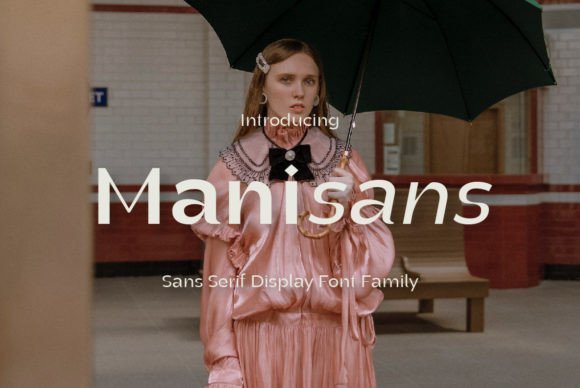
Manisans Sans Serif Font Family marries restrained geometry with soft terminals to produce a clean, contemporary voice for display work. It ships in multiple weights and matching italics, letting designers modulate emphasis without swapping typefaces. The letterforms emphasize open counters and predictable stroke endings, which keeps headlines legible at a glance.
At large sizes the family reads with authority while smaller sizes retain character thanks to careful spacing and a generous x-height. Its numerals and punctuation are drawn to match the glyph rhythm, making the set reliable for posters, packaging, and UI headings. Use it when you want clarity with a subtle human touch rather than blunt ornamentation.
╰┈➤ Download Manisans Sans Serif Font
My Recommendation: I choose Manisans when a brief needs clarity plus a hint of refinement-brand headers, event posters, and packaging get the most from its weight range. The italics are purposeful rather than decorative, so emphasis feels natural. Pair it with a neutral body sans or a warm serif to balance precision and personality.
17. Kawede Font
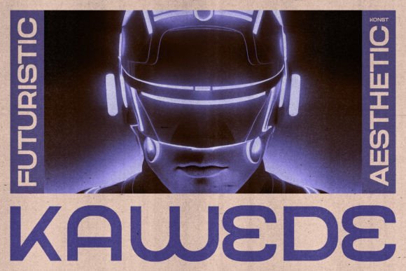
Kawede Font speaks in a muscular, futuristic tone: truncated terminals, sharp joints, and deliberate apertures give each glyph an engineered presence. Drawn with influence from brutalist poster-making and anti-design attitudes, the characters have an industrial, almost mechanical energy. Its shapes read as design statements rather than neutral text, which makes them memorable for short headlines.
The face thrives on bold contexts-music covers, game branding, and movie titles where attitude matters most. It performs best against high-contrast photography or solid color fields that let the letterforms assert themselves. Avoid long paragraphs; Kawede is built for impact in compact doses.
My Recommendation: I pick Kawede for projects that demand aggressive personality-album art, esports identities, and cinematic posters where the typography can dominate. It pairs well with minimal layouts and saturated color to preserve its sculptural qualities. Use it sparingly and give it space so each letter can read like an object.
18. Fourty Font

Fourty Font is a restrained sans with refined proportions crafted for headlines and posters that need a polished look. Its thin-to-medium stroke contrast and slightly condensed lettershapes create a silhouette that feels both modern and composed. A modest set of alternates lets initials and wordmarks take on a distinct, editorial flavor without fuss.
On print, Fourty benefits from quality paper and tactile finishes, where its fine details remain evident; on-screen it preserves clarity at high resolutions and responds well to tightened tracking. The overall effect is quiet luxury-headlines that read as thoughtful rather than loud. Reach for it when you want sophistication with restraint.
My Recommendation: I use Fourty for boutique catalogs, fashion editorials, and upscale event posters where a calm, elegant tone is required. Its clean lines lift headlines while leaving room for imagery and layout breathing. Pair it with a soft serif for body copy to maintain a refined, readable hierarchy.
19. Poster Font
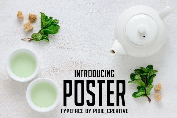
Poster Font is a crisp sans serif with measured proportions and clean terminals that feel deliberate rather than generic. Its relatively tall x-height and open counters preserve legibility at distance while subtle stroke variation keeps headings from feeling mechanical. Spacing is disciplined: tight compositions breathe without crowding, and small caps and punctuation are tuned for editorial use.
The family includes useful alternates and italic forms that retain personality instead of turning into mere slants, which makes it flexible for both display and short blocks of copy. I like pairing it with a soft serif for extended text, or running it solo on packaging, posters, and signage where clear, confident letterforms are the main message.
My Recommendation: I would reach for Poster Font when a project needs a clean, readable face that still has character. It performs well in magazine mastheads, transit signs, and product labels where scale and clarity matter. Use it when you want restrained presence with a hint of warmth.
20. Honest Action Font
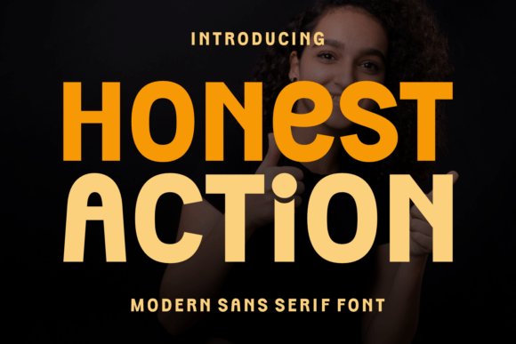
Honest Action Font arrives as a heavy, geometric sans with extra-wide strokes and condensed proportions that force attention. Rounded terminals temper the aggression, so the blocks read as assertive but not hostile; this balance makes it effective for short, emphatic headlines. Optical spacing is consistent across weights, which helps maintain rhythm on billboards and large-scale displays.
This face excels when single lines must dominate-sports graphics, bold corporate badges, and high-impact web hero panels-yet it grows tiresome in long runs of text where its mass becomes visually heavy. For secondary copy pair it with a lighter, neutral sans to keep hierarchy clear while preserving the headline’s punch.
╰┈➤ Download Honest Action Font
My Recommendation: I reach for Honest Action when a headline needs to behave like a banner: clear, forceful and immediately legible. Its dense geometry makes short slogans and logo words feel decisive and memorable. Ideal for athletic brands, event posters, and digital ads that require instant recognition.
21. Merry Story Font
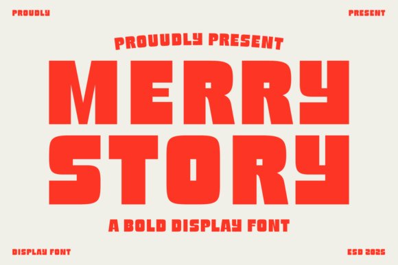
Merry Story Font is an ultra-heavy display sans whose chunky, rounded letters read like a cheerful shout. Despite its weight, counters are carved with care so shapes remain distinct rather than blending into a single dark mass; the soft terminals and generous curves lend a friendly, approachable tone. It thrives at headline sizes where the personality can breathe and the playful rhythm becomes a focal point.
Because of its visual density, Merry Story works best used sparingly on festival posters, children’s packaging, and playful logos rather than in long passages. Bright color choices and ample negative space amplify its character, so keep surrounding graphics simple and let the letterforms carry the mood.
My Recommendation: I use Merry Story when a project needs instant, cheerful personality that reads at a glance. It’s perfect for kid-focused brands, event posters, and logos that benefit from bold charm. Keep layouts minimal and give the type room to perform so its character stays readable and joyful.
22. Poster Power Font
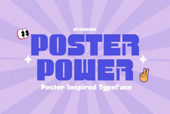
Poster Power Font is a bold sans-serif built to take over large-format designs; its thick vertical strokes, tight counters, and slightly condensed letterforms make headlines legible from a distance while keeping a strong silhouette. The type leans on mid-century poster traditions-blocky construction softened with rounded joins-giving text a retro pulse without feeling dated. Display alternates and careful spacing let you push titles toward playful or authoritative tones with minimal fuss.
Use Poster Power for concert posters, event banners, packaging, and wayfinding where a single line must carry the visual story. Pair a heavy Poster Power headline with a neutral humanist for supporting copy to maintain hierarchy and eye comfort. When you want typography to dominate the page and cut through color and imagery, Poster Power delivers a confident, readable voice.
╰┈➤ Download Poster Power Font
My Recommendation: I use Poster Power when a headline must be the unequivocal center of attention; its retro references add character and the display alternates let me tune the attitude quickly. It’s ideal for posters, festival branding, and packaging where bold type needs to read across distance. The face saves time by giving clear options for weight and rhythm so layouts come together fast.
23. Pentacle Font
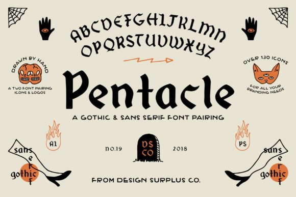
Pentacle Font pairs a dense blackletter with a pared-back sans, offering dramatic contrast inside one family so you can mix ornate titles and readable captions without hunting for matches. The blackletter carries sharp terminals, tight texture, and optional swashes that suit headlines and logos; the sans companion mirrors stroke weights so the two styles feel intentionally linked. Thoughtful ligatures and stylistic sets let you dial up flourish where appropriate.
This duo shines on band posters, craft labels, apparel graphics, and identities that benefit from a moody, handcrafted edge. Let the blackletter punctuate names or key phrases while the sans handles metadata and smaller copy to preserve legibility. Because both scripts were designed to sit together, pairing feels natural rather than forced, giving projects a cohesive, expressive look.
My Recommendation: I reach for Pentacle when a project asks for old-world character with modern usability; the two styles cover both headline drama and everyday reading needs. It’s perfect for music packaging, boutique branding, and merchandise that wants a gritty, artisanal presence. The integrated alternates and ligatures make it straightforward to craft arresting logotypes without juggling multiple type families.
24. Reilax Font
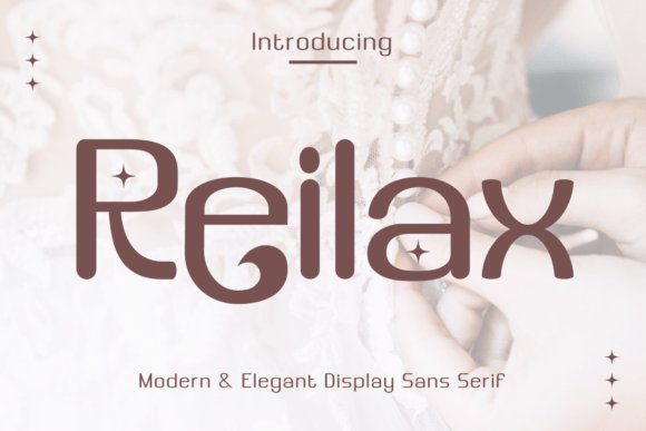
Reilax Font is a refined sans with an elegant skeleton and open counters that read crisply at both display and text sizes; a high x-height and soft terminals give it warmth while maintaining a precise geometry. Slightly condensed proportions and multiple weights make it flexible for logos, editorial headings, and poster copy, and a handful of alternate glyphs lets designers introduce subtle personality. Spacing and hinting were handled to preserve clarity on screen and in print.
In practice Reilax performs well across brand identity, web headers, and printed layouts where a polished yet friendly tone is required. Pair it with a humanist serif for longer blocks or with clean icons for a contemporary interface. If you need a typeface that balances cleanliness with character, Reilax offers a restrained but expressive voice.
My Recommendation: I choose Reilax when a project needs a modern, personable sans that doesn’t read generic; it brings enough warmth for boutique brands and enough clarity for editorial systems. The alternate glyphs let me add small touches that lift a logo or headline, and the family scales nicely from banners to body copy. Great for startups, magazines, and web projects that want polished typography with subtle soul.
25. Stikers Font
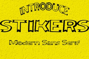
Stikers Font is a hollow modern sans serif that relies on outlined strokes and generous counters to create a buoyant headline voice. The open interiors and geometric stems let backgrounds peek through, turning color fields and textures into part of the letterform. Its balance of rounded terminals and straight edges gives a contemporary-but-friendly look that reads best at display sizes. Tight default kerning keeps stacked words compact and energetic.
This face shines on posters, gig flyers and storefront signage where the outline effect can carry imagery and mood. Pair it with a solid, compact sans for supporting copy or place it against bold color blocks for maximum contrast. For print, consider a faint inner shadow or emboss to boost separation on busy visuals. Use it as a headline or single-word logo rather than body text.
My Recommendation: I reach for Stikers Font when a headline needs breathing room and a graphic attitude; the hollow letters let the background play an active role. It’s particularly effective on music posters and youth-oriented campaigns where a bold, posterized look helps messaging cut through. In practice I pair it with a neutral sans for body copy and keep decorative effects subtle so the outline remains the star.
26. Runcing Font
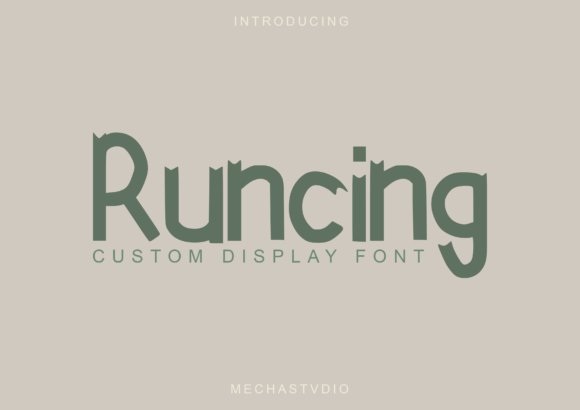
Runcing Font mixes hefty display strokes with playful sans details, yielding a typeface that reads lively and unmistakable at a glance. Distinctive terminals and a set of quirky ligatures give short words a handcrafted personality without feeling fussy. The generous counters preserve legibility even where strokes are thick, so it performs well on screen and in print at moderate sizes. Uppercase characters carry most of the attitude while lowercase supports rhythm and flow.
It’s a smart choice for logos, labels and social graphics that need strong character rather than subtlety. Tight tracking creates a compact headline, but loosening spacing benefits wordmarks and packaging. Try embossing or foil on product tags to highlight its bold contours, and pair it with a neutral serif for informational text. Reserve Runcing for display use rather than dense copy blocks.
My Recommendation: I use Runcing Font when a brief piece of text must communicate personality immediately-product tags, boutique logos and punchy social posts are ideal. Its bold forms command attention without becoming ornamental, and it translates well to tactile print finishes like emboss or foil. For readability I support it with a plain, readable body face and avoid using it for paragraphs.
27. Poster Linear Font
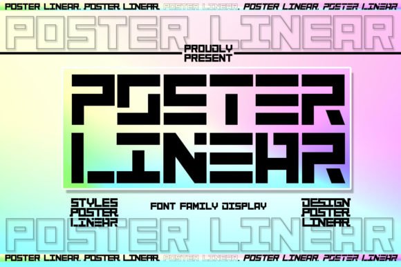
Poster Linear Font is a monoline sans whose elongated stems and spare terminals create a clear, forward-looking presence. The restrained geometry favors straight edges and consistent stroke widths, producing a confident, minimal title voice without unnecessary ornament. It scales cleanly for wide-format work where legibility at distance matters, and light weight differences help you control emphasis across layouts. Tight leading keeps compact headlines crisp.
Apply it to magazine covers, game art and sports signage where a clean, assertive title is required. It pairs well with a softer serif for longer reads or with condensed display faces when space is at a premium. On digital banners slightly increasing tracking improves on-screen rendering, and using all-caps boosts impact. Keep decorative treatments minimal to preserve its linear clarity.
╰┈➤ Download Poster Linear Font
My Recommendation: I pick Poster Linear Font when a project needs precise, no-frills headlines-think sports branding, tech covers and event posters. Its straight geometry gives layouts a disciplined, professional look while staying highly readable at scale. I often combine it with a warmer serif for body copy to temper the mechanical edges and add human warmth to the composition.
28. Poster Grunge Font
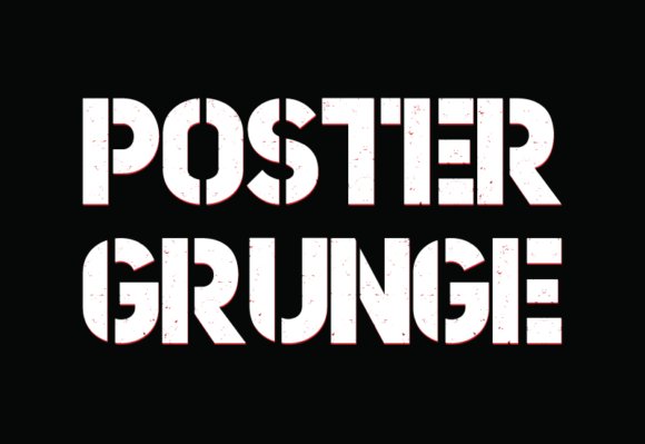
Poster Grunge Font wears its rough edges openly: strokes appear chipped, terminals fray, and irregular ink traps give letters a weathered presence. At display sizes it reads like a shout-tactile, urgent, and unmistakable-while fine detail can soften at small sizes or on low-resolution screens. Use strong contrast and textured backgrounds to keep the distressed details legible.
Reserve Poster Grunge Font for headlines, gig posters, album art, and streetwear marks where character outweighs neutrality. Pair it with a quiet geometric sans or a restrained serif for body copy, and give generous tracking so its rugged terminals don’t collide. When preparing files for print, convert to outlines and proof at scale to preserve the handcrafted feel.
╰┈➤ Download Poster Grunge Font
My Recommendation: I reach for Poster Grunge Font when a brief needs to feel lived-in and bold-music posters, protest flyers, and streetwear badges are ideal. Its distressed letterforms inject personality without extra ornament, saving time during mockups. I set it large, match it to subdued palettes, and pair it with a calm text face so the grit reads clearly.
29. Megazine Poster Font
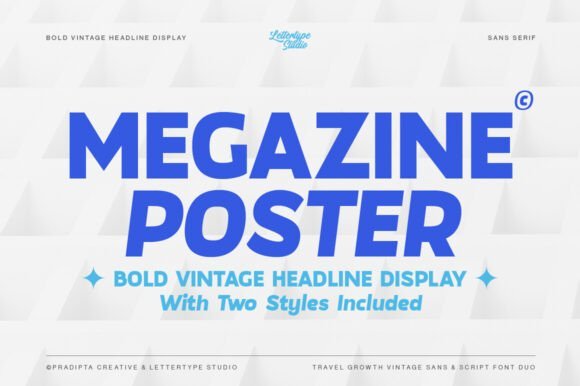
Megazine Poster Font channels 60s and 70s headline craft with compact, square lettershapes and a confident heft that reads instantly. Balanced proportions and generous counters preserve clarity in bold titles while the period voice lends instant character. Heavier styles dominate mastheads and posters; medium weights work well for subheads and short blocks.
Use warm palettes, paper grain, or subtle duotone to reinforce its retro appeal, and pair it with a neutral humanist or a soft serif for body copy to avoid visual competition. Tight kerning on all-caps lockups and careful leading will reward editorial and packaging work. It adapts cleanly between print and responsive web when headline presence matters most.
╰┈➤ Download Megazine Poster Font
My Recommendation: I pick Megazine Poster Font for projects that call for clear period flavor-magazine covers, boutique packaging, and signage benefit from its bold yet readable forms. It supplies headline authority without appearing stiff, so type can carry mood and message together. I usually team it with neutral text faces and warm color treatments to keep the vintage cue tasteful.
30. Poster Luxury Font
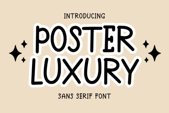
Poster Luxury Font offers a playful, rounded sans-serif voice: open counters, soft terminals, and a friendly rhythm that stays readable in tight settings. The design feels handcrafted but restrained, which makes it a good match for planners, greeting cards, KDP interiors, and printable stationery. Light to medium weights keep multipage documents airy while bolder cuts give emphasis to covers and headings.
On paper the font brings warmth to stationery; on screens it retains a calm, tidy presence suitable for apps and templates. Pair it with a narrow monospaced accent or a casual script to introduce contrast and charm, and apply small tracking adjustments to prevent crowding in dense lists. Always proof printed samples at final scale to confirm the best weight for tiny text.
╰┈➤ Download Poster Luxury Font
My Recommendation: I choose Poster Luxury Font when a project needs friendly clarity-teacher materials, planners, invitations, and KDP interiors all gain personality without sacrificing legibility. Its warmth reduces the need for heavy decoration, so pages feel inviting yet clean. I recommend printing a sample at final size to pick the right weight for small-body text.
31. Peregrin Font
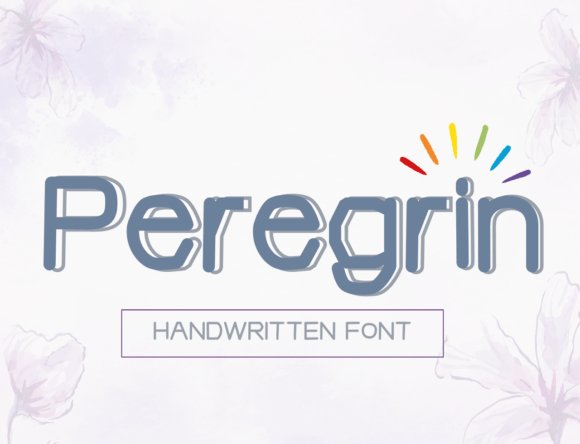
Peregrin is a clean sans-serif that balances measured geometry with subtle humanist touches. Open counters and a generous x-height give it excellent legibility at small sizes while maintaining a crisp presence in display use. The letterspacing feels calibrated for flexible layouts, so blocks of text and short headlines sit comfortably together.
On screen it renders with steady contrast, and in print the shapes keep crisp edges without feeling cold. Multiple weights and italics provide options for hierarchy without hunting for alternate families, and its punctuation and numerals are unusually well-tuned for data and UI work. Pair it with a restrained serif for editorial pieces or with a condensed grotesque when you need denser headlines.
My Recommendation: I reach for Peregrin when a project needs clarity and a modern personality without fuss. Its readable forms save time during prototyping, and the weight range makes it a reliable single-family choice for brand systems. Use it for dashboards, long-form articles, and corporate identities where neutral confidence matters.
32. Morgan Font
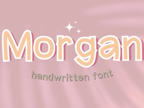
Morgan is a bold, compact sans-serif that stakes visual ground immediately with heavy strokes and tight counters. Its high-impact letterforms make headlines feel decisive, and the pronounced terminals give the typeface a memorable silhouette on posters and labels. The overall color on a page reads dark and even, so short bursts of copy register strongly at a glance.
Morgan handles color and texture treatments well, allowing designers to add grit or gloss without losing legibility. It performs best in display sizes where the weight becomes a feature rather than a hindrance, and it pairs well with lighter serifs to soften long-form reading. Use its clean capitals for monograms and product badges to maximize recognizability.
My Recommendation: I use Morgan when a layout needs to read as confident and unmistakable in a single glance. Its mass and rhythm work brilliantly on packaging and signage where recognition matters. I avoid it for body text, but for headlines, mastheads, and product labels it’s a practical go-to.
33. Phelan Font
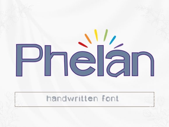
Phelan brings warm playfulness through rounded strokes and slightly irregular terminals that read as hand-inflected rather than manufactured. Letters have a gentle bounce and varied widths that add personality without sacrificing clarity, making it ideal for lively headlines and event graphics. The open bowls and clear counters keep the type friendly even when applied at larger scales.
Small details like quirky dots and offbeat numerals give Phelan a lot of character in short phrases, and it pairs nicely with a straightforward geometric sans to balance whimsy with restraint. It photographs well on textured materials and remains readable in colorful layouts, though it’s best used sparingly in body copy. Think invitations, kids’ books, cafés, and playful brand identities where tone matters as much as form.
My Recommendation: I pick Phelan when I want a design to feel personable and slightly cheeky without losing professionalism. The subtle irregularities inject warmth and help a brand stand out in crowded visuals. It’s perfect for packaging, posters, and boutique hospitality projects where approachability is part of the brief.
34. Lincoln Font
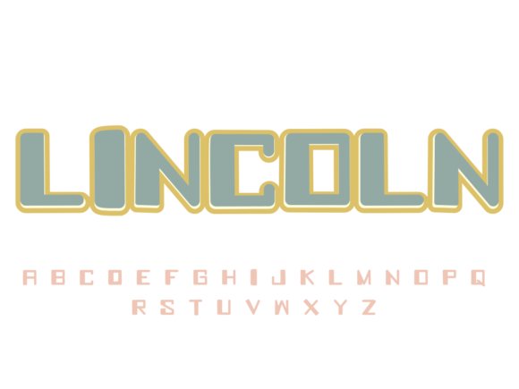
Lincoln is an elegant sans serif built around clear geometric proportions and a generous x-height, which gives typesetting a poised, airy presence. Terminals are gently softened rather than abrupt, so long reads feel more comfortable without losing contemporary character. The family’s weight spread balances delicate hairlines with stronger bold cuts, making headings and body text play well together. Spacing is tuned for editorial use, so it behaves predictably across multi-column layouts and cover art.
Apply Lincoln to book jackets, magazine spreads, or premium packaging when you want restraint rather than ornament. It pairs neatly with a modest serif to introduce warmth, or stands alone for pared-back identity projects. Kerning at display sizes feels intentional and stable, and line-height adjustments rarely need heavy correction. For designers focused on clarity, Lincoln is a quietly refined choice.
My Recommendation: I use Lincoln when a project requires calm, readable typography with a refined profile-editorial work and sophisticated brands benefit most. Its predictable spacing and sensible weight options shave time off layout decisions. For identities that need poise without showiness, Lincoln is my go-to.
35. Marvin Font
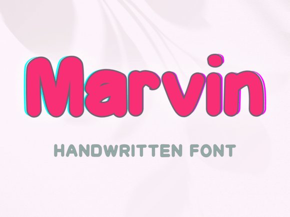
Marvin grabs attention with brush-like strokes and a confident slant that reads strongly in short lines and logotypes. The letterforms mix tight counters with playful terminals, producing a handmade feel rather than a manufactured one. Thick stems provide real presence in headlines while subtle irregularities keep the voice human and expressive. A set of alternates and discretionary ligatures makes it straightforward to craft distinctive wordmarks.
This face shines at display sizes-think posters, album covers, and product labels where personality is the main ingredient. Pair Marvin with a neutral sans to let texture and colour carry the mood, or place it against a muted field for a retro poster aesthetic. It asks for breathing room, so reduce density in layouts to maintain clarity. For brands wanting character, Marvin brings bold, tactile charm.
My Recommendation: I reach for Marvin when a brief calls for attitude and handcrafted energy-its strokes turn plain headlines into statements. It’s fantastic for posters, merch, and vintage-inspired packaging where presence matters more than micro-legibility. Use the alternates to build unique marks that feel bespoke.
36. Osman Font
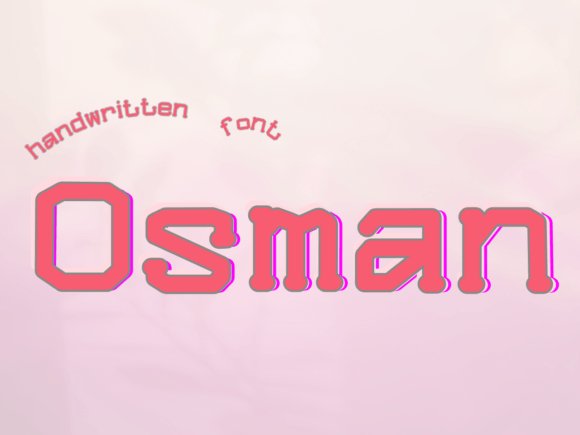
Osman reads as warm and approachable thanks to rounded terminals and a gentle baseline rhythm that suggests handwriting without being untidy. Open counters and generous letter spacing help its forms remain legible at small scales, making it practical for social posts and cards. The design includes a handful of alternates that add character without compromising clarity. A light-to-regular weight range is particularly suited to invitations and personal stationery.
Use Osman on boutique labels, children’s books, or lifestyle branding where friendliness is the priority over strict formality. It pairs well with a restrained serif to maintain balance, and its forgiving shapes speed up typesetting when deadlines pressure layout choices. Because it reads as human and unforced, Osman softens a brand voice without feeling twee or saccharine. It’s a reliable pick for approachable design work.
My Recommendation: I pick Osman for projects that need a relaxed, human touch-greeting cards, small business identity, and kid-focused layouts are ideal fits. Its open shapes make setting copy fast and fuss-free, which I appreciate on tight schedules. When a brief asks for warmth rather than polish, Osman delivers every time.
Choose a typeface that aligns with the feeling you want to send-warm and organic, crisp and modern, or playful and quirky. Keep hierarchy clear by pairing expressive display faces with straightforward text fonts to preserve legibility.
Use the pairing and licensing notes to speed your selection, then test each font at the sizes and environments where it will live. A few thoughtful choices will make your typography carry much of the message to readers.