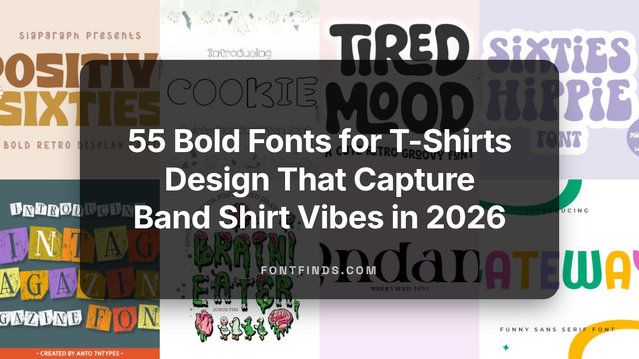
55 Bold Fonts for T-Shirts Design That Capture Band Shirt Vibes in 2026
Fonts for t-shirts design are what give a tee its attitude – from gritty band shirts to minimalist streetwear and playful kids’ prints. This post lists 55 typefaces chosen for legibility on fabric, personality at print scale, and reliable performance across CMYK and screen previews.
You’ll see serif, sans, script, and display options plus practical notes on typography, letterspacing, contrast, and font pairings. Try each face in mockups and on sample swatches to check how ink, fabric, and scale alter the final look.
1. Positive Sixties Font
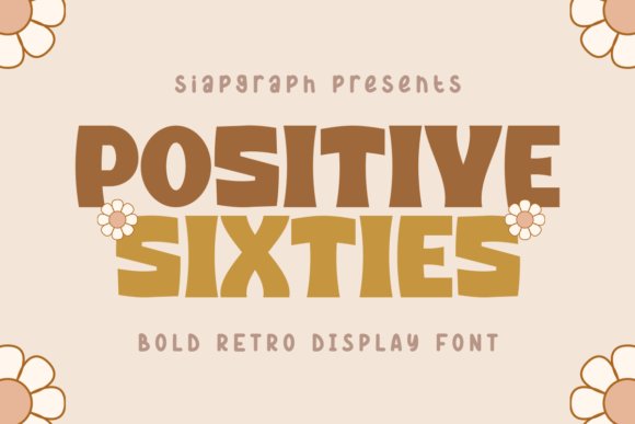
Positive Sixties is a bold retro display font that channels 1960s advertising with thick, playful letterforms and soft curves. Its heavy strokes and slightly condensed proportions give headlines a tactile presence while maintaining surprising readability. The set includes upper- and lowercase characters, punctuation, and multilingual support so text stays consistent across languages.
This design shines on apparel, stickers, and poster-sized layouts where the weight of the letters becomes a visual feature. Small-format uses like journals, planners, and digital mockups on platforms such as Canva benefit from its friendly personality and clear counters. Use it against simple backgrounds for instant vintage character or pair with a geometric sans to calm the composition.
╰┈➤ Download Positive Sixties Font
My Recommendation: I reach for Positive Sixties when a project needs cheerful, retro attitude-T-shirts, scrapbook covers, and bold sticker runs are ideal. Its sturdy strokes print reliably on fabric and vinyl, and the multilingual set makes short runs practical across markets. If you want nostalgic charm with strong legibility, this is my go-to display choice.
2. Alert Grand Slab Serif Font
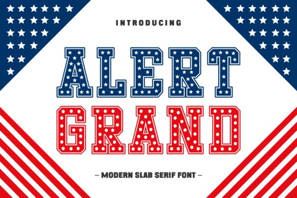
Alert Grand is a slab serif with assertive serifs and broad shoulders that read like classic American signage. The characters carry a slightly softened finish so the weight feels confident rather than heavy-handed. Proportions favor display work, giving mastheads and logos a durable, historic voice that anchors a layout.
It performs well on magazine covers, packaging that needs presence, and T-shirts aiming for an authoritative aesthetic. The robust serifs translate cleanly to embroidery and textured print, holding shape at small scales. Use tight caps for compact impact or set larger for an unmistakable headline treatment.
╰┈➤ Download Alert Grand Slab Serif Font
My Recommendation: I pick Alert Grand when a design needs to feel established and strong-product labels, editorial mastheads, and retro Americana branding are perfect fits. Its slab construction survives small-scale production like embroidery while still dominating posters and packaging. For clients who want a voice that reads both familiar and commanding, this font does the job.
3. Samelro Sans Serif Font
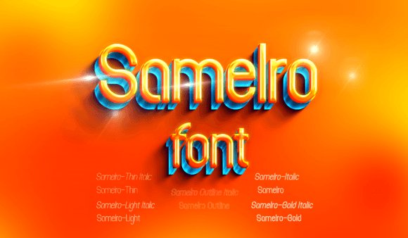
Samelro is a clean sans-serif with an industrial edge, defined by crisp verticals and open counters that emphasize clarity at a distance. The glyph set covers numerals and essential punctuation, and spacing has been tuned to produce an even colour in headlines. The restrained geometry suggests a technical, modern temperament without appearing cold.
It is well suited to film titles, app headings, and product labels where a precise, engineered look is wanted. On screens the forms retain legibility at small sizes, while large displays gain an architectural presence. Pair it with a lively accent font for contrast or use it alone to keep layouts minimal and focused.
╰┈➤ Download Samelro Sans Serif Font
My Recommendation: I use Samelro when projects demand a tight, technical voice-tech identities, industrial product packaging, and movie posters are where it excels. Its spacing and clear counters make it reliable across print and digital, and the aesthetic keeps compositions feeling crisp rather than decorative. For concise, modern branding that needs speed and clarity, Samelro gets the job done.
4. Vintage Magazine Font
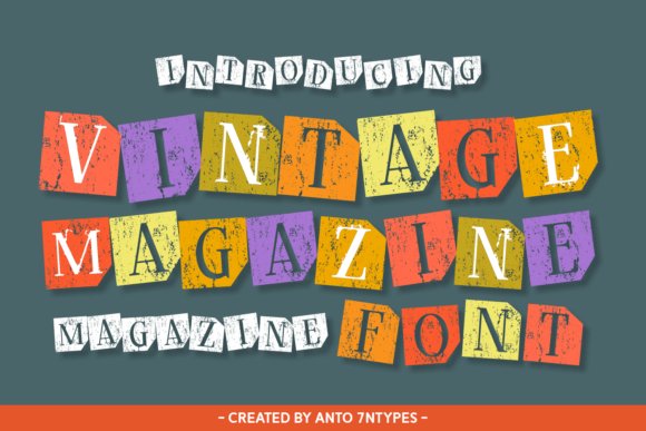
“Vintage Magazine” mimics a collage of clipped headlines and hand-cut letters, where irregular baselines and rough edges create a tactile, analog feel. The type mixes fully formed capitals with fractured shapes that read boldly at title sizes while retaining the charm of imperfect paste-up typography. That slightly chaotic rhythm gives it a rebellious voice ideal for posters, indie zines, and record sleeves.
It performs best on short bursts of copy-mastheads, taglines, product names-and comes alive when layered over textured photography or block color. Small kerning nudges restore balance without erasing the handcrafted character, and its strong contrasts make it a natural partner for clean sans or narrow script used as secondary text. Provided in OTF and webfont formats, it adapts well to print collages and social tiles with little fuss.
╰┈➤ Download Vintage Magazine Font
My Recommendation: I reach for Vintage Magazine when a headline needs attitude and a handmade stamp of personality. Its ransom-cut aesthetic reads like archival ephemera but stays legible, so it’s perfect for posters, album covers, and bold packaging. Use it when you want a nostalgic, slightly mischievous look that stands out in short, punchy copy.
5. Dirty Strong Font
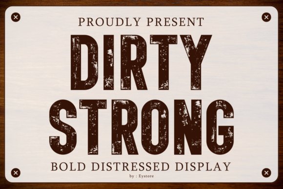
Dirty Strong sits between a heavy sans and a weathered stencil, carrying deliberate grain through each glyph so the letters look worn but never illegible. The erosion is controlled rather than random, preserving bold counters and sturdy stems that read well at a distance. That combination makes it a commanding choice for band merch, industrial signage, and rugged packaging.
Built with layered texture options, the font lets you tone the grit up for large-scale posters or dial it back for small-format printing and vinyl cutting. Vector outlines remain crisp for screen printing and heat press, while its compact proportions keep layouts tight and impactful. Pair it with a simple geometric shape or a light secondary face to keep compositions readable and focused.
╰┈➤ Download Dirty Strong Font
My Recommendation: I use Dirty Strong when a project needs a raw, assertive presence-its eroded strokes look authentic in print and on fabric. The layered distress options are practical for apparel and labels because they let me control texture without losing letter shape. Ideal for streetwear, automotive posters, and packaging where a tough, lived-in aesthetic matters.
6. Longhorn Western Font
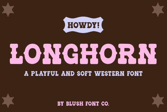
Longhorn Western softens old saloon signage into a friendly display that balances chunky letterforms with rounded edges, giving a modern spin to cowboy motifs. Subtle flares and inward curves add character without excessive ornament, so headlines feel lively but remain readable. The overall voice lands between country kitsch and contemporary rustic, suitable for lifestyle brands and event graphics.
Designed with crafters in mind, its smooth strokes translate cleanly to Cricut, vinyl, and sublimation where layered fills and shadow cuts sing. Use stacked compositions for badge-style logos or combine it with a narrow neutral face for longer copy; alternates and clean outlines make it easy to build layered SVGs and stickers. The font fits apparel, invitations, merch, and decor that want a warm western wink.
╰┈➤ Download Longhorn Western Font
My Recommendation: I pick Longhorn Western for projects that need charm and approachability without fuss-its soft curves are forgiving in cut files and striking on merch. It’s a go-to for Cricut makers, boutique labels, and event stationery where a playful cowboy vibe is the goal. Use it for tees, party invites, stickers, and rustic branding that benefits from friendly, bold lettering.
7. Bold Rust Font
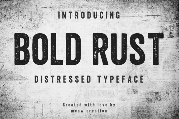
Bold Rust wears its rough edges proudly: heavy letterforms marred by a distressed texture that reads like weathered metal or aged wood. The irregular ink coverage and tight counters give headlines a tactile presence that commands attention without relying on ornament; optical kerning helps preserve legibility at display sizes while the grit rewards generous leading and bold color contrasts.
Use this face when you want packaging, posters, or apparel to feel hand-built rather than polished-think craft brewery labels, concert posters, and industrial signage. For best results, place it against solid backgrounds, avoid very small body copy, and when preparing for vinyl or precision cutting create a clean outline version so the distress doesn’t disappear during production.
My Recommendation: I reach for Bold Rust when a project needs an honest, lived-in character that clean fonts can’t provide. Its textured strokes add instant personality to apparel and branding, and it pairs well with a simple sans for contrast. I’d use it for labels, posters, or any design that benefits from a gritty, analog touch.
8. Vintage Roses Font
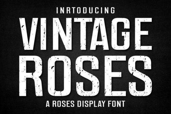
Vintage Roses blends chunky, retro letterforms with tasteful roughness and a set of alternate characters that let you dial up nostalgia without feeling clichéd. The high-contrast strokes and rounded terminals nod to the 70s and 80s while the grunge-inflected fills give each word an approachable, printed-once quality; smart alternates and ligatures keep repeating shapes from looking mechanical in long headlines.
This font shines on apparel, book covers, and packaging where a nostalgic mood is the goal-think sun-faded posters, boutique labels, or editorial spreads that reference past decades. Pair it with a narrow geometric sans or a delicate script, mask it into texture layers for print effects like foil or letterpress, and use the alternates sparingly to maintain readability and variety in longer lines.
╰┈➤ Download Vintage Roses Font
My Recommendation: I’d pick Vintage Roses when a design needs to evoke a specific era without resorting to pastiche. Its alternates and distinctive weight make it a go-to for retro-themed apparel and editorial covers, and it plays nicely with modern sans companions. Use it when you want warmth and character in headlines or packaging.
9. Rustic Font
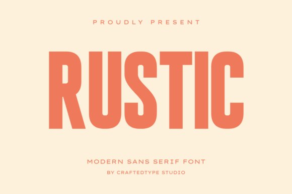
Rustic is a bold, condensed sans with a tall x‑height and tight proportions that give it headline-level impact while saving horizontal space. The letters are crafted for clarity at large sizes and for quick recognition on merchandise, and the clean outlines make it forgiving in raster and vinyl workflows-the font is PUA encoded so special characters and alternates are easy to access in common design apps.
It’s especially friendly to Print on Demand and craft projects: crisp counters and smooth strokes cut and weed reliably on Cricut and Silhouette machines, and the condensed forms make stacked logotypes and social headlines feel dense without crowding. For production, convert to outlines for cutting, adjust tracking for stacked words, and pair Rustic with a soft script or a slab if you need contrast in longer layouts.
My Recommendation: I use Rustic when I need bold messaging that fits tight spaces-pod merch, social headers, and modern packaging are its sweet spots. The PUA encoding speeds access to alternate glyphs, and its clean geometry makes it reliable for cutting and printing. It’s a practical choice when clarity and space efficiency matter.
10. Kooka Font
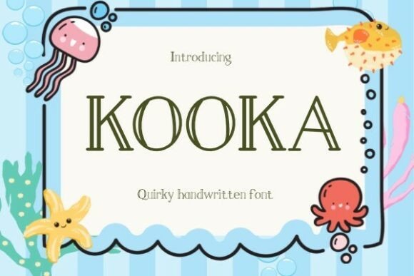
Kooka Font feels handcrafted yet controlled: playful, bouncy strokes sit on slightly irregular baselines so each word reads like a friendly handwritten note. The inked terminals and subtle pressure contrasts give text a tactile warmth that performs well at headline sizes and on printed goods. Its loose kerning and optional alternates let designers shape the rhythm of a phrase for logos or short blurbs.
Kooka suits t-shirts, greeting cards, invitations, mugs and mockups where a human touch is wanted without becoming messy. It tolerates texture overlays and light distressing while maintaining legibility, so it works in raster comps and vector exports alike. Provided in standard OTF/TTF formats, it installs quickly and adapts to layered mockups and print templates with minimal fuss.
My Recommendation: I reach for Kooka when a design needs hand-made personality that still prints cleanly-its quirks add charm without chaos. It’s great for boutique apparel runs, seasonal stationery, and small product labels where a warm, approachable voice matters. Use it when you want craft-driven appeal and easy implementation across print and digital mockups.
11. Cowboy Rodeo Font
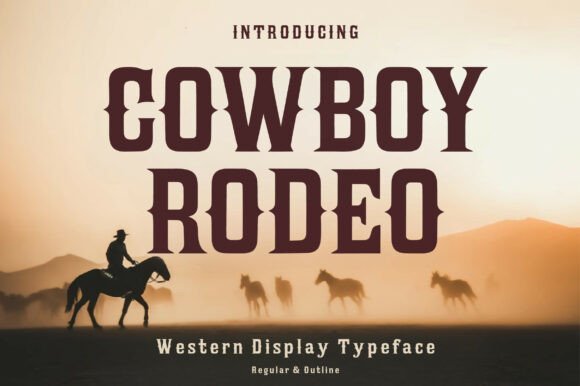
Cowboy Rodeo Font channels vintage Wild West posters through heavy slab serifs and decorative terminals that read like carved signage. The family includes Regular and Outline styles so you can stack layers for shadowed headlines and signboard effects without complicated masks. Small ornaments and wedge-shaped terminals echo old woodcut shop lettering and poster letterpress details.
This typeface punches on posters, logos, T-shirts, Cricut projects and sublimation pieces where bold, western character is needed. Its forms allow tight tracking for compact badges or expanded spacing for dramatic mastheads, and the bold counters take distressing and halftone textures well. Pair it with natural grain backgrounds, rope motifs, or sunburst graphics to sell a period look quickly.
╰┈➤ Download Cowboy Rodeo Font
My Recommendation: I pick Cowboy Rodeo when a brief needs unmistakable Western attitude that still reads at a glance. The outline companion speeds up layered screen printing and vinyl cutting, cutting production time on multi-pass jobs. It’s ideal for festival branding, saloon-style signage, merch lines, and any project aiming for gritty, handcrafted headlines.
12. Western Horses Font
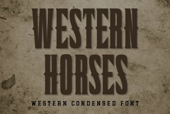
Western Horses Font blends western flavor with a sporty edge, using thick strokes and condensed proportions for a punchy, modern presence. Strong, clean letterforms remain legible from a distance and give team names and numbers an assertive silhouette. The set favors caps and bold numerals, keeping compositions tight and impactful for athletic branding.
Designed with t-shirts, team logos, jerseys, posters and heat-transfer vinyl in mind, it cuts crisply for Cricut and vinyl workflows and reproduces well in sublimation. You can pair it with a flowing script mascot or a simple emblem to introduce motion and narrative into lockups. It also scales cleanly from small labels to banners without losing its bold character.
╰┈➤ Download Western Horses Font
My Recommendation: I use Western Horses when a project needs bold, sporty Western styling-perfect for rodeo teams, vintage athletics, or event merchandise. Its clean edges and condensed forms print and cut with consistency, which saves time on production. Choose it when readability at speed or distance is a top priority and you want a gritty-yet-modern headline voice.
13. Glory School Font
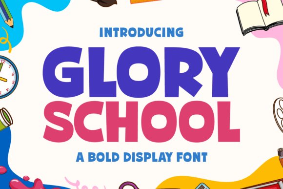
Glory School Font arrives with a bold presence and a hand-made temperament that reads energetic without feeling crude. Heavy strokes are tempered by small irregular terminals and slightly uneven counters, which give headlines a crafted, human touch rather than a mechanical block. The family includes upper- and lowercase letters, numerals and a wide complement of punctuation and symbols for varied typographic needs.
Its high weight and clear forms make this face ideal for apparel and large-format pieces such as rally banners, academic posters and school merchandise where visibility matters. Designers will appreciate the multilingual glyph set and alternate characters that keep text rhythmic across languages and layouts. The result is a display face that holds up under printing and embroidery while retaining personality.
╰┈➤ Download Glory School Font
My Recommendation: I use Glory School Font when a project needs big, attention-grabbing type that still feels hand-crafted. Its heavy strokes survive screen printing and embroidery, and the expanded glyph set saves time when preparing multilingual runs. It’s especially good for school spirit wear, team branding and bold campus signage.
14. String Lights Font
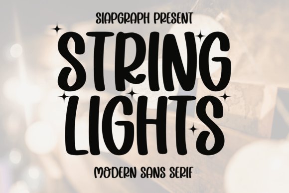
String Lights Font channels playful invitation lettering with rounded terminals and a chunky skeleton that reads cheerfully at a glance. The letterforms favor compact widths and generous counters, which makes the face a strong choice for mugs, stickers and planners where legibility and personality must coexist. Contrast is minimal by design, so edges cut cleanly for vinyl, laser and sublimation workflows.
Don’t confine it to holiday graphics: the font works well for party stationery, children’s products and casual retail signage because of its upbeat, retro-infused tone. Files arrive in formats that suit Cricut and SVG production, helping small makers move from concept to finished goods quickly. Expect a friendly, approachable look that performs reliably across print and digital outputs.
╰┈➤ Download String Lights Font
My Recommendation: I reach for String Lights Font when crafting party invitations or kid-focused merchandise because it brings instant cheer without fuss. Its straightforward shapes cut well on vinyl and laser systems, so production is less glitchy. It’s a smart choice for small-batch makers and boutique merch who want a retro-cute vibe.
15. Heartfinity Font
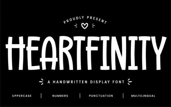
Heartfinity Font delivers a tall, handwritten display with playful terminals and occasional heart-like motifs tucked into select characters for an unmistakable signature. Strokes vary in width to create a natural, hand-lettered rhythm that feels intimate yet legible, and thoughtfully designed alternates and ligatures smooth word color for short headlines and logos. The result is a modern, personable face that reads as crafted rather than contrived.
This family shines on wedding stationery, boutique packaging and social graphics where a warm, friendly tone is required. It pairs effectively with thin sans faces for contrast or with simple scripts for a softer look, and its narrow proportions suit tight column layouts. Crafters will also value how well the letterforms translate to vinyl cutting and sticker production without losing their charm.
My Recommendation: I pick Heartfinity Font when a design needs a heartfelt, handmade feel-think wedding signage, boutique tags and product labels. The tall letterforms give presence without overpowering delicate artwork, and alternates help keep type readable at various sizes. It’s a great fit for makers and small brands seeking an affectionate, contemporary voice.
16. Athletic Circle Font
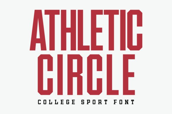
Athletic Circle is a condensed sports font built for high-impact headlines and tight layouts. Its narrow letterforms and firm stroke contrast let you cram bold wording into small spaces without losing legibility. Uppercase-focused shapes and crisp numerals make it particularly suited to team names and scoreboard-style graphics.
On the production side the type holds up well for apparel printing, vinyl cutting, and Cricut projects thanks to closed counters and predictable joins that reduce weeding and stitching issues. Careful kerning keeps stacked names readable on jersey backs while maintaining a muscular aesthetic. Pair it with a neutral geometric sans or a thin script for contrast when you need a softer accent.
╰┈➤ Download Athletic Circle Font
My Recommendation: I reach for Athletic Circle when I need compact, athletic lettering that reads at a distance-especially for jersey backs, caps, and tight poster layouts. Its condensed proportions let me fit long team names without lowering type size, which saves layout headaches. The clean numerals and joins also make it a reliable pick for heat-transfer and die-cut vinyl work.
17. Universal College Font
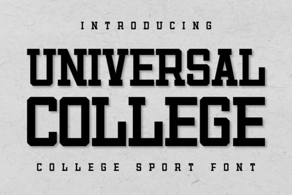
Universal College channels the classic varsity block look with stout, squared letterforms and blunt terminals that read as authoritative on hoodies and banners. The weight feels dense without collapsing into mush, giving headlines a built, confident presence. Letter spacing is generous enough to avoid crowding in multi-word crests.
For makers, the font’s broad counters and firm outlines make it embroidery-friendly and forgiving in flock or screen printing. Adding a thin outline or a subtle drop layer creates a stamped, collegiate badge effect that snaps in photographs. Use it alone for institutional tones or pair it with a hand-drawn script to soften merchandise visuals.
╰┈➤ Download Universal College Font
My Recommendation: I choose Universal College when a project needs that unmistakable varsity look-club jackets, alumni tees, or institutional banners. It stitches and prints well, holding shape in both small patches and large silkscreen runs. I often combine it with simple icons to craft team crests and retro athletic marks.
18. Retro Chunky Font
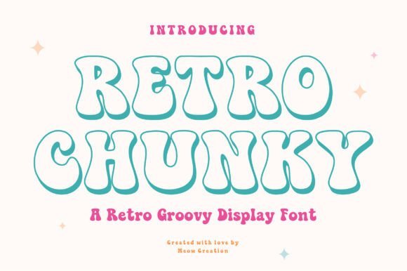
Retro Chunky channels 1970s playfulness with rounded, bulbous letterforms and a playful outline/shadow treatment that feels tactile. The face favors short, punchy headlines where its curvature drives mood more than literal meaning. Its inflated shapes create an approachable, friendly voice ideal for stickers, novelty tees, and retro packaging.
Practically speaking, the outlined shadow variant provides depth without extra production passes, and generous counters avoid ink-saturation problems in sublimation or screen printing. Color blocking and gradients pop because each glyph reads as a bold color field rather than a delicate stroke. When used sparingly it becomes the cheerful focal point of posters and product labels.
╰┈➤ Download Retro Chunky Font
My Recommendation: I pick Retro Chunky for projects that need warmth and a nostalgic wink-party posters, cafe signage, and playful branding work great with it. Its forms respond beautifully to bright palettes and textured backgrounds, and it holds up well in both digital and print runs. Use it when you want type that feels friendly and unmistakably retro.
19. Happy Doodle Font
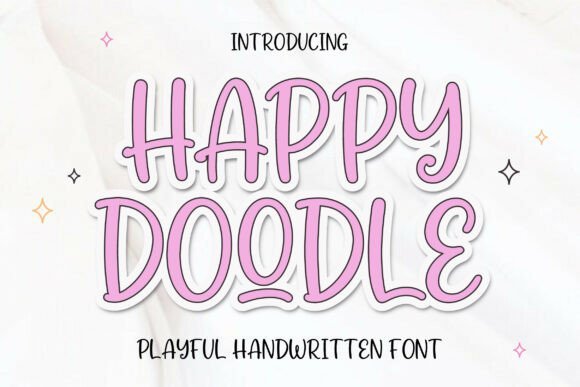
Happy Doodle is a playful handwritten font with smooth curves and warm, rounded letterforms that read like a quick note from a friend. Slight irregularities in stroke width and baseline make the alphabet feel handcrafted without becoming messy, balancing legibility with personality. Its light-hearted shapes work well for anything that needs a gentle, human touch.
Use it for T-shirts, mugs, social posts, greeting cards, and kid-focused packaging where approachability matters; it scales cleanly at display sizes and stays readable in short blocks of text. Pair it with a tidy geometric sans for contrast or layer it over simple patterns to let the doodle energy pop. Alternates and ligatures provide subtle variety so repeated phrases don’t look identical.
╰┈➤ Download Happy Doodle Font
My Recommendation: I reach for Happy Doodle when a design needs to feel warm and informal-those irregular strokes give headlines personality without losing clarity. It speeds up mockups for apparel and product labels because the mood is evident at a glance. Use it for greeting cards, casual brands, or any project that benefits from a personable, hand-marked presence.
20. Rustic Charm Font
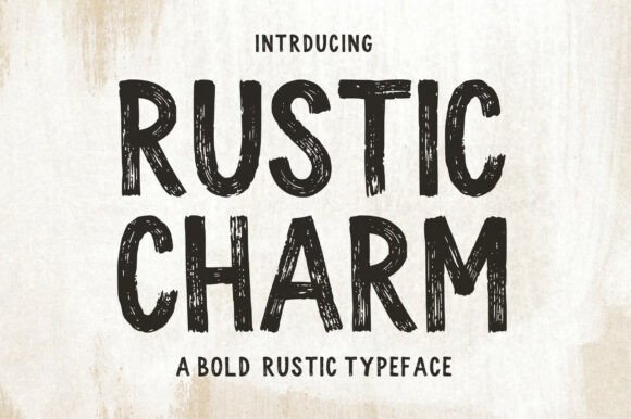
Rustic Charm is a bold display font that wears texture and ink drops like a weathered sign, giving letters a lived-in, handcrafted appearance. Rough terminals and porous fills hint at letterpress or woodcut techniques, so headlines gain immediate vintage character. It delivers strong presence while keeping a believable handmade quality.
Ideal for logos, packaging, posters, and cafe or brewery branding where an analog, earthy feel is desired; it holds up at large sizes and prints with personality on textured stock. Pair with minimalist layout choices or muted palettes to keep the type from competing with ornamental artwork. Built-in distressing lets you dial the grit up or down without reworking the artwork.
╰┈➤ Download Rustic Charm Font
My Recommendation: I pick Rustic Charm for projects that need tactile authenticity-its textured forms read like craft rather than digital imitation. It’s especially effective on food and drink labels, market signage, and event posters where the type should feel handcrafted. Pair it with simple icons and subdued colors to reinforce a rustic, honest look.
21. Tired Mood Font
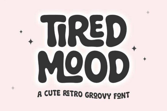
Tired Mood channels retro seventies warmth with soft, rounded counters and a playful bounce in its letter shapes, producing a groovy yet legible display face. Thicker weights and gentle curves give headlines a cozy, velvety presence that nods to vintage posters without copying them. Included ligatures and alternates make wordforms flow and prevent repetitive rhythms.
This font shines on stickers, sublimation transfers, apparel, and colorful packaging where nostalgic personality is a selling point; gradients and textured fills amplify the period vibe. For contemporary work, contrast it with a condensed sans or use it sparingly for short phrases to preserve readability. The ligatures are fun tools when crafting rhythmic headlines and playful taglines.
My Recommendation: I use Tired Mood when a design needs cheerful nostalgia and a relaxed attitude; it sets tone immediately with its rounded forms. The ligatures are delightful to experiment with in poster and merchandise layouts, helping short lines read like handcrafted marks. Best for boutique brands, retro-themed events, and merchandise that leans into color and texture.
22. Black Distressed Font
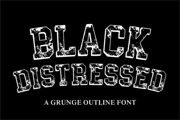
Black Distressed is a bold grunge outline font with a rugged, weathered texture that reads like worn ink on cotton. Strong collegiate letterforms combine with jagged edges and intentional gaps to produce an athletic, vintage tone that commands attention at headline sizes. It feels at home on retro posters, team apparel, and logo badges where attitude matters.
It excels in t-shirt prints, streetwear labels, and distressed logo marks, and handles halftone overlays and duotone palettes without losing character. The outline version lets you layer color fills or background textures and the heavy strokes keep legibility crisp even when reduced for tags or patches. For vector cutting and laser engraving, the roughness gives a handmade look while still reading clearly.
╰┈➤ Download Black Distressed Font
My Recommendation: I use Black Distressed when a design needs gritty, athletic energy-it’s immediate and bold without feeling sloppy. The outline form works brilliantly for multi-color printing and mockups where depth is created through layering. I’d pick it for sports-themed merch, retro event posters, or any brand that wants a confident, lived-in typographic voice.
23. Sixties Hippie Font
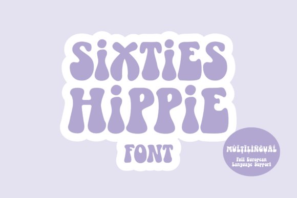
Sixties Hippie Font channels the playful, psychedelic curves of 1960s display typography with thick, rounded strokes that bend nicely into arcs and waves. It was crafted to hold its shape when warped in graphics software yet also looks balanced on a straight baseline, making it forgiving for quick layouts. Clean node structure means the glyphs work well with cutting machines and vinyl projects.
Put it to work on festival posters, children’s apparel, retro packaging, or any piece that needs a sunlit, era-specific personality. Pair it with a neutral sans for contrast or stack it with decorative florals and bold color gradients to push the vintage feel. Letter shapes carry enough presence for large signage while remaining friendly at small scales for merch and labels.
╰┈➤ Download Sixties Hippie Font
My Recommendation: I reach for Sixties Hippie when I want designs to feel warm and playful with instant 60s character. Its clean nodes make it a go-to for Cricut and small-batch craft runs, saving time during production. Use it for band posters, retro-themed party invites, and kids’ products where a bright, friendly headline is key.
24. Flower Chunk Font
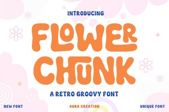
Flower Chunk is a chunky, rounded display font that leans into 1970s warmth with soft counters and playful weight. The included ligatures smooth common letter pairs so word shapes maintain a handcrafted, sticker-like charm, and the bold forms remain readable at small print sizes. The overall personality is cheerful without becoming saccharine, which makes it surprisingly adaptable.
It shines on sublimation transfers, sticker sheets, and packaging that needs a friendly, tactile voice; the bold rounded strokes take flat color beautifully and invite gradient fills or textures. Pair it with a thin script or a narrow grotesque to avoid visual competition, and use generous padding in layouts to keep the bubbly shapes breathing. Cut-file friendly outlines mean quick turnaround for craft shops and print-on-demand runs.
╰┈➤ Download Flower Chunk Font
My Recommendation: I pick Flower Chunk for projects that need an upbeat, approachable vibe-children’s apparel, label work, and playful packaging are perfect fits. The ligatures and rounded geometry help text flow naturally, giving designs a handmade quality without extra labor. If you want bold, readable type with a cheerful personality, this font delivers that feel quickly and reliably.
25. Outline Groovy Font
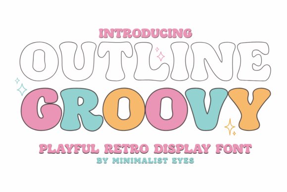
Outline Groovy Font channels a playful 1970s bubble look with heavy outlined letterforms that read clearly at display sizes. The open outline construction makes it ideal for layered color fills, foil or negative-space treatments, and quick conversion to cut paths for Cricut and Silhouette projects. Use it for t-shirts, vinyl decals, party signage, and bold social headers where a retro, cheerful silhouette needs to carry color and shape without fuss.
From a production standpoint the consistent stroke and tidy counters simplify weeding and vinyl application, and the outline weight tolerates stroke expansion without losing its character. Try stacking two offset copies for a vintage drop-shadow or pairing it with a compact geometric sans to create contrast that keeps text legible at a distance. For small cut pieces, slightly thicken the outline before plotting; for posters, loosen tracking so the bubbly shapes have room to breathe.
╰┈➤ Download Outline Groovy Font
My Recommendation: I reach for Outline Groovy when I want big, friendly headlines that translate well from screen to cut vinyl – it handles weeding and heat transfers with less fuss than many decorative display faces. It’s perfect for retro-themed event merch, kids’ party signage, and shops selling handmade decals. If your workflow includes frequent Cricut or Silhouette runs and you want a strong vintage vibe, this font speeds production while keeping a joyful look.
26. Gray Club Font
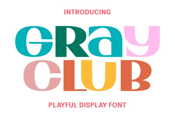
Gray Club Font offers a soft, approachable voice with rounded terminals and a slightly irregular hand that reads as warm and playful. Its shapes favor bold contours that hold up in iron-on, screen print, and SVG formats while still feeling whimsical enough for unicorn motifs, holiday cards, and planner stickers. The design strikes a good balance between childlike charm and production-ready clarity, lending itself to children’s apparel, greeting cards, and seasonal craft designs.
On the technical side the letterforms convert cleanly to vector cut files and the kerning is steady, which reduces tweak time when making sheets or repeating patterns. Texture fills or distressed overlays pair well to accent the home-crafted look, and small increases in tracking help preserve each character during heat application. Consider pairing Gray Club with a calm, narrow sans for captions to keep layouts readable while keeping the main type playful.
My Recommendation: I choose Gray Club when a project calls for upbeat, nostalgic typography that still behaves well in production – it prints predictably and looks handmade. It’s my go-to for kids’ stationery, seasonal SVGs, and boutique apparel where personality matters more than strict formality. Use it when you want a font that reads as affectionate and familiar but won’t complicate the printing or cutting process.
27. Preppy Lovely Font
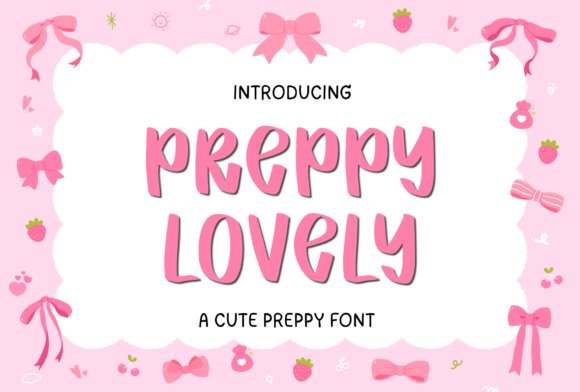
Preppy Lovely Font is a bubbly handwritten face with smooth curves, buoyant strokes, and a lively baseline rhythm that feels instantly friendly. Alternates and flowing joins give repeated text a natural, hand-scripted variation, making it ideal for stickers, planners, worksheets, and social graphics that benefit from a personal touch. The letterforms remain legible at display sizes and deliver a joyful presence for brands aiming for a light, approachable aesthetic.
Designers will appreciate the open counters and clear stroke contrast, which scale well for small prints but can benefit from slight thickening when used for fine vinyl cuts. Use alternates selectively to avoid repetition on sticker sheets or repetitive headers, and pair the font with soft pastel palettes and clean geometric accents to let its handwritten charm lead. For logo work, reserve it for secondary marks or subheadings to keep brand hierarchy clear.
╰┈➤ Download Preppy Lovely Font
My Recommendation: I lean on Preppy Lovely when I need type that feels like a warm handwritten note – it brings instant friendliness without looking amateurish. It works great for classroom materials, boutique product labels, and social posts that should feel intimate. The alternates and clear strokes reduce layout fiddling and help create charming, repeatable assets quickly.
28. Retro Crab Font
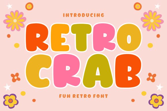
Retro Crab Font channels 1970s warmth with broad, rounded letterforms and playful weight contrast that reads like hand-cut signage. Its slab-leaning terminals and lifted x-height give headlines strong presence while keeping counters open for clean vinyl cuts and SVG exports. Seasonal stylistic sets-spring florals, winter ornaments and cartoon marks-are built as alternates so you can change mood without rebuilding layouts.
The typeface’s chunky shapes and considered spacing make it ideal for T-shirts, stickers, and signage that must read from a distance. Included dingbats and decorative avatars simplify background fills and packaging art; Cricut users will appreciate the weed-friendly solids. Pair with a narrow grotesque for longer copy and tweak kerning on stacked words to preserve a vintage rhythm.
My Recommendation: I reach for Retro Crab Font when a project needs confident retro character without tipping into kitsch. Its heavy, cut-friendly shapes work beautifully for sublimation and Cricut projects, so I use it for vintage tees and seasonal sticker sheets. It’s especially good for boutique labels, event posters, and any branding that benefits from a bold, nostalgic voice.
29. Holiday Line Font
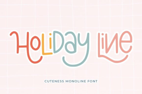
Holiday Line Font delivers a cheerful monoline look with consistent stroke width and a casual rhythm that reads well at display sizes. The swashes and glyphs are PUA-encoded, making ornamentation quick to access for mugs, cards, and tote designs. That uniform stroke profile also translates reliably to embroidery and single-pass screen printing where even lines matter.
Open counters and subtle terminals give good legibility for quotes and social captions, while the swash set adds seasonal flourish without overpowering layouts. It pairs nicely with condensed sans faces for longer text and reproduces cleanly on lightweight fabrics and engraved surfaces. Mind line spacing when stacking swashes so decorative elements don’t overlap.
╰┈➤ Download Holiday Line Font
My Recommendation: I often choose Holiday Line Font for surface-print products because its simple stroke profile reproduces consistently across production methods. The PUA swashes let me add festive accents quickly when designing cards, mugs, or gift tags. It’s ideal for small-batch apparel, cheerful stationery, and social creatives that want a handmade, friendly tone.
30. Dino Hagor Font
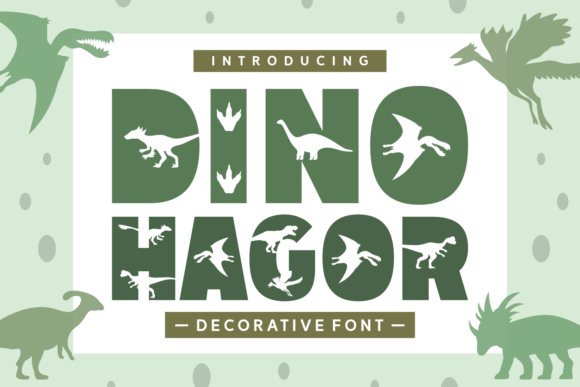
Dino Hagor Font wears its theme proudly: oversized letterforms carry dinosaur motifs and optional pattern fills integrated into the glyphs. The result reads as a playful display type suited to children’s activity sheets, party invites, and toy packaging where personality must not sacrifice clarity. PUA encoding gives immediate access to themed alternates and repeat patterns, speeding layout and mockup work.
Rounded, thick strokes make the face excellent for stickers and heat-transfer vinyl and ensure legibility on small screens. Use bright, flat color palettes to let the motifs pop and pair with a soft rounded sans for captions. When preparing print craft files, separate multi-color fills into layers for straightforward production and color separation.
My Recommendation: I recommend Dino Hagor Font when designing for kids’ products or lively branding because the integrated motifs reduce the need for extra illustrations. It’s a time-saver for party invitations, classroom posters, and vinyl decals thanks to clear shapes and accessible alternates. Choose this font when you want playful character and efficient production in the same package.
31. Tripple Chunky Duo Font Duo
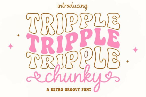
Tripple Chunky Duo pairs a heavily rounded display with a sugary script that sprinkles personality across any design. The puffy stacked letterforms sit wide and readable, the outlined layer giving a sticker-like presence, while the Chunky Heart script offers looping strokes finished with small heart terminals. Together they create a striking contrast between bold shapes and delicate gestures without competing for attention.
This combo works especially well on apparel, party goods, labels and greeting cards where a soft, friendly look matters; the outlined display accepts bright fills and textures for sublimation or vinyl, and the handscript functions as a signature element on tags and logos. Because the display keeps a strong silhouette, it prints clean on fabric and cutters while the heart swashes inject instant charm into short headlines.
╰┈➤ Download Tripple Chunky Duo Font Duo
My Recommendation: I reach for Tripple Chunky Duo when a project must feel playful and handmade-children’s tees, boutique sticker sheets and party invites are perfect matches. The chunky display reads well from a distance while the script gives an intimate, personal finish. Use the display as the headline and the hearted script for names or accents to get a cheerful, cohesive look.
32. Rocky Brush Font
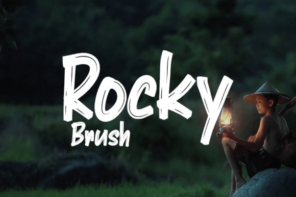
Rocky Brush reads like a vigorous hand stroke rendered at scale: uneven edges, varied pressure and slightly jagged terminals give each letter a lived-in character. Those textured gestures make it ideal for apparel graphics, band identities and posters that want a handcrafted attitude rather than corporate polish. The generous counters and bold weight keep single-line headlines legible while the rough surface hints at tactile printing methods.
Treat Rocky Brush as a display voice and pair it with a calm sans or a narrow serif to keep compositions balanced; it performs best in short bursts-titles, badges, product names-where its personality can lead without tiring the eye. Alternates and roughened terminals help you avoid repetition, giving layouts a spontaneous, human feel even when repeated across a range of pieces.
My Recommendation: I use Rocky Brush when a design needs to feel raw and human, like indie clothing drops, concert posters or craft packaging. Its hand-rubbed texture immediately signals authenticity, so I reserve it for headlines and logos rather than long copy. Pair it with clean supporting type to let the brush work shine without cluttering the page.
33. The Alaska Font
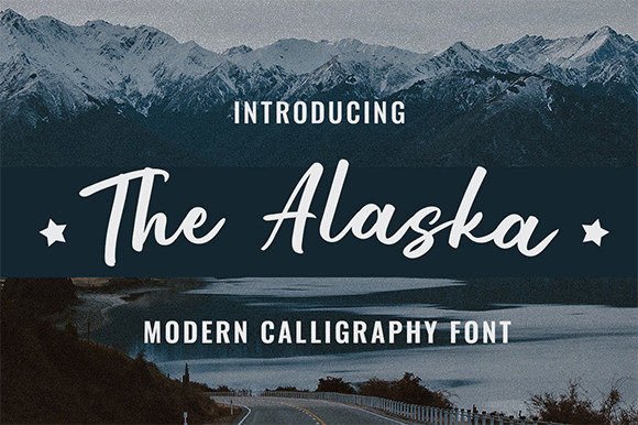
The Alaska is a neat handwritten script that balances calligraphic influence with contemporary restraint; its letterforms are tidy, connectors are thoughtful, and overall rhythm reads as quietly elegant. The moderate stroke contrast lends a hint of classic penmanship without ornate flourishes, making this script appropriate for invitations, refined logos and editorial accents. Generous breathing space between letters helps the type stay readable on printed cards and narrow web headers.
Measured swashes are available when you need a little flourish, but they remain controlled so the type rarely overwhelms a composition; use them for signatures or to punctuate a headline. Combine The Alaska with a light serif or a simple geometric sans to form a polished two-part system suited to boutique brands, stationery suites and premium packaging.
My Recommendation: I pick The Alaska for projects that demand a refined handwritten touch-wedding suites, boutique branding and product labels where clarity matters as much as style. It photographs beautifully on textured paper and pairs naturally with minimal supporting faces. Use it when you want a personable, upscale voice without excessive ornamentation.
34. Calisthenic Font
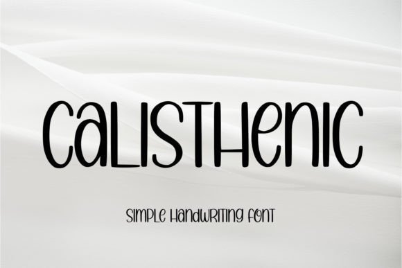
Calisthenic presents itself as a clean, handwritten sans serif with restrained strokes and an easygoing rhythm that stays readable across sizes. Letterforms sit on a steady baseline with moderate x-height and open counters, which makes it reliable for both printed merchandise and on-screen mockups. The overall temperament reads as informal but tidy, lending a human touch without looking messy.
Use it for apparel graphics, product tags, signage, or social posts where a handcrafted look is desired without sacrificing clarity. It pairs well with a compact geometric sans for body copy or a low-contrast slab for stronger headlines, and it tolerates light distressing or texture for vintage treatments. Pay attention to kerning on tight wordmarks and simplify fine details if you plan to embroider or laser-cut the design.
My Recommendation: I would reach for Calisthenic when I need handwriting that feels handmade but remains legible at a glance. Its straightforward letter shapes make it a safe pick for T-shirts, mugs, labels, and any small-scale printing where clarity matters. For small shops and craft goods, it gives personality without complicating production.
35. Homeschool Font
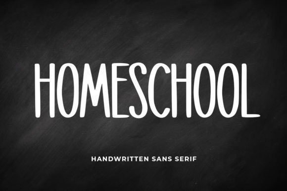
Homeschool is a warm, approachable handwritten script with balanced strokes that avoid being too thin or too heavy, creating a comfortable visual weight for headings and short passages. Rounded terminals and slight irregularities in letter width convey an authentic, human-written vibe while preserving solid legibility. The font’s rhythm feels playful without becoming decorative noise, which helps it hold up across colorful layouts and educational contexts.
It excels on packaging, classroom printables, newsletters, and social graphics where tone matters as much as readability. Pair it with a neutral serif for editorial pieces or a crisp sans for modern product labels, and test it on both matte and textured papers to see how the soft edges reproduce. Consider using alternates sparingly to keep longer lines from appearing too busy.
My Recommendation: I like Homeschool when a project needs friendliness without sacrificing order-the middle ground between childlike and professional. Its balanced strokes make it a go-to for kids’ materials, casual branding, and background signage. If you want approachable typography that still reads clearly on print and screen, this font delivers.
36. Brown Love Font
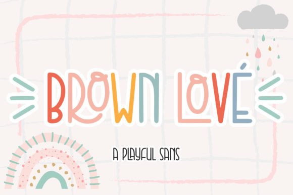
Brown Love brings an energetic, playful handwritten style with bouncing baselines and lively looped terminals that feel delightfully personal. Characters show slight variations in stroke and spacing that evoke hand-lettering, making it especially effective for short, expressive headlines or decorative accents. The overall character is whimsical and optimistic, which suits projects aiming for warmth and charm.
Put it on greeting cards, product tags, stickers, and lifestyle branding where an informal, affectionate voice is desired. It pairs nicely with minimal sans faces to keep layouts readable, and techniques like foil stamping, letterpress, or spot varnish will amplify its handcrafted impression. Avoid using it for long body text; it performs best as a display or accent element.
My Recommendation: I would use Brown Love when I want graphics to feel personal and joyful-perfect for boutique stationery, small-batch product labels, and social media posts that aim for a smile. Its quirky shapes and lively motion add personality to short lines and logos. For any project that benefits from a handcrafted, friendly tone, this font gives quick visual warmth.
37. Cookie Font
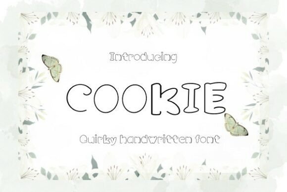
Cookie Font is a lively handwriting face that reads like a confident personal note: slightly bouncy baselines, flowing connections, and playful swashes give it personality without looking sloppy. The strokes vary enough to feel hand-rendered while remaining legible at display sizes, which makes it a smart pick for T-shirts, posters, greeting cards and product mockups where a human touch matters.
OpenType alternates and tasteful ligatures reduce repetition and let you craft words that look naturally written rather than machine-generated, and the heavier forms survive heat transfer and vinyl cutting better than ultra-thin scripts. Pair Cookie with a simple geometric sans for balance, test small sizes for hairline preservation, and use it where a boutique or handmade aesthetic is the goal.
My Recommendation: I use Cookie when a project needs authentic handwriting that still reads cleanly at larger scales-boutique apparel labels, intimate invitations and artisanal packaging are perfect contexts. Its alternates let each line feel bespoke, which helps small-batch brands stand out. For anything that benefits from a warm, human presence without sacrificing control, Cookie is my go-to.
38. Groovy Spark Font
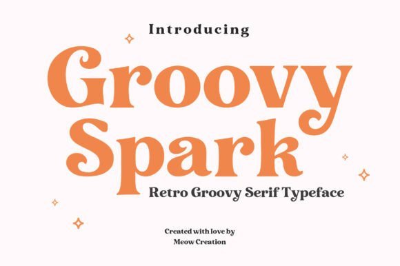
Groovy Spark Font channels 1970s typography with generous counters, rounded serifs and a bold, retro silhouette that commands attention in headlines and logos. The letterforms combine wide curves and tight terminals, giving compositions a friendly, optimistic tone that reads vintage while staying contemporary.
It thrives in display roles such as poster art, packaging and apparel where weight and personality matter, and works well with distressed textures or flat, saturated palettes to sell that retro mood. For balance, set Groovy Spark against a narrow sans for body copy or use it solo for short phrases to preserve readability and visual impact.
╰┈➤ Download Groovy Spark Font
My Recommendation: I reach for Groovy Spark when a brand or poster needs that sunny, retro vibe-think beverage labels, festival posters and merch. Its bold shapes make logos and headlines pop, and it pairs nicely with modern sans serifs to avoid feeling dated. If your brief calls for personality and nostalgia, this font gets the job done with style.
39. Writing Cream Font
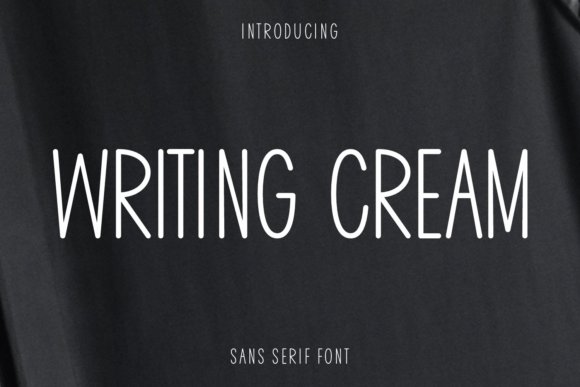
Writing Cream Font is a playful sans with soft, rounded terminals and neat, slightly irregular strokes that mimic friendly handwriting geared toward children and educators. Its open counters and generous spacing keep letterforms readable at small sizes, which makes it ideal for worksheets, planners, stickers and kid-focused packaging.
The design feels handcrafted yet tidy, and it supports digital workflows in Procreate and Canva as well as physical crafting tools like Cricut and sublimation presses. Use it for journal headers, classroom materials and personalized stickers; its clear shapes and approachable tone help content feel warm without losing clarity.
╰┈➤ Download Writing Cream Font
My Recommendation: I pick Writing Cream for school-related projects, planners and sticker designs because it balances cheerfulness with legibility-perfect for kids and teachers. It’s especially handy when crafting digital planner assets or vinyl decals where readable curves matter. For projects that need a friendly, handwritten look without eccentric letterforms, this font performs consistently well.
40. Cricut Bold Font
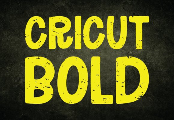
Cricut Bold slams a heavy, weathered sans-serif into the foreground with thick block letters and a tactile, grunge surface that reads like stamped canvas. The distressed edges and uneven ink coverage give it a handcrafted, utility-minded personality that suits outdoor apparel and rustic packaging. It maintains clarity at large sizes while still showing its textured character up close. On-screen and in print the bold counters hold up well, so designs keep their attitude without becoming muddy.
Because the forms are wide with sturdy counters, they work well for vinyl cutting and large-format printing, keeping lettershapes intact when weathered effects are applied. Pair it with narrow monoline scripts or minimalist sans faces to build contrast without muddling the grit. Use layered textures, halftone overlays, or tone-on-tone colorways to keep the roughness readable on merchandise like tees and labels. Ideal for brands that want a human-made, no-frills attitude.
My Recommendation: I reach for Cricut Bold when a project needs a hands-on, workshop aesthetic-especially for custom tees and DIY goods. Its heavy strokes survive cutting and printing processes that eat finer detail, and the weathered finish gives designs an instant lived-in feel. Use it when you want strong, readable lettering that reads authentic rather than polished.
41. The Forest Hunter Font
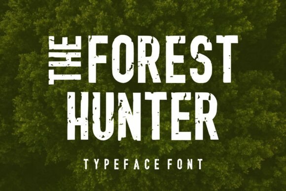
The Forest Hunter wears a stamped, military-tinged mask: condensed letterforms and rough ink marks that suggest an equipment tag or an old campaign poster. Its narrow proportions deliver compact headlines that read confidently across banners, cans, or truck doors. The surface texture works especially well against woodgrain, kraft paper, or leather backdrops, reinforcing an outdoors-focused identity. Thoughtful tracking keeps it legible at distance despite the distressed treatment.
Deploy this face when you need a badge-like headline or a bold logo that feels field-tested rather than polished. Combine it with simple emblems-compass roses, antlers, or contour lines-to create rugged insignia and merch. It also responds nicely to monochrome palettes or subtle grain overlays for a vintage, worn-in look without losing clarity. Perfect for events, labels, and gear that want a practical, outdoor character.
╰┈➤ Download The Forest Hunter Font
My Recommendation: I’d choose The Forest Hunter for adventure brands, festival posters, and packed-label beer cans because it reads strong in tight spaces and carries a stamped, utilitarian tone. Its condensed weight is great when layout real estate is limited, and the distressed texture pairs beautifully with tactile substrates like kraft or canvas. Use it when you want an outdoorsy, no-nonsense voice that feels like equipment handed down from a good trip.
42. Break Action Font
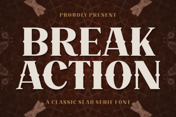
Break Action channels woodtype and turn-of-the-century signage with massive slab serifs and ornamental cuts that feel architectural yet hand-tooled. The decorative ink traps and bold terminals give headlines a carved, theatrical presence that suits distillery labels, saloon-style posters, and vintage packaging. High contrast between thick stems and stylized serifs creates a dramatic silhouette that still reads clean at poster scale. Alternates and ligatures extend its typographic vocabulary for custom logotypes and badges.
On tactile print applications like letterpress, embossing, or heavy screen ink, Break Action holds up with pronounced character and depth. Tight lockups make for powerful mastheads while looser spacing yields a dignified masthead or bottle label. Pair it with a neutral grotesque for clarity or with a delicate script flourish for ornamented lockups to balance the type’s visual heft. It performs best when the type itself is the main visual statement.
╰┈➤ Download Break Action Font
My Recommendation: I reach for Break Action when a project needs a hefty, period feel-think whiskey labels, theater posters, or shop signage that wants to read like history. Its carved shapes respond beautifully to foil, deboss, or deep-ink printing, and the stylistic alternates let me craft distinctive wordmarks. Use it to give headlines a strong, handcrafted identity that reads both nostalgic and authoritative.
43. Holidays Christmas Font
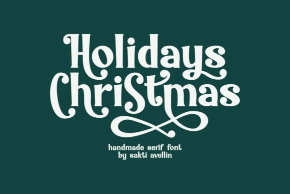
Holidays Christmas Font is a handcrafted serif that pairs bold, flowing strokes with a retro holiday sensibility, giving text a warm, nostalgic feel without feeling clichéd. Rich alternate glyphs and subtle ligatures create natural connections between letter pairs, so short headlines and names read like bespoke hand lettering rather than a generic typeface. The slightly condensed proportions and confident weight make it stand out on labels and small-format products while remaining readable at display sizes.
It works especially well on seasonal packaging, greeting cards, banners, apparel, mugs, and boutique logos-swap alternates to tune the personality from elegant to playful. For best results, pair it with a neutral sans to keep longer copy calm and use textured papers or warm color palettes to amplify the vintage character. Small adjustments to kerning and selective alternates will turn routine copy into memorable seasonal branding.
╰┈➤ Download Holidays Christmas Font
My Recommendation: I reach for Holidays Christmas Font when I need a handcrafted holiday look without commissioning custom lettering. Its alternates and ligatures let me craft unique wordmarks and short headlines quickly, and the weight holds up on both print and textile. Use it for boutique gift tags, seasonal product lines, or festive packaging where a nostalgic, crafted voice helps sell the story.
44. Brain Eater Font
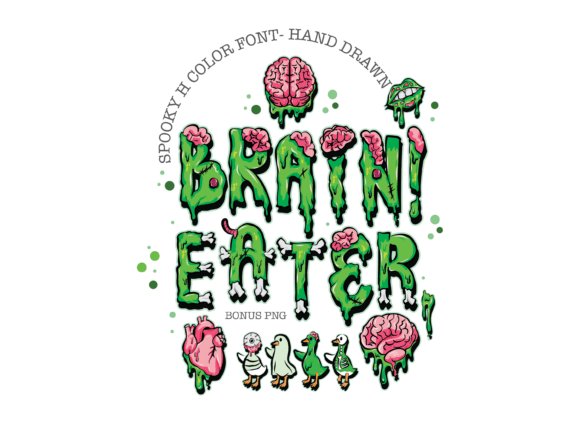
Brain Eater Font is a hand-drawn color alphabet that wears its Halloween theme proudly: gooey drips, brain textures, and small bone details make every character an illustrated element rather than a plain glyph. The style balances campy horror with charm, so letters remain legible on shirts and posters while delivering an unmistakable spooky personality. Included PNG clipart-brains, bones, hearts, and quirky zombie ducks-gives layout-ready accents that expand design options instantly.
Files ship as high-resolution transparent PNGs and color-ready glyphs suited to sublimation, print-on-demand, and sticker production, so you can preview and print without extra color separation work. Try layering the letters over distressed textures or halftone patterns to add depth, or isolate highlights and shadows for alternate colorways. This set is great when you want immediate, hand-crafted Halloween art without tracing or complex vectoring.
My Recommendation: I use Brain Eater Font for seasonal tees and event art because it delivers immediate character with minimal setup. The color-ready letters and bonus PNGs save production time and let me mock up merch fast. Ideal for family-friendly Halloween products, party kits, and playful horror-themed merch where personality matters more than polished realism.
45. Quinest Font
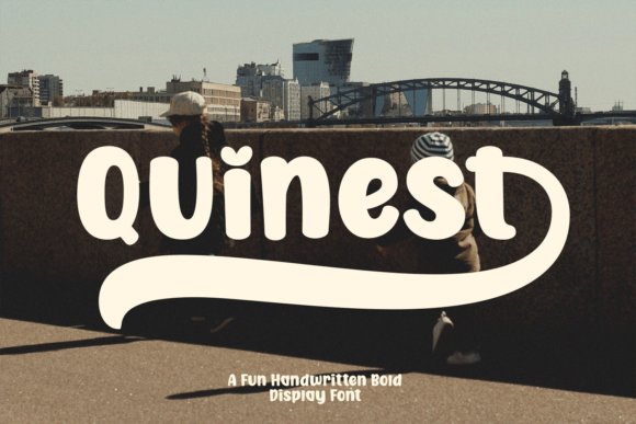
Quinest Font is a chunky handwritten display face that reads like a friendly voice on the page: generous curves, quirky terminals, and playful proportions give headlines a buoyant, approachable attitude. PUA encoding exposes alternates, swashes, and stylistic sets without fuss, so you can swap characters to craft logos and eye-catching slogans. The design keeps strong letter shapes that remain legible at larger sizes while contributing lively rhythm to short bursts of text.
Ideal for snack packaging, event posters, social templates, and casual logos, Quinest pairs well with a restrained geometric sans to let the type carry the personality. Use swashes sparingly to add emphasis and keep body copy minimal-this face excels as a display headline rather than long-form text. Its rounded forms also reproduce reliably on fabric and textured substrates, making it a solid pick for apparel and labels.
My Recommendation: I choose Quinest when a project needs an upbeat, energetic headline that reads well in photos and on print. The PUA glyphs make it simple to create unique logotypes without building new artwork, and the bold shapes hold up on textured materials. It’s perfect for casual food brands, community events, youth-oriented packaging, and any application that benefits from an inviting, animated tone.
46. Bitchcraft Font
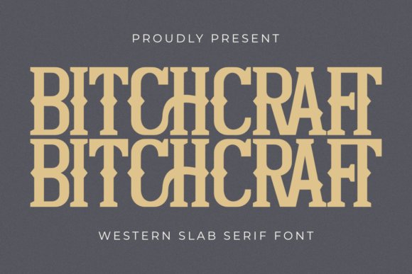
Bitchcraft is a bold Western slab serif that wears its frontier influences on every glyph: heavy serifs, squared terminals and handcrafted ligatures give headlines a weathered, theatrical attitude. The weight and punctuation of each letter create a theatrical, lodge-sign look that reads instantly as vintage but not kitschy.
Use it for short, punchy applications like apparel prints, posters, shop signage and craft labels where personality matters more than subtlety. It comes PUA-encoded so alternates, swashes and special ligatures are easy to access; try distressed textures, warm ochres and tight tracking for an authentic hand-painted appearance.
My Recommendation: I reach for this font when a project needs a strong Western personality-think brewery labels, rodeo posters, or band tees. Its ligatures and alternates let me tighten or flourish words without rebuilding shapes. For any design that must feel rugged and deliberate, Bitchcraft delivers fast and with plenty of character.
47. Kondank Font
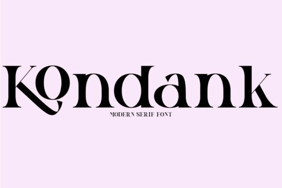
Kondank is a refined serif with graceful curves and balanced proportions that suit both modern editorial work and polished brand identities. Its letterforms read clean at small sizes thanks to a generous x-height, while subtle stroke contrast gives headings a composed, elegant tone.
The set includes alternate characters and swashes available via PUA encoding, so you can add delicate accents to logos or mastheads without custom drawing. Pair Kondank with a neutral sans for corporate layouts or with muted palettes and generous margins when creating fashion spreads or high-end packaging.
My Recommendation: I choose Kondank when a project needs quiet sophistication-magazine layouts, upscale labels, and sleek corporate identities benefit most. The font’s clear shapes keep long reads comfortable while alternates add a decorative touch when needed. It’s a reliable choice when polish and readability must coexist.
48. Dog Cat Font
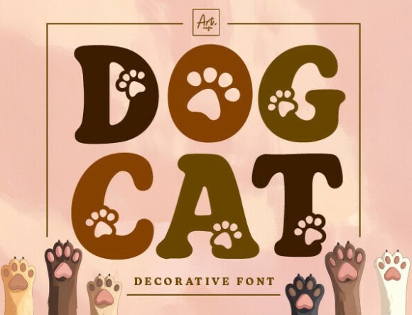
Dog Cat Retro Paw is a playful decorative display font where each letter features paw-print cutouts that inject instant charm and humor. The chunky, rounded letterforms evoke retro signage and are unmistakable in kid-friendly and pet-focused applications.
Best used at display sizes for posters, t-shirts, stickers and logos, it’s not suited for body text but shines when layered with bright colors, two-tone fills or textured backgrounds. Glyph alternates are PUA-encoded for quick access; experiment with tight leading and solid backgrounds so the paw details remain legible in print and on screen.
My Recommendation: I use Dog Cat when the brief calls for warmth and playfulness-pet shop signs, birthday invites, and quirky merch are perfect fits. The paw motifs create an emotional hook without extra illustration work. It’s a fast way to give designs character that appeals to families and animal lovers.
49. Think Alike Font
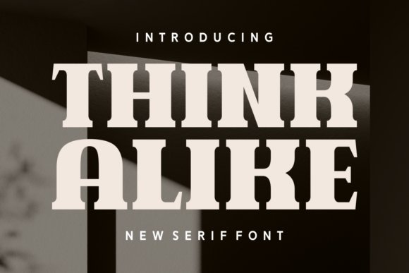
Think Alike blends classic serif detailing with a photographic, contemporary sensibility: slender terminals and measured contrast give it a refined but energetic voice. The caps have distinctive endings that read powerfully on covers and headlines, while the lowercase preserves legibility through an open x-height and considered spacing. Its multilingual glyph set and tidy kerning make it well suited for printed identities where type must feel crafted yet production-ready.
On paper the generous counters and subtle ink traps hold form without becoming heavy, and on screen the finer strokes remain clear at headline sizes. Use a neutral sans for extended text and let Think Alike take lead on jackets, premium packaging, and apparel labels that need personality. Designers will appreciate its alternate glyphs for tight compositions and quote treatments that demand a handcrafted finish.
My Recommendation: I use Think Alike when a project needs serif refinement that doesn’t feel old-fashioned. It gives book covers, boutique packaging, and branded tees a polished headline presence while staying production-friendly. I reach for it when I want letters that look hand-tuned but print cleanly across formats.
50. Varsity Display Font
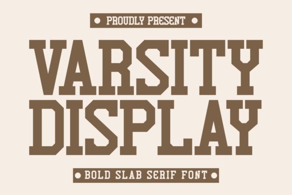
Varsity Display tightens traditional slab terminals into a compact, athletic face that reads with instant team energy. The bold strokes and squared letterforms cut crisply for laser-cut vinyl and garment printing, and the condensed proportions help fit names and slogans in narrow spaces. Its geometric impact works well for logos, jersey numbers, and any application that needs to register from a distance.
Print-focused features like generous counters and hard edges reduce bleeding in screen-printing while keeping engraved or sticker runs neat. Pair it with a rounded script for spirited posters or let it stand alone for number plates and enamel pins where shapes echo stitched borders. When clarity under production constraints matters, this face delivers a no-frills, athletic look.
╰┈➤ Download Varsity Display Font
My Recommendation: I pick Varsity Display for apparel and merchandise projects where visibility and durability are non-negotiable. It survives heavy ink coverage, laser cutting, and vinyl work without losing character. It’s ideal for custom team shirts, enamel pins, and compact wordmarks that must read from across a room.
51. Darling Groove Font
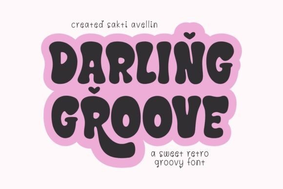
Darling Groove channels a retro, playful mood through alternating uppercase forms and rounded terminals that create a lively headline rhythm. The alternates let you achieve a hand-crafted vibe without hand-drawing each glyph, which makes it perfect for mugs, totes, and bold quote graphics. Base shapes are chunky enough to hold up in embroidery and product mockups while the alternates add a wink of personality.
Try layering color, soft shadows, or subtle texture to coax depth from its thick strokes, or keep it flat and high-contrast for small merchandise where readability matters. Swap repeated letters with alternates to avoid monotony and preserve a natural, hand-set appearance. Use it where charm and character should lead the visual voice rather than quiet neutrality.
╰┈➤ Download Darling Groove Font
My Recommendation: I turn to Darling Groove for seasonal cards and small-run merch when I want warmth and a playful personality. The alternate caps let me tweak word shapes for a handcrafted feel without extra illustration work. It’s perfect for brands that want nostalgic, smile-inducing type on mugs, shirts, and greeting cards.
52. Vulcanica Font
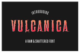
Vulcanica is a raw, shattered display font that looks like geological fractures carved into each glyph. The family ships in regular and italic, both keeping jagged terminals and textured edges so the face reads as intentional distress rather than accidental wear. Its aggressive shapes demand scale, making it ideal for posters, movie titles, band logos, and any application that needs visible attitude.
Treat Vulcanica as a headline instrument: pair it with a clean grotesque to restore calm and keep supporting copy minimal so the type doesn’t compete. For print, increase tracking slightly and avoid tiny sizes where the distress will clog; on screen, solid fills and restrained duotones preserve detail. Use it sparingly on merchandise to retain impact and prevent visual fatigue.
My Recommendation: I reach for Vulcanica when a brief asks for raw energy-action posters, gritty album covers, or dystopian book jackets benefit from its fractured personality. It gives instant character and reads as handcrafted turmoil, perfect when the project needs attitude. Use it as a display or logotype and keep body text neutral to preserve legibility.
53. Gateway Font
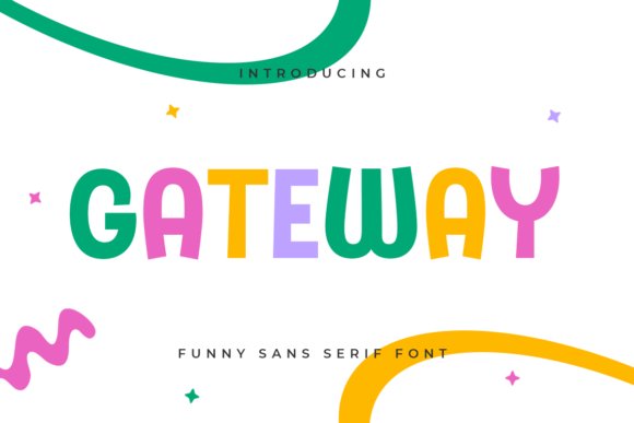
Gateway is a warm sans-serif designed with children’s projects in mind, featuring rounded terminals, broad counters, and a generous x-height that aids readability. Its letterforms lean slightly wide and include friendly alternates that add personality without undermining structure, so it works well on packaging, apparel prints, and educational materials. The voice is bright and approachable, communicating playfulness without resorting to gimmicks.
Match Gateway with pastel or primary palettes and simple iconography to reinforce its kid-focused tone while avoiding clutter. For textile printing choose medium weights to keep strokes crisp; online use sizes above 14px for best legibility. Pair it with a restrained geometric display for headings or a light serif when you need a touch of formality in the system.
My Recommendation: I prefer Gateway for child-facing brands, school materials, and soft home-goods where approachability is essential. It balances friendliness and clarity, holding up on low-resolution screens and fabric printing. My go-to use is logo or headline work paired with a minimal supporting typeface to build hierarchy.
54. Brave Monday Font
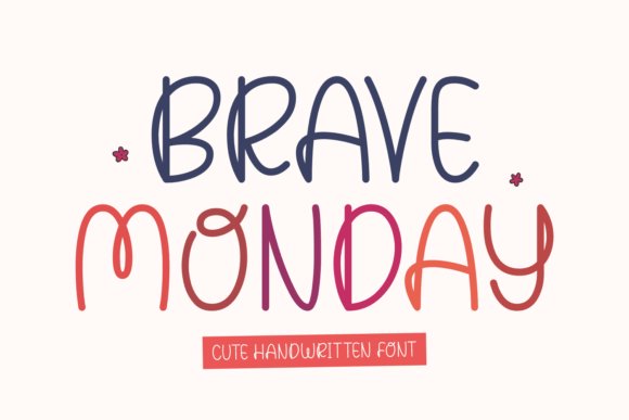
Brave Monday is a neat handwritten font whose strokes feel intentionally relaxed and tidy rather than wildly calligraphic. With smooth curves, subtle baseline shifts, and restrained ligatures, it gives short lines of text a personable, modern tone suitable for labels, mugs, and social overlays. Alternates and small caps provide enough variety to keep compositions lively while maintaining a controlled, clean appearance.
Reserve Brave Monday for headlines, product tags, and quote graphics where personality matters but long reads are unnecessary; it’s not built for dense body copy. For print on fabric or ceramics use bolder weights and slightly increased stroke contrast to counter absorbent surfaces. Combine it with a simple sans for contrast or a light serif to add warmth to layouts.
╰┈➤ Download Brave Monday Font
My Recommendation: I’d choose Brave Monday when I want a handcrafted feeling without messy strokes-boutique labels, greeting cards, and lifestyle blogs benefit from its tidy charm. The alternates make it feel bespoke, so simple phrases take on character quickly. I typically use it for short copy and balance it with a neutral supporting face for readability.
55. Letter Kids Font
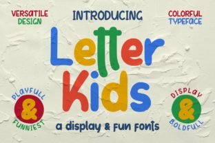
Letter Kids Font is a playful brush display with rounded terminals and a consistent stroke weight that reads energetic without feeling messy. It includes a full set of standard characters plus a generous selection of quirky ligatures that allow letters to interlock in amusing, characterful ways. Because every glyph was painted with the same brush and matched heights, mixed words and stacked compositions keep visual harmony even at bold sizes.
Kerning and metric tables come pre-tuned for tight display use, which makes the face ideal for t-shirt graphics, labels, stickers, and logo marks that need personality. It holds up well on packaging and lively headlines, though very small body copy will lose some charm; pair it with a neutral sans or a restrained slab for contrast. The brush textures respond nicely to distressing, color overlays, and playful layout tricks, and the ligature set encourages surprising wordplay in brand treatments.
My Recommendation: I use Letter Kids Font when a project calls for a warm, handmade voice – think children’s apparel, cheeky packaging, or social stickers. Its uniform brush strokes and ready-made kerning speed up layout work, while the ligatures add bespoke touches that feel handcrafted. For any brief that wants a cheerful, dependable display face with built-in personality, this font hits the mark.
These 55 picks provide a broad toolkit for t-shirt projects across niches like music merch, skate labels, and casual apparel. Pair a statement display with a neutral sans, tweak spacing for fabric readability, and keep print tests part of the workflow.
Choose a few favorites, run real mockups, and note how printing technique changes weight and texture. The right typefaces will help your shirts read clearly and feel intentional in 2026.