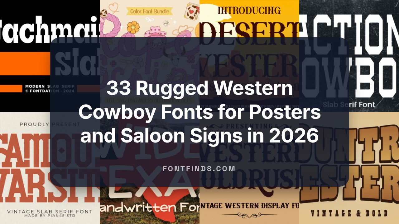
33 Rugged Western Cowboy Fonts for Posters and Saloon Signs in 2026
Western cowboy fonts bring gritty, rusted charm to any design that nods to the Old West. I run through 33 typefaces made for posters, packaging, signage, and themed events so you can match mood and message quickly.
Expect old-west typefaces from heavy slab serifs and stamped caps to flowing saloon scripts and rope-style display letters. Each entry includes style notes, best use cases, and pairing suggestions to help you pick a look-rugged, playful, or ornate.
1. Summer Western Rope Font
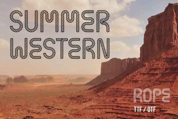
Summer Western Rope Font traces each character with a rope-inspired outline, borrowing visual cues from mid-century cowboy posters and ranch signage. The letterforms include twisted strokes and knotlike terminals that read clearly at headline sizes, giving words a handcrafted, tactile feel. It makes for an immediate southwestern accent on posters, product labels, and seasonal signage.
The set includes alternate glyphs and connective ligatures that let you mimic looping rope joins or create compact initials with decorative end knots. Best used at display scale so the rope texture remains legible; pair it with a simple sans or narrow serif to avoid clutter. Warm, earthy palettes and wood-grain backdrops intensify the material impression.
╰┈➤ Download Summer Western Rope Font
My Recommendation: I reach for Summer Western Rope Font when I want a playful, handcrafted western motif without leaning on clichéd stamp effects. Its rope detailing gives headlines personality and a tactile character that photographs and print both handle well. I use it for rodeo posters, farm-to-table packaging, and event signage where the headline must set a rustic, friendly tone.
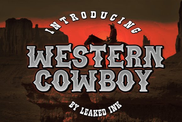
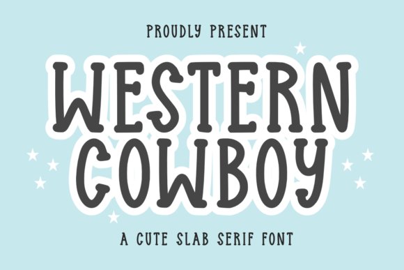
2. Western Cowboy Font
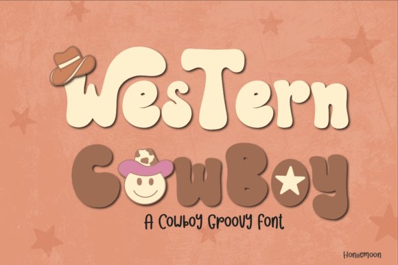
Western Cowboy Font is a compact collection blending display alphabets with handwritten and decorative variants aimed at festive, themed work. The kit supplies roughened strokes, swashy endings, and ornamental glyphs suited for invitations, logos, and posters that need lively western spirit. It also includes cowgirl-style flourishes alongside tougher block letters so you can mix playful and grounded moods.
Extras like alternates, dingbats, and handy ligatures speed layout and help craft cohesive headlines with minimal edits. Use the fonts at poster and tee scale; sun-bleached and warm ochre palettes amplify the celebratory feel. Tight tracking on capitals yields punchy banners, while a softened script layer tempers the look for more feminine or romantic pieces.
╰┈➤ Download Western Cowboy Font
My Recommendation: I like Western Cowboy Font for lively event work and themed branding because it provides both energy and variety in a single package. The mix of handwritten and display styles lets me create matching collateral without swapping type families. I rely on it for festival invites, pop-up markets, and merchandise where a spirited, handcrafted aesthetic is needed.
3. Cowboy Western Font
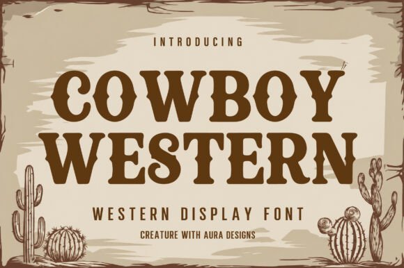
Cowboy Western Font is a bold vintage display face built around chunky slab serifs and decorative spurs, channeling saloon signs and wanted posters. The all-caps set has compact proportions and heavy letterforms that command attention across storefronts, packaging, and promotional signage. Carved terminals and angled curves evoke hand-painted woodblock lettering rather than modern geometric types.
This face performs well for restaurant identities, product labels, retro posters, and apparel that call for authentic frontier character and high visibility. Pair it with distressed textures, metallic stamping, or embossed leather to emphasize age and craft, while keeping long copy in a softer sans for comfort. For badge graphics, tighten spacing slightly and crop into circular seals to echo period insignia.
╰┈➤ Download Cowboy Western Font
My Recommendation: I pick Cowboy Western Font when a project needs unmistakable western authority and strong legibility at a distance. Its dense, iconic shapes make it ideal for steakhouse menus, signage, and country-music art where a rugged, nostalgic tone matters. The font gives instant character and brand recall without heavy ornamentation, so it works well across print, signage, and apparel.
4. Cowboy Western Grunge Font
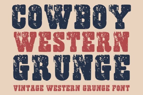
Cowboy Western Grunge channels classic Wild West letterforms while letting texture take the lead: heavy serifs and compact caps wear a hand-distressed surface that reads like sun-bleached wood or corroded tin. The type shapes are intentionally bold and slightly irregular, so headlines and posters gain a weathered, tactile presence without losing legibility at display sizes. Stylistic alternates and tight kerning options let you craft stacked logotypes and festival posters that feel handcrafted rather than manufactured.
For best results use high-contrast color palettes – deep umber, faded ochre, denim indigo – and print processes that celebrate grit, such as letterpress or textured screen printing. Pair it with a neutral sans for body copy so the textured faces stay dominant, and reserve thin strokes or small caps for accents only; the distressed fills need breathing room to read clearly. This font is a practical choice when you want an immediate, worn-in western attitude without resorting to cliché ornamentation.
╰┈➤ Download Cowboy Western Grunge Font
My Recommendation: I reach for Cowboy Western Grunge when a design must evoke frontier character with real surface personality – things like craft beer labels, rodeo posters, and rustic storefront signage. Its distressed fills and alternates let me create bold headlines that feel tactile and authentic, while controlled kerning helps keep logotypes tight. If your project benefits from a lived-in look rather than a polished replica of Western motifs, this font delivers that mood cleanly and reliably.
5. Action Cowboy Font
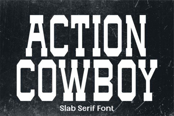
Action Cowboy is a slab serif built around geometric force: squared serifs, uniform stroke widths and compact letterforms give it an industrial, athletic stance ideal for headlines. The design reads like block lettering carved from steel – heavy weights carry visual weight without collapsing into muddiness thanks to measured counter space and purposeful aperture shapes. Condensed styles accentuate impact for logotypes and sports crests, while alternate glyphs provide subtle character shifts that keep repeated branding from feeling static.
Use wide tracking for large-format signage or tighten spacing for tight markwork; the font behaves well under bold colorfields and layered textures, holding up in vinyl printing and billboard scales. Pair with a narrow script or a simple geometric sans to provide contrast; numerals and caps are especially strong for jersey numbers, event dates and headline banners. This type suits identities that require visible strength and straightforward, no-nonsense letterform architecture.
╰┈➤ Download Action Cowboy Font
My Recommendation: I choose Action Cowboy when a project needs assertive, headline-first typography – think team branding, event posters, or product labels that must read from a distance. Its geometric slab details give logos a compact, muscular silhouette, and the condensed cuts keep layouts economical without losing presence. For campaigns that favor bold simplicity over decorative flair, this font helps anchor the design with clear visual authority.
6. Western Cowboy Font
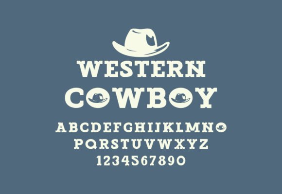
Western Cowboy pares Western styling down to its essentials: measured slab serifs, even proportions and a modest weathering that suggests age without heavy distress. The result is a retro-informed face that reads cleanly across print and web, lending a vintage air to logos and interface headers without overwhelming supporting text. Moderate x-height and open counters make it surprisingly usable at smaller sizes, so it moves smoothly from product labels to navigation headings.
For identities that need heritage cues but prefer restraint, place Western Cowboy against muted palettes, grid-driven layouts and simple iconography to reinforce authenticity without ornament. It plays especially well with minimalist photographic treatments or monochrome packaging, offering a hint of frontier mood while keeping the overall aesthetic refined. Use it when you want nostalgia with clarity rather than theatrical flourishes.
╰┈➤ Download Western Cowboy Font
My Recommendation: I pick Western Cowboy for brands aiming for a subtle retro voice – artisanal goods, boutique cafés, and online stores that want a touch of frontier charm without heavy texture. Its balanced proportions make it a flexible headline choice that won’t overpower clean layouts, and the light weathering gives personality without shouting. If you need a dependable Western feel that fits modern design systems, this font is a great, low-drama option.
7. Western Cowboy Blackletter Font
Western Cowboy Blackletter Font channels heavy calligraphic strokes and ornate terminals to deliver a strong, period-inspired headline face that reads best at display sizes. The high contrast between thick downstrokes and finer hairlines gives titles and badges a solid, antique presence without tipping into caricature. Decorative capitals and compact counters make it a go-to for book covers, packaging, and signage that need a lived-in, historic look.
The family includes alternate capitals and a set of ligatures to smooth awkward letter pairs, and kerning is tuned for tight compositions typical of logos and patches. For balance, use a neutral sans for body copy and reserve this face for focal elements or single-word mastheads. Textures, warm paper tones, and subtle distressing will reinforce the type’s rugged character while keeping legibility intact.
╰┈➤ Download Western Cowboy Blackletter Font
My Recommendation: I reach for this blackletter when a design needs immediate period character-craft beer labels, western-themed posters, or embossed book covers are perfect fits. Its alternates let me finesse troublesome letter combos without redesigning the logotype. I pair it with a simple sans and textured backgrounds so the type reads clearly while retaining that historic, handcrafted feel.
8. Western Cowboy Display Font
Western Cowboy Display Font reads like a confident, handwritten script with irregular strokes that add warmth and personality to any layout. Its casual rhythm makes it suitable for children’s books, greeting cards, tees, and stickers where a human touch matters more than rigid geometry. The friendly letterforms keep sentences approachable and inject a playful voice into packaging and small-batch branding.
Use alternate characters to avoid repetitive shapes and open tracking slightly on large-format prints to preserve clarity. Pair this face with straightforward icons or bold color blocks to sustain its informal tone, and avoid tiny sizes where the hand-drawn quirks could blur. It favors expressive, loose layouts over tight, grid-bound systems.
╰┈➤ Download Western Cowboy Display Font
My Recommendation: I use this handwritten display when a project benefits from charm rather than polish-kid-focused covers, artisan labels, or casual event posters come to mind. The alternates help the text feel genuinely hand-made, and the roughened edges respond well to screen printing or sticker production. It’s ideal when you want typography that feels like a friendly note rather than a formal announcement.
9. Western Cowboy Display Font (Retro)
Western Cowboy Display Font in its retro variant leans on bold slab proportions and decorative inlines to evoke vintage posters and saloon signage with authority. Its condensed counters and confident weight make it a standout for magazine covers, social headers, and invitations where headline impact is the priority. Punctuation and numerals are designed to sit comfortably with the ornate capitals, keeping composition balanced.
This version is PUA encoded, so stylistic alternates and ligatures are accessible directly in common design tools without extra setup. Try it against sun-faded gradients, paper textures, or minimalist frames to amplify the period feel, and avoid long passages of text to maintain clarity. Large-scale use preserves edge definition, which is perfect for posters and album art.
╰┈➤ Download Western Cowboy Display Font (Retro)
My Recommendation: I reach for this retro display when a design needs bold, nostalgic energy-event posters, themed invitations, or record covers work especially well. The PUA mapping saves time in layout sessions by making extras easy to apply. I treat it as the headline element and keep supporting type minimal so the vintage details can take center stage.
10. Western Cowboy Font
Western Cowboy Font brings the sturdy presence of slab serifs into everyday stationery. Its blocky serifs and steady stroke widths give handwritten layouts a grounded, analog feel while remaining legible at small sizes. Open counters and even spacing keep the face comfortable for diaries, note-taking, and long-form personal writing.
Apply it to greeting cards, banners, mugs, and shirts when you want practical character rather than ornate flourish; a subtle paper texture or ink distress will make printed pieces feel handcrafted. Pair with a light script to soften headings or with a neutral sans for event signage, and nudge tracking for bold display use to avoid crowding.
╰┈➤ Download Western Cowboy Font
My Recommendation: I reach for this font when a project needs readable character with a rustic touch. Its slab forms print crisply and hold up in vinyl cuts, which makes it useful for both home projects and small merchandise runs. Use it for notebooks, stationery suites, indie zines, or any piece that benefits from straightforward, tactile letterforms.
11. Western Cowboy Font
Western Cowboy Font channels frontier iconography with a playful tilt: chunky slabs are softened by a thick outlined shadow that reads like hand-painted signage. At display sizes the layered outline creates a mild three-dimensional effect that attracts attention without feeling heavy, giving letters a cheerful, retro personality. Two-tone fills or spot colors let the outline act as a graphic accent.
Put it on children’s book covers, themed party invites, or retro posters where warmth matters more than neutrality; the bold counters keep legibility across textured printing. The outlined layer is especially useful for screen printing, foiling, or layered vinyl, and reducing the outline stroke yields a subtler appearance for smaller prints.
╰┈➤ Download Western Cowboy Font
My Recommendation: I use this variant when a design requires personality and approachability-its outlined slabs add warmth to kid-focused covers and event collateral. The outline makes color separations straightforward for specialty print jobs, and it scales well for large-format pieces. Ideal for invitations, posters, novelty apparel, and any project that benefits from a friendly western motif.
12. Rope Rider Font
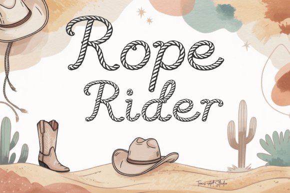
Rope Rider Font mimics the twist and tension of real lariat rope, with letterforms composed of intertwined strokes that suggest motion and handcraft. Despite its decorative construction, generous counters and clear terminals keep characters readable at medium display sizes, so the motif reads as design rather than clutter. The letter joins are intentionally shaped to avoid fragile points when reproduced physically.
This face shines on logos, badges, and apparel where an authentic rustic accent is needed; the rope motif becomes an identity mark on hats, patches, and signage. It’s prepared for Cricut, Silhouette, vector apps, and common print flows-outlines and joins are optimized for vinyl, HTV, laser cutting, and sublimation to reduce cleanup during production.
My Recommendation: I pick Rope Rider when I want a tactile, handcrafted look that survives production constraints-its cut-safe geometry speeds up vinyl and laser workflows. It adds instant character to ranch branding, festival merch, and DIY home décor while offering alternates to avoid repetitive letter patterns. Perfect for makers, small shops, and designers building western-themed logos or craft-ready graphics.
13. Rope Script Font
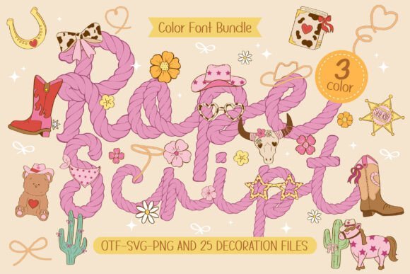
Rope Script wraps a playful script into a fiber-like texture, each letter appearing braided and tactile. Offered in three color layers, the glyphs stack to build depth and highlight the twist of the rope while keeping letterforms legible at display sizes. The type carries a girly Western mood without cliché florals, balancing whimsy with clear shapes that read well on invitations and small-format prints.
Beyond the letters you get 25 clipart pieces-boots, hats, horses, stars and desert accents-that sit perfectly alongside the font’s curves, ready for sticker sheets or nursery wall art. It translates neatly to sublimation and heat-transfer projects because the layered colors yield lively prints, and its friendly attitude makes planners, scrapbooks and kids’ apparel read as lovingly crafted rather than mass-produced.
My Recommendation: I’d reach for Rope Script when I want a playful, country-flavored look with tactile detail. The layered color support and included clipart speed up production for party stationery and nursery decor. It shines on small-run apparel, stickers and any craft where a hand-applied appearance helps sell the concept.
14. Cowboy School Font
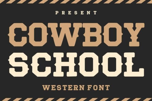
Cowboy School borrows the bold blockiness of collegiate lettering and grafts in western sign details, producing a display face with heavy weight and confident serifs. Letters show slab-like terminals and slightly condensed proportions, so they command attention on posters and badge-style logos without feeling overcrowded. The overall tone leans vintage, but clean counters and measured stroke contrast keep it readable in contemporary layouts.
Use this face to evoke old storefront signs, rodeo posters or retro apparel labels; it holds up at headline sizes and benefits from texture or embossing on print runs. Pair it with a light sans or a restrained script to soften impact while preserving the font’s assertive character for brand marks and packaging.
╰┈➤ Download Cowboy School Font
My Recommendation: I pick Cowboy School when a project needs bold western attitude without losing clarity-think brewery labels, event posters, or merch that nods to heritage. Its strong shapes reduce the need for extra ornament and take embossing or foil treatments very well. For logos and packaging where presence matters, this typeface delivers a tactile, confident voice.
15. Cowboy Junior Font
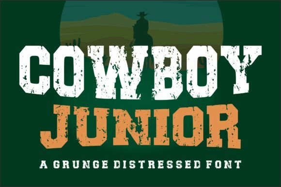
Cowboy Junior is a distressed slab serif that looks like letters pulled from a saloon billboard and left in the sun; edges are intentionally frayed and fills show wear. The uneven texture gives each glyph a lived-in, weathered character that reads as authentic rather than artificially aged, especially when used large on posters or tees. It’s primarily uppercase and built for bold headlines rather than dense body copy.
Because of its rough surface, offsetting it with clean white space or minimal graphics makes the type sing without cluttering the layout. It suits monochrome screen printing and layered halftone treatments on merchandise, and it accepts distress masks readily when you want to dial the amount of wear.
╰┈➤ Download Cowboy Junior Font
My Recommendation: I reach for Cowboy Junior when a design calls for grit-album covers, craft beer labels and streetwear tees all benefit from its raw texture. The built-in distress shortens prep time compared with crafting custom weathering, and the bold letterforms hold up well in print processes. Use it as a headline or emblem and keep supporting text simple to protect legibility.
16. Country Western Font
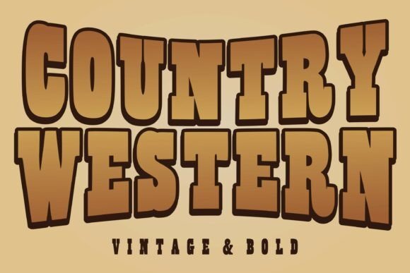
Country Western is a slab serif display face that channels saloon signage and fairground posters with bold, blocky letterforms and generous counters. The heavy strokes and thick outlines give headlines a physical presence on print and screen, while subtle irregularities in the terminals add an aged, handcrafted personality that reads as warm rather than harsh.
This face shines at large sizes where its carved details and wide letterspacing read clearly from a distance; try it for event posters, apparel art, and retro product labels. Pair Country Western with a narrow sans for secondary text or a simple script for accents, and consider textured backgrounds or metallic inks to reinforce the antique feel.
╰┈➤ Download Country Western Font
My Recommendation: I choose Country Western when a design needs an unmistakable frontier attitude without feeling kitschy. Its bold proportions make it a go-to for festival posters, western-themed packaging, and brand marks that require instant recognition. Use it where headlines must dominate and the typework should feel tactile and lived-in.
17. Western Outline Font
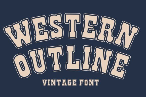
Western Outline takes the slab-style weight of traditional western types and pares it back with elegant outline strokes, producing a retro signboard quality that balances ornament with legibility. The outlining opens negative space inside letterforms, creating opportunities for color fills, layered effects, and graphic treatment that read clearly at display sizes.
It works especially well for logos, badges, and product packaging that benefit from two-tone or layered printing, and the outline detail makes it friendly to embossing and screenprint techniques. For best results, reserve it for headlines and mark work, and contrast it with a plain serif or geometric sans to ground the layout.
╰┈➤ Download Western Outline Font
My Recommendation: I reach for Western Outline when a project needs vintage Americana flair but also visual flexibility for layered color or print effects. The outline makes it easy to craft two-color treatments and eye-catching logos, perfect for brewery labels, apparel brands, and event signage. It’s ideal when you want nostalgia without heavy, opaque letterforms.
18. West Shine Font
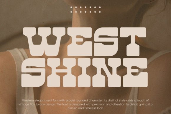
West Shine is a display font that distills mid-century western signage into compact, charismatic letterforms intended for strong headlines and brand marks. Its slightly condensed proportions and lively terminals give type a kinetic, show-card energy that reads as both retro and celebratory.
Use West Shine for poster headings, storefront signage, and merchandise where a punchy, optimistic voice is needed; add subtle drop shadows or halftone textures to amplify the vintage vibe. It pairs well with wide-set sans fonts for body copy and with warm, muted palettes to evoke old print posters and painted boards.
My Recommendation: I would pick West Shine for creative work that aims to feel festive and nostalgic-think rodeo posters, retro diner branding, and limited-edition T-shirts. Its condensed, perky shapes deliver strong headlines without taking up too much space. This is my choice when a design needs personality and instant visual rhythm.
19. Retro Mexico Font
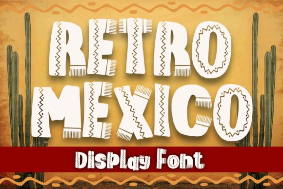
Retro Mexico Font wears a playful cowboy hat on every glyph: thick strokes, slab-like terminals, and a compact width give it bold stage presence without feeling clumsy. Decorative glyphs and alternate capitals inject a hand-painted sign flavor that reads friendly and informal rather than manufactured. Generous counters preserve legibility so headlines pop while smaller applications remain clear.
This face shines on apparel, kids’ books, greeting cards, stickers and posters where a casual, upbeat voice is needed. Pair it with a neutral sans for body text or add aged textures and sunset tones to push a mid-century southwestern mood. Included swashes and punctuation extras let short phrases feel intentionally crafted.
╰┈➤ Download Retro Mexico Font
My Recommendation: I reach for Retro Mexico Font when a design needs loud, cheerful character that still prints crisply. Its bold shapes tolerate low-resolution reproduction and tiny labels, so it’s reliable for merch and signage. Use it when you want a playful western flavor that reads immediately and keeps a handcrafted appeal.
20. Babycowboy Font
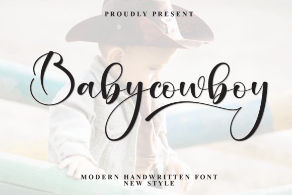
Babycowboy Font reads like a poised, hand-signed name: long flowing descenders, a gentle rightward slant, and balanced stroke weight create a steady, rhythmic flow. Terminals are tapered with a slight inked finish that suggests pen pressure rather than digital brushwork. Open counters and thoughtful spacing keep the script legible even at modest sizes.
Its boutique-western charm suits invitations, nursery art, product tags, and refined brandmarks where softness matters more than grit. Alternate ligatures and caps make it easy to move between casual handwriting and a more formal signature treatment. Try pairing it with a simple serif or light sans to keep the script front and center.
My Recommendation: I pick Babycowboy when a project needs warmth without leaning too rustic. The long descenders add elegant motion to logos and stationery, and the alternates give useful variety across print and social uses. It’s perfect for baby events, boutique labels, and photography overlays that benefit from a refined handwritten voice.
21. Desert Western Font
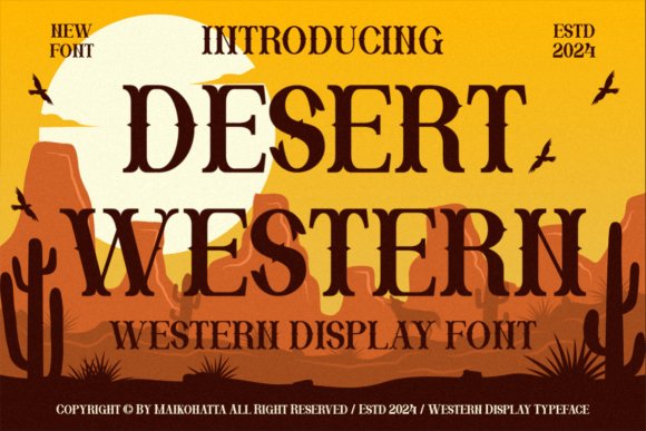
Desert Western Font offers rugged serif character with slightly worn profiles and strong stems that recall old shop lettering. Broad slab terminals and subtle irregularities in stroke width create a weathered, sun-faded feel without becoming ornate. It commands attention in large display settings while remaining straightforward and readable.
Bring it into posters, album covers, beer labels, restaurant signage, or any brand that wants a timeworn, masculine presence. Complement it with warm ochres, grain overlays, or stark black-and-white contrasts depending on whether you want grit or clarity. Its robust weights work well for bold headlines and stacked logotypes alike.
╰┈➤ Download Desert Western Font
My Recommendation: I choose Desert Western when a design needs typographic grit that feels authentic rather than staged. It excels at headline scales for posters, packaging, and themed interiors where texture enhances the concept. Use it for craft beverages, event posters, and hospitality branding that benefits from a lived-in, rustic personality.
22. Uachmain Slab Font
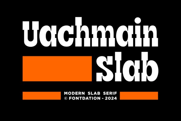
Uachmain Slab pairs a modern slab weight with unmistakable western character: heavy, squared serifs meet slightly condensed letterforms that hint at poster art from mid‑century cowboy cinema. The capitals carry strong horizontal terminals while counters remain generous enough to keep short headlines clear and bold on packaging or title cards.
Use this face when you need a loud, vintage note without losing legibility; it works best at display sizes and when combined with rough paper grains, woodblock textures, or warm ink tones. Tighten kerning for tight wordmarks, avoid long paragraphs, and consider pairing with a neutral sans for supporting body copy to keep compositions balanced.
╰┈➤ Download Uachmain Slab Font
My Recommendation: I reach for Uachmain Slab when a brand needs a confident, old‑west personality that still reads well at a glance. Its slab weight punches through busy backgrounds and gives logos a handcrafted, posterized aura. I would use it on food packaging, indie game titles, and boutique brewery labels where a nostalgic, bold voice helps the product stand out.
23. Wide Texas Font
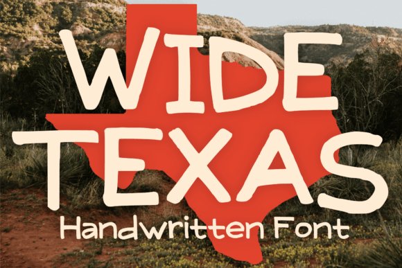
Wide Texas is a playful display face built on broad letterforms and cheerful curves, evoking cartoonish western signage rather than strict period reproduction. The generous widths and rounded terminals create a friendly rhythm that suits stickers, tees, and comic covers where personality matters more than restraint.
Scale this font up to headline sizes and pair it with clean, narrow supporting text to avoid visual clutter; bright color palettes and simple outlines amplify its charm. Keep tracking open for multi‑word lines and reserve the style for short copy or single‑line logotypes to preserve its readability and comic energy.
My Recommendation: I would pick Wide Texas for projects that need playful, bold character-kids’ apparel, novelty packaging, or quirky editorial covers are ideal. Its broad forms make a statement at a glance and photograph well on merch. Use it when you want a spirited, approachable look that reads as handcrafted and fun.
24. Gladium Font
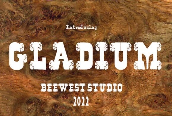
Gladium channels engraved Roman lettering with pronounced contrast and stylized flares that evoke monumental inscriptions and gladiatorial epics. The letters feel carved rather than drawn, with delicate interior strokes that reward high‑resolution printing and careful kerning in titles and posters.
Best applied to cinematic covers, editorial spreads, or apparel where an antique, stately voice is desired; metallic foils, debossing, and spot varnish will amplify its engraved quality. Avoid small sizes or low‑dpi screens where the finer details vanish, and consider pairing with a soft script or small caps for subtitling that complements the main title without competing with it.
My Recommendation: I choose Gladium when a project needs a dramatic, heritage appearance-think historical fiction covers, festival posters, or premium product labels. It brings a sense of gravitas that works beautifully with tactile finishes like foil or deboss. Use it when you want typography that reads as sculpted and cinematic rather than casual.
25. Broome Font
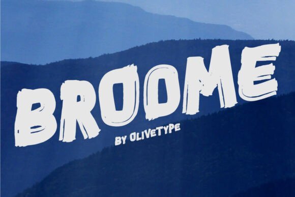
Broome is a brash brush display font that wears its hand-painted construction on every glyph, with thick, uneven strokes and textured edges that read as fiercely analog. The rough contours and energetic terminals push the letterforms out of neutral territory and give them a distinctive, rebellious voice that grabs attention. It performs best at display sizes where its grain and gesture are legible and where the imperfect marks add tactile personality to a composition.
Apply Broome to posters, album art, apparel branding, movie titles, or punchy social media headers to get a handcrafted, expressive look; pair it with a minimal geometric sans to prevent visual competition. Because of its textured ink appearance, avoid tight small text and watch kerning on clustered words so the brush rhythm remains readable. Subtle single-color prints or restrained halftone overlays preserve the brush detail without cluttering the design.
My Recommendation: I reach for Broome when a project needs raw, hand-painted attitude instead of polished neatness. Its brush texture gives posters, covers, and streetwear a sense of craft and motion, and it reads strongest when used large. Use it when you want a design that feels weathered, physical, and unapologetically bold.
26. Varsity Holiday Font
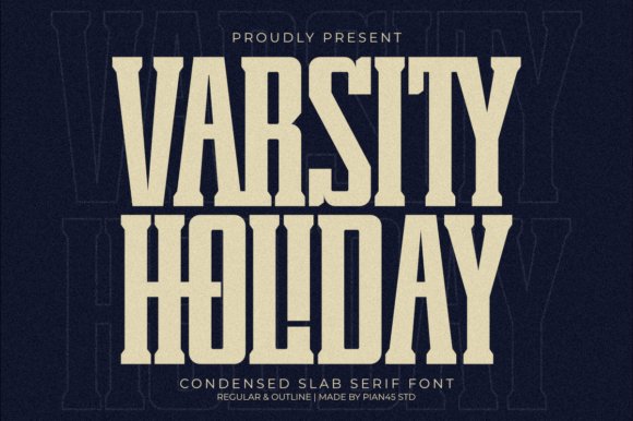
Varsity Holiday fuses condensed slab proportions with a retro varsity and western sensibility, producing compact letterforms that still command attention. Heavy serifs and tight counters make it efficient in narrow spaces while projecting a vintage, stamped presence suitable for signage and headlines. The family’s Regular and Outline styles act like built-in layers, letting you create shadowed or inset effects without building extra assets.
This face shines on sports posters, rodeo branding, whiskey labels, and heritage packaging where a bold, nostalgic mark is required; try distress textures and woodgrain backgrounds to deepen the mood. Pair it with a lighter script or a neutral sans to offset its weight and experiment with tight tracking on condensed words. Its condensed stance is also handy on banners and tickets where space is limited but impact matters.
╰┈➤ Download Varsity Holiday Font
My Recommendation: I choose Varsity Holiday for projects that need a stout, retro character-especially event posters, team merch, and vintage-style packaging. The outline style is a favorite for layered prints and enamel-look badges. It locks in a rugged, nostalgic identity without needing heavy treatments.
27. Famous Varsity Font
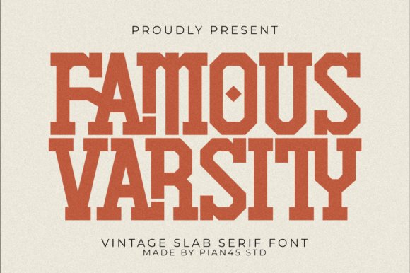
Famous Varsity channels collegiate authority in a condensed slab body, balancing blocky stems with decorative markers that nod to engraved letterpress and old team crests. The type’s compact proportions and strong serifs make logos and headlines read like stamped insignia, ideal for badges, team shields, and retro editorial covers. Thoughtful custom ligatures smooth awkward pairings and introduce subtle flourishes that keep text feeling handcrafted rather than mechanical.
Because the font is PUA-encoded, access to alternates, swashes, and extra glyphs is immediate-handy for rapid mockups and bespoke wordmarks without extra tooling. It performs very well in apparel, poster, and identity work where embroidery or print needs a bold, recognizable silhouette. Reserve body copy for a neutral sans to maintain legibility, and use Famous Varsity to carry the headline treatment with personality.
╰┈➤ Download Famous Varsity Font
My Recommendation: I use Famous Varsity when I want an authentic collegiate stamp with decorative options at hand; the PUA extras and ligatures speed up experimentation on logos and headlines. It’s particularly strong for team apparel, event badges, and poster art that needs a compact, impactful face. For longer text I pair it with a clean sans so the headline remains the focal point.
28. Tekila Font
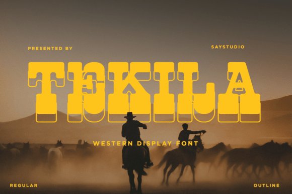
Tekila Font channels the weathered spirit of the Old West with hefty slab terminals and compact letterforms that sit confidently on a headline line. The strokes are wide without feeling clumsy, so the face reads at distance and keeps its personality on badges and signage. A subtle wedge in some characters gives it a handcrafted flavor rather than a mechanical slab look.
I reach for Tekila when a project needs immediate period character: brewery labels, event posters, and retro logos all gain presence from its weight and silhouette. Pair it with a narrow sans or a loose script to create clear typographic hierarchy and avoid crowding by loosening tracking slightly at larger sizes. The font tolerates rough textures and screen printing well, making it practical for physical goods as well as digital headers.
My Recommendation: I would use Tekila for headlines and logotypes that must read like authentic Old West signage while staying legible. Its strong letterforms cut through busy compositions and tolerate distressing or textured printing. Ideal for craft beverages, festival posters, restaurant branding, and merch that need bold vintage character.
29. Western Sketch Font
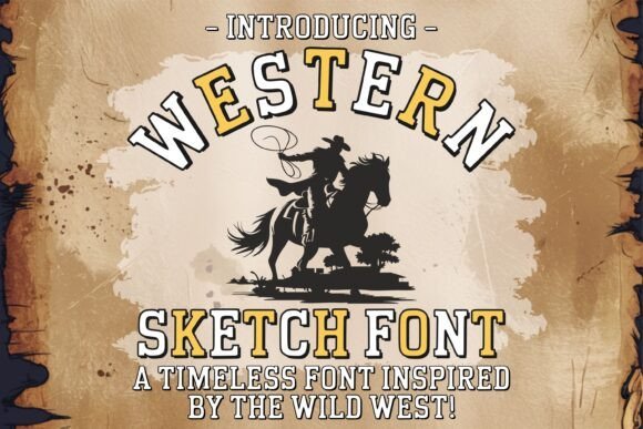
Western Sketch Font wears its imperfections like a badge; irregular strokes and rough edges mimic hand-carved signage rather than polished typesetting. The uneven terminals and varying stroke pressure give artwork a tactile, rustic feel that reads especially well on t-shirts and posters. Because the forms remain generous in width, the face retains legibility even when distressed or halftone effects are applied.
Its bold weight makes it ideal for marquee text, rodeo flyers, and cottage-core home goods where a handmade impression matters. The glyphs cut cleanly for vinyl cutters and hold up under sublimation, so you can move from digital mockup to physical product with confidence. For balance, combine Western Sketch with a thin geometric sans for secondary lines and small print.
╰┈➤ Download Western Sketch Font
My Recommendation: I reach for Western Sketch when a project needs a handcrafted, rugged headline that feels made rather than manufactured. Its thick, textured strokes survive transfers and printing tricks, which is handy for apparel and signage production. Use it for rodeo merch, rustic home decor, posters, and any application that benefits from a bold, lived-in aesthetic.
30. Cowboy Bundle Font Pack
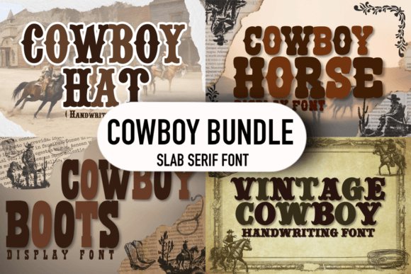
The Cowboy Bundle Font Pack collects several complementary western styles into one toolkit so designers can build a consistent vintage identity. The assortment ranges from blocky slab caps to more ornamental display cuts, allowing for layered headlines, subtle subheads, and badge text without hunting for matching faces. Since the faces share a common aesthetic, mixing weights and styles produces cohesive layouts rather than visual friction.
Use the pack to construct full brand systems: pairing a bold slab for main marks with a lighter condensed type for secondary information creates a clear hierarchy across posters, packaging, and merch. Test the heavier weights at small scales to ensure counters remain open, and apply distress textures sparingly to maintain legibility. This collection speeds up concept work by offering multiple looks within one visual family.
╰┈➤ Download Cowboy Bundle Font Pack
My Recommendation: I’d choose the Cowboy Bundle when I need a ready-made suite for a western-themed identity that spans print and product. It keeps style consistent across logos, signage and apparel while providing enough variety to craft hierarchy. Perfect for agencies, event designers, and makers building campaigns or product lines with a unified vintage feel.
31. Gherry Font
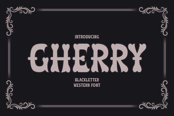
Gherry marries dense blackletter strokes with wide, angled terminals borrowed from frontier signage, creating letterforms that feel ornate and forceful at display sizes. High-contrast stems, decorative ligatures and stylized capitals give headlines a theatrical presence while maintaining enough clarity for embossing or foil stamping. Careful kerning and alternate capitals let the font read like crafted hand-lettering instead of a single flat block of ornament.
Use Gherry for film titles, vintage product labels, or event branding where Gothic drama should carry a western grit; it pairs particularly well with leather textures, metallic inks and short, bold phrases. Give it generous tracking when set in lines longer than a single word and favour larger point sizes to preserve its interior counters. Reserve it for focal headlines rather than continuous text so the ornamentation remains a feature, not a distraction.
My Recommendation: I choose Gherry when a project needs theatrical history bumped up with frontier grit-think film posters, boutique bottles, or festival identities. Its ligatures and bold capitals create a memorable signature that stands up to tactile finishes like letterpress or foil. For me it’s perfect when a headline must feel handcrafted and have instant personality.
32. Western Goldrush Font
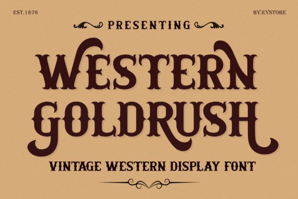
Western Goldrush channels saloon signage and nineteenth‑century poster lettering into a display face that announces itself with broad serifs and curled terminals. Decorative swashes and multiple uppercase variations are directly accessible, so designers can compose authentic-looking headlines without toggling OpenType features. The letterforms are cut to prioritize quick recognition, balancing ornament with legibility in headline use.
This face suits whiskey labels, barbershop marques, ranch badges and retro apparel where a rugged, masculine tone is desired; it reads cleanly on heavy paper and coarse textures. Because alternates are on hand without extra software tricks, it speeds layout work and keeps designs consistent across platforms. It also handles stacked logos and circular badges well thanks to even proportions and steady stroke weights.
╰┈➤ Download Western Goldrush Font
My Recommendation: I recommend Western Goldrush for projects that need immediate frontier character without fiddly setup-distilleries, heritage apparel, and rustic hospitality brands are perfect fits. The ready-made alternates save time in tight workflows and the bold letterforms print beautifully on textured stock. I often pair it with warm, muted palettes and tactile finishes to sell the old‑west feel.
33. Texas Western Font
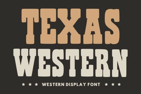
Texas Western reduces western ornament to a compact slab-serif alphabet built for clear headlines and far‑away reading. Heavy slab terminals and subtle flares nod to woodblock posters while open counters and measured spacing prevent the letters from closing up under pressure. The overall effect is a no-nonsense display face that reads strongly on signage and apparel alike.
Lean use cases include rodeo posters, storefront signage, t-shirts and packaging that benefit from a hefty, readable voice rather than excessive decoration. Apply distressing or halftone textures if you want a vintage worn look, or keep edges sharp for a contemporary take on frontier lettering. It pairs neatly with condensed sans faces or emblem marks when space is tight.
╰┈➤ Download Texas Western Font
My Recommendation: I reach for Texas Western when a headline must be legible at a distance-storefronts, festival posters and merchandise benefit from its slab strength. Its forms survive print, screen and cut materials with minimal fuss, which makes it reliable for production-heavy jobs. For best results I combine it with a single accent color and rugged texture to anchor the design.
These 33 Western cowboy fonts provide a wide set of options when a project needs authentic frontier character. Use distressed caps for bold headlines, slab serifs for sturdy layouts, and scripts for signage or product labels.
Save the list and test a few faces on mockups to find the right match for texture, color, and composition. If you want pairing ideas for a specific project, tell me the context and I will suggest combinations from the collection.