
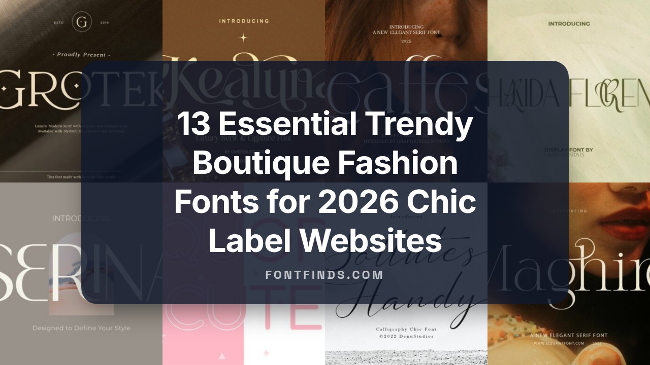
13 Editorial Trendy Boutique Fashion Fonts for 2026 Chic Label Websites
This post showcases 13 handpicked trendy boutique fashion fonts chosen for designers who craft label identities, lookbooks, and product packaging. The set spans refined serifs, airy sans options, and textured scripts aimed at boutique aesthetics.
Each face includes pairing ideas, weight options, and short licensing notes so you can test them in mockups and on product shots. Read on for quick styling tips, pairing suggestions, and practical use cases that suit small fashion labels and indie designers.
1. Curlonia Font
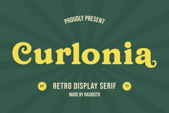
Curlonia revives the playful drama of 60s and 70s display serifs with broad stems and distinctive ball terminals that spiral into lively curls. Its heavy-but-balanced letterforms read clearly at large sizes while the terminals add a handcrafted, retro personality that stands out on invitation covers and signage. The typeface walks a fine line between bold headline voice and approachable charm, making it excellent for brands that want vintage charisma without visual clutter.
Curlonia’s warm, whimsical energy suits sunlit ceremonies and printed collateral. I’ve found it pairs neatly with a clean sans for body copy or a restrained script for RSVP lines, and Curlonia’s bold curls and nostalgic silhouette make it a strong pick among Summer wedding fonts for couples aiming for a retro, sunlit celebration. Use heavier cuts for marquee names and tighter tracking or lighter strokes for smaller details to preserve legibility.
My Recommendation: I’d reach for Curlonia when I want a wedding suite or venue sign to feel playfully vintage rather than kitschy. Its bold terminals give you graphic presence for ceremony posters and café-style menus, while still reading well on kraft paper or heavy stock. It’s especially effective when paired with muted pastels or warm sunset hues for a retro-summer vibe.
2. Aquora Cute Font
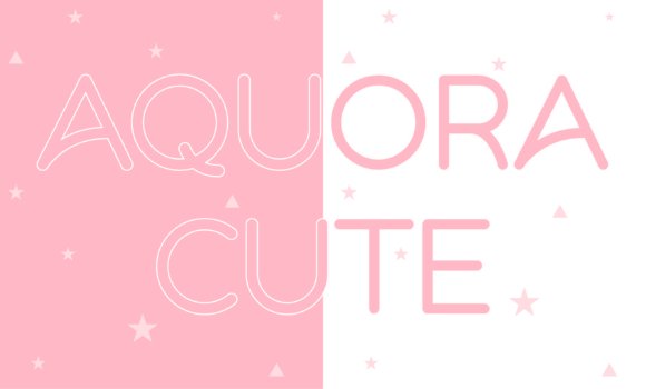
Aquora Cute is a rounded sans with open counters and soft terminals that create a breezy, friendly tone-perfect for joyful, contemporary applications. The typeface reads as both youthful and polished, thanks to its careful proportions and slightly inflated curves that retain structure without feeling fussy. Think playful headlines, bright product labels, or social headers where personality must coexist with readability.
Color-forward projects benefit from Aquora’s upbeat character; it sings in coral, blush, and mint palettes and works well across web banners and printed place cards. Try it for bridal shower graphics, welcome signs, or casual invitation suites where a cheerful, modern aesthetic is key. Pair Aquora with a light serif or thin script for contrast to keep layouts lively without overwhelming the eye.
My Recommendation: I recommend Aquora Cute when a project needs to feel optimistic and contemporary-ideal for boutique bridal events, beauty packaging, or children’s outlets. Its rounded shapes make it approachable at both small and large sizes, and it prints beautifully on textured stocks. Use bright color accents to amplify its bubbly personality while keeping body text in a more neutral face for contrast.
3. Manolisa Font
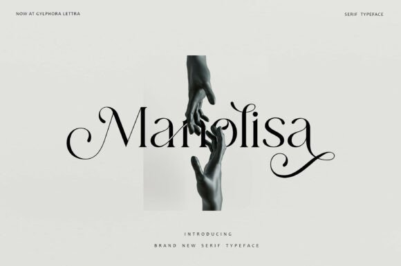
Manolisa is a high-contrast serif with sweeping swashes and ornamental ligatures that read like jewelry for a layout. Its dramatic strokes and elegant flourishes excel at large display uses-editorial covers, monograms, and luxury packaging-where the decorative elements can breathe. The face balances femininity and authority, delivering a refined headline that still feels distinctly crafted.
Reserve Manolisa for pieces that benefit from expressive detail: embossed invitations, foil-stamped place cards, or a logo lockup where a single decorative glyph can anchor the design. It pairs beautifully with a minimal sans for body copy and responds well to generous leading and wide margins, which let its ligatures shine without clutter. For best results, use at larger sizes and test printing finishes to emphasize its sculptural quality.
My Recommendation: I use Manolisa when I want a wedding suite or brand identity to read as intentionally luxe and feminine. The ligatures and swashes give you instant ornamentation, so you can rely on type instead of extra graphics. It’s my go-to for formal invitations, high-end packaging, and editorial spreads where craftsmanship and presence matter.
4. Leaffes Font
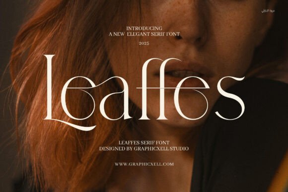
Leaffes is a refined serif with tapered terminals and softly flowing letterforms that read beautifully in both print and on screen. Its moderate contrast and open counters lend clarity to headlines and fine print alike, making it an excellent choice among Summer wedding fonts for stationery that needs to feel fresh yet formal. The typeface balances readability with personality: careful kerning, alternates and subtle ligatures give headlines a bespoke quality without sacrificing legibility.
Use Leaffes for invitation headers, RSVP cards, menus and boutique branding where a quiet sense of refinement is required. It pairs particularly well with an airy script or a restrained sans for contrast; try warm ivory stock, light embossing, or botanical motifs to complement the font’s organic curves and make monograms pop.
My Recommendation: I reach for Leaffes when a project asks for elegant restraint rather than flamboyance. Its serif details add warmth on paper and clarity on screens, so it works for both printed invites and wedding websites. For formal summer ceremonies or boutique bridal brands, Leaffes gives a polished, bespoke impression without feeling overwrought.
5. Maghire Font
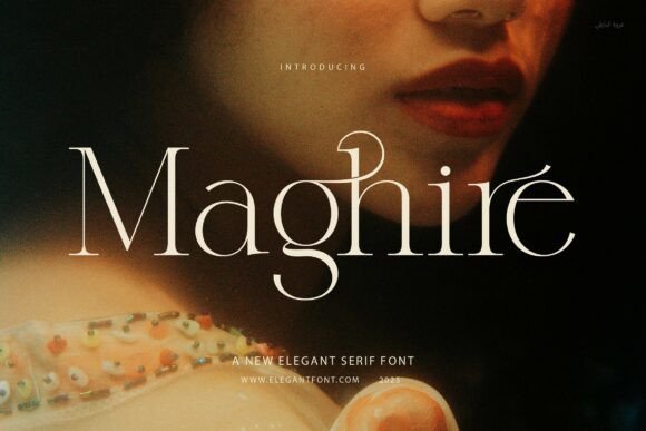
Maghire offers calm, balanced proportions and subtle bracketed serifs that keep text readable across sizes while giving headlines authority. The design sits between classical serif geometry and current minimal tastes, so it holds up in large display uses and long-form copy with equal confidence. Small caps and tasteful ligatures provide extra typographic control for designers crafting cohesive suites of materials.
Because of its clean rhythm, Maghire works well on thick stationery, menus and editorial layouts; pair it with a neutral sans and a lightly scripted accent to create contrast. It suits wedding suites, brand identities and lookbooks where clarity and a measured fashion sensibility are priorities rather than ornamentation.
My Recommendation: I pick Maghire when a client wants polished, readable typography that won’t compete with photographic or handwritten elements. It’s dependable for multi-page programs and venue signage because it keeps hierarchy clear. Use it when you need a classic serif voice with restrained, modern appeal.
6. Honey Dove Font
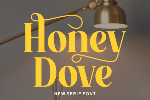
Honey Dove is a minimalist display serif with high-contrast strokes and delicate terminals that lean feminine without tipping into frill. It commands attention in logotypes, invitation titles and social tiles where a refined, fashion-forward tone is required, and its decorative ligatures add character to initials and monograms. The overall silhouette reads luxe while remaining crisp on digital banners and print pieces.
Pair Honey Dove with watercolor washes, pale blush palettes or metallic foil for a romantic summer aesthetic; use it for save-the-dates, signage and branding for bridal boutiques seeking a polished look. Lightweight scripts and textured papers accentuate its couture feel, making it ideal for intimate ceremonies and editorial styling that call for a tasteful, modern romance.
My Recommendation: I recommend Honey Dove when the brief asks for a chic, feminine presence that won’t overwhelm other design elements. It’s especially effective for boutique wedding brands and influencer-led wedding content where visual identity must feel curated. Use it for bold titles, monograms, and any application where fashion-forward elegance is the goal.
7. Girl Font – Summer wedding fonts Script
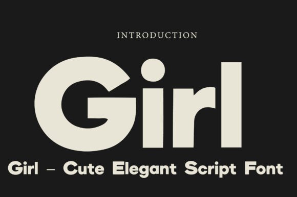
Girl presents a flowing, handwritten script built around smooth, calligraphic strokes that feel intimate without losing legibility. Among Summer wedding fonts Girl stands out for its warm, feminine character: soft loops, modest swashes, and controlled contrast give invitations and brand marks a handcrafted, polished presence.
Technically it ships with uppercase and lowercase sets, numerals, punctuation, and a selection of alternate forms that make signatures and monograms simple to compose. Use thin-lined serifs or restrained sans-serifs as companions to let Girl’s curves breathe on stationery, packaging, and web headers while keeping readability intact.
╰┈➤ Download Girl Font – Summer wedding fonts Script
My Recommendation: I reach for Girl when a design needs personality that still reads clearly at small sizes. Its handwritten feel is ideal for intimate wedding invitations, boutique beauty brands, and signature logos where warmth matters. The alternates and solid punctuation make it quick to work with in both print and digital layouts.
8. Kealuna Font
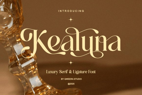
Kealuna is a refined serif with a focus on elegant terminals and handcrafted ligatures that link letters into graceful wordforms. The type’s moderate contrast and slightly tapered stems create a polished, editorial voice suited to boutique identity systems and upscale packaging where typography needs to signal calm refinement.
Included PUA-encoded glyphs and decorative ligatures let designers craft bespoke logotypes and ornamental headlines without extra tooling. Pair Kealuna with airy layouts, muted color palettes, and generous tracking on subheads to maintain a relaxed, high-fashion rhythm across labels, lookbooks, and web editorial pieces.
My Recommendation: I use Kealuna when a project needs an elevated, editorial mood without feeling ornate. Its ligatures are perfect for wordmarks and product fronts, and the PUA characters save time when assembling stylised copy. It suits boutique branding, skincare packaging, and magazine spreads that call for restrained elegance.
9. Sollutes Handy Font
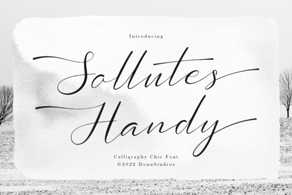
Sollutes Handy channels chic calligraphy with long, airy horizontals and broad swashes that read like artful handwriting. Its open counters and sweeping tails introduce a sense of movement, making headings and featured names feel intentionally hand-crafted rather than mechanically styled.
All ornamental swashes and alternate glyphs are PUA encoded for straightforward access in common design apps, which speeds up layout work for print invitations and online hero banners. For balance, combine it with a minimal serif or neutral sans to prevent visual clutter and to highlight the script as a focal accent on stationery, menus, and branded collateral.
╰┈➤ Download Sollutes Handy Font
My Recommendation: I pick Sollutes Handy for projects that need a fashion-forward, hand-inked look-especially wedding stationery and luxe editorial covers. The long swashes create memorable signatures and focal headlines, and the PUA support keeps production tidy. It’s particularly effective when paired with clean, minimal supports so the script remains the star.
10. Khalida Florent Font
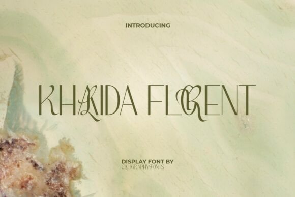
Khalida Florent brings a couture sensibility to display typography: tall, narrow letterforms sit beside unexpected ligatures and sculpted terminals that catch the eye. Its linear geometry and selective ornamentation make it a natural pick for invitation headers and branded signage, and it reads particularly well among Summer wedding fonts where a polished, editorial look is desired.
Use this face large and spare so each bespoke ligature can breathe; pair it with a soft script for names or with a quiet serif for menus and programs. The font’s PUA-accessible extras let you swap stylistic alternates without extra tooling, making it faster to craft cohesive collateral for boutique venues, luxury stationery, or minimalist floral suites.
╰┈➤ Download Khalida Florent Font
My Recommendation: I reach for Khalida Florent when a project needs theatrical, fashion-forward lettering that still feels refined. It’s my go-to for upscale invitation suites and modern venue signage where the type must act like jewelry-noticeable but never fussy. Use it where high contrast and generous spacing are possible so those sculpted ligatures can be appreciated.
11. Serina Font
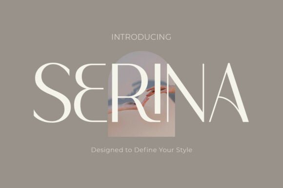
Serina is a clean, refined sans serif with gentle curves and a set of alternate characters that add personality without compromising clarity. Its restrained stroke contrast and careful spacing make it equally suited to social feeds, packaging headlines, or editorial mastheads where a soft yet professional voice is needed.
The included ligatures and alternates let you tune each word for warmth-swap a single character to give a logotype a handwritten hint or keep the standard set for clean, readable body headlines. Use Serina across responsive layouts because its open counters and clear shapes maintain legibility at small sizes while still holding charm at display scale.
My Recommendation: I use Serina when a brand needs approachability paired with polish-think boutique beauty labels or modern stationery. It’s reliable for UI headers and print covers alike, and the alternates mean you can add subtle flair without custom lettering. For projects that require consistency across platforms, Serina keeps things coherent and attractive.
12. Nikolas Modern Serif Font
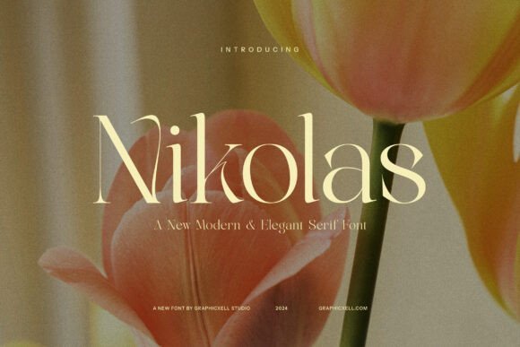
Nikolas Modern Serif blends classic serif cues with contemporary proportions: modest bracketed serifs, open counters, and a slightly condensed profile give text both presence and readability. It excels in editorial spreads and long-form layouts where a refined voice is required, yet it retains enough character for headlines and identity work.
Because of its balanced weight range and clear glyph shapes, Nikolas performs well in print menus, wedding programs, and upscale catalogs-pair it with a light script for guest names or with a neutral sans for supporting captions. Careful kerning and thoughtful italics make it a dependable choice when you need consistent visual authority across multiple touchpoints.
╰┈➤ Download Nikolas Modern Serif Font
My Recommendation: I turn to Nikolas when a project calls for poised, readable typography with a contemporary edge. It’s especially effective for print-heavy pieces like programs, magazines, and product booklets where sustained legibility matters. Use it when you want a serif that feels modern without sacrificing traditional elegance.
13. Grotek Font
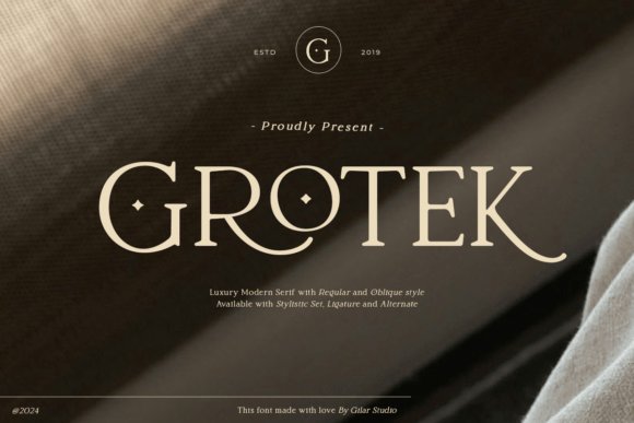
Grotek pairs magazine-grade polish with subtle serif details, giving headlines and titles a refined, modern posture that still feels warm. It ships in two styles – Regular and Oblique – where Regular reads cleanly across body copy and Oblique adds a soft slanted accent for invitations or signage. Among Summer wedding fonts Grotek stands out for bringing editorial chic to seaside, garden, and minimalist palettes, making printed suites and online headers look intentionally curated.
The letterforms show moderate stroke contrast and open counters, which helps legibility at small sizes while remaining distinctive on large-format printing like ceremony signage. Careful kerning and balanced x-height mean Grotek works well when paired with light scripts or geometric sans for contrast; use Regular for RSVP text and Oblique for names, monograms, or boutique branding. Expect crisp reproduction in foil, embossing, and digital layouts where a classy, readable serif is needed.
My Recommendation: I reach for Grotek when I want a serif that reads like an upscale magazine but still plays nicely with soft, romantic palettes. Its two styles let me use the Regular for clear invitation copy and the Oblique for names or headings that need personality. It’s ideal for coastal or garden weddings, boutique stationery, and brands seeking a polished, editorial look without feeling too formal.
Try mixing a serif headline with a minimalist sans for balance, or pair a light serif with an expressive script to add character. Small shifts in spacing and size will change the feel dramatically, so preview each font in real layouts before committing.
The 13 selections cover luxe display faces, airy sans-serifs, and handwritten scripts – all suited to boutique labels and editorial spreads. Check specimen files and licensing details, then run a few short brand mockups to find the best match for your project.


One Comment