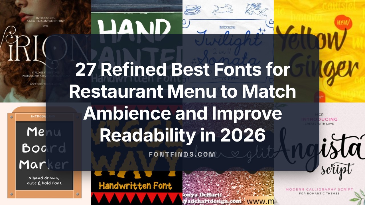
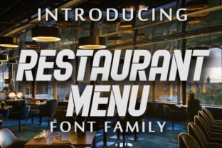
27 Refined Best Fonts for Restaurant Menu to Match Ambience and Improve Readability in 2026
Best fonts for restaurant menu are a small design choice with a surprisingly big effect. The right typeface helps guests scan sections, feel the cuisine’s character, and make confident choices.
Here you’ll find 27 carefully chosen typefaces across serif, sans-serif, script, and display styles, plus practical tips on pairing, sizes, spacing, and how to test for print and digital menus. Short examples and use-case notes will help you match type to casual counters, tasting menus, food trucks, and themed concepts without guesswork.
1. Restaurant Menu Font
Restaurant Menu Font channels mid-century diner signage with four complementary styles-regular, bold, condensed and ornamented-that give headings presence without overwhelming body copy. Its letterforms balance playful curves with sturdy strokes, creating a clear typographic hierarchy that keeps dish names readable while adding period character. Because of that controlled contrast and deliberate spacing, it ranks among the Best fonts for restaurant menu choices for cafés and bistros aiming for a retro look without sacrificing clarity.
Apply the ornamented cut to page headers and the condensed face for tight two-column layouts; the light weight works well on printed table cards and social tiles. Pair it with a neutral sans for prices to keep the eye moving, and consider warm paper textures or muted chalk backgrounds to enhance the era-specific feel. The family exports clean outlines for vinyl cutting and large-format banners, so it performs across both physical signage and digital menus.
╰┈➤ Download Restaurant Menu Font
My Recommendation: I would reach for this design when creating a casual bistro or retro diner menu because it communicates character without compromising legibility. The four styles make it easy to control emphasis-ornate glyphs for headers and condensed forms for item lists-so layouts stay compact. It also scales and prints cleanly, which helps when moving a concept from screen to banner or tabletop.
2. Chalk Brush Font
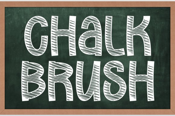
Chalk Brush Font mimics authentic chalkboard texture with internal sketch lines that catch the eye and feel handcrafted. The blocky, high-contrast letterforms maintain legibility at a distance, making this face a reliable choice for café menu boards and event signage where quick reading matters. Its tactile roughness reads casual and approachable without becoming sloppy, which keeps daily specials and headings distinct.
Because the type carries built-in texture, pair it with simple icons or thin rule lines to prevent compositions from feeling crowded. It translates well to photographed boards and social media graphics, and the rough edges survive scanning and low-resolution captures better than flat display faces. For balance, combine Chalk Brush with a narrow sans for descriptions and a light script for small accents to create a handcrafted palette.
My Recommendation: I pick this font when a design needs warmth and a human touch-ideal for neighborhood cafés, bakeries, or school event posters. Its internal sketch effect removes the need for heavy Photoshop treatments and speeds up production. The result is a convincing chalkboard aesthetic that remains readable in real-world signs and online photos.
3. Winter Sign Font
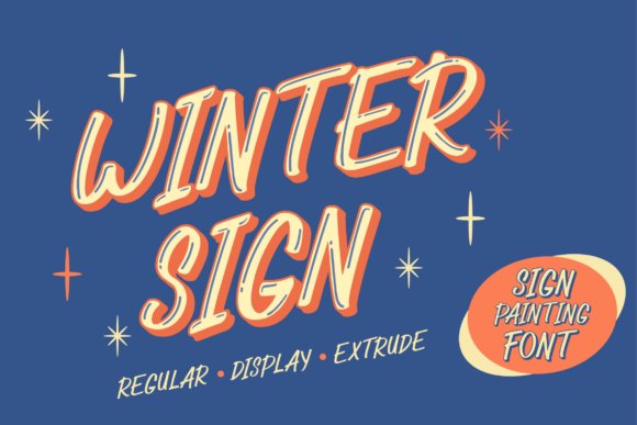
Winter Sign Font captures the spirit of hand-painted storefront lettering with flowing italics and subtle brush flares that show up beautifully at display sizes. The family includes Regular, Display, and Extrude styles so you can simulate layered paint or shadowed signage for menu headers and window vinyl. Multilingual glyph coverage eases the work of global menu design while preserving the handcrafted appearance without sacrificing legibility.
Use the Display weight for bold titles and the Extrude style to suggest three-dimensional painted signs on posters or packaging; Regular serves well for subheadings and ingredient lines. The shaped strokes reproduce cleanly in screen printing and letterpress, making the face useful for seasonal menus and retail signage where tactile print finishes matter. Try offset layers, subtle gradients, or metallic inks to accentuate the vintage depth this family offers.
My Recommendation: I rely on Winter Sign when a project needs the authority of hand-painted lettering-great for boutique cafés, holiday menus, or artisanal food packaging. The layered styles let me build depth without heavy effects, and the glyph set makes it practical for multilingual layouts. Its strength in specialty printing processes is a real advantage when producing tactile collateral like window decals or limited-run posters.
4. Sunbath Font
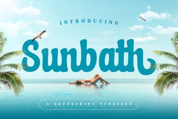
Sunbath is a soft, script-style font that leans on gentle, hand-lettered curves to give text a warm, human tone. Sunbath ranks among the Best fonts for restaurant menu when you want headers that feel handmade yet readable; its medium contrast and open counters keep words legible on printed and digital menus. The face works well for short lines-slogan bars, section headings, signature dishes-and carries personality without overwhelming a layout.
On a technical level the letterforms show a modest x-height and deliberate stroke rhythm, which helps retain clarity at common menu sizes and on chalkboard boards. Pair Sunbath with a plain sans for body copy to preserve readability while letting the script set the mood; use sparing swashes and alternates to avoid clutter. Its sunny character suits cafes, bistros, and intimate dining where warmth is part of the brand voice.
My Recommendation: I would reach for Sunbath when I need a menu header that reads like a handwritten note-friendly, slightly dressy, and approachable. It’s great for coffee shops, boutique bistros, wedding menus, and branded social graphics where personality matters. Use it for titles and highlights while keeping dish descriptions in a neutral sans to maintain clarity.
5. Snowy Days Font
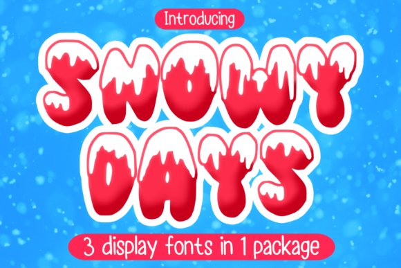
Snowy Days is a playful, seasonal display font whose flurries and rounded forms instantly signal winter and holiday themes. It excels at grabbing attention for seasonal menus, special-event headers, and promotional graphics where a festive tone is appropriate, but it is intended for large sizes rather than paragraph text. The character set carries a casual, illustrated feel that pairs naturally with photo overlays and decorative icons.
Because of its decorative shapes, spacing and letterweight are tuned for headlines and posters; tight tracking or small sizes can harm legibility. Use Snowy Days for seasonal menu banners, holiday specials, limited-run signage, merchandise and greeting cards, then balance it with a restrained serif or sans for body copy. Its cheerful motif makes a concept feel celebratory without needing extra ornamentation.
My Recommendation: I’d pick Snowy Days when I’m designing a winter menu or limited-time holiday promotion that needs an immediate seasonal cue. It gives menus and posters a festive personality and works well on signage and merch. Keep dish text simple so the display lettering can shine without competing for readability.
6. Wiggly Wavy Font
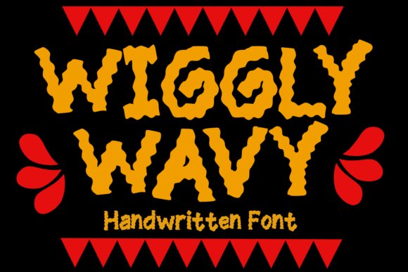
Wiggly Wavy takes a playful route with irregular, snack-inspired letterforms that read like a set of cartoon fries-fun, bold, and informal. It’s tailored to eye-catching headers, kids’ menu sections, and casual restaurant branding where a lighthearted tone helps attract families and younger crowds. While delightful at display sizes, the font should be avoided for dense body copy because its idiosyncratic shapes demand visual breathing room.
The font’s lively counters and varying stroke widths make it a strong choice for packaging, stickers, and posters tied to fast-casual or retro diner concepts. Pair Wiggly Wavy with a plain geometric sans to ground layouts and provide clear course descriptions. Use it sparingly for section titles, callouts, and logo marks to keep menus playful without sacrificing readability.
My Recommendation: I would use Wiggly Wavy for kids’ menus, burger joints, and promotional materials that benefit from a cheeky personality. It creates instant visual character and works superbly on signage and printed collateral. Treat it as a headline tool and pair with a neutral body font so the menu stays easy to scan.
7. Hand Painted Font
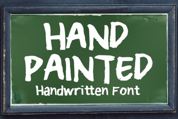
Hand Painted is a brush-style display font with authentic bristle textures and slightly irregular letterforms that read as handcrafted. The rough ink edges and variable stroke width give headlines a lived-in, artisanal character, which is why designers often include it among the Best fonts for restaurant menu when they want a homemade or farm-to-table feel without losing clarity. The letters retain good contrast on dark boards and printed menus, making them work well for specials or section headers.
For practical use, pair Hand Painted with a neutral sans for item descriptions and prices so the board stays readable; keep body sizes larger than 12–14 pt when printing. It shines on chalkboard-style signage, seasonal handouts, and branded tote bags where texture matters, and its expressive shapes are forgiving of rough printing or textured paper.
╰┈➤ Download Hand Painted Font
My Recommendation: I would reach for Hand Painted when I want menus to feel personal and handcrafted-think neighborhood bistros, market-style eateries, and pop-up stalls. Its lively strokes create personality fast, while pairing it with a clean sans keeps things legible. Use it for headings and daily specials rather than long paragraphs to preserve readability and charm.
8. Kocak Outline Font
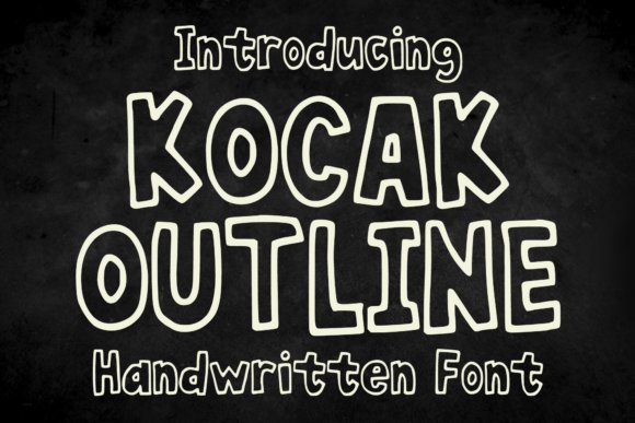
Kocak Outline is a playful chalk-outline typeface that mimics hand-drawn cartoon lettering, with open counters and a bouncy baseline that give text a lighthearted presence. The outline-only construction reads best at larger sizes where the interior negative space balances the strokes, creating a fun, approachable look for signage and menus aimed at families or casual diners. Its informal voice is especially effective on chalkboards, menu chalk art, and kids’ sections.
Use Kocak Outline as a headline or accent rather than for dense copy; combine it with a solid, wider-weight font for prices or descriptions to preserve legibility. High-contrast backgrounds and careful spacing will keep the outlines from disappearing, and the typeface lends itself to playful color fills, sticker designs, and promotional posters that need a handcrafted, energetic touch.
╰┈➤ Download Kocak Outline Font
My Recommendation: I’d use Kocak Outline for cafe chalkboards, children’s menus, or weekend brunch promos where a cheerful, hand-drawn look helps set the tone. It draws attention without feeling formal, and when paired with a solid text face it keeps the menu readable. Reserve it for short headlines or labels-its charm works best in small doses.
9. Second Mark Duo Font Duo
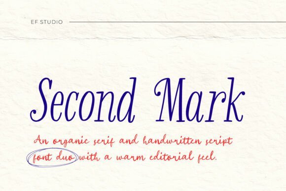
Second Mark Duo pairs a warm, organic serif with a companion handwritten script to produce refined yet approachable typography. The serif brings tasteful letter proportions and modest contrast, suited to headline or section text, while the script injects personality for accents like signatures, dish highlights, or hand-written-style callouts. Together they give printed menus and identity pieces a curated, editorial sensibility without feeling stiff.
Designers can set the serif for the main menu structure-categories and descriptions-and use the script sparingly for chef notes, specials, or price highlights to add a human touch. Opt for cream or textured stock to accentuate the pair’s soft character, keep tracking comfortable on the script, and test sizes to ensure the handwritten style remains legible when reproduced.
╰┈➤ Download Second Mark Duo Font Duo
My Recommendation: I favor Second Mark Duo for boutique restaurants, wine lists, and upscale cafes where the menu should look both polished and personal. The serif gives structure and credibility, while the script adds warmth and distinctiveness. It’s my pick when a brand needs approachable luxury and consistent typographic pairing across menus and collateral.
10. Virlone Font
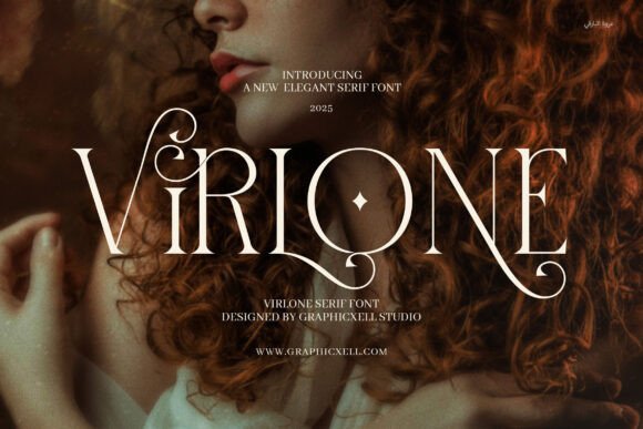
Virlone is a refined serif with measured contrast, long terminals, and carefully drawn ligatures that add personality to menu headings without compromising clarity. It earns a spot among the Best fonts for restaurant menu when a polished, restrained tone is needed: alternates let chefs and designers introduce subtle stylistic accents to course names while maintaining readable body text.
Technically, Virlone performs well at display sizes and holds up in print on textured stock thanks to tidy counters and sensible spacing; pair it with a plain grotesque for prices and ingredient notes to keep hierarchy clear. Use its alternates sparingly for signature dishes or section headers to create a high-end visual rhythm on tasting menus and boutique restaurant branding.
My Recommendation: I reach for Virlone when I want a menu that reads like a refined printed program-there’s elegance without excessive ornament. Its ligatures provide character for dish titles while the base letterforms stay readable in dim dining rooms. Best for fine-dining, boutique bistros, and any menu that needs to feel curated and considered.
11. Yellow Ginger Font
Yellow Ginger is a lively handwritten script with a clear stroke and friendly irregularities that suggest hand-lettered chalkboard signs. It works brilliantly for specials, casual café headings, and social media graphics where a personal, approachable voice helps dishes feel homemade and immediate.
For menus, treat Yellow Ginger as a display accent-use it for section titles or featured items and balance it with a straightforward sans for descriptions and prices to preserve legibility. Its organic, slightly textured lines pair well with kraft paper or chalkboard backgrounds and bring warmth to brunch spots, bakeries, and pop-up food stalls.
╰┈➤ Download Yellow Ginger Font
My Recommendation: I pick Yellow Ginger for projects that need warmth and personality rather than strict formality. It gives menus a handcrafted feel that connects with customers visually and emotionally. Ideal for cafés, bakeries, casual bistros, and promotional signage where charm and approachability are the priorities.
12. Jesintha Font
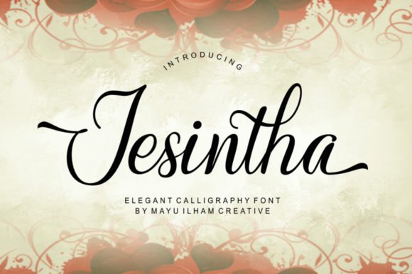
Jesintha is a formal script with graceful swashes and high-contrast strokes that read as hand-calligraphy at larger sizes. It brings an elegant, celebratory tone to dessert lists, prix fixe headings, and printed place cards, making it a strong choice for pastry menus, wedding reception menus, and boutique tea rooms.
Use Jesintha sparingly: reserve it for titles or single-word accents and match it with a neutral serif or clean sans for longer item descriptions to avoid readability issues. It also responds well to foil stamping or letterpress techniques, where the curls and terminals gain tactile presence on premium menu stock.
My Recommendation: I recommend Jesintha when a menu needs a refined, classical voice-its flourishes read as handcrafted elegance. It’s best used in small doses to highlight special items or sections while keeping the main text straightforward. Perfect for patisseries, upscale cafés, event menus, and printed pieces that benefit from a touch of formal calligraphy.
13. Kids Menu Font
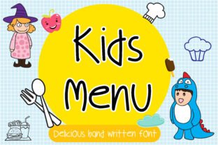
Kids Menu Font is a hand-drawn script that captures childlike energy with uneven strokes, playful loops and sprightly terminals. Its letterforms read well at larger sizes, making it practical for children’s menu headings, activity panels and classroom signs. When choosing the Best fonts for restaurant menu, a face like this guides young eyes and adds character while keeping words legible. Use it sparingly for titles and accents to keep the main ordering text clear.
Printed on uncoated stock the irregular edges feel authentic, while smooth paper preserves the crisp counters of each glyph. Pairing it with a neutral sans for item descriptions improves readability and keeps the layout tidy. OpenType alternates and swashes provide lively variety so each dish name can feel unique without extra artwork.
My Recommendation: I reach for Kids Menu Font when designing family-focused menus or kids’ activity sheets because it reads like real handwriting and catches children’s attention. Its playful forms make headings joyful without confusing the ordering flow. Use it for kids’ sections, party invites, stickers or school projects when a handcrafted, friendly voice is needed.
14. Food Menu Font – Best fonts for restaurant menu
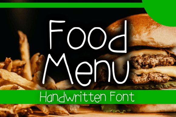
Food Menu Font presents a relaxed, hand-set look that reads well on both print and digital surfaces. It balances rounded terminals with a steady x-height, which keeps item names legible at small sizes and headlines inviting. The overall tone feels warm and approachable, suited to cafés, bakeries and casual dining concepts.
For menu layouts, use a bold weight for section headings and a regular or light for descriptions to create clear hierarchy. It performs well on chalkboard mockups, tote bags and event posters since spacing holds up under heavy textures and photography. The family supports accented characters and straightforward punctuation for clear allergen notes and price lines.
╰┈➤ Download Food Menu Font – Best fonts for restaurant menu
My Recommendation: I use Food Menu Font when a project needs a friendly, unpretentious voice-think neighborhood cafés, pop-up bakeries and lifestyle brands. Its consistent spacing and multiple weights cut down layout tweaks and speed up proofing. It feels right on menus, merchandise and promos where a warm, human tone is the goal.
15. Menu Board Marker Font
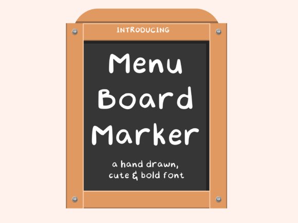
Menu Board Marker Font mimics broad-tip marker strokes with slight texture and generous counters, creating an energetic, human-made headline style. Letters are bold and open, which helps legibility from a distance on chalkboards, plywood signs or digital banners. The hand-rendered terminals give a friendly, approachable presence without feeling sloppy.
This face pairs well with condensed sans or a simple serif for body copy to preserve contrast and hierarchy. It tolerates heavy background patterns and bright colors, so it’s a strong pick for food trucks, market stalls and seasonal signage. Use all-caps for maximum clarity on long boards and mixed case for a more casual shopfront sign.
╰┈➤ Download Menu Board Marker Font
My Recommendation: I’d pick Menu Board Marker Font for weekly specials, festival menus or any situation that benefits from a bold, hand-marked look. It reads quickly at a glance and handles textured printing methods like screen print and vinyl with ease. Ideal for temporary signage, pop-ups and casual storefronts where personality must pair with legibility.
16. Menu Moments Font
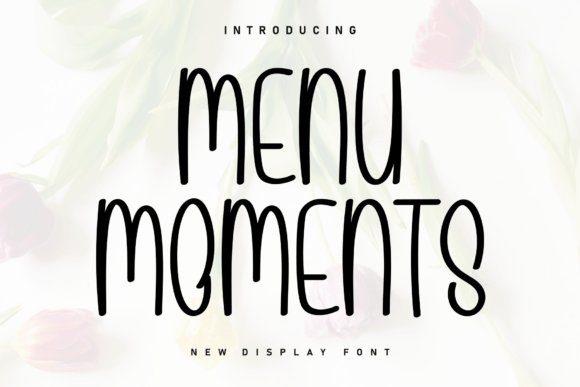
Menu Moments is a warm handwritten font with lively, organic strokes that read like a chef’s quick note. Its airy counters and slightly irregular terminals give menus a relaxed, personal tone, which is why designers often list it among Best fonts for restaurant menu selections aimed at casual cafés and bakeries. The letterforms keep character without sacrificing clarity, so specials and dish names stay readable even on small cards.
At text sizes the generous spacing and open shapes preserve legibility, and a handful of alternates lets you highlight signature dishes without repeating the same look. Pair it with a restrained sans for body copy or use it alone on chalkboard-style signage to emphasize approachability. It performs well in print, on boards, and across social posts where personality matters as much as readability.
╰┈➤ Download Menu Moments Font
My Recommendation: I reach for Menu Moments when I want menus to feel intimate and unpretentious – ideal for neighborhood cafés, patisseries, and farmer’s-market stalls. It adds human warmth to daily specials and Instagram graphics while remaining legible at small sizes. Use it when you want a handcrafted voice that still reads cleanly across print and digital touchpoints.
17. Lunch Menu Font
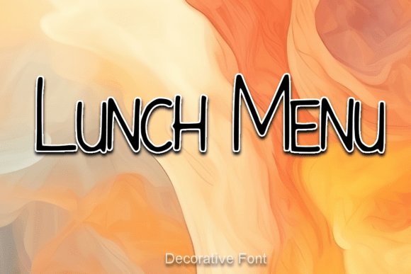
Lunch Menu is a clean sans serif designed for everyday clarity: neutral proportions, open counters, and steady stroke widths make it easy to read at glance. It creates a calm typographic hierarchy for midday menus, signage, and online ordering pages without calling attention to the letterforms themselves. Several weight options help distinguish headings, dish names, and prices without adding visual clutter.
The font’s even spacing and clear numerals work well under bright restaurant lighting and in narrow columns, so printed handouts and mobile menus remain scannable. Use a handwritten accent or a condensed display face for emphasis when you want a touch of character. Reliable webfont support and sensible kerning make it a safe choice for responsive menu systems.
My Recommendation: I pick Lunch Menu when functionality is the priority – for cafeterias, food halls, and casual dining apps where quick scanning is essential. Its neutral voice keeps attention on the food rather than the type, and multiple weights simplify building a readable layout. It’s a dependable base when you need clarity across both print and screen.
18. Worthy Menu Font
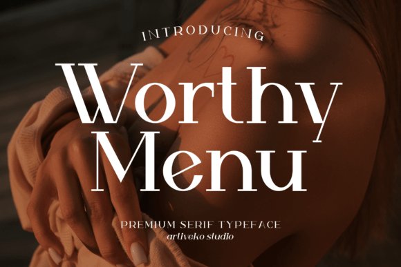
Worthy Menu is a refined serif with pronounced contrast and crisp terminals that suit upscale dining identities. Long ascenders and shaped serifs lend gravitas to wine lists and tasting menus, making headings feel composed and deliberate. In larger display settings its elegant curves create a polished look that signals quality without ornamental excess.
Careful kerning, small caps, and oldstyle figures give pricing and descriptions a typographic finesse useful for printed menus and letterpress stationery. For extended body text pair it with a low-contrast sans to reduce eye strain, or use the serif boldly for section heads and covers to anchor the menu visually. The face reads particularly well on textured stock and embossed covers.
My Recommendation: I choose Worthy Menu for projects that require a sense of refinement, such as fine-dining menus, tasting menus, and premium wine lists. It brings typographic discipline and a formal tone while remaining surprisingly readable in print. Use it for headings, covers, and any application where you want the type to communicate care and quality.
19. Bakso Menu Font
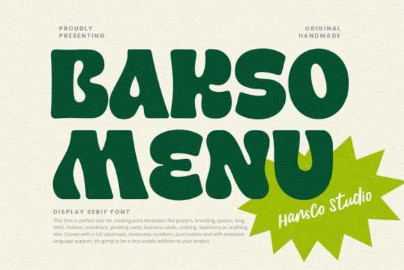
Bakso Menu is a bold retro display face with soft rounded terminals that read confidently at headline sizes. The character set covers uppercase, lowercase, numerals and punctuation plus multilingual glyphs, so it handles restaurant headings, packaging labels, and social tiles without missing a beat. Its weight and rounded counters give menu titles a friendly yet assertive presence that works well on chalkboard prints and digital menu boards alike.
The type’s personality makes it one of the Best fonts for restaurant menu choices when you want a modern-retro look that remains highly legible. Pair it with a neutral sans for body text or use it as a standalone logotype for café signage – contrast and spacing are forgiving, so the font performs across print, Canva layouts and sticker art with consistent clarity.
My Recommendation: I would reach for Bakso Menu when a venue needs a nostalgic but readable headline voice – think burger joints, noodle shops, or casual cafés. Its rounded forms feel warm on menus and packaging, while the broad glyph set keeps multilingual and numerical pricing tidy. For projects that need instant personality without sacrificing legibility, this font delivers reliable impact.
20. Wiggle Whistle Font
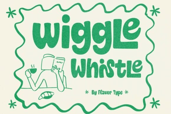
Wiggle Whistle is a chubby, hand-drawn display font that conveys playful motion through gently wavy letterforms. The bubbly counters and soft strokes lend an inviting, almost tactile feel that suits dessert labels, kid-focused menus, and snack packaging where charm matters more than formality. Its bold shapes keep headlines readable from a distance and add a casual, friendly tone to signage and social graphics.
Because the letter rhythm suggests movement, this face works well for seasonal promos, market stalls, and café chalkboards where you want to signal approachability. For page layouts, try pairing it with a clean neutral for body copy to maintain balance; on product stickers or banner art, its personality becomes the focal point and makes offerings feel instantly wholesome.
╰┈➤ Download Wiggle Whistle Font
My Recommendation: I’d pick Wiggle Whistle for projects that benefit from a cheerful, approachable voice – think ice-cream stands, bakeries, children’s menus, and pop-up cafés. It prints crisply on labels and holds up in digital banners while giving brand assets a friendly, memorable look. Use it for bold headlines and let simpler text styles carry the descriptions.
21. Friday Morning Sunshine Font
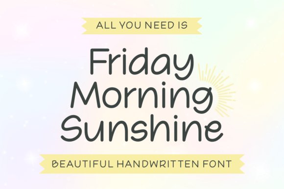
Friday Morning Sunshine is a neat handwritten script with monoline strokes and soft, upright letterforms that mimic careful journal writing. The even weight and restrained curves make the face feel personal without appearing overly ornate, so it reads comfortably on greeting cards, lifestyle headers, and boutique menu sections. Its friendly rhythm and tidy spacing provide a handcrafted touch that won’t overpower surrounding elements.
The font suits situations where an intimate, human voice is desired-signature dish names, artisanal labels, and café menu accents are ideal uses. For best results pair it with a simple sans for body text to preserve readability at small sizes; its charm works best in medium-to-large display roles where the writing-like quality can shine.
╰┈➤ Download Friday Morning Sunshine Font
My Recommendation: I’d use Friday Morning Sunshine when a project needs the warmth of handwriting without losing polish – small bistros, brunch cafés, gift packaging, and social media quotes benefit most. It adds approachable personality to headings and specialty item names while remaining legible and refined. Combine it with neutral text faces for menus to keep the overall layout clean and inviting.
22. Gravebone Font
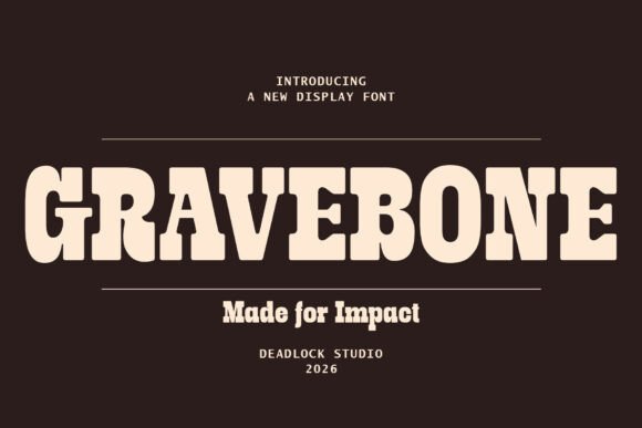
Gravebone is a slab serif that reads like a monument: heavy, blocky serifs and an industrial skeleton give headlines serious weight. Its open counters and broad terminals keep clarity on chalkboard specials and printed menu headers, which is why I include Gravebone among the Best fonts for restaurant menu when a kitchen needs attitude. It projects vintage craft without sliding into ornamentation, so diners can scan item names instantly.
Files arrive as OTF and TTF with extended Latin coverage so accented dish names render correctly across web and print. Use it for pizzeria signage, beer-garden boards, or bold entrée headlines; pair with a narrow sans for body copy to prevent visual crowding. On large formats it reads from a distance, and the tactile, hand-pressed sensibility adds personality without losing legibility.
My Recommendation: I reach for Gravebone when a brand needs a heavy, tactile headline voice-wood-fired pizzerias, gastropubs, and rustic cafés benefit most. Its weight makes it ideal for menu boards and sandwich boards where distance readability matters, and it pairs well with a neutral sans for descriptions. Use it when you want typography that reads like signage carved into wood: bold, readable, and a bit defiantly individual.
23. Twilight Sonata Font Duo
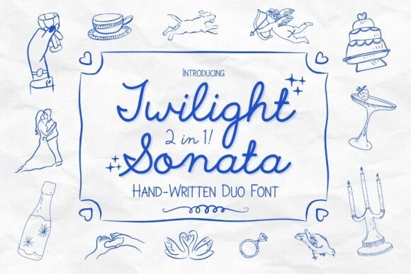
Twilight Sonata pairs a flowing script with a modest sans to create a friendly, storybook look that works well on intimate menus. The script has airy loops and slightly irregular strokes that feel genuinely handwritten, while the sans balances with compact, steady letterforms-handy for café headers that should feel warm without becoming fussy. Use the duo to mark section headings or highlight specials so the page feels curated rather than crowded.
Spacing and alternate swashes make it perform well in print invites and narrow mobile overlays, and small caps add refinement for initials or dish modifiers. Designers will like the composition options: the sans supports dense body copy while the script lends personality to dish names or promotional badges. If you need typography that blends hand-made charm with dependable structure, this pairing covers both roles gracefully.
╰┈➤ Download Twilight Sonata Font Duo
My Recommendation: I choose Twilight Sonata for projects that need charm without losing clarity-cafés, bistros, and wedding menus benefit most. The script adds warmth to specials and seasonal items while the sans keeps nutritional details readable. It’s a reliable option when you want handwritten character that still behaves on the page.
24. Lightning Script Font
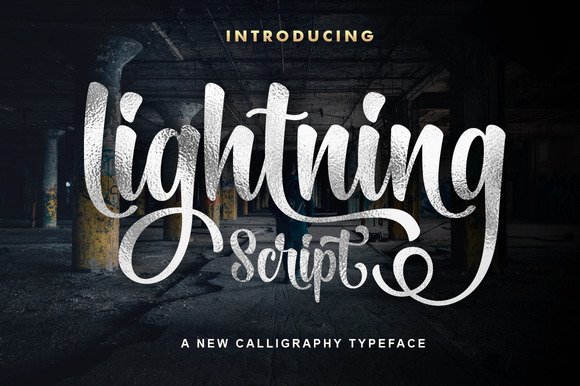
Lightning Script is a freehand brush script with lively strokes and an organic baseline bounce that gives menus an approachable, handcrafted voice. It suits small-batch bakeries, coffee shops, and pop-up stalls where a homemade feel improves appeal, and its casual rhythm keeps dish names feeling personal rather than mass-produced. Use it for section headers, dessert names, or social graphics where a less formal tone helps sell the vibe.
The set includes generous ligatures and alternates so lettering reads varied without manual redraws, and it scales cleanly at medium sizes for both web and print. Avoid using it for long ingredient lists because its flourishing shapes can slow reading speed, but it’s perfect as a headline or accent to suggest human touch. As a free resource, it’s an easy way to trial a handwritten direction before committing to a paid script.
╰┈➤ Download Lightning Script Font
My Recommendation: I keep Lightning Script in my toolkit for low-budget or experimental menu work-weekly specials, chalk-style posts, and pastry labels are ideal uses. Use it large and sparingly and pair it with a clean sans for body text to maintain readability. It’s a safe, expressive bet when you want a handcrafted headline quickly and affordably.
25. I Love Glitter Font
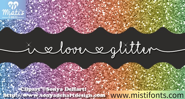
I Love Glitter presents a hand-drawn script with bold loops, uneven baseline rhythm and playful terminals that read strongly at headline sizes. The weight and ornamentation lend a festive, handcrafted feel that suits party invites, craft labels, and seasonal menus; it can be particularly effective for dessert headings and specials, which is why some stylists include it when assembling lists of Best fonts for restaurant menu choices. Its personality makes it a strong display face but not a substitute for body copy.
Technically, the letterforms retain clear counters and generous spacing, so the font prints well on textured stock and vinyl decals; avoid shrinking it below headline scale to preserve legibility. Pair it with a clean sans or a restrained serif to balance the exuberance, and use color or metallic inks for emphasis rather than heavy effects that obscure the glyph details. If you need a joyful signifier for short labels, this script carries that message loudly and playfully.
╰┈➤ Download I Love Glitter Font
My Recommendation: I’d reach for I Love Glitter when I want a cheerful, handcrafted headline that captures attention-think wedding dessert boards, seasonal specials, or handmade product tags. Its exuberant swashes read well in large formats and work beautifully with muted supporting type. Use sparingly as a feature element to maintain legibility and impact.
26. Anastasia Font
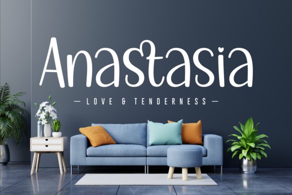
Anastasia is a soft, handwritten script with rounded terminals and an easygoing bounce that brings warmth to any layout. The casual rhythm and slight slant give it a friendly, romantic tone suited to greeting cards, boutique packaging, and event menus where you want a personal touch. It’s a good choice for short lines of text and display use rather than long paragraphs.
Because Anastasia is not compatible with Canva, plan to work in desktop design apps or your cutter software where you can tweak kerning and apply subtle effects. It pairs nicely with narrow sans-serifs or minimal serifs to let the handwriting read cleanly against decorative backgrounds. Keep letter spacing tight for headlines, and increase it slightly if you use the font over patterned surfaces to aid readability.
My Recommendation: I would use Anastasia for intimate branding-wedding stationery, small-batch product labels, or social graphics where a tender, handcrafted voice matters. Its gentle letterforms create an immediate emotional connection without feeling overwrought. For best results, combine it with plain supporting type and avoid long blocks of body text.
27. Angista Script Font
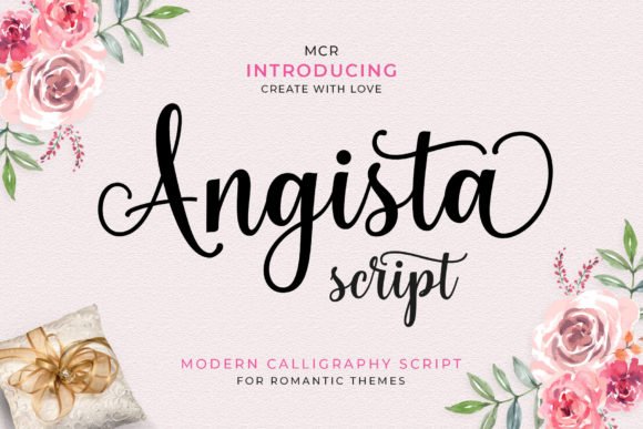
Angista Script offers delicate, high-contrast strokes and graceful swashes that seem to dance along the baseline, yielding an elegant, editorial look for titles and logos. The refined terminals and elongated ascenders read as premium, making this font a natural fit for wine lists, boutique menus, or beauty product packaging where a polished impression is desired. The PUA encoding gives access to alternate glyphs and swashes without complicated font tools.
Use Angista sparingly as a decorative headline or logo mark and set it at sizes that allow the thin strokes to remain visible in print and on screens. Pair with a sturdy sans or a compact serif to maintain hierarchy, and test ink weights or stroke outlines when reproducing on textured materials. When well-kerned and paired thoughtfully, Angista brings an upscale personality to short, prominent copy.
╰┈➤ Download Angista Script Font
My Recommendation: I’d choose Angista Script for projects that require a refined, upscale voice-restaurant wine lists, boutique signage, or luxury packaging. The alternate swashes let you craft bespoke wordmarks while PUA encoding keeps special characters easy to access. Use it for short, visible lines and always proof at production size to ensure the thin strokes survive printing.
Good typography makes menus easier to read and gives diners a clear sense of what your restaurant offers. Test a few options at actual menu size, check legibility under typical lighting, and use consistent hierarchy for headings, dishes, and prices.
Try pairings from this list, get feedback from staff and regulars, and iterate until the type supports both clarity and the mood you want guests to feel. Small adjustments to size, weight, and spacing often yield the best results.