

26 Handpicked Fronts for Barbers to Boost Shop Signage & Menus in 2026
Fronts for barbers are more than pretty lettering – they set the tone for your shop, from storefront signs to appointment cards. The right type affects readability, perceived quality, and how clients respond before they even step inside.
I’ve handpicked 26 fonts suited to barbering businesses, covering classic shop scripts, sturdy display faces for window signage, clean sans-serifs for booking pages, and pairing ideas for menus and social posts. Each entry includes style notes and suggested uses so you can match type to your barbershop’s vibe.
1. Gagal Move on Font

Gagal Move on Font presents a bold pairing: a gritty textured brush face set against a compact serif display. The contrast between the rough, kinetic brush strokes and the composed serif creates a slightly futuristic, urban attitude that still feels handcrafted. That duality makes it striking for logos and headlines where personality must read immediately.
Use the serif as the structural anchor for wordmarks and the brush as an accent or overlay to introduce motion and grit; layering the two with masks keeps the texture readable. It performs strongly on posters, apparel, and packaging where large format prints let the texture resolve, and it can carry an editorial spread when used sparingly. Run print proofs and rasterize textured glyphs at output size to avoid muddy strokes.
╰┈➤ Download Gagal Move on Font
My Recommendation: I turn to Gagal Move on when a brief needs character with bite – it’s perfect for streetwear labels, band art, and coffee shops that want attitude. The two-style approach gives me immediate options for hierarchy without hunting for additional typefaces. I’d use the serif for logotypes and headline clarity, then drop the brush in for secondary marks and merchandise.
2. Originale Brush Font

Originale Brush Font channels vintage signpainting with irregular strokes and a tactile grain embedded into each letterform. The handcrafted marks – slight ink pooling, ragged terminals, and visible brush texture – read as authentic rather than mechanically produced. The face shines at display sizes where that painterly detail can register cleanly.
Treat Originale Brush as an accent type: short headlines, label copy, packaging tags, and posters where personality outweighs continuous reading. Pair it with a calm neutral sans for supporting copy so the overall layout remains balanced. For print and apparel, export high-resolution files or convert the texture to vector masks to preserve the painted edges.
╰┈➤ Download Originale Brush Font
My Recommendation: I pick Originale Brush for projects that need an honest, handmade aesthetic – artisan food labels, café menus, and craft product packaging are ideal. Its texture gives designs warmth and visible craft that appeals to tactile-focused brands. I recommend using it sparingly and pairing it with a clean body face to maintain legibility.
3. Keronige Font

Keronige Font is a modern sans serif with clean terminals and measured spacing that favors clarity over ornament. Even stroke widths and a moderate x-height make it comfortable in headlines while remaining readable in longer text blocks. Subtle letterform choices give it a composed, approachable personality without calling attention to itself.
This face works well across identity systems, user interfaces, and product packaging where predictable behavior and legibility matter. It integrates into tight grids, supports consistent line lengths, and pairs effectively with more expressive display cuts when a stronger visual anchor is required. Test its hinting on small-screen sizes to ensure crisp rendering across devices.
My Recommendation: I use Keronige when a project needs dependable, readable text that won’t fight the rest of the design – corporate systems, websites, and editorial layouts are prime fits. It keeps hierarchies tidy and pairs nicely with decorative headline faces. When clarity and a restrained, modern tone are essential, Keronige is my go-to.
4. Brother Bikers Font

Brother Bikers Font channels old-school blackletter grit with broad verticals, spiky serifs, and condensed counters that read bold from a distance. Its letterforms carry tattoo-like flourishes and exaggerated terminals that sit well alongside leather, chrome, and inked imagery. The substantial weight and contrast make it ideal for display uses that demand personality and attitude.
Apply it to motorcycle club insignia, barber shop signage, coffee shop posters, or tattoo studio branding where a handcrafted, rebellious edge is wanted. The face responds beautifully to heavy distressing, metallic inks, and tight tracking; select alternates to avoid crowded joins. Pair with a simple geometric sans for body copy so headlines remain dominant without overpowering the layout.
╰┈➤ Download Brother Bikers Font
My Recommendation: I pick Brother Bikers when a project needs a headline with grit and historic blackletter flavor without slipping into cliché. Its raw strokes and decorative terminals give instant character to shopfronts, posters, and badges. Use it large, experiment with texture finishes, and balance it against clean supporting copy for best results.
5. Bidger Font

Bidger Font presents a bold, vintage serif voice: firm stems, compact counters, and pronounced terminals that lend headlines a deliberate, stamped quality. It reads confidently at display sizes while retaining enough internal white space to avoid feeling bulky. Small touches of roughness suggest letterpress or hand-stamped signage rather than digital coldness.
Best used for packaging, editorial covers, brewery labels, and posters, Bidger thrives where a strong headline must hold its own against textures and busy artwork. It pairs well with narrow sans or restrained scripts to add flair without clutter. Thoughtful tracking and occasional small-caps can turn a short line into a memorable masthead or logo.
My Recommendation: I reach for Bidger when a brief needs a bold vintage signature that stands up in print and on product. Its sturdy serifs work beautifully for craft branding, magazines, and signage that want a heritage feel. For clarity and impact, keep it at headline scale and let simpler type handle the supporting text.
6. Montavie Font
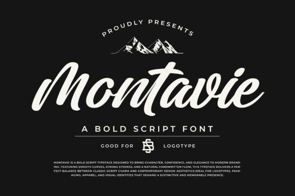
Montavie Font is a bold script with smooth connections, generous stroke contrast, and a natural handwritten motion that suits modern branding and expressive logotypes. Its flowing joins and lively terminals create a steady rhythm that reads as personable and assured at display sizes. Built-in alternates and ligatures give quick variety so you can craft distinct wordmarks without manual tinkering.
Ideal for logos, apparel, packaging, and poster headlines, Montavie performs best when given room to breathe-tight small sizes reduce legibility. The set includes full case letters, numerals, and punctuation, and it responds well to subtle effects like emboss or soft drop shadows. Pair it with a neutral geometric sans to keep body copy legible while the script provides the focal point.
My Recommendation: I use Montavie for projects that need a hand-lettered signature feel: boutique brands, clothing labels, and artisan packaging are perfect fits. The alternates let me produce varied wordmarks quickly, and the bold strokes hold up across print and apparel. Keep supporting text simple and let Montavie carry the personality at larger sizes.
7. Salon Font

Salon Font resurrects heavy blackletter forms with textured strokes and condensed counters, handing designs a weathered, handcrafted character. Its sharp spurs, high-contrast verticals, and ornamental swashes sit firmly on the baseline, so the face reads as display-first rather than for long text. The set includes alternate capitals and discretionary ligatures that let you dial up flourish without creating typographic clutter.
Apply it to shop signage, retro packaging, grooming brands, or coffee labels when you want instant period style; pair it with a neutral sans to prevent visual overload. On textured stock or with letterpress, its thick strokes become tactile and expressive, while small sizes reveal why it’s best reserved for headlines and logos. Adjust tracking modestly to keep dramatic glyphs breathing in tight layouts.
My Recommendation: I pick Salon Font when a brand needs to feel lived-in and authentic-its blackletter voice reads like a handcrafted stamp rather than a novelty. The alternates let me choose between restrained and ornate looks depending on the application, and pairing it with a plain sans keeps the overall design readable. It’s ideal for barbershops, craft foods, packaging, and identity work that benefits from vintage personality.
8. Khromeas Font

Khromeas is a display face that bends letter geometry into playful, angular terminals and a slight retro-futurist silhouette. Its unexpected cuts and narrow counters inject motion into short headlines, making it stand out on posters, album covers, and bold identity marks. Spacing tends toward tight tracking, so a little negative tracking or increased letter-spacing can improve legibility without losing its character.
Because of its eccentric shapes, Khromeas excels at short, attention-grabbing lines but tires quickly in long passages. Pair it with a humanist or neutral grotesque for body copy to give the design some breathing room while keeping the headline vocal. Test on-screen rendering at low resolutions since slimmer joins may fragment at small sizes.
My Recommendation: I reach for Khromeas when a brief asks for a personality-first headline that feels both modern and playful-its cuts create instant recognition. It’s perfect for music posters, boutique labels, and titles where space is limited and attitude matters. For interfaces or long text I reserve it strictly for display use, pairing with a calm sans to hold the rest of the layout together.
9. Blue Denim Font

Blue Denim is a restrained serif that balances clean terminals with open counters, offering dependable readability across print and screens. The family ships in Regular, Bold, and Italic, each weight calibrated so transitions between styles feel smooth rather than abrupt. Slightly taller x-heights contribute to clarity at small sizes while the modest serifs preserve a polite, formal presence for headings.
This face suits editorial work, hospitality menus, and corporate collateral where a sensible, professional tone is wanted. Combine Blue Denim with a soft geometric sans for user interfaces, or lean on its italics for emphasis without changing voice. Hinting is predictable and web performance is solid, though a quick pass on paragraph color will keep long reads visually consistent.
My Recommendation: I recommend Blue Denim when a project needs a dependable serif that won’t draw attention away from content-especially for print editorial, cafes, and service brands. The three-style set simplifies hierarchy so I can handle headlines and body without swapping families. Use it where clarity and a mild, professional personality are priorities.
10. Shelten Font

Shelten is a serif with a clear nod to classic letterpress and hand-cut signage: the strokes feel slightly uneven in the right places, and terminals carry a soft, worn finish that reads as organic rather than forced. The contrast between stem and hairline is modest, which keeps words readable at small sizes while still offering character when set large for logos or shopfronts.
OpenType alternates and ligatures add subtle variety, so repeated words never look mechanical. I find it thrives on textured substrates-kraft, uncoated paper and stamped leather-where its nostalgia becomes tactile; pair it with a plain sans for body copy and use tighter tracking for compact badge work.
My Recommendation: I reach for Shelten when a project needs a warm, lived-in personality without losing clarity. It brings period charm to product labels, coffee branding, and barbershop signage while staying reliable for small print. Use it when you want handcrafted warmth-especially on textured materials or boxed packaging where detail can show.
11. Beatford Font

Beatford is a display face built to read like old workshop signage: bold, slightly condensed letterforms with deliberate roughness along edges that simulates wear and ink bleed. That handcrafted texture gives headlines instant presence and a tactile vibe that photographs well on posters and product mockups.
The set works best large, where the distressed details register; for logos try stacked wordmarks or paired initials with generous leading. Consider layering a solid color version beneath a roughed mask for depth, and match it with a clean geometric type for captions to avoid visual clutter.
My Recommendation: I use Beatford when I want bold vintage attitude-think craft beer labels, market signage, and posters for pop-up events. It brings a rustic, tangible quality that reads as authentic rather than contrived. For best results, reserve it for headlines and brand marks and combine it with simple supporting text.
12. Alemoric Font

Alemoric channels traditional blackletter forms with modern spacing decisions that make the style less dense than historical examples; the sharp diagonals and ornate terminals give an immediate ceremonial tone. High stroke contrast and swooping descenders make it arresting at display sizes, ideal for crests, labels, or headline art that needs old-world gravity.
Use Alemoric sparingly-its visual weight can dominate a layout-so reserve it for focal phrases or monograms and balance with wide margins and a neutral sans for supporting text. Pay attention to cultural associations and legibility at small sizes; embossing or foil treatments amplify its craft appeal.
My Recommendation: I pick Alemoric when a project calls for bold heritage and formal character, such as brewery branding, vintage stationery, or event identity. It provides dramatic silhouette and ornament without feeling overwrought if paired with airy layouts. Avoid long passages; use it for statements, seals, and initials where impact matters most.
13. Montern Font

Montern Font reinterprets blackletter with a weathered, hand-forged personality: angular strokes meet slightly eroded terminals that suggest ink on coarse paper. The letterforms are condensed with tight counters, which gives mark-making a dense, emblematic quality that reads well on labels and shop signage. Small ornamental details and careful weight balance make it feel handcrafted rather than purely decorative.
Use Montern for product logos, packaging badges, or barbershop and café identities where a sense of history helps sell craft. Its texture responds beautifully to letterpress, embossing, and foil techniques, though it performs best at display sizes rather than long passages. Pair it with a neutral sans for supporting copy to keep the overall system legible and modern.
My Recommendation: I reach for Montern when a brand needs an aged, artisanal voice-its blackletter lean gives instant heritage without feeling overwrought. It’s ideal for grooming brands, specialty coffee, and crafted goods where tactile production methods will reinforce the type’s character. For extended copy I combine it with a simple sans to maintain readability while keeping the visual identity distinct.
14. Strange Cool Font

Strange Cool Font is a clean, casual sans with eight coordinated styles from Thin to Bold, plus condensed variants, offering a broad palette for typographic hierarchy. The family delivers even spacing and well-tuned kerning, so it feels calm and readable across menus, websites, and printed collateral. Its form language nods to mid-century and contemporary coffee branding, giving text an approachable, slightly handcrafted tone.
Because the set includes condensed and italic options, it handles tight layout constraints and expressive headlines without importing extra families. Use heavier weights for logos and signage, thinner cuts for captions and fine details, and condensed styles where space is limited. It pairs well with a soft serif or a restrained script when you need a touch of contrast in brand systems.
╰┈➤ Download Strange Cool Font
My Recommendation: I pick Strange Cool when a project needs a friendly, adaptable sans that can do heavy lifting across touchpoints-menus, web headers, and packaging alike. The range of weights and condensed styles lets me create clear hierarchies without juggling multiple fonts. It feels dependable for lifestyle and hospitality brands that want modern clarity with a warm edge.
15. Boldern Font

Boldern Font is a display face built for attention: broad proportions, pronounced terminals, and a hint of aged grain create a memorable headline voice. The shapes recall vintage advertising while staying bold enough for contemporary layouts, making each word read as a deliberate design element rather than incidental text. Contrast between thick stems and refined details gives it a theatrical yet grounded presence.
Reserve Boldern for posters, packaging seals, and hero headlines where its character can dominate without competing with dense copy. It works especially well when paired with a narrow grotesque or a low-contrast serif to keep body text unobtrusive. The font’s drama is best exploited at larger sizes and on tactile materials like thick stock or labels.
My Recommendation: I use Boldern when a headline must carry personality and nostalgia-craft beer cans, festival posters, and boutique packaging are natural fits. Because it commands attention, I limit it to display work and support it with pared-back body typography. The end result reads curated and expressive without feeling like a costume.
16. Crossroad Slab Font

Crossroad Slab – Rough Edition arrives like a found woodblock: a bold slab serif shaped by American woodtype, western posters and worn print. Heavy slab terminals meet hairline distressing, so letters remain clear while carrying handcrafted grit; uppercase forms show tight shoulders and open counters that keep long headlines readable. The restrained texture sits comfortably on packaging yet gives labels and posters an authentic, printed-on-paper feel.
It performs best where personality matters more than polish: whiskey labels, barber marks, craft beer cans, retro posters and bold editorial headlines all benefit from its grain and weight. Set it tight with generous leading for stacked headlines or pair it with a calm humanist sans to soften ornamented display shapes. Because it stays legible at large sizes, it’s ideal for merchandise, signage and logos that must read from a distance.
╰┈➤ Download Crossroad Slab Font
My Recommendation: I reach for Crossroad Slab when a brief calls for rugged authenticity rather than sleek neutrality. Its distressed surfaces give designs an aged, handcrafted character without sacrificing legibility, which makes mockups feel tangible early in the process. Use it for vintage-inspired brands, alcohol labels, barbershop identities, craft packaging and posters that need visible personality.
17. Handsome Soul Font

Handsome Soul Font reads like a well-dressed headline: friendly curves, slightly flared terminals and a balanced rhythm give this display face both charm and clarity. It ships with full upper- and lowercase sets, numerals, punctuation and PUA-encoded alternates so you can access special glyphs directly in common design apps on Windows and macOS. The designer-friendly build works predictably in Illustrator, InDesign, Photoshop, Corel and office software, which speeds up prototypes and final art alike.
Its tall x-height and open counters make short lines and logos pop across menus, invitations, packaging and signage, while the overall voice skews approachable rather than fussy. For layout work, pair it with a narrow geometric sans to accentuate contrast or with a light serif for editorial balance. Multilingual support and accessible alternates simplify work on cross-border projects and brand systems.
╰┈➤ Download Handsome Soul Font
My Recommendation: I often choose Handsome Soul when a brand needs warmth without becoming informal. The PUA alternates add subtle personality that elevates wordmarks and headlines, and the broad app support means I can iterate in whatever tool the client prefers. It’s a great fit for cafés, boutiques, lifestyle packaging, event materials and any project that benefits from an inviting headline treatment.
18. Barber Font

Barber Font carries a stacked, sports-style grammar that immediately reads as athletic and assertive; its compact, chunky letterforms were crafted to anchor team names and event titles. The type is designed with layering in mind, so fills, outlines and shadow passes slot in cleanly for varsity and retro treatments. Its geometry preserves impact at large sizes, making it a go-to for jerseys, posters and box art where legibility under pressure is essential.
Because the family was conceived for display and motion use, Barber animates and colorizes without losing form; its stacked options allow quick creation of alternate looks for social and broadcast. It excels on esports branding, match posters, documentary titles and game covers that need a confident, competitive voice. Pair it with a thin sans for supporting copy to keep visual focus on the headline.
My Recommendation: I pick Barber whenever a project needs loud, athletic typography that still reads on camera and in print. Its layer-ready builds save hours when producing alternate colorways or animated titles, and the compact shapes keep long team names tidy. Perfect for sports branding, event posters, esports identities and any artwork that benefits from strong, disciplined headlines.
19. Barber Font

Barber is a modern handwritten display with lively, slightly irregular strokes that keep it feeling personal rather than mechanical. It balances playful loops with tidy terminals so headlines read friendly without sacrificing clarity. At larger sizes the texture reads like casual calligraphy; at smaller sizes it retains surprising legibility.
It excels on greeting cards, craft labels, social-media headers and any project that needs a personable touch without becoming ornate. Pair it with a clean geometric sans for body copy to prevent visual clutter, and try warm paper textures or light ink grain to emphasize its hand-made character. This makes it a strong choice for indie brands, event invites and boutique packaging.
My Recommendation: I reach for Barber when I want typography that feels written by hand but still behaves predictably across layouts. Its warmth suits tactile projects like stationery and product labels, and it reads well even at smaller sizes. Pick it when you need a headline that feels friendly and human without looking messy.
20. The Barkers Font

The Barkers channels graffiti energy with thick strokes, rough contours and expressive ligatures that mimic spray-can motion. Letterforms show uneven weights and aggressive counters so the face feels immediate and alive. Alternate glyphs let you construct varied, hand-painted looks without drawing each letter by hand.
This style sits naturally on apparel, team graphics, posters and streetwear branding where attitude is the objective. Use heavy textures, halftone overlays or distressed printing to match the font’s raw surface and reinforce an urban aesthetic. It also reads well as a bold logo headline when you need a rebellious voice.
My Recommendation: I use The Barkers when a project must convey grit and attitude-music merch, skate brands or event posters where subtlety won’t do. The glyph alternates speed up iterations and the distressed personality survives loud colorways and rough printing. Choose it for youth-focused, urban work that benefits from a hand-drawn, in-your-face style.
21. Barber Kills Font

Barber Kills is a display face built on heavy, condensed shapes and sharp terminals that command attention. Ornamental cuts and dramatic counters give words a cinematic, slightly menacing presence without becoming unreadable. A range of alternates and swash options lets you dial the drama up or down depending on the mood required.
It suits posters, book covers, band identities and event promotions where a dominant headline must set the tone. Pair it with a neutral serif or narrow sans for supporting text and rely on its sturdy forms for large-format print and on-screen banners. Use it where impact and atmosphere matter more than subtlety.
╰┈➤ Download Barber Kills Font
My Recommendation: I’d pick Barber Kills for punchy cover art, festival posters and identities that need a strong focal point. Its condensation and ornamental edges pack a lot of presence into tight spaces, so it performs well on vertical layouts and signage. Keep it out of long text blocks and reserve it for headlines, logotypes and dramatic display use.
22. Jasera Font

Jasera Font channels classical blackletter into a refined display face, where sharp diagonal strokes and compact counters deliver a dense, tactile texture. The set includes uppercase, lowercase, numerals, alternates and punctuation, and its multilingual support keeps accents and special characters faithful to the design. Built-in alternates and contextual forms let you shift between formal medieval motifs and more readable variants without losing the type’s personality.
This face performs best at generous sizes for titles, tattoos, posters and cinematic credits, where the carved details can be admired. Pair Jasera with a neutral sans to balance its heavy voice, and increase tracking for longer words to preserve legibility. Use it sparingly as a display element rather than for continuous text to keep its impact intact.
My Recommendation: I reach for Jasera when a project needs a bold, historical character-think boutique signage, film title cards or tattoo lettering. Its alternates and language coverage make it practical for real-world branding where authenticity matters. I avoid it for body copy, but for display work it delivers immediate personality and a handcrafted aesthetic.
23. Joyful Barbershop Font

Joyful Barbershop Font dresses letters with barber-themed ornaments: scissors, comb motifs and pole-like swashes are integrated as decorative glyphs to create instant shop signage. The PUA encoding means those playful characters are available straight from a glyph panel, avoiding complex feature menus. Rounded terminals and open counters give the type a friendly, vintage-shop look while keeping forms recognizably letter-like at display sizes.
This style is ideal for logos, appointment cards, flyers and social graphics where the headline does the storytelling. Use bold color contrasts and limit decorative glyphs per line to avoid visual clutter, then place a clean neutral face for supporting copy. Test small-size legibility before printing merchandise to ensure the ornaments don’t obscure letter shapes.
╰┈➤ Download Joyful Barbershop Font
My Recommendation: I pick Joyful Barbershop when a client wants instant themed personality without commissioning custom lettering; it’s a fast route to a retro, friendly identity. The PUA glyphs save time in layout and make badge-style marks simple to assemble. It’s perfect for shop signage and promo pieces, but I wouldn’t use it for dense text or subtle editorial work.
24. Romeo Font

Romeo Font is a slab serif built on broad, squared serifs and compact modern proportions that read strongly in headlines. Its restrained details and high x-height convey presence without ornament, while generous counters and measured stroke contrast aid clarity on screen and in print. The overall balance gives Romeo a confident, contemporary voice suited to bold typographic statements.
Use Romeo for editorial headings, product packaging and UI headers where stature is required but flourish would feel excessive. It pairs well with airy sans families or delicate scripts to create tension between solidity and openness, and modest tracking adjustments improve rhythm in uppercase settings. Pay attention to kerning for tight headlines to keep letter pairs comfortable.
My Recommendation: I choose Romeo when a brief calls for solid typographic authority without fuss-great for mastheads, posters and product labels. Its clarity across sizes makes it a dependable choice for campaigns and UI headings. I also like pairing it with minimal photography so the type anchors the layout while imagery breathes.
25. Western Whiskey Font

Western Whiskey Font channels frontier signage with heavy slab letterforms and sharply spurred serifs; the Italic Style pushes the forms forward, lending a sense of motion that reads like a stamped proclamation. Its bold weight and compact counters make it ideal for short headlines and labels, where a strong, vintage attitude is required. The face conveys a weathered, handcrafted spirit without slipping into pastiche, so it feels authentic rather than theatrical.
Treat this as a display-only tool: open tracking slightly at large sizes to keep the italic strokes clear, and apply subtle distress or paper textures to reinforce the saloon-era mood. Pair with a neutral sans for supporting copy to avoid visual competition, and avoid using it for long paragraphs or tiny captions where the slab mass will impede legibility. Perfect for brewery packaging, barber signage, apparel logos, and any project that needs a rugged, declarative headline.
╰┈➤ Download Western Whiskey Font
My Recommendation: I pick Western Whiskey when a brief needs bold vintage character – it instantly sets a frontier tone without relying on cliché icons. The Italic Style adds motion that reads well on posters and labels, and its weight survives rough printing and embroidery. Use it for brands and packaging that want a confident, masculine headline voice rather than subtlety.
26. Bondiska Font

Bondiska Font is a clean, contemporary sans with slightly condensed proportions and open counters that keep letterforms legible at a glance. The design threads geometric clarity with a soft humanist influence, which makes headlines and logotypes feel precise yet friendly rather than sterile. Its restrained shapes let layouts breathe while still commanding attention.
Available in a range of weights, Bondiska adapts to identity systems by offering bold cuts for mastheads and lighter cuts for captions and UI labels. It pairs nicely with a classic serif for editorial work or stands alone across menus, packaging, and websites for a polished, approachable look. Use it in fashion, café branding, photography, or corporate collateral when clarity and modern presence are priorities.
My Recommendation: I recommend Bondiska when a client wants modern clarity with personality; it supports strong marks while keeping text warm and readable. The weight range makes it a reliable choice for branding systems that need consistent hierarchy across print and digital. Reach for it on identities, signage, or interfaces where clean typography must carry the message.
Use this list as a quick reference when refreshing signage, menus, or web layouts; testing a few options in mockups will show what reads best at a distance and on mobile. Small changes to typography can sharpen brand clarity and help clients spot your shop faster.
If you’d like further help, I can propose pairings or mockup examples tailored to your storefront or online booking pages so you can see how a chosen font performs in real settings.
One Comment