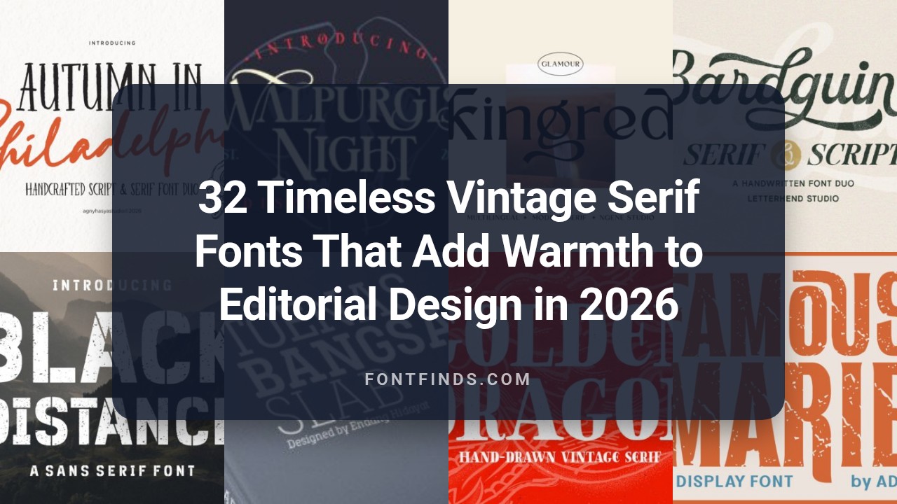
32 Timeless Vintage Serif Fonts That Add Warmth to Editorial Design in 2026
Vintage Serif Fonts bring back the character of hand-set type and aged printing without feeling dated. This collection of 32 faces spans book serifs, slab-influenced classics, and weathered display styles to suit editorial spreads, boutique labels, and heritage websites.
I outline where each style excels, pairing ideas, and quick tips for weight, kerning, and ornamented capitals so you can keep clarity while adding period charm. Short specimens and download pointers follow to help you test options on real layouts.
1. Woodsman Script
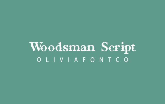
Woodsman Script channels the warmth of vintage serif lettering into a hand-drawn, rustic script with subtle distressing. Its slightly worn terminals and ink-bleed textures give letterforms an organic, tactile presence that reads well on labels and stamped logos. This personality makes it a natural for outdoor brands, farmhouse packaging, and any mark that needs a handcrafted, heritage feel.
Technically the font includes alternate characters, discretionary ligatures, and generous kerning that keep longer lines readable while preserving a rough-hewn aesthetic; pairing it with a clean sans or a restrained old-style serif balances visual weight. Use it at display sizes where its textured counters and decorative tails can sing; it also complements projects rooted in retro type, Vintage Serif Fonts, and classic woodtype motifs. For print and high-resolution digital mockups the distress holds up; for tiny UI labels consider using a slightly heavier weight or a smoothed variant.
My Recommendation: I reach for Woodsman Script when a project needs an honest, handmade voice-think craft beer labels, woodshop logos, or farmer’s-market packaging. Its distressed edges and alternates let me create marks that feel aged without looking sloppy, and the OpenType features give flexibility for display treatments. I would avoid tiny UI text but it’s excellent for large-format print and tactile branding.
2. Cartour Font
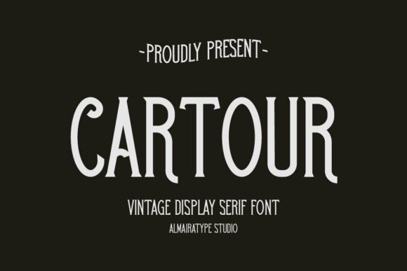
Cartour is a poised serif with measured contrast and refined terminals that favor headlines and identity work. Its balanced proportions and clear axis lend authority to corporate marks and editorial headlines while maintaining an approachable character. The family includes small caps, multiple figure styles, and stylistic alternates that broaden typographic expression across posters and logotypes.
On the page Cartour reads with calm clarity, its stroke modulation offering enough personality to feel classic without becoming ornate; optical sizes mean it adapts neatly between print and large-format use. Use bolder cuts for mastheads and lighter weights for refined stationery; pairing it with a neutral grotesque produces a modern-but-traditional voice. It performs particularly well in magazine spreads, film title treatments, and upscale apparel branding where restraint matters.
My Recommendation: I choose Cartour when a brand must appear confident and refined-perfect for editorial mastheads, corporate identity, or cinematic titles. Its modest contrast and small caps let me build a typographic system that feels established without being old-fashioned. The alternates give just enough variety to keep repeated use interesting.
3. Like Lines Vintage Font
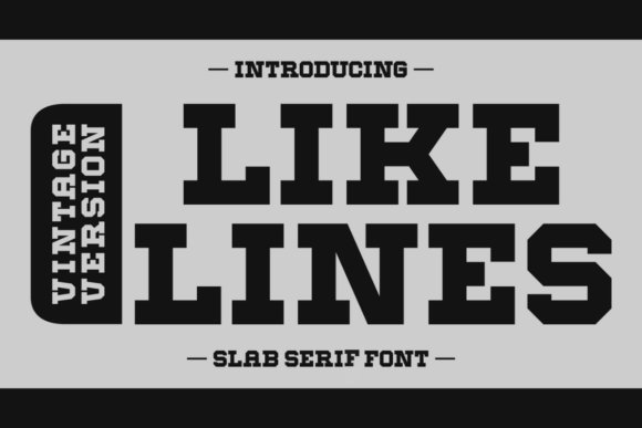
Like Lines Vintage is a slab serif collection built around bold, blocky letterforms and sporty accents that cue Americana and athletic design. Its squared serifs and rounded counters create a rhythmic, punchy presence that reads well on jerseys, posters, and packaging needing bold display typography. Alternate glyphs and accent characters let designers push the voice from retro advertising into contemporary brand work.
The family ships with italic options and multilingual support, and spacing tuned for short, impactful headlines so text remains tight and energetic. For editorial spreads or apparel labels pair it with a soft script or a narrow sans to temper its mass; on signage it reads instantly from a distance. Use heavier weights for titles and thinner cuts for subheadings to build a clear visual hierarchy and strong identity.
╰┈➤ Download Like Lines Vintage Font
My Recommendation: I reach for Like Lines Vintage when a project needs loud, dependable typography-team apparel, retro posters, or product packaging with attitude. The slab forms and sports-inspired alternates give headlines immediate presence while italics and language support widen its usability. It’s my go-to for work that benefits from bold nostalgia without feeling kitschy.
4. Kingred Font
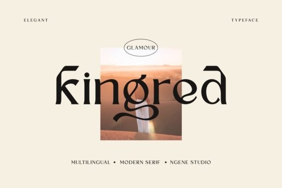
Kingred is a handmade display serif that channels western sign painting and soft, romantic letterforms; its slightly rough terminals and warm stroke contrast give it a tactile, retro character and place it squarely among strong Vintage Serif Fonts for expressive headers. The letterforms show tiny irregularities that read as crafted rather than mechanical, and subtle alternates add charm without overwhelming readability.
It truly shines at large sizes-logotypes, badges, apparel labels, posters and wedding invitations-where the hand-drawn details can breathe. Try combining it with a neutral geometric sans or a tight, delicate script to keep compositions legible while highlighting Kingred’s handcrafted personality.
My Recommendation: I’d reach for Kingred whenever a project needs a handcrafted, nostalgic voice-think vintage-inspired apparel, boutique logos, or stationery with a soft western edge. Its imperfections make designs feel personal, and the alternates let you inject distinct character without resorting to heavy distressing. Pair it with a clean sans for contrast and you get readable yet charming results.
5. Skiff Font
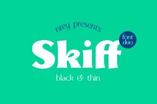
Skiff occupies the space between antique serif models and cleaner contemporary letterforms, offering medium contrast with subtly sharpened serif terminals that catch the eye without shouting for attention. Its proportions read confident and playful at once, giving headlines and short passages a tasteful, modern-retro attitude.
Best used for editorial mastheads, boutique packaging, and short-form web headings, Skiff performs well in both print and screen contexts when set at moderate sizes. It pairs nicely with humanist or geometric sans companions and benefits from slightly tightened tracking on display lines to emphasize its chiseled edges.
My Recommendation: I use Skiff when a design needs personality that remains sophisticated-magazine covers, product labels, and boutique brand identities are perfect fits. Its medium contrast keeps letterforms legible but interesting, and pairing it with a plain sans creates a clean visual hierarchy. It’s my go-to when a project calls for contemporary charm with classical roots.
6. Lessa Font
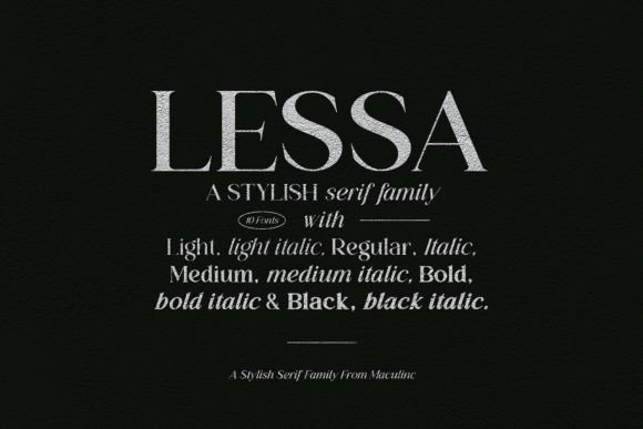
Lessa is an elegant serif family built around restrained uprights and flowing italics rooted in humanist calligraphy; the package of ten coordinated styles gives designers granular typographic control while maintaining consistent metrics across weights. The italics introduce cursive flourishes that complement the plain styles, useful when you want refined contrast without mixing typefaces.
Its clean structure makes Lessa suitable for posters, brochures, logos and extensive template work where typographic harmony matters, and the broad language support simplifies international projects. Use upright styles for steady body copy and deploy the italics to create focal points in invitations or editorial spreads.
My Recommendation: I recommend Lessa for projects that require polished, flexible typography-wedding suites, luxury product packaging, and multi-page editorial systems are where it excels. The matched italic forms let me create elegant hierarchies without introducing separate display faces, and the multilingual coverage reduces headaches on global work. It’s dependable when you need subtlety and control.
7. Famous Marie
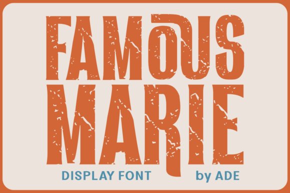
Famous Marie channels the weight and personality of slab serifs while echoing the thick Old-Style letterforms popular in the 70s, 80s and 90s. Its slightly weathered edges and ink-stamped texture give it a lived-in grunge attitude that sits comfortably among Vintage Serif Fonts used for retro packaging and posters. Subtle accent details and robust diacritics broaden its range, making it a solid choice for multilingual typesetting that includes Eastern European languages.
On garments and logotypes it reads bold and assured, while on book covers and greeting cards those rough contours add handcrafted charm. Famous Marie also cleans up nicely for product labels and sublimation prints, striking a balance between legibility and character. As an alternative to purely modern slabs, it brings nostalgic grit without sacrificing practical use in branding and editorial headings.
My Recommendation: I reach for Famous Marie when a project needs retro muscle with a handcrafted feel. Its grunge texture and strong serifs give headlines and logos instant personality, and the language support is handy for international releases. Use it for apparel, vintage-themed packaging, and bold book covers where character matters.
8. Always Vintage 2.0
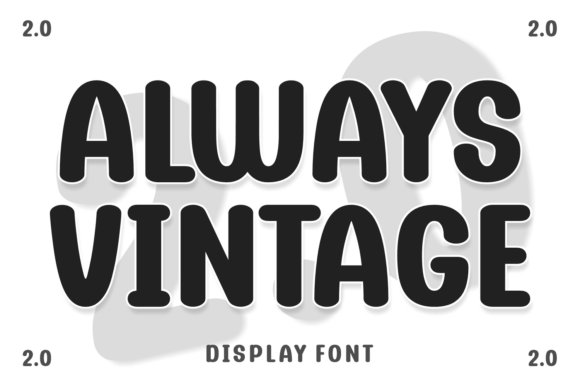
Always Vintage 2.0 blends playful ornament and classic letter shapes to create a personality that feels both nostalgic and deliberately theatrical. It toggles between serif warmth and sans-like clarity through alternative glyphs, which makes it suitable for display work that calls for character. Decorative flourishes and optional rough textures give designers tools for cartoons, mascots, or expressive editorial headlines.
Apply it to photography overlays, logo marks that need a retro wink, or book covers where a touch of whimsy is desirable. The face handles sporty collegiate vibes as comfortably as marker-style headlines, so it can carry team branding as well as boutique packaging. Its layered personality is ideal for projects that mix illustration with typographic voice.
╰┈➤ Download Always Vintage 2.0
My Recommendation: I’d pick Always Vintage 2.0 when a design needs nostalgic personality without going full historic. The alternates and textures let me dial between playful and authoritative tones, which is great for editorial work, product labels, and character-driven identities. It’s especially handy for pieces that combine illustration and type.
9. Gradiyla Font
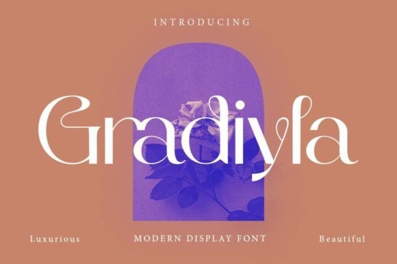
Gradiyla Font is a high-contrast display serif that pairs geometric terminals with sinuous curves for a refined silhouette. The pronounced stroke contrast and didone influence yield a fashion-forward feel, enhanced by discretionary ligatures that smooth the rhythm of text. Because it’s PUA encoded, designers can access ornamental glyphs and advanced typographic features without complex software setups.
It performs best in large sizes – think magazine mastheads, wedding invitations, and upscale brand identities – where the finer details can breathe. The elegant yet assertive forms bring instant polish to editorial spreads and luxury packaging while keeping readability intact at display scale. Those seeking a typeface that mixes classical sophistication with contemporary geometry will find Gradiyla compelling.
My Recommendation: I use Gradiyla when a project needs luxury with personality – fashion editorials, boutique logos, and wedding stationery are natural fits. The ligatures and rich glyph set let me craft distinctive headlines without resorting to heavy effects. Because it’s PUA encoded, it’s quick to implement even in simpler layout tools.
10. Fortune Seeker Font
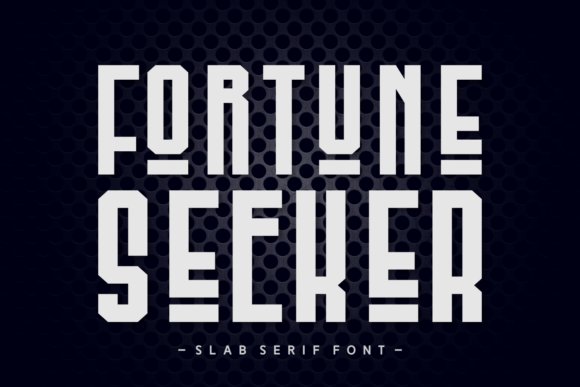
Fortune Seeker sits among Vintage Serif Fonts with a forthright slab-serif voice: heavy slab terminals, mildly rounded counters and a gently distressed texture give each word an analog, hand-printed presence. The family includes swash alternates that bring ornamental flair without overwhelming legibility, so quotes and headlines gain personality while body text stays readable.
Practically speaking, Fortune Seeker shines on apparel art, book covers and bold packaging where a vintage, patriotic or rustic tone is needed; its regular and italic cuts are built to pair with condensed sans or light scripts. Full multilingual support and clean spacing make it work well for magazine mastheads, T-shirt logos and greeting card headings that require a confident, tactile serif look.
╰┈➤ Download Fortune Seeker Font
My Recommendation: I would reach for Fortune Seeker when a project calls for strong heritage character – think craft breweries, Americana apparel lines, retro posters or book jackets. Its swash options let headlines sing while the core weights remain sturdy enough for repeat use across branding. Use it when you want type that reads like a printed poster: present, textured and unapologetically bold.
11. Elegant Handwritten Font
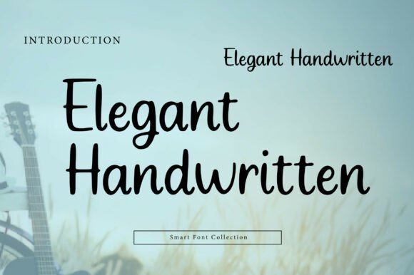
Elegant Handwritten presents a tall, condensed script that balances casual stroke work with measured spacing, producing a handwritten look that still feels composed and intentional. Strokes are restrained rather than florid, which keeps lines tidy and helps the type act as an intimate accent without overpowering layouts.
This face is well suited as a secondary voice for lifestyle brands, editorial pull-quotes and photography watermarks where a personal touch is required. It pairs effectively with classic serifs for a refined, vintage-inspired editorial mood and works equally well on product labels, menus and refined e-commerce headers where legibility and character are both priorities.
╰┈➤ Download Elegant Handwritten Font
My Recommendation: I use Elegant Handwritten when a project needs warmth without chaos – wedding stationery, boutique packaging and editorial bylines are natural fits. The narrow proportions make it friendly for vertical or tight layouts, and its restrained pen feel keeps things readable at small sizes. It’s my go-to when I want handwriting that reads like a thoughtful note rather than decorative flair.
12. Signs Painted Font
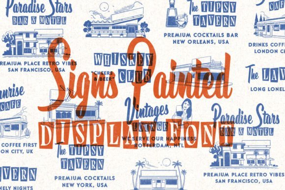
Signs Painted combines a hand-painted script with a complementing display serif to recreate the look of old storefront lettering and roadside signs. Each glyph carries subtle brush marks and uneven terminals that mimic paint on wood, while the included illustrations-26 food and lodging–inspired motifs-extend the set into full brandable kits for hospitality and vintage retail signage.
The collection is PUA encoded, so accessing ligatures and alternate characters is straightforward for designers who want authentic, handcrafted letterforms in logos and posters. It performs best at display sizes where the painted texture and ligatures can be seen clearly, and it pairs nicely with monoline sans or condensed serifs for layered identity work.
╰┈➤ Download Signs Painted Font
My Recommendation: I recommend Signs Painted for projects that need an instant hand-painted personality-restaurant signage, cafe menus, boutique hotel collateral and retro posters are ideal. The illustrative extras save time and help create cohesive visual narratives, while PUA encoding makes special characters easy to deploy. Pick this set when you want signage that feels like a found object rather than a sterile digital layout.
13. Walpurgis Night Font
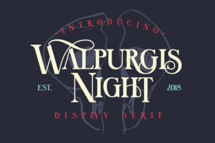
Walpurgis Night is a majuscule display serif that channels the feel of engraved book type through tall capitals, refined contrast, and decorative terminals. Its generous set of alternate uppercase shapes and ornate ligatures gives designers a chance to craft distinctive headlines and monograms; the font sits naturally with Vintage Serif Fonts when you need a classical voice that still reads as contemporary. Thoughtful spacing and distinctive serifs make it especially striking at large sizes where detail matters.
Because the design leans toward display use, it performs best on invitations, editorial mastheads, and premium packaging where those delicate strokes can be seen. I recommend pairing it with a neutral sans for body copy or a restrained script for accent lines so the ornamentation doesn’t compete with legibility.
╰┈➤ Download Walpurgis Night Font
My Recommendation: I reach for Walpurgis Night when a project calls for historical character without looking costumey. Its alternates and ligatures let me craft bespoke wordmarks and elegant invitation headlines, while the strong uppercase voice suits editorial covers and boutique packaging. Use it where decorative letterforms will be appreciated at display sizes.
14. Toenas Bangsa Slab Font
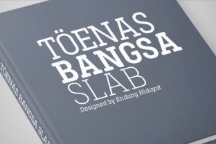
Toenas Bangsa Slab blends old-style slab proportions with polished, rounded terminals to create a friendly but assertive slab serif. The family spans six weights plus italics, giving a surprising range from light captions to bold headlines, and its smooth curves improve on-screen readability while retaining the visual heft slab serifs are known for. Letters sit with even color, so short blocks of text remain approachable and coherent.
This slab’s clarity makes it a strong choice for brand marks, posters, and editorial pull quotes where personality must coexist with legibility. Try pairing heavier weights with condensed sans or using lighter weights for captions in print; rounded terminals add warmth, which helps when a more human tone is required in signage or packaging.
╰┈➤ Download Toenas Bangsa Slab Font
My Recommendation: I like Toenas Bangsa for projects that need dependable presence without harsh edges-think coffee-shop branding, magazine headlines, or signage. The multiple weights give me flexibility to build hierarchy, and the rounded shapes soften corporate tones for friendlier communication. It’s a go-to when a slab serif must be readable at small sizes yet still make an impact.
15. Vintage Roses Font
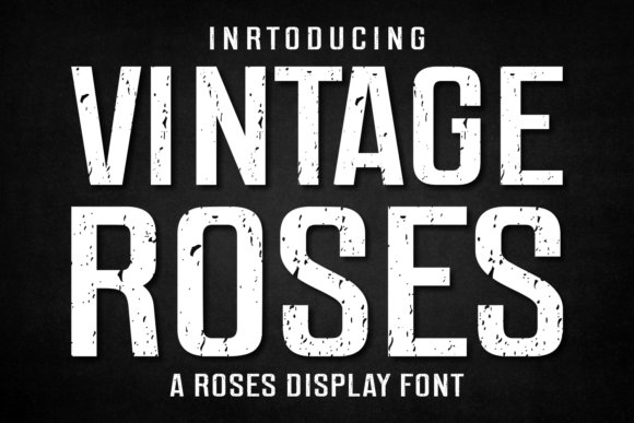
Vintage Roses is a bold display type that marries heavy, indulgent strokes with a raw, slightly distressed texture evocative of 70s and 80s poster typography. Its alternates and accent characters let you tune the mood from playful retro to gritty rock-poster, and the thick letterforms make immediate impact on apparel and cover art. The feel leans expressive rather than neutral, so it excels where personality must carry the visual message.
Use Vintage Roses for t-shirt lines, retro packaging, or headline work where texture and nostalgia are the selling points; it performs well in large-format printing and sublimation. Pair it with sparse layouts and supporting muted palettes so the type remains the focal point rather than getting lost among other graphic elements.
╰┈➤ Download Vintage Roses Font
My Recommendation: I pick Vintage Roses when a design needs a confident, throwback attitude-album art, merch, or bold poster campaigns are perfect fits. The alternative characters let me craft variations that keep a series feeling cohesive yet fresh, and the textured strokes translate well across print and fabric. It’s my choice for projects that benefit from loud, characterful type that reads from a distance.
16. Golden Dragon
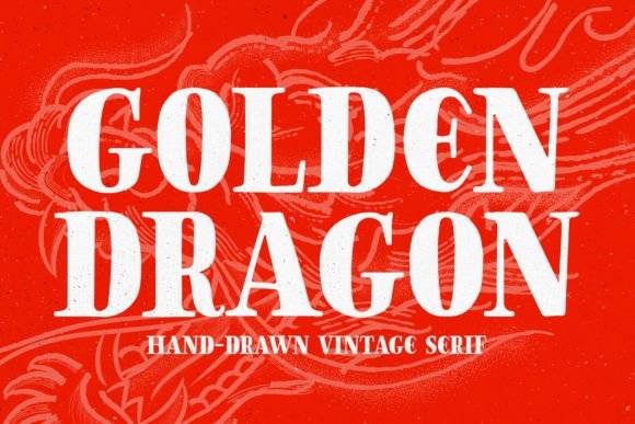
Golden Dragon is a hand-drawn serif that wears its irregularities proudly: brush-like terminals, slightly uneven stroke widths and narrow counters give headlines a lived-in character. On textured backgrounds or printed labels it reads more like sign-painting than a polished display face, which places it logically among Vintage Serif Fonts for craft-forward identities. The font’s alternates and decorative glyphs let you build custom wordmarks and emblems without layering extra artwork. For big display work the handmade quirks deliver personality, but expect to tweak spacing for tight initials.
Pair Golden Dragon with grainy overlays, stamped effects, or natural paper to amplify its tactile appeal, or combine it with a neutral sans when you want contrast instead of competition. Its East Asian-inspired strokes feel authentic for cultural nods, yet playful swashes also slip easily into pirate or nautical themes without seeming forced. Test legibility at smaller sizes and consider optical kerning for compact logos and thumbnails. Use it for posters, packaging, merchandise, and any project where handcrafted presence matters.
My Recommendation: I reach for Golden Dragon when a design needs readable personality that reads handcrafted rather than mass-produced. Its irregular strokes and ornament set make it ideal for brewery labels, festival posters, and boutique packaging where a mark must feel bespoke. I also like it for YouTube thumbnails and emblems because it stands out against busy textures and photo backgrounds.
17. Land of Laugh – Vintage Serif Fonts
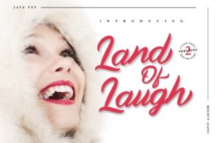
Land of Laugh is a smooth, handwritten-style script with clean joins and restrained swashes that sits comfortably across open layouts and tighter editorial blocks. Consistent baseline behavior and moderate stroke contrast help it remain legible for both web banners and printed tags, so the face reads as friendly rather than frilly. Built-in alternates and contextual ligatures reduce repetition in repeated initials and make multi-word settings feel organic. The overall rhythm is calm, which keeps copy approachable even at display sizes.
Use it alongside a neutral sans for contemporary branding or pair it with a condensed serif to steer a design toward a retro mood; companions decisively change its personality. It performs well on greeting cards, labels, and headlines, though careful kerning and line breaks improve the final balance. When set in compact lines, give it slightly looser tracking to preserve letter shapes; for signage, allow more breathing room. The result is a handwriting voice that reads dependable and warm.
╰┈➤ Download Land of Laugh – Vintage Serif Fonts
My Recommendation: I keep Land of Laugh in my toolkit for projects that need a personable script without sacrificing clarity. The alternates make typesetting longer names and phrases feel natural, and it pairs cleanly with modern sans choices for identity systems. I’d use it for branding, product labels, social headers, and invitation suites where approachability and legibility both matter.
18. Swanky Monogram
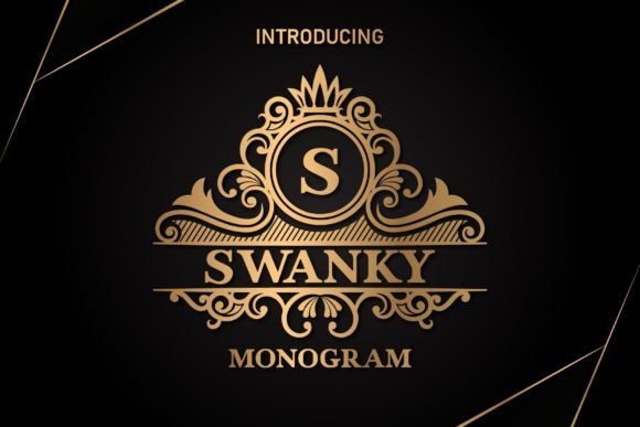
Swanky Monogram is a display-first monogram type with ornate capitals, thoughtfully designed alternates and a matching serif family to build fuller identities. The decorative terminals and flourishes are engineered for single-line marks, crests and luxury wordmarks, and the included dingbats/dividers let you assemble seals without extra assets. Weight and contrast are tuned for print finishes like foil and letterpress, so it keeps presence without collapsing into mud on tactile papers. The set reads formal while remaining lively, not overly fussy.
It responds particularly well to metallic foils and embossing, and testing for ink spread at small sizes will protect the delicate terminals. Pair a single, ornate initial with a pared-back sans to avoid visual clutter, or stack initials with tightened kerning for compact badges. The matching serif styles simplify building stationery systems and help maintain cohesion across collateral. For invitations, boutique packaging, or premium labels it creates an immediate focal point.
My Recommendation: I choose Swanky Monogram when a project needs an elegant signature lockup – wedding suites, boutique logos, or artisanal packaging work perfectly. The ornament set and alternates speed up mark creation, and the companion serifs make expanding into stationery straightforward. Use it whenever an initial or crest should carry most of the visual weight in a refined, print-friendly way.
19. Holen Vintage
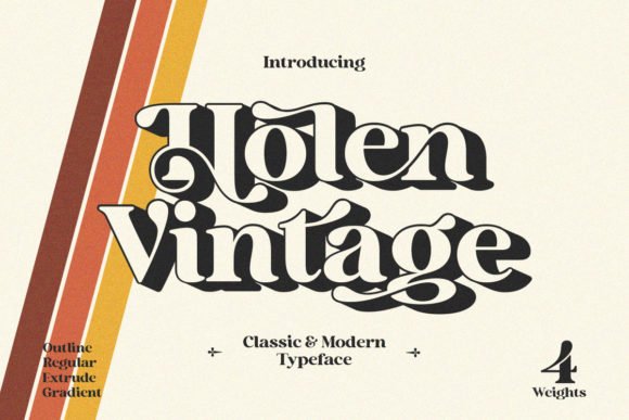
Holen Vintage blends old-style serif proportions with pronounced terminal curves and a touch of groovy attitude; the result reads like a luxury label rescued from a mid-century storefront. Letterforms balance a modest x-height with open counters, so the type feels both decorative and remarkably legible at display sizes for posters, packaging, and editorial mastheads.
The family includes alternate caps, ornamental swashes and small caps accessible via PUA encoding, which makes creative typography faster in most apps. Kerning and contrast hold up in tight logotypes while the overall voice slots neatly into collections of Vintage Serif Fonts when a project demands personality alongside precision.
My Recommendation: I reach for Holen Vintage when a brief calls for retro elegance without fiddly setup. The PUA-enabled extras let me build bespoke headlines and logos quickly, and the contrast in the strokes reads beautifully on labels and editorial spreads. Use it for boutique packaging, heritage-inspired branding, or any display work that benefits from a refined, nostalgic flair.
20. Silver Font
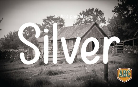
Silver Font reads like handwriting traced with a fine-nib pen: tall ascenders, soft curves and rounded terminals give it a handcrafted, intimate presence that suits artisanal brands. Its slender stroke and airy counters provide a gentle, human warmth ideal for farm-to-table packaging, wedding stationery, and lifestyle blog headers without feeling fussy.
On the technical side, Silver maintains steady spacing and generous leading, which preserves legibility at small sizes while keeping personality when scaled up for shop signs or hero banners. Use alternates selectively to keep clarity; it pairs especially well with restrained serif faces or tonal photography to create a curated countryside aesthetic.
My Recommendation: I’d choose Silver Font for projects that need a personal, made-by-hand feeling-think boutique food labels, cozy newsletters and intimate social posts. Its tall, pen-like letters bring warmth while staying readable, and it mixes nicely with subtle serif companions or textured paper. When I want approachable charm without losing polish, Silver is a reliable pick.
21. Black Distance
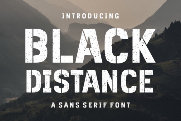
Black Distance is a bold sans with vintage-inspired proportions: strong stems meet compact counters and slightly flared terminals, producing a confident, editorial voice that works well in headlines and logos. The design feels rooted in mid-century poster type but refined enough for modern fashion labels, book covers, and packaging that need weight and presence.
The family offers tuned spacing and a handful of alternates useful for display titling, and it holds up across print and screen applications where clarity matters. Pair it with light serif captions or minimalist layouts to let its assertive letterforms do the visual heavy lifting, or add a subtle texture for a nostalgic touch.
My Recommendation: Black Distance is my go-to when a design must read bold and clear-perfect for editorials, apparel graphics, and striking logotypes. It scales consistently across media, and the alternates provide small adjustments that make headlines sing without swapping typefaces. I often use it opposite delicate serifs to achieve a strong, balanced contrast.
22. Vintage College
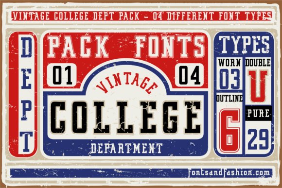
Vintage College is a compact family of four slab serif styles that marries geometric proportions with softly rounded terminals, giving headlines a warm, collegiate flair. The display-focused letterforms hold up at large sizes and retain personality on posters, banners, and printed promotional artwork, while the different weights allow for hierarchy in layered layouts. Vintage Serif Fonts fit projects that want an alumni or varsity mood without feeling heavy, and the rounded edges make the faces forgiving on textured papers and fabric.
Kerning across the family is generous, so tight headlines still read cleanly and retain rhythm; heavier cuts read like emblematic logotypes while lighter cuts make tidy subheads. Pair Vintage College with a neutral grotesque for contrast or a light script for softer branding, and use the bolder styles for badges and signage where silhouette recognition matters. The included numerals and punctuation suit editorial use and screen-print reproduction alike.
My Recommendation: I reach for Vintage College when I need an unmistakable collegiate or retro-sports voice that reads from a distance; the rounded slab terminals give attitude without clutter. I like using the heavy weights for posters and event banners and the lighter cuts for supporting copy, then pairing them with a plain sans to keep compositions clear. It shines on university merchandise, team signage, and any campaign that benefits from a nostalgic athletic look.
23. Tobacco Road
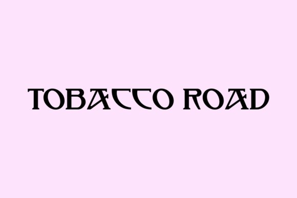
Tobacco Road, designed by Nick Curtis, channels a warm, mid-century serif sensibility that suits branding, logos, headlines and t-shirt graphics. The letterforms feel slightly hand-set, with modest contrast and purposeful terminals that give the face a lived-in personality without sacrificing legibility at display sizes. As a freely distributed font it’s a practical way to add retro typography to covers, quotes, and web headers when budget or time is tight.
The spacing leans toward condensed proportions, which creates compact stacked headlines and strong lockups for packaging and posters. It pairs well with a straightforward geometric sans when the design needs balance, or with an expressive script for seasonal or lifestyle pieces; the personality scales from small labels to billboard treatment. If you plan commercial use, double-check the specific license tied to the download to avoid surprises.
My Recommendation: I keep Tobacco Road in my kit for projects that need old-school charm on a budget-branding, merch, and retro editorial headers benefit most. The slightly worn, mid-century cues provide immediate character, while the condensed shapes help when space is limited. I often pair it with a clean sans or a textured background depending on whether I want a polished or rugged finish.
24. Hamburger Heaven
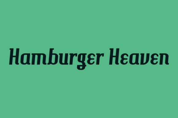
Hamburger Heaven, another release from Nick Curtis, leans toward the elegant side of retro serif design with gently bracketed serifs and refined terminals that recall classic advertising types. The face carries decorative character while remaining legible for t-shirt printing, headlines, magazine covers, and wedding stationery, offering a boutique editorial mood without excessive ornament. Short lines and stacked initials benefit most from its measured rhythm and old-style charm.
Use bolder cuts for mastheads and lighter cuts for pull quotes; the type’s personality is most effective in compact settings where its letterforms can be appreciated. Pair it with a neutral sans for restrained identity systems or with a hand-lettered script for invitations and labels, and consider subtle textures to amplify the vintage feel. File sizes are friendly for print workflows, making it simple to share with printers and apparel vendors.
My Recommendation: I reach for Hamburger Heaven when a project calls for refined retro character-think boutique branding, diner signage, or upscale wedding invites. Its bracketed serifs and restrained flourishes strike a nice balance between ornament and readability, which makes it reliable across print and fabric. For me it’s a go-to when I want nostalgia with a polished edge.
25. Old String
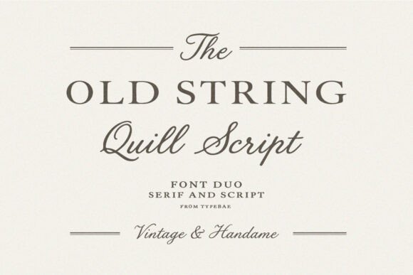
Old String pairs a restrained vintage serif with a flowing quill script to produce a refined typographic voice that reads like a family heirloom. The serif’s measured contrast and the script’s hand-drawn strokes combine to bring warmth and period character to projects where Vintage Serif Fonts are required-wedding suites, boutique packaging, editorial mastheads and bespoke logos all benefit from this pairing.
Technically the set includes thoughtful kerning, complementary x-heights and OpenType alternates that keep display letterforms readable while preserving handwritten charm. Use the serif as an anchoring headline or monogram and reserve the script for signatures and decorative swashes to maintain clarity and lend each piece a handcrafted finish.
My Recommendation: I reach for Old String when a design needs to feel both formal and intimate; its serif grounds layouts while the script supplies personality. It’s especially effective for boutique wedding invitations, artisanal product labels, and magazine features that want a handcrafted touch. For branding, I assign the serif to marks and headlines and use the script sparingly to highlight names or taglines.
26. Sunday Eighties
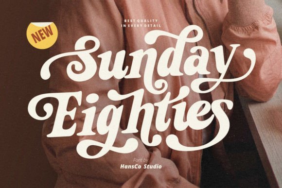
Sunday Eighties is a bold, retro-inspired serif built for display work that needs unmistakable attitude. It ships with alternative swash characters and PUA-encoded glyphs so you can apply dramatic flourishes without specialized font tools, and it supports multiple languages and full punctuation for wide applicability across projects.
The letterforms lean on 1980s sign-painting cues with strong stems and pronounced terminals that cut through busy compositions, making it ideal for logotypes, posters, apparel and Cricut creations. Alternates allow quick vintage wordmarks while the single-minded display voice ensures high-impact headlines, stickers and packaging labels.
My Recommendation: I use Sunday Eighties when a project calls for unapologetic retro personality-album art, t-shirts and bold posters are perfect fits. The included swashes make it fast to craft distinctive wordmarks without hunting for extra scripts. Its PUA encoding is a real time-saver for small teams and hobbyist workflows like Cricut and vinyl cutting.
27. Royal Imperial
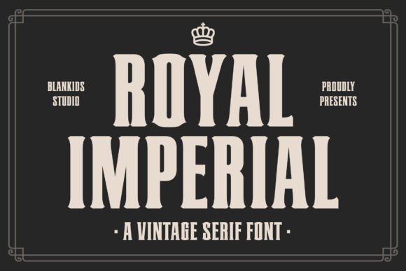
Royal Imperial is a slab serif that marries old-style proportions with solid slab terminals to give headlines and logotypes a commanding presence. The face reads well at large sizes thanks to open counters and carefully weighted strokes, lending a dignified tone suitable for institutions, premium packaging and editorial covers.
Spacing options and tight kerning make it practical for compact marks while the heavier cuts hold up on signage and labels from a distance. Use bolder weights for mastheads and brand marks and a medium cut for longer display lines to maintain rhythm and preserve the historical character without losing clarity.
My Recommendation: I turn to Royal Imperial when a brand needs a stately, authoritative headline voice-museums, craft spirits and boutique publishers benefit from its slab strength. It balances historical references with modern spacing so packaging and posters read well both near and far. For identities, I pair it with a neutral sans for body text while letting the slabs carry the personality.
28. Silver Stone Font
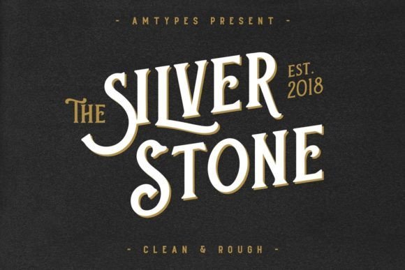
Silver Stone Font reimagines mid-century retail lettering with clear nods to pressed-tin signage, aged book jackets, and old product tins. It sits naturally among Vintage Serif Fonts thanks to firm bracketed serifs, slightly condensed proportions, and restrained contrast that make it readable in small sizes and striking in headlines. The letterforms blend soft terminal curves with subtle flares, giving logos and labels a nostalgic voice without sacrificing clarity.
OpenType alternates, small caps, and a range of figure styles make this family practical for packaging, editorial work, and brand identities that need period character. When printed on textured stock or used with letterpress or foil stamping, Silver Stone gains additional tactile appeal, picking up ink in a way that emphasizes its handcrafted feel. Use it for beverage labels, boutique branding, and book covers where an authentic vintage tone matters.
╰┈➤ Download Silver Stone Font
My Recommendation: I reach for Silver Stone when a project needs clear vintage character without looking costume-like. Its serif shapes read well across package copy and headline scales, and the OpenType extras save time during layout. It’s a great match for artisan food labels, boutique product lines, and retro-inspired editorial covers.
29. Autumn in Philadelphia Font Duo
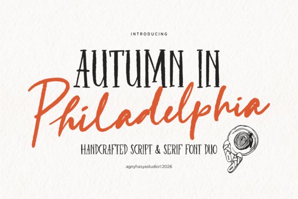
Autumn in Philadelphia Font Duo pairs an organic handwritten script with a rustic serif that feels hand-set rather than manufactured. The script shows lively brush strokes and contextual alternates that mimic quick penwork, while the companion serif offers tall x-heights and slightly irregular serifs that recall hand-cut metal type. That contrast creates a cozy, narrative tone suited to branding and intimate print pieces.
Both faces include swashes, ligatures, and headline-ready punctuation so they work immediately for café logos, wedding stationery, or small-batch product tags. The serif’s lighter weights function well for longer copy when the script serves as a display accent, enabling layered editorial layouts with artisanal charm. Designers will like how the duo suggests human craft without compromising compositional control.
╰┈➤ Download Autumn in Philadelphia Font Duo
My Recommendation: I pick Autumn in Philadelphia when a brief asks for warmth and personality without over-the-top flourish. The script brings human imperfection while the serif keeps layouts grounded, a useful balance for cafés, food packaging, and boutique stationery. It shines on projects that benefit from a handcrafted, story-driven aesthetic.
30. Sundown Gazette Duo Display Font
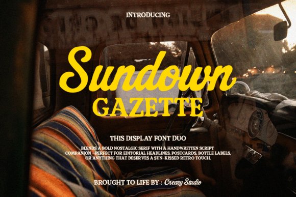
Sundown Gazette Duo combines a heavy retro serif with a loose, sun-washed script to evoke roadside signage and travelogues of mid-century summers. The serif’s strong weight, short ascenders, and compact counters give headlines a stamped, authoritative look, while the script sweeps across with warm, uneven strokes that suggest handwritten notes and postcards. Together they form a bold display pairing that reads clearly at large sizes and carries a nostalgic personality.
The family ships with weathered texture options and stylistic sets that let you dial in a subtly aged appearance for posters, apparel, or labels. It works especially well on album covers, travel editorials, and seasonal campaigns where a sunlit analog mood is desired. Pair it with bold photography and coarse paper to reinforce the retro, tactile atmosphere.
╰┈➤ Download Sundown Gazette Duo Display Font
My Recommendation: I use Sundown Gazette Duo when a project calls for loud, retro personality-poster headlines, merch drops, and travel editorials are ideal. The built-in textures speed up production when an aged look is wanted, and the script softens the serif’s heft for balanced compositions. It’s perfect for brands aiming for summery nostalgia or vintage-inspired promotions.
31. Darkwood Font
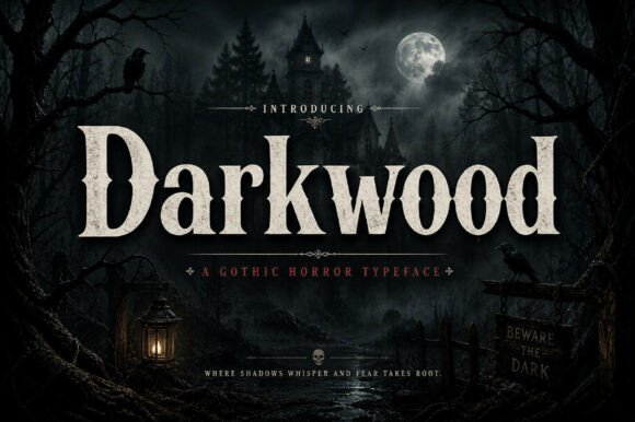
Darkwood presents a heavy, theatrical display serif built from thick stems, sharp serifs, and compact counters that read strongly at headline sizes. Its visual weight and slightly condensed proportions recall early 20th-century poster types, giving designs a brooding, antique character that pairs naturally with Vintage Serif Fonts for labels, signage, and album art. The letterforms carry deliberate irregularities-subtle flares and bracketed terminals-that suggest metal typesetting without losing modern clarity.
Technically the family includes upper- and lowercase, numerals and punctuation with reliable kerning for tight wordmarks and stacked titles. Use it where presence matters: packaging, apparel badges, editorial covers, or any identity that needs a masculine, mysterious, or handcrafted tone. Pair Darkwood with a restrained sans or a light script to balance its density and keep hierarchy clear.
My Recommendation: I reach for Darkwood when a project demands dramatic, old-school character with modern readability. Its heavy letterforms cut through busy layouts, and the distressed vintage feel reads as crafted rather than gimmicky. I’d use it for retro-inspired brands, record jackets, posters, and premium product labels where atmosphere and legibility must coexist.
32. Bardguine Serif & Script Duo Font
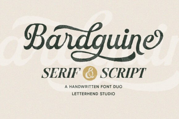
Bardguine pairs a composed serif with an expressive script to create instant typographic contrast: the serif supplies structure with upright shapes and moderate contrast, while the script offers sweeping ligatures and lively terminals that appear hand-drawn. The combination reads like artisanal signage-polished enough for boutique identities yet warm enough for invitations and packaging. PUA-encoded alternates and accessible stylistic sets make switching between flourishes and restrained forms straightforward for designers.
On the technical side the duo supports useful OpenType features, balanced kerning, and a range of decorative characters that let you craft both headline pairings and complementary sublines. Use the serif as the visual anchor and let the script supply personality for taglines, badges, or monograms. This pairing works well for editorial covers, lifestyle brands, wedding suites, and any application that benefits from a handcrafted, refined look.
╰┈➤ Download Bardguine Serif & Script Duo Font
My Recommendation: I recommend Bardguine when a project needs a graceful, human touch combined with solid typographic structure. The script’s ligatures bring personality while the serif keeps hierarchy readable, making it perfect for boutique branding, labels, or editorial headers. The included PUA characters save time and make decorative work much easier during layout and production.
Pair a carefully chosen Vintage Serif Font with a neutral sans to keep body copy legible while retaining headline personality. Small caps, subtle textures, or slightly tightened tracking will increase that historic feel without sacrificing readability.
With these 32 selections you have a broad range of old-style and display serifs for print and web projects. Try a few on mockups to see which voice best matches your concept and audience.