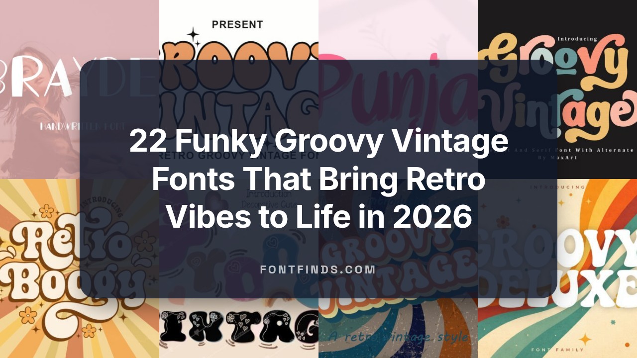
22 Funky Groovy Vintage Fonts That Bring Retro Vibes to Life in 2026
Finding the right aesthetic for a project often means looking back at the bold styles of the past. These 22 Groovy Vintage Fonts provide a nostalgic trip into the heart of psychedelic and retro design. They capture the spirit of an era defined by curved lines and expressive letterforms.
Designers are currently favoring looks that feel organic and human. Using 70s-inspired lettering helps a brand stand out by offering a warmth that standard sans-serifs simply lack. These typefaces work well on everything from concert posters to high-end apparel packaging.
The shift toward bold, expressive type continues to grow in 2026. By incorporating these wavy and thick-stroked options, you can create visuals that feel both familiar and fresh. Let these selections serve as the foundation for your next creative endeavor.
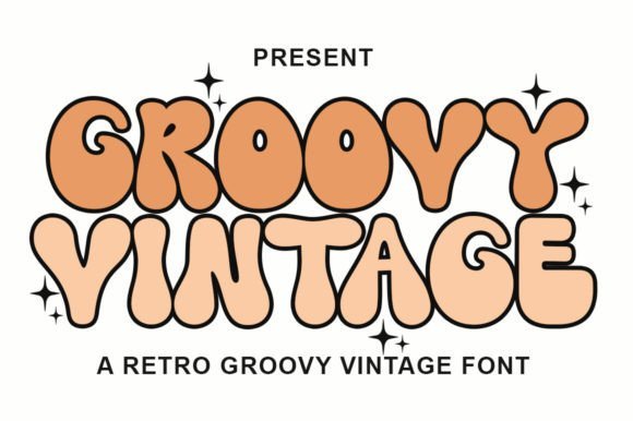
1. Groovy Vintage Font
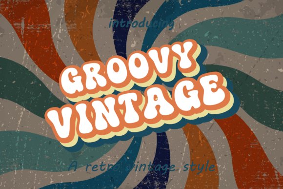
This typeface captures the essence of 1970s aesthetics with its heavy weight and soft, pillowy edges. Its thick letterforms provide a bold visual presence that immediately grabs attention in print or digital layouts. The design stays grounded in mid-century influences while offering a clean execution.
Using Groovy Vintage Fonts allows you to evoke a sense of nostalgia while maintaining a modern finish. The wide curves and uniform strokes ensure legibility even in busy graphic environments like concert posters or merchandise designs. It fills the space effectively without appearing cluttered.
╰┈➤ Download Groovy Vintage Font
My Recommendation: I reach for this style whenever a brand needs to feel approachable and fun. It works well on physical products like tote bags or vinyl record sleeves because the proportions feel substantial. If your project demands a bold, friendly personality, this is a top-tier choice for your toolkit.
2. Groovy Vintage Retro Font
This specific display typeface leans heavily into nostalgic vibes, offering a distinct visual language that recalls classic advertising from decades past. The letterforms are crafted with a specific weight that feels grounded yet energetic. It provides a sense of warmth that modern, sterile fonts often lack.
It stands out by balancing traditional retro elements with a clarity that works well for headlines. The smooth transitions between characters make it easy to read, ensuring your message stays clear amid the stylistic flourishes. This balance makes it a reliable pick for high-impact titles.
╰┈➤ Download Groovy Vintage Retro Font
My Recommendation: This version is my go-to for social media tiles that need a warm, inviting feel. It lacks the harshness of modern sans-serifs, making it perfect for lifestyle blogs or boutique coffee shop menus. Use it when you want your text to feel like a comfortable, familiar memory for your audience.
3. Groovy Vintage Serif Font
This serif variant introduces a sophisticated edge to the retro theme, blending high-fashion elegance with throwback charm. Its refined serifs and varying stroke widths create a rhythmic flow that feels both upscale and relaxed. It moves away from the bubble-look to offer something more structured.
The typeface excels in editorial contexts where a touch of personality is needed without sacrificing professional polish. It adapts well to diverse themes, from luxury travel brochures to seasonal holiday branding, providing a flexible tool for varied layouts. The character spacing is wide enough to handle high-contrast backgrounds.
╰┈➤ Download Groovy Vintage Serif Font
My Recommendation: I find this serif particularly effective for wedding stationery or high-end packaging where a plain font feels too sterile. It provides enough character to be memorable while remaining legible in smaller sizes for subheadings. It bridges the gap between old-school flair and modern luxury beautifully.
4. Groovy Vintage Font
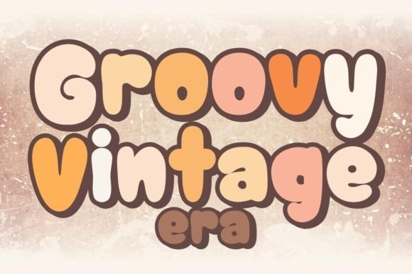
This typeface brings back the soulful energy of late sixties record covers. It balances thick, liquid-like strokes with sharp terminals to create a high-contrast look that feels both historic and fresh. When working with Groovy Vintage Fonts, you notice how the letterforms flow into one another, mimicking the hand-painted signs often seen at old-school music festivals or street markets.
The weight distribution stays heavy, ensuring your text remains legible even when printed on textured materials. It avoids the rigidity of traditional serifs by introducing soft curves that suggest movement and rhythm. This choice works remarkably well for projects requiring a sense of warmth and human touch without sacrificing professional polish or visual impact.
╰┈➤ Download Groovy Vintage Font
My Recommendation: I would reach for this whenever a client asks for a 1970s aesthetic that doesn’t feel like a cheap costume. It is perfect for apparel branding where you want that sun-drenched, retro California vibe. The way the characters sit together makes it a top choice for band posters or organic food packaging.
5. Groovy Vintage Decorative Font
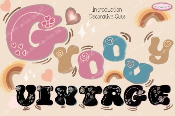
This decorative option leans heavily into a bubbly, cheerful personality. Its rounded shapes and playful heart patterns baked into the glyphs make it an immediate standout for projects aimed at children or festive occasions. The thick outlines and soft edges provide a friendly atmosphere that invites people to engage with the text on a personal level.
Unlike more serious retro types, this one prioritizes charm and whimsy over strict historical accuracy. The wide letter spacing and high x-height improve readability for short bursts of text like product names or greeting card messages. It brings a lighthearted spirit to digital layouts, making even simple phrases look like custom illustrations rather than standard typing.
╰┈➤ Download Groovy Vintage Decorative Font
My Recommendation: This is my go-to for candy shop signage or Valentine’s Day social media graphics. Its built-in decorations save so much time because the font does the heavy lifting for the theme. Use it on stickers or birthday invites to give your work a joyful, hand-crafted appearance.
6. Retro Boogy Display Font
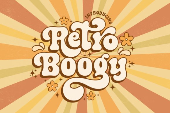
This serif typeface channels the flashy neon lights and dance floor energy of the disco era. It features dramatic, elongated swashes and high-contrast lines that catch the eye and suggest late-night excitement. The decorative elements are integrated so smoothly that they feel like a natural extension of the letters rather than forced additions.
Designers can use this to build tall, imposing headlines that demand attention. The mix of sharp points and exaggerated curves creates a visual tension that keeps the eye moving across the page. It successfully captures a specific moment in design history where elegance met bold, rhythmic expression, making it a powerful tool for editorial layouts or movie titles.
╰┈➤ Download Retro Boogy Display Font
My Recommendation: If you are designing a high-end cocktail menu or a fashion magazine cover, this font is a goldmine. The swashes give you so much room to play with layout and composition. I love using it for large-scale print work where the intricate details of the serifs can really shine.
7. Cat and Dog Font
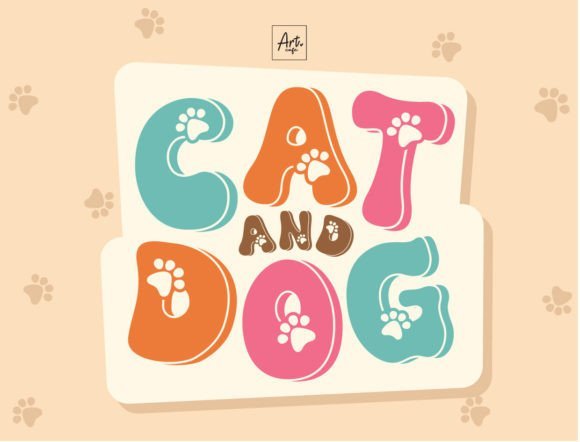
Cat and Dog brings a lighthearted touch to any creative layout by blending 1970s aesthetics with animal-inspired details. The letterforms carry a weight that feels substantial yet bouncy, making them perfect for headers that need to grab attention immediately. Tiny paw prints are integrated into the glyphs, providing a quirky visual beat that resonates with pet owners and animal lovers alike.
Using Groovy Vintage Fonts like this one allows designers to inject personality into youth-oriented branding or boutique veterinary clinics. The soft edges and rounded counters suggest a friendly approachable mood, while the retro influence keeps the overall look stylish rather than purely childish. It bridges the gap between old-school nostalgia and modern illustrative design.
My Recommendation: I’d grab this for a local animal shelter’s adoption event or a specialty pet bakery menu. The paw print accents add a custom feel without requiring extra illustration work. It works best in bright, punchy colors to emphasize that classic 70s spirit.
8. Groovy Deluxe Font
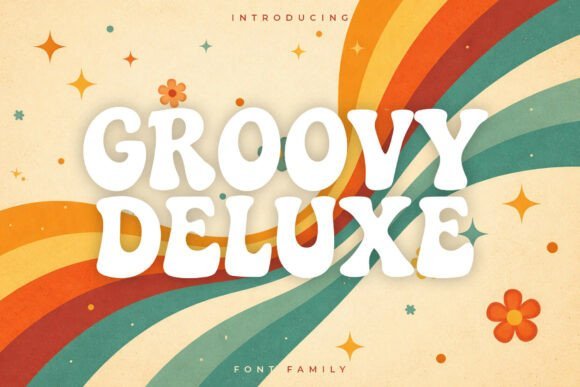
This typeface acts as a time capsule for the psychedelic era, featuring heavy weights and exaggerated liquid curves. The strokes seem to flow into one another, mimicking the wavy motion found in vintage vinyl covers and lava lamps. Its bold presence ensures that text remains legible even when packed with high-contrast colors or busy background patterns typical of the disco age.
The design emphasizes a rhythmic bounce that feels alive on the page, avoiding the static feel of traditional display faces. It captures the energy of a funk concert, making it a strong pick for merchandise or event posters that need to scream with volume. Every character is sculpted to maximize impact, leaning heavily into a thick, bubbly style that defined an entire decade of visual culture.
╰┈➤ Download Groovy Deluxe Font
My Recommendation: This is my top pick for screen printing onto t-shirts or designing gig flyers for indie bands. The way the letters swell and taper creates a natural sense of movement that doesn’t need much help from extra effects. I recommend using it in tight, overlapping compositions to really lean into that authentic retro look.
9. Radial Vintage Font
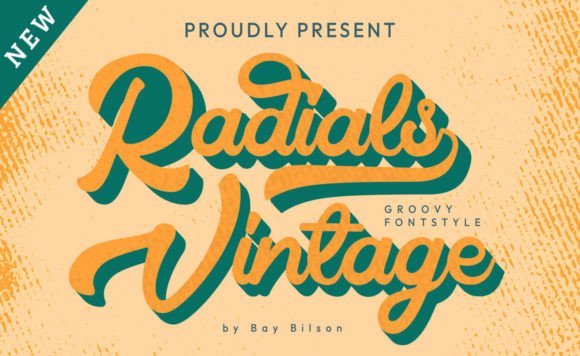
Radial Vintage offers a hand-drawn script that balances casual lettering with a polished retro finish. Its cursive flow is smooth and consistent, providing a sense of warmth and personal connection that rigid block fonts often lack. The gentle slant and looped connections suggest a handwritten sign from a mid-century diner or a backyard party invitation, bringing a human touch to digital layouts.
Designers looking for a softer aesthetic will appreciate how the baseline bounces slightly, adding a playful cadence to every word. This script avoids the overly formal appearance of classic calligraphy, opting instead for a relaxed, approachable vibe. It works exceptionally well when paired with simple sans-serifs, allowing the decorative script to stand out as the centerpiece of a brand identity or social media graphic.
╰┈➤ Download Radial Vintage Font
My Recommendation: Use this for organic food packaging or a craft brewery label where you want to emphasize a handmade quality. It feels personal and inviting, which helps build trust with an audience. I find it most effective when given plenty of white space to let the elegant loops breathe.
10. Christmas Retro Mini Font Bundle
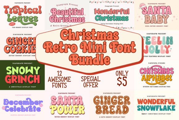
This massive collection brings twelve distinct typefaces together to celebrate the festive season with a heavy dose of nostalgia. Each style pulls from the playful aesthetics of sixties and seventies holiday cards, offering everything from chunky bubble letters to weathered display options. It provides enough variety to handle an entire winter campaign without feeling repetitive or stale.
When you need Groovy Vintage Fonts that capture that specific warm, fuzzy feeling of old-school decorations, this pack delivers. Labels like Tropical Legues and Snowy Grinch offer thick outlines and friendly curves that look great on printed goods. These designs pair well with bright, saturated palettes, making your holiday messaging pop off the page with a cheerful, approachable spirit.
╰┈➤ Download Christmas Retro Mini Font Bundle
My Recommendation: I would pick this up for any print-on-demand shop specializing in holiday apparel. The variety of thick contours makes weeding vinyl a breeze for physical crafters. It works best for cozy sweatshirt slogans or personalized gift tags that need a touch of old-fashioned whimsy.
11. Callidryas Font
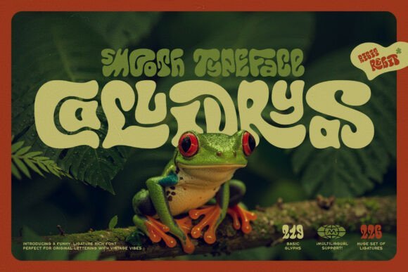
This typeface stands out because of its fluid, liquid-like shapes that feel both high-end and approachable. The 227 unique ligatures are the real star here, automatically connecting lowercase letters to create a hand-lettered look that feels customized. It avoids the stiff, mechanical appearance often found in digital scripts, opting instead for a smooth, rhythmic flow across every sentence.
The weight of the characters feels balanced, providing enough presence for headlines while remaining legible in smaller blocks of text. Because the ligatures handle the heavy lifting, you can produce complex layouts with minimal manual adjustments. It handles multilingual support well, ensuring your message stays consistent across different regions and languages.
My Recommendation: I recommend this for upscale branding projects like boutique skincare labels or artisanal food packaging. The way the letters interact creates a signature-style look that usually requires a custom illustrator. It is perfect for when you want a design to feel expensive but welcoming.
12. Huron Groovy Vintage Fonts
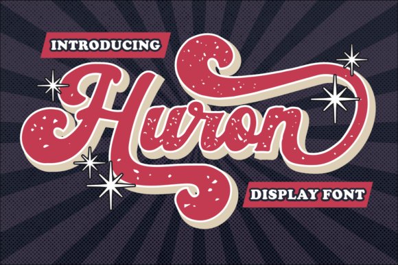
This display typeface merges the energy of old-school sign painting with the grit of automotive culture. You get two distinct flavors: a crisp, clean version for sharp layouts and a weathered, textured version for that authentic, aged feel. The script-inspired forms lean into a heavy weight that demands attention, making it a strong choice for primary titles or logo marks.
The inclusion of numerous alternative characters allows for deep customization, letting you swap out glyphs to fit specific space requirements. Its bold strokes and swinging tails evoke the spirit of custom car shops and retro diners from the mid-century era. This style provides a heavy visual punch that works exceptionally well on physical media like stickers, badges, and posters.
╰┈➤ Download Huron Groovy Vintage Fonts
My Recommendation: Use this font if you are designing merchandise for a brewery or a motorcycle club. The rough texture option saves so much time when you need an immediate lived-in appearance. It also makes for fantastic book titles that need a heavy, masculine, yet playful presence.
13. Akroma Font
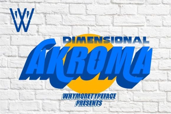
This typeface pulls from high-energy athletic aesthetics while blending in 80s neon nostalgia. It sits comfortably alongside Groovy Vintage Fonts because it captures that specific retro-modern weight and flair. The geometry feels rigid yet fast, echoing the spirit of vintage sportswear and arcade gaming.
The heavy stroke thickness commands attention on large-scale signage or digital hero sections. Use it when you need a bold statement that feels both classic and contemporary. It handles tight tracking well, allowing you to create dense, impactful headers that dominate the page layout.
My Recommendation: I’d reach for this when designing a fitness brand logo or a high-intensity event poster. It brings a punchy weight that thinner scripts lack. The way it mimics track-and-field gear makes it ideal for local sports team merchandise or collegiate-style apparel.
14. Any Sn Script Font
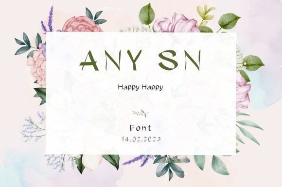
This handwritten script balances flowing ligatures with distinct, individual character shapes. It captures an approachable vibe that feels hand-inked rather than digitally rendered. The rhythm of the letters provides a soft motion that guides the eye across the text naturally.
The letterforms provide enough visual interest to stand alone on a minimalist book cover or a clean product label. It remains readable even at smaller sizes, making it a reliable choice for long-form quotes. You can easily pair it with a simple sans-serif to create a sophisticated typographic hierarchy.
╰┈➤ Download Any Sn Script Font
My Recommendation: This is my top pick for organic skincare branding or small-batch coffee labels. It feels authentic and warm without being overly formal or stiff. I love how the letters connect naturally, giving it a custom look for social media graphics that need a human element.
15. Venita Handwriting Font
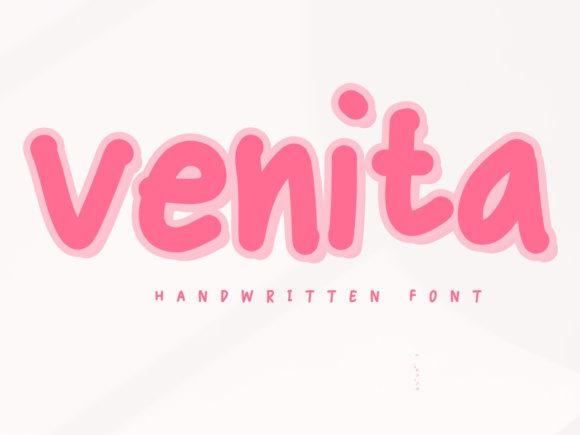
Soft curves and an inviting rhythm define this script, making it feel remarkably friendly and lighthearted. Its casual nature works well for projects that require a personal, human touch instead of a cold digital feel. The strokes are consistent yet retain the charm of real penmanship.
The slight slant and varied heights suggest a quick note written by hand, which adds a layer of intimacy to your design. This organic imperfection helps break up the rigidity of standard layouts. It works beautifully when layered over photography or used as a subtle accent in larger compositions.
╰┈➤ Download Venita Handwriting Font
My Recommendation: Use this for wedding invitations or digital scrapbooks where you want a cozy, intimate feel. It excels in layouts that need a bit of personality without overpowering the main photography. I often pair it with clean headers to create a balanced, inviting layout for lifestyle blogs.
16. Marni Sans Serif Font
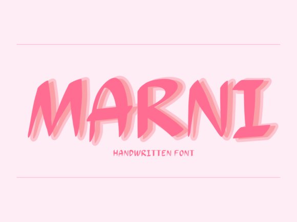
Marni brings a soft, approachable feel to any digital canvas through its relaxed letterforms. This typeface avoids rigid geometry, opting instead for organic curves that feel deeply personal and hand-drawn rather than mechanically produced.
Integrating these Groovy Vintage Fonts styles into your layout adds a nostalgic layer without sacrificing legibility. The gentle strokes work well for social media graphics or branding that needs to feel warm and inviting to a wide audience.
╰┈➤ Download Marni Sans Serif Font
My Recommendation: I would grab Marni for lifestyle blogs or bakery menus because it feels like a friendly conversation. The weight is consistent enough for body text but has enough personality for short pull-quotes. It balances that retro vibe with modern clarity perfectly.
17. Armand Script Font
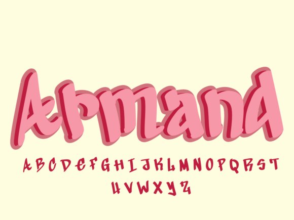
Armand showcases a flowing script style that mimics fast, confident penmanship. Each character connects with a slight flair, making it look like a custom signature rather than a standard digital asset for your creative toolkit.
The slant and spacing provide a sense of movement across the page. It captures a casual elegance that works for high-end packaging or digital invitations where a personal touch is vital for the brand identity.
╰┈➤ Download Armand Script Font
My Recommendation: This is my go-to for wedding stationery or luxury branding that needs a handwritten soul. Its informal structure helps break up stiff layouts and adds a sophisticated human element. I find it particularly effective when paired with a clean, wide-spaced serif.
18. Brayden Script Font
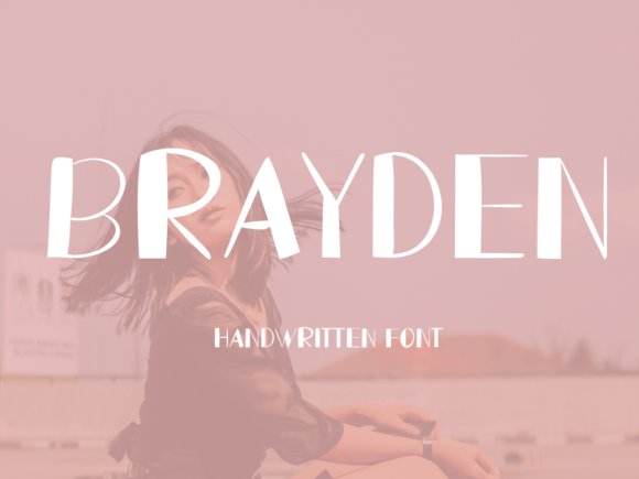
Brayden stands out with its bold, loopy script that emphasizes circular motions and thick downstrokes. It provides a heavy visual weight that demands attention while maintaining a playful, upbeat energy throughout the entire alphabet.
The character set includes unique ligatures that help words flow together in a natural sequence. It feels substantial and textured, making it ideal for large-scale print projects like posters or apparel designs that need a bit of grit.
╰┈➤ Download Brayden Script Font
My Recommendation: Use Brayden for logo designs or t-shirt graphics that need a retro-pop aesthetic. Its chunky letters have a physical presence that fills white space beautifully. I love how it looks when applied with a bright, 70s-inspired color palette.
19. Seth Handwritten Font
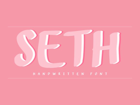
Seth brings a rhythmic, organic energy to digital canvases through its fluid strokes and natural spacing. These letterforms mimic actual ink on paper, providing an authentic touch for branding projects that require a direct personal connection. It avoids the stiff look of digital type, instead offering a soft and approachable aesthetic for your text blocks.
When you pair this script with Groovy Vintage Fonts, you create a striking contrast between bold retro shapes and delicate hand-drawn lines. This combination works exceptionally well for lifestyle imagery or product packaging that needs a human signature. The legibility remains high even at smaller sizes, which is a rare find for such stylized handwriting.
╰┈➤ Download Seth Handwritten Font
My Recommendation: I would use Seth for local bakery menus or personalized stationary sets. It has a relaxed personality that makes your audience feel like they are reading a letter from a close friend. It is the perfect choice for projects that need to feel humble and handcrafted rather than corporate.
20. Punjai Handwritten Font
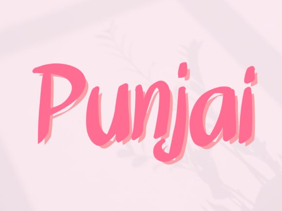
Punjai stands out with its bouncy baseline and cheerful character heights. It captures a sense of spontaneous creativity, making it a top pick for projects aimed at younger audiences or lighthearted community events. The irregular shapes give every word a unique profile that grabs attention without being aggressive.
The weight of the lines remains consistent, ensuring that your message is clear on both dark and light backgrounds. Use this typeface for poster titles or greeting cards where the goal is to transmit a sense of joy. It breaks away from traditional grids to give your layouts a more spirited and active feel.
╰┈➤ Download Punjai Handwritten Font
My Recommendation: This is my top pick for children’s book titles or vibrant sticker designs. Its quirky nature brings an immediate sense of fun and prevents the design from looking too clinical. I find it works best for brands that want to show off their playful and less serious side.
21. Kati Handwritten Font
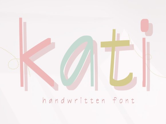
Kati offers a sophisticated balance between elegance and approachability through its slender, tall letterforms. The typeface suggests a refined hand while maintaining a soft appearance that feels welcoming rather than distant. It excels in minimalist layouts where the text needs to speak softly but carry a lot of visual weight.
The gentle curves and consistent rhythm provide a human element to digital interfaces, softening the sharp edges of modern web design. Each character is crafted to flow into the next, creating a visual harmony that is easy on the eyes during longer reads. It is a graceful option for those who want a clean, legible script.
╰┈➤ Download Kati Handwritten Font
My Recommendation: I recommend Kati for boutique skincare labels or high-end lifestyle blogs. It feels light and airy, which perfectly matches products intended to convey a sense of calm and purity. It is an excellent choice for long-form quotes that need an artistic flair without sacrificing readability.
22. Bredford Handwritten Font
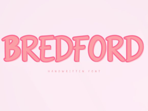
This script face captures the casual elegance of hand-inked lettering with a flow that feels both personal and polished. Its strokes maintain a consistent weight while offering enough variation to mimic natural handwriting on every page. Design projects requiring a touch of warmth benefit from its clean loops and legibility, making it a strong choice for modern branding or upscale social media posts.
While many modern scripts feel too rigid, this typeface balances structure with a relaxed vibe often found in popular Groovy Vintage Fonts. It works remarkably well for wedding invitations or boutique packaging where a human connection is needed. The ligatures provide a smooth connection between characters, ensuring your headers look custom-made rather than digital.
╰┈➤ Download Bredford Handwritten Font
My Recommendation: I often reach for Bredford when a project needs to feel approachable but high-end. It’s perfect for lifestyle blogs or minimalist fashion logos because it avoids the cluttered look of many scripts. Use it on textured paper backgrounds to make the ink-like quality truly pop for your clients.
The selection provided offers a wide range of styles to suit any project needing a bit of old-school soul. Each typeface brings its own personality, making it easier to find the exact match for your visual identity. These choices reflect a deep appreciation for the artistry of the past while meeting modern standards.
As design trends evolve in 2026, the demand for personality-driven type remains high. Choosing the right lettering can make the difference between a project that feels flat and one that truly resonates. Stick with these classic yet revived options to keep your work feeling soulful and distinct.