
91 Curated Font for Wedding Invitations Rustic Boho Brides 2026
Font for wedding invitations matters more than many couples expect. The typeface you pick signals formality, mood, and personality before guests even open the envelope.
From flowing script fonts and hand-lettered calligraphy to clean serifs and modern sans-serifs, the right wedding invitation typeface balances style and readability. This article presents 91 font options, practical pairing ideas, and quick printing tips to help you match typography to your theme and paper choice.
1. Qurellia Salesta Font
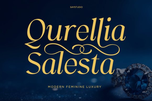
Qurellia Salesta reads like a contemporary serif with a pronounced calligraphic temperament: graceful curves, flowing strokes and refined swashes produce a handwritten veneer that maintains clarity at display sizes. As a Font for wedding invitations, its balanced contrast and smooth rhythm allow names, dates and venue lines to feel romantic without losing legibility on both print and screen. The letterforms are carefully spaced so long lines remain readable while still appearing feminine and polished.
OpenType alternates, discretionary ligatures and swash sets make it simple to introduce bespoke capitals and flourish endings without manual vector work. It pairs well with a neutral sans for body copy or a restrained geometric serif on programs, and it responds predictably to foil, embossing and textured stocks. Use the range of stylistic sets to dial the drama up or down depending on invite formality.
╰┈➤ Download Qurellia Salesta Font
My Recommendation: I turn to Qurellia Salesta when a project needs romantic script presence that still reads clearly; its swash options let me craft standout envelopes and headers quickly. The font performs reliably in foil and letterpress, which makes production testing straightforward. Ideal for formal wedding suites, jewelry tags and boutique branding where softness and an upscale voice are desired.
2. Valentine Decorative Font
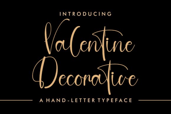
Valentine Decorative channels artisanal calligraphy with elongated swashes and delicate terminals that convey motion and grace. Thin hairlines and controlled curves create an airy, high-end feel that works especially well for names and display headlines. Multiple alternates and stylistic sets expand expressive choices so letterforms can appear hand-drawn without extra illustration work.
The typeface shines on bridal stationery, event monograms and premium labels when paired with a restrained sans for supporting text. Keep an eye on tracking and line-height since long swashes can collide at tight settings, and rely on contextual alternates to maintain natural connections. Best used at larger sizes where the character movement can be appreciated fully.
╰┈➤ Download Valentine Decorative Font
My Recommendation: I recommend Valentine Decorative for projects that demand romantic, calligraphic flourish-wedding envelopes, ceremony programs and boutique product covers are ideal. Its swashes make single-line headlines feel handcrafted, but I avoid it for extended copy. When you want expressive lettering with a light, poetic touch, this face delivers.
3. Salmaritta Font
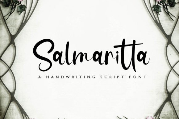
Salmaritta presents ornate handwritten letterforms with fluid connectors and tasteful ornamentation that read contemporary yet classically inspired. Consistent stroke modulation and thoughtfully designed terminals make signatures and logos feel handcrafted without becoming fussy. The family includes stylistic alternates for capitals and a useful set of ligatures that produce natural, flowing words.
This face fits boutique identities, premium packaging and stationery accents where distinctive names and seals need personality. Test embossing and debossing on textured stocks because decorative tails can trap ink differently than plain shapes. Pair Salmaritta with a low-contrast serif or a neutral sans to keep layouts balanced and readable across collateral.
My Recommendation: I choose Salmaritta when a brief, elegant handwritten voice is required-excellent for monograms, labels and invitation headers. The alternates help produce unique initials and the font prints consistently on coated and uncoated papers. Use it when you want handcrafted character without compromising sophistication.
4. Sanskerta Font
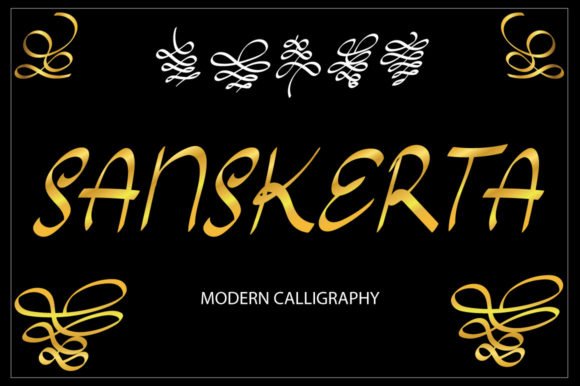
Sanskerta is a modern calligraphy display with slender upstrokes and flourished terminals that read luxurious on printed stationery. Alternates and swash glyphs give varied signatures and decorative endings, letting you create personalised monograms and headings. PUA encoding makes those special characters accessible in most design apps without extra toolsets.
As a Font for wedding invitations, it performs best at nameplates and headline scales where its ornamentation can be appreciated; light kerning tweaks are often needed because of overlapping swashes. Pair it with a restrained serif or clean sans for body text and choose textured stock or metallic inks to amplify its presence on suites and envelopes.
My Recommendation: I use Sanskrita when a couple wants a luxe, calligrapher-like aesthetic without commissioning hand-lettering. The alternate glyphs let me craft distinct signatures for different layouts, and PUA access saves time in production. For formal ceremonies I favour wider margins and foil accents to give the flourishes room to breathe.
5. Comfortable Font
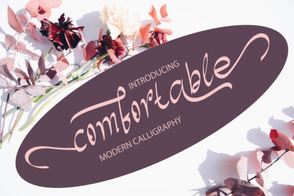
Comfortable is a warm calligraphic hand with slightly bouncy letterforms and modest ink contrast that reads as intimate yet polished. It includes several swashes and ornamental endings that inject personality into names and headings without overwhelming a page. PUA encoding means alternates are one-click accessible in most apps, making custom wordmarks or envelope addressing easier.
On wedding stationery it carries a casual-formal tone-well suited to garden ceremonies, brunch receptions, or invitations aiming for friendly elegance. Use it at headline sizes for readable signatures and combine it with a narrow sans or light serif to keep text blocks clear; textured paper enhances its handwritten feel.
My Recommendation: I reach for Comfortable when the event needs an approachable, hand-lettered look instead of rigid formality. Its built-in swashes speed up mockups and reduce manual editing during revisions. For my designs I pair it with muted inks and matte stocks to preserve a handcrafted, easygoing atmosphere.
6. AL Veshion Font
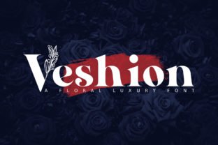
AL Veshion is a decorative floral display font with petal-like terminals and playful ligatures that read like botanical ornamentation. The letterforms feel airy and fashionable, lending a light, romantic character well suited to themed stationery or florist branding. It works best as a headline typeface rather than body copy, where its embellishments can shine without hindering legibility.
For wedding suites, AL Veshion pairs nicely with thin serifs or neutral sans faces and responds beautifully to spot-color printing and letterpress-especially on cream or recycled papers. Use it for save-the-dates, menu headers, and tags where the floral motifs can be echoed in borders, seals, or companion patterns.
My Recommendation: I pick AL Veshion for floral-forward events and spring or summer weddings that need typographic decoration tied to the theme. Its ornaments add instant character, so I reserve it for names, titles, or seals rather than long passages. When printed in a single accent color on textured paper it reads crafted and celebratory.
7. Bathine Font
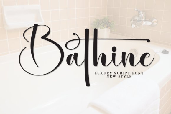
Bathine is a high-contrast luxury script that pairs broad, assertive downstrokes with slender, graceful connectors, giving letterforms a dramatic yet refined silhouette. Its exaggerated flourishes create focal points that draw the eye, which makes it an excellent Font for wedding invitations when you need a bold headline or names to stand out. In large-format contexts – signage, editorial mastheads, window decals – Bathine holds presence without losing delicacy. The balance between weight and whitespace gives compositions a sense of measured opulence.
The family ships with PUA-encoded glyphs, swashes, and alternates that make customizing layouts straightforward; alternates let you avoid repetition in long names or guest lists. For best results pair Bathine with muted neutrals, cream stock, and metallic foils to emphasize its luxe quality, or reserve it as a display face while using a clean sans or serif for body copy. Works well for beauty brands, spa packaging, editorial headlines, and upscale event collateral where ornamentation can be controlled. Treat its decorative elements as anchors rather than continuous text.
My Recommendation: I’d reach for Bathine when a single word or a couple’s names must command attention without feeling overwrought. Its swashes are ideal for RSVP cards and ceremony signage, and PUA encoding makes stylistic swaps simple. Use it sparingly alongside a neutral reading face to keep layouts readable and refined.
8. Relooyd Font
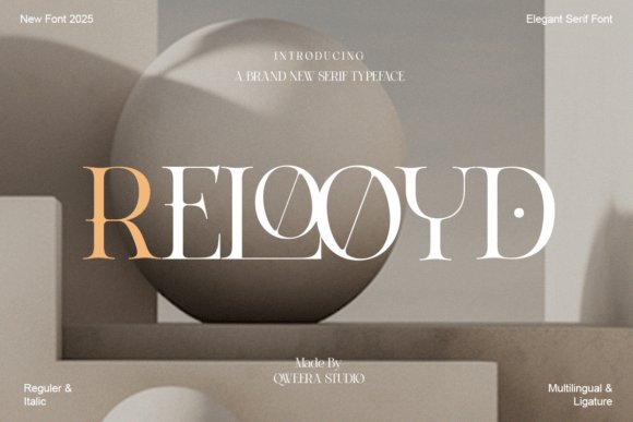
Relooyd is a refined high-contrast serif with sculpted terminals and purposeful ligatures that improve flow in titles and logos. The structure reads as poised and modern, making it suitable for premium packaging and editorial headings where clarity and gravitas are required. At display sizes its delicate hairlines and bold stems produce a striking rhythm that photographs well for print and web. Letters maintain consistent proportions so brand marks remain stable across sizes.
Designers will appreciate Relooyd’s suite of features: alternate capitals, discretionary ligatures, and multiple weights that allow subtle modulation of tone. Pair it with tactile finishes – letterpress, embossing, or gold foil – for a luxury look, or combine with minimal sans serifs for contemporary apparel and website headers. Although strong as a logo face, it also complements short blocks of copy in editorials or premium product labels. Expect clean kerning and reliable optical balance.
My Recommendation: I use Relooyd when a project needs a composed serif that reads as premium without being fussy. Its ligatures add personality to mastheads and monograms, and the range of weights lets me match mood from formal to modern. Ideal for fashion campaigns, luxury product labels, and any identity that benefits from crisp, legible typography.
9. Winter Font
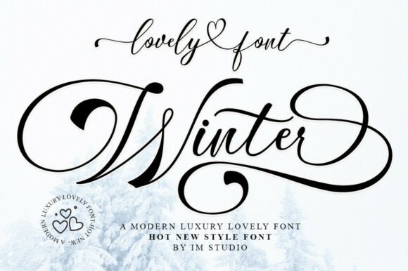
Winter is a hand-lettered script with generous swashes and a rhythmic cadence reminiscent of traditional calligraphy. Its alternates and ligatures create organic variations so repeated names or phrases do not look mechanical, lending a bespoke quality to each line. The font’s balance of strong entry strokes and delicate hairlines produces a romantic, artisan touch that suits intimate stationery and fashion covers. Because of its ornamentation, it works best as a headline or focal nameplate rather than long paragraphs.
Winter comes PUA-encoded for easy access to decorative glyphs and stylistic sets, which speeds layout work and encourages playful combinations. Combine it with textured papers, watercolor motifs, or minimal monograms to emphasize handcrafted charm; pair with a restrained serif for legibility on information-heavy pieces. Its expressive forms make it a natural choice for invitation suites, boutique branding, and limited-edition packaging where personality matters. Be mindful of tracking and line breaks to preserve the script’s rhythm.
My Recommendation: I recommend Winter when a brief, hand-crafted voice is wanted for suite headers and logos. Its alternates prevent repetition across multiple names, and PUA access keeps production friction low. Great for intimate wedding suites, boutique labels, and editorial spreads that profit from a handwritten touch.
10. Saillen Font
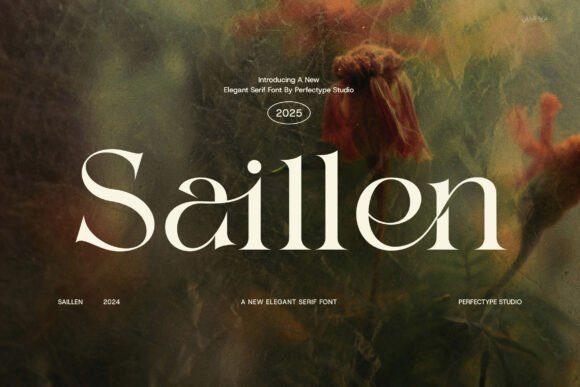
Saillen is a refined serif with balanced proportions and gentle contrast that gives printed pieces an editorial, upscale feel. As a Font for wedding invitations, it pairs sculpted capitals with softly tapered terminals to deliver formal headings that remain readable within delicate layouts. The letterforms include open counters and subtle flared serifs that keep names legible even at modest sizes.
Designer-friendly extras such as contextual ligatures, stylish alternates, and a smooth italic allow selective ornamentation without adding a separate script; those features behave predictably in foil stamping, letterpress, and digital proofs. Thoughtful kerning and moderate stroke contrast mean Saillen holds up for both covers and inner pages, and it pairs beautifully with a light geometric sans for RSVP lines or maps.
My Recommendation: I would reach for Saillen when I need invitations to carry a quiet editorial mood-the ligatures let you craft signature-style nameplates without resorting to a script. It excels across envelopes, programs, and RSVP cards and stands up well to foil or letterpress finishes. For boutique ceremonies and upscale stationery suites this typeface gives a cohesive, refined look.
11. Meladishya Font
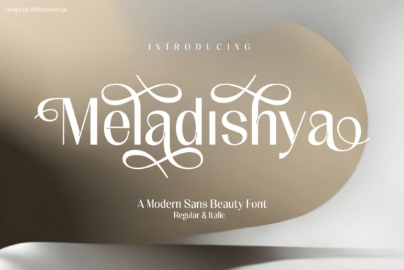
Meladishya is a luxurious sans serif that blends clean geometry with decorative alternates so the same family can serve both body copy and display roles. Its generous x-height and open apertures make extended text easy to read, while plentiful stylistic sets let you craft distinct names or monograms without introducing extra typefaces. PUA encoding means designers can access special glyphs quickly in common design applications.
Because it reads reliably on screen and in print, Meladishya suits contemporary invitation suites, minimalist branding, and product labels where a single type family needs to do double duty. Tight tracking and select alternates create compact monograms, while increased leading yields a refined program or menu spread. Pair it with a delicate script for small-details like RSVP cards to introduce contrast and softness.
My Recommendation: I recommend Meladishya for modern, pared-back invitations that still require personality; its alternates let you add flourish without juggling multiple fonts. The PUA encoding speeds up monogram creation and makes special glyphs accessible in standard tools. Use this for city weddings, gallery receptions, or branded stationery where a polished sans foundation is desired.
12. Belvina Font
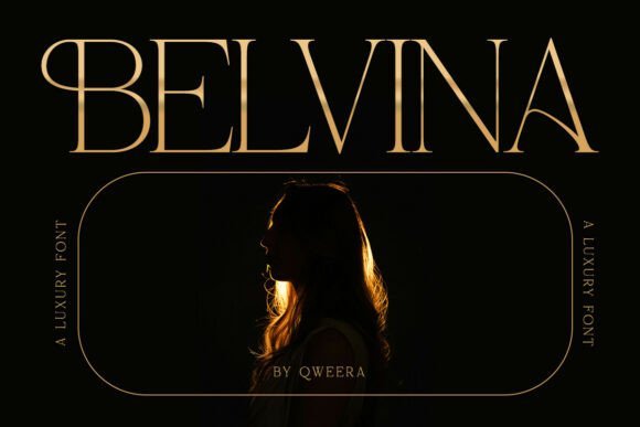
Belvina is a contemporary serif built for prestige, with pronounced stroke contrast and elegant swashes that produce striking headline treatments while preserving legibility. The family includes Regular and Italic styles alongside over twenty alternates and careful ligatures, so initials and covers can feel bespoke rather than generic. Its character shapes read as high-fashion editorial but remain practical for print runs and digital layouts.
On press, Belvina responds well to foil and embossing because refined terminals keep edges crisp; when used for long names the subtle italics add motion and hierarchy. For body text choose the lighter weight to avoid visual heaviness, and pair the font with a narrow sans to keep suites contemporary. Multilingual support and OTF/TTF delivery ensure consistent results across platforms.
My Recommendation: I’d pick Belvina when the project calls for dramatic headings and graceful swashes that read like luxury branding, not decorative excess. The alternates are perfect for crafting monograms and program covers, while the italic provides a tasteful way to add emphasis. For editorial-style invitations or fashion-forward resort weddings Belvina gives the suite a confident, high-end voice.
13. Human Diary Font
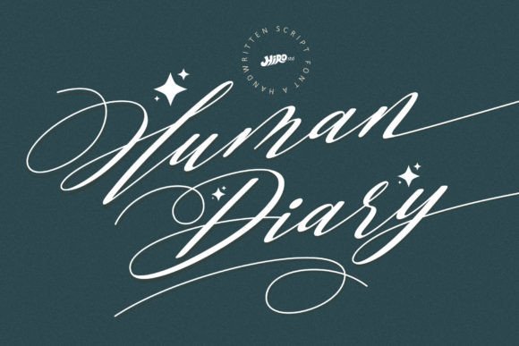
Human Diary Font pairs relaxed calligraphy with a steady rhythm, producing warm, approachable letterforms that scan beautifully on printed paper and screens alike. Its hand-drawn swashes and alternate glyphs give invitations a personal, intimate feeling while keeping text tidy and readable. PUA encoding means designers can access ornaments and ligatures without complicated workflows.
As a Font for wedding invitations it strikes a balance between casual charm and readable formality, letting names stand out without overpowering RSVP copy. Try mixing its scripted names with a narrow serif for addresses, or use a soft watercolor background and envelope liners to amplify its handcrafted vibe. The font works well for informal to semi-formal celebrations where a human touch matters.
My Recommendation: I use Human Diary when clients want an authentic handwritten look without sacrificing legibility. The PUA glyphs let me craft unique swashes for envelopes and headers without manual tracing. It’s ideal for boho, garden, or backyard celebrations and pairs nicely with textured stocks and organic paper.
14. Regality Font
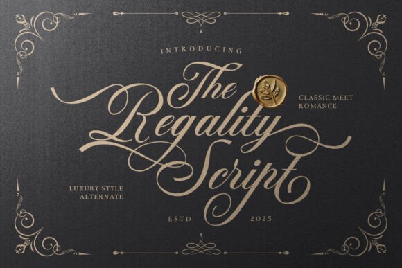
Regality Font presents a flowing script with crisp hairlines and generous loops that suggest refinement without excess. A broad set of alternates and contextual forms lets you tune letter connections so each line reads as bespoke lettering rather than a repeated pattern. Full multilingual coverage eases work when guest lists include several alphabets.
On formal stationery the thin strokes pair particularly well with metallic foils and letterpress, where contrast creates a luxury impression without heavy ornament. Swap in small caps for RSVP blocks to preserve clarity while the script handles names and headline pieces. OpenType features for ligatures and alternates are straightforward in modern design apps.
My Recommendation: I recommend Regality when couples want classic romance with a clean contemporary feel. Its alternates give creative freedom without extra illustration work, so invitations look custom-made. Use it for black-tie events, refined save-the-dates, and branding that needs a graceful script voice.
15. Dahlliaty Rofahness Font
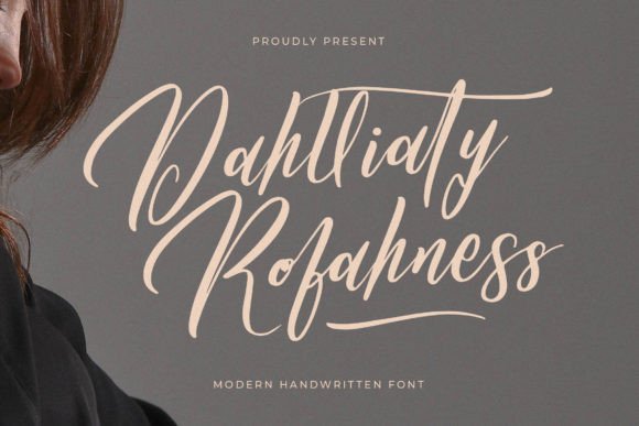
Dahlliaty Rofahness Font offers ornamental letterforms with delicate terminals and soft curves that read like couture handwriting. The contrast in strokes and tight joins create a strong display presence suited to names, monograms, and cover lines. It performs best at larger sizes where the carved details remain visible and impactful.
Reserve its flourishes for headers, envelope fronts, and place cards, and pair the script with a calm sans for program text to keep long passages readable. Its mood leans toward classic luxury, matching ivory, charcoal, and jewel palettes with natural ease. Because the decorative elements can dominate, use them sparingly to maintain overall balance.
╰┈➤ Download Dahlliaty Rofahness Font
My Recommendation: I reach for Dahlliaty Rofahness for upscale events that need a couture signature on the invitation suite. It translates beautifully to foil stamping and letterpress where the fine details become tactile. Avoid setting long addresses in this face; let it headline and personalize while simpler type handles supporting copy.
16. Gradefully Beauttina Font
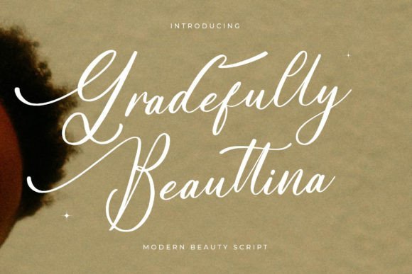
Gradefully Beauttina unfurls with generous swashes and delicate hairlines, a script that reads like modern calligraphy while remaining legible at display sizes. As a Font for wedding invitations it emphasizes names and headers, where its flourished capitals and engaging terminals make a clear statement on embossed or foil-stamped stock. The texture-friendly strokes sit particularly well on cotton papers and letterpress impressions, turning a simple invite into a handheld piece of stationery.
The face includes alternate characters and contextual ligatures that let you swap in swashes without upsetting rhythm, which is handy when spacing names and dates. Pair it with a restrained serif or a clean grotesque for smaller informational type, and avoid busy backgrounds so the fine strokes remain visible. For designers who want an ornate headline script that still reads easily, Gradefully Beauttina strikes a pleasing balance.
╰┈➤ Download Gradefully Beauttina Font
My Recommendation: I reach for Gradefully Beauttina when a wedding suite needs a romantic headline with an artisanal feel. The alternates let me create bespoke name treatments while keeping RSVP and envelope text clear. Use it on heavyweight papers, foil, or letterpress to make the most of those flourishes.
17. Living Love Font
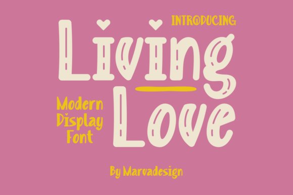
Living Love pairs romantic gestures with a fresh display profile: broad counters, graceful terminals, and generous x-height give it presence without feeling fussy. The font is PUA encoded, so swashes and stylistic glyphs are accessible inside common layout apps for quick custom lettering or monograms. It shines at large sizes for save-the-dates, cover art, and signage where the ornamental strokes can breathe.
Because Living Love belongs to the display class, reserve it for names, event titles, or focal elements and set body copy in a compact sans or serif to preserve hierarchy. The alternates provide a range of wordmark options while clean stroke endings keep reproduction tidy even with metallic inks. If you want a contemporary romantic headline that reads well on screen and in print, this face performs reliably without being overworked.
My Recommendation: I recommend Living Love when a wedding identity needs a bold, modern romance rather than a traditional script. Its PUA glyphs speed up the creation of monograms and stylized names without extra tooling. Use it for save-the-dates, signage, and social graphics where a strong display face is the focal point.
18. Bregitwon Font
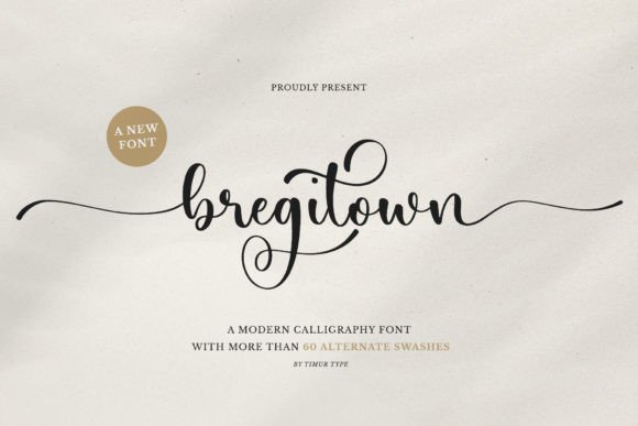
Bregitwon favors restrained elegance: smooth curves, tight joins, and low-contrast strokes create a composed script suited to refined stationery and editorial treatments. The measured rhythm keeps legibility across mid-to-large sizes, so it works well for nameplates, venue headings, and menus where clarity matters. Its modest ornamentation lets the letter shapes do the talking rather than overwhelming supporting elements.
The set offers discretionary ligatures and alternate terminals to introduce subtle variations without breaking hierarchy, and its tracking holds up when used for initials in caps. Pair it with a humanist sans for RSVP copy or a classic serif for a traditional suite, and consider soft letterpress or edge foil to accent key lines. For projects that call for quiet sophistication, Bregitwon reads as polished and dependable.
My Recommendation: I pick Bregitwon when the brief asks for understated refinement instead of flashy decoration. It gives names a formal, composed look that translates well across programs, menus, and invites. Use it for ceremonies at historic venues or boutique events where a calm, elegant tone is desired.
19. Background Font
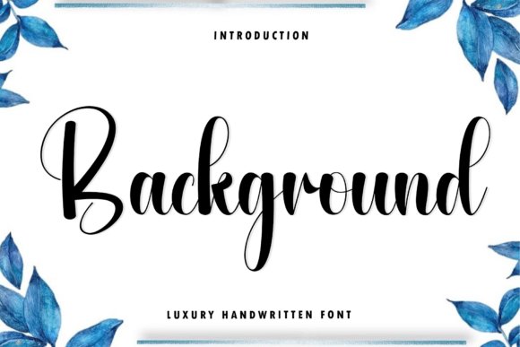
Background is a luxury handwritten type that reads with a steady, upright rhythm and clean strokes reminiscent of felt-tip calligraphy. Its letterforms balance warmth and polish, giving lines the feel of a refined signature rather than rushed script. As a Font for wedding invitations, Background brings hand-inked character while keeping address blocks and RSVP details perfectly legible.
Small shifts in weight and thoughtfully crafted alternates create an authentic, hand-made texture on the page, and PUA encoding makes swashes and stylistic sets straightforward to use. Pair it with soft botanicals, cream stock or restrained layouts to achieve an intimate, high-end suite that feels both current and timeless. I also rely on it when I need a typeface that performs at display sizes and still reads cleanly in small print.
My Recommendation: I would choose Background when a couple wants handwritten personality without sacrificing clarity; it prints beautifully on textured paper and responds well to foil or letterpress. The PUA access to alternates makes it quick to craft custom flourishes. Use it for boutique weddings, elegant stationery suites, and brands that want a personable but refined voice.
20. Maudy Font
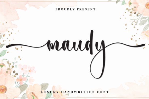
Maudy is a scripted handwriting font defined by elongated horizontals and fluid, connected strokes that read like a practiced signature. The spacing and rhythm give it a confident visual presence while keeping the forms approachable and feminine. It holds up well across scales, making it suitable for both product labels and editorial mastheads.
Pair Maudy with metallic foils, delicate floral motifs or contrasting photography to underscore its refined personality. Its long crossbars and smooth connectors lend an editorial edge, while tight control of line-height preserves readability for addresses and small captions. Because it includes PUA-encoded alternates and ligatures, designers can easily access decorative endings without extra tooling.
My Recommendation: I reach for Maudy when a design needs a signature that reads as intentional and stylish rather than casual handwriting. It works especially well on beauty packaging, boutique business cards, and fashion spreads where a poised script is required. Test a few alternates to dial the tone from romantic to assertive.
21. Magnolia Signature Font
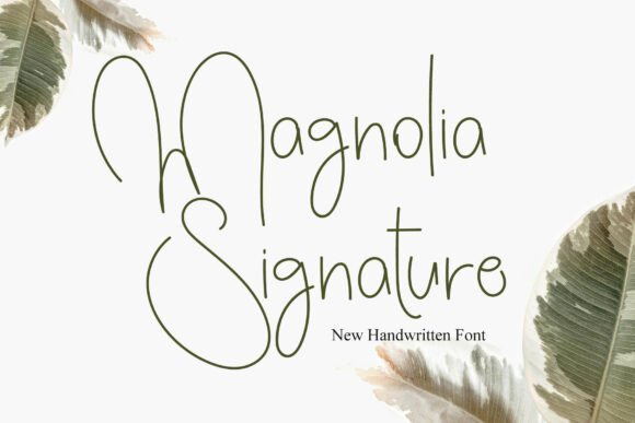
Magnolia Signature is built on ultra-thin strokes and generous loops that give it an airy, high-fashion handwriting quality, like a delicate sign-off from a photographer or stylist. Its light forms create a soft presence on imagery and minimal stationery, though the thin lines require careful contrast to remain legible. For watermarking and logo accents it reads as an elegant whisper rather than a bold statement, which suits understated luxury projects.
Use Magnolia Signature against monochrome photos or textured stocks to preserve its lightness while keeping characters visible. It pairs well with a solid serif for body text to provide balance and hierarchy. PUA features include alternate endings so you can introduce subtle flourishes where a touch of personality is needed.
╰┈➤ Download Magnolia Signature Font
My Recommendation: I’d pick Magnolia Signature when the brief calls for a refined, understated personal touch-think save-the-dates, photography watermarks, or boutique stationery. Its thin strokes ask for generous spacing and strong contrast, so plan your backgrounds accordingly. Used sparingly, it gives projects a quiet, distinctive signature.
22. Cheilene Font
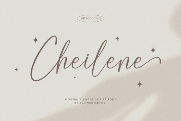
Cheilene is an elegant script whose flowing strokes and refined terminals give text a handcrafted, bridal feel. As a Font for wedding invitations its sweeping ascenders and tasteful swashes create expressive names and headings while remaining readable at display sizes. OpenType alternates and discretionary ligatures let you fine-tune initials and word shapes for personalized stationery.
Use Cheilene for RSVP cards, envelope calligraphy and ceremony programs where a romantic tone matters; it reproduces beautifully in letterpress, foil stamping and digital print. Pair it with a restrained serif or a clean geometric sans for contrast, and tighten tracking slightly on multi-word lines to keep the rhythm intact.
My Recommendation: I reach for Cheilene when I want a romantic, calligraphic voice that still reads clearly on printed pieces. The alternates let me craft unique names and monograms without having to redraw, and the font holds up well in foil and embossing. It’s ideal for formal and vintage-inspired wedding suites where personality matters.
23. Rosenthal Monogram Font
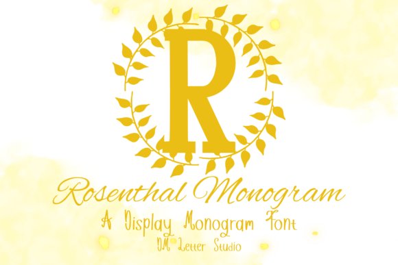
Rosenthal Monogram is a refined serif designed specifically for initials and bespoke insignia, with sculpted terminals and carefully weighted stems that read clearly when scaled down. Each uppercase A–Z is crafted for balance so letters stack or interlock seamlessly in monogram arrangements. The clean outlines make it reliable for Cricut, Silhouette and laser cutting, and vector-friendly shapes translate well to engraving or metal stamps.
The type’s classic proportions suit crests, seal stickers and luxury packaging where a traditional tone is required. It pairs beautifully with ornate scripts or minimalist sans faces to create a composed stationery system. Numerals and basic punctuation mean it can also be used on save-the-dates, favour tags and small-format branding without fuss.
╰┈➤ Download Rosenthal Monogram Font
My Recommendation: I choose Rosenthal Monogram whenever a single-letter mark must look deliberate and timeless-its geometry cuts crisply and survives physical processes like engraving and die-cutting. It’s perfect for bespoke wedding insignias, wax seals, and collectible gift tags. Use it with a soft script to give a suite both formality and charm.
24. Arestmation Font
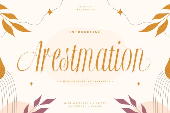
Arestmation channels Copperplate calligraphy with high-contrast strokes, crisp hairlines and controlled terminals that echo traditional nib-work. Its formal capitals and refined lowercase connections produce a stately, ceremonial voice suited to headings, menus and certificates. Built-in swashes and discretionary ligatures provide tasteful flourishes while keeping letterforms stable at display sizes.
This script performs best in foil stamping, engraving and spot-UV where its thin lines become tactile details; avoid very small sizes to preserve the hairlines. Pair it with a neutral serif for body copy or a light sans for a contemporary counterpoint to its ornamentation. The overall effect fits black-tie weddings, heritage brands and upscale packaging that seek a poised, historical tone.
My Recommendation: I reach for Arestmation when a project needs crisp, old-world calligraphy without feeling overwrought. It really comes alive in foil or engraved work, where the fine strokes read as deliberate craftsmanship, and the alternates let me vary initials and names. Use it for formal invitations, certificates, and luxury labels where precision is part of the story.
25. Alora Monogram Line Font
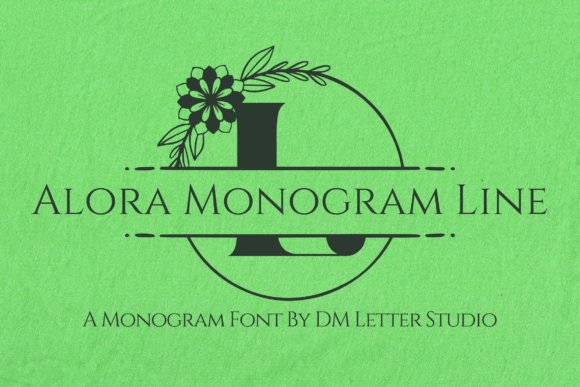
Alora Monogram Line is a finely detailed monogram font built for elegant initials and bespoke seals. Its high-contrast strokes and delicate terminals create crisp letterforms that reproduce cleanly in print, making it a reliable Font for wedding invitations as well as stationery and personal branding. Alternate capitals and subtle hairlines let you craft distinctive initials without heavy vector work.
OpenType features include contextual alternates, stylistic sets and a selection of ligatures so paired letters flow naturally while kerning is tuned for tight monogram stacks. The design holds up across foil stamping, embossing and small-format printing, and pairs well with a restrained serif or a minimal sans for RSVP cards and detail panels.
╰┈➤ Download Alora Monogram Line Font
My Recommendation: I reach for Alora when a client wants an initial that reads handcrafted but prints precisely-especially for foil, embossing or wax seals. The alternate capitals speed up monogram variations without custom lettering, and the fine details survive reproduction. Use it for formal invitation suites, personalized keepsakes and monogrammed stationery where ornament and clarity must coexist.
26. Aether Monogram Line Font
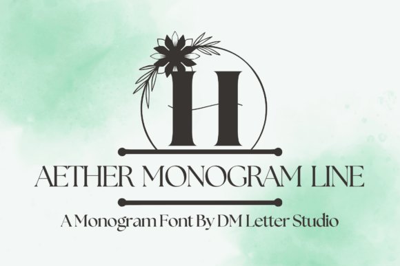
Aether Monogram Line combines geometric restraint with thoughtful ornament to produce initials that feel contemporary yet personal. Sturdier stems and open counters help it scale cleanly from printed invitation suites to larger signage, giving each monogram presence without heavy decoration. Designers who prefer a slightly condensed mark will appreciate its forgiving spacing and balanced negative space.
The set includes alternate glyphs and discretionary swashes for building interlocking letterforms, along with extended language support for international projects. It performs well for laser-cut seals, embossing and brand marks, and reads particularly well when paired with a light script header or a quiet sans for body text and details.
╰┈➤ Download Aether Monogram Line Font
My Recommendation: I choose Aether when the brief asks for a modern monogram that stays legible at multiple sizes; it’s particularly useful for couples who want a clean, contemporary look. Its sturdy construction makes it reliable for signage, napkin wraps and invitation liners where detail must remain clear. Use it when you need a monogram that reads from a distance yet keeps fine craftsmanship up close.
27. Ilarique Cursivea Font
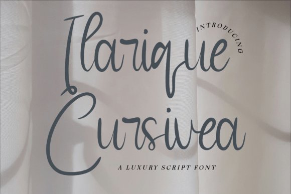
Ilarique Cursivea channels pointed-pen calligraphy with relaxed connections, long swashes and a visible pressure contrast that suggests a human hand. Letter spacing and rhythm are tuned so headers remain readable at display sizes without looking mechanical, making it a strong choice for envelope addressing and invitation headings. The overall impression is expressive and deliberately handcrafted.
OpenType alternates provide multiple entrance and exit swashes, contextual forms and helpful ligatures so repeated letter combinations avoid visual monotony. It pairs naturally with narrow serifs or airy sans-serifs and holds up well in foil printing, die-cut edges and large-format graphics.
╰┈➤ Download Ilarique Cursivea Font
My Recommendation: I recommend Ilarique for projects that want expressive script without sacrificing legibility-ideal for invitation headings, envelope calligraphy and boutique branding. The alternates let me shape each line to feel bespoke without redrawing every letter, which speeds production. Choose it when you want a scripted aesthetic that photographs warmly and prints with consistent detail.
28. Wamolye Font
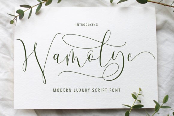
Wamolye is a modern luxury script with sweeping curves and delicate swashes that read like contemporary calligraphy. Its hand-drawn flow gives guest names and headings an intimate, high-end feel, and it functions beautifully as a Font for wedding invitations that needs to feel romantic yet readable. The airy strokes preserve clarity on printed cards while keeping a bespoke, handwritten character.
OpenType features include alternate letterforms, multiple ligatures and elegant terminal variations, which let designers craft distinctive monograms and name treatments. Pairing Wamolye with a restrained serif or a minimalist sans creates pleasing contrast across save-the-dates, menus, and place cards. Built-in kerning is thoughtful, though slight tracking tweaks help achieve perfect balance on small-format pieces.
My Recommendation: I reach for Wamolye whenever a couple wants a soft, romantic script without losing legibility. Its swashes and alternates make names feel custom, ideal for RSVP cards and escort displays. It suits modern-formal weddings and boutique stationery where a personal, handcrafted touch is desired.
29. Berlian Quines Font
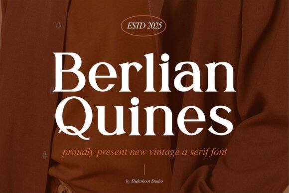
Berlian Quines channels classic serif traditions with high-contrast strokes and refined terminals that evoke engraved printing. This typeface lends a dignified voice to wedding stationery, editorial spreads, and premium packaging without feeling nostalgic for its own sake. Small caps and bracketed serifs help maintain readability in display use while adding decorative flair.
The design holds up particularly well on textured paper or during letterpress runs, and multiple weights provide flexibility for hierarchy across an invite suite. When combined with a delicate script for names or logos, Berlian Quines produces a composed, formal presentation suited to ceremony invitations and reception menus. Its crisp modulation and print-friendly shapes make it a strong choice for tactile, luxury projects.
╰┈➤ Download Berlian Quines Font
My Recommendation: I pick Berlian Quines for projects that call for polished, timeless typography with a hint of vintage charm. It performs excellently with letterpress and foil, and its contrast reads beautifully at larger sizes. Use it for formal ceremonies, editorial-style invites, and upscale product packaging where classic presence matters.
30. Chalent Style Font
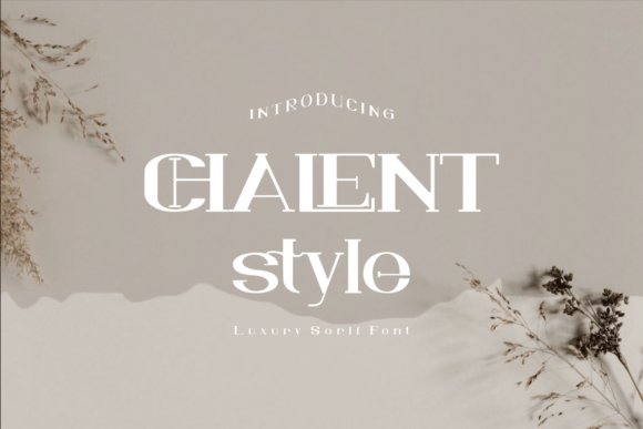
Chalent Style brings a polished serif aesthetic with sculpted curves and subtle stroke modulation that suggests refinement without excess ornament. Slightly condensed proportions and open counters make it practical for guest lists, programs, and RSVP cards where space and legibility matter. The overall silhouette projects an understated luxury suited to modern editorial and stationery work.
The family includes several weights and italics, which helps establish clear typographic rhythm between headings and body copy across a wedding suite. Teamed with a flowing script for names, Chalent Style provides stability and strong readability on both digital invites and printed collateral. Its reserved personality fits events aiming for elegant restraint rather than flamboyance.
╰┈➤ Download Chalent Style Font
My Recommendation: I choose Chalent Style when a design needs quiet sophistication and reliable readability across sizes. The available weights simplify hierarchy, keeping menus and itineraries tidy, while italics add a touch of grace. Ideal for invitations, signage, and printed pieces that prefer elegant understatement over ornament.
31. Mastodone Font
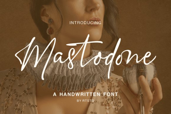
Mastodone pairs the warmth of hand-lettering with precise stroke control, creating a script that feels personal without losing polish. As a Font for wedding invitations it offers generous swashes, contextual alternates and smooth connections that read well on both save-the-dates and formal invitation suites. The letterforms are balanced for letterpress impressions and high-resolution prints, and the organic motion gives names and RSVP lines a handcrafted flair.
Beyond ceremony stationery, Mastodone works well on labels, boutique logos and menus thanks to its readable lowercase shapes and elegant capitals. It includes useful OpenType features like ligatures and stylistic sets so designers can craft unique monograms and nameplates. Pair it with a restrained serif or a clean sans for contrast, and keep tracking light to preserve its flowing rhythm.
My Recommendation: I would reach for Mastodone when I want a handwritten voice that still looks refined-ideal for intimate or luxury weddings where invitations need personality and legibility. Its swashes and alternates let you customize couple names and monograms without extra illustration work. Use it for place cards, envelope addressing and signature lines where a warm, artisanal touch matters.
32. Archine Eamore Font
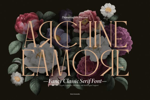
Archine Eamore is a classic serif built with a decorative sensibility: high-contrast strokes, sculpted terminals and a full set of small caps and ligatures give it a historic yet polished presence. With more than 280 glyphs, alternates and multilingual support, it handles editorial spreads and luxury branding with equal confidence. The face performs especially well at larger sizes where its subtle hairlines and bracketed serifs can be appreciated on letterheads and invitation covers.
For wedding stationery the font lends itself to formal suite headings, menus and ceremony programs where a sense of tradition is desired. It responds beautifully to blind embossing and foil stamping, producing crisp impressions that read as premium. Try it with a delicate script accent for names or with a minimal sans for RSVP and informational text to maintain hierarchy and clarity.
╰┈➤ Download Archine Eamore Font
My Recommendation: I recommend Archine Eamore for couples planning a traditional or vintage-inspired celebration; its typesetting options and glyph richness support typographic variety across an entire invitation suite. It’s particularly useful when producing print finishes like letterpress or foil because the forms retain character at scale. Use it when you want a dignified, editorial look that reads as established and refined.
33. Omanche Font
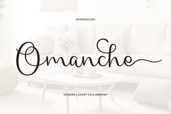
Omanche blends modern calligraphic strokes with contemporary spacing to produce a graceful, airy script that fits stylish invitation design. The letterforms favor open counters and fluid ascenders, which gives envelopes and RSVP cards a light, romantic feel without crowding the layout. Built-in swashes and alternate capitals allow for decorative headlines while keeping body text legible when used sparingly.
Because Omanche balances flourish with restraint, it works nicely on digital invitations as well as printed suites, adapting to foil and digital emboss techniques. Pair it with a geometric or humanist sans for clear informational panels, and reserve its decorative sets for couple names and headings to maintain visual impact. The overall impression is contemporary romance with a polished finish.
My Recommendation: I’d pick Omanche for modern weddings that want an elegant, handwritten aesthetic without heavy ornamentation. It’s especially effective for destination or outdoor events where a breezy, open script complements the setting. Use the alternates and swashes selectively-to highlight names and headings-while keeping body copy simple for best readability.
34. Seraphina Font
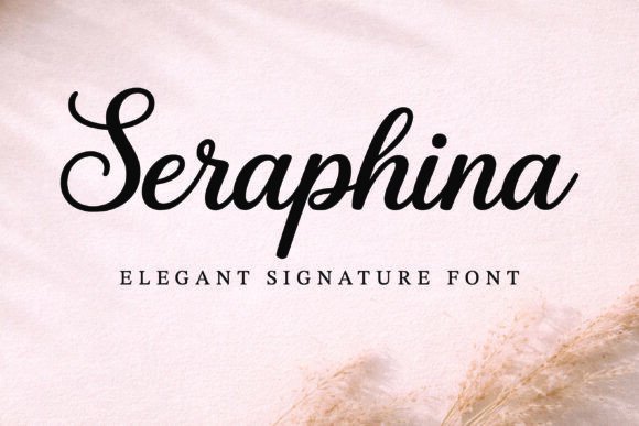
Seraphina is a signature script with fluid, brushlike strokes and refined terminals that stay readable even at small sizes. As a Font for wedding invitations it supplies expressive swashes and alternate glyphs that let you compose bespoke name lines and headings without sacrificing clarity. The letterforms strike a balance between intimate handwriting and polished calligraphy, making them well suited to invitation suites, envelope addressing, and RSVP cards.
On the technical side Seraphina ships with a wide set of ligatures, discretionary swashes, and contextual alternates; built-in kerning covers most pairings but manual spacing gives the best results in tight layouts. Pair it with a neutral serif or a geometric sans for supporting text, and plan for foil, letterpress, or digital print to show off the softer stroke contrasts. Use the regular for body-friendly lines and the swash alternates as focal touches for names, monograms, or signage.
My Recommendation: I pick Seraphina when I want handwriting that feels both personal and refined-its swashes let me craft standout names without resorting to heavy ornament. The font’s alternates make it easy to create varied looks across an invitation suite while maintaining a single cohesive voice. It’s ideal for intimate weddings, boutique stationery, and any design that needs a handwritten feel with professional legibility.
35. Billionaire Club Font
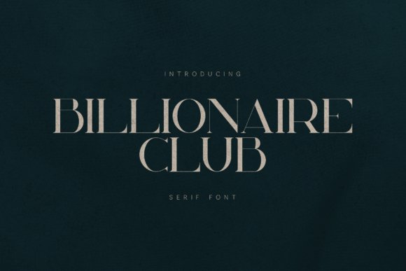
Billionaire Club is a high-contrast serif built to give headlines and display text a confident, refined presence. Sharp terminals and open counters combine to produce striking magazine mastheads, luxury logos, and upscale packaging, while also lending an editorial tone to wedding invitations, menus, and place cards. The typeface reads as formal without feeling heavy, which helps it anchor luxury identity systems and printed suites.
Technically, the face benefits from thoughtful tracking and optical sizing when used across print and screens; its moderate x-height supports dramatic display uses yet still performs at larger caption sizes. Pair this serif with a delicate script for guest names or a clean sans for body copy, and consider foil stamping or deep embossing to emphasize its stroke contrast and tactile qualities. For tight layouts, small spacing tweaks reveal the design’s sculpted shapes.
╰┈➤ Download Billionaire Club Font
My Recommendation: I reach for Billionaire Club when a project needs a poised, editorial aesthetic-its contrast reads luxury without relying on gimmicks. It’s a strong choice for upscale invitation suites, fashion lookbooks, and packaging where headline authority matters. Use it when you want clear, formal typography that pairs beautifully with metallic finishes and tactile printing methods.
36. Royale Milanor Font
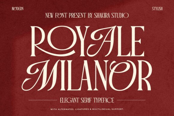
Royale Milanor blends classic serif proportions with contemporary detailing to produce a composed, elegant voice for premium print. The family includes alternates and contextual ligatures that allow ornate initials and flowing nameplates ideal for wedding invitations, monograms, and identity marks. Its measured rhythm and balanced serifs suit centered invitation layouts as well as editorial spreads that require a refined atmosphere.
From a production standpoint, Royale Milanor responds very well to letterpress, embossing, and high-resolution offset printing; slight tracking adjustments often reveal the nicest texture in body copy. Combine its decorative alternates with a restrained sans for longer passages or use them sparingly to highlight names and initials, keeping the suite cohesive while introducing handcrafted character. The alternates make it simple to achieve a bespoke appearance without custom lettering.
╰┈➤ Download Royale Milanor Font
My Recommendation: I choose Royale Milanor when a project calls for restrained elegance with flexible typographic features-those alternates let me craft distinctive initials and nameplates quickly. It’s perfect for formal invitation suites, premium labels, and identities where print finish and detail matter. Use it when you want a classical look that still allows for tasteful customization.
37. Albertha Font
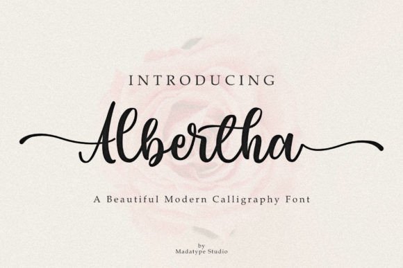
Albertha is a modern calligraphy script with a generous set of alternates and more than a hundred ligatures that let letterforms breathe. Smooth curves, graceful swashes and delicate terminals make each word read like careful handwriting, while broad multilingual support and OpenType features keep typesetting flexible for print and digital pieces.
As a Font for wedding invitations, Albertha shines on RSVP cards, envelope addressing and header names where expressive strokes matter; mixing alternates creates subtle variety across a full suite so each item feels bespoke. It pairs well with restrained sans or soft serifs, imports cleanly into major design apps, and adapts to foil, letterpress and web use without losing its calligraphic charm.
My Recommendation: I’d reach for Albertha when I want an elegant handwritten voice across a wedding suite without hand-lettering every piece. Its extensive alternates make repetition feel intentional rather than mechanical, and the swashes give a luxury look suitable for formal invitations, escort cards and branded stationery. Use it when you want expressive script that still behaves predictably in production and printing.
38. Rose Heart Monogram Font
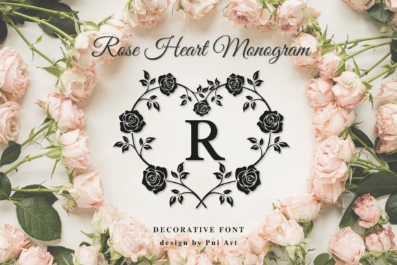
Rose Heart Monogram combines classic serif initials with hand-drawn rose heart wreaths to create a romantic emblem that reads as both refined and intimate. Each letter is treated as a miniature composition, framed by floral strokes that retain fine detail even when scaled down for seals or embossed stamps. The aesthetic sits between heirloom stationery and boutique brand marks, giving initials an artisan touch.
The set suits luxury invitations, personalized logos and keepsake items where an emblem anchors the design; floral frames deliver a distinct focal point for save-the-dates, thank-you cards and packaging. Vector-ready outlines and clear outlines for foil or letterpress make it practical for print, while layered options let you swap wreaths or letters quickly for customization.
╰┈➤ Download Rose Heart Monogram Font
My Recommendation: I would use Rose Heart Monogram when a couple wants a signature emblem that reads like a family crest but softer and floral. It excels on wax seals, envelope liners and bespoke stationery where a decorative initial becomes the visible mark of the event. Pair it with a minimal body type to keep the monogram front and center and use metallic inks for a premium finish.
39. Wildflower Monogram Font
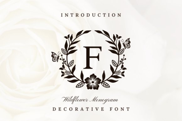
Wildflower Monogram frames uppercase serif letters with botanical sketches that feel hand-crafted rather than mass-produced, lending each initial a natural, organic personality. The botanical motifs are drawn with varied line weights so they reproduce well across print techniques, from flat ink to embossed textures, while preserving the delicate floral character. This approach gives monograms a fresh, unforced elegance suited to nature-focused celebrations.
Designed for wedding invitations, boutique labels and premium packaging, the set works especially well for garden, meadow or outdoor-themed events where botanical elements support the overall look. Glyph organization and scalable artwork make swapping initials and adjusting wreath sizes straightforward, and the compositions pair nicely with light scripts or clean sans serifs for balanced layouts.
╰┈➤ Download Wildflower Monogram Font
My Recommendation: I’d pick Wildflower Monogram for a boho or garden wedding where natural motifs should feel authentic rather than ornamental. The hand-drawn botanical frames create an immediate connection to outdoor settings and translate beautifully to letterpress, die-cut, and laser-etched applications. Use it when you want initials that read like part of the landscape-romantic but rooted in hand-drawn detail.
40. Gerisska Font
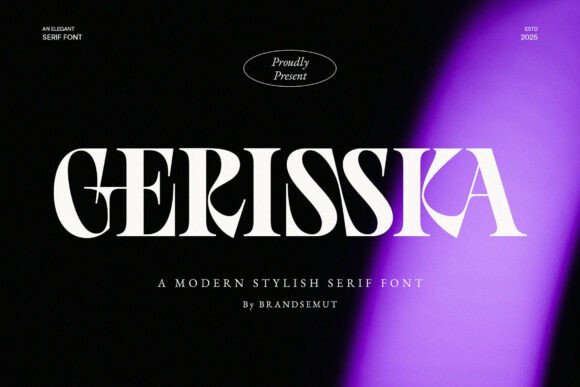
Gerisska is a refined modern serif with high-contrast strokes, elegant terminals and carefully drawn alternates that add personality without sacrificing clarity. Its measured proportions and graceful curves make it an excellent choice as a Font for wedding invitations and other luxury stationery where typographic presence must feel deliberate and polished. The face performs well at large display sizes for headings and monograms while retaining legibility in RSVP lines and address blocks thanks to open counters and readable lowercase forms.
Designed with editorial sensibilities, Gerisska moves smoothly between bold titles and subtle supporting text, so you can craft layered suites that read consistently across print and digital. Consider pairing it with a clean sans for body copy or a light script for names; small adjustments to tracking and line-length reveal its best balance on textured papers and in foil or letterpress finishes.
My Recommendation: I reach for Gerisska when a wedding suite needs a timeless, editorial feel-its serif details lend authority to invitations and the alternates let me design custom monograms without extra artwork. It reads beautifully on heavy papers and responds well to foil stamping or blind deboss. Ideal for formal ceremonies, magazine-style programs, and high-end brand identities that require refined typography.
41. Wedding Romantic Font
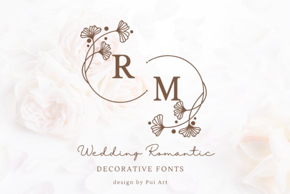
Wedding Romantic blends a classic serif skeleton with hand-drawn botanical wreaths that frame uppercase letters and numerals, creating instant monograms and ornamental initials. The floral frames are drawn with a steady, delicate line weight so each letter becomes a small emblem suitable for seals, stickers and envelope liners. Matching punctuation and numbers keep the decorative system cohesive across suites and print elements.
This font shines when used as a focal graphic-save-the-dates, menu headers or embossed crests-especially when combined with foil or letterpress to emphasize the line work. For longer passages pick a neutral supporting face to avoid visual clutter; keep the wreathed capitals for titles and personalized accents to preserve clarity and impact.
╰┈➤ Download Wedding Romantic Font
My Recommendation: I use Wedding Romantic when couples want clear botanical ornament without hiring an illustrator-its framed capitals speed up monogram creation and bring consistent charm to every piece. It works particularly well with foil, blind embossing, and envelope liners where the delicate line art reads at close range. Best suited to garden ceremonies, vintage-inspired suites, and boutique stationery projects seeking a handcrafted look.
42. Amelya Font
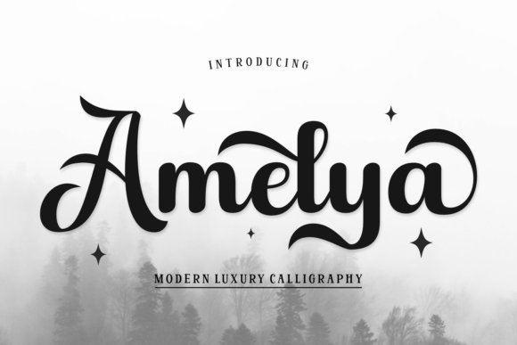
Amelya is a modern calligraphic script that pairs flowing connections with refined terminals to deliver an intimate, upscale hand-lettered look. It includes alternates and discretionary ligatures to avoid repetitiveness and to mimic the subtle variety of real pen work, which makes names and headings feel bespoke. The weight and rhythm of the strokes are tuned for invitation headings and logo marks where personality matters most.
Because flourishes can compete with dense text, reserve Amelya for names, chapter headings and accent lines rather than long paragraphs; combine it with a simple serif or geometric sans to preserve readability. Small kerning tweaks and careful baseline adjustments help the letterforms breathe, and printing techniques like foil or emboss reveal the script’s delicate contrasts to best effect.
My Recommendation: I reach for Amelya when a project needs warmth and handwritten character without looking casual-the alternates make repeated names feel handcrafted rather than copied. It’s perfect for RSVP cards, place cards and welcome signage where script conveys intimacy. Pair it with minimal supporting type and avoid heavy textured backgrounds that obscure thin strokes.
43. Snerffora Font
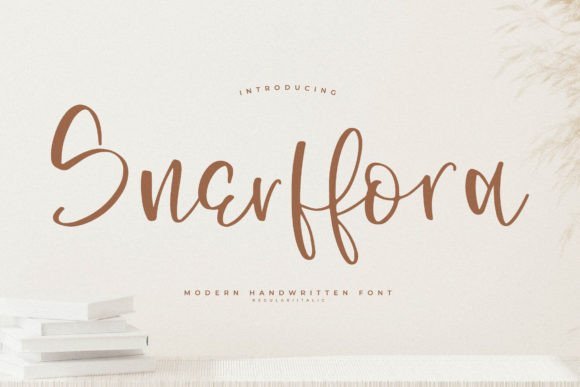
Snerffora feels like a friendly hand-lettered script with rounded terminals and a gentle bounce that keeps letterforms clearly readable at modest sizes. Its strokes show slight irregularities that give stationery a crafted, human touch without drifting into amateurish charm. OpenType alternates and lively ligatures add character while default spacing requires minimal manual kerning.
As a Font for wedding invitations Snerffora reads intimate and casual, well suited to backyard ceremonies, brunch receptions, and laid-back suites. It pairs neatly with a narrow serif or clean sans for RSVP cards and direction inserts, and it prints beautifully on cotton or kraft stocks. Use it at medium display sizes for names and at smaller sizes for ancillary text to keep the suite balanced.
My Recommendation: I reach for Snerffora when I want invites that feel warm and personal rather than formal. Its hand-drawn quirks make it ideal for rustic, boho, or casual celebrations, and the alternates let me vary letter endings across pieces. I recommend pairing it with textured paper and muted inks to highlight its friendly strokes.
44. Bell Font
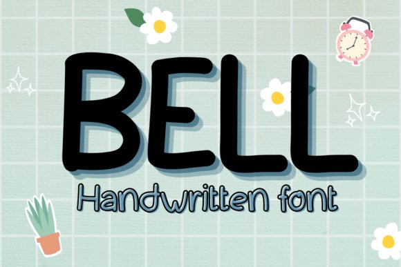
Bell Font offers a refined script with long, sweeping strokes and noticeable contrast between heavy and hairline elements, creating a polished, elegant look. Letterforms remain restrained rather than ornate, which helps names read clearly while still conveying formality. The face includes tasteful swashes and contextual alternates for decorative headlines and monograms.
On print Bell performs exceptionally with techniques like letterpress, foil, or engraving where its stroke contrast adds sophistication, and it also holds up cleanly in digital announcements. Pair it with a restrained serif for body text or a simple geometric sans for contemporary suites to maintain visual equilibrium. Small tracking and baseline tweaks are often enough to achieve perfect spacing for long names.
My Recommendation: I choose Bell when a wedding needs a classic, polished presence-think black-tie or formal affairs. It complements upscale production methods such as foil stamping and embossing, and it reads beautifully at larger display sizes. For couples seeking a timeless, elegant identity across invitations and day-of pieces, Bell is a reliable pick.
45. Klice Font
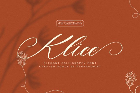
Klice Font emphasizes modern calligraphic shapes with soft brush-like terminals and a slightly condensed skeleton that feels both refined and confident. Alternates for terminals and ligatures replicate natural handwriting, helping to avoid repetitive rhythms when setting multiple names. The letters’ open counters and measured x-height keep secondary text legible even when script dominates the suite.
For invitation suites Klice pairs well with a low-contrast serif or narrow sans to preserve an airy layout and highlight the script as the focal point. It creates striking monograms when combined with a simple geometric mark, and it responds well to subtle ink colors and light paper stocks. When converting to vector, reduce aggressive smoothing to retain the natural brush texture of the strokes.
My Recommendation: I gravitate toward Klice for romantic, contemporary designs that want a handwritten voice without excessive flourishes. The alternate characters are especially useful for crafting unique name treatments and saving horizontal space on RSVP lines. It performs beautifully on vellum overlays or translucent papers where soft light enhances the brushy details.
46. Leodra Font for wedding invitations
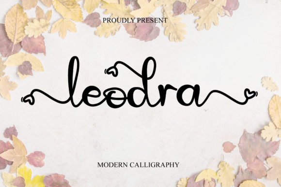
Leodra is a romantic calligraphy script whose characters seem to dance along a lively baseline, offering a soft, handwritten personality that reads like a signature. Its flowing connections and optional swashes give stationery and name treatments a refined, luminous feel; it’s especially effective as a Font for wedding invitations where names and headers need warmth and presence. The set includes alternate letterforms and contextual ligatures that keep lines from feeling repetitive.
Technically, Leodra is PUA encoded so design apps expose every alternate, swash, and ligature without complex font tools, and the glyph set covers small caps, numerals, and punctuation for polished compositions. Because the strokes span from airy hairlines to fuller terminals, test ink coverage and print finishes-foil or letterpress will highlight its contrast. Pair it with a clean serif or restrained sans to preserve legibility across RSVP cards and envelopes.
╰┈➤ Download Leodra Font for wedding invitations
My Recommendation: I reach for Leodra when I want an intimate, handwritten voice that still prints crisply; its swashes feel personal without becoming fussy. The PUA encoding saves layout time by exposing alternates instantly. I recommend it for formal invitation suites, nameplates on menus, and specialty packaging where an elegant script makes an emotional impression.
47. Moonlight Font
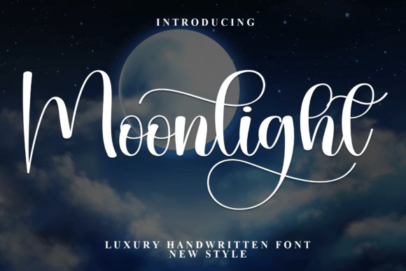
Moonlight is a handwritten display that reads like a nocturne: long, interlocking strokes and measured spacing create a poetic rhythm suited to high-end stationery and boutique branding. The design carries an airy calligraphic quality with refined terminals, which makes it a strong pick for bridal editorials, perfume labels, or cinematic title cards that want subtle drama. Alternates and connected forms let headline treatments feel soulful without sacrificing legibility.
On the technical side, Moonlight includes contextual ligatures, stylistic alternates, and accented characters for multilingual work, and it scales cleanly from small social headers to large-format print. Pair it with a minimalist geometric sans for brand marks, or layer it over soft photography for an enigmatic mood. Pay attention to tracking at small sizes to preserve the interlocking rhythm of the letters.
My Recommendation: I use Moonlight when a project needs an evocative, elegant hand-lettered voice that leans toward mystery rather than ornament. It’s ideal for boutique brands, high-end invitations that favor mood over fuss, and cinematic posters. Simple kerning tweaks often make a big difference when the letters interlock.
48. Saint Valentines Font
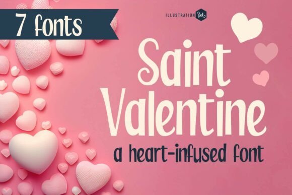
Saint Valentines is a tall, condensed sans with a high-fashion attitude and subtle romantic details threaded into the letterforms. Its vertical emphasis and delicate stroke contrast give names and headlines a statuesque quality, while tiny heart-shaped terminals and dotted counters act as charming, understated surprises. Use it for logos, escort cards, and luxe invitation headers when you want a modern, editorial tone.
Built for display, the family offers tight kerning, consistent weight across uppercase sequences, and alternate glyphs that inject personality without adding ornament. Because the set is narrow, add tracking for longer words and pair it with a soft script or neutral serif for clear hierarchy. It performs beautifully when foiled or blind-embossed, where the small heart motifs become tactile focal points.
╰┈➤ Download Saint Valentines Font
My Recommendation: I turn to Saint Valentines when a wedding suite needs a confident, minimalist voice that still reads romantic. The slim proportions make striking monograms and place cards, and the heart-infused dots provide a clever signature detail. Best used on modern invitations, upscale save-the-dates, and editorial spreads that want subtle romance.
49. Roselunia Script Font
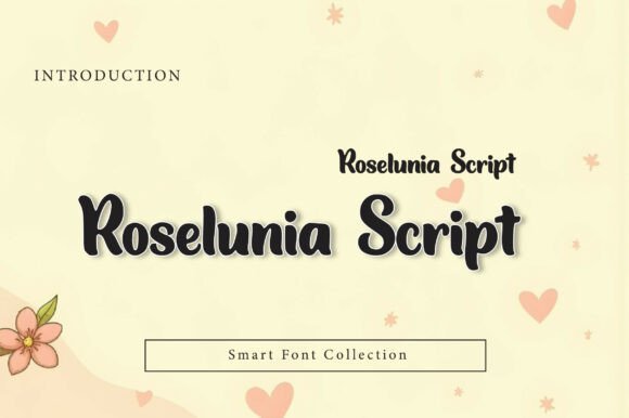
Roselunia Script channels modern calligraphy with airy loops, refined terminals, and consistently flowing strokes that read like an elegant signature. This Font for wedding invitations brings a soft, intimate mood to invitation suites, place cards, and envelope addressing while offering a luxe, feminine voice without feeling overwrought.
The family includes multiple alternates, swashes, and contextual ligatures mapped via PUA for easy access, plus careful kerning that preserves rhythm across names and long lines. It behaves predictably with letterpress, foil and digital prints, and pairs well with a restrained serif or a clean sans for body copy and details.
╰┈➤ Download Roselunia Script Font
My Recommendation: I reach for Roselunia when a couple wants a romantic, handcrafted look without sacrificing legibility. Its alternates make names and monograms sing, and it holds up beautifully on textured stock and foil-stamped envelopes. Use it for garden ceremonies, floral-themed suites, or boutique stationery where a feminine, signature feel is desired.
50. Cynthera Grace Font
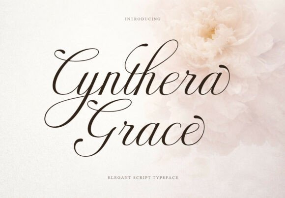
Cynthera Grace presents a poised script voice built from smooth, measured strokes and elegant swashes that feel both classical and restrained. The typeface contains tasteful alternates and ligatures and full extended Latin support, making it a reliable choice for multilingual wedding collateral and luxury labels.
On the technical side, contextual alternates and thoughtful spacing allow it to hold detail at headline sizes while remaining legible on tags and small cards. Pair it with a high-contrast serif for a formal invitation suite or a minimal sans for editorial layouts and perfume packaging to create a balanced, upscale look.
╰┈➤ Download Cynthera Grace Font
My Recommendation: I recommend Cynthera Grace when you need a script that reads formal without being fussy. It’s particularly good for invitations that include longer lines of copy or multilingual text because of its extended character set. Use it for classic stationery, upscale product labels, or magazine mastheads where refined calligraphy is required.
51. Kiona Rosebelle Font
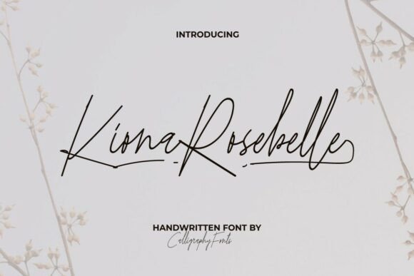
Kiona Rosebelle Font is a minimalist monoline script that captures delicate, contemporary penmanship with restrained loops and generous ligature options. The result is a signature-style mark that feels personal and modern, ideal for logos, social headers, and invitation names where clarity and charm are both priorities.
This monoline approach keeps forms crisp when used for small-scale printing, digital watermarks, or embossing, and its ligatures allow for natural-looking connections without crowded letterforms. For contrast, combine it with a narrow geometric sans for RSVP details or a light serif for printed programs to maintain readability and visual hierarchy.
╰┈➤ Download Kiona Rosebelle Font
My Recommendation: I pick Kiona Rosebelle for projects that call for a clean, contemporary signature without heavy ornament. It’s especially useful for minimalist wedding suites, boutique branding, and cosmetic labels where subtlety matters. Use it when you want handwritten warmth that remains legible across print and web formats.
52. Floral Font
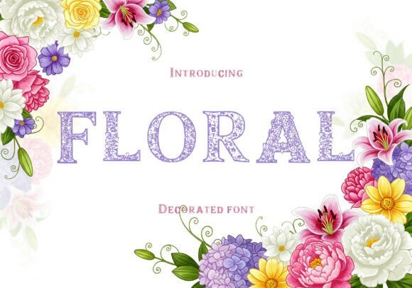
Floral Font is a decorative display face where each capital letter is woven with botanical ornament – tiny blossoms, curling stems and leaf shapes form the letterforms rather than sitting beside them. The result is an ornate, highly stylized headline type that reads as handcrafted artwork; designers can use it to give stationery and luxury packaging a distinctly artisanal, romantic personality. This Font for wedding invitations performs especially well when used sparingly: names, monograms and ceremony headings become focal points without competing with other design elements.
Because the letters are dense with detail, this typeface works best at larger sizes and for short lines; pair it with a restrained serif or a clean sans for body copy. It reproduces beautifully in letterpress, foil or embossing where the floral relief adds tactile depth, and it holds up in pastel palettes or metallic inks that pick out the tiny botanical shapes. For digital use, provide generous letter-spacing and simple backgrounds so the ornamentation remains legible and elegant.
My Recommendation: I’d reach for Floral Font when a client wants invites to read like miniature works of art – it brings a handcrafted, botanical charm that’s hard to mimic with plain scripts. Its strength lies in headlines, monograms and signage rather than long paragraphs, and it’s ideal for spring ceremonies, garden-themed weddings or luxury gift wraps. Print methods that add texture, like embossing or foil, make those floral details sing.
53. The Granite Font
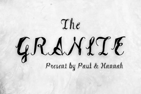
The Granite Font is a handcrafted calligraphic script that balances graceful curves and generous swashes with controlled stroke contrast, giving names and titles an air of refined handwriting. It offers a variety of decorative flourishes and alternate forms so each word can feel custom-made, which makes it a strong choice for upscale identity work and stationery that aims for classic romance. While richly styled, the letterforms maintain clear shapes so they remain readable on invitations and product labels.
Use The Granite for full names, monograms, or logos where a cultured, personal touch is desired; pair it with a neutral serif for long paragraphs to preserve contrast. It performs well in traditional print finishes like gold foil and letterpress, and careful kerning and moderate line-height will keep the swashes from colliding. OpenType alternates allow subtle variations so repeated words don’t look mechanical, perfect for suites where repetition is common.
My Recommendation: I’d choose The Granite when a project needs formal calligraphy without the unpredictability of custom hand-lettering; it gives stationery a bespoke, polished personality. It’s especially suited to formal invitations, luxury packaging and identities that benefit from graceful ornamentation. For best results, reserve it for display text and pair with a simple supporting face to let the script shine.
54. Clouds Font
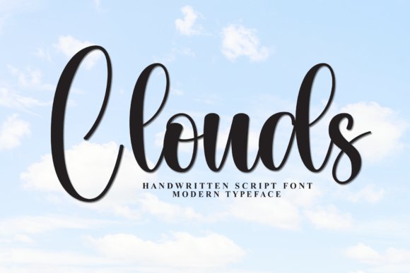
Clouds Font presents a contemporary handwritten script with bold loops, dramatic swashes and a lively thick-to-thin stroke rhythm that reads both modern and personable. Its consistent baseline and confident connections make the text feel natural while still allowing for flourish, and the PUA-encoded glyph set provides easy access to alternates and swashes for quick customization. This makes Clouds a strong candidate for brands and stationery that want a fashionable, approachable signature style.
Because Clouds carries strong personality, it excels as a display face for headings, save-the-dates and social graphics rather than dense body copy; pair it with a light sans or condensed serif to anchor layouts. The type tolerates larger tracking and benefits from generous negative space around its swashes, and it translates well to web graphics and print items such as tags or labels where a hand-drawn energy is desirable.
My Recommendation: I’d use Clouds when I want a script that feels current and energetic – it adds a handwritten flair without feeling fussy. It’s perfect for boutique wedding invites with a relaxed-chic vibe, lifestyle brands, and bold social media headers. Keep it as a statement face and give it room to breathe so its loops and swashes remain expressive.
55. Memories Christmas Font
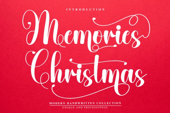
Memories Christmas is a hand-scripted type that mirrors the sweep of a high-end signature, its letterforms linked by fluid, confident curves that feel personal and composed. It ships with full uppercase and lowercase sets, extensive swashes, contextual alternates and ligatures, all available via PUA encoding for easy access in common layout apps. Because of its warm, handwritten character, Memories Christmas works especially well as a Font for wedding invitations where names and headings must read intimate yet deliberate.
On paper the strokes keep character at larger sizes while remaining legible when scaled down for RSVP cards or seating tags; optional swashes let you dial up flourish for main invites and tone it down for enclosures. Pair it with a narrow serif or a clean geometric sans to ground ornamental headlines and preserve white space. The face prints reliably on cotton and recycled stock and reproduces cleanly in digital invites, so it adapts to multiple production methods.
╰┈➤ Download Memories Christmas Font
My Recommendation: I choose Memories Christmas when a couple requests a handwritten signature that still reads clearly across a full wedding suite. Its PUA-accessible alternates make creating bespoke nameplates and monograms quick without complex OpenType workflows. Best suited to romantic, feminine stationery and boutique events where a personalized, handcrafted tone matters.
56. Limited Font
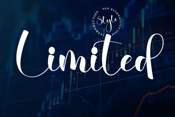
Limited presents a restrained script voice that favors measured strokes and subtle movement over heavy ornamentation, giving it a modern yet approachable presence. The family includes ligatures, alternates and long swashes, and glyphs are PUA-encoded so decorative characters are reachable in basic editors. Its rhythm reads contemporary and composed, useful for projects that need a signature feel without excess embellishment.
In layouts Limited excels when given space to breathe-wide margins, single-column invites and generous leading let the script headlines sing while keeping event details readable. It handles foil stamping, embossing and die-cut applications well thanks to its clean contours, and the simpler letterforms maintain clarity at small sizes for place cards and menus. For a polished look, pair Limited with a sparse serif and reserve color and metallic accents to highlight key names and dates.
My Recommendation: I reach for Limited when the brief asks for a signature script that won’t dominate the page; its pared-back swashes provide personality without stealing attention. Ideal for minimalist wedding suites, product labels and branded stationery where restraint is part of the aesthetic. It scales neatly from large envelope liners to subtle RSVP entries and performs well with specialty print finishes.
57. Vintage Signature Font
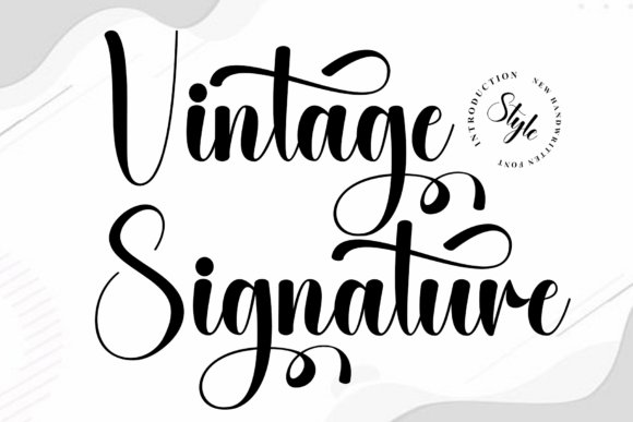
Vintage Signature evokes classic calligraphy with slightly irregular baselines and textured strokes that suggest hand-inked writing, lending an instant period charm to any layout. The set includes uppercase and lowercase letters plus a wide range of alternates and discretionary ligatures so you can craft convincing, unique name treatments; PUA encoding keeps all decorative glyphs accessible in simpler programs. Its characterful forms suit designs that aim for warmth and historical reference rather than modern minimalism.
This typeface shines on tactile materials-kraft, deckled-edge or cotton stocks-and pairs naturally with wax seals, ribbon and hand-addressed envelopes for a cohesive old-world suite. Use the more ornate alternates for ceremony headings and choose pared-down forms for smaller pieces to retain readability. It also photographs well for digital previews, preserving the ink-like textures across screens and print mockups.
╰┈➤ Download Vintage Signature Font
My Recommendation: I’d pick Vintage Signature for weddings that lean into nostalgia or rustic elegance; the inked feel and imperfect baselines make invites feel like keepsakes. The PUA glyphs let me tailor signatures and monograms without heavy typographic work. Perfect for barn venues, vintage-inspired stationery and suites that emphasize texture and handcrafted details.
58. Floral Bewitching Font
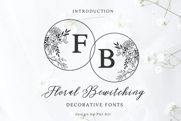
Floral Bewitching Font channels botanical illustration into an ornate display full of swashes, floral ligatures, and elegant monograms-making it a natural choice as a Font for wedding invitations as well as upscale stationery. Its calligraphic terminals and fine hairlines create a soft rhythm across names and dates, where ornamented initials become focal points. Designers will appreciate how decorative caps contrast with restrained lowercase forms when composing invitation suites.
OpenType alternates, contextual ligatures, and stylistic sets are included to help craft unique monograms and repeating floral motifs without manual tweaking. The type shines with foil stamping, letterpress, or blind emboss so delicate strokes gain tactile life, and it pairs neatly with a neutral sans for body copy. Files are supplied for both print and web to cover invitations, RSVPs, and envelope addressing.
╰┈➤ Download Floral Bewitching Font
My Recommendation: I reach for Floral Bewitching when I need a romantically ornate headline that still reads cleanly on printed stock. Its botanical ornaments let you produce cohesive monograms and suite accents without hiring an illustrator. Use it for garden or vintage-themed weddings where the invitation should feel handcrafted and lavish.
59. Callivora Italic Font
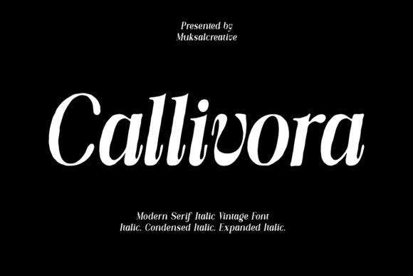
Callivora Italic is a textured serif with a soft slant and hand-drawn surface that suggests paper grain and ink flow, giving headlines a warm, human touch. The subtle distressed finish keeps the letterforms from feeling overworked while smooth curves retain strong legibility for names and dates. It balances classic serif etiquette with a slightly nostalgic voice suited to branding, editorial headings, and intimate stationery.
OpenType features include discretionary ligatures and stylistic alternates so you can swap in gentler terminals or extended swashes for emphasis. The family ships in OTF/TTF/WOFF formats with thoughtful kerning that preserves rhythm in menus, vows, and thank-you cards. Try pairing it with a minimalist sans for blocks of text or let it stand alone for poetic quotes and headers.
╰┈➤ Download Callivora Italic Font
My Recommendation: I choose Callivora when a project needs quiet character rather than heavy ornamentation; its textured strokes add an approachable, handcrafted feel. It performs particularly well on slightly rough or cotton papers and pairs cleanly with modern layout treatments. Use it for boutique brands, editorial pieces, or intimate stationery that benefits from tactile warmth.
60. Guegie Font
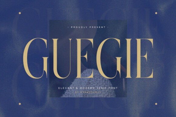
Guegie Font is a refined modern serif defined by tall proportions, narrow apertures, and crisp stroke contrast that reads beautifully in both headlines and small caps. Its balanced x-height and carefully tuned terminals deliver a dignified, editorial voice well suited to luxury logos and corporate identity. When used at display sizes Guegie projects calm authority without relying on ornamentation.
Multiple weights and meticulous kerning give designers control over hierarchy for invitations, signage, and premium packaging, while hairline strokes reproduce cleanly in foil or emboss. Pair it with a flowing script for nameplates or keep the suite minimal with a neutral sans for supporting text. Guegie’s economy of form makes it a smart pick where clarity and refined presence are priorities.
My Recommendation: I reach for Guegie when the brief calls for understated elegance and strong typographic structure. It handles both small informational text and large display use, which keeps branding cohesive across printed pieces. Use it for modern wedding suites, editorial layouts, or premium labels that need a polished, minimal tone.
61. Forest Honey Font
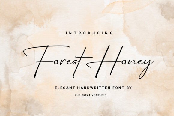
Forest Honey Font is a graceful handwritten script that balances luxury with an organic, pastoral feel; long, flowing strokes and refined curves give names and headings a bespoke look. The family includes alternate characters and discretionary ligatures so you can shape initials and signatures with subtle variety, while keeping clear letterforms for envelopes and inserts. This design sits particularly well as a Font for wedding invitations, lending a warm handwritten presence without losing legibility.
Apply it at display sizes for couple names and section headers, and pair with a simple serif or neutral sans for RSVP and details to avoid crowding. It responds very well to foil stamping, letterpress, and high-resolution digital printing; slight negative tracking often improves readability on textured stocks. Use alternates sparingly to create memorable monograms and signature lines that feel handcrafted.
╰┈➤ Download Forest Honey Font
My Recommendation: I reach for Forest Honey when a suite needs an intimate script that still reads polished. The alternates and ligatures let me craft one-of-a-kind nameplates and monograms, and it prints beautifully on cotton or recycled papers. Ideal for rustic-glam or woodland ceremonies, boutique stationery, and editorial wedding spreads.
62. Romantic Wedding Font
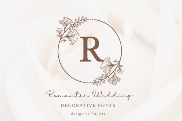
Romantic Wedding Font combines a clean, classic serif with hand-drawn botanical wreaths that frame uppercase letters and numerals, turning each glyph into a ready-made monogram. The unadorned serif characters remain legible when used as body text or menu copy, while the decorative frames provide instant focal points for save-the-dates, seals, and gift tags. The contrast between structured letterforms and delicate line art creates a refined, romantic aesthetic.
Because framed capitals are delivered as standalone decorative glyphs, they work well for embossing, foil, and one-color printing when converted to outlines; that makes production simpler for favors and packaging. Reserve the framed initials for headers and place cards, and use the plain serif for longer passages to preserve readability. Subtle metallics or soft pastels will let the botanical strokes read cleanly against textured materials.
╰┈➤ Download Romantic Wedding Font
My Recommendation: I recommend Romantic Wedding when you want instant monograms without commissioning custom illustrations. It streamlines branding across invitations, favor tags, and boxed gifts while keeping a heritage feel. Best for vintage-inspired ceremonies, garden weddings, and luxury paper goods where artisanal detail matters.
63. Anantha Font
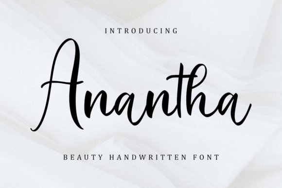
Anantha Font is a refined handwritten face with feather-light strokes and gently looping terminals that read as feminine and poetic without excess ornament. Its rhythm is airy, so short headlines, signatures, and romantic quotes stand out while maintaining a quiet sophistication; contextual alternates expand expressive options for bespoke layouts. The overall voice feels intimate and restrained, making it suitable for tasteful stationery and lifestyle identities.
Because of the thin hairlines, printing at higher dpi or using slightly heavier ink coverage ensures the letterforms retain presence on textured stocks. Pair Anantha with a neutral sans for a modern invite or a soft serif for traditional suites to create clear typographic contrast. It suits vow books, boutique branding, and small-format invitation accents where a gentle, handwritten touch is desired.
My Recommendation: I use Anantha when a project needs a delicate, signature-style script that reads soft yet purposeful. Its alternates help me create distinct name treatments, and it holds up well on letterpress or flat digital prints when contrast is managed. Perfect for intimate ceremonies, personal branding, and elegant quote graphics.
64. Botanic Monogram Font
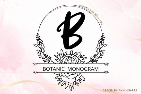
Botanic Monogram pairs uppercase lettering with hand-drawn botanical wreaths, each character framed for instant monogram use. As a Font for wedding invitations it gives names and initials a sculptural presence, balancing bold calligraphic strokes against fine floral filigree. The combination reads both elegant and approachable on ceremony cards, envelope liners, and luxury packaging.
The collection includes multiple wreath styles, alternate letterforms, and high-resolution vector ornaments that scale cleanly for foil stamping or blind emboss. Kerning is tuned for initials and short lines, and the botanical elements remain crisp when reduced for place cards. Pair it with a restrained serif to keep the focus on the monogram while ensuring legible body copy.
╰┈➤ Download Botanic Monogram Font
My Recommendation: I often choose Botanic Monogram when a couple wants botanical detail without losing typographic strength. Its ready-made wreaths speed up layout work yet retain a handcrafted feel that prints beautifully in foil or emboss. Ideal for garden weddings, boutique stationery, and personalized keepsakes where initials are the focal point.
65. Big Baby Font
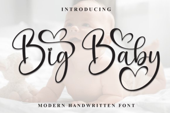
Big Baby is a flowing modern script with generous capitals and long, natural descenders that read like authentic pen strokes. It sits beautifully in invitation headings and RSVP headers, offering graceful motion without distracting from short lines of text. The letterforms photograph well on textured stock and maintain presence on digital mockups.
OpenType alternates and discretionary ligatures let designers craft unique pairings so names look bespoke, while its consistent weight keeps legibility at display sizes. Watch spacing on multi-line addresses, since extended swashes can collide; using contextual alternates keeps lines tidy. This script suits relaxed celebrations and lifestyle brands seeking a warm, handwritten touch.
My Recommendation: I pick Big Baby for relaxed or boho weddings when the couple wants handwritten warmth that still reads clearly. The alternates allow subtle personalization so each invitation feels custom-made. It’s especially effective on textured paper, social announcements, and playful branding pieces.
66. Magnolia Font
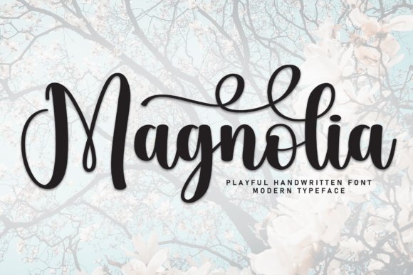
Magnolia presents a restrained calligraphic voice with compact loops and controlled swashes that keep lines neat on denser layouts. Its measured rhythm makes it suitable for programs and longer guest lists because it preserves legibility at moderate sizes. The overall mood is refined and intimate, fitting formal stationery or editorial spreads.
The font ships with multiple numeral sets and punctuation tuned for wedding copy, plus stylistic alternates for delicate initial flourishes. It pairs well with thin sans-serifs and narrow serifs when hierarchy is needed without extra ornament. Use Magnolia where readable script and graceful handwriting aesthetics must coexist across suites.
My Recommendation: I favor Magnolia when invitations require a refined script that can handle longer text blocks without appearing fussy. Its controlled swashes give elegance without sacrificing readability, which is great for programs, menus, and formal invites. It works particularly well for black-tie events and printed pieces where clarity matters as much as style.
67. Babyday Font
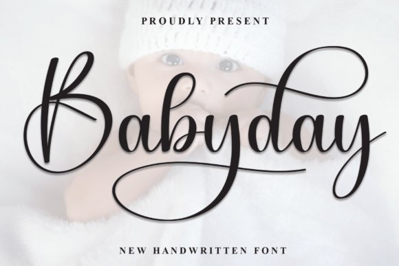
Babyday is a flowing script with a modern calligraphy voice, its loops and swashes forming soft, romantic shapes that read as both handcrafted and polished. The letterforms balance playful flourishes with readable counters, which lets names and headings retain personality without sacrificing clarity. Used as a Font for wedding invitations, Babyday brings warmth to envelope addressing, RSVP cards, and ceremony programs. Fine-tuned kerning and a gentle slant keep blocks of display text feeling intentional rather than loose.
OpenType alternates and several swash sets give designers flexibility to build custom wordmarks and monograms that feel bespoke. The stroke contrast and clean terminals respond well to cotton stock and hot-foil printing, where the flourishes catch light attractively. Pair it with a modest serif or a quiet sans for body text so the script remains the focal point. Small tweaks to line-height preserve legibility when names and dates run together.
My Recommendation: I pick Babyday when a couple wants a warm, hand-lettered look that still reads clearly. Its swash options make it simple to create unique name treatments and monograms without extra lettering work. It’s ideal for intimate ceremonies, elegant stationery suites, and printed invitations on textured paper where the script can show its character.
68. Country Font
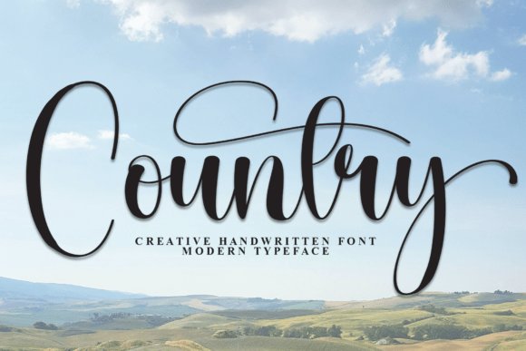
Country Font channels a relaxed, hand-lettered aesthetic with slightly roughened strokes and an uneven baseline that feels approachable rather than formal. Characters are open and broad, offering strong legibility at medium sizes while keeping a homespun personality for names and signage. It’s particularly appealing for wedding stationery that aims for a friendly, rustic tone or an outdoor celebration. The textured edges read beautifully against kraft or recycled stocks that amplify its artisanal charm.
A set of alternates and decorative ligatures lets you switch between tidy and weathered looks without swapping typefaces. In print, the font’s grainy details pair well with light foil accents or letterpress impressions used sparingly. Use Country for display lines, welcome signs, and save-the-dates, and combine it with a clean sans for RSVP and informational text to maintain contrast. Adjust stroke weight modestly for large-scale signage to keep letter spacing balanced.
My Recommendation: I use Country when the brief calls for a genuine, handcrafted vibe rather than polished formality. It works wonderfully on natural papers and venue signage where texture plays a role in the overall look. Best suited to barn weddings, backyard ceremonies, and invitation suites that prioritize personality over perfection.
69. Southine Font
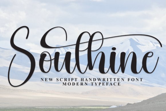
Southine Font is an airy script with elongated ascenders and graceful terminals that give a sense of motion across a wedding suite without becoming fussy. High-contrast strokes and refined loops lend a modern elegance, so guest names remain readable even when embellished with decorative tails. Its restrained shapes make Southine a strong choice for minimalist or contemporary stationery that wants a soft handwritten quality. The overall effect feels fresh and deliberate rather than ornate.
Packed with stylistic alternates, ligatures, and solid multilingual support, Southine adapts smoothly from large display use to small labels. It performs well in both digital invites and offset printing; pairing it with a narrow geometric sans highlights the script’s lightness. When setting longer lines, slightly increase tracking to preserve rhythm and avoid collisions from long descenders. The font’s clean counters also respond nicely to embossing and subtle foil details.
My Recommendation: I recommend Southine when a modern, understated script is needed that still carries personality. The alternates let me shape custom monograms and headers without adding extra assets. It’s perfect for contemporary invitation suites, save-the-dates, and minimal designs that require clarity alongside stylistic flair.
70. Willnesong Celestial Font
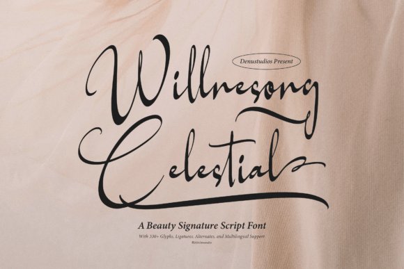
Willnesong Celestial is a refined signature script that balances airy flourishes with controlled strokes, offering an elegant voice for printed pieces. The typeface’s rich set of ligatures and alternate characters creates natural rhythm across names and long lines, and the multilingual glyph coverage handles accented names confidently. Its weight and contrast remain legible at invitation sizes, which makes it a premier Font for wedding invitations without sacrificing personality.
Designers will appreciate how its swashes pair with compact serif headlines and how OpenType alternates let you adjust ornamentation without redrawing. It responds well to foil stamping, embossing, and textured cotton papers; kerning needs minor refinement on tight caps but overall spacing is generous. Use it for main names and headlines rather than dense blocks of text to preserve its signature quality.
╰┈➤ Download Willnesong Celestial Font
My Recommendation: I would choose Willnesong Celestial when a couple wants a handcrafted, upscale look that still reads well on RSVP cards. Its alternates let me craft bespoke name treatments and the multilingual set reduces layout surprises for international guest lists. I usually pair it with a restrained serif to add structure and reserve it for display elements that need character.
71. Lumirnas Font
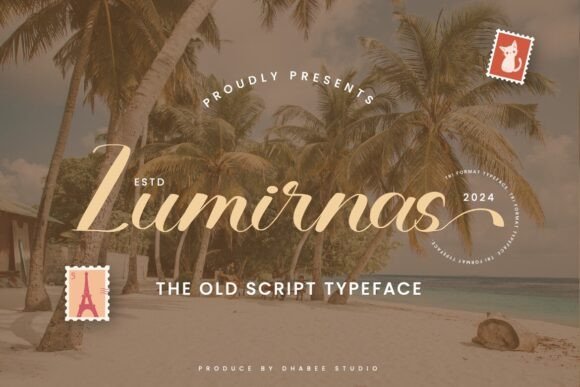
Lumirnas channels a classic handwritten sensibility with restrained vintage gestures that feel current rather than dated. Its smooth curves and subtle terminal flicks create a warm, approachable tone suitable for wedding stationery, menus, and place cards. The lowercase rhythm maintains legibility across short lines, giving designers flexible control over formality and charm.
Technically, Lumirnas ships with alternates and swash sets that help tune personality without compromising alignment, and its moderate contrast prevents ink pooling during letterpress runs. Pair it with a clean sans for contemporary suites or an old-style serif for romantic affairs; play with muted neutrals and cream stocks to emphasize its vintage character. Pay attention to leading and tracking on long names to preserve graceful connections between letters.
My Recommendation: I reach for Lumirnas when I want a brief, nostalgic hand-lettered feel without over-ornamentation. It performs beautifully on textured and cotton stocks and tolerates letterpress and soft foil well. For a modern-meets-vintage suite, I combine it with a geometric sans to keep the overall look fresh.
72. Gastonia Script Font
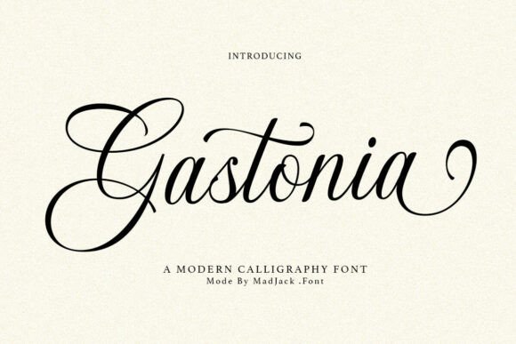
Gastonia Script delivers a luxurious modern calligraphic voice, with bold entry strokes and delicate tails that read as handcrafted but deliberate. Its decorative flourishes are abundant and work beautifully for monograms, save-the-dates, and invitation headers when used sparingly. The letterforms have high contrast, giving premium presence on coated stocks and foil accents.
OpenType features include contextual alternates and stylistic sets that let you swap ornate forms for simpler ones, which helps balance legibility with drama. Keep body copy in a neutral sans or serif and reserve Gastonia for names and logos; test ink coverage for thin strokes to avoid breakage in small print. Use it to give suites a romantic signature while maintaining clarity elsewhere in the layout.
╰┈➤ Download Gastonia Script Font
My Recommendation: I pick Gastonia Script when a project calls for pronounced calligraphic flair-it’s ideal for wedding suites, boutique branding, and luxurious stationery. The stylistic sets make initial design playful and unique, while the high-contrast strokes translate well to foil and letterpress. I recommend using it at display sizes only and pairing it with a simple typeface to maintain readability.
73. Shina Qatline Font
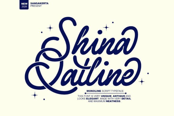
Shina Qatline is a refined monoline script that balances vintage charm with modern minimalism. Its flowing strokes and modest contrast give each letter a handwritten signature feel, supported by OpenType swashes and contextual alternates. This combination makes it an elegant Font for wedding invitations, as well as logos and beauty packaging.
At display sizes the thin monoline maintains legibility, and the balanced x-height prevents letters from feeling cramped. Designers will appreciate alternate capitals and stylistic sets for customizing names and monograms, and the face prints beautifully on textured papers, foils, and embossing. It’s well suited to romantic stationery, boutique branding, and social headers that require a hand-lettered touch.
╰┈➤ Download Shina Qatline Font
My Recommendation: I reach for Shina Qatline when a soft, hand-drawn signature is needed: the swash options let me create bespoke names and RSVP headers quickly. The font’s restrained monoline works extremely well with gold foil and letterpress, producing a refined tactile result. Use it on intimate wedding suites, bridal logos, or beauty labels that benefit from a polished handwritten voice.
74. Slowdate Font
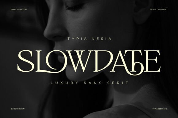
Slowdate is an elegant ligature serif that reads like a modern heirloom. Refined serifs, gentle stroke contrast, and carefully sculpted terminals give words an upscale, editorial voice. Its ligatures and discretionary alternates create smooth character connections that shine in logotypes, magazine mastheads, and wedding stationery.
Slowdate performs best at mid to large display sizes where its ligature details can be appreciated, and letterspacing adjustments are minimal thanks to thoughtful kerning. The family includes small caps, old-style and lining figures, and a full punctuation set useful for labels and price marks. For print, choose soft-lustre or textured stock to emphasize the delicate stroke endings.
My Recommendation: I use Slowdate when I want typographic refinement without fuss: the ligatures give a handcrafted feel while keeping strong readability for headlines. It suits beauty branding, editorial covers, and premium product packaging where typography must look curated. Pair it with a simple sans for longer copy to maintain a calm, high-end aesthetic.
75. Twoswash Font
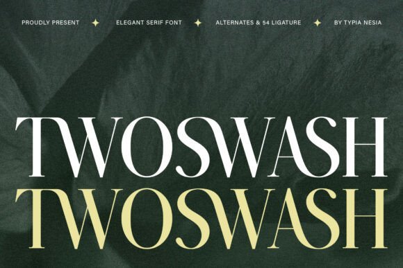
Twoswash is a display serif built around sweeping swash terminals and high-contrast strokes that feel regal and decorative. Ornate initial caps and extended alternates allow designers to craft dramatic headings, initials, and monograms that stand out in print and on screen. This personality makes the typeface ideal for premium packaging, event stationery, and fashion editorials.
Under the hood, Twoswash delivers multiple stylistic sets and discretionary ligatures engineered to layer swashes around word shapes without collisions. Careful kerning keeps letters tidy at large sizes, and the forms respond beautifully to foil stamping, embossing, and letterpress. To maintain balance, pair Twoswash with a neutral sans for body text so the decorative forms remain the focal point.
My Recommendation: I reach for Twoswash for projects that need theatrical, formal lettering-monograms, invitation covers, and luxury labels benefit most. The swash alternates let me build bespoke initials without hand-drawing, and the face holds up well in foil or emboss processes. Use it when you want a dramatic, ceremonial headline that anchors a sophisticated layout.
76. Mothan Font
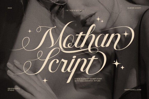
Mothan Font presents a refined calligraphic script with long, flowing strokes and carefully inked terminals that read like modern handwriting. Its alternate glyphs-swashes, ligatures and discretionary forms-let you shape headings into graceful compositions without overwhelming the layout. For anyone selecting a Font for wedding invitations, Mothan balances flourish with legibility so names and dates remain clear even at smaller sizes.
On paper it photographs beautifully: the thin-to-thick contrast and soft terminals create a handcrafted impression ideal for letterpress or foil finishes. Pair it with a restrained serif for body text or let the script stand alone on minimalist suites where the lettering becomes the visual focus. Use alternates with restraint to keep designs elegant rather than busy.
My Recommendation: I reach for Mothan when a wedding suite needs a strong handwritten personality that still reads well; its swashes let me craft bespoke couple names that feel custom-made. The font holds up across foil, embossing, and digital invites, so it’s reliable for both print and online announcements. I’d pick Mothan for upscale stationery, save-the-dates, and boutique branding where romantic pen-script matters.
77. Grimersa Font
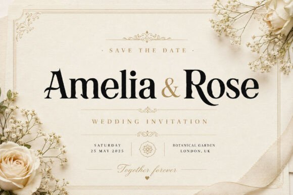
Grimersa Font delivers a stately serif voice with pronounced terminals and a confident vertical stress, giving headlines a poised, deliberate feel. Its generous x-height and open counters maintain clarity at display sizes while the bold serifs provide presence on embossed or foil-stamped covers. The type projects formality without ornate flourishes, making it ideal for titles and monograms.
Try Grimersa alongside a soft script for names or with a narrow sans for contemporary contrast; its letterforms respond well to tight tracking for monogram-style marks. It performs strongly across magazine mastheads, luxury packaging and premium stationery where a clear, authoritative title is required. Use heavier weights for signage and lighter cuts for programs and menus to keep hierarchy clean.
My Recommendation: I choose Grimersa when a project needs a dignified headline that commands attention across different print finishes. Its serif details read beautifully on thick stock and in high-contrast layouts, so it suits formal invitations, fashion editorials, and refined branding. Use Grimersa when you want typography that signals tradition while staying current.
78. Le Saint Clair Font
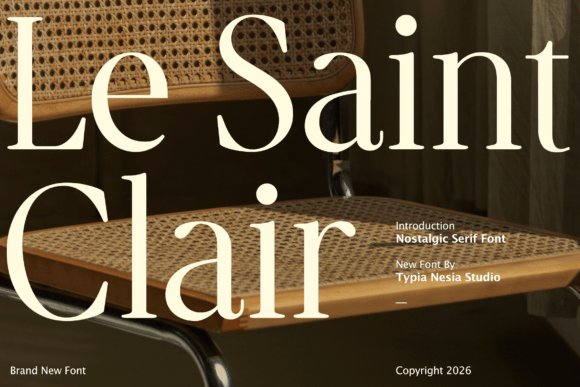
Le Saint Clair Font channels a refined retro aesthetic with subtle bracketed serifs and slightly condensed proportions that recall 1990s fashion typography. The letterforms show soft terminals and gentle contrast, giving them a feminine, editorial character that sits well on boutique branding and beauty packaging. It creates an approachable yet polished voice for names, titles, and logotypes.
Because of its balanced shapes, Le Saint Clair works neatly in tight settings like monograms and seal stamps, and it scales cleanly for posters and invitations. Pair it with warm neutrals and textured stock to emphasize its nostalgic charm, or set it against a crisp sans for contemporary collateral. The type feels confident without theatrics, ideal for refined lifestyle projects.
╰┈➤ Download Le Saint Clair Font
My Recommendation: I gravitate to Le Saint Clair when I want a hint of nostalgia paired with modern clarity; it gives invites and packaging a soft fashion-house vibe without heavy ornament. It’s perfect for bridal suites, cosmetic labels, and boutique stores that need a feminine yet assured typographic identity. I particularly like it with gold foil on matte paper for a tactile, designer finish.
79. Elvare Font
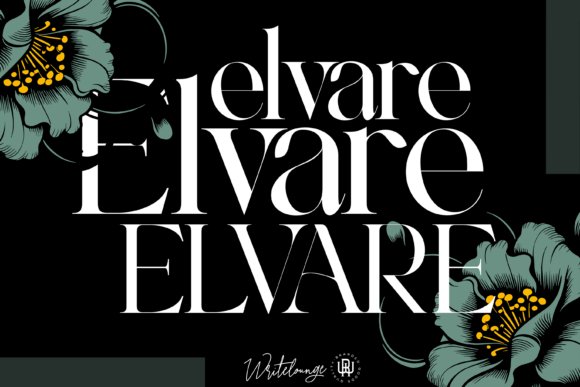
Elvare shows a high-contrast serif voice with delicate terminals and gently tapered stems that read beautifully at display sizes. The design blends refined calligraphic curves with solid structure, making it particularly well suited as a Font for wedding invitations where names and headings must sing without overpowering the layout. The letterforms carry a slightly condensed profile that keeps long lines tidy and gives suites a polished, editorial feel.
On the production side, Elvare performs well in foil printing and letterpress because its hairlines keep their integrity when printed on textured stock. Pair it with a neutral sans for RSVP copy or a loose script for name accents; allow generous tracking on venue details to let the serifs breathe. Small OpenType features such as ligatures and alternate capitals give designers subtle ways to customize each invitation without cluttering the page.
My Recommendation: I reach for Elvare when a client requests a refined, feminine stationery suite with a quiet sense of luxury. Its contrast and fine details make it ideal for formal invitations, save-the-dates, and bridal logos that need to read as handcrafted yet composed. Use it when printing on cotton or textured paper and pair it with a minimal sans for secondary text to keep the overall feel modern and elevated.
80. Gristha Script Font
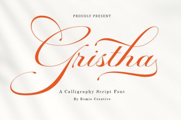
Gristha is a dramatic calligraphic script with long, sweeping swashes and razor-fine hairlines that mimic a pointed nib in motion. It functions as a statement display face best used for names, monograms, or the main headline on an invitation suite; its ornate flourishes draw the eye and establish an expressive, handcrafted personality. Because the strokes vary widely in weight, Gristha creates a distinct contrast when paired with simple, geometric type for information blocks.
Technically, Gristha benefits from OpenType alternates and contextual ligatures that let you place bespoke swashes without manual editing, and PUA encoding keeps access simple across apps. Printing methods like thermography or metallic foil highlight its delicate strokes, while embossing can add dimensionality to the loops. Use sparingly in body copy and reserve the most elaborate alternates for accents like RSVP cards or envelope liners where space is generous.
╰┈➤ Download Gristha Script Font
My Recommendation: I recommend Gristha for projects that demand dramatic, signature-like lettering-think couture invitations, luxury branding marks, or bespoke stationery suites. It works especially well when the design centers on a single large name or emblem and when paired with restrained supporting type. If the event calls for expressive, handcrafted flair, Gristha delivers memorable personality and ornamental charm.
81. Angelica Script Font
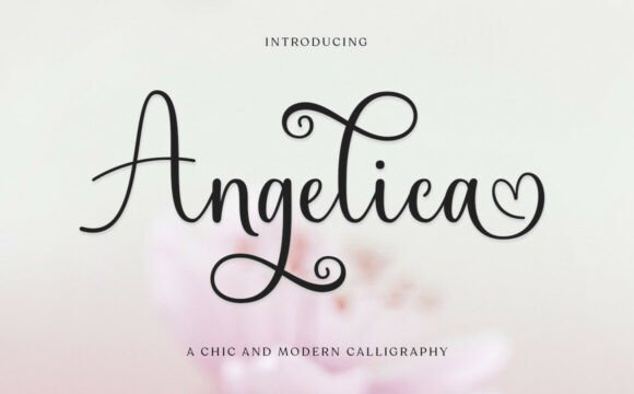
Angelica offers a softer, more restrained calligraphy that balances elegant flourishes with improved legibility for longer text lines. Its moderate contrast and rounded terminals make it adaptable across invitation elements: use the flowing forms for bride and groom names, and opt for lighter, compact alternates for details like dates or locations. The overall rhythm feels romantic without overwhelming the layout, which helps maintain clarity in multi-piece stationery sets.
Practical features include a useful set of short swashes and stylistic alternates that let designers add personality without sacrificing readability; the font pairs especially well with a thin serif or humanist sans for secondary copy. Angelica responds well to color exploration-soft metallics and muted inks temper its curves-and reproduces cleanly at both web and print sizes, giving cohesive results across digital save-the-dates and printed suites.
╰┈➤ Download Angelica Script Font
My Recommendation: I pick Angelica when a couple wants poetic handwriting that still reads easily across RSVP lines and menus. It’s a great choice for romantic, garden, or intimate celebrations where you need calligraphic charm but also practical legibility. Combine it with a simple serif for venue details and choose warm paper stocks to amplify the font’s gentle, personal tone.
82. Always Font
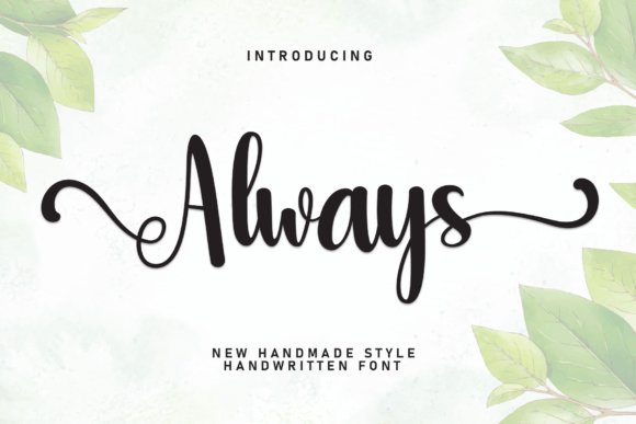
Always is a graceful, timeless script with gently flared terminals and soft looping connections that read as hand-crafted without feeling fussy. Its letterforms strike a balance between ornamental swashes and restrained counters, so proper names remain clear even when you use decorative alternates. The family contains alternate capitals and curated ligatures that let designers dial the mood from intimate to formal.
As a Font for wedding invitations, Always lends a sense of perennial romance while holding up well to foil, letterpress, and digital print techniques. It maintains crisp hairlines without clogging and the alternates make monograms and place cards feel bespoke. Pair it with a simple serif for RSVP cards or a clean sans for envelopes to keep hierarchy obvious and readable.
My Recommendation: I pick Always when I want handwriting that feels personal but remains readable across print methods. Its alternates and ligatures let me customize monograms and stationery suites without extra hand-lettering. Ideal for luxury invites, vow books, and intimate event collateral where a warm, timeless signature is the goal.
83. The Choirs Font
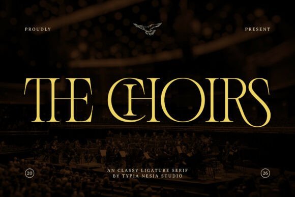
The Choirs is a luxury serif shaped around refined contrast and tapered feet that suggest ceremonial formality. Generous ligatures and discretionary swashes add a faintly theatrical, royal character while avoiding excess ornamentation. The type comes PUA-encoded so designers can access glyphs, swashes, and alternates in common layout applications with minimal fuss.
Use The Choirs for display contexts where letterforms can breathe-packaging, covers, and logos benefit most from its carved details. Deep stocks, matte finishes, or high-contrast colorways help its features read at larger sizes; tighten tracking for headline sets to enhance vertical rhythm. It pairs well with an unadorned sans for captions to preserve legibility while keeping the display work ornate and authoritative.
My Recommendation: I recommend The Choirs when a brand needs dignified, upscale serif voice with decorative options built in. The PUA glyphs let me compose luxurious wordmarks and packaging without assembling extra swash systems. Best for beauty, couture, and editorial projects that want formality with flexible styling choices.
84. Pistachio Font
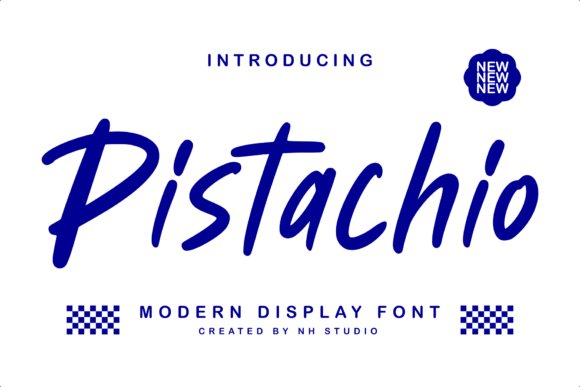
Pistachio is a modern calligraphic display face with lively brush-like strokes and playful terminals that channel hand-lettered charm. Its rhythm favors flowing ascenders and generous loops, producing a romantic yet approachable tone for headlines and emblems. Thoughtful spacing prevents crowding so names and short phrases remain distinct even when swashes are used extensively.
Because it reads beautifully at display sizes, Pistachio suits boutique packaging, editorial mastheads, and stylish stationery where personality matters. Alternate characters and swash sets offer softer or bolder looks depending on the brief, and it pairs well with a condensed sans for modern contrast. When preparing print, test small sizes to prevent ink spread from softening fine strokes.
My Recommendation: I reach for Pistachio when a project needs expressive, friendly lettering that still feels refined. Its swashes and alternates give me plenty of options to craft romantic headlines or product names without custom lettering. Perfect for boutique invitations, lifestyle branding, and social graphics that call for warmth rather than strict formality.
85. Monogram Flowers Font
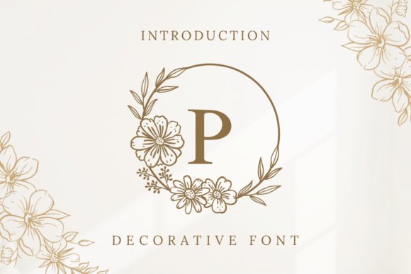
Monogram Flowers is a delicate decorative font that pairs floral ornaments with carefully drawn letterforms intended for monograms and ceremony stationery. The family contains ornate monogram initials, swashes and alternate glyphs so you can assemble crests and personalized initials without extra illustration work. Its fine hairlines and measured contrast perform best at larger display sizes, so envelopes, invitation headers and place cards read as handcrafted and refined. Use of this Font for wedding invitations brings a botanical motif that reads like a curated keepsake rather than a generic script.
When composing event suites, pair the initials with a neutral serif or a restrained sans so the decorative letters remain the focal point, and test foil or letterpress proofs to confirm the thin strokes survive printing. Optical kerning and a few heavier ink choices help preserve the tiny terminals, and the OpenType swashes and contextual alternates let you avoid repeated shapes across repeats. The included vector ornaments speed layout work for menus and programs and make it simple to create matching seals and guest-name headings.
╰┈➤ Download Monogram Flowers Font
My Recommendation: I reach for Monogram Flowers when a suite needs a botanical signature because the monogram set substitutes for custom illustration without losing personality. The alternates and ornaments let me tailor initials for each couple while keeping the whole set cohesive. Use it for garden ceremonies, floral-themed receptions and luxury packaging where a handcrafted emblem is the visual anchor.
86. Mardigare Font
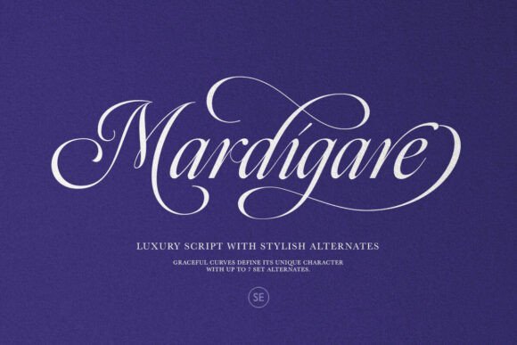
Mardigare Font is a luxe script with flowing strokes and seven stylistic alternates that let familiar letterforms take on new character. Alternates, discretionary ligatures and smooth joins give designers the tools to craft bespoke nameplates, headlines and logo marks that avoid repetition. Moderate contrast and open counters keep the face legible on posters and signage while retaining a hand-drafted personality. The overall voice fits upscale branding without heavy ornamentation, offering a confident script look for display use.
For wedding stationery the font pairs well with a clean serif for body copy and performs nicely on foil-stamped or embossed covers, though tight curls should be checked at small sizes. Turning on stylistic sets changes the mood from playful to formal, and optical spacing helps maintain consistent word color across lines. Use caps and alternate lowercase forms to design signature-style monograms, signage and bespoke invitation headers that read like custom lettering.
My Recommendation: I choose Mardigare when a project needs a polished script that still feels handcrafted; its alternates mean I can make several unique lockups without custom lettering. It works especially well for upscale invitations, boutique logos and editorial covers. If you want a refined script voice for signage or headlines, this font is a practical, flexible choice.
87. Weddingnight Font
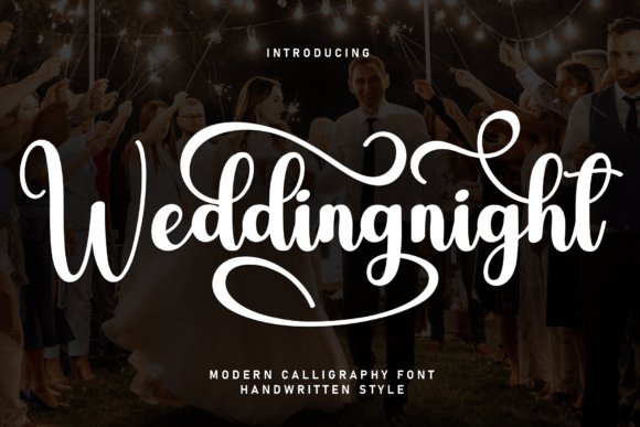
Weddingnight Font presents a romantic cursive voice with long looping strokes and delicate terminals that flatter bridal stationery and vow books. The letterforms balance expressive swashes with readable lowercase shapes so names, program headers and envelope lines look ornate without losing clarity. Spacing and rhythm favor display settings, and subtle alternates allow you to vary repeated words or initials for a more handcrafted feel. The type conveys warmth and a personal touch while still appearing polished for formal suites.
Apply Weddingnight to invitation headers, program covers and thank-you notes, pairing it with a small neutral sans for RSVP text to preserve legibility. It responds well to metallic inks and letterpress when plate depth protects thin strokes, and heavier paper stocks help the finer details hold. For digital invites, increase tracking slightly to prevent swashes from colliding and enable stylistic sets to introduce variety across layouts.
╰┈➤ Download Weddingnight Font
My Recommendation: I rely on Weddingnight for intimate ceremonies and vow books when I want a handwritten, romantic appearance that still reads clearly at display sizes. The long swashes and alternates make it easy to personalize names and cover titles, and it pairs naturally with simple body text. Use it for ceremony programs, signage and keepsake stationery to give printed pieces a warm, personal character.
88. Harrogate Font
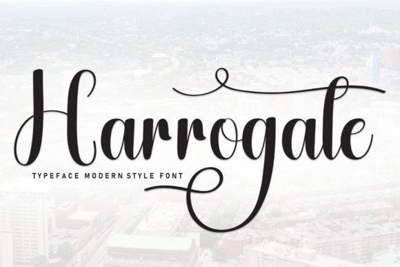
Harrogate Font blends graceful script strokes with crisp, readable letterforms to form a poised, classic look that reads modern at a glance. Its moderate contrast, restrained swashes and tidy terminals make it especially well suited as a Font for wedding invitations, monograms and RSVP cards where both presence and clarity matter. Kerning stays consistent even with long names, and the overall rhythm keeps lines from feeling cramped or overly ornate.
OpenType ligatures, alternate capitals and small caps provide compositional options without overwhelming the design, so you can add personality in small doses. Print finishes like foil stamping or letterpress pair nicely with Harrogate’s clean details; try combining it with a spare sans or a delicate serif and a cream stock to emphasize its composed character.
My Recommendation: I reach for Harrogate when a formal invitation needs a calm, elevated voice-its shapes read elegant without fuss. The OpenType options make it easy to introduce subtle flourishes while maintaining legibility. Use it for classic ceremonies, black-tie events or any project that benefits from a refined, professional handwritten touch.
89. Nophi Nophia Font
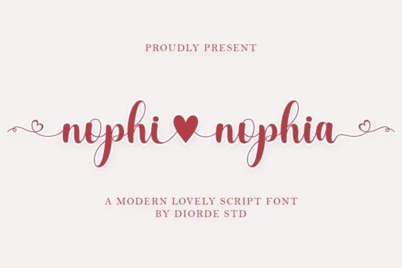
Nophi Nophia Font arrives with a playful, hand-drawn personality centered around a tiny heart-shaped stroke that acts as a repeatable emblem rather than an obvious gimmick. Its lively baseline and slightly bouncy letterforms create an intimate, friendly tone that suits social posts, greeting cards and whimsical stationery. Strokes feel handcrafted yet controlled, giving designs an approachable, personal quality without sacrificing readability.
All alternates and swashes are PUA-coded for straightforward access in common design apps, and the set includes useful ligatures that smooth out word shapes. Pair Nophi Nophia with a neutral sans to establish hierarchy, use pastel palettes or kraft paper to match its charm, and reserve heart motifs for names or focal elements to avoid visual clutter.
╰┈➤ Download Nophi Nophia Font
My Recommendation: I pick Nophi Nophia when a project needs a lighthearted, romantic accent-its heart detail becomes an instant signature. The PUA coding saves layout time, so adding alternates is quick in most editors. Ideal for boho or informal invites, charming social graphics and cute greeting cards.
90. Babe Salome Font
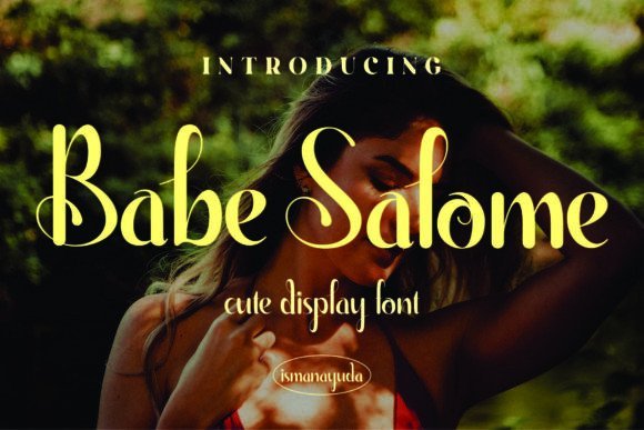
Babe Salome Font brings warm, friendly handwriting to designs with rounded terminals and gentle connections that read like a personal note. It maintains comfortable spacing at invitation sizes while offering enough casual flair for save-the-dates, gift tags and intimate stationery pieces. The letterforms strike a careful balance between playful and polished, avoiding fussy flourishes that can overwhelm small-format printing.
Light textured stocks and simple embossing highlight its soft strokes, and pairing Babe Salome with a clean geometric sans helps keep body copy legible. Use its modest alternates for names or headings and reserve heavier embellishments for single focal words to preserve clarity across both print and digital invitations.
My Recommendation: I recommend Babe Salome for cozy, personal celebrations where warmth matters more than formality-its handwritten voice feels sincere and inviting. It performs well on textured paper and in modest layouts, and the restrained alternates let you add character without losing readability. Great for backyard weddings, showers and bespoke stationery projects.
91. Kesawan Font
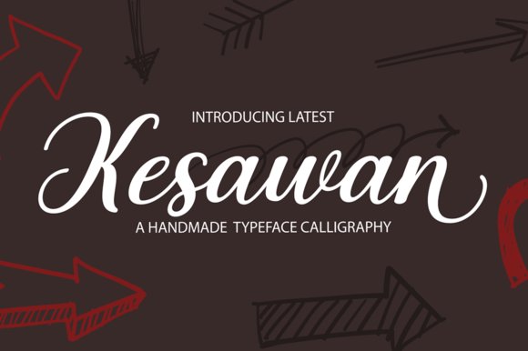
Kesawan Font is a handwritten script that pairs generous flourishes with a measured rhythm, lending a refined hand-crafted feel to stationery and on-paper branding. Its flowing strokes and balanced terminals remain readable at headline sizes and hold up well on RSVP cards and envelope addressing, so Kesawan works especially well as a Font for wedding invitations and small-format typographic details. OpenType alternates and swashes provide plenty of decorative options, and the PUA encoding lets users access those glyphs without complex software. The letterforms feel deliberate rather than fussy, which helps maintain elegance across a variety of print finishes.
On textured stock with foil or letterpress, Kesawan’s curves render smoothly and the swash endings avoid heavy ink build-up, producing a clean printed result. Kerning is careful but names with repeated ascenders or consonant clusters may benefit from minor manual tweaks to avoid collisions. For practical suites, pair Kesawan with a neutral geometric sans for body copy or a low-contrast serif for programs to keep hierarchy clear and readable. It suits boutique, intimate, and modern-romantic celebrations where a hand-lettered voice is preferred over rigid script styles.
My Recommendation: I would reach for Kesawan when I want calligraphic charm without the complications of custom lettering. The PUA-encoded swashes let me produce varied layouts quickly, and the font prints beautifully in metallic foils or deep inks, making it ideal for small to medium wedding suites, envelope addressing, and signage. For projects needing clear body text alongside decorative headings, pairing Kesawan with a clean sans helps preserve legibility while retaining a personal, handcrafted aesthetic.
Picking a Font for wedding invitations comes down to three things: how it reads at invitation sizes, how it fits your wedding tone, and how it reproduces on your chosen paper. Test a few of the 91 recommended fonts on a printed sample before committing.
With a clear sense of style and a short printed test, you can select a typeface that complements your wording, venue, and color palette – giving guests a perfect first impression of your day.

One Comment