39 Elegant Script Fonts For Logo Brand Identity Design 2026
script fonts for logo play a big role when you want Wedding Invitations to feel handcrafted and personal. This collection highlights 39 typefaces that span classic calligraphy, modern brush scripts, and refined cursive styles so you can match tone and legibility.
Each entry includes a brief note on temperament, recommended pairings, and license details to help you test fonts at different sizes and in print or digital layouts. Use the samples to narrow choices quickly and focus on contrast, spacing, and stylistic alternates.
1. Metron Font
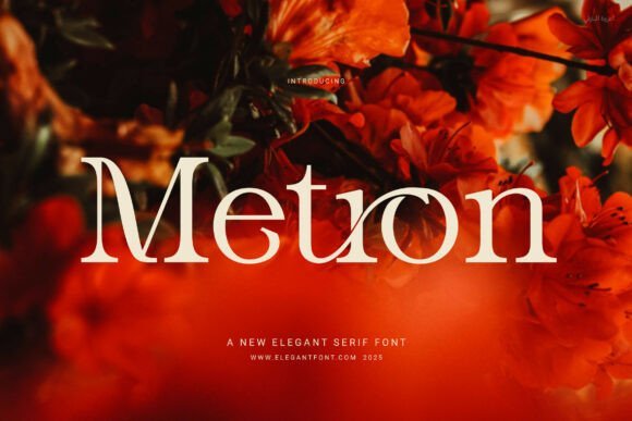
Metron Font – Metron presents a modern serif voice built around measured proportions and subtle contrast; its smooth bowls and tapered terminals give text a composed, readable appearance across display and body sizes. OpenType features such as contextual ligatures, alternates, and refined kerning reduce visual collisions and let logotypes feel custom-made without hand-drawing each letterform.In logo work Metron can anchor a brand with quiet authority and pairs well with script fonts for logo projects when you want a structured nameform beside a flowing signature. It performs reliably on labels, editorial mastheads, and embossed packaging where consistent stroke weight and clear counters matter for reproduction and legibility.
My Recommendation: I reach for Metron when a brand needs a poised serif that still reads cleanly at small sizes; its ligatures and optical adjustments save time when building a logotype. The font’s restrained contrast makes it a safe bet for print, digital, and embossing workflows. Use it for fashion labels, magazine headers, premium packaging, and any identity that benefits from a refined, readable serif.
2. Sylvaris Split Monogram Font
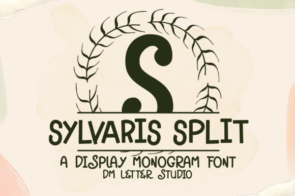
Sylvaris Split Monogram Font – Sylvaris Split Monogram rethinks the classic serif monogram by carving a horizontal break through each uppercase glyph, creating a neat editable band ideal for inserting initials, dates, or short names. The letterforms carry delicate flared serifs and botanical-inspired curls that read decorative without becoming fussy, so the mark feels handcrafted while remaining orderly.This format excels for engraved gifts, wedding suites, and boutique identity badges where personalization is key; the middle gap accepts tiny copy or decorative elements without distorting the letter’s silhouette. The family ships with full punctuation, numerals and extended language support, plus clean outlines suitable for Cricut, laser engraving and vector export in common design apps.
╰┈➤ Download Sylvaris Split Monogram Font
My Recommendation: I choose Sylvaris Split Monogram when a project calls for personalized luxury-its break makes adding names or dates effortless and visually elegant. The botanical flares give monograms a signature look that translates well to embossing, vinyl, and signage. It’s perfect for wedding stationery, bespoke packaging, engraved gifts and small-batch craft products where a refined monogram amplifies perceived value.
3. Wonderful Background Font
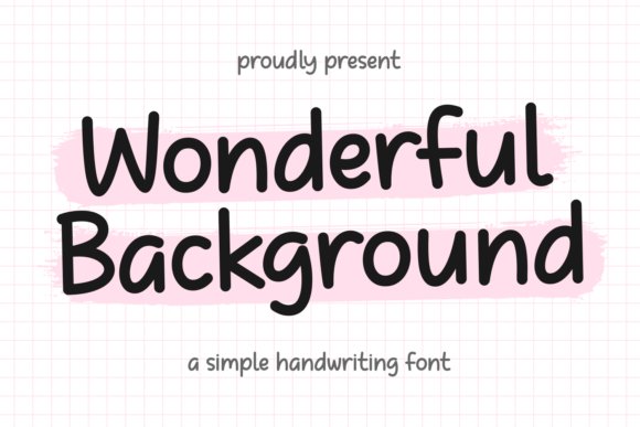
Wonderful Background Font – Wonderful Background blends a hand-written sensibility with a clean, monoline construction to produce a friendly, contemporary script that stays legible at display sizes. The even stroke weight and open counters let it behave predictably across print, apparel tags and web headers, while alternate glyphs add casual personality without sacrificing clarity.On product labels and lifestyle identities this typeface reads like a relaxed signature and works well alongside stronger geometric sans-serifs for contrast. It supports multiple languages, exports clean SVG/OTF outlines for craft cutters and screen printers, and responds well to modest tracking and baseline adjustments when turning a name into a logotype.
╰┈➤ Download Wonderful Background Font
My Recommendation: I’d pick Wonderful Background for brands that need an approachable handwritten mark-think cafés, boutique goods, and seasonal packaging. Its monoline strokes simplify reproduction for embroidery, vinyl cutting and print, saving setup time on craft and apparel runs. Use it where a personal, friendly signature complements imagery or a bold sans provides structural balance.
4. Modern Hand Flow Font
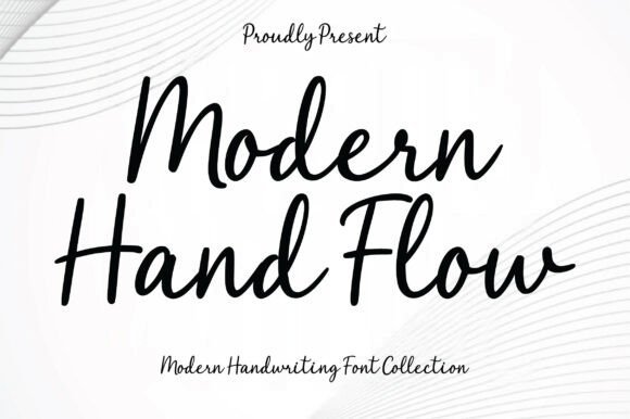
Modern Hand Flow Font – Modern Hand Flow channels relaxed handwriting into a polished script that reads clearly at a glance. Its flowing strokes and medium-weight letterforms keep each word legible while offering the kind of personality many designers want from script fonts for logo work, signature treatments, and branded headlines. The connections between letters feel organic rather than forced, which helps the font retain warmth without losing visual order.On a technical level Modern Hand Flow handles spacing and kerning sensibly, so it behaves well in short logotypes and on product labels where space is tight. Slightly rounded terminals and consistent stroke contrast mean it scales nicely across screens and print; pair it with a geometric sans for balance or use as a standalone signature mark when you need a human touch with dependable readability.
╰┈➤ Download Modern Hand Flow Font
My Recommendation: I would pick Modern Hand Flow when a brand needs an authentic handwritten look that still reads well at small sizes. It gives logos a friendly tone without becoming fussy, and its steady letter spacing makes layout decisions easier. Ideal for boutique shops, lifestyle brands, and personal identity marks where approachability matters.
5. Crispy Bites Font
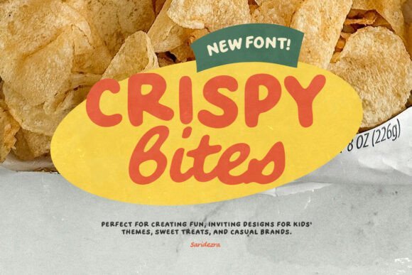
Crispy Bites Font – Crispy Bites is a family of playful handwritten styles with both regular and bold weights plus an italic option for added motion. The uppercase sans pairs with the lowercase script to create a duo-like feel that can simulate a hand-lettered logo while keeping headline clarity, which is handy for stickers, packaging, and kid-focused identities. Rounded shapes and generous counters give it a cheerful, tactile presence on labels and social posts.Because the strokes are friendly and relatively thick, Crispy Bites performs well at small scales and on textured surfaces like kraft paper or vinyl. Multilingual support and the bold cut widen its applications to product lines and retail displays; consider mixing the caps-only sans with the flowing lowercase for a custom mark without heavy custom lettering work.
╰┈➤ Download Crispy Bites Font
My Recommendation: I reach for Crispy Bites when a project needs playful energy and instant charm, especially for children’s products, bakeries, or casual food brands. The dual feel between the caps and script lets you imply a custom logotype without long lettering sessions. Use the bold weight for packaging headlines and the regular for supporting copy to keep a cohesive, joyful look.
6. Singtton Vintage Font
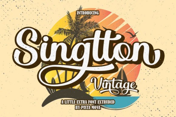
Singtton Vintage Font – Singtton Vintage leans into bold retro script forms with confident, sweeping strokes that evoke mid-century signage and poster lettering. A rich set of alternates and ligatures gives designers the freedom to craft distinctive wordmarks and vintage-inspired logotypes that read like custom hand-drawn type. The heavy weight makes it particularly effective where the mark must hold its own across storefronts, labels, and promotional merchandise.Pay attention to OpenType features: stylistic alternates can break up repetition in long names, while tight kerning will preserve the intended compact look typical of retro badges. This font shines in apparel branding, craft packaging, and any context where a bold, nostalgic presence is desirable; pair it with a narrow sans or a textured background for authentic period character.
╰┈➤ Download Singtton Vintage Font
My Recommendation: I choose Singtton Vintage for projects that need loud, confident personality with a nostalgic edge-think tees, beer labels, and retro cafés. The alternates let you craft logotypes that stand apart without extra lettering, and the bold weight reads well from a distance. It’s a go-to when the brief calls for vintage charisma rather than subtlety.
7. Pablo Duo Font
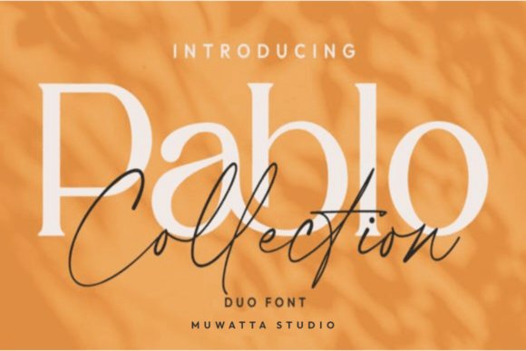
Pablo Duo Font – Pablo Duo pairs an expressive script with a refined serif to create a high-end signature suited to brand identities and premium packaging. The script side offers generous ligatures, elegant swashes and tightly kerned connections while the serif provides structure and readable wordmarks, making it a strong option among script fonts for logo use and luxury stationery. That contrast helps the pair function as both a signature-style logotype and a headline system across print and digital applications.Technically the duo feels polished: alternates and contextual forms give designers control over flourish density, and the serif balances weight for clear stacked lockups. Use the script sparingly as a focal point and let the serif carry longer lines or tagline text; this keeps visual hierarchy intact while preserving a handcrafted impression. Small test prints retained detail well, which is helpful for embossed business cards, labels and monograms.
My Recommendation: I reach for Pablo Duo when a project needs a refined, fashion-forward personality-think boutique perfumery, artisan labels, or wedding stationery. The script provides a convincing signature while the serif stabilizes longer copy, so I can create cohesive marks without hunting for a matching partner. Its alternates and swashes give me creative options without sacrificing legibility on small collateral.
8. Joanne Smith Font
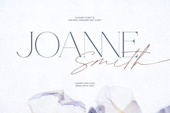
Joanne Smith Font – Joanne Smith bundles an elegant serif with a natural handwritten script, designed so the two feel like members of the same family rather than shoehorned companions. The serif reads crisply at small sizes and carries a refined contrast, while the script mimics casual pen strokes and offers multiple stylistic sets that soften formal layouts. That balance makes the pair well suited for brand identities, event invitations, and editorial accents where both personality and clarity are required.OpenType features such as contextual alternates and discretionary ligatures give the script a believable handwritten flow without awkward collisions, and the serif’s spacing helps for clean logo lockups or wordmarks. I found the combination quick to implement when creating stationery suites because the visual tone is already aligned. It works particularly well when the script is used as a signature element paired with the serif for supporting copy or taglines.
╰┈➤ Download Joanne Smith Font
My Recommendation: I recommend Joanne Smith for projects that need an approachable yet polished voice-wedding invites, boutique branding, and hospitality menus are ideal. The ready-made pairing saves time on font matching and keeps consistency across collateral. For clean application, use the script for display or signatures and reserve the serif for body copy and taglines.
9. Bestary Font
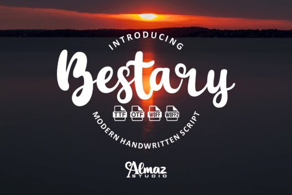
Bestary Font – Bestary is a minimalist script with pronounced curves and decorative loops that hint at vintage charm while staying contemporary in proportion. Its letterforms lean into curved terminals and selective exaggeration, which makes it an attention-grabbing choice for headlines, album covers, and product labels where a hint of mystique is desirable. The overall feel reads as a curved display typeface that brings personality without becoming ornamental clutter.From a practical standpoint Bestary performs best at larger sizes where its swashes and terminals can breathe; small-size legibility is good but requires tighter kerning and careful line spacing. The font offers alternate glyphs and some swash options that let you tailor the flourish level; pairing it with a neutral sans or a compact slab helps stabilize layouts. I tested it on mock packaging and found it adds a boutique vibe without overwhelming supporting graphics.
My Recommendation: I pick Bestary when I want a graceful, slightly mysterious voice for covers, branding, or limited-run packaging. It shines at display scale and responds well to typographic tweaking like adjusted kerning and selective alternates. Use it against simple backdrops and pair it with a clean companion face to keep the composition readable and focused.
10. Rattesh Font
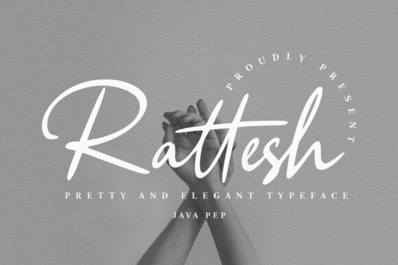
Rattesh Font – Rattesh is a refined script and handwritten typeface with graceful strokes and decorative terminals that read like careful pen work. It ships with extensive ligature sets and alternate glyphs, so letter combinations flow naturally and short names can feel bespoke; the collection is well suited to designers comparing script fonts for logo applications who want a signature-like mark. Spacing is balanced and swash options are plentiful, which helps when composing compact logotypes or expressive wordmarks.The font supports OpenType features such as discretionary ligatures and contextual alternates to avoid repeated letterforms and create subtle variation across words. Use it for branding, packaging, editorial headers and product labels where a handcrafted tone adds personality, and pair Rattesh with a low-contrast sans to keep layouts readable. Test at small sizes since fine hairlines may soften in certain print processes.
My Recommendation: I reach for Rattesh when a brand needs a personal, calligraphic identity-its ligatures and alternates make short names read like signatures. The broad glyph set cuts down on manual tweaking and speeds up logo exploration. I recommend it for boutique labels, wedding brands, and any project seeking an elegant handwritten presence.
11. Bronx Simpul Duo Font
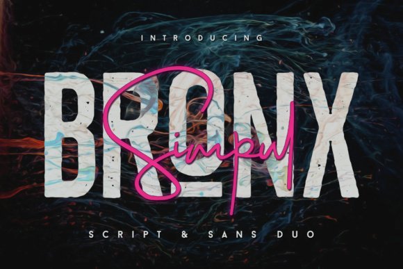
Bronx Simpul Duo Font – Bronx Simpul Duo pairs a lively script with a clean serif family and includes filled, outline and trace treatments for the serif companion. The script provides upper and lowercase letters, numerals and punctuation with discretionary ligatures to add organic variation, while the alternate serif version gives different letter shapes so repeating characters don’t look identical. This combination creates a readable yet decorative pairing that can adapt across brand assets.The duo excels for logo names, watermark marks and packaging where contrast between flowing handwriting and structured type matters. Swapping between the script, the clean serif and the outline style lets you test distinct moods without rebuilding layouts. OpenType support automates many alternates in apps that support discretionary ligatures, saving time during composition and mockups.
╰┈➤ Download Bronx Simpul Duo Font
My Recommendation: I use Bronx Simpul Duo when a project needs both friendliness and structural clarity; the script adds warmth while the serif anchors layouts. The outline option is particularly handy for badges and labels where fill needs to be minimal. It’s a solid pick for boutique packaging, wedding stationery and lifestyle branding.
12. Creative Romance Font
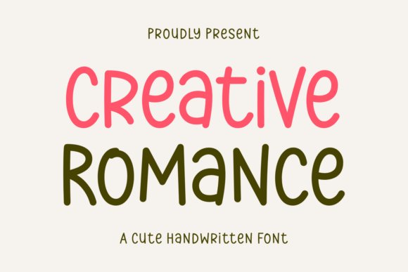
Creative Romance Font – Creative Romance is a playful handwritten font with rounded terminals and lively irregularities that read as handcrafted rather than mechanical. Stroke contrast is gentle so the letters remain readable at display sizes while still projecting a casual, friendly voice that suits informal brand identities. The overall rhythm makes it a good fit for apparel prints, framed quotes and approachable logotypes.The character set covers basic punctuation and numerals and pairs nicely with a narrow sans to keep compositions balanced. It performs well on merchandise and signage, though tracking adjustments help when forming multi-word logotypes to maintain even texture. Alternate forms and contextual swaps provide mild variety so repeated words avoid a stamped look.
╰┈➤ Download Creative Romance Font
My Recommendation: I choose Creative Romance for brands that want cheerful, handmade energy-its quirks read well on tags and posters. The font makes simple phrases feel personal without heavy production work. Ideal uses include children’s products, craft labels and friendly lifestyle logos.
13. Simply Pleasures Font
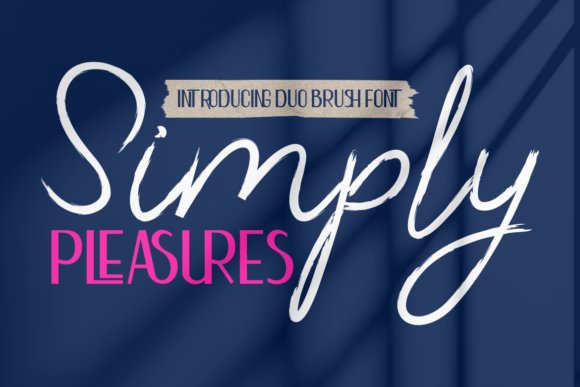
Simply Pleasures Font – Simply Pleasures pairs a lively modern brush script with a clean sans-serif to create a friendly yet refined voice. The brush strokes carry visible texture and a range of ligatures that feel handcrafted, while the sans provides measured contrast for legibility. If you work on script fonts for logo projects, this duo gives you the expressive, signature-style script needed for marks plus a neutral partner for supporting text and lockups.The combination suits packaging, event stationery, social headers, and editorial covers where a personal touch must coexist with clear typography. Use the brush for initials, headlines, or logotypes and the sans for sublines, tags, and product information; the pairing preserves hierarchy without competing for attention. Small details like alternate characters and connected strokes make it simple to craft a bespoke-looking identity without building letterforms from scratch.
╰┈➤ Download Simply Pleasures Font
My Recommendation: I reach for Simply Pleasures when a brand needs warmth without losing clarity. The brush script gives logos a memorable personality while the sans keeps packaging copy readable. For boutique stores, wedding suites, or lifestyle product labels this duo speeds up the design process and still feels handcrafted.
14. Veloura Crest Monogram Font
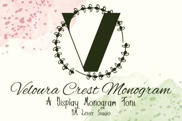
Veloura Crest Monogram Font – Veloura Crest Monogram presents an ornamental serif set built around uppercase monogram forms, each letter framed with graceful curves and leaf-like swashes. The decorative elements are carefully balanced so initials read cleanly at small sizes while still delivering a decorative, heirloom feel. The overall effect evokes heraldic crests and engraved seals without sacrificing the structural clarity you’d want for branding marks.This font fits refined logo work, embossed stationery, personalized gifts, and premium product labels where a sense of heritage is desirable. Pair a monogram initial with a simple sans or a minimal script to maintain visual contrast and ensure the mark scales for signage or digital use. The robust serif skeleton makes it suitable for laser engraving and craft machine projects as well as print and web assets.
╰┈➤ Download Veloura Crest Monogram Font
My Recommendation: I would pick Veloura for projects that need a formal, handcrafted touch-wedding monograms, boutique identity marks, or premium packaging. Its ornamentation reads well in embossing and engraving, which is rare among decorative sets. For any brand aiming for a vintage-luxe impression, this font delivers character while staying practical.
15. Germany Duo Font
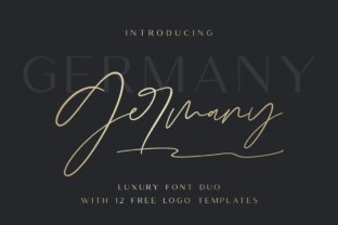
Germany Duo Font – Germany Duo bundles a polished script with a high-contrast sans to offer a refined pairing for contemporary identities. Included are a free-flowing script, an uppercase-only sans with bold contrast, a ligature-rich variant, and a monoline option that simplifies forms for minimalist treatments. The set of twelve editable logo templates showcases ready-made compositions that combine both faces into cohesive marks ready for quick customization.These fonts work well for modern lifestyle brands, editorial mastheads, wedding collateral, and product labeling where you want a blend of personality and typographic precision. Switch between the monoline or high-contrast sans to shift tone from casual luxe to formal minimalism without changing the core letterforms. The logo templates are a practical shortcut-adapt the layouts and you can produce distinct brand assets fast while maintaining a uniform voice.
My Recommendation: I use Germany Duo when a project benefits from multiple typographic moods within a single identity system. The various script and sans styles let me dial in formality or friendliness as needed, and the editable logo templates cut development time. It’s especially handy for boutique brands and printed goods where cohesive, high-impact marks matter.
16. Red Hair Sensual Duo Font
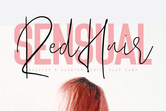
Red Hair Sensual Duo Font – Red Hair Sensual Duo pairs a loose, handwritten script with a compact serif to produce a friendly, handcrafted logotype that still reads crisply at small sizes. The script offers varied stroke width, lively alternates and subtle ligatures while the serif anchors headlines or taglines, making it a strong candidate among script fonts for logo work that needs personality without losing clarity. Careful kerning and selective use of alternates turn the duo into a bespoke signature or a multi-line brand lockup.Apply the script for the primary name and the serif for supporting copy to keep hierarchy clean on packaging, stationery and web headers; swap swashes sparingly so the mark remains legible across scales. The pair works well with muted palettes or tactile print finishes, and it responds nicely to slight tracking and manual kerning when you craft a unique wordmark or social media header.
╰┈➤ Download Red Hair Sensual Duo Font
My Recommendation: I reach for Red Hair Sensual Duo when a brand needs warmth and a human touch without sacrificing professionalism. The script provides character for signatures and boutique brands, while the serif keeps lines of copy tidy. For wedding suites, artisanal labels, or intimate lifestyle brands this pairing lets me build an identifiable logotype quickly and refine it with just a few alternate glyphs.
17. Bigetons Font
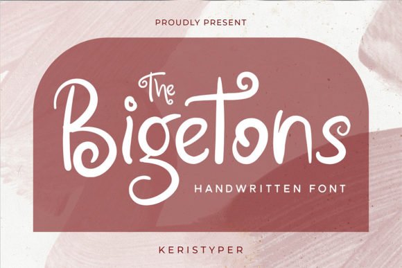
Bigetons Font – Bigetons arrives with bold, friendly letterforms that read strongly at display sizes, making it suitable for headline-driven identities and attention-grabbing logo marks. The shapes have playful proportions and sturdy terminals, so they hold up on posters, social posts and movie title screens; big counters and chunky strokes keep short words readable from a distance. When paired as a primary display face it handles condensed layouts and poster-style compositions well.As a partner to neutral body text, Bigetons functions as a confident headline choice next to a simple sans or humanist serif, helping a brand speak with character without complex ornament. Use uppercase for logos with a compact footprint or mix case for a friendlier tone, and be prepared to adjust tracking for logo lockups to avoid cramped joins between rounded characters.
My Recommendation: I would use Bigetons for energetic brands that need strong visual impact-think entertainment, youth-focused products, and poster campaigns. Its bold letterforms make it ideal for headlines, badges, and social banners where immediate recognition matters. I often pair it with a plain text face so the personality sits in the title while body copy remains unobtrusive.
18. Painting Font
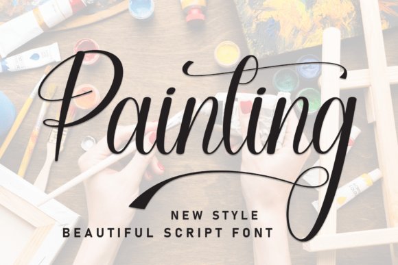
Painting Font – Painting is a brush-script style that replicates a fine-tipped, calligraphic stroke with dramatic swashes and high-contrast lines, giving words a crafted, artisanal presence. The typeface favors pronounced flourishes and rhythmic letter connections, which make short wordmarks and headlines feel hand-rendered and expressive; its PUA-encoded glyphs ensure special characters and decorative alternates are easy to access. For logo work, the font becomes most effective when you choose a restrained composition and trim superfluous swashes.Pair Painting with a clean geometric or humanist sans to let the script dominate the visual hierarchy while secondary text remains readable, especially on labels and editorial covers. When used in packaging or luxury invitations, convert the wordmark to outlines and refine junctions to avoid awkward overlaps at small sizes; the result is a bespoke, brush-painted identity rather than a generic script.
My Recommendation: I like Painting for projects that need an authentic hand-painted feel-wine labels, boutique hospitality brands and high-end editorial covers benefit from its flourish and movement. It demands careful spacing and selective use of alternates, so I reserve it for short names or focal headlines rather than running text. When treated as a bespoke element and refined in vector form, it gives logos a crafted, premium presence.
19. Bethalora Font
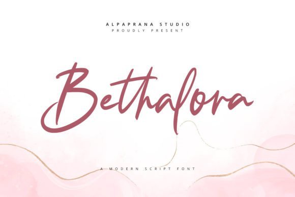
Bethalora Font – Bethalora reads like a refined handwritten signature, its strokes moving between slim hairlines and confident swells. If you’re selecting script fonts for logo work, Bethalora’s ligatures and alternate characters let you fine-tune letter connections and create distinctive wordmarks. Swashes are measured rather than overwhelming, which keeps the mark elegant without burying legibility.OpenType features include stylistic sets, contextual alternates, and tight kerning suited to display sizes. It performs well on packaging, boutique signage, and social profiles where a personal, upscale feel is the goal. Use short names or initials rather than long sentences to preserve clarity.
My Recommendation: I reach for Bethalora when a project calls for a luxurious, handwritten signature that still reads clearly at display sizes. Its alternates and swashes let me shape unique wordmarks quickly without custom lettering. Ideal for boutique fashion labels, wedding stationery, and premium product branding where a refined, personal touch matters.
20. Beluyha Font – script fonts for logo
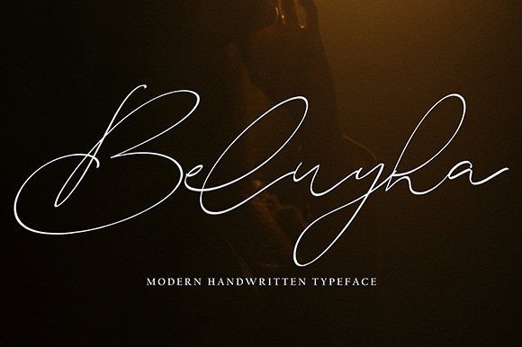
Beluyha Font – script fonts for logo – Beluyha moves with airy loops and soft terminals that read as intimate and approachable rather than fussy. The weight remains light, giving text room to breathe and preventing dense textures when used on darker backgrounds. Its rhythm works especially well for brands seeking a gentle, hand-lettered impression.OpenType alternates and swashes are plentiful, making it straightforward to craft matching initials or stylized monograms. It shines on wedding suites, beauty labels, and lifestyle blogs where refined ornamentation supports messaging. Test at multiple sizes and adjust tracking to keep thin stems visible in print.
╰┈➤ Download Beluyha Font – script fonts for logo
My Recommendation: I like Beluyha when a design needs a delicate, romantic feel that still functions across print and screens. The abundant alternates make it easy to personalize initials and pairings without complex edits. Use it for wedding branding, boutique beauty labels, and editorial headers that call for a soft, handcrafted voice.
21. Bhailando Font
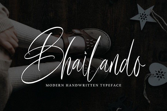
Bhailando Font – Bhailando brings an energetic, brush-led personality with broad strokes and playful terminals that feel handmade. The letterforms carry a lively tempo suitable for logos that need character without heavy ornament. Its stronger stroke contrast gives good presence on storefronts and product labels.Included alternates and discretionary ligatures allow quick tweaks to spacing and rhythm without redrawing. It handles display headlines, badges, and logotypes where legibility at a glance matters. Pair with minimal sans companions to keep the overall brand mark from becoming crowded.
My Recommendation: I choose Bhailando when a project requires bold, lively script that reads well across scales and materials. The brush-driven letterforms and alternates make it fast to craft distinctive marks while keeping the process efficient. Best suited for cafés, lifestyle brands, streetwear labels, and packaging that benefit from a spirited, handcrafted look.
22. Disttoris Andarlin Font
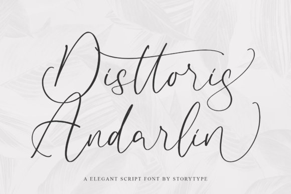
Disttoris Andarlin Font – Disttoris Andarlin feels like a modern calligraphy signature: high-contrast strokes, long swashes and a generous set of alternate characters that let you craft a distinctive wordmark. Among script fonts for logo work, it reads as polished and ornamental without tipping into excess, thanks to tidy terminals and thoughtful ligature choices.Use the font for premium branding, boutique packaging or social media headers where a luxurious handwritten vibe is needed; it pairs well with a clean sans for balance and holds up best at medium to large sizes. Expect to fine-tune tracking for short names and to use OpenType alternates for a handcrafted feel that still looks deliberate on print and digital assets.
╰┈➤ Download Disttoris Andarlin Font
My Recommendation: I’d reach for Disttoris Andarlin when I want a fashion-forward or wedding-brand aesthetic that reads like a crafted signature. Its swashes and alternates help create memorable logos and stylish Instagram headers, while pairing with a simple sans serif keeps the result readable. It’s a good choice when you want elegance without losing control over spacing and legibility.
23. Higanbana Font
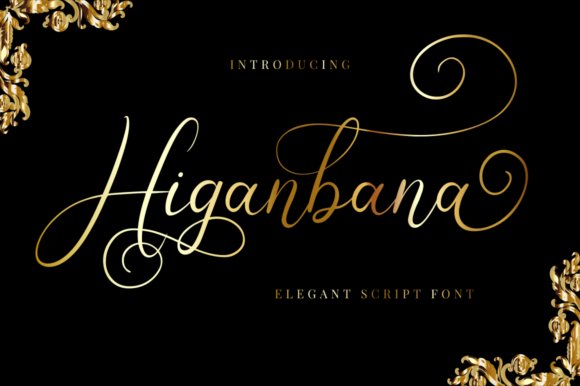
Higanbana Font – Higanbana leans into natural handwriting with warm, slightly irregular strokes and a relaxed baseline that feels personal rather than engineered. The design contains readable lowercase forms and several stylistic alternates; PUA encoding means glyphs and swashes are accessible in most design apps without extra steps.Because of its organic texture, Higanbana works well on invitations, product labels and brand identities that aim for an intimate, artisanal tone; pair it with a restrained serif or a neutral sans to keep layouts grounded. It scales nicely for print and on-screen use, though very small text benefits from tightened letterspacing to retain clarity.
My Recommendation: I would pick Higanbana for projects where a handmade, friendly voice is desirable-think boutique packaging, wedding stationery, or lifestyle blogs. The PUA-coded alternates make it practical for non-specialist designers, and its balanced strokes give you charm without sacrificing readability. It’s especially useful when you want a personal touch that still fits into modern layouts.
24. Black Cloud Font
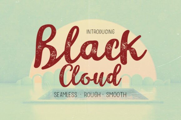
Black Cloud Font – Black Cloud mixes comic-style bold script with loose handwriting to produce an energetic, approachable display face that snaps on attention. The letterforms feature rounded terminals, chunky strokes and playful ligatures; these traits make it ideal for headlines, badges and graphic marks that need personality rather than subtlety.This font family suits merchandise, kid-focused brands and casual apparel where bold shapes improve visibility and mood. Keep it large for best impact-on T-shirts, stickers or social posts it reads instantly, but for tiny captions you’ll need a slimmer companion or a condensed version to preserve legibility.
My Recommendation: I’d use Black Cloud when a brand needs a lively, bold voice-streetwear labels, cafés with a playful identity, or event posters where energy matters. It stands out on merchandise and social artwork and pairs nicely with minimal sans faces to prevent visual clutter. For projects demanding cheer and immediacy, this font delivers strong character with clear practical use.
25. Nadya Font
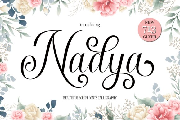
Nadya Font is a restrained handwritten design with smooth, slightly slanted strokes and open counters that keep the letters readable even at small sizes. Among script fonts for logo, Nadya stands out for its tidy swashes and consistent weight, which help maintain clarity when used as a signature mark or watermark. The letterspacing feels deliberate, so it maps well onto business cards, album covers, and social imagery.PUA encoding gives straightforward access to alternates and decorative swashes without complex font tools, so you can apply stylistic sets directly in most editors. For brand work, pairing Nadya with a minimal sans or a narrow slab adds contrast and keeps the signature readable in busy compositions. Small adjustments to kerning and baseline on longer words will keep the flow natural.
My Recommendation: I would reach for Nadya when a project needs a refined handwritten signature that still reads clearly at small sizes. The PUA glyphs make swapping in alternates and swashes quick, which saves time during revisions. It’s especially well-suited to photographers, boutique labels, and personal-brand logos where a polished, human touch matters.
26. Emeland Font
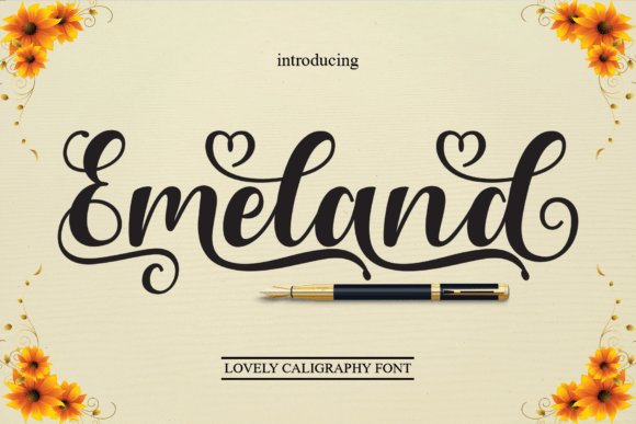
Emeland Font takes a more carefree handwritten tone with slightly irregular strokes and lifted terminals that suggest natural pen pressure. It keeps legibility high through a friendly x-height and clear joins, making it a comfortable choice for quotes, packaging labels, and social headers. The overall rhythm has a relaxed cadence that reads well across both print and screen contexts.Emeland is PUA encoded so decorative alternates and swashes are easy to reach without digging through glyph panels. Designers should try it at a range of sizes-the charm pops when letters have room to breathe-and pair it with a neutral sans to anchor brand applications. Light tracking and selective swash edits turn simple wording into a bespoke lockup.
My Recommendation: I recommend Emeland for projects that need an approachable, handwritten voice without sacrificing clarity. It shines on lifestyle packaging, greeting cards, and editorial pull-quotes where warmth is the priority. The PUA features speed up customization, which makes it practical for quick branding sprints.
27. Shadyspeed Script Font
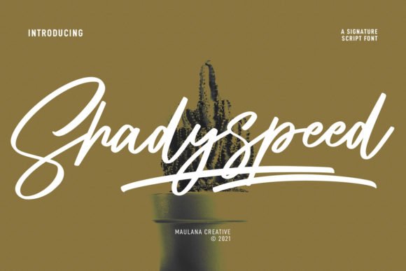
Shadyspeed Script Font reads like a contemporary signature with expressive stroke contrast and brisk letterforms that suggest motion. It includes lowercase alternates, swashes, and ligatures that allow construction of compact logotypes or sweeping headlines suited to film titles and bold social campaigns. The steady regular weight helps the face reproduce reliably across posters and merchandise.Since alternate sets are shipped in separate files, finishing a wordmark may involve toggling files or converting to outlines to lock in letter joins. In tight logotype situations, trimming swashes and tightening kerning produces a polished, professional result while preserving character. Treat the face as a strong starting point for refinement when crafting a bespoke brand mark.
╰┈➤ Download Shadyspeed Script Font
My Recommendation: I choose Shadyspeed when a brand needs an energetic, signature-style voice that reads boldly at display sizes. Its alternates and ligatures let me shape unique wordmarks that still feel handwritten. It’s ideal for entertainment titles, statement product labels, and social creatives that demand presence and attitude.
28. Floating Script Font
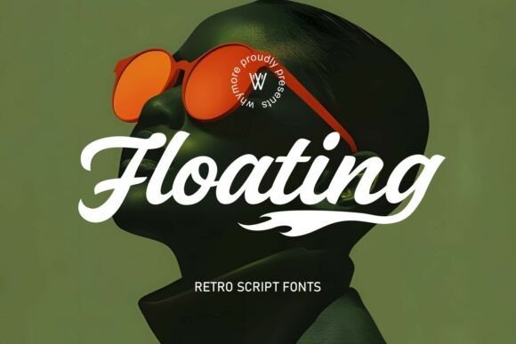
Floating Script Font – Floating Script channels mid-century Chicano lettering and classic sign painting into a bold display face with confident strokes and exaggerated swashes. The letterforms sit between hand-painted tattoo scripts and lowrider signage, giving words a commanding visual rhythm that reads well at headline sizes and on applied surfaces like apparel and album art. Technically it offers tight spacing and strong contrast that make it a natural choice when selecting script fonts for logo work that must read from a distance; alternates and swashes give designers an easy path to bespoke lockups. Use it with a condensed sans for lockups or on curved badges where its heavy terminals and flowing joins become focal points.
╰┈➤ Download Floating Script Font
My Recommendation: I reach for Floating Script when a project needs personality with attitude-think tattoo shops, streetwear labels, or gangsta-rap album covers. Its hand-lettered presence reads like a crafted emblem rather than a generic type choice, so logos feel like they were drawn specifically for the brand. For projects seeking bold identity and cultural flavor, this font gives instant character and plenty of stylistic options.
29. Katvondy Marker Brush Script Font
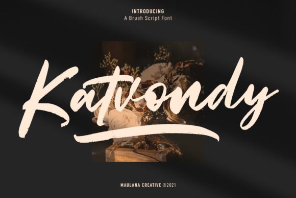
Katvondy Marker Brush Script Font – Katvondy presents a slanted marker-brush aesthetic with thick downstrokes and playful, irregular terminals that mimic quick hand lettering. The slant and weight create momentum on the line, making headings and logotypes feel casual yet assertive, and several quirky glyphs add personality without compromising legibility. This face is ideal for display work where a human, textured mark is desired: social graphics, posters, and cinematic titles all benefit from its bold marker texture and spontaneous flow. Pair it with a clean geometric sans for contrast, or use it as a secondary script to emphasize taglines and callouts in branding systems.
╰┈➤ Download Katvondy Marker Brush Script Font
My Recommendation: I use Katvondy when a brand needs a friendly, lived-in voice-think indie labels, lifestyle products, or promotional art. Its marker texture photographs well on textured backgrounds and reads strongly in social thumbnails. If you want a hand-drawn edge without sacrificing readability at display sizes, this font does the job with charm.
30. Chryselles Script Font
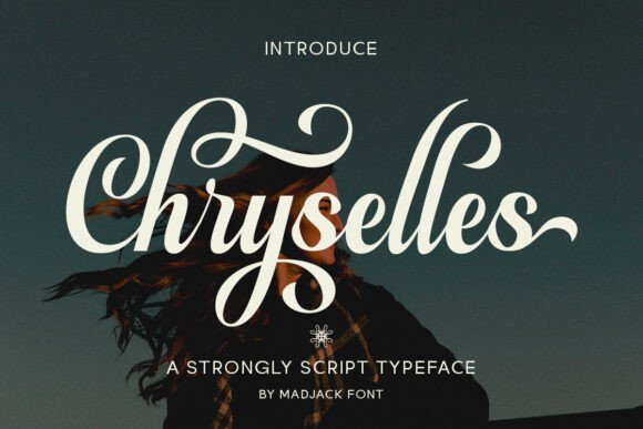
Chryselles Script Font – Chryselles Script blends refined calligraphic strokes with an extensive set of alternates and ligatures, offering designers many ways to customize letter pairings and flourish treatments. With up to 130 style set options, it supports nuanced typography: swashes, contextual alternates, and stylistic caps let you craft elegant wordmarks and decorative headlines. Its multilingual support and OpenType features make it suitable for global branding and formal print items like invitations and premium packaging, where subtlety and variation matter. For logos, the graceful joins produce sophisticated monograms and logotypes that feel custom without the time investment of hand-lettering.
╰┈➤ Download Chryselles Script Font
My Recommendation: I recommend Chryselles Script for boutique brands, wedding suites, or luxury product labels that need a polished, calligraphic touch. The wealth of alternates means you can tailor letter combinations for better balance and unique wordmarks. When a project calls for refined ornamentation and readable elegance, this font provides a fast route to distinctive, upscale typography.
31. Bright Script Font
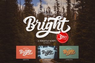
Bright Script Font – Among script fonts for logo, Bright Script stands out with three layered styles: Brush, Clean, and Layered. The brush cut brings a lively, hand-painted texture that suits social-media lettering, motivational posters, and expressive headlines. The clean cut pares back ornament for confident logotypes, apparel branding, and product labels where legibility matters. The layered variant stacks fills, shadows, and outlines so you can mix colors and age the type into a vintage-retro display.Under the hood Bright Script includes alternates and ligatures to smooth connections and avoid collisions, and kerning pairs are prepared for compact wordmarks. Because each style ships separately you can build depth by exporting layers as vectors or using color overlays in layout apps. The face reads well at large sizes while maintaining tidy spacing for short headlines, making it useful for badges and t-shirt prints. Try pairing it with a geometric sans when you need a clear supporting label.
╰┈➤ Download Bright Script Font
My Recommendation: I reach for Bright Script when a brief needs both playful and polished options inside one family. The three-style system saves time when iterating between hand-painted posters and clean logo marks, and the layered mode helps me craft retro effects without extra assets. It’s ideal for apparel lines, poster campaigns, boutique product branding, and any work that benefits from built-in depth and color layering.
32. Bizare Love Monoline Script Font
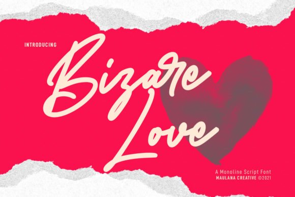
Bizare Love Monoline Script Font – Bizare Love is a casual monoline script that keeps stroke width consistent, giving designs a neat, friendly voice without fuss. Its relaxed connectors and natural rhythm work well for social posts, movie or book titles, boutique signage, and invitation headlines. The overall restraint helps short wordmarks stay legible at small sizes while preserving a handcrafted feel.Included alternates and swashes let you nudge personality into letters without compromising readability, and basic OpenType features handle kerning and smart substitutions. It’s a strong choice for signature-style logotypes or for pairing with a condensed sans in editorial and packaging layouts. The neutral flow of the strokes also performs well alongside minimal iconography and clean layouts.
╰┈➤ Download Bizare Love Monoline Script Font
My Recommendation: I’d use Bizare Love when a brand needs an approachable, human mark that still reads clearly at tiny sizes. It’s great for cafés, lifestyle startups, indie publishers, and social-first campaigns where a handcrafted look should feel tidy. The monoline structure makes it easy to pair with geometric supports and to reproduce across web and print.
33. Sky High Script Font
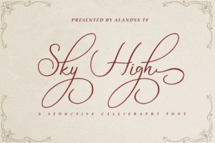
Sky High Script Font – Sky High Script is a classic calligraphic face with sweeping strokes that lend an elegant, refined presence to logos and stationery. It suits wedding suites, boutique branding, premium product packaging, and any application that benefits from a formal handwritten tone. Delicate terminals and fluent connections form a graceful silhouette at display sizes and give names a memorable signature quality.On the technical side it offers ligatures, alternate letterforms, and noticeable contrast between thick and thin strokes, so small tweaks to tracking or weight shift the overall mood. Pair Sky High with a neutral serif or a light sans to ground the composition, or let it stand alone as a signature wordmark. Because of its high contrast, test it at several scales and on textured substrates to ensure consistent legibility.
╰┈➤ Download Sky High Script Font
My Recommendation: I often choose Sky High Script for projects that require a refined, timeless personality, such as wedding brands, artisanal skincare, and editorial mastheads. Its calligraphic rhythm creates a standout signature but benefits from careful spacing and display sizes. Use it for premium labels and invitations where the lettering can be shown prominently and treated with restrained supporting elements.
34. Boardley Script Font
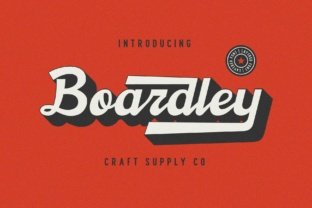
Boardley Script Font – Boardley Script is a layered script drawn from mid-century American and European advertising lettering; it ships with two complementary layers that let you build color, shadow, and inline effects. The letterforms were hand-drawn with deliberate weight contrasts and lively terminals, and the designer paid close attention to spacing and vintage-infused curves. Those vigorous details give the typeface a retro-modern character that reads handcrafted while staying refined.Among script fonts for logo, Boardley Script stands out when you want a tactile, period-specific look without photo textures; the two-layer system creates instant depth for signage and product packaging. Use stylistic alternates and contextual ligatures to refine wordmarks, pair it with a restrained sans for contrast, and experiment with color layering to reinforce an advertising-era mood.
╰┈➤ Download Boardley Script Font
My Recommendation: I would reach for Boardley Script when a brand needs that hand-lettered, mid-century personality-especially for packaging, café signage, or nostalgic product labels. The layered construction speeds up mockups and provides color layering options that read well in print and on screen. Its alternates make it simple to give each logotype a slightly bespoke feel without manual redraws.
35. Tempe! Script Font
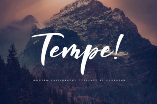
Tempe! Script Font – Tempe! Script is a bold, playful script with rounded terminals and a lively bounce that performs best at display sizes. Thick strokes and a casual flow give headlines and logos an approachable, buoyant voice, while built-in swashes and stylistic alternates allow you to add flourish without creating awkward gaps. The font’s metrics favor short phrases and branding headlines that need instant character.This typeface suits cheerful brand lettering for kids’ products, event posters, and upbeat social campaigns where a confident hand-lettered mark helps visuals pop. Pair Tempe! with a restrained sans or slab to preserve legibility at small scales, and use the exclamation mark as a compositional accent to reinforce energy. Generous counters and broad apertures also keep letterforms readable in condensed layouts.
╰┈➤ Download Tempe! Script Font
My Recommendation: I’d pick Tempe! Script for projects that demand bold personality: product labels for children’s goods, seasonal event posters, or energetic lifestyle brands. Its weight and built-in swashes make short headlines memorable, while the friendly shapes work well on packaging and shop signage. It’s an easy go-to when a logo needs to feel bright and approachable.
36. Sistermoon Script Font
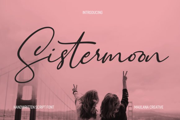
Sistermoon Script Font – Sistermoon Script leans into dramatically slanted pen strokes and flourished terminals, producing a cinematic rhythm across words. The family includes thoughtful ligatures and alternates that let you craft distinctive logotypes or elegant headers while keeping a calligraphic hand that remains legible. Its angle and flow give titles and short lines a stylized motion that feels both theatrical and refined.The slant and ornamentation make Sistermoon ideal for luxury branding, book or movie titles, and social banners where personality matters more than neutral neutrality. Pair it with a clean serif or geometric sans to balance the ornamentation, then use tracking and selective ligature swaps to control rhythm and improve readability. Moderate stroke contrast helps small-size reproduction when spacing is adjusted carefully.
╰┈➤ Download Sistermoon Script Font
My Recommendation: I would use Sistermoon for boutique fashion labels, indie film posters, or beauty and lifestyle brands that want a handwritten yet elevated signature. The alternates and ligatures let each word feel bespoke, which helps premium positioning without needing custom lettering. It works best as a headline or logotype feature rather than as body text.
37. Florateris Script Font
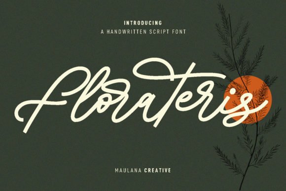
Florateris Script Font – Florateris Script reads like a refined cursive with medium-sharp terminals and steady stroke weight; its letterforms balance flourish and control. The design includes discretionary ligatures and stylistic alternates that let you vary repeated letters without losing harmony, and the nib-like edges give wordmarks a slightly formal, handcrafted feel. Florateris belongs on shortlists for script fonts for logo because those ligatures keep connections flowing while alternates prevent monotonous repetition in a name. It suits social headers, book or movie titles, and compact branding where legibility and personality both matter; tweak tracking for long text and keep default spacing for single-line logos to preserve the handwritten motion.
╰┈➤ Download Florateris Script Font
My Recommendation: I use Florateris when a brand needs elegance with a dash of whimsy-its ligatures create fluid, signature-style wordmarks without sacrificing clarity. It works particularly well for boutique shops, editorial brands, and product packaging that want a hand-crafted identity. Pair it with a clean sans to keep the logo readable across sizes and media.
38. Bestie Monoline Script Font
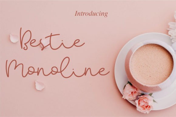
Bestie Monoline Script Font – Bestie Monoline Script presents a uniform, single-stroke aesthetic that reads crisp on screens and print alike. The casual letterforms feature smooth joins and friendly terminals, giving logos a handwritten vibe without rough texture or excessive contrast. Built-in alternates and basic ligatures help avoid collisions in tight letter pairs and polish short wordmarks.Because of its monoline construction, Bestie pairs neatly with condensed sans faces or light serifs to create balanced branding systems; its clarity makes it well suited for app icons, social handles, and product labels. For single-line logos tighten kerning slightly, and for playful headlines widen tracking to emphasize the flow of the script.
╰┈➤ Download Bestie Monoline Script Font
My Recommendation: I reach for Bestie when a project calls for an approachable, personal tone-its clean monoline strokes reproduce reliably at small sizes and on merchandise. It fits cafés, lifestyle labels, and friendly tech brands that want an informal signature. Use bold palettes and simple supporting type to maintain legibility and personality.
39. Madymory Script Font
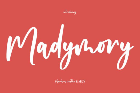
Madymory Script Font – Madymory Script leans into textured, rough strokes that mimic brush or dry-pen marks, giving each glyph a handcrafted, slightly gritty presence. Alternates and expressive ligatures expand options for bespoke wordmarks, introducing subtle differences that make repeated letters feel unique. The weight contrast is moderate, so the font holds texture at display sizes without losing overall cohesion.This script shines in editorial headers, film titles, and boutique packaging where an expressive, artisanal voice is desired; pairing it with a neutral sans grounds the composition and prevents visual clutter. For logo use, test at multiple sizes to preserve textured detail and adjust spacing when ligatures create tight joins to keep the mark readable.
╰┈➤ Download Madymory Script Font
My Recommendation: I pick Madymory when a brand needs character with an artisanal edge-its rough strokes add visible personality that plain scripts lack. It’s ideal for indie films, craft food labels, and fashion capsules where expressive calligraphy helps tell the story. Treat it as a display face and refine spacing and alternates to make a distinctive, memorable logo.
These 39 picks offer a wide range of moods for Wedding Invitations, from formal copperplate looks to casual brush scripts. Try a short test block at invitation size, check essential alternates and ligatures, and confirm the license before committing.
If you need a shortlist, pick three that match your suite’s tone, test them with your venue and names, then choose the one that reads well at small sizes and pairs cleanly with a neutral sans or serif.