10 Craft Fair Sign Fonts for Handmade Stall Displays
This post contains affiliate links. If you buy through them, we may earn a commission at no extra cost to you.
At a busy craft fair, a sign has to introduce your stall before you can greet every visitor. Craft fair sign fonts should fit the handmade products and make the important words easy to find. That does not mean every sign needs the heaviest typeface available: a ceramics collection, a print stall and a sporty accessories range can have very different voices.
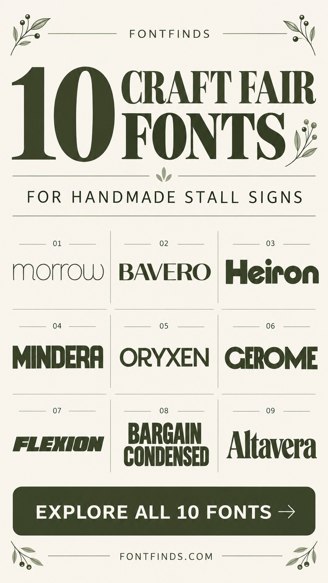
These 10 choices cover stall names and collection headings. Keep prices and longer descriptions in a functional companion where the display face becomes too thin or stylized. The font previews help you compare character; the suggestions explain where each direction makes sense.
Choosing craft fair sign fonts by viewing distance
Separate the big stall name from the small tabletop information. Test the large sign from the distance customers will approach, then read a sample price card at arm’s length. High contrast and plain backgrounds usually help more than extra decoration. Use one consistent system for prices, sizes and product names across the table. A delicate font can suit a close-up boutique card but be the wrong choice for a distant banner, so choose for the job rather than forcing one face onto everything.
1. Morrow: A quiet tabletop collection card
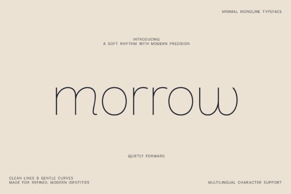
Morrow’s very thin monoline forms suit a close-range boutique card more than a distant stall banner. I would try it for a short ceramics or stationery collection name on a pale, uncluttered card.
Use a stronger companion for prices. The delicate headline can express the collection’s mood while the information shoppers need remains easy to read.
View Font on Creative Fabrica →Preview • Download options • License details
2. Bavero: An editorial handmade-brand header
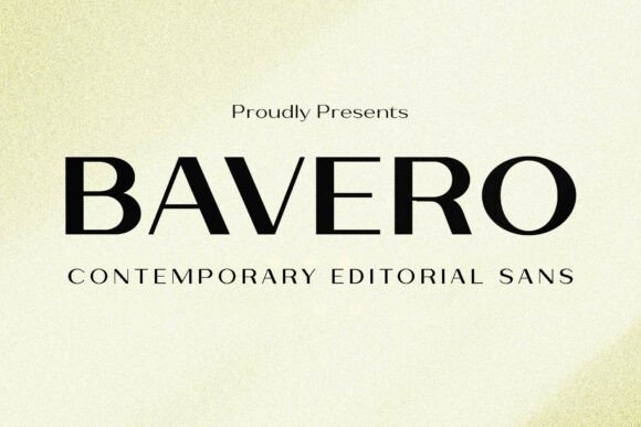
Bavero combines clean sans-serif shapes with contrasting strokes for a more editorial direction. It could suit a carefully styled accessories or print stall with a short brand name.
Compare available weights using the real sign size. The lightest treatment may work on a small brand card, while a stronger version could be more useful at a distance.
View Font on Creative Fabrica →Preview • Download options • License details
3. Heiron: A bold stall-name banner
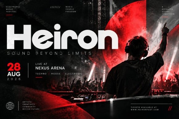
Heiron’s heavy geometric construction gives a short stall name a strong presence. I would use it on a plain horizontal header with generous margins and very little extra wording.
Keep individual product cards lighter in visual weight. That difference makes the stall name easy to locate without turning every label into another competing headline.
View Font on Creative Fabrica →Preview • Download options • License details
4. Mindera: A compact collection heading
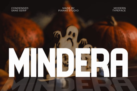
Mindera’s condensed, all-capital direction is useful to test where a heading has limited width. It could support a short collection sign above a display of prints or accessories.
Check the actual wording rather than relying on the specimen. Condensed letters save space, but a long line can still feel dense when viewed across a busy table.
View Font on Creative Fabrica →Preview • Download options • License details
5. Oryxen: A structured modern display
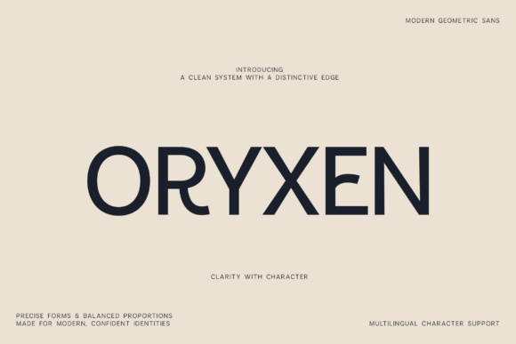
Oryxen’s geometric proportions and architectural details suit a more contemporary stall presentation. Try it for a short brand or collection name with consistent left-aligned product cards beneath.
Use plain price typography to support the system. The distinctive display details should help identify the stall, not make basic information harder to scan.
View Font on Creative Fabrica →Preview • Download options • License details
6. Gobeor: A polished brand-name sign
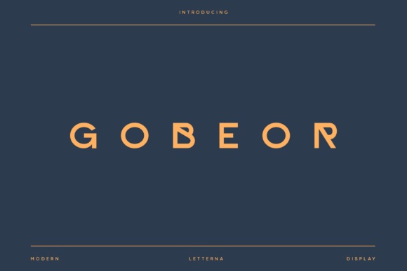
Gobeor is presented as a modern logo-oriented display option. I would compare it on a brief brand name for a stall with clean packaging and a restrained visual identity.
Keep the preview and actual test wording side by side. The supplied description contains broad branding language, so the visible letterforms should drive the final choice.
View Font on Creative Fabrica →Preview • Download options • License details
7. Gerome: A high-impact print-stall headline
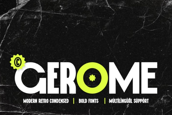
Gerome has a heavy condensed structure with distinctive counter details. It is a strong direction for a print or graphic-design stall that wants an assertive header.
Give the title a simple background and avoid repeating the same decorative counter motif everywhere. One strong headline can anchor a table full of visually varied products.
View Font on Creative Fabrica →Preview • Download options • License details
8. Flexion: A sporty handmade-accessories sign
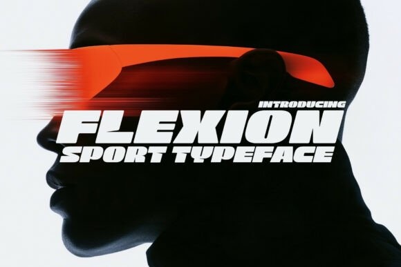
Flexion’s thick athletic forms make sense for a stall selling sport-inspired accessories or energetic graphic products. I would use it for the brand header rather than a long explanatory sentence.
Keep the smaller labels clean and upright. The contrast between an active headline and calm information will make the overall table easier to navigate.
View Font on Creative Fabrica →Preview • Download options • License details
9. Bargain Condensed: A long heading in limited width
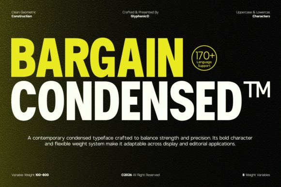
Bargain Condensed offers tall, space-efficient proportions for a longer collection name. It is worth testing where a wide brand title must fit a modest tabletop sign.
Do not use the extra room to add unnecessary words. A shorter message in a generous size will often be easier to spot than a compressed paragraph of selling points.
View Font on Creative Fabrica →Preview • Download options • License details
10. Altavera: An elegant close-range display card
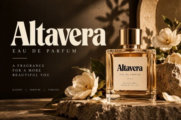
Altavera shows high-contrast serif lettering with a refined display character. I would use it on a close-up jewelry or boutique gift card where a short collection name has enough room to breathe.
Test the fine strokes in print before using it on the main banner. This is a style choice for a specific setting, not a universal replacement for clear price lettering.
View Font on Creative Fabrica →Preview • Download options • License details
Which style would I start with?
Bargain Condensed offers a useful direction for long headings in limited width. Morrow belongs on a quieter close-range card, while Gerome brings more visual force. Build one stall header and one matching price card before extending the system to every product.
Font previews are supplied product artwork. Layout suggestions are editorial ideas; fonts have not been installed or production-tested for this guide. Check the linked listing for the current files, supported characters and license.
More font ideas
Frequently asked questions
Should my stall banner and price cards use the same font?
They can share a display font, but the price cards may need a more functional companion. Consistent alignment, colors and spacing can connect the system even when the text sizes differ.
Can a thin font work for a craft fair sign?
It can work for a close-range card with good contrast. For a sign viewed across an aisle, compare a heavier alternative and test from the actual viewing distance.
How do I check the numerals before using a font for prices?
Type realistic prices with currency symbols, decimal marks and any unit labels. Check that the characters are present and that the numbers are easily distinguished at the intended size.