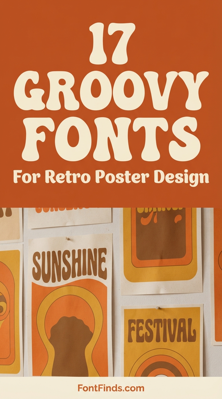
Retro poster design works because the seventies were a poster era. Concert bills, film one-sheets and festival announcements from that decade established a visual vocabulary so strong that using it now triggers instant recognition, even in people far too young to remember it. Getting the typography right is most of the job. These seventeen groovy fonts cover the range, with notes on which suits which kind of poster.
Why Groovy Type Works for Retro Poster Design
Three technical reasons, beyond nostalgia.
Weight. Groovy faces are heavy by default, and posters are read at distance. A thin elegant serif that looks refined on a business card disappears on a wall from ten metres away, whereas a chunky retro face still reads.
Stacking. The style assumes stacked, centred layouts with lines of varying width filling a rectangle. That structure is native to poster design and awkward almost everywhere else, which is why groovy type looks slightly wrong on a website and completely right on a bill.
Reproduction tolerance. The original faces were designed for screen printing and cheap offset on absorbent stock, so they were drawn with fat strokes and generous counters that survive ink spread. Modern posters still get printed cheaply, so those qualities remain relevant.
One thing to decide before choosing. Sixties and seventies lettering look meaningfully different. Sixties is tighter and bouncier with cartoon influence. Seventies is wider, curvier and more psychedelic. If your poster references a specific period, mixing them reads as inaccurate to anyone who knows the difference.
17 Groovy Fonts for Retro Poster Design
Groovy Display
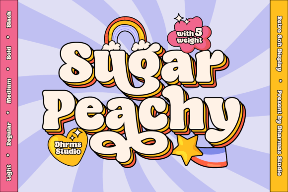
1. Sugar Peachy
Sugar Peachy is the most downloaded font in this collection and it earns that position by being unmistakably seventies without becoming a parody. The curves are generous, the counters are wide, and the overall weight sits heavy enough to dominate a poster from across a room.
Groovy type works on posters specifically because the era it references was a poster era. Concert bills, festival announcements and film one-sheets from the seventies all used this vocabulary, so the association is doing half your design work before you have chosen a colour.
My take: Start here if you are new to groovy type. It is the safest entry point and the one least likely to look like a costume.
View This Font → Free.
All-Caps Vintage
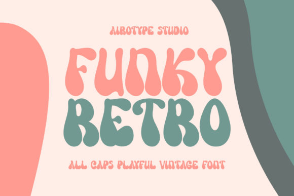
2. Funky Retro
Funky Retro is an all-caps vintage display face with a bold, dynamic character. All-caps is a meaningful limitation for poster work, because it removes the ascender and descender variation that normally creates rhythm in a headline.
What you get instead is a solid rectangular block of type, which is exactly what a poster headline often needs. Uniform cap height means the words stack cleanly with no awkward gaps, and stacked type is the defining structure of retro poster layout.
My take: Best used stacked in three or four lines. All-caps fonts were made for that structure and this one stacks beautifully.
View This Font → Free.
Soft Groovy
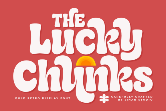
3. Lucky Chunks
Lucky Chunks combines bold retro proportions with soft rounded curves, which sits it at the friendlier end of the groovy range. Rounding removes aggression from a heavy typeface without removing its presence.
That matters for the kind of poster this suits. Music festivals, farmers markets, community events and anything family-facing want visual energy without hostility, and a rounded groovy face delivers exactly that balance. Sharper retro faces read as harder-edged.
My take: The pick for community and family event posters. Rounded groovy type is welcoming in a way angular retro is not.
View This Font →
True Retro
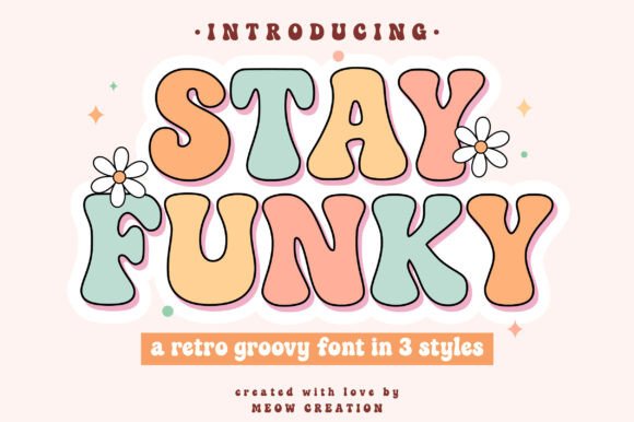
4. Stay Funky
Stay Funky is a bold playful groovy face that captures a genuine retro feel across multiple styles. Multiple styles in one purchase is a real advantage for poster work, because posters need hierarchy.
A single-weight display font forces you to create hierarchy through size alone, which is crude. Having a second style lets you set a headline in one and a subhead in the other while keeping the whole poster tonally consistent.
My take: Buy multi-style groovy fonts over single-weight ones. Posters need at least two levels of hierarchy and size alone is not enough.
View This Font →
Bubble Retro
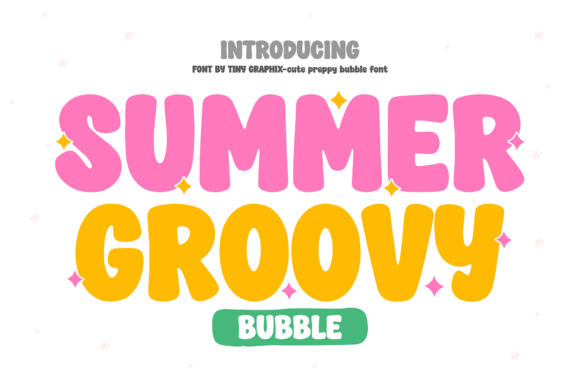
5. Summer Groovy
Summer Groovy blends bubble letterforms with preppy retro styling, which is a specifically contemporary interpretation rather than a historical revival. This is seventies aesthetics filtered through current social media design.
That distinction matters commercially. Historical accuracy appeals to design-literate audiences, while contemporary reinterpretation appeals to a much larger general audience who recognise the vibe without knowing the source. For volume, reinterpretation usually wins.
My take: Contemporary retro outperforms historically accurate retro on social platforms. The audience recognises the mood, not the decade.
View This Font →
Stacked Groovy
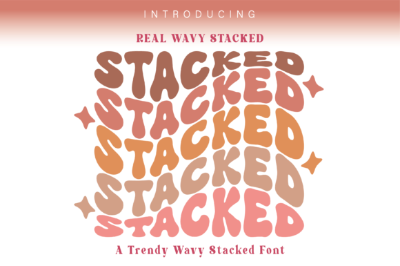
6. Real Wavy Stacked
Real Wavy Stacked is built specifically for stacked effects, shipping with glyphs designed to sit above and below each other in wave formations. That is an unusual and genuinely useful feature.
Stacked wavy type is one of the hardest retro effects to create manually, because each line has to curve differently to nest properly. A font that has solved the nesting for you turns a two-hour job into a two-minute one, which is worth more than the price for anyone producing volume.
My take: Genuinely time-saving rather than merely decorative. Building stacked wave type by hand is tedious and this removes the tedium.
View This Font →
Chunky Nostalgic
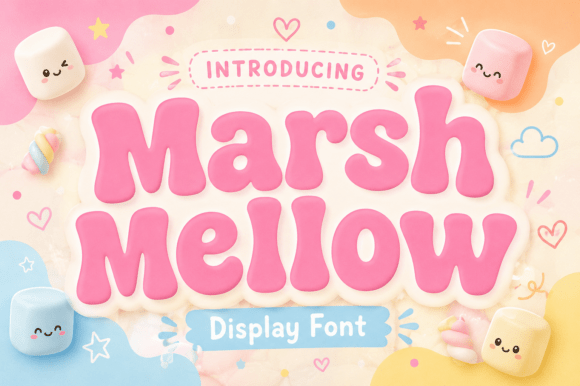
7. Marshmellow
Marshmellow is a chunky retro face built around joy and nostalgia. Chunky proportions serve a specific function on posters: they survive being printed on cheap stock and photographed badly.
Event posters lead a hard life. They get photocopied, taped to walls, photographed on phones in bad light and reposted at low resolution. Heavy letterforms survive all of that where finer type turns to mush after the second generation.
My take: Choose weight over refinement for anything that will be photocopied or reposted. Chunky type survives generational loss.
View This Font →
Warm Retro
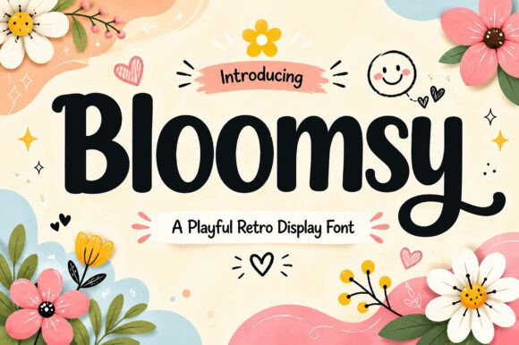
8. Bloomsy
Bloomsy is a playful retro display face designed around warmth and personality. Warmth in typography comes from a specific set of decisions: rounded terminals, slight irregularity, and proportions that lean wide rather than condensed.
Wide proportions are the underappreciated part. Condensed type reads as urgent and commercial, while wide type reads as relaxed and generous. For a poster advertising something enjoyable rather than something urgent, wide almost always feels better.
My take: Wide proportions signal relaxed. Use condensed when you need urgency and wide when you need warmth.
View This Font →
Vintage Contemporary
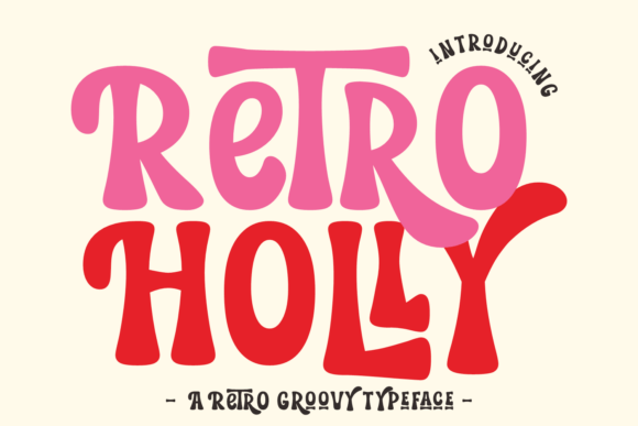
9. Retro Holly
Retro Holly is a mesh of vintage aesthetics with contemporary construction, which describes most of the successful retro type being made now. Pure revivals have technical problems that modern reinterpretations quietly fix.
The main one is spacing. Original phototype and metal faces were spaced for their production method, and digitising them faithfully preserves spacing that looks wrong on screen. Contemporary reinterpretations are spaced for digital use from the start.
My take: Modern reinterpretations space better than faithful revivals. Authenticity has a real technical cost that shows up in headlines.
View This Font →
Playful Retro
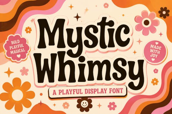
10. Mystic Whimsy
Mystic Whimsy is a playful retro-inspired display face with charm as its main quality. Charm-led typefaces occupy a difficult commercial position: strong personality limits where they can be used.
For posters that limitation matters less than elsewhere. A poster is a single self-contained design with one message, so a font that would be exhausting across a brand system works fine when it only has to carry six words on one sheet.
My take: Posters tolerate stronger personality than brand systems do. A font too characterful for a logo can be perfect here.
View This Font →
1960s Cartoon
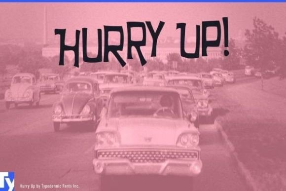
11. Hurry Up
Hurry Up is a 1960s cartoon display face, which is an earlier reference point than most fonts here. Sixties cartoon lettering is distinct from seventies groovy: tighter, bouncier and less curvaceous.
Knowing the difference lets you target a period accurately. If your poster references sixties animation, mid-century advertising or early space-age design, sixties lettering is right and groovy seventies type is anachronistic by a decade.
My take: The sixties and the seventies look different. If period accuracy matters, do not use groovy type for a sixties reference.
View This Font → Free.
Curly Retro
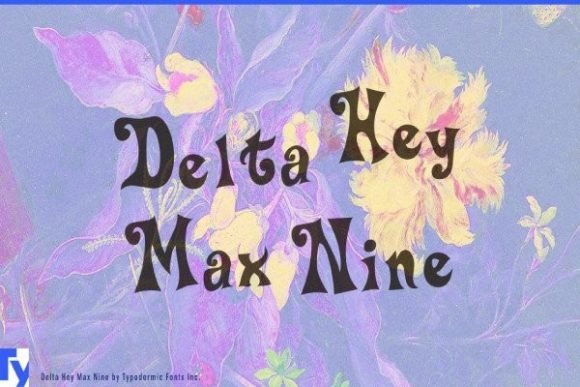
12. Delta Hey Max Nine
Delta Hey Max Nine is a silly retro curly display face, and silly is the correct description rather than a criticism. Deliberately unserious type is underrepresented and genuinely useful.
Most display type takes itself seriously even when it is decorative. A font that is openly playful suits children’s events, comedy nights, party posters and anything where the audience should expect to enjoy themselves rather than be impressed.
My take: Deliberately silly type is scarce. Worth keeping for comedy and children’s events where serious display faces feel wrong.
View This Font → Free.
Sans With Shadow
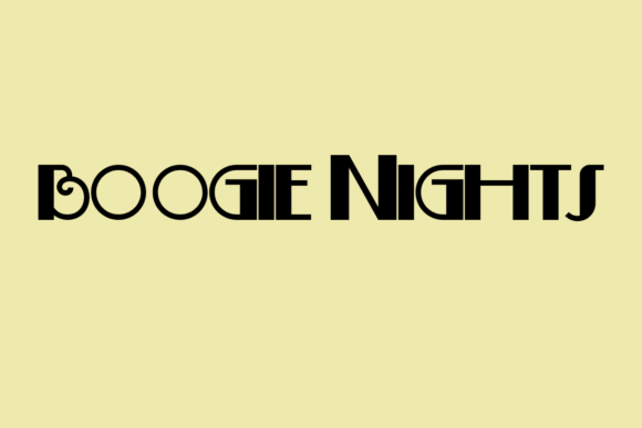
13. Boogie Nights
Boogie Nights is a fun sans serif shipping in regular and shadow styles. The shadow variant is the important part, because layered shadow type is a defining retro poster technique.
Layering a shadow style behind the regular in a contrasting colour produces the offset three-dimensional effect used constantly in seventies design. Doing that manually requires duplicating and offsetting text, which is fiddly and breaks when you edit. A dedicated shadow style makes it a two-layer job.
My take: Shadow styles are worth paying for. Faking the effect manually breaks every time you change the wording.
View This Font → Free.
Bold Duo
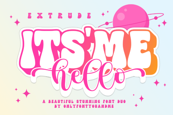
14. Its Me Hello
Its Me Hello is a duo pairing a bold display face with a complementary style. Duos remove the hardest decision in poster design, which is what to pair with your headline face.
Poor pairing is the most common failure in amateur poster work. Two fonts that clash in weight, era or proportion make the whole design look accidental, and a matched duo eliminates that risk entirely for anyone without typographic training.
My take: Buy duos if you are not confident pairing fonts. Mismatched pairing ruins more posters than poor font choice does.
View This Font → Free.
Modern Playful
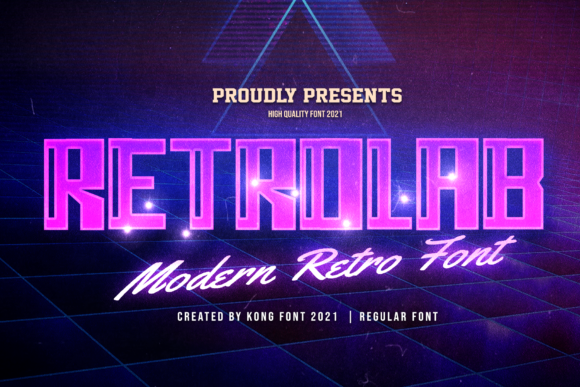
15. Retro Lab
Retro Lab is a modern playful display face flagged as craft-compatible, which usually indicates clean vector outlines without overlapping paths.
For poster work that matters less than for cutting, but it still shows up when you convert type to outlines for print. Overlapping paths can produce unexpected transparency artefacts when a design is flattened, and fonts built cleanly avoid that entirely.
My take: Clean outlines matter even in print. Overlapping paths cause transparency artefacts when artwork gets flattened.
View This Font → Free.
Cartoon Display
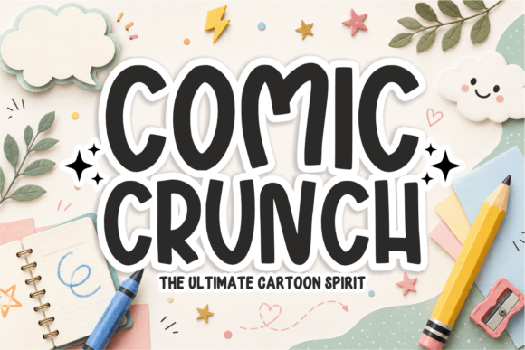
16. Comic Crunch
Comic Crunch is a bold cartoon display face inspired by classic comic lettering. Comic type shares ancestry with retro poster type, since both descend from hand-lettered commercial work of the same period.
The practical overlap is heavy outlines and strong colour separation, both designed for cheap printing on absorbent paper. Those same qualities make comic-derived type reproduce well on modern budget printing, which is what most event posters actually use.
My take: Comic lettering was built for cheap printing, which is exactly what most posters get. That heritage still pays off.
View This Font → Free.
Bold Comic
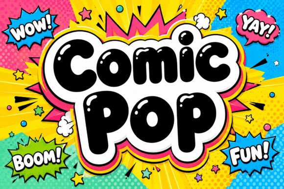
17. Comic Pop
Comic Pop is a bold playful display face drawing on classic comic conventions. Sitting alongside Comic Crunch, the two make a reasonable pairing for anyone building a small poster toolkit.
Two faces in the same register from different designers give you variation without tonal clash. That is usually safer than pairing one comic face with something from a completely different tradition, which tends to look unresolved.
My take: Pairs naturally with Comic Crunch. Same register, different designer, so you get variety without a clash.
View This Font →
Building the Retro Poster Design Layout
Choosing the font is half of retro poster design. These four layout conventions carry the rest.
Stack, do not spread
Retro poster typography stacks vertically in centred lines of varying width, filling the rectangle edge to edge. Spreading a headline across one wide line loses the whole effect.
Two colours, maybe three
The originals were screen printed, which made every colour expensive. That constraint produced the limited palettes we now read as authentic. Adding a fourth colour immediately looks modern.
Use offset shadow, not drop shadow
Retro shadows are hard-edged solid offsets in a contrasting colour, not soft blurred drop shadows. The soft version is a modern default and it breaks the period instantly.
Fill the frame
Seventies poster design uses very tight margins with type running close to the edge. Generous white space is a contemporary convention and reads as modern minimalism rather than retro.
Questions People Ask
What fonts work best for retro poster design?
Heavy groovy display faces with wide proportions and rounded curves. Weight matters more than refinement because posters are read at distance and often reproduced badly.
What is the difference between groovy and psychedelic type?
Groovy is legible with rounded, bubbly letterforms. Psychedelic distorts and interlocks letters until readability becomes secondary to visual effect. Groovy suits commercial work, psychedelic suits art posters.
What makes retro poster design look authentic?
Tight margins, stacked centred type, hard offset shadows and a two-colour palette. Most amateur retro poster design fails on layout conventions rather than on font choice.
How many fonts should a retro poster use?
Two. One heavy display face for the headline and one plain face for dates, times and details. The originals rarely used more because every additional element cost money to print.
Can I use these fonts for commercial posters?
Check each licence. Most Creative Fabrica fonts allow commercial use, though selling the poster as a product may fall under different terms than designing one for a client.
Why does my retro poster look modern despite the font?
Usually margins and shadows. Generous white space and soft blurred shadows are contemporary conventions that override the period signal of the typeface. Tighten the margins and use hard offset shadows instead.
Related: bold display fonts for posters, vintage display fonts for branding, or browse Creative Fabrica →



One Comment