
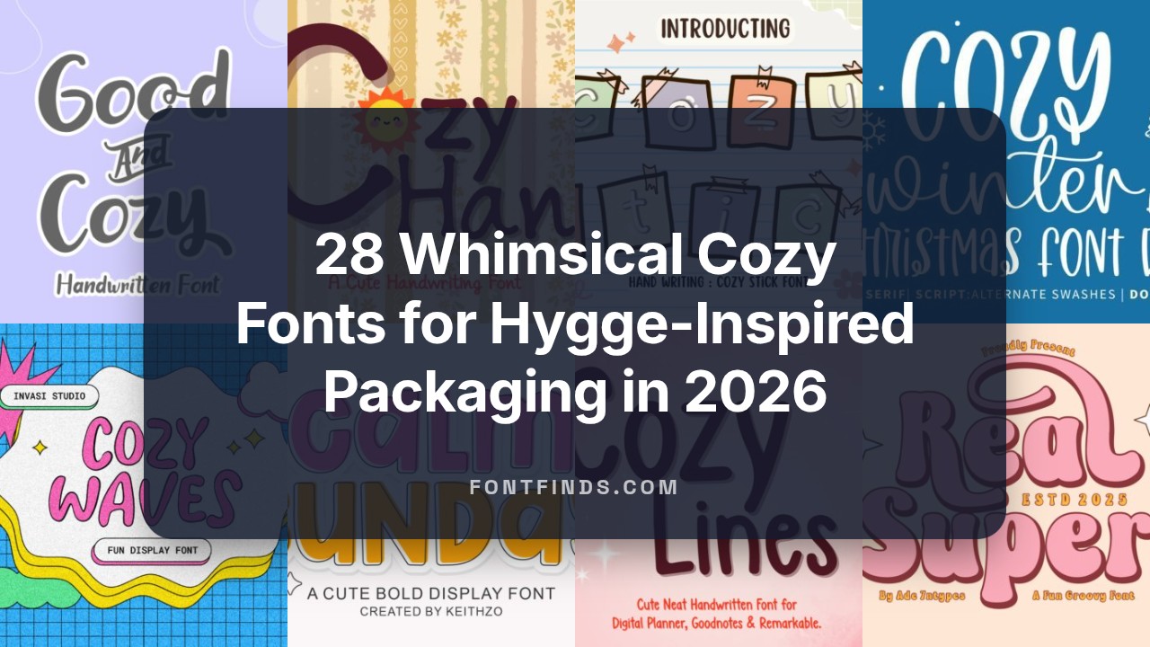
28 Whimsical Cozy Fonts for Hygge-Inspired Packaging in 2026
Cozy fonts are perfect when you want typography that feels warm, approachable, and handcrafted. These warm typefaces-like soft scripts, rounded sans, and gentle serifs-work great for packaging, web banners, and home-lifestyle projects.
Below you’ll find 28 selections with short mood cues, pairing suggestions, and recommended use-cases such as hygge-style packaging, seasonal promos, and indie editorial spreads. Quick notes on readability and contrast make it simple to test combinations in real designs.
1. Calm Sunday Font
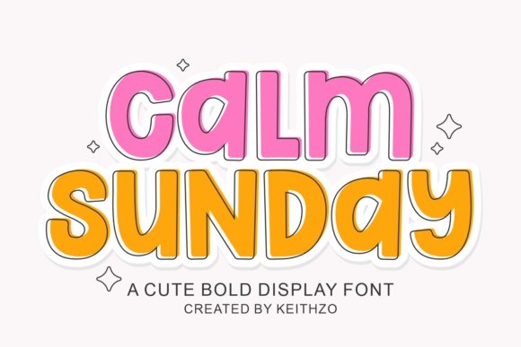
Calm Sunday is a display type that reads like a quiet weekend morning: soft, rounded terminals, moderate contrast, and open counters that encourage a gentle reading pace. As one of the softer Cozy fonts, it keeps letterforms clear at headline sizes while lending a homespun, modern sensibility to logos, quote cards, and title treatments. The balanced weight and generous spacing make it reliable across print and screen contexts.
The face includes carefully tuned kerning and subtle alternates for more natural word shapes; pair it with a geometric sans for contrast or a warm serif for editorial depth. It adapts well to lifestyle product design-think organic packaging, throw-pillow art, and understated apparel-where a restrained personality outperforms loud ornament. Designers will appreciate how its rounded shapes reduce visual clutter in busy compositions.
My Recommendation: I reach for Calm Sunday when a design needs to feel familiar and restful without tipping into saccharine territory. Its alternates and spacing make layouts quicker to finalize, and the rounded forms translate well to fabric prints and labels. Use it for boutique branding, seasonal collections, and any project that benefits from a gentle, approachable headline voice.
2. Real Super Font
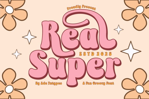
Real Super wears a 1970s influence on every curve: bold, rounded glyphs, condensed caps, and decorative ligatures that give instant nostalgia. The collection spans serif, sans, and playful dingbats, offering modular display options for posters, tees, and event graphics that need a lively retro personality. Each style holds up in large-format work and on-screen headers where character-driven headings must grab attention.
Files are available in standard OTF/TTF and many variants include SVG color layers plus Cricut-ready outlines for craft use. Combine saturated palettes, halftone textures, or distressed overlays to deepen the vintage mood, and pair with a neutral sans to preserve readability in longer copy. This set shines for seasonal campaigns, sticker art, and any merchandise that benefits from cheerful, retro-pop styling.
My Recommendation: I use Real Super when a brief calls for unapologetic vintage character-think concert posters, merch drops, and party invitations. The mix of weights and dingbats speeds up creative exploration and keeps compositions cohesive. It’s a solid pick when you want bold personality without sacrificing clarity.
3. Hello Autumn Font
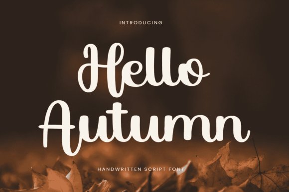
Hello Autumn is a hand-lettered script that channels the hush of falling leaves with long swashes and gentle pen strokes. Its flowing connections and warm terminal shapes make headlines and invitations feel intimate and handmade, ideal for Thanksgiving cards, fall wedding stationery, and farmer-market signage. The subtle irregularities read as human, which helps designs feel personal rather than mechanically produced.
The font includes swash alternates and contextual ligatures so repeated phrases avoid visual monotony, and it translates cleanly to embroidery and SVG cut files. Keep body copy to neutral sans choices and reserve Hello Autumn for display sizes so its charm remains legible; for craft projects, add light textures or outlines to boost contrast. Crafters and makers will value its clear strokes and friendliness across greeting cards, labels, and seasonal decor.
╰┈➤ Download Hello Autumn Font
My Recommendation: I pick Hello Autumn for seasonal pieces that need a handcrafted voice-invites, gift tags, and cozy merch come alive with its swashes. The alternates let each line feel bespoke without extra redraws, and its construction suits Cricut and embroidery workflows. Use it when you want warmth and personality in short bursts of text.
4. Shella Font
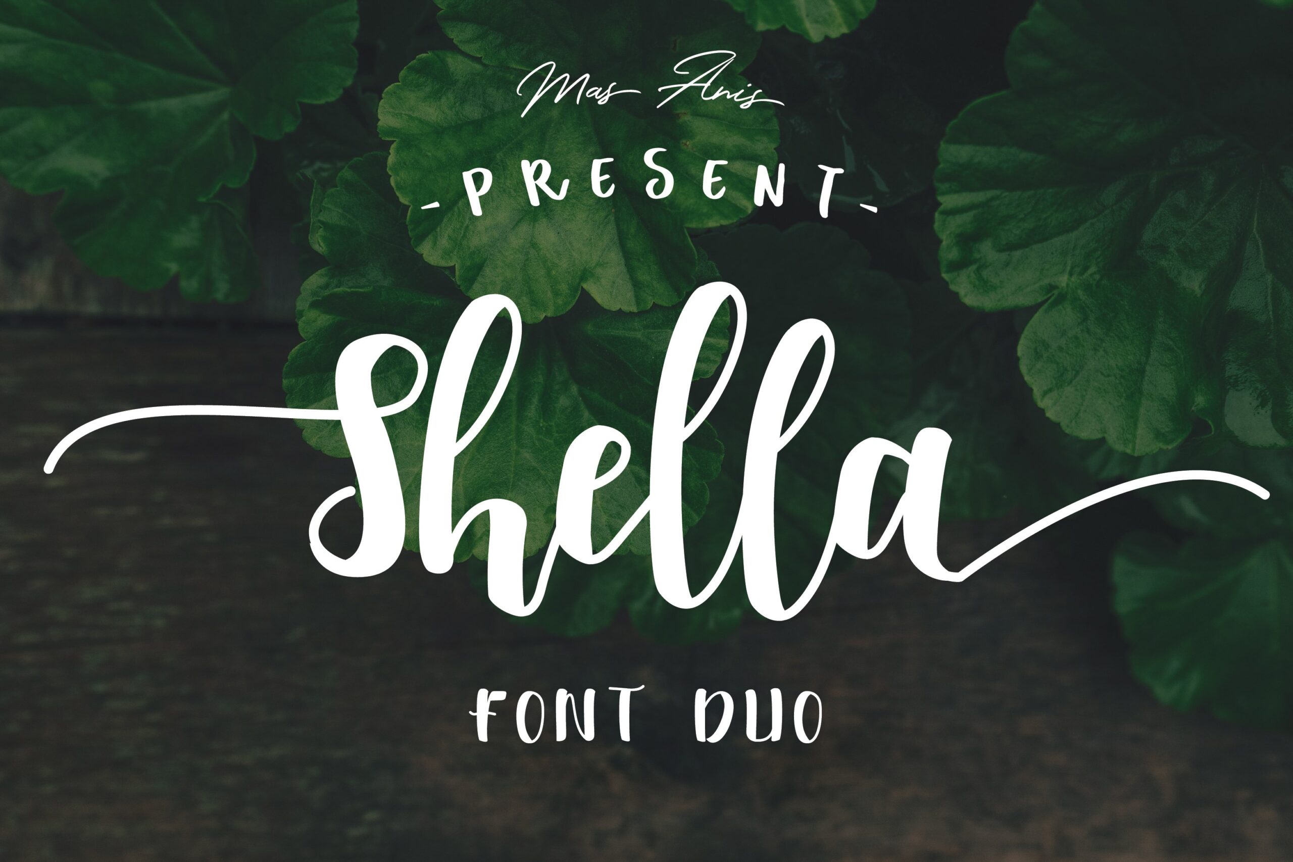
Shella Font Duo wears its hand-brushed personality on every curve: three coordinated styles – Clean, Sans and Rough – that let you shift tone without changing type families. The Clean cut gives tight, readable shapes while the Rough version adds textured brush grain; combined with the sans companion you can create layered headlines that feel intimate and familiar. OpenType alternates, swashes and ligatures expand how words flow, so small typographic choices make a big visual difference.
For practical use, treat Shella as a headline or logotype asset and pair it with a neutral text face for longer copy; its large swashes work best at display sizes. Try layering Clean over Rough at slight offsets for a handcrafted shadow effect, or use the sans member for short taglines to stabilize the script. The trio responds well to warm color palettes, paper textures and packaging where tactile, human lettering matters.
My Recommendation: I reach for Shella when a project needs authentic hand-brushed character but also flexibility – the three styles let me adjust grit and clarity without switching fonts. It’s ideal for greeting cards, boutique packaging, cafe menus and cozy brand marks where a personal touch counts. The alternates and swashes give enough variety to avoid repetition across a whole set of collateral.
5. Cozy Cuddles Font
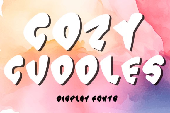
Cozy Cuddles is a caps-only display font with rounded, friendly letterforms and generous counters that read well in short bursts. The package includes 26 uppercase letters and digits 0–9 in OTF/TTF formats, making it straightforward to drop into most design programs. Its aesthetic favors playful headlines, seasonal cards and social graphics that benefit from a soft, approachable voice.
Because the set is limited to uppercase glyphs, plan to pair it with a complementary lowercase companion or add decorative elements for longer text. It shines at large sizes on stickers, logos and invitations, but requires careful tracking and contrast choices when used against patterned backgrounds. For multilingual projects you’ll likely need supplemental typefaces to fill missing diacritics and special characters.
╰┈➤ Download Cozy Cuddles Font
My Recommendation: I would use Cozy Cuddles for short, joyful display work like holiday cards, children’s party invites and social banners where a big, cheery headline is the focus. Its simplicity keeps layouts readable and quick to produce. If you need full language support or running copy, pair it with a soft sans or script to cover gaps.
6. Cozy Fall Font
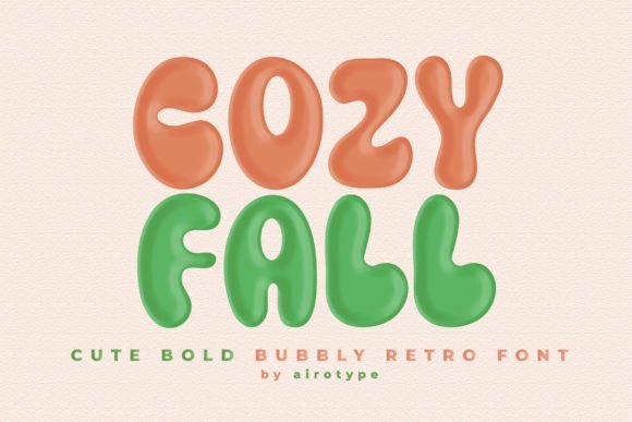
Cozy Fall channels retro, groovy energy with plump, bubbly letterforms and slightly condensed counters that give every word a vintage smile. The shapes favor rounded terminals and smooth joins, producing a friendly, punchy look that holds up on t-shirts, posters and sticker designs. Its personality reads as both playful and nostalgic, making it well suited to quirky branding and crafty products.
Use Cozy Fall as a headline face and balance it with a clean geometric sans for body copy to avoid visual fatigue. It takes well to layered treatments – outlines, shadows and halftone textures enhance the retro feel – but watch kerning on wordmarks to keep letter clusters readable. Consider high-contrast colorways and textured prints to make the forms pop on merchandise.
My Recommendation: I pick Cozy Fall when a design needs upbeat vintage charm, especially for apparel, labels and playful logos. It prints reliably on sublimation and sticker runs and looks great with warm autumnal palettes or bold pop colors. For identity work, it gives a strong, memorable headline while a neutral text face carries the longer copy.
7. Cozy Winter Font
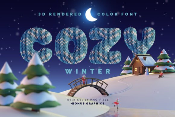
Cozy Winter is a 3D-rendered color bitmap OpenType-SVG typeface that mimics knitted fabric and sweater motifs with convincing surface depth and stitch detail. It installs and behaves like a standard OTF in supported design apps while also including full-resolution PNGs with transparent backgrounds (each file averages roughly 11 megapixels) for large-scale work. This entry sits among Cozy fonts and is English-only with basic punctuation, so review the specimen screenshot to confirm character coverage before committing to multilingual projects.
Workflow is straightforward in modern tools such as Photoshop, Illustrator, InDesign and Procreate, but some older software and certain web environments may not render color SVG fonts, so plan a raster fallback or use the supplied PNGs. The tactile knit texture is particularly effective for seasonal branding, retail packaging and large headers where surface detail reads at scale, and the included 3D winter scene artwork gives ready-made assets for holiday layouts. When exporting for unsupported platforms, rasterize at target resolution or outline letters to preserve appearance.
My Recommendation: I reach for Cozy Winter when I need a headline that practically reads as a cozy sweater; its knit texture conveys warmth immediately. The high-resolution PNGs save the day when app support for color SVG is inconsistent, and the included 3D scene speeds up seasonal campaigns. Use it for holiday packaging, greeting cards, storefront signage and campaign headers where tactile, large-format type makes a clear emotional connection.
8. Cozy Beach Font

Cozy Beach is a relaxed brush script with bold, sweeping strokes that balance legibility and casual character. Its generous stroke width and open counters keep letterforms readable at display sizes, making it suitable for business cards, web headers and quote graphics. The handmade brush personality evokes sun and leisure without heavy ornamentation, so short headlines and logo marks retain clarity while feeling approachable.
For practical layouts, pair it with a neutral sans for body text or a slim serif for contrast, and give headlines ample breathing room to prevent the brush terminals from feeling cramped. On-screen the weight holds up well, though very small UI labels should be tested since fine terminal details can blur. If alternates or ligatures are available, use them to avoid visual repetition and to enhance the handcrafted feel.
My Recommendation: I use Cozy Beach when a project needs an open, friendly voice-perfect for surf shops, cafés, vacation promos and casual branding. It reads quickly yet still looks handmade, which gives identity work an instant human touch. For best results pair it with a simple body face so the script can take center stage.
9. Cozy and Bright Font
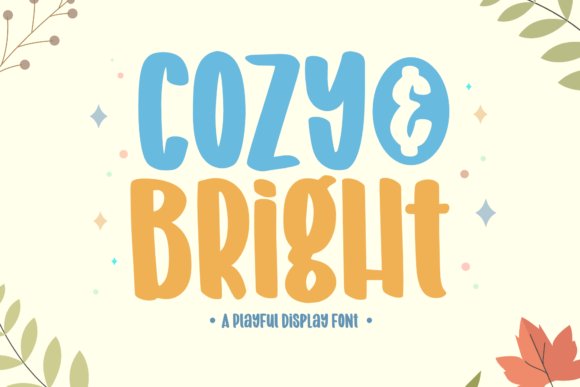
Cozy and Bright is a playful display face built for impact: rounded terminals, a high x-height and a bouncy baseline give text an energetic, joyful personality. Heavy, even strokes favor large sizes where the type’s character can shine on posters, book covers and product labels. The simple, friendly silhouettes help headlines read fast and communicate cheer without visual fuss.
Use saturated color palettes, two-color fills or subtle shadows to amplify the cheer while keeping layouts uncluttered; avoid long blocks of copy because fine details vanish at body text sizes. To balance the exuberance, set it alongside a restrained sans or neutral slab and adjust tracking to keep counters open. It’s also a strong choice for merchandise and stickers where bold shapes remain legible from a distance.
╰┈➤ Download Cozy and Bright Font
My Recommendation: I pick Cozy and Bright when a design must read as playful at first glance-ideal for children’s books, party invites and friendly product identities. Its bold shapes translate well to stickers, posters and app splash screens. Use it for short headlines that need to carry most of the voice and color of the design.
10. Cozy Vibes Font
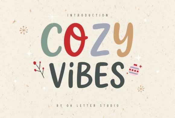
Cozy Vibes is a playful, hand‑drawn doodle script that pairs rounded strokes with casual ligatures to create a homemade, approachable look. As one of the friendlier Cozy fonts in this collection, its irregular baselines and whimsical terminals read as handcrafted while keeping letter shapes clear and usable. The mix of sketchy outlines and soft curves gives headlines and short phrases a charming, human quality without sacrificing readability.
This face shines on sticker sheets, planners, greeting cards, kids’ apparel, mugs and social templates where a tactile, handcrafted feel matters. It exports cleanly for Cricut and Silhouette cut files and behaves predictably in Canva, Procreate, Illustrator and Photoshop, which simplifies mockups and print preparation. Small‑business makers and crafters will appreciate how forgiving the letterforms are when cutting vinyl or creating printables.
My Recommendation: I reach for Cozy Vibes when a project needs to read like it was hand drawn; it instantly warms packaging, stickers and planner spreads. The doodle characters cut reliably for vinyl and adapt well to Procreate lettering. I’d recommend it for indie shops, kids’ products and anyone aiming for a friendly, approachable aesthetic.
11. Cozy Night Font
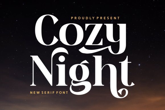
Cozy Night is a modern serif that balances high-contrast strokes with playful, decorative swashes to produce an elegant yet slightly whimsical presence. Tall ascenders and a refined italic give display lines a dramatic silhouette suited to covers and headline use. The type’s contrast makes it stand out at large sizes while retaining clarity in tighter compositions.
Use the heavier cuts for logos and boutique packaging and the lighter weights for pull quotes, editorial headers and social banners to keep a consistent voice across materials. Thoughtful kerning and an expressive set of alternates make it easy to craft distinctive wordmarks without overworking layouts. It prints crisply on coated stock and scales well for sharp web headers.
My Recommendation: I use Cozy Night when a brief needs both polish and personality; its swashes add flair to logos without feeling showy. It’s ideal for premium stationery, book jackets and seasonal campaigns that want warmth with structure. For projects needing a memorable headline face, this one earns the spot.
12. Cozy Light Font
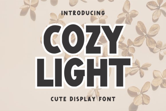
Cozy Light is a soft display face built around open counters and rounded terminals that cut down visual clutter while keeping a breezy, upbeat character. Slightly uneven strokes and charming apertures give headlines a hand‑touched, airy personality that reads best at larger scales. The light weight breathes on posters and hero banners, where its shapes can be appreciated.
Pair it with a neutral sans for body copy or use it alone on signage, packaging and web heroes when you want a gentle, clean headline voice. Simple alternates and tracking adjustments let you refine wordmarks without fighting balance. It’s economical for low‑ink printing and pairs well with minimal, bright layouts.
My Recommendation: I grab Cozy Light for projects that need a gentle, modern headline without excess ornament. It’s especially handy for café menus, minimalist packaging and hero web panels where clarity and warmth are both required. I usually combine it with a plain sans and tweak tracking to keep things crisp and airy.
13. Cozy Bliss Font
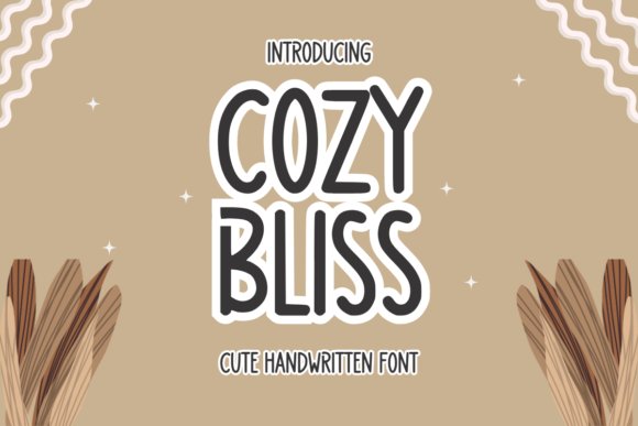
Cozy Bliss is one of the warmer entries among Cozy fonts, a modern handwritten face with graceful, flowing strokes and a refined character that reads both personal and polished. The letterforms carry lively terminals and tasteful alternates, so it suits wedding invitations, boutique branding, and editorial mastheads where personality matters without chaos. Small caps and ligatures help vary word shapes for signature-style treatments.
On the production side, the font shows medium contrast and even spacing, which reads nicely at display sizes and responds well to print finishes like foil or embossing. It pairs cleanly with a neutral sans for body copy to keep legibility while letting the script act as the visual focal point. Use the stylistic set options to avoid repetition in repeated headings or logotypes.
My Recommendation: I reach for Cozy Bliss when a project needs handwritten warmth with a refined finish-wedding suites, boutique identity work, or high-end packaging. Its alternates and ligatures save time when building distinctive wordmarks. For any brief that calls for a personable yet elegant voice, this font performs reliably and photographs well on textured paper.
14. Cozy Corner Art Deco Font
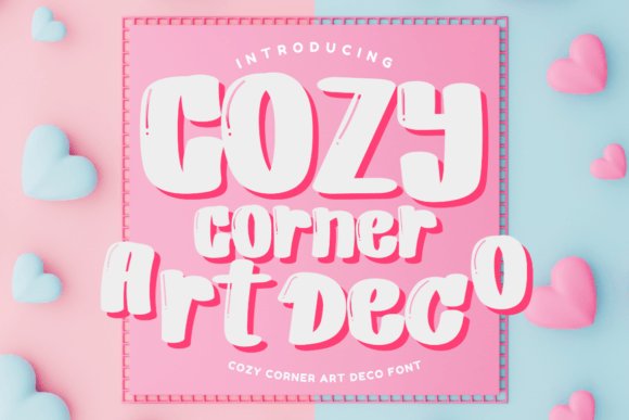
Cozy Corner Art Deco Font channels 1920s geometric glamour through tall, angular capitals, stepped terminals, and decorative ligatures that read like classic signage. The display-focused shapes are ideal for posters, theater bills, and boutique labels that aim for a vintage mood with contemporary clarity. Several alternates and display-only glyphs let designers craft varied headlines without repeating identical forms.
For best effect use deep tones, creams, and metallics to amplify the period feel, and keep tracking generous on large sizes to preserve letterform integrity. Pair the face with a low-contrast serif or a clean sans for longer passages so the ornate caps can carry the visual weight. Reserve it for primary logos and titles where a strong decorative voice is wanted rather than for body text.
╰┈➤ Download Cozy Corner Art Deco Font
My Recommendation: I pick Cozy Corner Art Deco when a brief asks for nostalgic glamour-cocktail menus, boutique signage, or event posters-because it reads as era-specific without feeling forced. The display alternates make one-line logos feel handcrafted, and the high-contrast forms print crisply. If you want period character that still sits well in modern layouts, this font delivers.
15. Good and Cozy Font – Cozy fonts
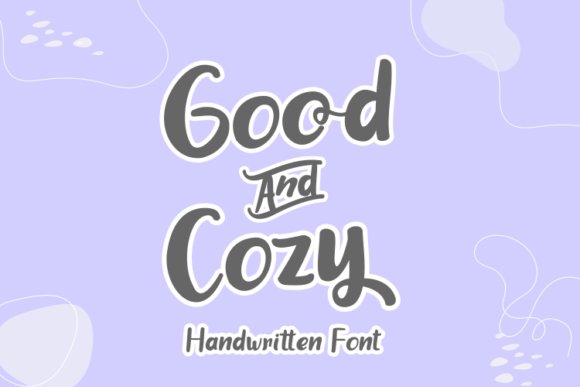
Good and Cozy Font offers a bouncy, friendly handwritten voice with rounded strokes and a compact, slightly irregular baseline that feels immediate and approachable. The shapes are cheerful and readable, lending themselves to greeting cards, kids’ products, and social-media headers where a handcrafted look helps connect with audiences. Its joyful rhythm gives headlines personality without becoming fussy.
Technically, the face sits at a single display weight with generous x-height and open counters, which keeps it usable at smaller sizes on screens and labels. Pair it with a simple sans or neutral slab for body text to create contrast and visual balance. For designs that need a handmade, upbeat presence without sacrificing clarity, this font is a dependable choice.
╰┈➤ Download Good and Cozy Font – Cozy fonts
My Recommendation: I often choose Good and Cozy for family-focused brands, playful packaging, or newsletters because it feels warm and unpretentious. It quickly brings a handcrafted charm to stickers, headers, and product tags while staying legible. When a brief calls for friendliness over formality, this font hits the right tone.
16. Cozy Choco Font
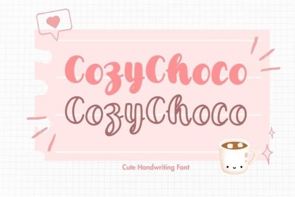
Cozy Choco arrives as a pair: a soft handwritten script and a hollow outline companion that composes layered headlines with minimal fuss. Rounded terminals, slightly irregular strokes and warm spacing give it an intimate, hand-poured feel, making it ideal for greeting cards, artisanal food labels and seasonal social posts; Cozy fonts like this excel when you want typography to feel handcrafted.
OpenType alternates and ligatures let you vary repeated letters without visible repetition, while the outline cut works well as a shadow or emboss effect when layered over solid color fills. I found the kerning pleasantly forgiving, and the pair scales cleanly from large display headers down to modest taglines, so try pairing with a neutral sans for balance or a slender serif to add contrast.
My Recommendation: I reach for Cozy Choco when crafting romantic stationery or small-batch food packaging because the duo delivers immediate tactile warmth and a playful, handmade look. The outline version is especially useful for two-color labels and simple layered effects. Use it on valentines, chocolate wrappers and seasonal posts when you want type to feel personal and crafted.
17. Cozy Stick Font
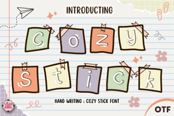
Cozy Stick is a hand-lettered decorative face with jaunty strokes and sing-song terminals that read like holiday handwriting on paper tags. Stylized swashes and a few ornament glyphs let you dress headlines with seasonal flare without adding extra illustration work. Its letterforms are deliberately uneven, which helps give warmth to packaging, craft labels and merry social graphics.
Because strokes are fairly bold, it performs best at medium to large sizes where the playful ink texture can show; thin outlines or white fills on dark backgrounds produce a festive, high-contrast look. I recommend pairing Cozy Stick with a plain geometric sans for body text so the decorative shapes can take center stage, and make use of alternate caps and numerals built into the set for quick badge work.
My Recommendation: I use Cozy Stick when a project needs an unmistakable handcrafted holiday voice – gift tags, seasonal posters and product labels spring to life with its lively shapes. Built-in ornaments save time that would otherwise go to illustration. Best suited for display uses where the personality can breathe and catch the eye.
18. Easy Cozy Font
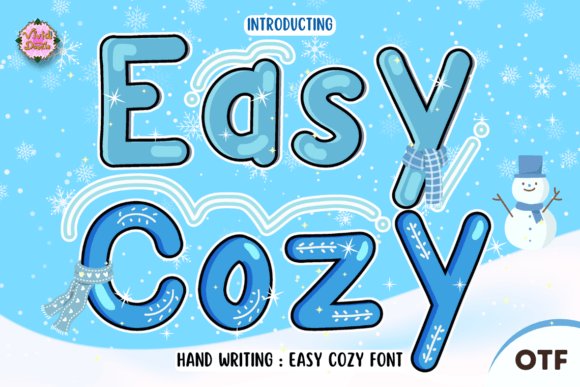
Easy Cozy is a pared-back script that favors legibility over flourish, with steady stroke widths and gentle joins that keep words readable at small sizes. The restrained, casual brush quality suggests handwriting but avoids fussy loops, making it a good candidate for product tags, user interface headers and quick social captions. It includes several alternate characters to prevent repetition while keeping a unified look.
Because its counters are open and baseline rhythm is consistent, Easy Cozy pairs neatly with compact sans-serifs or slab serifs for editorial and packaging layouts where warmth must meet clarity. Try it for friendly body copy accents, signature-style subheads or compact logos where longer scripts would look overdone, and note that it prints crisply at small point sizes for labels and price tags.
My Recommendation: I tend to pick Easy Cozy when a design needs a human touch without sacrificing clarity – shop labels, event badges and microcopy benefit from its restrained strokes. Its limited but thoughtful feature set keeps typesetting quick and dependable. Use it when you want approachable lettering that reads well across print and screens.
19. Cozy Relex Font
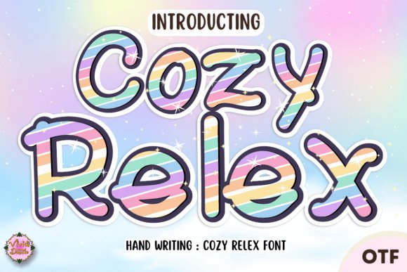
Cozy Relex is a hand-lettered script that carries holiday cheer through lively strokes and playful swashes. Its bouncy baseline and slightly irregular terminals create a convincing handmade look while remaining readable at display sizes. OpenType extras-contextual alternates, discretionary ligatures, and extended swashes-let you shape distinctive headlines without resorting to custom lettering.
I reach for this face when a project needs warmth and personality: greeting cards, seasonal packaging, and social headers all benefit from its tactile feel. When paired with a neutral sans for body copy, Cozy fonts help maintain hierarchy while adding character to titles. The range of alternates prevents repetition and keeps layouts feeling personal and handcrafted.
My Recommendation: I would use Cozy Relex when a design must feel hand-created and celebratory, especially for holiday campaigns or intimate product labels. Its alternates and swashes give me flexibility to avoid repeated shapes across multiple words. It’s ideal for short display text where warmth and personality are the primary goals.
20. Cozy Daisy Font
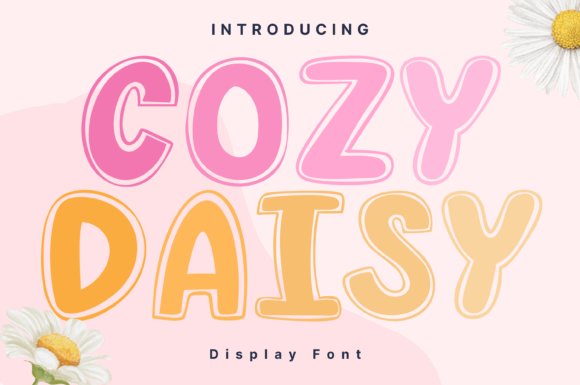
Cozy Daisy is a clean display face with petal-like terminals and an upbeat rhythm that reads clearly at large sizes. A generous x-height and open counters keep the letterforms legible even when the design leans whimsical, and a set of alternate glyphs helps craft monograms and logotypes with a handmade touch. The overall feel marries friendliness with precision, making it easy to place in playful branding systems.
Color and spacing bring out the floral cues, and the face scales well from web hero banners to printed hang tags. Pairing it with a restrained sans creates pleasant contrast that highlights the decorative shapes without cluttering layouts. Consider Cozy Daisy for kid-focused goods, stationery lines, or packaging that benefits from a charming, readable headline voice.
My Recommendation: I’d pick Cozy Daisy for projects that need cheerful, legible display type-think product labels, event posters, or boutique branding. Its distinctive terminals add character without sacrificing clarity, which is great for short headlines and badges. Use plenty of white space and bold color to let the floral details sing.
21. Cozy Season Font
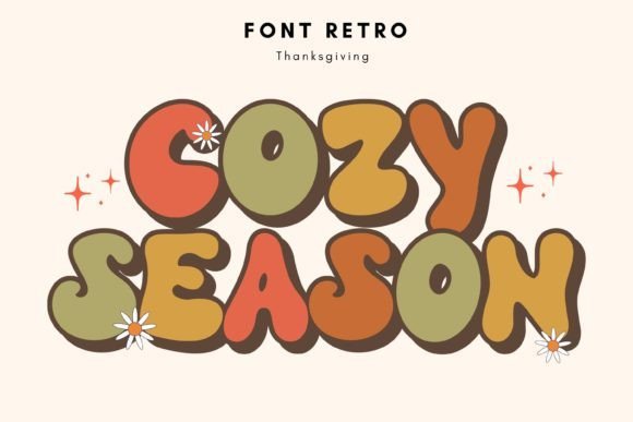
Cozy Season is a retro-inspired display font with bold, rounded forms and compact spacing designed to command attention in short bursts. Letterforms nod to mid-century signage with simplified joints and thicker strokes, and built-in alternates and inline shadows provide stylistic variety for logos and headlines. The type feels energetic and optimistic, suited to designs that ask to be noticed from a distance.
Because of its strong presence, it works best for titles, posters, and badge work rather than long paragraphs. Combining it with a thin geometric sans or a neutral serif keeps the focus on the headline while preserving visual balance. Use Cozy Season for seasonal promotions, party invitations, or retro-themed merch that benefits from a bold, joyful headline voice.
My Recommendation: I reach for Cozy Season when a concept calls for retro personality and bold readability-poster campaigns, invitations, and product graphics are great fits. Its compact shapes and alternate features let me create striking headers that still play nicely with modern grid systems. Best used in short, impactful copy where the type can act as the focal point.
22. Cozy Nap Font
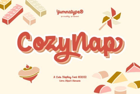
Cozy Nap is a chunky display face with heavy weights and playful curves that read clearly even at large sizes. Its dramatic bold shapes make it ideal for headlines, title cards, and bold packaging labels where personality matters. A few rounded terminals and subtle quirks give it a hand-drawn warmth, fitting right into collections of Cozy fonts and warm typography.
Spacing and contrast are tuned so letters remain legible in short lines, and its exaggerated counters invite eye-catching color fills or patterned overlays. Use the font with simple body faces to keep hierarchy clean, or pair it with illustrative elements-the supplied pictograms and doodles push its friendly charm further. Kerning is workmanlike but worth a glance at large display sizes to polish tight pairings.
My Recommendation: I reach for Cozy Nap when a headline needs to shout playfulness without losing clarity; its heavy forms stop the scroll and its quirks add character. It shines on children’s packaging, event posters, and social graphics that require a warm, bold voice. I avoid using it for long paragraphs and reserve it for short, punchy phrases and branding marks.
23. Cozy Winter Duo Font
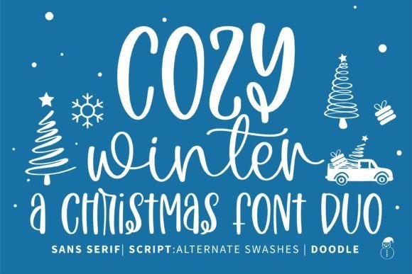
Cozy Winter Duo pairs a tidy sans with a loose script to give designers two complementary voices in one package. The sans brings clean structure for captions and small text while the script supplies lively swashes and ligatures that feel handmade and seasonal. PUA encoding means you can access alternate glyphs and ornamental swashes directly from common apps without extra tooling.
Both styles include solid punctuation, contextual alternates, and practical kerning so words maintain a pleasing rhythm across short headlines and cards. Try the duo for greeting cards, seasonal branding, menus, and logos where a handwritten touch sits next to reliable body copy. The trick is balancing the script’s flourish with measured spacing in the sans so layouts remain composed.
╰┈➤ Download Cozy Winter Duo Font
My Recommendation: I use Cozy Winter Duo when a project benefits from contrast between crisp text and expressive script; switching between the two keeps compositions lively yet readable. The PUA-accessible swashes speed up mockups in everyday software, which is handy for client work. It’s a good fit for holiday stationery, boutique labels, and warm seasonal campaigns.
24. Curling Cozy Font
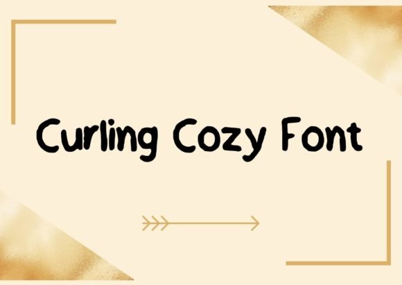
Curling Cozy is a rounded handwritten face with a friendly bounce that softens factual content. Its curling terminals and generous bowls give text a human rhythm, making headlines or short phrases feel approachable and informal. Strokes carry light texture rather than heavy calligraphic contrast, which helps maintain legibility across light and dark backgrounds.
The family includes alternates and ligatures to avoid repeated shapes in a single phrase, while a subtle baseline wobble adds personality without appearing careless. This face is well suited to artisanal product labels, playful logos, greeting cards, and any application that benefits from a hand-marked look. Pair it with a neutral sans for longer passages to preserve comfortable reading.
╰┈➤ Download Curling Cozy Font
My Recommendation: I pick Curling Cozy when a design needs warmth without leaning into overt whimsy; its friendly letterforms read clearly at headline sizes and print labels. Alternates are handy for creating visual variety on repeat patterns or packaging. For body copy I combine it with a clean sans to keep long texts easy on the eye.
25. Cozy Waves Font
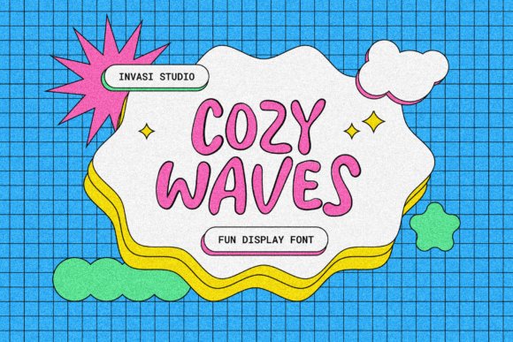
Cozy Waves is a whimsical display font that pairs sinuous strokes with playful terminals, giving text a hand-painted, surfboard‑meets-vintage-sign feel. The letterforms ride a gentle baseline wave that introduces motion without sacrificing clarity, so headlines and short phrases read easily even when styled with texture or color overlays. Alternates and decorative swashes make it simple to tune the personality for packaging, poster headers, and seasonal promos.
Used alongside neutral body typefaces, Cozy Waves brings a lively accent that feels intimate and friendly; as one example among cozy fonts it helps craft a softer, more human brand voice. Tightening tracking for logotypes or using a bold cut for shelf labels creates contrast while preserving the font’s fluid rhythm. It also works well over imagery when given a subtle outline or drop shadow to keep letters visible.
My Recommendation: I reach for Cozy Waves when I need a headline that reads like a hand-painted sign but still plays well in modern layouts. Its swashy alternates let me add personality to packaging and event posters without custom lettering. For cafes, seasonal product lines, or kids’ event branding this font gives instant charm while staying readable.
26. Cozy Stroke Font
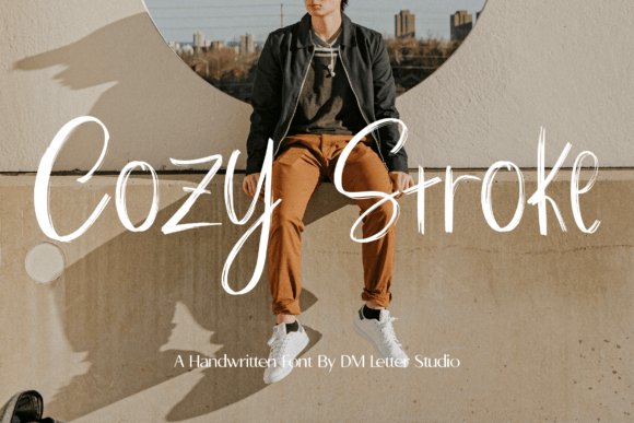
Cozy Stroke is a warm handwritten font that mimics steady pen pressure and friendly hand motion, producing strokes that feel personal yet deliberate. Its moderate contrast and smooth terminals make short notes and captions feel intimate, and included ligatures and alternates add small handcrafted touches that prevent repetition. The overall rhythm keeps words approachable, which is handy for on-brand social headers and printed labels.
It excels on planners, quote cards, and cafe menus where human character matters more than strict formality, and the lighter weights reproduce well at small sizes for stickers or product tags. Pair Cozy Stroke with a neutral geometric sans to let the handwriting sit front and center, and avoid using it for long paragraphs to maintain quick readability. Small texture overlays amplify the ink-on-paper impression without muddling letterforms.
My Recommendation: I use Cozy Stroke when projects need a friendly, handwritten voice-think boutique packaging, menu boards, or Instagram quote images. The font’s alternates keep repeated words engaging, and its moderate legibility makes it great for planners and labels. It’s a reliable choice when a design should read personal rather than overly polished.
27. Cozy Hand Font
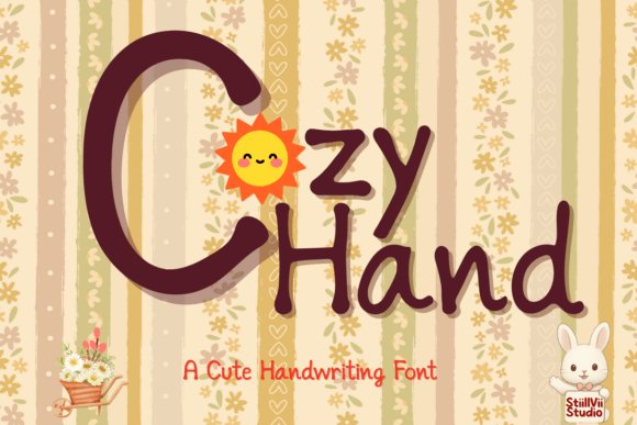
Cozy Hand captures the ease of casual penmanship with rounded terminals and a steady baseline, producing text that looks both neat and genuinely written. The letter shapes favor open counters and generous spacing, which helps longer snippets and recipe-style content remain readable without losing a handmade vibe. Slight irregularities in stroke length and angle lend a human presence that suits comforting messages and family-focused projects.
This font shines in digital handwriting apps like GoodNotes and Notability, and it translates nicely to printed planners, storybooks, and craft labels where legibility matters over decoration. Use heavier weights for short headings and the regular cut for notes or instructions to keep text inviting. Its friendly tone works particularly well for children’s materials and cozy home-brand collateral.
My Recommendation: I pick Cozy Hand when I want typographic warmth that still reads clearly across pages or screens. It’s especially useful for digital planners, recipe cards, and kids’ activity sheets because the rounded forms feel sincere and are easy on the eye. For projects that aim to feel handmade without sacrificing clarity, this font is a go-to.
28. Cozy Lines Font
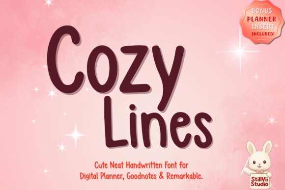
Cozy Lines presents a neat, handwritten aesthetic that keeps legibility front and center while still feeling warm and approachable. Designed with digital planners and students in mind, it performs reliably in GoodNotes, Notability, Procreate, and Remarkable, and as part of a broader set of Cozy fonts it brings a consistent, friendly voice to journals, study summaries, and daily lists. The restrained stroke contrast and soft terminals make long passages easy on the eyes without slipping into formality.
Typographically it offers careful spacing, subtle alternates, and sensible kerning so headings, notes, and sticker art behave predictably across sizes; ascenders and descenders stay neat even at small scales. Works well paired with a simple sans or a condensed serif when you need visual hierarchy, and OTF/TTF delivery ensures smooth stylus input and crisp on-screen rendering for thumbnails, labels, and social graphics.
My Recommendation: I gravitate toward Cozy Lines for planner pages and study notes because it feels handwritten without sacrificing clarity. Its alternate glyphs keep repeated phrases from looking mechanical, and the spacing saves me time during layout so I edit less. Use it when you want a friendly, organized look for stickers, thumbnails, or everyday journaling.
Testing a handful of cozy typefaces in context is the fastest way to see what fits your project. Try pairing a soft serif with a rounded sans, check sizes for legibility, and keep color contrast high for both print and screens.
Use this collection as a starting point: swap weights, tweak spacing, and preview designs on actual mockups to find the right homey feel for packaging, newsletters, or product labels in 2026.
One Comment